利用dataBinding的BindingAdapter来扩展View在xml里面的属性,从此妈妈再也不用担心我写Shape文件了
开始
注意:使用之前,需要开启dataBinding,而且是能kotlin哦,所以还没有学习kotlin的童鞋,赶快。
TA的存在主要解决Shape文件带来的冗余
使用场景:
当我们的某个控件需要实现边框、圆角、渐变背景、textview的中划线等,我们大多需要编写一个Shape.xml来实现
但如果我们的控件风格过多,大量的Shape.xml文件会产生冗余问题,而且还会产生入侵性。
举个栗子:
我们有2中按钮形式,一种是圆角5dp, 一种是10dp的,但这些圆角需要不同的背景,这个时候,我们会存在大量的Shape.xml
文件。当我们需要在使用5dp某某背景的时候,我们也不太好找到我们需要的这个文件,这时候我们可能会误认为,没有这个文件,
再次创建一个内容相同的但文件名不同的Shape.xml文件,产生冗余。
再举个例子:
当我们同一个Shape.xml文件被多个view同时使用时,但我们产品让我们改其中一个,如果我们直接改Shape.xml文件,那将会
产生入侵性,将同时引用这个文件的多个view的风格也改了。
说到这里,是不是感觉...确实是那么回事,那我们就来看看解决方案吧
这里,我将使用ExtendsViewBindingAdapter 来解决以上问题,当然ExtendsViewBindingAdapter是我自己取得名字哈,不是任何官方或第三方起的名
1. 先说可行性

肯定可行,我们借助dataBinding的力量和kotlin语言的特性,可以免去写attr文件而使得xml里面自定义属性

2. 稳定性

稳定性是有绝对保障的,这样写的我不是第一个,这种写法的原理其实和数据的双向绑定有点类似,双向绑定如果有问题,
谷歌是不会拿出来给我们用的

3. 实用性

对于我个人而言,直接写xml属性,比新建一个Shape.xml文件要舒服的多吧,我想应该不止我一个人会这样认为,而且对于开发速度上来说
也是优于Shape.xml文件方案的
如何使用
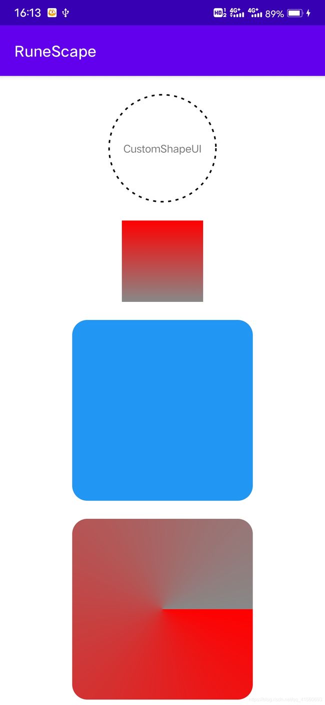
假如我们要在一个TextView 的背景实现 一个圆形虚线边框,切为黑色,代码如下
又例如我们要一个上下渐变背景
再例如我们需要一个蓝色圆角背景的
是不是很简单,那就直接上代码吧
object CustomShape {

    // ----------------------------------Shape 样式
    // 矩形
    const val RECTANGLE = GradientDrawable.RECTANGLE

    // 椭圆 如果控件为正方形,则该椭圆为正圆
    const val OVAL = GradientDrawable.OVAL

    // 线条
    const val LINE = GradientDrawable.LINE

    // 环形
    const val RING = GradientDrawable.RING


    // ----------------------------------渐变类型

    // 线性渐变
    const val LINEAR_GRADIENT = GradientDrawable.LINEAR_GRADIENT

    // 圆形渐变
    const val RADIAL_GRADIENT = GradientDrawable.RADIAL_GRADIENT

    // 扫描式渐变
    const val SWEEP_GRADIENT = GradientDrawable.SWEEP_GRADIENT


    // ----------------------------------渐变方向
    // 上到下
    const val TOP_BOTTOM = 1

    // 右上到左下
    const val TR_BL = 2

    // 右到左
    const val RIGHT_LEFT = 3

    // 下右到左上
    const val BR_TL = 4

    // 下到上
    const val BOTTOM_TOP = 5

    // 左下到右上
    const val BL_TR = 6

    // 左到右
    const val LEFT_RIGHT = 7

    // 上左到下右
    const val TL_BR = 8

}

/**
 * UI扩展方法 可以类似于xml的方式使用,如android:text="xxx"
 *
 * @author ZeroCode
 * @date 2021/5/25 : 11:01
 */
object ExtendsViewBindingAdapter {


    /**
     * 提供给xml调用的方法,但前提是必须开启databinding
     * 例如 : app:customBackground{@{Color.RED}}
     *
     * @param customBackground 背景颜色 填充颜色,在button中不生效
     * @param customStrokeColor 边框颜色(注意:边框颜色只有在边框宽度不为0的时候才会生效)
     * @param customStrokeWidth 边框宽度
     * @param customRound 圆角
     * @param customShape 样式
     * @param customIsDashed 是否边框为虚线
     * @param customDashWidth 虚线的一个宽度
     * @param customDashGap 虚线的间隔宽度
     * @param customIsShade 是否为渐变背景 默认不是
     * @param customShadeStartColor 渐变开始的颜色
     * @param customShadeEndColor 渐变结束的颜色
     * @param customShadeColors 渐变颜色集合(支持多个颜色,当设置了这个,开始颜色和结束颜色失效)
     * @param customShadeType 渐变类型
     * @param customShadeOrientation 渐变方向
     */
    @BindingAdapter(
        value = [
            "customBackground",
            "customStrokeColor",
            "customStrokeWidth",
            "customRound",
            "customShape",
            "customIsDashed",
            "customDashWidth",
            "customDashGap",
            "customIsShade",
            "customShadeStartColor",
            "customShadeEndColor",
            "customShadeColors",
            "customShadeType",
            "customShadeOrientation"
        ],
        requireAll = false
    )
    @JvmStatic
    fun View.setCustomStyle(
        customBackground: Int = Color.TRANSPARENT,                  // 背景颜色
        customStrokeColor: Int = Color.TRANSPARENT,                 // 边框颜色
        customStrokeWidth: Float = 0f,                              // 边框宽度
        customRound: Float = 0f,                                    // 圆角宽度
        customShape: Int = GradientDrawable.RECTANGLE               // Shape样式 默认矩形
        ,
        customIsDashed: Boolean = false                           // 配合边框使用,是否画为虚线
        ,
        customDashWidth: Float = 10f                              // 虚线的一个宽度
        ,
        customDashGap: Float = 10f                                // 虚线的间隔宽度
        ,
        customIsShade: Boolean = false                            // 是否为渐变背景 默认不是
        ,
        customShadeStartColor: Int = Color.TRANSPARENT            // 渐变开始的颜色
        ,
        customShadeEndColor: Int = Color.TRANSPARENT              // 渐变结束的颜色
        ,
        customShadeColors: IntArray? = intArrayOf()                // 渐变颜色集合(支持多个颜色,当设置了这个,开始颜色和结束颜色失效)
        ,
        customShadeType: Int = GradientDrawable.LINEAR_GRADIENT   // 渐变类型 默认线性渐变
        ,
        customShadeOrientation: Int = CustomShape.TOP_BOTTOM      // 渐变方向 默认上到下
        ,

        ) {
        val gradientDrawable: GradientDrawable = if (background as? GradientDrawable == null) {
            GradientDrawable()
        } else {
            background as GradientDrawable
        }

        if (!customIsShade) {
            // 背景
            gradientDrawable.setColor(customBackground ?: Color.TRANSPARENT)
        } else {
            // 渐变背景
            if (customShadeColors == null || customShadeColors.isEmpty()) {
                gradientDrawable.colors = intArrayOf(customShadeStartColor, customShadeEndColor)
            } else {
                gradientDrawable.colors = customShadeColors
            }

            // 设置渐变类型
            when (customShadeType) {
                GradientDrawable.LINEAR_GRADIENT -> gradientDrawable.gradientType =
                    GradientDrawable.LINEAR_GRADIENT
                GradientDrawable.RADIAL_GRADIENT -> gradientDrawable.gradientType =
                    GradientDrawable.RADIAL_GRADIENT
                GradientDrawable.SWEEP_GRADIENT -> gradientDrawable.gradientType =
                    GradientDrawable.SWEEP_GRADIENT
            }

            // 设置渐变方向
            when (customShadeOrientation) {
                CustomShape.TOP_BOTTOM -> gradientDrawable.orientation =
                    GradientDrawable.Orientation.TOP_BOTTOM
                CustomShape.TR_BL -> gradientDrawable.orientation =
                    GradientDrawable.Orientation.TR_BL
                CustomShape.RIGHT_LEFT -> gradientDrawable.orientation =
                    GradientDrawable.Orientation.RIGHT_LEFT
                CustomShape.BR_TL -> gradientDrawable.orientation =
                    GradientDrawable.Orientation.BR_TL
                CustomShape.BOTTOM_TOP -> gradientDrawable.orientation =
                    GradientDrawable.Orientation.BOTTOM_TOP
                CustomShape.BL_TR -> gradientDrawable.orientation =
                    GradientDrawable.Orientation.BL_TR
                CustomShape.LEFT_RIGHT -> gradientDrawable.orientation =
                    GradientDrawable.Orientation.LEFT_RIGHT
                CustomShape.TL_BR -> gradientDrawable.orientation =
                    GradientDrawable.Orientation.TL_BR
            }

        }


        if (customIsDashed!!) {
            gradientDrawable.setStroke(
                customStrokeWidth?.toInt() ?: 0,
                customStrokeColor ?: Color.TRANSPARENT, customDashWidth, customDashGap
            )
        } else {
            gradientDrawable.setStroke(
                customStrokeWidth?.toInt() ?: 0,
                customStrokeColor ?: Color.TRANSPARENT
            )
        }

        gradientDrawable.cornerRadii = floatArrayOf(
            customRound ?: 0f,
            customRound ?: 0f,
            customRound ?: 0f,
            customRound ?: 0f,
            customRound ?: 0f,
            customRound ?: 0f,
            customRound ?: 0f,
            customRound ?: 0f
        )
        GradientDrawable.OVAL

        // 可简化为这句代码,但是不符合规范,因为对customShape的值没有限制
        // gradientDrawable.shape = customShape
        when (customShape) {
            GradientDrawable.RECTANGLE -> gradientDrawable.shape = GradientDrawable.RECTANGLE
            GradientDrawable.OVAL -> gradientDrawable.shape = GradientDrawable.OVAL
            GradientDrawable.LINE -> gradientDrawable.shape = GradientDrawable.LINE
            GradientDrawable.RING -> gradientDrawable.shape = GradientDrawable.RING
            else -> gradientDrawable.shape = GradientDrawable.RECTANGLE
        }

        background = gradientDrawable
    }
}
注意
不支持 button
其他控件都应该支持
感谢
如果有喜欢的小伙伴,感谢三连,不喜勿喷哦
github主页