编者按:本文介绍了新版Seurat在数据可视化方面的新功能。主要是进一步加强与ggplot2语法的兼容性,支持交互操作。
seurat visualization
我们将使用之前在2700 PBMC教程中计算的Seurat对象演示Seurat中的可视化技术。你可以在这里下载here
ibrary(Seurat)
library(ggplot2)
pbmc <- readRDS(file = "D:\\Users\\Administrator\\Desktop\\Novo周运来\\SingleCell\\scrna_tools/pbmc3k_final.rds")
pbmc$groups <- sample(c("group1", "group2"), size = ncol(pbmc), replace = TRUE)
features <- c("LYZ", "CCL5", "IL32", "PTPRCAP", "FCGR3A", "PF4")
pbmc

An object of class Seurat
13714 features across 2638 samples within 1 assay
Active assay: RNA (13714 features)
 3 dimensional reductions calculated: pca, umap, tsne
five-visualizations-of-marker-feature-expression
# Ridge plots - from ggridges. Visualize single cell expression distributions in each cluster
RidgePlot(pbmc, features = features, ncol = 2)

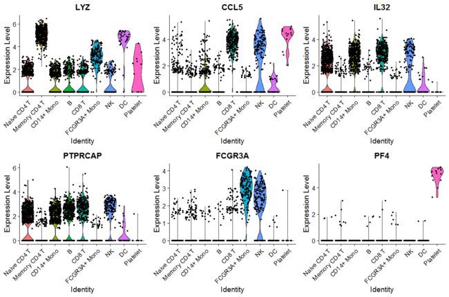
# Violin plot - Visualize single cell expression distributions in each cluster
VlnPlot(pbmc, features = features)
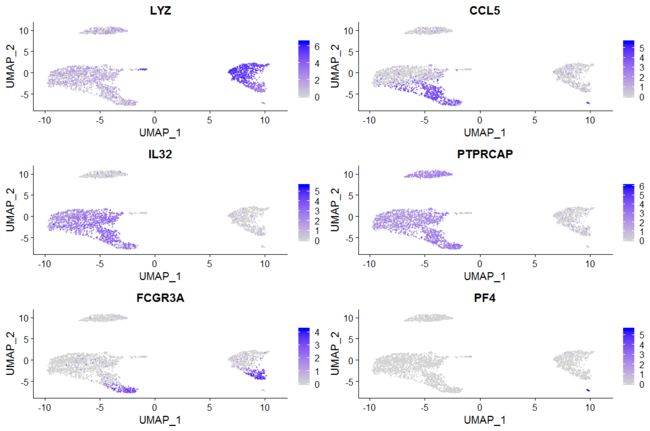
# Feature plot - visualize feature expression in low-dimensional space
FeaturePlot(pbmc, features = features)
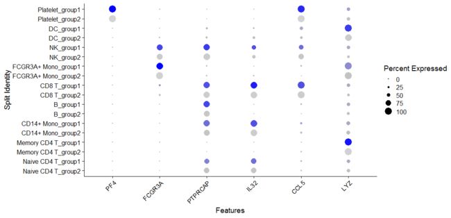
# Dot plots - the size of the dot corresponds to the percentage of cells expressing the feature
# in each cluster. The color represents the average expression level
DotPlot(pbmc, features = features) + RotatedAxis()

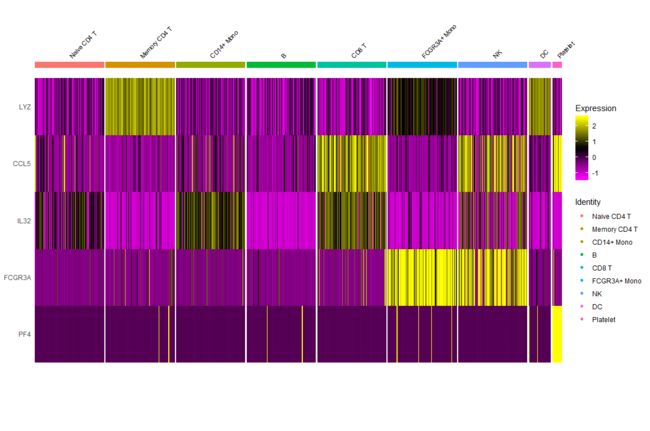
# Single cell heatmap of feature expression
DoHeatmap(subset(pbmc, downsample = 100), features = features, size = 3)
new-additions-to-featureplot
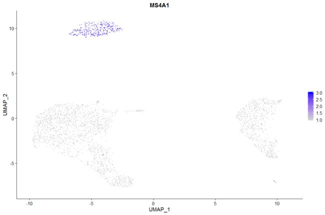
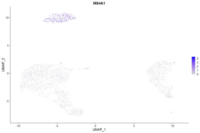
# Plot a legend to map colors to expression levels
FeaturePlot(pbmc, features = "MS4A1")

# Adjust the contrast in the plot
FeaturePlot(pbmc, features = "MS4A1", min.cutoff = 1, max.cutoff = 3)
# Calculate feature-specific contrast levels based on quantiles of non-zero expression.
# Particularly useful when plotting multiple markers
FeaturePlot(pbmc, features = c("MS4A1", "PTPRCAP"), min.cutoff = "q10", max.cutoff = "q90")

# Visualize co-expression of two features simultaneously
FeaturePlot(pbmc, features = c("MS4A1", "CD79A"), blend = TRUE)
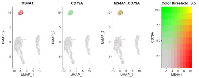
# Split visualization to view expression by groups (replaces FeatureHeatmap)
FeaturePlot(pbmc, features = c("MS4A1", "CD79A"), split.by = "groups")

updated-and-expanded-visualization-functions
除了对FeaturePlot进行更改外,还更新和扩展了其他几个绘图函数,添加了一些新特性,并取代了现在不推荐的函数.
# Violin plots can also be split on some variable. Simply add the splitting variable to object
# metadata and pass it to the split.by argument
VlnPlot(pbmc, features = "percent.mt", split.by = "groups")

# SplitDotPlotGG has been replaced with the `split.by` parameter for DotPlot
DotPlot(pbmc, features = features, split.by = "groups") + RotatedAxis()
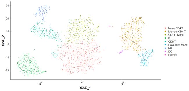
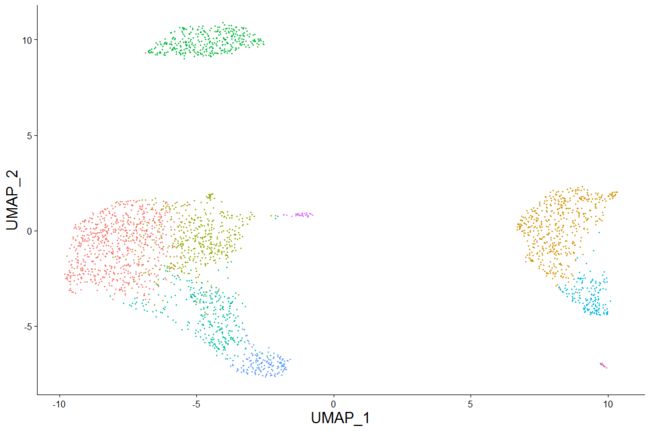
# DimPlot replaces TSNEPlot, PCAPlot, etc. In addition, it will plot either 'umap', 'tsne', or
# 'pca' by default, in that order
DimPlot(pbmc)

pbmc.no.umap <- pbmc
pbmc.no.umap[["umap"]] <- NULL
DimPlot(pbmc.no.umap) + RotatedAxis()
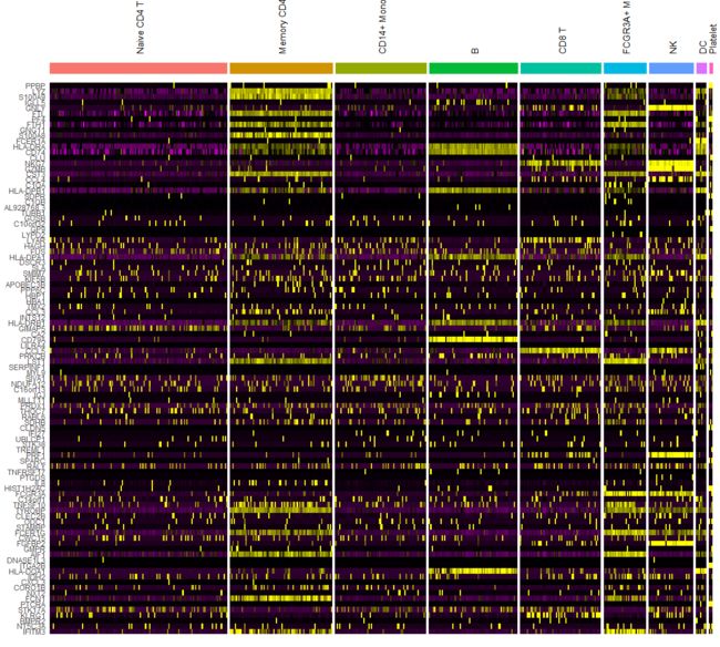
# DoHeatmap now shows a grouping bar, splitting the heatmap into groups or clusters. This can be
# changed with the `group.by` parameter
DoHeatmap(pbmc, features = VariableFeatures(pbmc)[1:100], cells = 1:500, size = 4, angle = 90) +
    NoLegend()
applying-themes-to-plots
在Seurat v3.0中,所有绘图函数默认情况下都返回基于ggplot2的绘图对象,允许我们像其他基于ggplot2的绘图对象一样轻松地再次操作绘图。
baseplot <- DimPlot(pbmc, reduction = "umap")
# Add custom labels and titles
baseplot + labs(title = "Clustering of 2,700 PBMCs")

# Use community-created themes, overwriting the default Seurat-applied theme Install ggmin with
# devtools::install_github('sjessa/ggmin')
baseplot + ggmin::theme_powerpoint()

# Seurat also provides several built-in themes, such as DarkTheme; for more details see
# ?SeuratTheme
baseplot + DarkTheme()

# Chain themes together
baseplot + FontSize(x.title = 20, y.title = 20) + NoLegend()
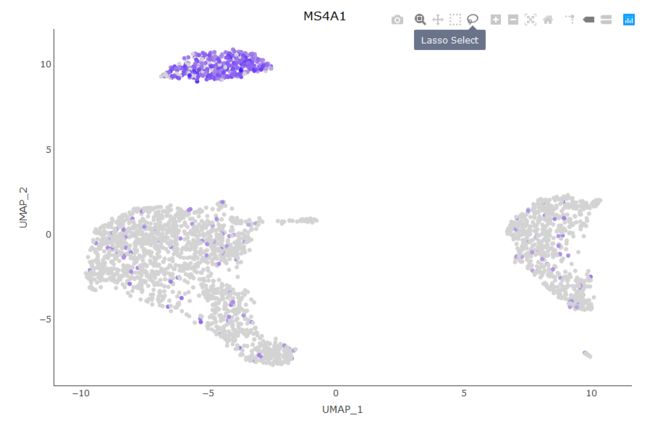
interactive-plotting-features
Seurat利用R的plot绘图库来创建交互式绘图。这个交互式绘图功能适用于任何基于ggplot2的散点图(需要一个geom_point层)。要使用它,只需制作一个基于ggplot2的散点图(例如DimPlot或FeaturePlot),并将生成的图传递给HoverLocator.
# Include additional data to display alongside cell names by passing in a data frame of
# information Works well when using FetchData
plot <- FeaturePlot(pbmc, features = "MS4A1")
HoverLocator(plot = plot, information = FetchData(pbmc, vars = c("ident", "PC_1", "nFeature_RNA")))
Warning messages:
1: In if (is.na(col)) { :
  the condition has length > 1 and only the first element will be used
2: In if (is.na(col)) { :
  the condition has length > 1 and only the first element will be used
3: `error_y.color` does not currently support multiple values.
4: `error_x.color` does not currently support multiple values.
5: `line.color` does not currently support multiple values.
6: The titlefont attribute is deprecated. Use title = list(font = ...) instead.
更多细节等你探索,交互式Seurat!
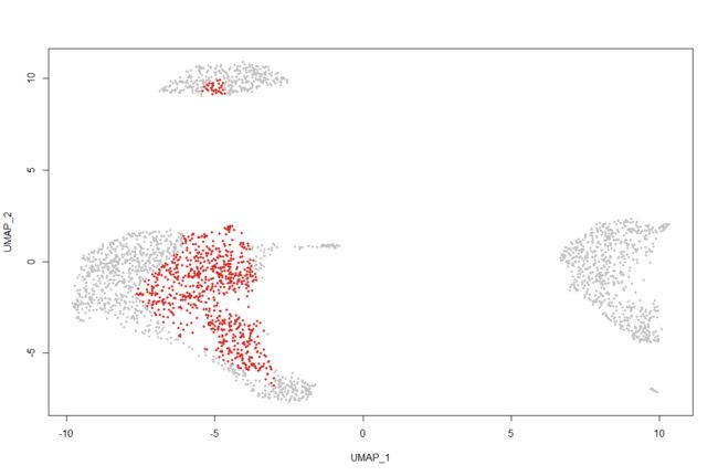
Seurat提供的另一个交互特性是能够手动选择细胞以进行进一步的研究。我们发现,对于那些并不总是使用无偏聚类进行分离的小集群来说,这一点特别有用,但是它们看起来非常不同。现在,您可以通过创建一个基于ggplot2的散点图(例如使用DimPlot或FeaturePlot,并将返回的图传递给CellSelector)来选择这些细胞。CellSelector将返回一个向量,其中包含所选点的名称,这样您就可以将它们设置为一个新的标识类进行 differential expression。
例如,让我们假设树突状细胞(DCs)已经在集群中与单核细胞(monocytes)合并,但是我们想根据它们在tSNE图中的位置了解它们的独特之处。
pbmc <- RenameIdents(pbmc, DC = "CD14+ Mono")
plot <- DimPlot(pbmc, reduction = "umap")
select.cells <- CellSelector(plot = plot)
给出一行小提示:
Click around the cluster of points you wish to select
ie. select the vertecies of a shape around the cluster you
are interested in. Press  when finished (right click for R-terminal users)

然后我们可以使用SetIdent将这些细胞转变成它们自己的小簇。
> head(select.cells)
[1] "AAGCCATGAACTGC" "ACGTCGCTCCTGAA" "ACTTAAGATTACTC"
[4] "ACTTCAACAAGCAA" "AGCACTGATGCTTT" "CACCGGGACTTCTA"
Idents(pbmc, cells = select.cells) <- "NewCells"

# Now, we find markers that are specific to the new cells, and find clear DC markers
newcells.markers <- FindMarkers(pbmc, ident.1 = "NewCells", ident.2 = "CD14+ Mono", min.diff.pct = 0.3,
                                only.pos = TRUE)
head(newcells.markers)
                p_val avg_logFC pct.1 pct.2    p_val_adj
HLA-DQA2 6.579989e-24  1.635741 0.619 0.045 9.023796e-20
SPECC1   1.928970e-21  0.547701 0.333 0.009 2.645390e-17
FCER1A   3.069126e-21  2.062739 0.524 0.036 4.208999e-17
HLA-DQB1 1.476429e-20  1.823891 0.905 0.142 2.024774e-16
HLA-DRB5 3.013802e-20  1.994758 0.810 0.112 4.133129e-16
HLA-DMA  6.237886e-20  1.363932 0.762 0.092 8.554637e-16
除了返回一个向量的细胞名称,CellSelector也可以选择的细胞和分配一个新的身份,返回一个修对象与身份已经设置类。这样做是通过修对象用来制造阴谋CellSelector,以及身份类。例如,我们将选择与之前相同的单元格集合,并将它们的标识类设置为" selected "
pbmc <- CellSelector(plot = plot, object = pbmc, ident = "selected")
levels(pbmc)
[1] "selected"     "NewCells"     "CD14+ Mono"   "Naive CD4 T"
 [5] "Memory CD4 T" "B"            "CD8 T"        "FCGR3A+ Mono"
 [9] "NK"           "Platelet"
plotting-accessories
除了向绘图添加交互功能之外,Seurat还提供了用于操作和组合绘图的新辅助功能。
# LabelClusters and LabelPoints will label clusters (a coloring variable) or individual points
# on a ggplot2-based scatter plot
plot <- DimPlot(pbmc, reduction = "pca") + NoLegend()
LabelClusters(plot = plot, id = "ident")

# Both functions support `repel`, which will intelligently stagger labels and draw connecting
# lines from the labels to the points or clusters
LabelPoints(plot = plot, points = TopCells(object = pbmc[["pca"]]), repel = TRUE)

# Plotting multiple plots at once is easy with CombinePlots
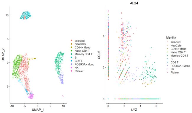
plot1 <- DimPlot(pbmc)
plot2 <- FeatureScatter(pbmc, feature1 = "LYZ", feature2 = "CCL5")
# CombinePlots takes a list of ggplot2-based plots
CombinePlots(plots = list(plot1, plot2))
# CombinePlots can also easily remove the legend from the plots by passing `legend = 'none'`;
# legends can also be combined with `legend = 'right'`
CombinePlots(plots = list(plot1, plot2), legend = "none")

# CombinePlots used cowplot:plot_grid under the hood, and will pass on additional arguments to
# cowplot::plot_grid