《R for Data Science》第二、三章 Data visualisation 啃书知识点积累
参考书籍
- 《R for data science》
- 《R数据科学》
- The Layered Grammar of Graphics.
- ggplot2: Points
“The simple graph has brought more information to the data analyst’s mind than any other device.” — John Tukey
“The greatest value of a picture is when it forces us to notice what we never expected to see.” — John Tukey
A graphing template
ggplot(data = ) +
  (
     mapping = aes(),
     stat = ,
     position =
  ) +
   +
Aesthetic mappings
# Left
p1 <- ggplot(data = mpg) +
  geom_point(mapping = aes(x = displ, y = hwy, alpha = class))

# Right
p2 <- ggplot(data = mpg) +
  geom_point(mapping = aes(x = displ, y = hwy, shape = class))

p1 + p2
# Warning messages:
# 1: Using alpha for a discrete variable is not advised.
# 2: The shape palette can deal with a maximum of 6 discrete values
# because more than 6 becomes difficult to discriminate; you have
# 7. Consider specifying shapes manually if you must have them.
# 3: Removed 62 rows containing missing values (geom_point).
![[R语言] ggplot2包 可视化《R for data science》 1_第1张图片](http://img.e-com-net.com/image/info10/50ec4c15b0854feeaf9ab059a7a89aa9.jpg)
ggplot2 will only use
six shapesat a time. By default, additional groups will go unplotted when you use the shape aesthetic.
![[R语言] ggplot2包 可视化《R for data science》 1_第2张图片](http://img.e-com-net.com/image/info10/80945280bfbe4a4b904f8bd243382b4c.jpg)
- How do these aesthetics behave differently for categorical vs. continuous variables
'''
color 有序属性
1. 分类变量映射:对应多种不同颜色
2. 连续变量映射:形成有固定范围的色阶,在色阶内部取色

size 有序属性
1. 分类变量映射:点大小和分类类型逐一对应但不相关,且会警告
2. 连续变量映射:点的大小和连续变量线性相关

shape 无序属性
1. 分类变量映射:对应多种形状,最多同时出现6种,超过则不显示且有警告
2. 连续变量映射:无法映射
'''
- mpg的变量类型
![[R语言] ggplot2包 可视化《R for data science》 1_第3张图片](http://img.e-com-net.com/image/info10/5789f85d84074bec8aa547ef5405340b.jpg)
- stroke属性
![[R语言] ggplot2包 可视化《R for data science》 1_第4张图片](http://img.e-com-net.com/image/info10/c3c420fd828541e99ae64497993f88d5.jpg)
p1 <- ggplot(mpg,aes(x = displ, y = hwy)) +
  geom_point(shape = 1)

p2 <- ggplot(mpg,aes(x = displ, y = hwy)) +
  geom_point(shape = 1,stroke = 2)

p1 + p2
![[R语言] ggplot2包 可视化《R for data science》 1_第5张图片](http://img.e-com-net.com/image/info10/a6ad5da9e7344d9fbef939629b5feac6.jpg)
Facet 分面
- 封装型 wrap
ggplot(mpg) +
  geom_point(aes(x = displ, y = hwy)) +
  facet_wrap(~ class, nrow = 2)
![[R语言] ggplot2包 可视化《R for data science》 1_第6张图片](http://img.e-com-net.com/image/info10/48d6755401ee479aaabf7d2b7d3063cf.jpg)
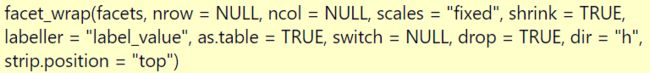
facet_wrap()参数如下:
# strip.position参数调节标签的朝向
p1 <- ggplot(mpg) +
  geom_point(aes(x = displ, y = hwy)) +
  facet_wrap(~ class, nrow = 2, strip.position = 'bottom')

p2 <- ggplot(mpg) +
  geom_point(aes(x = displ, y = hwy)) +
  facet_wrap(~ class, nrow = 2, strip.position = 'right')

p1 + p2
![[R语言] ggplot2包 可视化《R for data science》 1_第7张图片](http://img.e-com-net.com/image/info10/df50deca5b904d1aad3c9b65ba784b5d.jpg)
- 在分面中呈现总数据
ggplot(mpg, aes(displ, hwy)) +
  geom_point(data = transform(mpg, class = NULL),
             colour = "grey85") +
  geom_point() +
  facet_wrap(~ class)
![[R语言] ggplot2包 可视化《R for data science》 1_第8张图片](http://img.e-com-net.com/image/info10/7fca214f613a45f7848f96a8054dc5ca.jpg)
- 网格型 grid
# . 的作用表示的是不想在行或者列的维度上进行分面
p1 <- ggplot(data = mpg) +
  geom_point(mapping = aes(x = displ, y = hwy)) +
  facet_grid(drv ~ .) # 列 ~ 行

p2 <- ggplot(data = mpg) +
  geom_point(mapping = aes(x = displ, y = hwy)) +
  facet_grid(. ~ cyl)

p1 + p2
![[R语言] ggplot2包 可视化《R for data science》 1_第9张图片](http://img.e-com-net.com/image/info10/4ef79d15f7f040eebef61291e1e17eca.jpg)
Geometric objects
- 不显示图例和置信区间
p1 <- ggplot(mpg) +
  geom_smooth(aes(x = displ, y = hwy))

p2 <- ggplot(mpg,aes(x = displ, y = hwy, group = drv)) +
  geom_smooth(se = FALSE)

p3 <- ggplot(mpg) +
  geom_smooth(
    aes(x = displ, y = hwy, color = drv),
    show.legend = FALSE)

p1 + p2 + p3
![[R语言] ggplot2包 可视化《R for data science》 1_第10张图片](http://img.e-com-net.com/image/info10/46f3118f72664feeae6056fa5e196fb1.jpg)
- 配合filter
ggplot(mpg, aes(x = displ, y = hwy)) +
  geom_point(aes(color = class)) +
  geom_smooth(data = filter(mpg, class == "subcompact"), se = FALSE)
![[R语言] ggplot2包 可视化《R for data science》 1_第11张图片](http://img.e-com-net.com/image/info10/8aaf639063d64b2c8b406b033dd2f47e.jpg)
- 细节画图
同样是外白内其他颜色的点,一种重叠后有白色,一种无白色在内
p1 <- ggplot(mpg, aes(x = displ, y = hwy)) +
  geom_point(aes(fill=drv),shape=21,color='white',size=2.5,stroke=1.5)

p2 <- ggplot(mpg, aes(x = displ, y = hwy)) +
  geom_point(color='white',size=3.5)+
  geom_point(aes(color=drv),shape=16,size=2.3)

p1 + p2
![[R语言] ggplot2包 可视化《R for data science》 1_第12张图片](http://img.e-com-net.com/image/info10/6ecdf1941684477b976168fd85e4a628.jpg)
Statistical transformations
barcharts, histograms, and frequency polygons bin your data and then plot bin counts, the number of points that fall in each bin.
smoothersfit a model to your data and then plot predictions from the model.
boxplotscompute a robust summary of the distribution and then display a specially formatted box.
![[R语言] ggplot2包 可视化《R for data science》 1_第13张图片](http://img.e-com-net.com/image/info10/649adb65bbbe4de09ea6cf259e02d5b4.jpg)
- 几种常用互换
You can generally use geoms and stats interchangeably. For example, you can recreate the previous plot using stat_count() instead of geom_bar()
ggplot(data = diamonds) +
  stat_count(mapping = aes(x = cut))
# 等价于
ggplot(data = diamonds) +
  geom_bar(mapping = aes(x = cut), stat = 'identity') # 默认stat可以不写
ggplot(data = diamonds) +
  geom_pointrange(
    mapping = aes(x = cut, y = depth),
    stat = "summary",
    fun.ymin = min,
    fun.ymax = max,
    fun.y = median
  )
# 等价于
ggplot(data = diamonds) +
  stat_summary(
    mapping = aes(x = cut, y = depth),
    fun.ymin = min,
    fun.ymax = max,
    fun.y = median
  )

# 也可以手动复现
ggplot(diamonds, aes(cut,depth)) +
  geom_line(size=1) +
  # 更换data需要重新指名data = xxx
  geom_point(data = diamonds %>%
               group_by(cut) %>%
               summarise(median(depth)),
               aes(cut, `median(depth)`), size=2)
![[R语言] ggplot2包 可视化《R for data science》 1_第14张图片](http://img.e-com-net.com/image/info10/c41f8fb5195c47c1aa7b999612e86644.jpg)
- 覆盖默认映射
ggplot(diamonds) +
  geom_bar(aes(x = cut, y = stat(prop), group = 1, fill = stat(prop)))
# 等价于
p1 <- ggplot(diamonds) +
  geom_bar(aes(x = cut, y = ..prop.., group = 1, fill = ..prop..))

p2 <- ggplot(diamonds) +
  geom_bar(aes(x = cut, y = ..prop.., group = color, fill = color))

p1 + p2
![[R语言] ggplot2包 可视化《R for data science》 1_第15张图片](http://img.e-com-net.com/image/info10/cd6c2b23648f44bd92bb5634cf87469e.jpg)
- What does geom_col() do? How is it different to geom_bar()?
- geom_col() 函数也是用来绘制柱状图,"identity" 表示不做统计变换
- geom_bar() 函数默认是 count,表示计数
- Most geoms and stats come in pairs that are almost always used in concert. Read through the documentation and make a list of all the pairs. What do they have in common?
![[R语言] ggplot2包 可视化《R for data science》 1_第16张图片](http://img.e-com-net.com/image/info10/b7bcab91ad7f4abc95375ae9598bb7fc.jpg)
![[R语言] ggplot2包 可视化《R for data science》 1_第17张图片](http://img.e-com-net.com/image/info10/9fbee8b1ca214b97b22dea6ec3669c49.jpg)
![[R语言] ggplot2包 可视化《R for data science》 1_第18张图片](http://img.e-com-net.com/image/info10/82890a75c1a6429fb4044abf900bb360.jpg)
Position adjustments
position = "identity" 将每个对象直接显示在图中,这样数据会彼此重叠,不适合展示结果
position = "fill" 堆叠百分比条形图
position = "dodge" 并列条形图
position = "stack" 堆叠起来
position = "jitter" 数据随机抖动,一般应用于散点图
用一下刘博的案例
library(ggplot2)
library(patchwork)

v <- data.frame(x = 1:20,
                y = runif(40,min = 10,max = 20),
                z = rep(c("A","B"),each = 20))

p1 <- ggplot(v, aes(x, y, fill = z))+
  geom_area(position = position_dodge(), alpha = 0.5) +
  labs(title = "position_dodge()")

p2 <- ggplot(v, aes(x, y, fill = z))+
  geom_area(position = position_fill(), alpha = 0.5) +
  labs(title = "position_fill()")

p3 <- ggplot(v, aes(x, y, fill = z))+
  geom_area(position = position_stack(), alpha = 0.5) +
  labs(title = "position_stack()")

p4 <- ggplot(v, aes(x, y, fill = z))+
  geom_area(position = position_identity(), alpha = 0.5) +
  labs(title = "position_identity()")

p5 <- ggplot(v, aes(x, y, fill = z))+
  geom_area(position = position_jitter(), alpha = 0.5) +
  labs(title = "position_jitter(), usually for point")

(p1 + p2 + p3)/(p4 + p5)
![[R语言] ggplot2包 可视化《R for data science》 1_第19张图片](http://img.e-com-net.com/image/info10/7c3c036b87d44ccd97d78a0a602bd1da.jpg)
- geom_jitter() 抖动
geom_jitter() 对数据进行随机抖动
geom_count() 将重叠的位置数目进行计数
p1 <- ggplot(data = mpg, mapping = aes(x = cty, y = hwy)) +
  geom_point()

ggplot(data = mpg, mapping = aes(x = cty, y = hwy)) +
  geom_jitter()
# 等价于
ggplot(data = mpg, mapping = aes(x = cty, y = hwy)) +
  geom_point(position = position_jitter())
# 等价于
p2 <- ggplot(data = mpg, mapping = aes(x = cty, y = hwy)) +
  geom_point(position = 'jitter')

# geom_count()
p3 <- ggplot(data = mpg, mapping = aes(x = cty, y = hwy)) +
  geom_count()
![[R语言] ggplot2包 可视化《R for data science》 1_第20张图片](http://img.e-com-net.com/image/info10/8a2fc995a7744142b74458257f96ab8d.jpg)
Coordinate systems
- coord_flip()
coord_flip() switches the x and y axes. This is useful (for example), if you want horizontal boxplots. It’s also useful for
long labels: it’s hard to get them to fit without overlapping on the x-axis.
p1 <- ggplot(data = mpg, mapping = aes(x = class, y = hwy)) +
  geom_boxplot()

p2 <- ggplot(data = mpg, mapping = aes(x = class, y = hwy)) +
  geom_boxplot() +
  coord_flip()

p1 + p2
![[R语言] ggplot2包 可视化《R for data science》 1_第21张图片](http://img.e-com-net.com/image/info10/3d561405cc6b4e4b88bc9c946b4fb1b9.jpg)
- coord_quickmap()
帮助地图设置成正确比例
coord_quickmap() sets the aspect ratio correctly for maps. This is very important if you’re plotting spatial data with ggplot2.
nz <- map_data("nz")

p1 <- ggplot(nz, aes(long, lat, group = group)) +
  geom_polygon(fill = "white", colour = "black")

p2 <- ggplot(nz, aes(long, lat, group = group)) +
  geom_polygon(fill = "white", colour = "black") +
  coord_quickmap()

p1 + p2
![[R语言] ggplot2包 可视化《R for data science》 1_第22张图片](http://img.e-com-net.com/image/info10/80c7e986de3840de9996033da2ca68b5.jpg)
- coord_polar()
bar <- ggplot(data = diamonds) +
  geom_bar(
    mapping = aes(x = cut, fill = cut),
    show.legend = FALSE,
    width = 1
  ) +
  theme(aspect.ratio = 1) +
  labs(x = NULL, y = NULL)

p1 <- bar + coord_flip()
p2 <- bar + coord_polar()

p1 + p2
![[R语言] ggplot2包 可视化《R for data science》 1_第23张图片](http://img.e-com-net.com/image/info10/3e00f226a6374fd3bf81023be38112fd.jpg)
进一步拓展:
- Turn a stacked bar chart into a pie chart using coord_polar()
p1 <- ggplot(diamonds) +
  geom_bar(aes(x = cut, fill = clarity)) +
  coord_polar()

p2 <- ggplot(diamonds) +
  geom_bar(aes(x = cut, fill = clarity),
           position = 'fill') +
  coord_polar()

# theta 参数表示 variable to map angle to (x or y)
# 意思就是根据值计算出所占的比例,然后再映射到角度
p3 <- ggplot(diamonds) +
  geom_bar(aes(x = cut, fill = clarity),
           position = 'fill') +
  coord_polar(theta = "y")

p1 + p2 + p3
![[R语言] ggplot2包 可视化《R for data science》 1_第24张图片](http://img.e-com-net.com/image/info10/c3a2dfd0bf5d4f699f5d6e4127b15124.jpg)
- What does the plot below tell you about the relationship between city and highway mpg? Why is coord_fixed() important? What does geom_abline() do?
'''
城市和公路燃油效率之间呈现正相关。
coord_fixed()能够固定x轴和y轴的比例。
geom_abline()是绘制斜线,默认45度,截距适应图形
可以指定intercept截距,slope坡度
'''

p1 <- ggplot(data = mpg, mapping = aes(x = cty, y = hwy)) +
  geom_point() +
  geom_abline() +
  coord_fixed()

p2 <- ggplot(data = mpg, mapping = aes(x = cty, y = hwy)) +
  geom_point() +
  geom_abline(intercept=-5,slope=1) +
  coord_fixed()

p1 + p2
![[R语言] ggplot2包 可视化《R for data science》 1_第25张图片](http://img.e-com-net.com/image/info10/3c49eed7d2f246a2a1351654278bf741.jpg)