Android高级UI--Material Design设计理念下的控件使用详解与各种问题的解决方案
一.配置:
1.Material Design的控件大多都放在design库中
implementation 'com.android.support:design:30.0.3'
2.Circleimageview的配置:
implementation 'de.hdodenhof:circleimageview:2.1.0'
3.使用三方框架Glide的配置:
    implementation 'com.github.bumptech.glide:glide:4.3.1'
    annotationProcessor 'com.github.bumptech.glide:compiler:4.3.1'
二:控件介绍和使用:
(一).Toolbar:顶替系统标题栏,能引入更精致的设计风格
替换系统标题栏步骤:
1.将style.xml的主题改成
<style name="AppTheme" parent="Theme.AppCompat.Light.NoActionBar">
2.主函数加入(还需要在layout中添加该控件)
        Toolbar toolbal = findViewById(R.id.toolbal);
        setSupportActionBar(toolbal);
3.若要开启标题栏的导航按钮(固定id值为: android.R.id.home) 则添加:
       ActionBar actionBar = getSupportActionBar();
       if(actionBar != null){

            actionBar.setDisplayHomeAsUpEnabled(true);
            actionBar.setHomeAsUpIndicator(R.drawable.ic_menu);
        }
(二)DrawerLayout–滑动菜单
使用说明:
1.可像LinearLayout一样单独使用
2.最好只有俩个直接子控件,第一个是用于主屏幕中显示的内容,第二个是用于菜单的显示内容
3.第二个子控件的layout_gravity属性一定要,否则会覆盖在主屏幕中
属性值"start"表示左边滑出菜单,”end“则表示右边滑出菜单
4.若要加第三个直接子控件,那么第三个直接子控件也会以菜单的形式出现
且layout_gravity属性值不能与第二个子控件一样,否则报错
(三)NavigationView----谷歌官方推荐DrawerLayout的菜单页面中填充的最佳控件
使用说明:
1.有俩个关键属性:app:menu 还有 app:headerlayout
2.上述俩个属性的值都是相应的menu布局文件与layout布局文件
3.有监听事件:
        navigation.setNavigationItemSelectedListener(new NavigationView.OnNavigationItemSelectedListener() {

            @Override
            public boolean onNavigationItemSelected(@NonNull MenuItem menuItem) {

                mDrawerLayout.closeDrawers();
                return true;
            }
        });
(四)FloatingActionButton----悬浮按钮
使用说明:
1.有src属性可以放置图标
2.跟button一样有监听功能
3.使用layout_gravity去适配它的位置
4.有投影:使用elevation属性去调整它的高度,高度越高,投影范围越大,投影效果越淡。反而反之
(五)Snackbar----可交互提示
使用说明:
1.比Toast多了一个setaction,目的就是在开启事件时你还可以有取消的动作,防止误删数据等
2.多了一个监听功能除了1的作用外逻辑是可以自己写的,跟button的监听一样
3.利用上述的FloatingActionBar的监听功能来体会Snackbar的用法
FloatingActionButton fab = (FloatingActionButton) findViewById(R.id.fab);
fab.setOnClickListener(new View.OnClickListener() {
@Override
public void onClick(View v) {
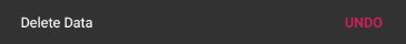
Snackbar.make(v,"Delete Data",Snackbar.LENGTH_SHORT).setAction("Undo", new View.OnClickListener() {
@Override
public void onClick(View v) {
Toast.makeText(MyApplication.getContext(),"Data is restored",Toast.LENGTH_SHORT).show();
}
}).show();
}
});
效果:
(六)CoordinatorLayout----加强版的FrameLayout
使用说明:
1.普通功能与FrameLayout基本一样
2.特殊功能在于它可以监听所有子控件的各种事件,然后做出最合理的响应
3.比如在(五)点击了悬浮按钮FloatingActionButton后下面的效果图会遮挡住FloatingActionButton,而若将FloatingActionButton置于CoordinatorLayout中就能轻松解决,因为它会让我们的FloatingActionButton知道上浮防止被覆盖到,使用户体验更加。
(七)AppBarLayout----使toolbar变得更灵活
使用说明:
为了解决在CoordinatorLayout中加入滚动布局例如RecyclerView造成toolbar被RecyclerView遮挡覆盖
1.将toolbar置为AppBarLayout的子控件
   <com.google.android.material.appbar.AppBarLayout
       android:layout_width="match_parent"
       android:layout_height="wrap_content"
       >
    <androidx.appcompat.widget.Toolbar
        android:id="@+id/toolbal"
        android:layout_width="match_parent"
        android:layout_height="?attr/actionBarSize"
        android:background="?attr/colorPrimary"
        android:theme="@style/ThemeOverlay.AppCompat.Dark.ActionBar"
        app:popupTheme="@style/ThemeOverlay.AppCompat.Light"
       />
   </com.google.android.material.appbar.AppBarLayout>
2.为含有RecyclerView等滚动布局的最外层控件指定一个布局行为:
app:layout_behavior="@string/appbar_scrolling_view_behavior"
例:
  <androidx.swiperefreshlayout.widget.SwipeRefreshLayout
       android:id="@+id/swipeRefresh"
       android:layout_width="match_parent"
       android:layout_height="match_parent"
       app:layout_behavior="@string/appbar_scrolling_view_behavior">
      <androidx.recyclerview.widget.RecyclerView
       android:id="@+id/recycler_view"
       android:layout_width="match_parent"
       android:layout_height="match_parent"
       />
这样就可以很好的解决toolbar被遮挡的问题了
(七)SwipeRefreshLayout—下拉刷新
使用说明:
1.将想实现下拉刷新的控件放置到SwipeRefreshLayout中就可以实现下拉刷新了
例:
  <androidx.swiperefreshlayout.widget.SwipeRefreshLayout
       android:id="@+id/swipeRefresh"
       android:layout_width="match_parent"
       android:layout_height="match_parent"
       app:layout_behavior="@string/appbar_scrolling_view_behavior">
      <androidx.recyclerview.widget.RecyclerView
       android:id="@+id/recycler_view"
       android:layout_width="match_parent"
       android:layout_height="match_parent"
       />
2.可以设置刷新的监听功能
        swipeRefresh = findViewById(R.id.swipeRefresh);
        swipeRefresh.setColorSchemeColors(R.color.colorPrimary);
        swipeRefresh.setOnRefreshListener(new SwipeRefreshLayout.OnRefreshListener() {

            @Override
            public void onRefresh() {

                refreshAnimals();
            }
        });
二之七控件的结合使用:
<androidx.drawerlayout.widget.DrawerLayout android:id="@+id/drawer_layout"
    android:layout_height="match_parent"
    android:layout_width="match_parent"
    xmlns:android="http://schemas.android.com/apk/res/android"
    xmlns:app="http://schemas.android.com/apk/res-auto"
    android:fitsSystemWindows="true">
 <androidx.coordinatorlayout.widget.CoordinatorLayout
      android:layout_width="match_parent"
      android:layout_height="match_parent"
     android:fitsSystemWindows="true">
   <com.google.android.material.appbar.AppBarLayout
       android:layout_width="match_parent"
       android:layout_height="wrap_content"
       >
    <androidx.appcompat.widget.Toolbar
        android:id="@+id/toolbal"
        android:layout_width="match_parent"
        android:layout_height="?attr/actionBarSize"
        android:background="?attr/colorPrimary"
        android:theme="@style/ThemeOverlay.AppCompat.Dark.ActionBar"
        app:popupTheme="@style/ThemeOverlay.AppCompat.Light"
       />
   </com.google.android.material.appbar.AppBarLayout>
   <androidx.swiperefreshlayout.widget.SwipeRefreshLayout
     android:id="@+id/swipeRefresh"
     android:layout_width="match_parent"
     android:layout_height="match_parent"
     app:layout_behavior="@string/appbar_scrolling_view_behavior">
     <androidx.recyclerview.widget.RecyclerView
         android:id="@+id/recycler_view"
         android:layout_width="match_parent"
         android:layout_height="match_parent"
         />
   </androidx.swiperefreshlayout.widget.SwipeRefreshLayout>
    <com.google.android.material.floatingactionbutton.FloatingActionButton
        android:id="@+id/fab"
        android:layout_width="wrap_content"
        android:layout_height="wrap_content"
        android:layout_gravity="bottom|end"
        android:layout_margin="16dp"
        android:src="@drawable/ic_done"
        app:elevation="8dp"/>
</androidx.coordinatorlayout.widget.CoordinatorLayout>
<com.google.android.material.navigation.NavigationView
    android:id="@+id/nav_view"
    android:layout_gravity="start"
    android:layout_width="match_parent"
    android:layout_height="match_parent"
    app:headerLayout="@layout/nav_header"
    app:menu="@menu/nav_menu"/>
</androidx.drawerlayout.widget.DrawerLayout>
(八)CardView----卡片式布局
使用说明:它其实也是一个FrameLayout
1.最好直接子控件来一个LinearLayout或者另外的其他布局,然后再嵌套子控件,不然多个控件显示的效果就还是跟FrameLayout一样
例:
<androidx.cardview.widget.CardView
    android:layout_height="wrap_content"
    android:layout_width="match_parent"
    xmlns:app="http://schemas.android.com/apk/res-auto"
    android:layout_margin="5dp"
    app:cardCornerRadius="4dp"
    xmlns:android="http://schemas.android.com/apk/res/android">
    <LinearLayout
        android:orientation="vertical"
        android:layout_width="match_parent"
        android:layout_height="match_parent">
       <ImageView
           android:id="@+id/animal_image"
           android:layout_width="match_parent"
           android:layout_height="160dp"
           android:scaleType="centerCrop"/>
       <TextView
           android:id="@+id/animal_name"
           android:layout_width="wrap_content"
           android:layout_height="wrap_content"
           android:layout_gravity="center_horizontal"
           android:layout_margin="5dp"
           android:textSize="16sp"/>
    </LinearLayout>
</androidx.cardview.widget.CardView>
假如最外层的LinearLayout去掉,那显示的效果就完全不一样了,可以试试看
app:cardCornerRadius="4dp"
这个属性是来显示 卡片边缘的圆弧的弧度
(九)CollapsingToolbarLayout----可折叠式标题栏
使用说明:
1.CollapsingToolbarLayout必须作为AppBarLayout的直接子布局
2.AppBarLayout必须作为CoordinatorLayout的子布局
3.CollapsingToolbarLayout中可以放置图片资源 + toolbar作为标题栏,这就使标题栏更加的好看
        <com.google.android.material.appbar.CollapsingToolbarLayout
            android:id="@+id/collasping_toolbar"
            android:layout_width="match_parent"
            android:layout_height="match_parent"
            android:theme="@style/ThemeOverlay.AppCompat.Dark.ActionBar"
            app:contentScrim="?attr/colorPrimary"
            app:layout_scrollFlags="scroll|exitUntilCollapsed"
            android:fitsSystemWindows="true">
            <ImageView
                android:id="@+id/animal_image_view"
                android:layout_width="match_parent"
                android:layout_height="match_parent"
                android:scaleType="centerCrop"
                app:layout_collapseMode="parallax"
                android:fitsSystemWindows="true"/>
            <androidx.appcompat.widget.Toolbar
                android:id="@+id/toolbar"
                android:layout_width="match_parent"
                android:layout_height="?attr/actionBarSize"
                app:layout_collapseMode="pin"/>
        </com.google.android.material.appbar.CollapsingToolbarLayout>
属性分析:
1.这个是将图片按原来的比例进行缩放,然后填充到它的指定width和height
android:scaleType="centerCrop"
2.表示折叠过程中的折叠模式:
“parallax”表示在折叠的过程中产生一定的错位偏移,能达到更好的视觉效果
"pin"表示在折叠过程中位置始终保持不变
 app:layout_collapseMode="parallax"
 app:layout_collapseMode="pin"
注:下面这个属性是配置 用UI布局填充掉系统状态栏所用的
用法:
1.将所需要填充的控件以及它的外层到最外层的控件都加入这一属性
android:fitsSystemWindows="true"
2.将系统状态栏变成透明,透明这一属性只有 API为21开始才有,所以需要配置values-21的文件,不配置也可以,直接在style里这样子:
即声明了21的api
<item name="android:statusBarColor" tools:targetApi="lollipop">@android:color/transparent</item>
这样就可以充分的利用系统状态栏,达到更好的UI效果
(十)ScrollView与NestedScrollView–滚动的View
作用:可以以滚动的方式来查看屏幕以外的数据(数据多的时候)
使用说明:
1.只允许存在一个子布局,所以一般用嵌套结构
2.NestedScrollView 比 ScrollView多了嵌套响应滚动事件的功能,CoordinatorLayout也具备
3.也有app:layout_behavior的属性
   <androidx.core.widget.NestedScrollView
        android:layout_width="match_parent"
        android:layout_height="match_parent"
        app:layout_behavior="@string/appbar_scrolling_view_behavior">
        <LinearLayout
            android:orientation="vertical"
            android:layout_width="match_parent"
            android:layout_height="wrap_content">
            <TextView
                android:id="@+id/animal_content_text"
                android:layout_width="wrap_content"
                android:layout_height="wrap_content"
                android:layout_margin="10dp"/>
        </LinearLayout>
    </androidx.core.widget.NestedScrollView>
我使用过的Material Design的控件到这就总结结束了,之后有遇到更好的控件会继续补充。