大数据分析——Matplotlib进阶教程
文章目录
- 问题区设置坐标轴
- 1.matplotlib.pyplot总览
-
- (1)总函数
- (2)常用函数
- 常用函数解析
- 对于figure和axes的理解
- 2.实战
-
- (1)三维图
-
- 3D画图常用函数
-
- np.meshgrid()
- np.mgrid()
-
- 解析
- 实例
- (2)饼状图
- (3) 等高线图
- (4) 热力图
问题区设置坐标轴
plot.grid()画线
如果没有看初级教程的小伙伴们可以看一下上一篇教程
大数据分析——Matplotlib入门教程
这期教程将系统讲解Matplotlib的各种方法及其参数,如果能帮到你,小伙伴记得点赞哦!
1.matplotlib.pyplot总览
(1)总函数
| Functions | |
|---|---|
| acorr(x, *[, data]) | Plot the autocorrelation of x. |
| angle_spectrum(x[, Fs, Fc, window, pad_to, …]) | Plot the angle spectrum. |
| annotate(text, xy, *args, **kwargs) | Annotate the point xy with text text. |
| arrow(x, y, dx, dy, **kwargs) | Add an arrow to the Axes. |
| autoscale([enable, axis, tight]) | Autoscale the axis view to the data (toggle). |
| autumn() | Set the colormap to ‘autumn’. |
| axes([arg]) | Add an axes to the current figure and make it the current axes. |
| axhline([y, xmin, xmax]) | Add a horizontal line across the axis. |
| axhspan(ymin, ymax[, xmin, xmax]) | Add a horizontal span (rectangle) across the Axes. |
| axis(*args[, emit]) | Convenience method to get or set some axis properties. |
| axline(xy1[, xy2, slope]) | Add an infinitely long straight line. |
| axvline([x, ymin, ymax]) | Add a vertical line across the Axes. |
| axvspan(xmin, xmax[, ymin, ymax]) | Add a vertical span (rectangle) across the Axes. |
| bar(x, height[, width, bottom, align, data]) | Make a bar plot. |
| bar_label(container[, labels, fmt, …]) | Label a bar plot. |
| barbs(*args[, data]) | Plot a 2D field of barbs. |
| barh(y, width[, height, left, align]) | Make a horizontal bar plot. |
| bone() | Set the colormap to ‘bone’. |
| box([on]) | Turn the axes box on or off on the current axes. |
| boxplot(x[, notch, sym, vert, whis, …]) | Make a box and whisker plot. |
| broken_barh(xranges, yrange, *[, data]) | Plot a horizontal sequence of rectangles. |
| cla() | Clear the current axes. |
| clabel(CS[, levels]) | Label a contour plot. |
| clf() | Clear the current figure. |
| clim([vmin, vmax]) | Set the color limits of the current image. |
| close([fig]) | Close a figure window. |
| cohere(x, y[, NFFT, Fs, Fc, detrend, …]) | Plot the coherence between x and y. |
| colorbar([mappable, cax, ax]) | Add a colorbar to a plot. |
| connect(s, func) | Bind function func to event s. |
| contour(*args[, data]) | Plot contour lines. |
| contourf(*args[, data]) | Plot filled contours. |
| cool() | Set the colormap to ‘cool’. |
| copper()、 | Set the colormap to ‘copper’. |
| csd(x, y[, NFFT, Fs, Fc, detrend, window, …]) | Plot the cross-spectral density. |
| delaxes([ax]) | Remove an Axes (defaulting to the current axes) from its figure. |
| disconnect(cid) | Disconnect the callback with id cid. |
| draw() | Redraw the current figure. |
| draw_if_interactive() | |
| errorbar(x, y[, yerr, xerr, fmt, ecolor, …]) | Plot y versus x as lines and/or markers with attached errorbars. |
| eventplot(positions[, orientation, …]) | Plot identical parallel lines at the given positions. |
| figimage(X[, xo, yo, alpha, norm, cmap, …]) | Add a non-resampled image to the figure. |
| figlegend(*args, **kwargs) | Place a legend on the figure. |
| fignum_exists(num) | Return whether the figure with the given id exists. |
| figtext(x, y, s[, fontdict]) | Add text to figure. |
| figure([num, figsize, dpi, facecolor, …]) | Create a new figure, or activate an existing figure. |
| fill(*args[, data]) | Plot filled polygons. |
| fill_between(x, y1[, y2, where, …]) | Fill the area between two horizontal curves. |
| fill_betweenx(y, x1[, x2, where, step, …]) | Fill the area between two vertical curves. |
| findobj([o, match, include_self]) | Find artist objects. |
| flag() | Set the colormap to ‘flag’. |
| gca(**kwargs) | Get the current Axes, creating one if necessary. |
| gcf() | Get the current figure. |
| gci() | Get the current colorable artist. |
| get(obj, *args, **kwargs) | Return the value of an Artist’s property, or print all of them. |
| get_current_fig_manager() | Return the figure manager of the current figure. |
| get_figlabels() | Return a list of existing figure labels. |
| get_fignums() | Return a list of existing figure numbers. |
| get_plot_commands() | Get a sorted list of all of the plotting commands. |
| getp(obj, *args, **kwargs) | Return the value of an Artist’s property, or print all of them. |
| ginput([n, timeout, show_clicks, mouse_add, …]) | Blocking call to interact with a figure. |
| gray() | Set the colormap to ‘gray’. |
| grid([b, which, axis]) | Configure the grid lines. |
| hexbin(x, y[, C, gridsize, bins, xscale, …]) | Make a 2D hexagonal binning plot of points x, y. |
| hist(x[, bins, range, density, weights, …]) | Plot a histogram. |
| hist2d(x, y[, bins, range, density, …]) | Make a 2D histogram plot. |
| hlines(y, xmin, xmax[, colors, linestyles, …]) | Plot horizontal lines at each y from xmin to xmax. |
| hot() | Set the colormap to ‘hot’. |
| hsv() | Set the colormap to ‘hsv’. |
| imread(fname[, format]) | Read an image from a file into an array. |
| imsave(fname, arr, **kwargs) | Save an array as an image file. |
| imshow(X[, cmap, norm, aspect, …]) | Display data as an image, i.e., on a 2D regular raster. |
| inferno() | Set the colormap to ‘inferno’. |
| install_repl_displayhook() | Install a repl display hook so that any stale figure are automatically redrawn when control is returned to the repl. |
| ioff() | Turn interactive mode off. |
| ion() | Turn interactive mode on. |
| isinteractive() | Return if pyplot is in “interactive mode” or not. |
| jet() | Set the colormap to ‘jet’. |
| legend(*args, **kwargs) | Place a legend on the Axes. |
| locator_params([axis, tight]) | Control behavior of major tick locators. |
| loglog(*args, **kwargs) | Make a plot with log scaling on both the x and y axis. |
| magma() | Set the colormap to ‘magma’. |
| magnitude_spectrum(x[, Fs, Fc, window, …]) | Plot the magnitude spectrum. |
| margins(*margins[, x, y, tight]) | Set or retrieve autoscaling margins. |
| matshow(A[, fignum]) | Display an array as a matrix in a new figure window. |
| minorticks_off() | Remove minor ticks from the axes. |
| minorticks_on() | Display minor ticks on the axes. |
| new_figure_manager(num, *args, **kwargs) | Create a new figure manager instance. |
| nipy_spectral() | Set the colormap to ‘nipy_spectral’. |
| pause(interval) | Run the GUI event loop for interval seconds. |
| pcolor(*args[, shading, alpha, norm, cmap, …]) | Create a pseudocolor plot with a non-regular rectangular grid. |
| pcolormesh(*args[, alpha, norm, cmap, …]) | Create a pseudocolor plot with a non-regular rectangular grid. |
| phase_spectrum(x[, Fs, Fc, window, pad_to, …]) | Plot the phase spectrum. |
| pie(x[, explode, labels, colors, autopct, …]) | Plot a pie chart. |
| pink() | Set the colormap to ‘pink’. |
| plasma() | Set the colormap to ‘plasma’. |
| plot(*args[, scalex, scaley, data]) | Plot y versus x as lines and/or markers. |
| plot_date(x, y[, fmt, tz, xdate, ydate, data]) | Plot co-ercing the axis to treat floats as dates. |
| polar(*args, **kwargs) | Make a polar plot. |
| prism() | Set the colormap to ‘prism’. |
| psd(x[, NFFT, Fs, Fc, detrend, window, …]) | Plot the power spectral density. |
| quiver(*args[, data]) | Plot a 2D field of arrows. |
| quiverkey(Q, X, Y, U, label, **kw) | Add a key to a quiver plot. |
| rc(group, **kwargs) | Set the current rcParams. group is the grouping for the rc, e.g., for lines.linewidth the group is lines, for axes.facecolor, the group is axes, and so on. Group may also be a list or tuple of group names, e.g., (xtick, ytick). kwargs is a dictionary attribute name/value pairs, e.g.,::. |
| rc_context([rc, fname]) | Return a context manager for temporarily changing rcParams. |
| rcdefaults() | Restore the rcParams from Matplotlib’s internal default style. |
| rgrids([radii, labels, angle, fmt]) | Get or set the radial gridlines on the current polar plot. |
| savefig(*args, **kwargs) | Save the current figure. |
| sca(ax) | Set the current Axes to ax and the current Figure to the parent of ax. |
| scatter(x, y[, s, c, marker, cmap, norm, …]) | A scatter plot of y vs. |
| sci(im) | Set the current image. |
| semilogx(*args, **kwargs) | Make a plot with log scaling on the x axis. |
| semilogy(*args, **kwargs) | Make a plot with log scaling on the y axis. |
| set_cmap(cmap) | Set the default colormap, and applies it to the current image if any. |
| setp(obj, *args, **kwargs) | Set one or more properties on an Artist, or list allowed values. |
| show(*[, block]) | Display all open figures. |
| specgram(x[, NFFT, Fs, Fc, detrend, window, …]) | Plot a spectrogram. |
| spring() | Set the colormap to ‘spring’. |
| spy(Z[, precision, marker, markersize, …]) | Plot the sparsity pattern of a 2D array. |
| stackplot(x, *args[, labels, colors, …]) | Draw a stacked area plot. |
| stairs(values[, edges, orientation, …]) | A stepwise constant function as a line with bounding edges or a filled plot. |
| stem(*args[, linefmt, markerfmt, basefmt, …]) | Create a stem plot. |
| step(x, y, *args[, where, data]) | Make a step plot. |
| streamplot(x, y, u, v[, density, linewidth, …]) | Draw streamlines of a vector flow. |
| subplot(*args, **kwargs) | Add an Axes to the current figure or retrieve an existing Axes. |
| subplot2grid(shape, loc[, rowspan, colspan, fig]) | Create a subplot at a specific location inside a regular grid. |
| subplot_mosaic(layout, *[, subplot_kw, …]) | Build a layout of Axes based on ASCII art or nested lists. |
| subplot_tool([targetfig]) | Launch a subplot tool window for a figure. |
| subplots([nrows, ncols, sharex, sharey, …]) | Create a figure and a set of subplots. |
| subplots_adjust([left, bottom, right, top, …]) | Adjust the subplot layout parameters. |
| summer() | Set the colormap to ‘summer’. |
| suptitle(t, **kwargs) | Add a centered suptitle to the figure. |
| switch_backend(newbackend) | Close all open figures and set the Matplotlib backend. |
| table([cellText, cellColours, cellLoc, …]) | Add a table to an Axes. |
| text(x, y, s[, fontdict]) | Add text to the Axes. |
| thetagrids([angles, labels, fmt]) | Get or set the theta gridlines on the current polar plot. |
| tick_params([axis]) | Change the appearance of ticks, tick labels, and gridlines. |
| ticklabel_format(*[, axis, style, …]) | Configure the ScalarFormatter used by default for linear axes. |
| tight_layout(*[, pad, h_pad, w_pad, rect]) | Adjust the padding between and around subplots. |
| title(label[, fontdict, loc, pad, y]) | Set a title for the Axes. |
| tricontour(*args, **kwargs) | Draw contour lines on an unstructured triangular grid. |
| tricontourf(*args, **kwargs) | Draw contour regions on an unstructured triangular grid. |
| tripcolor(*args[, alpha, norm, cmap, vmin, …]) | Create a pseudocolor plot of an unstructured triangular grid. |
| triplot(*args, **kwargs) | Draw a unstructured triangular grid as lines and/or markers. |
| twinx([ax]) | Make and return a second axes that shares the x-axis. |
| twiny([ax]) | Make and return a second axes that shares the y-axis. |
| uninstall_repl_displayhook() | Uninstall the matplotlib display hook. |
| violinplot(dataset[, positions, vert, …]) | Make a violin plot. |
| viridis() | Set the colormap to ‘viridis’. |
| vlines(x, ymin, ymax[, colors, linestyles, …]) | Plot vertical lines at each x from ymin to ymax. |
| waitforbuttonpress([timeout]) | Blocking call to interact with the figure. |
| winter() | Set the colormap to ‘winter’. |
| xcorr(x, y[, normed, detrend, usevlines, …]) | Plot the cross correlation between x and y. |
| xkcd([scale, length, randomness]) | Turn on xkcd sketch-style drawing mode. |
| xlabel(xlabel[, fontdict, labelpad, loc]) | Set the label for the x-axis. |
| xlim(*args, **kwargs) | Get or set the x limits of the current axes. |
| xscale(value, **kwargs) | Set the x-axis scale. |
| xticks([ticks, labels]) | Get or set the current tick locations and labels of the x-axis. |
| ylabel(ylabel[, fontdict, labelpad, loc]) | Set the label for the y-axis. |
| ylim(*args, **kwargs) | Get or set the y-limits of the current axes. |
| yscale(value, **kwargs) | Set the y-axis scale. |
| yticks([ticks, labels]) | Get or set the current tick locations and labels of the y-axis. |
(2)常用函数
| axes([arg]) | Add an axes to the current figure and make it the current axes.将轴添加到当前图形并使其成为当前轴。 |
| axis(*args[, emit]) | Convenience method to get or set some axis properties.获取或设置某些轴属性的方便方法。 |
| bar(x, height[, width, bottom, align, data]) | Make a bar plot.做一个条形图。 |
| bar_label(container[, labels, fmt, …]) | Label a bar plot.标记条形图。 |
| barbs(*args[, data]) | Plot a 2D field of barbs.绘制倒钩的二维场。 |
| barh(y, width[, height, left, align]) | Make a horizontal bar plot.做一个水平条形图。 |
| close([fig]) | Close a figure window. |
| draw() | Redraw the current figure. |
| grid([b, which, axis]) | Configure the grid lines.配置网格线。 |
| legend(*args, **kwargs) | Place a legend on the Axes.在轴上放置图例。 |
| pie(x[, explode, labels, colors, autopct, …]) | Plot a pie chart. |
| pink() | Set the colormap to ‘pink’.将颜色映射设置为“粉色”。 |
| plot(*args[, scalex, scaley, data]) | Plot y versus x as lines and/or markers.Plot y versus x as lines and/or markers. |
| show(*[, block]) | Display all open figures.显示所有打开的图形。 |
| xlabel(xlabel[, fontdict, labelpad, loc]) | Set the label for the x-axis. |
| xlim(*args, **kwargs) | Get or set the x limits of the current axes.获取或设置当前轴的x限制。 |
| xscale(value, **kwargs) | Set the x-axis scale.设置x轴比例。 |
| ylabel(ylabel[, fontdict, labelpad, loc]) | Set the label for the y-axis.设置y轴的标签。 |
| ylim(*args, **kwargs) | Get or set the y-limits of the current axes.获取或设置当前轴的y限制。 |
| yscale(value, **kwargs) | Set the y-axis scale.设置y轴比例。 |
| yticks([ticks, labels]) | Get or set the current tick locations and labels of the y-axis.获取或设置y轴的当前记号位置和标签。 |
| title(label[, fontdict, loc, pad, y]) | Set a title for the Axes. |
| text(x, y, s[, fontdict]) | Add text to the Axes. |
常用函数解析
| 函数 | 作用 |
|---|---|
| axis(*args[, emit]) | Convenience method to get or set some axis properties. |
| bar(x, height[, width, bottom, align, data]) | Make a bar plot. |
| bar_label(container[, labels, fmt, …]) | Label a bar plot. |
| barbs(*args[, data]) | Plot a 2D field of barbs. |
| barh(y, width[, height, left, align]) | Make a horizontal bar plot. |
| close([fig]) | Close a figure window. |
| draw() | Redraw the current figure. |
| grid([b, which, axis]) | Configure the grid lines. |
| legend(*args, **kwargs) | Place a legend on the Axes. |
| pie(x[, explode, labels, colors, autopct, …]) | Plot a pie chart. |
| pink() | Set the colormap to ‘pink’. |
| plot(*args[, scalex, scaley, data]) | Plot y versus x as lines and/or markers. |
| show(*[, block]) | Display all open figures. |
| xlabel(xlabel[, fontdict, labelpad, loc]) | Set the label for the x-axis. |
| xlim(*args, **kwargs) | Get or set the x limits of the current axes. |
| xscale(value, **kwargs) | Set the x-axis scale. |
| ylabel(ylabel[, fontdict, labelpad, loc]) | Set the label for the y-axis. |
| ylim(*args, **kwargs) | Get or set the y-limits of the current axes. |
| yscale(value, **kwargs) 、Set the y-axis scale. | |
| yticks([ticks, labels]) | Get or set the current tick locations and labels of the y-axis. |
对于figure和axes的理解

2.实战
(1)三维图
只画一个图时可以使用这个(不推荐):
ax=plt.figure().add_subplot(111,projection=“3d”)
推荐:
fig=plt.figure(dpi=100)
ax=fig.add_subplot(221,projection=‘3d’)
ax1=fig.add_subplot(222,projection=‘3d’)
ax2=fig.add_subplot(223,projection=‘3d’)
ax3=fig.add_subplot(224,projection=‘3d’)
使用axes的对象管理不会使程序报错,但是还是要了解一下(这个就直接和前面的知识点联系起来了)
我目前已知创建3D图像方法:
法一
fig=plt.figure(dpi=100)
ax=p3.Axes3D(fig)
法二
fig=plt.figure(dpi=100)
ax=fig.gca(projection='3d')
法三
fig=plt.figure(dpi=100)
ax=fig.add_subplot(111,projection='3d')
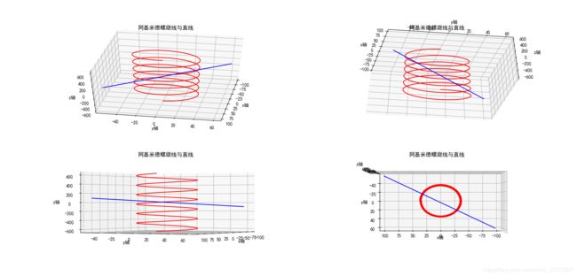
实例:
import matplotlib
import mpl_toolkits.mplot3d.axes3d as A3
import matplotlib.pyplot as plt
import numpy as np
import math
import time

#解决中文乱码
matplotlib.rcParams['font.sans-serif'] = ['SimHei']  # 用黑体显示中文
#解决 — 乱码
plt.rcParams['font.sans-serif']=['SimHei'] #用来正常显示中文标签
plt.rcParams['axes.unicode_minus'] = False #用来正常显示负号

#设置画板

fig=plt.figure(dpi=100)
ax=fig.add_subplot(221,projection='3d')
ax1=fig.add_subplot(222,projection='3d')
ax2=fig.add_subplot(223,projection='3d')
ax3=fig.add_subplot(224,projection='3d')


#设置数据
#阿基米德螺旋线
t=np.linspace(-np.pi*6,np.pi*6,666,endpoint=True)
x_data=34*np.cos(t)
y_data=34*np.sin(t)
z_data=34*t
#直线
t1=np.linspace(-5,5,5,endpoint=True)
x_line_data=1+5*t
y_line_data=3-3*t
z_line_data=-4+5*t

"""
    画图
"""
ax.plot(xs=x_data,ys=y_data,zs=z_data,color="r")
ax.plot(xs=x_line_data,ys=y_line_data,zs=z_line_data,color="b")

ax1.plot(xs=x_data,ys=y_data,zs=z_data,color="r")
ax1.plot(xs=x_line_data,ys=y_line_data,zs=z_line_data,color="b")

ax2.plot(xs=x_data,ys=y_data,zs=z_data,color="r")
ax2.plot(xs=x_line_data,ys=y_line_data,zs=z_line_data,color="b")

ax3.plot(xs=x_data,ys=y_data,zs=z_data,color="r")
ax3.plot(xs=x_line_data,ys=y_line_data,zs=z_line_data,color="b")

#细节调整
ax.set_title("阿基米德螺旋线与直线")
ax.set_xlabel("x轴")
ax.set_ylabel("y轴")
ax.set_zlabel("z轴")

ax1.set_title("阿基米德螺旋线与直线")
ax1.set_xlabel("x轴")
ax1.set_ylabel("y轴")
ax1.set_zlabel("z轴")

ax2.set_title("阿基米德螺旋线与直线")
ax2.set_xlabel("x轴")
ax2.set_ylabel("y轴")
ax2.set_zlabel("z轴")

ax3.set_title("阿基米德螺旋线与直线")
ax3.set_xlabel("x轴")
ax3.set_ylabel("y轴")
ax3.set_zlabel("z轴")


#角度设置
ax.view_init(45,10)
ax1.view_init(-45,-10)
ax2.view_init(0,30)
ax3.view_init(90,90)


plt.show()
其实上面的 mpl_toolkits.mplot3d.axes3d 看上去并没有用到,但是如果不导入的话运行时就会报错,经过实际验证,读者也可以自行验证一下
所以最简单的创建3D图像的方法是使用matplotlib.pyplot里的fig.add_subplot(221,projection=‘3d’)方法
实例:
import numpy as np
import matplotlib as mpl
from mpl_toolkits.mplot3d import Axes3D #导入相应对象
import matplotlib.pyplot as plt
import matplotlib.font_manager as fm
plt.rcParams['font.family'] = 'sans-serif'
plt.rcParams['font.sans-serif'] = 'SimHei' #设置全局字体
plt.rcParams['axes.unicode_minus']=False #解决负数显示问题
#声明要创建三维子图
fig=plt.figure()
ax=fig.gca(projection='3d')
#生成测试数据
theta=np.linspace(-4*np.pi,4*np.pi,100)#100个数据的等差数组
z=np.linspace(-4,4,100)*0.3
r=z**4+1
x=r*np.sin(theta)
y=r*np.cos(theta)
#绘制三位曲线,设置标签
ax.plot(x,y,z,'*',label='参数曲线')
#设置图例字号
mpl.rcParams['legend.fontsize']=10
ax.legend()#生成图例
plt.show()
回顾一下之前学习的知识:
可以将 ′ ∗ ′ '*' ′∗′ 修改为 ′ ∗ − . ′ '*-.' ′∗−.′试试看
实例:
import matplotlib
import mpl_toolkits.mplot3d.axes3d as A3
import matplotlib.pyplot as plt
import numpy as np
import math
import time

#解决中文乱码
matplotlib.rcParams['font.sans-serif'] = ['SimHei']  # 用黑体显示中文
#解决 — 乱码
plt.rcParams['font.sans-serif']=['SimHei'] #用来正常显示中文标签
plt.rcParams['axes.unicode_minus'] = False #用来正常显示负号

#设置画板

fig=plt.figure(dpi=600)
ax=fig.gca(projection='3d')


#设置数据
#阿基米德螺旋线
t=np.linspace(-np.pi*6,np.pi*6,666,endpoint=True)
x_data=20*np.cos(t)
y_data=20*np.sin(t)
z_data=20*t
#直线

t1=np.linspace(-5,5,10,endpoint=True)
x_line_data=1+5*t1
y_line_data=3-3*t1
z_line_data=-4+5*t1

"""
    画图
"""
ax.plot(x_data,y_data,z_data,label='参数曲线',color="b")
ax.plot(x_line_data,y_line_data,z_line_data,'*-.',label='参数曲线',color="m")


#细节调整
ax.set_title("阿基米德螺旋线与直线")
ax.set_xlabel("x轴")
ax.set_ylabel("y轴")
ax.set_zlabel("z轴")


#角度设置
ax.view_init(45,10)

ax.legend()#生成图例

plt.show()
注意这里传入的参数格式(和上面的不一样):
这样结果不会报错(我怀疑是函数的重载,但是看了源码后我发现事情没这么简单,调用的是同一个,我又怀疑是参数不同导致的,所以这个问题有待深究)而且事实证明这个在2D画图中任然存在这个情况
实例
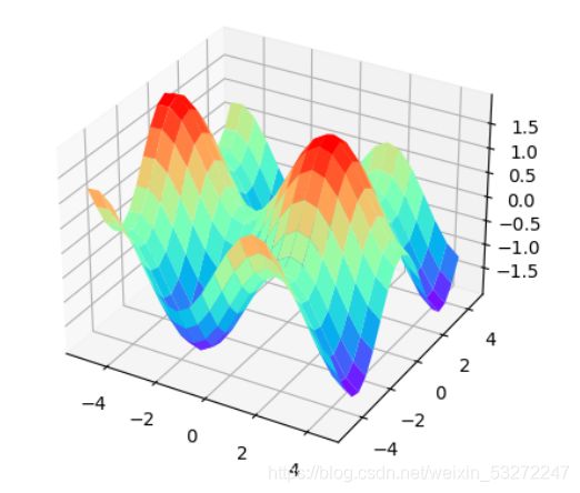
#方法二,利用三维轴方法
from matplotlib import pyplot as plt
from mpl_toolkits.mplot3d import Axes3D
import numpy as np

#定义图像和三维格式坐标轴
fig=plt.figure(dpi=700)
ax2 = Axes3D(fig)

fig = plt.figure()  #定义新的三维坐标轴
ax3 = plt.axes(projection='3d')

#定义三维数据
xx = np.arange(-5,5,0.5)
yy = np.arange(-5,5,0.5)
X, Y = np.meshgrid(xx, yy)
Z = np.sin(X)+np.cos(Y)


#作图
ax3.plot_surface(X,Y,Z,cmap='rainbow')
#ax3.contour(X,Y,Z, zdim='z',offset=-2,cmap='rainbow)   #等高线图,要设置offset,为Z的最小值
plt.show()
3D画图常用函数
np.meshgrid()
np.mgrid()
解析
np.mgrid(start:end:step)
-
start:开始坐标
stop:结束坐标(实数不包括,复数包括)
step:步长(实数表示间隔(左开右闭),复数表示点数) -
用法:
返回多维结构,常见的如2D图形,3D图形。第1返回值为第1维数据在最终结构中的分布,第2返回值为第2维数据在最终结构中的分布,以此类推。(分布以矩阵形式呈现) -
3j:3个点
步长为复数表示点数,左闭右闭
步长为实数表示间隔,左闭右开
实例
1D结构(array):
(2)饼状图
import matplotlib.pyplot as plt
name = ['one', 'two', 'three', 'four', 'five', 'six']
x = [1, 3, 2, 5, 9, 2]
colors=['#00F000', '#FFFF00', 'g', '#FF00FF', 'c', 'm']
plt.figure(dpi=100)
plt.pie(x, labels=name, colors=colors)
plt.axis('equal')
plt.show()
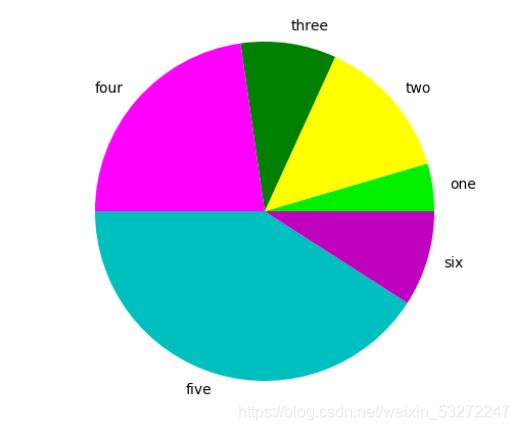
传入的x值只要是按照比例大小填入的就行了,并不关心具体数值大小。
(3) 等高线图
我们可以使用plt.contour()和plt.contourf()来画等高线图和登高面图
实际效果及代码入下:
plt.contour()
import numpy as np
import matplotlib.pyplot as plt


def h(x, y):
#定义x,y坐标对应的高度函数
     return (1-x/2+x**4+y**4) * np.exp(-x**2-y**2)

m,n=200,250
x=np.linspace(-3,3,m)
y=np.linspace(-3,3,n)

X,Y=np.meshgrid(x,y) #生成网格数据

plt.contour(X,Y,h(X,Y),10)#参数:x、y对应的网格数据;高度;2代表的是显示等高线的密集程度,
plt.show()

h ( x , y ) = ( 1 − x 2 + x 4 + y 4 ) ∗ e − x 2 − y 2 h(x,y)=(1-\frac{x}{2}+x^4+y^4)*e^{-x^2-y^2} h(x,y)=(1−2x+x4+y4)∗e−x2−y2
再来看看plt.contourf()
import numpy as np
import matplotlib.pyplot as plt


def h(x, y):
#定义x,y坐标对应的高度函数
     return (1-x/2+x**4+y**4) * np.exp(-x**2-y**2)

m,n=200,250
x=np.linspace(-3,3,m)
y=np.linspace(-3,3,n)

X,Y=np.meshgrid(x,y) #生成网格数据

plt.contourf(X,Y,h(X,Y),10)#参数:x、y对应的网格数据;高度;2代表的是显示等高线的密集程度,
plt.show()

我们来看看等高线三维图长上什么样子


经过实际测试这里面的点要使用np.mgrid[ ]
(4) 热力图
import matplotlib.pyplot as plt
import numpy as np
plt.figure(dpi=100)
# Fixing random state for reproducibility
#np.random.seed(19680801)
#创建子图1
plt.subplot(211)
plt.imshow(np.random.random((10, 10)), cmap="cool")

#创建子图2
plt.subplot(212)
plt.imshow(np.random.random((5, 5)), cmap="winter")

plt.subplots_adjust(bottom=0.09, right=0.8, top=0.9)
cax = plt.axes([0.75, 0.1, 0.065, 0.8])
plt.colorbar(cax=cax)


plt.show()

