本笔记只做复习以及巩固知识点使用,初次学习请下载练习工作簿,跟随网络课程的讲解同步操作,结果参考解法工作簿。
Tiled and Floating Layouts
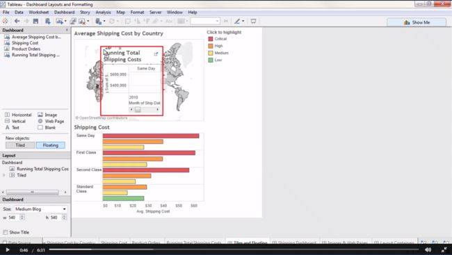
By default, views and legends pull out as tiled dashboard objects. Let’s make this fit nicely.
If we click here on the left where it says Floating, we can change that behavior. Note how the grey drop area indicator looks different, and if we let go, this view and all its legends and filters will come out on top of the view underneath it.
Tiled layouts automatically fill the entire space, Floating objects can have a fixed size and position. Let’s undo that.
Floating Objects
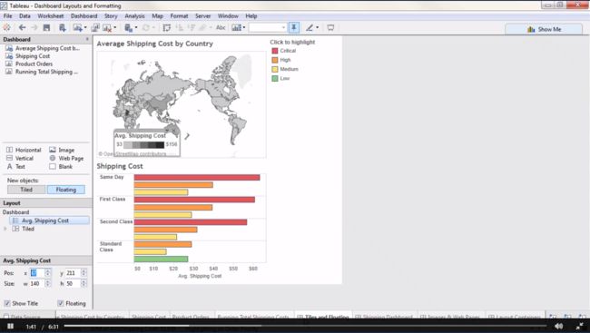
Floating objects allow for very precise control of where objects go. Let’s bring out the color legend for the map and float it.
- Click on the map
- Open the menu
- Go to Legend -> Color Legend
This Average Shipping Cost legend only applies to the top view. If we hold down the shift key and click and drag, this object will float. Now we can overlay it on top of the map. Let’s verify that we’re clicked on Ave. Shipping Cost in the layout area. This is our floating legend. Now, the very bottom of the dashboard pane shows us controls for position and size. We can make very controlled adjustments for floating objects such as moving it over by decreasing the x position.
Titles and Dynamic Values
Good titles are important for effective communication.
- If we double click on a title, we can edit it.
- The default is the sheet name, but we can replace that with whatever we want
A good trick is to insert a dynamic value into the view’s title.
- If we click on Insert, we’ll get a list of things that can be put in the title. This depends on what fields are in use in the view
- Here, we see that Ship Mode is an option.
- Let’s rename this “Average Cost for” then insert Ship mode and follow up with “Shipping”.
- Now as we play with that Ship mode flter, we’ll see this title dynamically change.
Format Menu
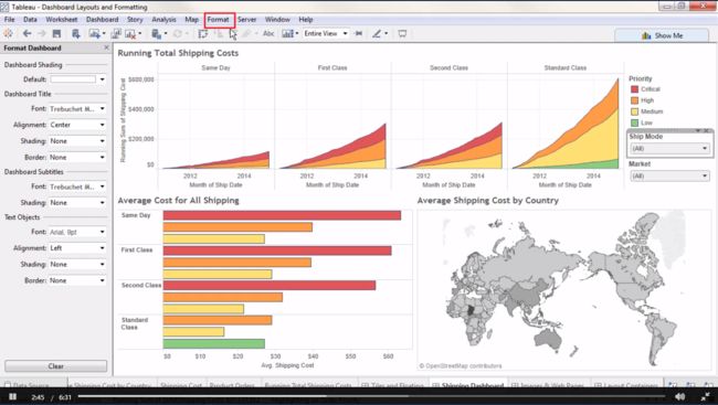
Just as we can modify the title for each view, we can format the titles and the dashboard as a whole by going to the Format menu and selecting Dashboard. The format pane opens over the dashboard pane, and we see options for shading, alignment, font…
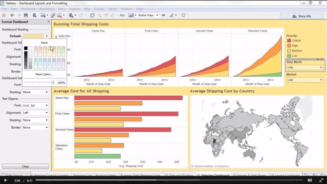
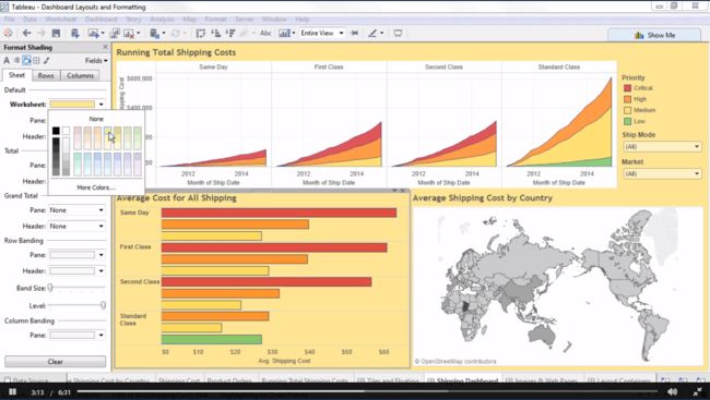
- One thing to note is that if we change the shading, say to yellow, only dashboard items are shaded.
- Views have their own formatting.
- To make the entire display yellow, we’d need to go to each view on the dashboard and format their shading.
- Right click in a view then click format. If we go to Shading, and select that same yellow, see that the view we had selected turns yellow.
- Let’s clear that.
- For more information, see the video on The Formatting Pane.
Images & Web Pages
Images can be added to dashboards simply by dragging out the Image object and navigating to the location of the image.
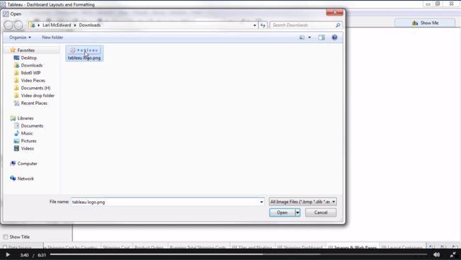
- Here, I want to add the Tableau logo
- I’ll bring out Image, navigate to the logo and open it
- By going to the menu,
- We see the option to add the image as a hyperlink to a URL
- Or we could center the image
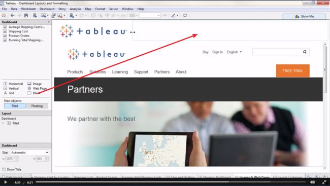
- If we want to add a web page, we simply bring out the web page part, we can drop it here at the bottom
- For the URL, I’ll put tableau.com
- Simply dragging on the top lets us resize this
- And it’s still a fully interactive webpage, just like in a browser
- But now the logo doesn’t ft very well
- If we go to the menu, we see the option to fit image.
- This keeps the image resized to fit the dashboard.
If we wanted to move the logo over to the left, there’s no left align option, just centering.
So instead, we can bring out a blank object to the right, and adjust it until the logo is where we want it to be.
Layout Containers
Layout containers are a great way to control placement on a dashboard. Here, when we have a tiled layout, note that if we click a specific ship mode, the bar chart is a static size but more or less bars are squeezed into that area.
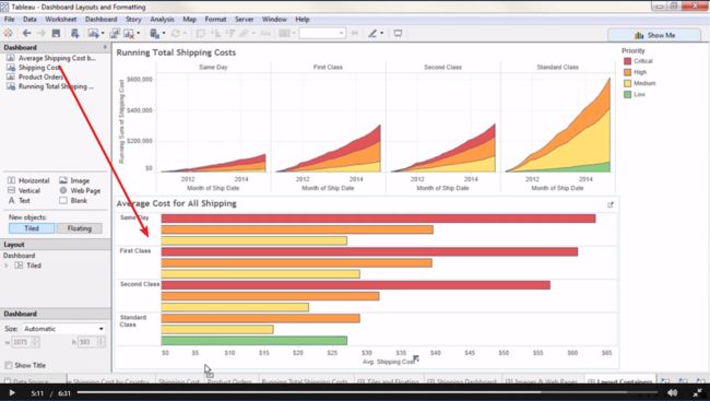
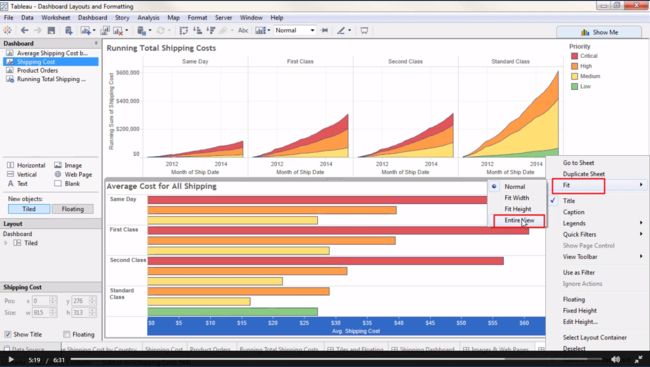
- Let’s go to a blank dashboard and bring out a horizontal layout container
- We’ll bring out Running Total
- And below it, Shipping Cost
- Click on the header to get the menu drop down
- Go the menu, and we’ll select fit -> entire view
- Just to make this more visually obvious, we’ll click on the header for Running Total
- Bring up the menu, select quick filter, and bring out the filter for Ship Mode,
The layout area of the Dashboard Pane can help visualize what views are in what containers, or allow us to add borders and shading around a collection of objects
Now let’s see how layout containers handle the resizing of those bars
- If we flter to All modes, the Running Total is pretty small up at the top.
- But if deselect ship modes, the bar chart collapses and the Running Total chart automatically flls that space
- As we select fewer or more modes, the sizes automatically adjust Layout containers can be a powerful way to control how a dashboard is laid out. For more information on working with Layout containers, check out the Online Help.

