一、布局流程

二、布局原则
- 尽量不要写死
width和height - 尽量使用高级语法,如
calc、nth-child、flex等 - 如果是 IE,就全部写死
三、float 布局与 flex 布局
float 布局
- 子元素上写
float: left(right) - 父元素(容器)上加
.clearfix
 .clearfix::after{
     content: '';
     display: block; /*或者 table*/
     clear: both;
 }
 .clearfix{
     zoom: 1; /* IE 兼容*/
 }
清除浮动示例
导航栏示例
flex 布局
详见阮一峰老师的这篇文章 Flex 布局教程:语法篇
四、布局示例
这里以做一个PC端和移动端的布局为例
PC端:
1. 用 float 实现平均布局
做平均布局时经常会碰到宽度不够的情况,就像下面这样

上图中,元素宽度的总和超出了容器的宽度,因此最后一个元素就跑到下一行去了
针对该问题,有以下几种解决方法供大家参考
方法一:使用nth-child
使用nth-child将上图中奇数个元素的margin-left和偶数个元素的margin-right分别设置为0即可
.pictures {
  width: 800px;
  background: green;
  margin: 0 auto;
}
.picture {
  width: 194px;
  height: 194px;
  background: #ddd;
  margin: 4px;
  float: left;
}
.picture:nth-child(4n+1) { /*1和5*/
  margin-left: 0;
}
.picture:nth-child(4n) { /*4和8*/
  margin-right: 0;
}
查看效果:http://js.jirengu.com/vazaqivoja/2/edit?html,css,output
如果要兼容IE等不支持nth-child语法的浏览器,可以使用“负margin”法。
方法二:负margin
该方法即在父子之间加一层wrapper,在wrapper上设置负数的margin值
.pictures {
  width: 800px;
  background: green;
  margin: 0 auto;
}
.picture {
  width: 194px;
  height: 194px;
  background: #ddd;
  margin: 4px;
  float: left;
}
.pictures > .picture-wrapper{
  margin:0 -4px;
}
查看效果:http://js.jirengu.com/mogenujaci/2/edit?html,css,output
2. 用 flex 实现平均布局
方法一:使用flex的space-between属性
.pictures {
  width: 800px;
  background: green;
  margin: 0 auto;
  display:flex;
  flex-wrap:wrap;
  justify-content:space-between;
}
.picture {
  width: 194px;
  height: 194px;
  background: #ddd;
  margin:4px 0;
}
查看效果:http://js.jirengu.com/yohebomuqo/2/edit?html,css,output
但是,如果仅仅只是使用space-between也是会有缺陷的(上面说的几种方法不会出现该问题),如下图,我们删掉了一个picture,会发现第二排并不是像我们期望的那样依次排列,最后留下一个空位。

为了解决这个问题,可以使用 flex + 负margin
方法二:flex + 负margin
.pictures {
  width: 800px;
  background: green;
  margin: 0 auto;
}
.picture {
  width: 194px;
  height: 194px;
  background: #ddd;
  margin: 4px;
}
.pictures > .picture-wrapper{
  display:flex;
  flex-wrap:wrap;
  margin: 0 -4px;
}
查看效果:http://js.jirengu.com/sedabamohe/2/edit?html,css,output
此方法和上面float布局中的“负margin”差不多,只是picture-wrapper上可以少写一个.clearfix
小优化:使用calc属性
.pictures {
  width: 800px; /*使用calc属性后,去掉此宽度,伸缩页面试试看*/
  background: green;
  margin: 0 auto;
}
.picture {
  width: calc(25% - 8px);/* 808x25% - 8px */
  height: 194px;
  background: #ddd;
  margin: 4px;
}
查看效果:http://js.jirengu.com/gimaverune/5/edit?html,css,output
这里使用calc属性的好处是,如果元素是不定宽/高的话,页面伸缩时可以保持比例不变。
3. 中间存在空隙的左右布局
   广告1
   广告2
.art{
  background: #ddd;
  width: 800px;
  margin: 0 auto;
}
.art > .sider{
  float: left;
  width: 33.333333%;
  border: 1px solid;
  height: 100px;
}
.art > .main{
  float: left;
  width: 66.666666%;
  border: 1px solid;
  height: 100px;
}
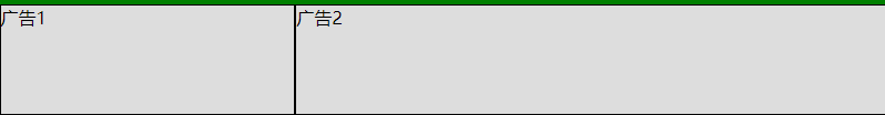
此时如果我们想让底部两个广告之间产生空隙该如何做呢?
使用float来做
方法一:内部加div
     广告1


     广告1
.art{
  background: #ddd;
  width: 800px;
  margin: 0 auto;
}
.art > .sider{
  float: left;
  width: 33.333333%;
}
.art > .main{
  float: left;
  width: 66.666666%;
  border: 1px solid;
  height: 100px;
}
.sider-child{
  margin-right: 20px;
  border: 1px solid;
  height: 100px;
}
查看效果:http://js.jirengu.com/cayiziribu/2/edit?html,css,output
方法二:使用calc属性
   广告1
   广告2
.art{
  background: #ddd;
  width: 800px;
  margin: 0 auto;
  display: flex;
}
.art > .sider{
  float: left;
  width: calc(33.333333% - 20px);
  margin-right: 20px;
  height: 100px;
  border: 1px solid;
}
.art > .main{
  float: left;
  width: 66.666666%;
  border: 1px solid;
  height: 100px;
}
查看效果:http://js.jirengu.com/tacanacohu/2/edit?html,css,output
使用flex来做
方法一:margin-right:auto
此时需要去掉html中.art上的.clearfix类,然后把上面方法二中的.art加上display: flex;并去掉float: left;,最后把.art > .sider中的margin-right: 20px;改为margin-right: auto;即可
查看效果:http://js.jirengu.com/canemojiju/3/edit?html,css,output
方法二:space-between
在方法一的基础上去掉margin-right: auto;,然后在.art中加上justify-content: space-between;即可
查看效果:http://js.jirengu.com/dusuputata/2/edit?html,css,output
移动端:
- 首先加一个meta:vp
- 使用媒体查询做响应式的导航栏
首先去掉min-width: 600px;
.parent .menu{
  display: none;
}
@media (max-width: 420px){
  .parent .menu{
    display: block;
  }
  .parent .nav{
    display: none;
  }
}
- 自适应的banner
PC上定宽,移动端自适应
.banner {
  width: 800px;
  height: 300px;
  background: #888;
  margin: 0 auto;
  margin-top: 10px;
}
@media (max-width: 420px){
  .banner{ width: auto; }
}
- 自适应的pictures
.pictures {
  width: 800px;
  background: green;
  margin: 0 auto;
}
@media (max-width: 420px){
  .pictures{ width: auto; }
}
- 从PC一行四张图变为移动端一行两张图
.picture {
  width: calc(25% - 8px);
  height: 194px;
  background: #ddd;
  margin: 4px;
}
@media (max-width: 420px){
  .picture {
    width: calc(50% - 8px);
  }
}
- 底部广告变为上下结构
.art{
  background: #ddd;
  width: 800px;
  margin: 0 auto;
  display: flex;
  justify-content: space-between;
}
@media (max-width: 420px){
  .art {
    width: auto;
    flex-direction: column;
  }
}
.art > .sider{
  width: calc(33.333333% - 20px);
  height: 100px;
  border: 1px solid;
}
@media (max-width: 420px){
  .art > .sider {
    width: auto;
    height: auto;
  }
}
.art > .main{
  width: 66.666666%;
  border: 1px solid;
  height: 100px;
}
@media (max-width: 420px){
  .art > .main {
    width: auto;
    height: auto;
  }
}
解决bug:
- 解决移动端页面左右滑动的一个bug(负margin造成的)
解决:加overflow: hidden;
.pictures {
  width: 800px;
  background: green;
  margin: 0 auto;
  overflow: hidden; /* 解决bug */
}
- 这里banner存在一个问题,就是当缩小到移动端时,宽度变为
auto,高度却没变,这会导致图片发生形变
解决:不使用img标签,使用CSS的background: url来设置背景图
.banner {
  width: 800px;
  height: 300px;
  background: #888;
  margin: 0 auto;
  margin-top: 10px;
  background: transparent url(https://ftp.bmp.ovh/imgs/2019/12/fea07c39f3654cff.jpg) no-repeat center;
  background-size: cover; /* 尽可能保持图片比例 */
}
另外,如果非要缩小后保持图片的固定比例,请搜索固定比例div
最终完成的布局(PC端 + 移动端):http://js.jirengu.com/panukozaxu/3/edit?html,css,output
加入响应式导航栏:http://js.jirengu.com/giquheqogu/2/edit?html,css,output