seaborn 教程
“Seaborn makes the exploratory data analysis phase of your data science project beautiful and painless”
“ Seaborn使您的数据科学项目的探索性数据分析阶段变得美丽而轻松”
介绍 (Introduction)
This tutorial is targeted at the audience who have worked with Seaborn, but had lost the touch of it. I hope that, by reading this article, you can recollect Seaborn visualization style and commands to get started with your data exploration. This tutorial layout is such that, it shows how and what visualizations you can do using Seaborn, given you have x number of numerical features and y number of categorical features.
本教程针对的是与Seaborn合作但失去了联系的读者。 我希望通过阅读本文,您可以回顾Seaborn的可视化样式和命令,以开始进行数据探索。 本教程的布局是这样的,它显示了给定x个数字特征和y个类别特征的情况,以及如何使用Seaborn进行可视化。
Lets import Seaborn:
让我们导入Seaborn:
import seaborn as sns数据集: (The Dataset:)
We will be using the tips dataset available within the seaborn library.
我们将使用seaborn库中提供的提示数据集。
Load the dataset using:
使用以下方法加载数据集:
tips = sns.load_dataset('tips')total_bill(numerical variable) : Total bill for the tabletip(Numeric): Tip for the waiter serving the table sex (Categorical): Gender of the bill payer (Male/Female)smoker(Categorical): Whether the bill payer was a smoker (Yes/No)day(Categorical): Day of the week (Sun, Mon… etc)table_size(Numerical) : Capacity of the tabledate: date and time of the bill payment
total_bill(数字变量):平板电脑的帐单总额(数字):服务表性别的服务员小费(分类):帐单付款人的性别(男/女)吸烟者(分类):帐单付款人是否是吸烟者(是/否)天(类别):星期几(星期日,星期一等)table_size(数值):表格的容量日期:帐单支付的日期和时间
海洋风格: (Seaborn Styles:)
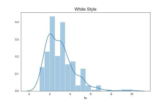
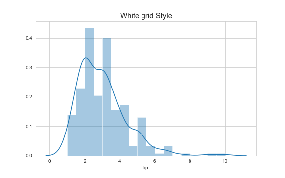
Let’s start with different styles available in Seaborn. Each style is differentiated by background colour, grid layout and axis ticks of the plot. There are five basic styles available in Seaborn: Dark, Darkgrid, White, White Grid and Ticks.
让我们从Seaborn中可用的不同样式开始。 每种样式都通过背景颜色,网格布局和绘图的轴刻度来区分。 Seaborn中有五种基本样式:深色,深色网格,白色,白色网格和刻度。
sns.set_style('dark')sns.set_style('darkgrid')sns.set_style('ticks')sns.set_style('white')sns.set_style('whitegrid')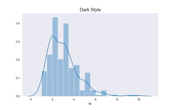


可视化 (Visualizations)
Let’s look at various visualizations we can do using Seaborn. Each segment below shows how to perform visualizations given the number of categorical and numerical variables that are available to you.
让我们看一下我们可以使用Seaborn进行的各种可视化。 下面的每个部分都显示了如何根据给定的类别和数字变量数量执行可视化。
一个数值变量: (One Numerical Variable:)
If we have one numerical variable, we can analyse the distribution of that variable.
如果我们有一个数值变量,我们可以分析该变量的分布。
g = sns.distplot(tips.tip)
g.set_title('Tip Amount Distribution');g = sns.distplot(tips.tip,kde=False)
g.set_title('Tip Amount Histogram');g = sns.distplot(tips.tip,rug=True)
g.set_title('Tip Amount Distribution with rug');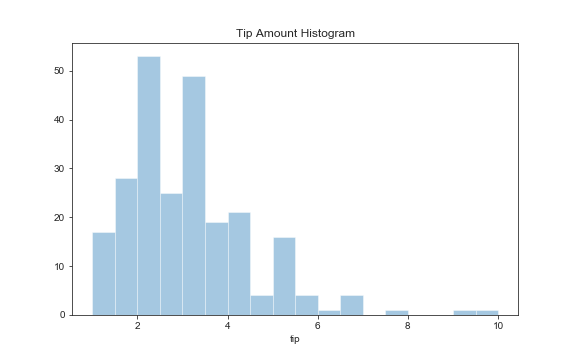


We can observe that the tip amount data is approximately normal.
我们可以观察到小费金额数据大致正常。
一个分类变量 (One categorical variable)
If we have one categorical variable, we can do a count plot which shows frequency of occurrence of each value of the categorical variable.
如果我们有一个分类变量,我们可以做一个计数图,显示分类变量每个值的出现频率。
g = sns.catplot(x="day",kind='count',order=['Thur','Fri','Sun','Sat'],data=tips);g.fig.suptitle("Frequency of days in the tips dataset [Count Plot]",y=1.05);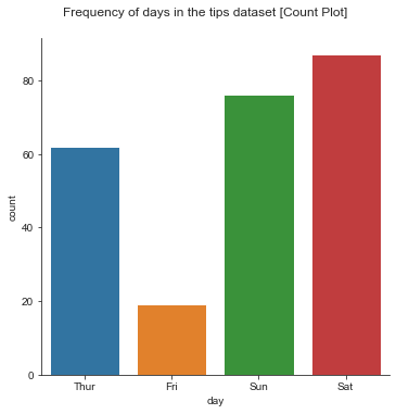
两个数值变量 (Two Numerical variables)
To analyse relationship between two numerical variables, we can do scatter plots in seaborn.
为了分析两个数值变量之间的关系,我们可以绘制seaborn中的散点图。
g = sns.relplot(x="total_bill",y="tip",data=tips,kind='scatter');g.fig.suptitle('Relationship between continuous variables [Scatter Plot]',y=1.05);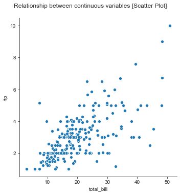
Seaborn also makes it easy to visualize density distribution of the relationship between two numerical variables.
Seaborn还使可视化两个数值变量之间关系的密度分布变得容易。
g = sns.jointplot(x="total_bill",y='tip',data=tips,kind='kde');g.fig.suptitle('Density distribution among tips and total_bill [Joint Plot]',y=1.05);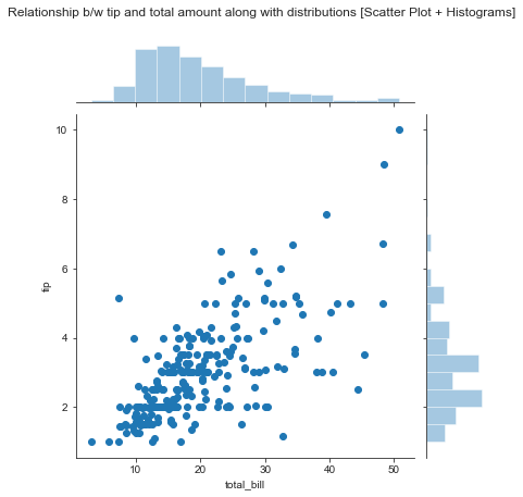
kde plot is another plot to visualize the distribution of relationship between two continuous variables.
kde图是另一个可视化两个连续变量之间关系分布的图。
g = sns.jointplot(x="total_bill",y='tip',data=tips,kind='kde');g.fig.suptitle('Density distribution among tips and total_bill [Joint Plot]',y=1.05);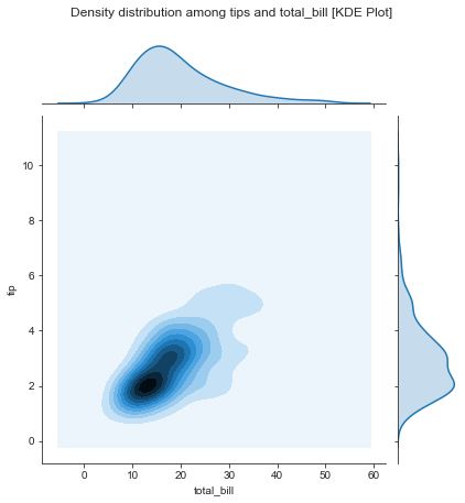
We can also plot a regression line with confidence intervals with one numerical variable as dependent variable and other as independent variable.
我们还可以绘制一条具有置信区间的回归线,其中一个数值变量为因变量,另一数值为自变量。
g = sns.lmplot(x="total_bill",y="tip",data=tips);g.fig.suptitle('Relationship b/w tip and total_bill [Scatter Plot + Regression Line]',y=1.05);
If the independent variable is datetime, we can do a lineplot, which is also a timeseries plot.
如果自变量是日期时间,我们可以做一个线图,它也是一个时间序列图。
g = sns.lineplot(x="date",y="total_bill",data=tips);g.set_title('Total bill amount over time [Line plot]');
两个数值和一个类别变量 (Two Numerical and One Categorical Variable)
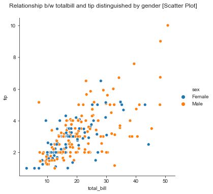
With two numerical variables and one categorical variable, we can do all the plots mentioned in the two numerical variables section . The additional dimension of categorical variable can be used as a colour/marker to distinguish the categorical variable values in the plot.
使用两个数值变量和一个类别变量,我们可以绘制两个数值变量部分中提到的所有图。 分类变量的附加维度可以用作颜色/标记,以区分绘图中的分类变量值。
g = sns.relplot(x="total_bill",y="tip",hue='sex',kind='scatter',data=tips);
g.fig.suptitle('Relationship b/w totalbill and tip distinguished by gender [Scatter Plot]',y=1.05);g = sns.relplot(x="total_bill",y="tip",style='sex',kind='scatter',data=tips)
g.fig.suptitle('Relationship b/w totalbill distinguished by gender as marker [Scatter Plot]',y=1.05);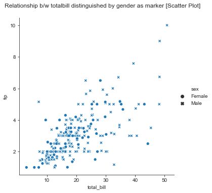
Alternatively, we can use each categorical variable value as a group to plot relationship between two numerical variables for each categorical variable value.
或者,我们可以将每个分类变量值作为一组使用,以绘制每个分类变量值的两个数字变量之间的关系。
g = sns.relplot(x="total_bill",y="tip",col='sex',kind='scatter',data=tips);g.fig.suptitle('Relationship between totalbill and tip by gender [Scatter Plot]',y=1.05);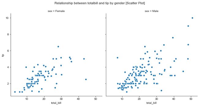
三个数值变量 (Three Numerical Variables)
If we have three numerical variables, we can do a scatter plot for two variables and third variables can be used as size of the points in the scatter plot.
如果我们有三个数值变量,我们可以对两个变量做一个散点图,第三个变量可以用作散点图中点的大小。
g = sns.relplot(x="total_bill",y="tip",size='table_size',kind='scatter',data=tips);g.fig.suptitle('total bill vs tip distinguished by table size [Scatter Plot]',y=1.05);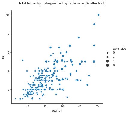
三个数值变量和一个类别变量: (Three Numerical Variables and One Categorical variable:)
If we have three numerical and one categorical variable, the same plot mentioned in the above section can be plotted for each value of the categorical variable.
如果我们有三个数值变量和一个分类变量,则可以为分类变量的每个值绘制上节中提到的同一图。
g = sns.relplot(x="total_bill",y="tip",col='sex',size='table_size',kind='scatter',data=tips);g.fig.suptitle('Total bill vs tip by gender distinguished by table size [Scatter Plot]',y=1.03);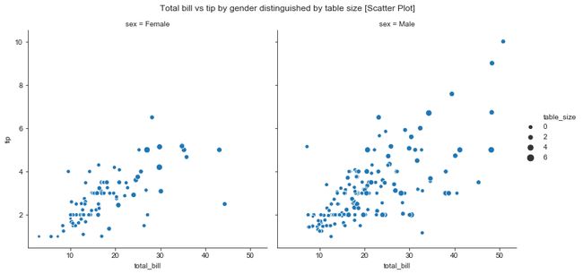
一个数字变量和一个类别变量: (One Numerical and One Categorical variable:)
This is probably the most basic, common and useful plot in data visualization. If we have one numerical variable and one categorical variable, we can do various plots like bar plot and strip plot.
这可能是数据可视化中最基本,最通用和最有用的图。 如果我们有一个数值变量和一个类别变量,我们可以做各种图,如条形图和条形图。
g = sns.catplot(x="day",y="tip",kind='bar',order=['Thur','Fri','Sun','Sat'],ci=False,data=tips);g.fig.suptitle('Tip amount by day of week [Bar Plot]',y=1.05);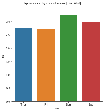
g = sns.catplot(x="day",y="tip",kind='strip',order=['Thur','Fri','Sun','Sat'],ci=False,data=tips);g.fig.suptitle('Tip amount by day along with tips as scatter [Strip Plot]',y=1.03);
The swarm plot and violin plot as shown below allow us to visualization of distribution of numerical variable within each categorical variable.
如下所示的群图和小提琴图使我们可以直观地看到每个类别变量中数值变量的分布。
g = sns.catplot(x="day",y="tip",kind='swarm',order=['Thur','Fri','Sun','Sat'],ci=False,data=tips);g.fig.suptitle('Tip amount by day along with tip distribution [Swarm Plot]',y=1.05);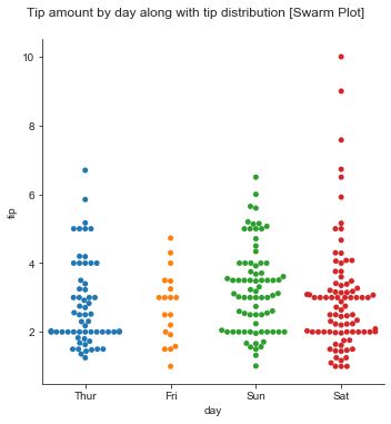
g = sns.catplot(x="day",y="tip",kind='violin',order=['Thur','Fri','Sun','Sat'],data=tips);g.fig.suptitle('Tips distributions by day [Violin Plot]');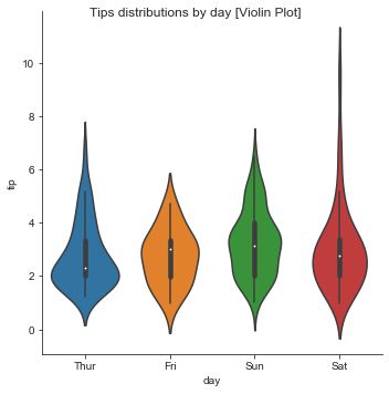
We can visualize the Inter Quartile Range(25th percentile to 75th percentile) of continuous variable within each value of categorical variable using a point plot.
我们可以使用点图可视化类别变量的每个值内的连续变量的四分位间距(第25个百分点至第75个百分点)。
g = sns.catplot(x="day",y="tip",kind='point',order=['Thur','Fri','Sun','Sat'],data=tips,capsize=0.5);g.fig.suptitle('IQR Range of tip by day [Point Plot]',y=1.05);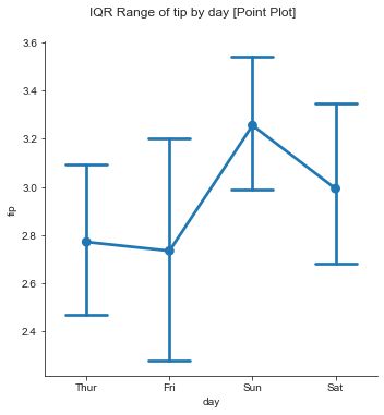
一个数值变量和两个分类变量: (One Numerical and Two Categorical variables:)
With one numerical and two categorical variables, we can use all the plots mentioned in the above section and accommodate the additional third categorical variable either as a column variable or as a subgroup in each subplot as shown below.
使用一个数字变量和两个类别变量,我们可以使用上一节中提到的所有图,并在每个子图中以列变量或子组的形式容纳额外的第三类变量,如下所示。
g = sns.catplot(x="day",y="tip",kind='bar',col='smoker',order=['Thur','Fri','Sun','Sat'],ci=False,data=tips);g.fig.suptitle('Tip amount by day of week by smoker/non-smoker [Bar Plot]',y=1.05);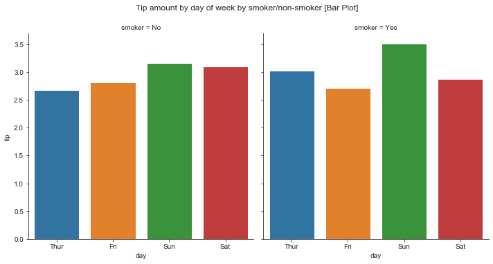
g = sns.catplot(x="day",y="tip",kind='bar',hue='smoker',order=['Thur','Fri','Sun','Sat'],ci=False,data=tips);g.fig.suptitle('Tips by day with smoker/non-smoker subgroup [Grouped Bar Plot]',y=1.05);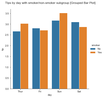
一个数值变量和三个类别变量: (One Numerical and Three Categorical Variables:)
With one numerical and three categorical, we can do all the visualizations mentioned in the one categorical and one numerical variable section and accommodate additional two categorical variables with one variable as a column variable/ row variable of the figure and other as a sub group in each sub plot.
使用一个数值和三个类别,我们可以完成一个类别和一个数值变量部分中提到的所有可视化,并容纳另外两个类别变量,其中一个变量作为图中的列变量/行变量,另一个作为子组子图。
g = sns.catplot(x="day",y="tip",kind='bar',hue='smoker',col='sex',order=['Thur','Fri','Sun','Sat'],ci=False,data=tips);g.fig.suptitle('Tips by day with smoker/non-smoker subgroup by gender [Grouped Bar Plot]',y=1.05);
超过三个连续变量: (More than three continuous variables:)
Finally, If we have more than three numerical variables, we can use heat map or pariplot. With these plots, we visaualize relationship between each and every other numerical variable in a single plot.
最后,如果我们具有三个以上的数值变量,则可以使用热图或偶极图。 通过这些图,我们将单个图中每个其他数值变量之间的关系归类化。
g = sns.heatmap(tips.corr());g.set_title('correlation between continuous variables [Heat Map]');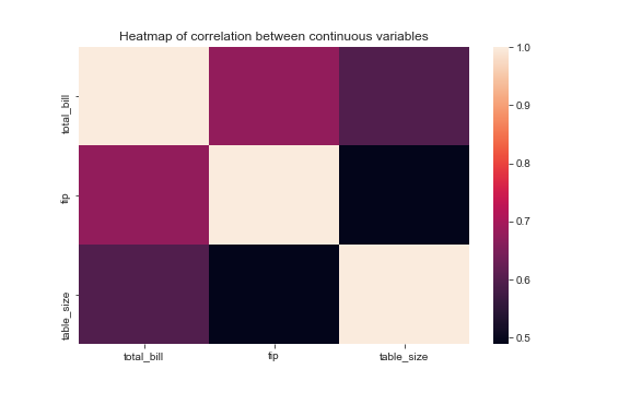
g = sns.pairplot(tips);g.fig.suptitle('Relationship between continuous variables [Patiplot]',y=1.03);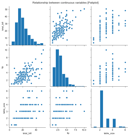
设置标题,标签和图例 (Setting Titles, Labels and legends)
Some Seaborn plots return matplotlib AxesSubplot while others return FacetGrid (If you forgot what are matplotlib AxesSubplots, check my notes on matplotlib for reference).
一些Seaborn图返回matplotlib AxesSubplot,而另一些返回FacetGrid(如果您忘记了什么是matplotlib AxesSubplots,请查看我在matplotlib上的注释以供参考)。


The FacetGrid is a grid(2D Array) of matplotlib AxesSubPlots. You can access each subplot using array indices and set labels, titles for each plot.
FacetGrid是matplotlib AxesSubPlots的网格(二维数组)。 您可以使用数组索引访问每个子图,并设置标签,每个图的标题。
g = sns.relplot(x="total_bill",y="tip",data=tips,kind='scatter');
g.axes[0,0].set_title('Relationship between continuous variables [Scatter Plot]');
g.axes[0,0].set_xlabel('Total Bill Amount');
g.axes[0,0].set_ylabel('Tip Amount');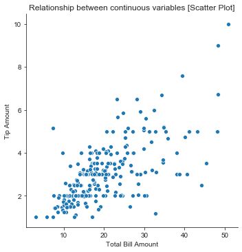
If the plot returns AxesSubplot, you can use AxesSubplot methods to set titles and legends.
如果该图返回AxesSubplot,则可以使用AxesSubplot方法设置标题和图例。
g = sns.distplot(tips.tip)
g.set_title('Tip Amount Probablity Distribution');
g.set_xlabel('Tip Amount')
g.set_ylabel('probability')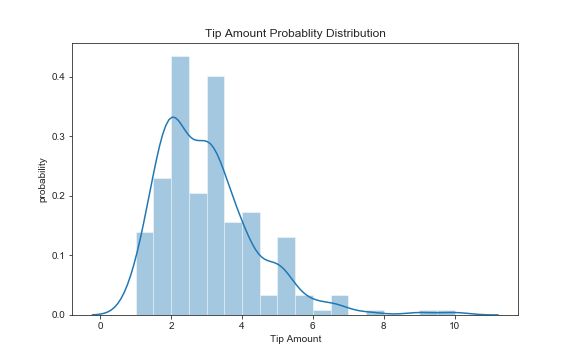
For FacetGrid, you can get figure object from the FacetGrid object and set title for the figure object.
对于FacetGrid,可以从FacetGrid对象获取图形对象,并为图形对象设置标题。
g = sns.relplot(x="total_bill",y="tip",col='sex',kind='scatter',data=tips);g.fig.suptitle('Relationship between totalbill and tip by gender [Scatter Plot]',y=1.05);结论 (Conclusion)
Hopefully, you find this tutorial helpful in getting started with making beautiful visualizations, easily with seaborn. Although Seaborn is easy to use, it also offers a lot of customisation, which is an advanced topic. Once you are comfortable with basic plots, you can explore Seaborn further as you use it for your visualizations.
希望本教程对Seaborn轻松制作精美的可视化效果有所帮助。 尽管Seaborn易于使用,但它还提供了许多自定义功能,这是一个高级主题。 熟悉基本图解后,可以在将Seaborn用于可视化时进一步进行探索。
翻译自: https://towardsdatascience.com/data-visualisation-tutorial-using-seaborn-26e1ef9043db
seaborn 教程