Python基础知识学习笔记——Matplotlib绘图
Python基础知识学习笔记——Matplotlib绘图
整理python笔记,以防忘记
文章目录
- Python基础知识学习笔记——Matplotlib绘图
- 一、绘图和可视化
-
-
- 1、导入模块
- 2、一个简单示例
- 3、Figure对象
- 4、Axes实例
- 二、绘图技巧
-
- 1、添加标题
- 2、添加文字
- 3、添加注释
- 4、设置坐标轴名称
- 5、添加图例
- 6、调整颜色
- 7、切换线条样式
- 8、显示数学公式
- 9、显示网格
- 10、调整坐标轴刻度
- 11、调整坐标轴范围
- 12、调整坐标轴自适应标注
- 13、添加双坐标轴
- 14、填充区域
- 15、画一个填充好的形状
- 16、切换样式
-
一、绘图和可视化
可视化是研究和展示计算结果的通用工具,几乎所有的计算工作(不管是数值计算还是符号计算)的最终产物都是某种类型的图形。当使用图形进行可视化时,最容易挖掘出计算结果中的信息。因此,可视化是所有计算研究领域非常重要的组成部分。
在python科学计算环境中,有很多高质量的可视化库,最受欢迎的通用可视化库是matplotlib,它主要用于生成静态的、达到出版品质的2D和3D图形,还有一些其他专注于某个特定领域的可视化库,如Brokeh、Plotly、Seaborn、Mayavi、VTK等,Paraview支持Python脚本。
有两种常用的方法可用来进行科学计算的可视化:使用图形化用户界面手动绘制图形以及通过编程的方法使用代码来生成图形。编程生成的图形能够保证一致性、能够重现,并且可以轻松进行修改和调整,而不用像在图形化用户界面中执行冗长繁琐的重做过程。
1、导入模块
大部分python库提供一个API入口,而matplotlib提供了多个入口,包括一个有状态的api和一个面向对象的api,这两个API都由matplotlib.pyplot模块提供,建议只使用面向对象的api。
%matplotlib inline
import matplotlib as mpl
import matplotlib.pyplot as plt
from mpl_toolkits.mplot3d.axes3d import Axes3D
上述第一行用于Ipyhton环境中,这可以让生成的图形直接在终端中显示,而不是使用新的窗口。
matplotlib常搭配numpy库一起使用。
import numpy as np
2、一个简单示例
matplotlib中的图形由一个画布(Figure) 实例和多个轴(Axes)构建而成。Figure实例为绘图提供了画布区域,Axes实例提供了坐标系。
可以手动将Axes分配到任意区域。设置图形外观的大部分函数都是Axes类的方法。
import numpy as np
import matplotlib.pyplot as plt

x = np.linspace(-5, 2, 100)
y1 = x**2 + 5*x**2 + 10
y2 = 3*x**2 + 10*x
y3 = 6*x + 10

fig, ax = plt.subplots()
ax.plot(x, y1, color='blue', label='y(x)')
ax.plot(x, y2, color='red', label="y'(x)")
ax.plot(x, y3, color='green', label='y"(x)')

ax.set_xlabel("x")
ax.set_ylabel("y")

ax.legend()
运行结果如下:
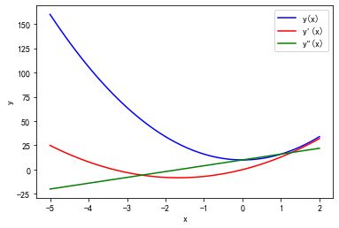
这里使用 plt.subplots 函数生成 Figure 和 Axes 实例。
matplotlib 库可以在很多不同的环境中交互使用,可以生成不同格式的图片(如PNG、PDF、Postscript和SVG等)。
此处没有plt.show()是因为在IPython环境运行代码,图片直接显示在IPython终端,在spyder环境中可以将代码和生成的图片放在同一个文件中避免重复运行代码。
3、Figure对象
4、Axes实例
二、绘图技巧
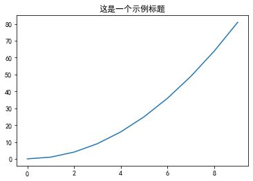
1、添加标题
matplotlib.pyplot 对象中有个 title() 可以设置图形的标题。
# 显示中文
plt.rcParams['font.sans-serif'] = [u'SimHei']
plt.rcParams['axes.unicode_minus'] = False

x = np.arange(0, 10)
plt.title('这是一个示例标题')
plt.plot(x, x*x)
plt.show()
具体实现效果:
2、添加文字
设置坐标和文字,可以使用 matplotlib.pyplot 对象中 text() 接口。其中,第一、二个参数来设置坐标,第三个参数设置显示文本内容。
x = np.arange(-10, 11, 1)
y = x*x
plt.plot(x, y)
plt.title('这是一个示例标题')

# 添加文字
plt.text(-2.5, 30, 'function y=x*x')
plt.show()
结果如下:

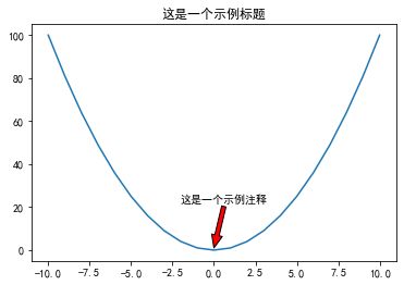
3、添加注释
使用 annotate() 接口可以在图中增加注释说明。其中:
x y 参数:备注点的坐标点
x y text参数:备注文字的坐标(默认为 xy 的位置)
arrowprops 参数:在 xy 和 xytext 之间绘制一个箭头。
x = np.arange(-10,11,1)
y = x*x
plt.title('这是一个示例标题')
plt.plot(x, y)

#  添加注释
plt.annotate('这是一个示例注释', xy = (0, 1), xytext = (-2, 22),
             arrowprops={'headwidth':10, 'facecolor':'r'})
plt.show()
结果如下:
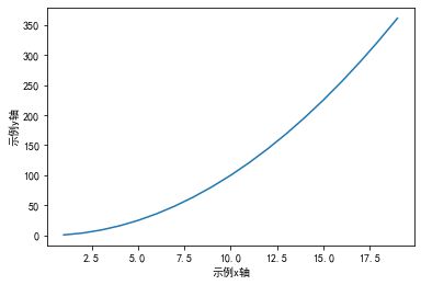
4、设置坐标轴名称
二维坐标图形中,需要在横轴和竖轴注明名称以及数量单位。设置坐标轴名称使用的接口是 xlabel () 和 ylabel () 。
x = np.arange(1, 20)
plt.xlabel('示例x轴')
plt.ylabel('示例y轴')

plt.plot(x, x*x)
plt.show()
结果如下:
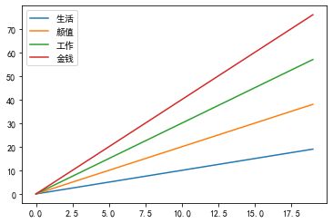
5、添加图例
当线条过多时,我们设置不同颜色来区分不同线条。因此,需要对不同颜色线条下做标注,我们使用 legend() 方法来实现。
x = np.arange(0, 20)
plt.plot(x, x)
plt.plot(x, 2*x)
plt.plot(x, 3*x)
plt.plot(x, 4*x)

# 使用 legend() 方法
plt.legend(['生活', '颜值', '工作', '金钱'])
plt.show()
结果如下:
6、调整颜色
传颜色参数,使用 plot() 中的 color 属性来设置, color 支持以下几种方式。
x = np.arange(0, 20)

plt.plot(x, color='r')
plt.plot(x+1, color='0.5')
plt.plot(x+2, color='#FF00FF')
plt.plot(x+3, color=(0.1, 0.2, 0.3))

plt.show()
结果:

7、切换线条样式
如果想改变线条的样式,可以修改 color() 绘图接口中 mark 参数。
x = np.arange(1, 10)
plt.plot(x, marker='o')
plt.plot(x+1, marker='>')
plt.plot(x+2, marker='s')

plt.show()
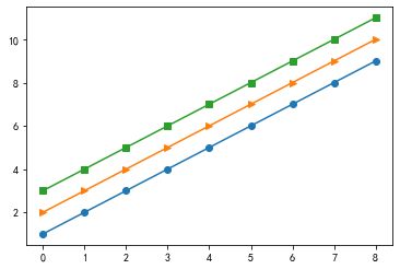
其中,marker 类型:
1、’.’:点(point marker)
2、’,’:像素点(pixel marker)
3、‘o’:圆形(circle marker)
4、‘v’:朝下三角形(triangle_down marker)
5、’^’:朝上三角形(triangle_up marker)
6、’<’:朝左三角形(triangle_left marker)
7、’>’:朝右三角形(triangle_right marker)
8、‘1’:朝下三角形
9、‘2’:朝上三角形
10、‘3’:朝左三角形
11、‘4’:朝右三角形
12、‘s’:正方形(square)
13、‘p’:五角星(pentagon marker)
14、’*’:星型(star marker)
15、‘h’:1号六角形(hexagon1 marker)
16、‘H’:2号六角形(hexagon2 marker)
17、’+’:+号标记(plus marker)
18、‘x’:x号标记(x marker)
19、‘D’:菱形(diamond marker)
20、‘d’:小型菱形(thin_diamond marker)
21、’|’:垂直线形(vline marker)
22、’_’:水平线形(hline marker)
8、显示数学公式
格式如下:开始符或结束符,如$,中间放公式的符号。
公式输入与 matlab 很相似。
plt.text(2, 4, r'$\alpha \beta \pi \lambda \omega $', size=25)
plt.xlim([1, 8])
plt.ylim([1, 5])

plt.text(4, 4, r'$ \sin(0)=\cos(\frac{\pi}{2}) $', size = 25)

plt.text(2, 2, r'$ \lim_{x \rightarrow y} \frac{1}{x^3} $', size = 25)
plt.text(4, 2, r'$ \sqrt[4]{x}=\sqrt{y} $', size = 25)

plt.show()
运行结果如下:

9、显示网格
grid() 方法用于显示网格。
x = 'a', 'b', 'c', 'd'
y = [15, 30, 45, 10]

# plt.grid()
plt.grid(color = 'r', linewidth = '0.5', linestyle = '-.')
plt.plot(x, y)
plt.show()
结果如下

10、调整坐标轴刻度
locator_params() 方法
坐标图的刻度我们可以使用 locator_params 接口来调整显示颗粒。
同时调整 x 轴和 y 轴:
plt.locator_params(nbins = 20)
只调整 x 轴:
plt.locator_params('x', nbins = 20)
只调整 y 轴:
plt.locator_params('y', nbins = 20)
具体代码如下:
x = np.arange(0, 30, 1)
plt.plot(x, x, color = 'r', linewidth = '1', linestyle = ':')

# x 轴和 y 轴分别显示10个
plt.locator_params(nbins=10)
plt.show()
结果如下:

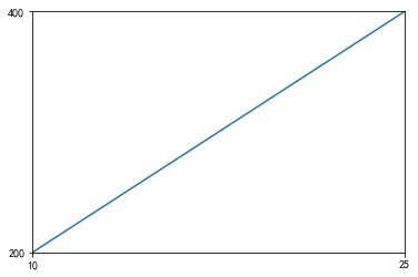
11、调整坐标轴范围
axis() 方法
axis([0, 5, 0, 10])
x 从 0 到 5 ,y 从 0 到 10 。
xlim: 对应参数有 xmin 和 xmax ,分别对应最大值和最小值。
ylim :和 xlim 一样。
x = np.arange(0, 30, 1)

plt.plot(x, x**2)

# plt.xlm(xmin = 10, xmax = 25)
plt.axis(['10', '25', '200', '400'])

plt.show()
结果:
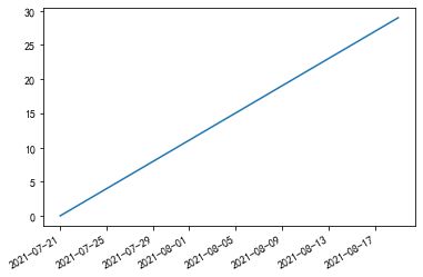
12、调整坐标轴自适应标注
有时候坐标轴显示的数字(如日期)会重叠在一起,非常不友好,调用 plt.gcf().autofmt_xdate(),将自动调整角度。
import pandas as pd

x = pd.date_range('2021/07/21', periods=30)
y = np.arange(0, 30, 1)

plt.plot(x, y)
plt.gcf().autofmt_xdate()

plt.show()
具体实现效果:
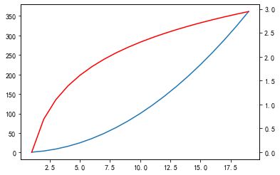
13、添加双坐标轴
使用 twinx() 方法 添加双坐标轴。
x = np.arange(1, 20)
y1 = x*x
y2 = np.log(x)

plt.plot(x, y1)

# 添加一个坐标轴,默认 0 到 1
plt.twinx()
plt.plot(x, y2, 'r')
plt.show()
结果如下:
14、填充区域
fil() / fill_beween() 方法填充函数区域。
x = np.linspace(0, 5*np.pi, 1000)
y1 = np.sin(x)
y2 = np.sin(2*x)
plt.plot(x, y1)
plt.plot(x, y2)

# 填充
plt.fill(x, y1, 'g')
plt.fill(x, y2, 'r')
plt.title('这是一个示例标题')

plt.show()
运行结果如下:

fill_between 填充函数交叉区域
x = np.linspace(0, 5*np.pi, 1000)
y1 = np.sin(x)
y2 = np.sin(2*x)
plt.plot(x, y1)
plt.plot(x, y2)

# # 填充
# plt.fill(x, y1, 'g')
# plt.fill(x, y2, 'r')
plt.title('这是一个示例标题')

plt.fill_between(x, y1, y2, where=y1>y2, interpolate=True)

plt.show()
运行结果:

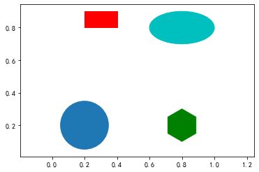
15、画一个填充好的形状
import matplotlib.patches as mptaches

xy1 = np.array([0.2, 0.2])
xy2 = np.array([0.2, 0.8])
xy3 = np.array([0.8, 0.2])
xy4 = np.array([0.8, 0.8])

fig,ax = plt.subplots()

# 圆形 指定坐标和半径
circle=mptaches.Circle(xy1, 0.15)
ax.add_patch(circle)

# 长方形
rect=mptaches.Rectangle(xy2, 0.2, 0.1, color='r')
ax.add_patch(rect)

# 多边形
polygon = mptaches.RegularPolygon(xy3, 6, 0.1, color='g')
ax.add_patch(polygon)


# 椭圆
ellipse = mptaches.Ellipse(xy4, 0.4, 0.2, color='c')
ax.add_patch(ellipse)

ax.axis('equal')
plt.show()
结果如下:
16、切换样式
matplotlib 支持多种样式,可以通过 plt.style.use 切换样式。
plt.style.available 可以查看所有的样式。
import matplotlib.pyplot as plt
plt.style.available
的出来的结果
['Solarize_Light2',
 '_classic_test_patch',
 'bmh',
 'classic',
 'dark_background',
 'fast',
 'fivethirtyeight',
 'ggplot',
 'grayscale',
 'seaborn',
 'seaborn-bright',
 'seaborn-colorblind',
 'seaborn-dark',
 'seaborn-dark-palette',
 'seaborn-darkgrid',
 'seaborn-deep',
 'seaborn-muted',
 'seaborn-notebook',
 'seaborn-paper',
 'seaborn-pastel',
 'seaborn-poster',
 'seaborn-talk',
 'seaborn-ticks',
 'seaborn-white',
 'seaborn-whitegrid',
 'tableau-colorblind10']
示例代码:
import matplotlib.patches as mptaches

plt.style.use('ggplot')

# 新建4个子图
fig,axes = plt.subplots(2, 2)
ax1, ax2, ax3, ax4 = axes.ravel()

# 第一个图
x, y = np.random.normal(size=(2, 100))
ax1.plot(x, y, 'o')

# 第二个图
x = np.arange(0, 10)
y = np.arange(0, 10)
colors = plt.rcParams['axes.prop_cycle']
length = np.linspace(0, 10, len(colors))
for s in length:
    ax2.plot(x, y+s, '-')

# 第三个图
x = np.arange(5)
y1, y2, y3 = np.random.randint(1, 25, size=(3, 5))
width = 0.25
ax3.bar(x, y1, width)
ax3.bar(x+width, y2, width)
ax3.bar(x+2*width, y3, width)


# 第四个图
for i, color in enumerate(colors):
    xy=np.random.normal(size=2)
ax4.add_patch(plt.Circle(xy, radius=0.3, color=color['color']))
ax4.axis('equal')
plt.show()
结果:

将上面例子汇总,代码如下:
# -*- coding: utf-8 -*-
"""
Created on Tue Jul 20 21:07:21 2021

@author: 86159
"""

import numpy as np
import matplotlib.pyplot as plt

# =============================================================================
# # x = np.linspace(-5, 2, 100)
# # y1 = x**2 + 5*x**2 + 10
# # y2 = 3*x**2 + 10*x
# # y3 = 6*x + 10
#
# # fig, ax = plt.subplots()
# # ax.plot(x, y1, color='blue', label='y(x)')
# # ax.plot(x, y2, color='red', label="y'(x)")
# # ax.plot(x, y3, color='green', label='y"(x)')
#
# # ax.set_xlabel("x")
# # ax.set_ylabel("y")
#
# # ax.legend()
#
# # plt.show()
# =============================================================================


# 显示中文
plt.rcParams['font.sans-serif'] = [u'SimHei']
plt.rcParams['axes.unicode_minus'] = False

# =============================================================================
# x = np.arange(0, 10)
# plt.title('这是一个示例标题')
# plt.plot(x, x*x)
# plt.show()
# =============================================================================


# =============================================================================
# x = np.arange(-10, 11, 1)
# y = x*x
# plt.plot(x, y)
# plt.title('这是一个示例标题')
#
# # 添加文字
# plt.text(-2.5, 30, 'function y=x*x')
# plt.show()
# =============================================================================

# =============================================================================
# x = np.arange(-10,11,1)
# y = x*x
# plt.title('这是一个示例标题')
# plt.plot(x, y)
#
# #  添加注释
# plt.annotate('这是一个示例注释', xy = (0, 1), xytext = (-2, 22),
#              arrowprops={'headwidth':10, 'facecolor':'r'})
# plt.show()
# =============================================================================

# =============================================================================
# x = np.arange(1, 20)
# plt.xlabel('示例x轴')
# plt.ylabel('示例y轴')
#
# plt.plot(x, x*x)
# plt.show()
# =============================================================================


# =============================================================================
# x = np.arange(0, 20)
# plt.plot(x, x)
# plt.plot(x, 2*x)
# plt.plot(x, 3*x)
# plt.plot(x, 4*x)
#
# # 使用 legend() 方法
# plt.legend(['生活', '颜值', '工作', '金钱'])
# plt.show()
# =============================================================================

# =============================================================================
# x = np.arange(0, 20)
#
# plt.plot(x, color='r')
# plt.plot(x+1, color='0.5')
# plt.plot(x+2, color='#FF00FF')
# plt.plot(x+3, color=(0.1, 0.2, 0.3))
#
# plt.show()
# =============================================================================


# =============================================================================
# x = np.arange(1, 10)
# plt.plot(x, marker='o')
# # plt.plot(x+1, marker='>')
# # plt.plot(x+2, marker='s')
#
# plt.show()
# =============================================================================

# =============================================================================
# plt.text(2, 4, r'$\alpha \beta \pi \lambda \omega $', size=25)
# plt.xlim([1, 8])
# plt.ylim([1, 5])
#
# plt.text(4, 4, r'$ \sin(0)=\cos(\frac{\pi}{2}) $', size = 25)
#
# plt.text(2, 2, r'$ \lim_{x \rightarrow y} \frac{1}{x^3} $', size = 25)
# plt.text(4, 2, r'$ \sqrt[4]{x}=\sqrt{y} $', size = 25)
#
# plt.show()
# =============================================================================

# =============================================================================
# x = 'a', 'b', 'c', 'd'
# y = [15, 30, 45, 10]
#
# # plt.grid()
# plt.grid(color = 'r', linewidth = '0.5', linestyle = '-.')
# plt.plot(x, y)
# plt.show()
# =============================================================================

# =============================================================================
# x = np.arange(0, 30, 1)
# plt.plot(x, x, color = 'r', linewidth = '1', linestyle = ':')
#
# # x 轴和 y 轴分别显示10个
# plt.locator_params(nbins=10)
# plt.show()
# =============================================================================


# =============================================================================
# x = np.arange(0, 30, 1)
#
# plt.plot(x, x**2)
#
# # plt.xlm(xmin = 10, xmax = 25)
# plt.axis(['10', '25', '200', '400'])
#
# plt.show()
# =============================================================================

# =============================================================================
# import pandas as pd
#
# x = pd.date_range('2021/07/21', periods=30)
# y = np.arange(0, 30, 1)
#
# plt.plot(x, y)
# plt.gcf().autofmt_xdate()
#
# plt.show()
# =============================================================================


# =============================================================================
# x = np.arange(1, 20)
# y1 = x*x
# y2 = np.log(x)
#
# plt.plot(x, y1)
#
# # 添加一个坐标轴,默认 0 到 1
# plt.twinx()
# plt.plot(x, y2, 'r')
# plt.show()
# =============================================================================

# =============================================================================
# x = np.linspace(0, 5*np.pi, 1000)
# y1 = np.sin(x)
# y2 = np.sin(2*x)
# plt.plot(x, y1)
# plt.plot(x, y2)
#
# # # 填充
# # plt.fill(x, y1, 'g')
# # plt.fill(x, y2, 'r')
# plt.title('这是一个示例标题')
#
# plt.fill_between(x, y1, y2, where=y1>y2, interpolate=True)
#
# plt.show()
# =============================================================================

# =============================================================================
# import matplotlib.patches as mptaches
#
# xy1 = np.array([0.2, 0.2])
# xy2 = np.array([0.2, 0.8])
# xy3 = np.array([0.8, 0.2])
# xy4 = np.array([0.8, 0.8])
#
# fig,ax = plt.subplots()
#
# # 圆形 指定坐标和半径
# circle=mptaches.Circle(xy1, 0.15)
# ax.add_patch(circle)
#
# # 长方形
# rect=mptaches.Rectangle(xy2, 0.2, 0.1, color='r')
# ax.add_patch(rect)
#
# # 多边形
# polygon = mptaches.RegularPolygon(xy3, 6, 0.1, color='g')
# ax.add_patch(polygon)
#
#
# # 椭圆
# ellipse = mptaches.Ellipse(xy4, 0.4, 0.2, color='c')
# ax.add_patch(ellipse)
#
# ax.axis('equal')
# plt.show()
# =============================================================================

# =============================================================================
# import matplotlib.patches as mptaches
#
# plt.style.use('ggplot')
#
# # 新建4个子图
# fig,axes = plt.subplots(2, 2)
# ax1, ax2, ax3, ax4 = axes.ravel()
#
# # 第一个图
# x, y = np.random.normal(size=(2, 100))
# ax1.plot(x, y, 'o')
#
# # 第二个图
# x = np.arange(0, 10)
# y = np.arange(0, 10)
# colors = plt.rcParams['axes.prop_cycle']
# length = np.linspace(0, 10, len(colors))
# for s in length:
#     ax2.plot(x, y+s, '-')
#
# # 第三个图
# x = np.arange(5)
# y1, y2, y3 = np.random.randint(1, 25, size=(3, 5))
# width = 0.25
# ax3.bar(x, y1, width)
# ax3.bar(x+width, y2, width)
# ax3.bar(x+2*width, y3, width)
#
#
# # 第四个图
# for i, color in enumerate(colors):
#     xy=np.random.normal(size=2)
# ax4.add_patch(plt.Circle(xy, radius=0.3, color=color['color']))
# ax4.axis('equal')
# plt.show()
# =============================================================================
** 搬砖不易,点个赞可好。 **