flex布局
flex布局
什么是flex布局
Flex 是 Flexible Box 的缩写,意思是弹性布局。flex布局可以简便、完整、响应式地实现各种页面布局,当页面需要适应不同的屏幕大小以及设备类型时非常适用。目前,几乎所有的浏览器都支持 Flex 布局。
注意:当一个元素设置了 Flex 布局以后,其子元素的 float、clear 和 vertical-align 等属性将失效。
flex布局当中的基本概念
采用 Flex 布局的元素,称为容器。它的所有子元素自动成为容器成员,称为项目。
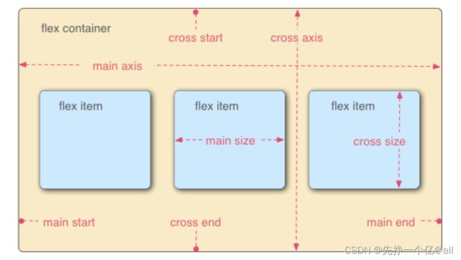
如图所示,容器默认存在两根轴,分别为水平的主轴也就是main axis和垂直的交叉轴也就是cross axis。主轴的开始位置叫做 main start,结束位置叫做 main end;交叉轴的开始位置叫做 cross start,结束位置叫做 cross end。项目默认沿主轴排列。单个项目占据的主轴空间叫做 main size,占据的交叉轴空间叫做 cross size。
怎样设置flex布局
- 块级:
display:flex - 行内:
display:inline-flex
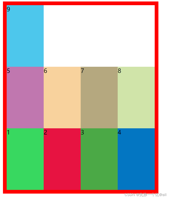
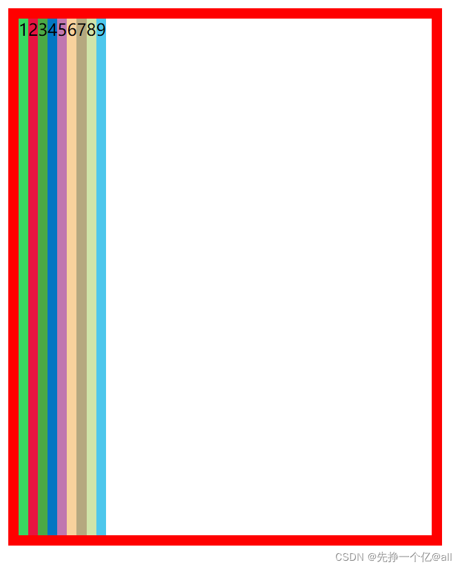
我们来看看设置flex的作用,首先,我们先来几个div,我们会明显的发现9个div放在容器里面,是按照从上而下的顺序放置。
DOCTYPE html>
<html lang="en">
<head>
    <meta charset="UTF-8">
    <meta http-equiv="X-UA-Compatible" content="IE=edge">
    <meta name="viewport" content="width=device-width, initial-scale=1.0">
    <title>Documenttitle>
head>
<style>
    .container{
        height: 500px;
        width: 100%;
        border: 10px solid red;
      }
    .item-1 {
        background-color: #38d860;
    }

    .item-2 {
        background-color: #e71341;
    }

    .item-3 {
        background-color: #4ba946;
    }

    .item-4 {
        background-color: #0376c2;
    }

    .item-5 {
        background-color: #c077af;
    }

    .item-6 {
        background-color: #f8d29d;
    }

    .item-7 {
        background-color: #b5a87f;
    }

    .item-8 {
        background-color: #d0e4a9;
    }

    .item-9 {
        background-color: #4dc7ec;
    }
style>
<body>
    <div class="container">
        <div class="item-1">1div>
        <div class="item-2">2div>
        <div class="item-3">3div>
        <div class="item-4">4div>
        <div class="item-5">5div>
        <div class="item-6">6div>
        <div class="item-7">7div>
        <div class=" item-8">8div>
        <div class="item-9">9div>

    div>
body>
html>
效果如下

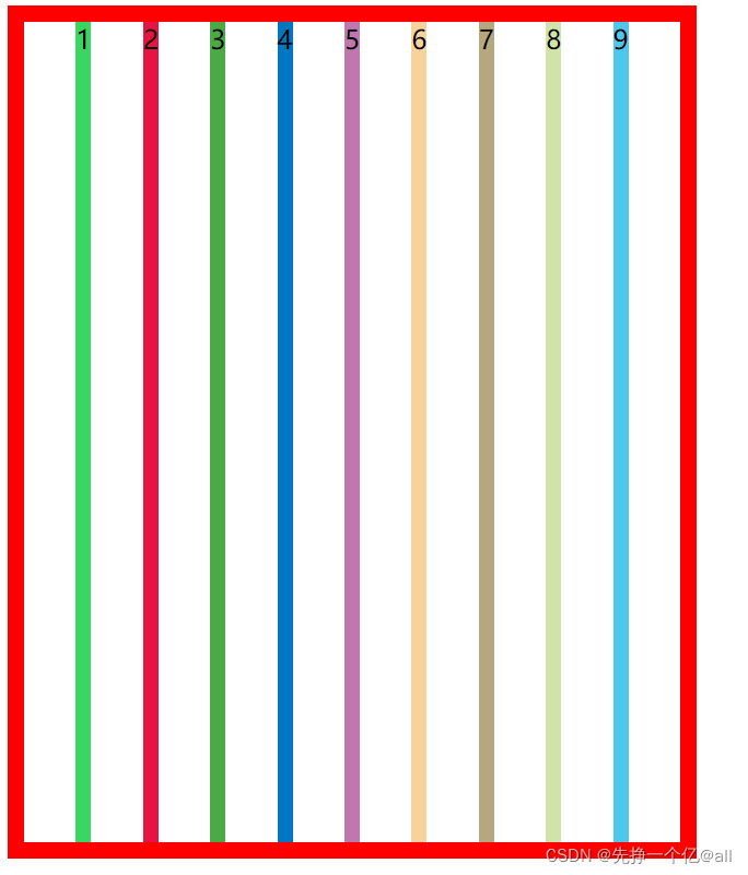
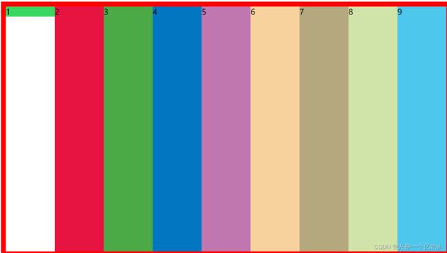
当我们设置了flex布局后
    .container{
        height: 500px;
        width: 100%;
        border: 10px solid red;
        display:flex;
      }
9个div会沿着默认的主轴方向放置。
效果图如下:

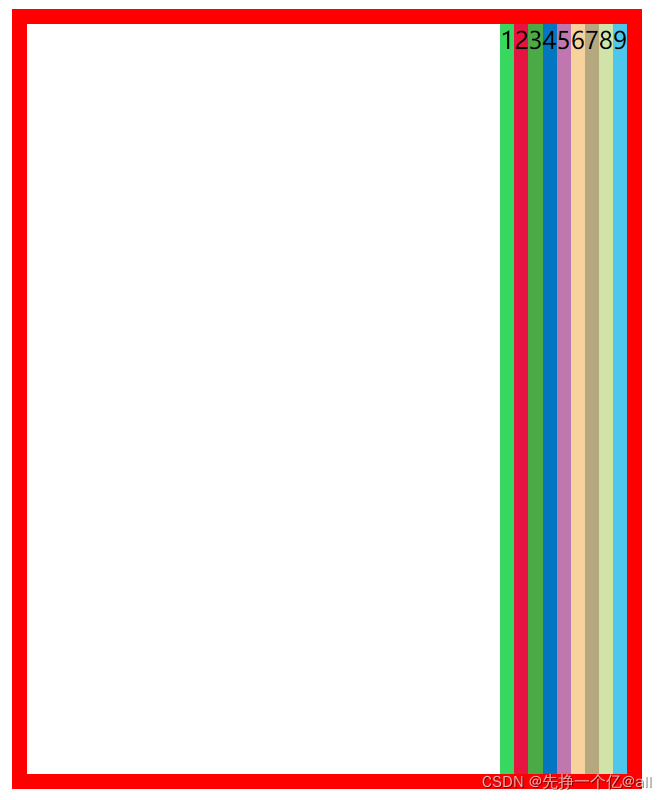
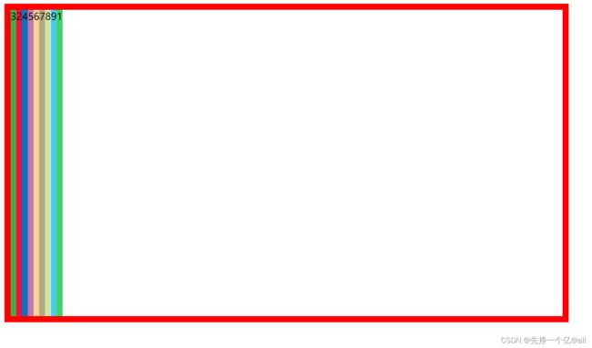
当我们把9个div换成行内元素span时(未设置flex),我们会发现,9个span会在同一行一次排列。
DOCTYPE html>
<html lang="en">
<head>
    <meta charset="UTF-8">
    <meta http-equiv="X-UA-Compatible" content="IE=edge">
    <meta name="viewport" content="width=device-width, initial-scale=1.0">
    <title>Documenttitle>
head>
<style>
    .container{
        height: 500px;
        width: 100%;
        border: 10px solid red;

      }
    .item-1 {
        background-color: #38d860;
    }

    .item-2 {
        background-color: #e71341;
    }

    .item-3 {
        background-color: #4ba946;
    }

    .item-4 {
        background-color: #0376c2;
    }

    .item-5 {
        background-color: #c077af;
    }

    .item-6 {
        background-color: #f8d29d;
    }

    .item-7 {
        background-color: #b5a87f;
    }

    .item-8 {
        background-color: #d0e4a9;
    }

    .item-9 {
        background-color: #4dc7ec;
    }
style>
<body>
    <div class="container">
        <span class="item-1">1sapn>
        <span class="item-2">2span>
        <span class="item-3">3span>
        <sapn class="item-4">4sapn>
        <span class="item-5">5span>
        <span class="item-6">6span>
        <span class="item-7">7span>
        <span class=" item-8">8span>
        <span class="item-9">9span>

    div>
body>
html>
效果图如下

当我们给它设置flex布局后,我们会发现这9个span个9个div的放置都是一样的
  .container{
        height: 500px;
        width: 100%;
        border: 10px solid red;
        display:flex;
      }
效果图如下

容器属性
容器属性
排列方向flex-direction
flex-direction 属性用来决定主轴的方向(即项目的排列方向)
| 取值 | 描述 |
|---|---|
| row | 主轴沿水平方向从左到右(默认值) |
| row-reverse | 主轴沿水平方向从右到左 |
| column | 主轴沿垂直方向从上到下 |
| column-reverse | 主轴沿垂直方向从下到上 |
首先,我们来看一下默认情况下的排列方向
DOCTYPE html>
<html lang="en">
<head>
    <meta charset="UTF-8">
    <meta http-equiv="X-UA-Compatible" content="IE=edge">
    <meta name="viewport" content="width=device-width, initial-scale=1.0">
    <title>Documenttitle>
head>
<style>
    .container{
        height: 500px;
        width: 100%;
        border: 10px solid red;
        display:flex;
      }
    .item-1 {
        background-color: #38d860;
    }

    .item-2 {
        background-color: #e71341;
    }

    .item-3 {
        background-color: #4ba946;
    }

    .item-4 {
        background-color: #0376c2;
    }

    .item-5 {
        background-color: #c077af;
    }

    .item-6 {
        background-color: #f8d29d;
    }

    .item-7 {
        background-color: #b5a87f;
    }

    .item-8 {
        background-color: #d0e4a9;
    }

    .item-9 {
        background-color: #4dc7ec;
    }
style>
<body>
    <div class="container">
        <div class="item-1">1div>
        <div class="item-2">2div>
        <div class="item-3">3div>
        <div class="item-4">4div>
        <div class="item-5">5div>
        <div class="item-6">6div>
        <div class="item-7">7div>
        <div class=" item-8">8div>
        <div class="item-9">9div>

    div>
body>
html>
效果图如下
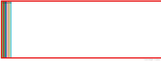
当我们把主轴换成 row-reverse时
    .container{
        height: 500px;
        width: 100%;
        border: 10px solid red;
        display:flex;
        flex-direction: row-reverse;
      }
当我们把主轴换成column 时
    .container{
        height: 500px;
        width: 100%;
        border: 10px solid red;
        display:flex;
        flex-direction:column;
      }
效果图如下

当我们把主轴换成column-reverse 时
    .container{
        height: 500px;
        width: 100%;
        border: 10px solid red;
        display:flex;
        flex-direction:column-reverse;
      }
效果图如下

是否换行 flex-wrap
flex-wrap 属性用来设置当项目超出父容器时是否换行
| 值 | 描述 |
|---|---|
| nowrap | 表示项目不会换行(默认值) |
| wrap | 表示项目会在需要时换行 |
| wrap-reverse | 表示项目会在需要时换行,但会以相反的顺序 |
首先,我们先来9个div,设置它们的宽,使它们的总宽大于容器宽度,我们来看它默认情况下(也就是不换行),发现它自动的压缩了每个div的宽度。
DOCTYPE html>
<html lang="en">
<head>
    <meta charset="UTF-8">
    <meta http-equiv="X-UA-Compatible" content="IE=edge">
    <meta name="viewport" content="width=device-width, initial-scale=1.0">
    <title>Documenttitle>
head>
<style>
    .container{
        height: 500px;
        width: 400px;
        border: 10px solid red;
        display:flex;
      }
    .item-1 {
        background-color: #38d860;
        width: 100px;
    }

    .item-2 {
        background-color: #e71341;
        width: 100px;
    }

    .item-3 {
        background-color: #4ba946;
        width: 100px;
    }

    .item-4 {
        background-color: #0376c2;
        width: 100px;
    }

    .item-5 {
        background-color: #c077af;
        width: 100px;
    }

    .item-6 {
        background-color: #f8d29d;
        width: 100px;
    }

    .item-7 {
        background-color: #b5a87f;
        width: 100px;
    }

    .item-8 {
        background-color: #d0e4a9;
        width: 100px;
    }

    .item-9 {
        background-color: #4dc7ec;
        width: 100px;
    }
style>
<body>
    <div class="container">
        <div class="item-1">1div>
        <div class="item-2">2div>
        <div class="item-3">3div>
        <div class="item-4">4div>
        <div class="item-5">5div>
        <div class="item-6">6div>
        <div class="item-7">7div>
        <div class=" item-8">8div>
        <div class="item-9">9div>

    div>
body>
html>
效果图如下
当我们设置换行时:
    .container{
        height: 500px;
        width: 400px;
        border: 10px solid red;
        display:flex;
        flex-wrap: wrap;
      }
效果图如下

当我们设置反向换行时
    .container{
        height: 500px;
        width: 400px;
        border: 10px solid red;
        display:flex;
        flex-wrap: wrap-reverse;
      }
效果图如下
项目对齐
主轴对齐方式justify-content
justify-content 属性用于设置弹性盒子中元素在主轴(横轴)方向上的对齐方式
| 值 | 描述 |
|---|---|
| flex-start | 行首排列 |
| flex-end | 行尾排列 |
| center | 居中 |
| space-between | 均匀排列每个元素首个元素放置于起点,末尾元素放置于终点 |
| space-around | 均匀排列每个元素,每个元素周围分配相同的空间 |
| space-evenly | 均匀排列每个元素每个元素之间的间隔相等 |
| stretch | 均匀排列每个元素 ,‘auto’-sized 的元素会被拉伸以适应容器的大小 |
首先,我们来看看默认情况下的排列(设置为flex-start):
DOCTYPE html>
<html lang="en">
<head>
    <meta charset="UTF-8">
    <meta http-equiv="X-UA-Compatible" content="IE=edge">
    <meta name="viewport" content="width=device-width, initial-scale=1.0">
    <title>Documenttitle>
head>
<style>
    .container{
        height: 500px;
        width: 400px;
        border: 10px solid red;
        display:flex;
      }
    .item-1 {
        background-color: #38d860;
    }

    .item-2 {
        background-color: #e71341;
    }

    .item-3 {
        background-color: #4ba946;
    }

    .item-4 {
        background-color: #0376c2;
    }

    .item-5 {
        background-color: #c077af;
    }

    .item-6 {
        background-color: #f8d29d;
    }

    .item-7 {
        background-color: #b5a87f;

    }

    .item-8 {
        background-color: #d0e4a9;

    }

    .item-9 {
        background-color: #4dc7ec;

    }
style>
<body>
    <div class="container">
        <div class="item-1">1div>
        <div class="item-2">2div>
        <div class="item-3">3div>
        <div class="item-4">4div>
        <div class="item-5">5div>
        <div class="item-6">6div>
        <div class="item-7">7div>
        <div class=" item-8">8div>
        <div class="item-9">9div>

    div>
body>
html>
效果图如下

当我们设置为flex-end
    .container{
        height: 500px;
        width: 400px;
        border: 10px solid red;
        display:flex;
        justify-content: flex-end;
      }
效果图如下
当我们设置为center
    .container{
        height: 500px;
        width: 400px;
        border: 10px solid red;
        display:flex;
        justify-content:center;
      }
效果图如下

当我们设置为stretch
     .container{
        height: 500px;
        width: 400px;
        border: 10px solid red;
        display:flex;
        justify-content:stretch;
      }
效果图如下

当我们设置为space-around
     .container{
        height: 500px;
        width: 400px;
        border: 10px solid red;
        display:flex;
        justify-content:space-around;
      }
效果图如下

当我们设置为space-between
      .container{
        height: 500px;
        width: 400px;
        border: 10px solid red;
        display:flex;
        justify-content:space-between;
      }
效果图如下

当我们设置为space-evenly
    .container{
        height: 500px;
        width: 400px;
        border: 10px solid red;
        display:flex;
        justify-content:space-evenly;
      }
效果图如下
交叉轴对齐方式align-content和align-items
| 值 | 描述 |
|---|---|
| stretch | 将项目拉伸以占据剩余空间(默认值) |
| center | 居中开始排布 |
| flex-start | 顶部开始排列 |
| flex-end | 底部开始排列 |
| space-between | 均匀分布项目第一项与起始点齐平,最后一项与终止点齐平 */ |
| space-around | 均匀分布项目 项目在两端有一半大小的空间*/ |
| space-evenly | 均匀分布项目 项目周围有相等的空间 |
两者之间的区别:align-content使用多行或是单行进行对齐,而,align-items 只适用单行项目
效果与在主轴上的排列方式差不多,在这里,我们就不做过多演示了
项目属性
收缩性
flex-shrink属性指定了 flex 元素的收缩规则。flex元素仅在默认宽度之和大于容器的时候才会发生收缩,其收缩的大小是依据flex-shrink的值。注意取值是一个数字,默认是1。1是可以压缩 0是禁止压缩
值为1时,我们来看一下,我们可以发现设置了不可压缩的项目就没有进行压缩,是原本的大小。
DOCTYPE html>
<html lang="en">
<head>
    <meta charset="UTF-8">
    <meta http-equiv="X-UA-Compatible" content="IE=edge">
    <meta name="viewport" content="width=device-width, initial-scale=1.0">
    <title>Documenttitle>
head>
<style>
    .container{
        height: 500px;
        width: 400px;
        border: 10px solid red;
        display:flex;
      }
    .item-1 {
        background-color: #38d860;
        width: 100px;
        flex-shrink: 0;
    }

    .item-2 {
        background-color: #e71341;
        width: 100px;
    }

    .item-3 {
        background-color: #4ba946;
        width: 100px;
    }

    .item-4 {
        background-color: #0376c2;
        width: 100px;
    }

    .item-5 {
        background-color: #c077af;
        width: 100px;
    }

    .item-6 {
        background-color: #f8d29d;
        width: 100px;
    }

    .item-7 {
        background-color: #b5a87f;
        width: 100px;
    }

    .item-8 {
        background-color: #d0e4a9;
        width: 100px;
    }

    .item-9 {
        background-color: #4dc7ec;
        width: 100px;
    }
style>
<body>
    <div class="container">
        <div class="item-1">1div>
        <div class="item-2">2div>
        <div class="item-3">3div>
        <div class="item-4">4div>
        <div class="item-5">5div>
        <div class="item-6">6div>
        <div class="item-7">7div>
        <div class=" item-8">8div>
        <div class="item-9">9div>

    div>
body>
html>
效果图如下
排列顺序 order
order 属性规定了弹性容器中的可伸缩项目在布局时的顺序。元素按照 order 属性的值的增序进行布局。order的默认值是0.
我们来看一下order的作用
首先是默认情况下的布局
DOCTYPE html>
<html lang="en">
<head>
    <meta charset="UTF-8">
    <meta http-equiv="X-UA-Compatible" content="IE=edge">
    <meta name="viewport" content="width=device-width, initial-scale=1.0">
    <title>Documenttitle>
head>
<style>
    .container{
        height: 500px;
        width: 400px;
        border: 10px solid red;
        display:flex;
      }
    .item-1 {
        background-color: #38d860;
    }

    .item-2 {
        background-color: #e71341;
    }

    .item-3 {
        background-color: #4ba946;
    }

    .item-4 {
        background-color: #0376c2;
    }

    .item-5 {
        background-color: #c077af;
    }

    .item-6 {
        background-color: #f8d29d;
    }

    .item-7 {
        background-color: #b5a87f;

    }

    .item-8 {
        background-color: #d0e4a9;

    }

    .item-9 {
        background-color: #4dc7ec;

    }
style>
<body>
    <div class="container">
        <div class="item-1">1div>
        <div class="item-2">2div>
        <div class="item-3">3div>
        <div class="item-4">4div>
        <div class="item-5">5div>
        <div class="item-6">6div>
        <div class="item-7">7div>
        <div class=" item-8">8div>
        <div class="item-9">9div>

    div>
body>
html>
效果图如下
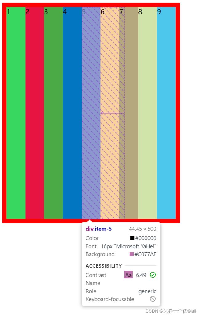
接下来,我们给其中两个设置order
    .item-1 {
        background-color: #38d860;
       order: 1;
    }

    .item-2 {
        background-color: #e71341;
        order: -1;

    }

    .item-3 {
        background-color: #4ba946;
        order: -3;

    }
效果图如下:
排列方向
align-self 会对齐当前 grid 或 flex 行中的元素,并覆盖已有的 align-items 的值。在flex box 中,会按照 cross axis(当前 flex 元素排列方向的垂直方向)进行排列。
| 取值 | 描述 |
|---|---|
| auto | 设置为父元素的 align-items 值(如果没有父容器,则为“stretch”) |
| center | cross-axis 的中间 |
| stretch | 被拉伸以适合容器 |
| flex-start | 容器的顶部 |
| flex-end | 容器的底部 |
| baseline | 与容器的基线对齐 |
我们来看一下它们的效果
首先是设置为center
DOCTYPE html>
<html lang="en">
<head>
    <meta charset="UTF-8">
    <meta http-equiv="X-UA-Compatible" content="IE=edge">
    <meta name="viewport" content="width=device-width, initial-scale=1.0">
    <title>Documenttitle>
head>
<style>
    .container{
        height: 500px;
        width: 900px;
        border: 10px solid red;
        display:flex;

      }
    .item-1 {
        background-color: #38d860;
        width: 100px;
       align-self: center;
    }

    .item-2 {
        background-color: #e71341;
        width: 100px;
    }

    .item-3 {
        background-color: #4ba946;
        width: 100px;
    }

    .item-4 {
        background-color: #0376c2;
        width: 100px;
    }

    .item-5 {
        background-color: #c077af;
        width: 100px;
    }

    .item-6 {
        background-color: #f8d29d;
        width: 100px;
    }

    .item-7 {
        background-color: #b5a87f;
        width: 100px;
    }

    .item-8 {
        background-color: #d0e4a9;
        width: 100px;
    }

    .item-9 {
        background-color: #4dc7ec;
        width: 100px;
    }
style>
<body>
    <div class="container">
        <div class="item-1">1div>
        <div class="item-2">2div>
        <div class="item-3">3div>
        <div class="item-4">4div>
        <div class="item-5">5div>
        <div class="item-6">6div>
        <div class="item-7">7div>
        <div class=" item-8">8div>
        <div class="item-9">9div>

    div>
body>
html>
效果如下

当我们设置为auto时
    .item-1 {
        background-color: #38d860;
        width: 100px;
       align-self:auto;
    }
效果如下:

当我们设置为flex-start时
     .item-1 {
        background-color: #38d860;
        width: 100px;
       align-self:flex-start;
    }
效果如下:
当我们设置为flex-end时
        .item-1 {
        background-color: #38d860;
        width: 100px;
       align-self:flex-end;
    }
效果如下:

当我们设置为baseline时
.item-1 {
        background-color: #38d860;
        width: 100px;
       align-self:baseline;
    }
效果如下:

当我们设置为stretch时
    .item-1 {
        background-color: #38d860;
        width: 100px;
       align-self:stretch;
    }
效果如下:

期末考试到了,祝大家
