Python拟合分布生成随机数
import pandas as pd
import numpy as np
import matplotlib.pyplot as plt
import seaborn as sns
from fitter import Fitter
import warnings

#解决中文显示问题
plt.rcParams['font.sans-serif'] = ['KaiTi'] # 指定默认字体
plt.rcParams['axes.unicode_minus'] = False # 解决保存图像是负号'-'显示为方块的问题

warnings.filterwarnings("ignore")
pd.set_option('display.max_columns',20)
pd.set_option('display.max_rows',20)
#禁用科学计数法
np.set_printoptions(suppress=True,   precision=10,  threshold=2000,  linewidth=150)
pd.set_option('display.float_format',lambda x : '%.4f' % x)
%matplotlib inline
data = pd.read_excel(r"附件2 近5年8家转运商的相关数据.xlsx")
data
| 转运商ID | W001 | W002 | W003 | W004 | W005 | W006 | W007 | W008 | W009 | ... | W231 | W232 | W233 | W234 | W235 | W236 | W237 | W238 | W239 | W240 | |
|---|---|---|---|---|---|---|---|---|---|---|---|---|---|---|---|---|---|---|---|---|---|
| 0 | T1 | 1.5539 | 1.6390 | 0.8124 | 1.2233 | 1.1194 | 1.1572 | 1.0769 | 1.1194 | 1.9129 | ... | 1.7240 | 1.5492 | 1.5870 | 1.3414 | 1.4453 | 1.5964 | 1.8137 | 1.7051 | 1.8279 | 1.9224 |
| 1 | T2 | 0.7092 | 1.2411 | 0.3546 | 1.5957 | 1.0638 | 0.7092 | 0.5319 | 1.0638 | 1.4184 | ... | 0.1773 | 1.2411 | 0.7092 | 0.3546 | 0.1773 | 0.3546 | 0.5319 | 0.8865 | 0.3546 | 0.7092 |
| 2 | T3 | 0.0000 | 0.0000 | 0.0971 | 0.0000 | 0.1295 | 0.0000 | 0.0324 | 0.0000 | 0.0000 | ... | 0.0000 | 0.0000 | 0.0324 | 0.0000 | 0.0971 | 0.0000 | 0.0647 | 0.0000 | 0.1295 | 0.0000 |
| 3 | T4 | 0.0000 | 0.0000 | 0.0000 | 0.0000 | 0.0000 | 0.0000 | 0.0000 | 0.0000 | 0.0000 | ... | 0.0000 | 0.0000 | 0.0000 | 0.0000 | 0.0000 | 0.0000 | 0.0000 | 0.0000 | 0.0000 | 0.0000 |
| 4 | T5 | 0.0000 | 0.0000 | 0.0000 | 0.0000 | 0.0000 | 0.0000 | 0.0000 | 0.0000 | 1.7391 | ... | 0.0000 | 0.0000 | 0.0000 | 0.0000 | 0.0000 | 0.0000 | 0.0000 | 0.0000 | 0.0000 | 0.0000 |
| 5 | T6 | 0.0106 | 0.0222 | 0.0454 | 2.2621 | 1.6387 | 5.0000 | 0.0412 | 0.0264 | 0.0254 | ... | 0.0074 | 0.0053 | 0.0053 | 0.0011 | 0.0053 | 0.0032 | 0.0032 | 0.0000 | 0.0000 | 0.0000 |
| 6 | T7 | 0.9783 | 0.9085 | 1.2579 | 0.9783 | 1.3976 | 1.6073 | 1.1880 | 1.2579 | 5.0000 | ... | 1.7470 | 1.3976 | 1.0482 | 1.5374 | 1.1181 | 1.3976 | 1.0482 | 1.3976 | 1.6073 | 1.2579 |
| 7 | T8 | 0.3390 | 0.0000 | 0.0000 | 0.0000 | 1.0169 | 0.8475 | 0.8475 | 0.6780 | 0.3390 | ... | 0.6780 | 5.0000 | 5.0000 | 0.6780 | 0.3390 | 0.1695 | 0.3390 | 0.6780 | 0.3390 | 0.6780 |
8 rows × 241 columns
一共为8家转运商240周的损耗率数据, T 1 . . . . T 8 T_1....T_8 T1....T8分别代表8家转运商. W 001 − W 240 W_{001}-W_{240} W001−W240代表转运商1-240周的数据
任务:已知8家转运商240周转运的历史数据,现要选择转运商进行转运,问应如何得到转运商此次转运的损耗率
题目来源--2021年数学建模国赛C题
思路
1、直接利用历史数据的平均值。
2、利用历史数据的均值和方差生成新的随机数。
3、利用历史数据,拟合分布,利用分布生成新的数据。
4、时间序列预测
首先查看数据分布
plt.figure(figsize=(30,15),dpi=300)
for i in range(8):
    plt.subplot(2,4,i+1)
    plt.title("T"+str(i+1))
    plt.ylabel("损耗率%")
    plt.xlabel("周数")
    y = list(data.iloc[i][1:])
    x = [i+1 for i in range(len(y))]
    plt.scatter(x,y)
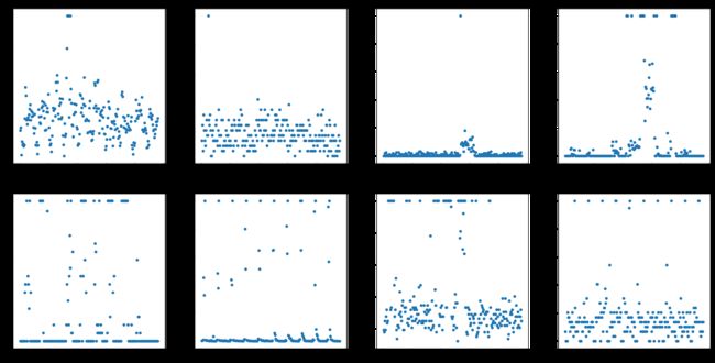
可以看出,数据并没有很明显的分布,因此不考虑用时间序列预测
而直接利用历史数据的平均值,受到异常点的影响过大且没有考虑到转运商的转运稳定性,因此不考虑平均值。
利用历史数据的均值和方差生成新的随机数,会导致生成的新数据不稳定,因此也不在此考虑。
我们使用历史数据来拟合一个分布,作为新数据的近似。
1、第一种我们可以使用已有的分布来进行拟合
2、第二种方法我们可以使用核密度估计(kde)来进行拟合
首先观察数据的分布
plt.figure(figsize=(30,15),dpi=300)
for i in range(8):
    plt.subplot(2,4,i+1)
    plt.title("转运商T"+str(i+1))
    plt.ylabel("损耗率%")
    plt.xlabel("周数")
    y = list(data.iloc[i][1:])
    #x = [i+1 for i in range(len(y))]
    sns.distplot(y)

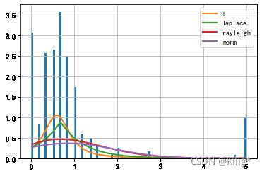
我们拟合分布,以第一家转运商的数据为例
distributions (list) – 给出要查看的分布列表。 如果没有,则尝试所有的scipy分布(80种),常用的分布distributions=[‘norm’,‘t’,‘laplace’,‘cauchy’, ‘chi2’,’ expon’, ‘exponpow’, ‘gamma’,’ lognorm’, ‘uniform’];
但是80种都进行拟合会用较多时间,因此目前只拟合几种常用的分布。
若要全部拟合,设置distributions为默认即可
f = Fitter(list(data.iloc[i][1:]), distributions=['norm', 't', 'laplace', 'rayleigh'])
f.fit()
f.summary()
| sumsquare_error | aic | bic | kl_div | |
|---|---|---|---|---|
| t | 35.5719 | 705.6813 | -441.7379 | inf |
| laplace | 35.7321 | 709.5500 | -446.1400 | inf |
| rayleigh | 38.4334 | 610.6358 | -428.6496 | inf |
| norm | 39.8850 | 610.3202 | -419.7522 | inf |
plt.figure(figsize=(30,80),dpi=300)
for i in range(1,17,2):
    plt.subplot(8,2,i)
    plt.title("转运商T"+str((i+1)//2))
    plt.ylabel("损耗率%")
    plt.xlabel("周数")
    y = list(data.iloc[i//2][1:])
    #x = [i+1 for i in range(len(y))]
    sns.distplot(y)
    plt.subplot(8,2,i+1)
    plt.title("转运商T"+str((i+1)//2))
    plt.ylabel("损耗率%")
    plt.xlabel("周数")
    f = Fitter(y, distributions=['norm', 't', 'laplace', 'rayleigh'])
    f.fit()
    f.plot_pdf(names=None, Nbest=3, lw=2) #绘制分布的概率密度函数
for i in range(8):
    y = list(data.iloc[i//2][1:])
    f = Fitter(y, distributions=['norm', 't', 'laplace', 'rayleigh'])
    f.fit()
    print(f.get_best(method='sumsquare_error'))
{'t': (3.8781876911784163, 1.8391428837077617, 0.44511037531118036)}
{'t': (3.8781876911784163, 1.8391428837077617, 0.44511037531118036)}
{'rayleigh': (0.07909570313413813, 0.6853095226694271)}
{'rayleigh': (0.07909570313413813, 0.6853095226694271)}
{'laplace': (0.0, 0.09070208333333335)}
{'laplace': (0.0, 0.09070208333333335)}
{'laplace': (0.0, 0.6674550000000001)}
{'laplace': (0.0, 0.6674550000000001)}
以第一个分布为例,我们生成随机数服从’t’: (3.8781876911784163, 1.8391428837077617, 0.44511037531118036),也可以通过f.fitted_pdf #使用最适合数据分布的分布参数生成的概率密度直接得到
# 方法详解
# Fitter方法
# Fitter(data, xmin=None, xmax=None, bins=100, distributions=None, verbose=True, timeout=10)
# 参数:
# data (list) –输入的样本数据;
# xmin (float) – 如果为None,则使用数据最小值,否则将忽略小于xmin的数据;
# xmax (float) – 如果为None,则使用数据最大值,否则将忽略大于xmin的数据;
# bins (int) – 累积直方图的组数,默认=100;
# distributions (list) – 给出要查看的分布列表。 如果没有,则尝试所有的scipy分布(80种),常用的分布distributions=[‘norm’,‘t’,‘laplace’,‘cauchy’, ‘chi2’,’ expon’, ‘exponpow’, ‘gamma’,’ lognorm’, ‘uniform’];
# verbose (bool) –
# timeout – 给定拟合分布的最长时间,(默认=10s) 如果达到超时,则跳过该分布。

# Fitter返回
# f.summary() #返回排序好的分布拟合质量(拟合效果从好到坏),并绘制数据分布和Nbest分布
# f.df_errors #返回这些分布的拟合质量(均方根误差的和)
# f.fitted_param #返回拟合分布的参数
# f.fitted_pdf #使用最适合数据分布的分布参数生成的概率密度
# f.get_best(method='sumsquare_error') #返回最佳拟合分布及其参数
# f.hist() #绘制组数=bins的标准化直方图
# f.plot_pdf(names=None, Nbest=3, lw=2) #绘制分布的概率密度函数

# from fitter import Fitter
# import numpy as np
#
# arr = np.arange(1, 200)
# np.random.shuffle(arr)  # arr为创建的随机数
#
# fitter_dis = Fitter(arr)
# fitter_dis.fit()
# distribution_df = fitter_dis.summary()  # 这里可以得到error最小的Dataframe型数据
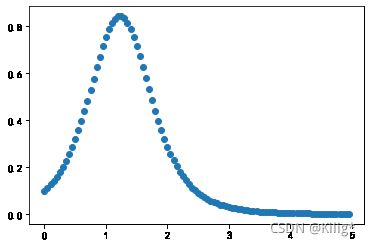
y = list(data.iloc[0][1:])
f = Fitter(y, distributions=['norm', 't', 'laplace', 'rayleigh'])
f.fit()
print(f.get_best(method='sumsquare_error'))
{'t': (3.8781876911784163, 1.8391428837077617, 0.44511037531118036)}
resulut1 = np.array(f.fitted_pdf['t']) #使用最适合数据分布的分布参数生成的概率密度
plt.scatter(x = [5*i/(100) for i in range(100)],y = resulut1)
在采样时,我们使用numpy中的choice进行采样,详见Numpy-Choice,我们在此生成了1000个点,绘制其分布图,观察是否与原来分布一致
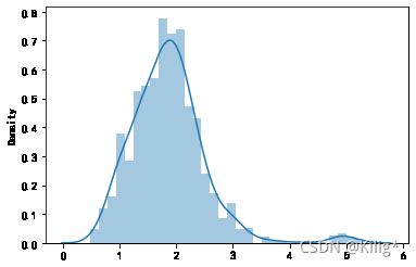
test = np.random.choice([5*i/(100) for i in range(100)], 1000, p=resulut1/sum(resulut1))
#采样1000个点
sns.distplot(test)
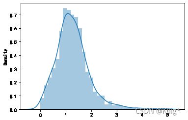
可以看出,效果较好
接下来我们尝试用核密度估计来进行拟合,仍然是以第一家转运商为例
核密度估计
方法
fit(X[, y])Fit the Kernel Density model on the data. get_params([deep])Get parameters for this estimator. sample([n_samples, random_state])Generate random samples from the model.
score(X[, y])Compute the total log probability under the model.
score_samples(X)Evaluate the density model on the data.
set_params(**params)Set the parameters of this estimator.
from sklearn.neighbors import KernelDensity
import numpy as np
X = np.array(list(data.iloc[0][1:])).reshape(-1, 1)
kde = KernelDensity(kernel='gaussian', bandwidth=0.2).fit(X)
resulut2 = kde.sample(1000)
#采样1000个点
sns.distplot(resulut2)
可以看出,效果较好