- 打字效果

说明:
通过 steps() 属性来实现分割文本的效果。首先,你必须指定 step() 中传入的数量,在这个例子中就是文本的长度。
接着,第二步,我们使用 @keyframes 去声明什么时候开始执行动画
    Typing effect for text


.typing {
  height: 80vh;
  display: flex;
  align-items: center;
  justify-content: center;
}
.typing-effect {
  width: 22ch;
  white-space: nowrap;
  overflow: hidden;
  border-right: 3px solid;
  font-family: monospace;
  font-size: 2em;
  animation: typing 2s steps(22), effect .5s step-end infinite alternate;
}

@keyframes typing {
  from {
    width: 0;
  }
}

@keyframes effect {
  50% {
    border-color: transparent;
  }
}- 透明图片阴影效果

说明:
使用:drop-shadow
drop-shadow 的工作方式是,其遵循给给定图片的 Alpha 通道。因此阴影是基于图片的内部形状,而不是显示在图片外面。
      box-shadow


      drop-shadow


.transparent-shadow {
  height: 80vh;
  display: flex;
  align-items: center;
  justify-content: center;
}

.margin-right {
  margin-right: 2em;
}

.margin-bottom {
  margin-bottom: 1em;
}

.align-center {
  text-align: center;
}

.box-shadow {
  box-shadow: 2px 4px 8px #3723a1;
}

.drop-shadow {
  filter: drop-shadow(2px 4px 8px #3723a1);
}
drop-shadow
.transparent-shadow {
height: 80vh;
display: flex;
align-items: center;
justify-content: center;
}
.margin-right {
margin-right: 2em;
}
.margin-bottom {
margin-bottom: 1em;
}
.align-center {
text-align: center;
}
.box-shadow {
box-shadow: 2px 4px 8px #3723a1;
}
.drop-shadow {
filter: drop-shadow(2px 4px 8px #3723a1);
}- 自定义 Cursor

    Default


    Image


    Emoji


.custom-cursor {
  display: flex;
  height: 80vh;
  align-items: center;
  justify-content: center;
  background: #f3f3f3;
  padding: 0 10px;
}

.card {
    width: 200px;
    height: 200px;display: flex;
    align-items: center;
    justify-content: center;
    background-color: #D29A5A;
    margin-right: 10px;color: #fff;
    font-size: 1.4em;
    text-align: center;
  }

.card-image-cursor {
  background-color: #D11A5A;
  cursor: url("https://p1-juejin.byteimg.com/tos-cn-i-k3u1fbpfcp/0ac1d8cb2b1b46a384e986a7461df26a~tplv-k3u1fbpfcp-watermark.image?"), auto;
}

.card-emoji-cursor {
  background-color: #D29B22;
  cursor: url("data:image/svg+xml;utf8,"), auto;
}- 使用 attr() 展示 tooltip
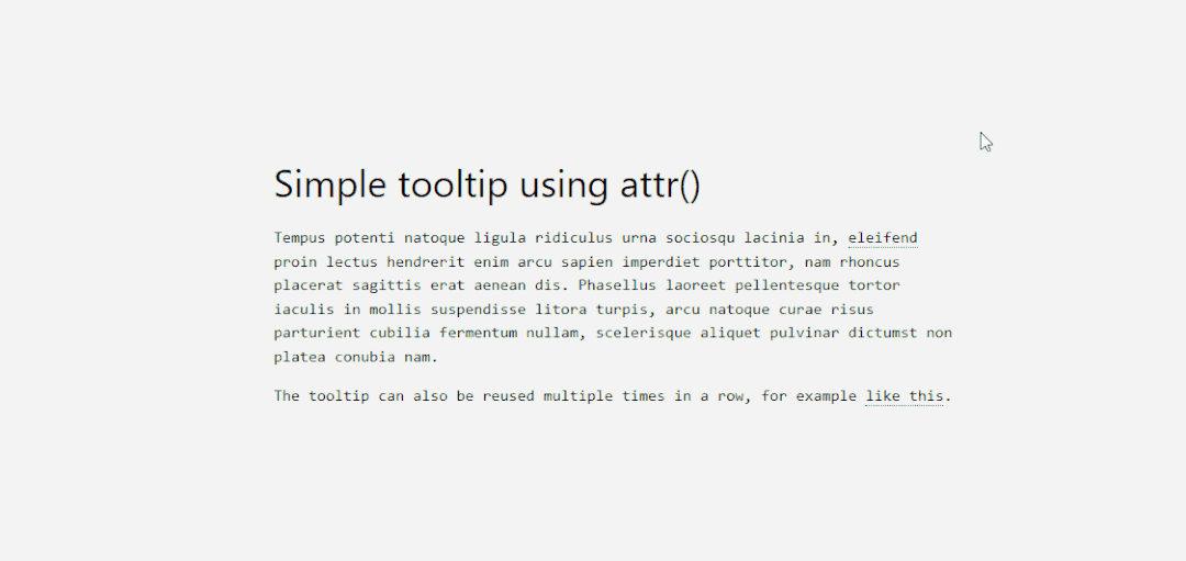
  HTML/CSS tooltip


  Hover Here to see the tooltip.


  You can also hover here to see another example.


.tooltip {
  position: relative;
  border-bottom: 1px dotted black;
}

.tooltip:before {
  content: attr(tooltip-data);
  position: absolute;
  width: 250px;
  background-color: #efba93;
  color: #fff;
  text-align: center;
  padding: 15px;
  line-height: 1.1;
  border-radius: 5px;
  z-index: 1;
  opacity: 0;
  transition: opacity .5s;
  bottom: 125%;
  left: 50%;
  margin-left: -60px;
  font-size: 0.70em;
  visibility: hidden;
}

.tooltip:after {
  content: "";
  position: absolute;
  bottom: 75%;
  left: 50%;
  margin-left: -5px;
  border-width: 5px;
  border-style: solid;
  opacity: 0;
  transition: opacity .5s;
  border-color: #000 transparent transparent transparent;
  visibility: hidden;
}

.tooltip:hover:before,
.tooltip:hover:after {
  opacity: 1;
  visibility: visible;
}- 纯 CSS 实现核算清单
Item Checklist with CSS
.checklist {
padding: 50px;
position: relative;
background: #043b3e;
border-top: 50px solid #03a2f4;
}
.checklist h2 {
color: #f3f3f3;
font-size: 25px;
padding: 10px 0;
margin-left: 10px;
display: inline-block;
border-bottom: 4px solid #f3f3f3;
}
.checklist label {
position: relative;
display: block;
margin: 40px 0;
color: #fff;
font-size: 24px;
cursor: pointer;
}
.checklist input[type="checkbox"] {
-webkit-appearance: none;
}
.checklist i {
position: absolute;
top: 2px;
display: inline-block;
width: 25px;
height: 25px;
border: 2px solid #fff;
}
.checklist input[type="checkbox"]:checked ~ i {
top: 1px;
height: 15px;
width: 25px;
border-top: none;
border-right: none;
transform: rotate(-45deg);
}
.checklist span {
position: relative;
left: 40px;
transition: 0.5s;
}
.checklist span:before {
content: '';
position: absolute;
top: 50%;
left: 0;
width: 100%;
height: 1px;
background: #fff;
transform: translateY(-50%) scaleX(0);
transform-origin: left;
transition: transform 0.5s;
}
.checklist input[type="checkbox"]:checked ~ span:before {
transform: translateY(-50%) scaleX(1);
transform-origin: right;
transition: transform 0.5s;
}
.checklist input[type="checkbox"]:checked ~ span {
color: #154e6b;
}- 使用 :is() 和 :where() 添加元素样式

Header 2 content title

:where(h2,h3,h4) > b {
  color: blue;
}

:is(h2):where(.content-title) {
  text-transform: uppercase;
}- 使用关键帧实现手风琴下拉效果

        Accordion Tab #1

          your text goes here


        Accordion Tab #2

          your text goes here


    Accordion Tab #3

      your text goes here


main {
  max-width: 400px;
  margin: 0 auto;
}
p {
    text-align: justify;
    font-family: monospace;
    font-size: 13px;
}
summary {
  font-size: 1rem;
  font-weight: 600;
  background-color: #f3f3f3;
  color: #000;
  padding: 1rem;
  margin-bottom: 1rem;
  outline: none;
  border-radius: 0.25rem;
  cursor: pointer;
  position: relative;
}
details[open] summary ~ * {
  animation: sweep .5s ease-in-out;
}
@keyframes sweep {
  0%    {opacity: 0; margin-top: -10px}
  100%  {opacity: 1; margin-top: 0px}
}
details > summary::after {
  position: absolute;
  content: "+";
  right: 20px;
}
details[open] > summary::after {
  position: absolute;
  content: "-";
  right: 20px;
}
details > summary::-webkit-details-marker {
  display: none;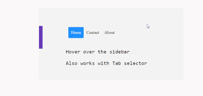
}- 侧边栏的 Hover 效果
.css-dynamic-sidebar {
overflow: hidden;
position: relative;
height: 15em;
max-width: 15em;
margin: auto;
}
.site-content {
margin: auto;
}
nav {
display: flex;
flex-direction: column;
position: absolute;
right: 100%;
padding: 1em;
background-color: #f3f3f3;
transform: translateX(1em);
transition: 0.2s transform;
}
nav:hover,
nav:focus-within {
transform: translateX(100%);
}
a {
white-space: pre;
color: black;
}
p {
font-size: 2em;
font-family: monospace;
text-align: center;
}- 使用 first-letter 实现首字母大写

  here we target the  wrapper and select the p element. then append first-of-type and target first-letter specifically. you can then reuse the same option in other parts of your design by changing the wrapper variable


.content-section p:first-of-type::first-letter {
    color: #f3f3f3;
    float:  left;
    font-size: 4rem;
    line-height: 4vw;
    padding-right: 8px;
 /* border: 0.25em double; */
}- 使用 ::before 添加按钮的图标

.card .card-body .btn {
display: block;
width: 200px;
height: 48px;
line-height: 48px;
background-color: blue;
border-radius: 4px;
text-align: center;
color: #fff;
font-weight: 700;
}
.card .card-body .btn-docu:before {
content:"\0000a0";
display:inline-flex;
height:24px;
width:24px;
line-height:24px;
margin:0px 10px 0px 0px;
position:relative;
top:0px;
left:0px;
background:url(https://stackdiary.com/docu.svg) no-repeat left center transparent;
background-size:100% 100%;
}