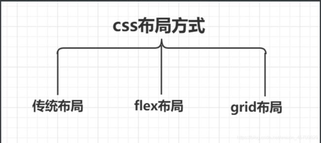
css浮动问题/css定位问题/css盒子模型/BFC原理详细剖析/css常用布局之flex布局grid布局table布局等—史上最全的css重难点整理笔记
前端css浮动问题
一 标准文档流 块级元素 行内元素
首先我们先来了解一下,css三种布局方式。本篇博客介绍的css浮动问题是传统布局的范围。想要完全掌握css浮动问题,先得了解一下什么是标准文档流,什么是块级元素和行内元素?它们都有什么特点?css为什么需要浮动?
Q1:什么是标准文档流?
A1:意思是元素在排版布局过程中,元素会默认自动从左往右,从上而下的流式排列方式。窗体自上而下分成一行行排列,并且在每一行中自左向右排列元素。要特别记住行内元素可以被包含在块级元素中,反之则不可以。
Q2:什么是标准文档流等级?
A2:我们开始在学css的元素的时候,都会接触到两大类元素分类,块级元素和行内元素。所以标准文档流的等级有两种,块级元素和行内元素。
Q3:什么是块级元素什么是行内元素?
A3:(1)块级元素:独占一行,不和其他的元素并列。能接受宽和高,如果不设置宽度,那么宽度将默认和父级一样宽度,是父级元素的100%。
(2)行内元素:和其他元素并列成为一行。不能这是宽和高,默认的宽度就是文字的宽度。
Q4:块级元素有哪些?行内元素又有哪些?
A4:块级元素有h1~h6,p,div等标签。行内元素span,a等等(这个可以自行记忆一下)
ps:写过一点点css代码都了解,块元素和行内元素可以转换的。以下是代码展示。
/*display的三个属性*/
/*
value:block 块元素
value:inline 行内元素
value:inline-block 既是块元素又是行内元素(常用)
*/
二 我们为什么需要浮动
一个东西的出现肯定是有它的原因。我本人比较信奉萨特的存在主义。存在即合理,它肯定是出现来解决某一个或者某一类特定的问题,提供了什么功能。
在搞清楚为什么需要浮动的前提,我们需要先思考一个问题。如何把块级元素排列成一行?
我们刚开始再写css的时候,如果块级元素很小,但是它是块级元素霸道地占据了一行,就会造成页面空间资源,布局也不美观。css处理方式就是把display设置成inline-block。
写个代码,举个例子,会更有逻辑去解释清除这个东西。
-
传统的块级元素布局的方式
代码展示
<html>
  <head>
      <meta charset="UTF-8">
      <title>浮动问题title>
      <style>
        .boxContaniner{
          background-color: rgb(204, 169, 224);
        }
        .box{
          background:pink;
          height: 100px;
          width: 100px;
          margin: 10px;
          text-align: center;
          line-height: 100px;
          color: aquamarine;
          border-radius: 10px;
        }
      style>
  head>
  <body>
        <div class="boxContainer">
          <div class="box">box1div>
          <div class="box">box2div>
          <div class="box">box3div>
        div>
  body>
html>
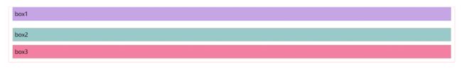
效果展示(每一个div自己独占一行)

-
display:inline-block 解决块级元素排列到一行
代码展示
<html>
  <head>
      <meta charset="UTF-8">
      <title>浮动问题title>
      <style>
        .boxContaniner{
          background-color: rgb(204, 169, 224);
        }
        .box{
          background:pink;
          height: 100px;
          width: 100px;
          text-align: center;
          line-height: 100px;
          color: aquamarine;
          border-radius: 10px;
          display: inline-block;
        }
      style>
  head>
  <body>
        <div class="boxContainer">
          <div class="box">box1div>
          <div class="box">box2div>
          <div class="box">box3div>
        div>
  body>
html>
效果展示

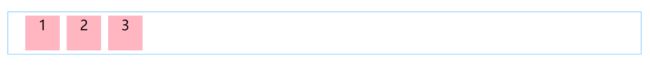
通过display: inline-block;这一行代码把三个块级元素排列到一行,但是有一个问题发现没有?这三个div盒子之间留有缝隙。attention我们没有给div盒子设置margin、padding哦!如果我们在排版布局的时候不希望div有缝隙,应该怎么处理。对的。这时候就需要浮动发挥它的作用了。它的出现就是用来解决这个问题,不让盒子之间留有缝隙。
Q1:为什么是浮动?
A1:浮动可以改变元素标签默认的排列方式。让元素一个挨着一个,创造出一个自然美观的自然流布局。可以这是自身的宽度和高度,和可以自定义父级元素容器的大小。
三 浮动介绍
1 定义:让某一个div脱离标准流,漂浮在标准流之上,和标准流不是一个层次。
2 怎么理解?我的理解很简单,从语文方面去拆字理解,浮动就是漂浮和移动,漂浮就是脱离标准流漂浮在标准流之上,移动就是告诉它要漂浮去哪里,在一行内的位置无非就是两个方向,左和右。是不是很清晰,也很有逻辑去理解呢!
3 浮动的语法
/*
选择器{
float:none/left/right
}
*/
4 浮动的规则(写个代码来解释会清晰,更容易理解)
<html>
  <head>
      <meta charset="UTF-8">
      <title>浮动问题title>
      <style>
        .boxContaniner{
          background-color: rgb(204, 169, 224);
        }
        .box1{
          background:rgb(123, 66, 175);
          height: 100px;
          width: 100px;
          text-align: center;
          line-height: 100px;
          color: aquamarine;
          border-radius: 10px;
        }
        .box2,.box3{
          background:pink;
          height: 100px;
          width: 100px;
          text-align: center;
          line-height: 100px;
          color: aquamarine;
          border-radius: 10px;
          float: left;
        }


      style>
  head>
  <body>
        <div class="box1">box1div>

        <div class="boxContainer">
          <div class="box2">box2div>
          <div class="box3">box3div>
        div>
  body>

html>
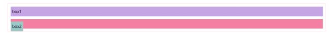
效果展示

在上面的代码中,可以看到我设置了三个盒子,一个紫色的盒子,两个粉色的盒子。代码很简单,可以看到紫色div盒子是没有使用float浮动的,所以div依然霸道的独占一行。两个粉色的div盒子设置了float,所以改变了默认的标签排列方式,两个粉色的div排列到了同一行,且消除了缝隙。
Q:我们可以了解到flaot的什么规则呢?
A:当A不是浮动元素即A是标准流元素,B和C是浮动元素的时候。C会自动排列与B同一行,且排列在B的后面,且无缝衔接(嗯对,可以理解为渣渣行为),B会自动排列在A的下一行,B的相对垂直位置不会改变,意思就是与B的顶部与A的底部对齐。如果box2和box3设置的宽高太离谱的话,box3会被强行挤占下去下一行。(这一行我呆不下去了,我去下一行也可以)
**还要记住的是!**一个元素浮动了,其他的兄弟元素也要浮动。好比一个盒子div里面有几个盒子,一个盒子动了,另外几个盒子也会跟着一起动的。浮动影响后面的而不会影响前面的。(好比排队吧,123456789排成一列,突然闯入一个0,说和5是好朋友,说要排到5后面,于是在5后面的6789都要往后移动,就被这个0影响到了。但是前面的1234丝毫不受影响。)
四 清除浮动clean(敲黑板,这个是重点)
attention:clean只能影响清除的元素本身,不能影响其他元素。
好了,问题又来了
Q:为什么需要清除浮动呢?
A:很多情况下父级盒子不方便给高度,但如果不给高度,子盒子浮动不占用位置,父盒子位置即为0,会影响下面标准流的布局。我们称这一现象为父级元素边框坍塌。清除浮动后,父盒子就会根据浮动的子盒子自动监测到盒子的高度,不会影响到下面的标准流了。
搞清楚了为什么,我们就要来搞清楚怎么做了?
那么,怎么清除浮动呢?(很重要,很重要,很重要)
我们要做的是闭合浮动,也就是让浮动只在父级盒子里面影响,而不影响父级盒子以外的其他元素。
清除浮动的方法
(1)增加父级元素的高度
这个很好理解,既然浮动会造成父级元素边框坍塌,那么为了防止坍塌我就给它设置高度呗。但是这个常用,因为高度要设置为多少,这是一个复杂的计算问题。不推荐使用。而且很容易影响布局的美观。
(2)父级元素添加overfloat属性(overfloat解决溢出问题)
好处:代码容易,操作简单
坏处:溢出会隐藏
/*给父级元素添加overfloat属性
hidden(常用)
auto
scroll
*/
"boxContainer" style="overfloat:hidden;">
          "box2">box2
          "box3">box3
3 给父级元素添加一个伪类(目前最火的处理方式)
好处:结构语义化正确
坏处:兼容性较差,会出现兼容性问题,目前IE6 IE7不支持
#father{
	border:1px solid red;
}
#father:after{
	content:'';
	display:block;
	clear:both;
}
4 额外标签法(增加一个空的div,然后清除浮动)
好处:简单方便,理解容易
坏处:增加新的空div标签,结构化较差
/*css代码*/
.clean{
	clean:both;
	margin:0;
	padding:0;
}
/*html*/代码
"clean">
display和float区别:
display:方向不可以控制
float:浮动起来的话会脱离标准文档流,需解决父级边框塌陷的问题
五 总结
;
}
4 额外标签法(增加一个空的div,然后清除浮动)

好处:简单方便,理解容易

坏处:增加新的空div标签,结构化较差

```css
/*css代码*/
.clean{
	clean:both;
	margin:0;
	padding:0;
}
/*html*/代码
display和float区别:
display:方向不可以控制
float:浮动起来的话会脱离标准文档流,需解决父级边框塌陷的问题
五 总结
在学习的过程中,要思考如何清晰有逻辑的学习知识点。我是从几个方面去思考,这个东西是什么?这个东西为什么会出现?这个东西解决了什么问题?这个东西解决了问题的同时本身会不会带来新的问题?这个东西有什么功能?这个东西在用的时候有什么规则?等等。很多时候我都会发现这套逻辑是类似的,某一种新的东西出现代替旧的东西的时候,都是改进优化了某一些功能,所以它才会被发明,不然我们都会一直沿用旧的东西。但是这都是相对而言,在某种特定的情况下需要用到什么还是不一样,需要分情况讨论,而不能一概而论。
前端css定位问题
一 布局和定位的区别
布局是屏幕平面上的,定位是垂直于平面的。
二 定位的方法
必须了解—静态定位(static)
一般的标签元素在不加任何定位属性的时候都属于静态定位,在页面的最底层,属于标准流。

写一下代码来做一个test,来清晰了解一下这四个定位。
测试代码展示
<html>
  <head>
      <meta charset="UTF-8">
      <title>默认定位title>
      <style>
        body{
           padding:20px;
          }
        div{
          margin: 10px;
          padding: 5px;
          font-size: 15px;
          line-height: 25px;
        }
        #father{
            border: 1px solid lightpink;
            padding: 0px;
        }
        #box1{
            background-color: blueviolet;
            border: 1px dashed rgb(176, 176, 241);
        }
        #box2{
            background-color: cadetblue;
            border: 1px dashed rgb(235, 182, 114);
        }
        #box3{
            background-color: cornflowerblue;
            border: 1px dashed rgb(87, 173, 133);
        }
      style>
  head>
  <body>
       <div id="father">
         <div id="box1">box1div>
         <div id="box2">box2div>
         <div id="box3">box3div>

       div>
  body>
html>
测试代码效果展示(默认定位)

2.1 相对定位(relative)
定位的参考系:自身
相对自己原来的位置偏移,但是它仍然在标准文档流中,原来的位置会被保留。既然是相对自己原来的位置偏移,那么偏移的方向有哪些,无非就是上下左右。(按照写css代码的顺序习惯,top right bottom left 四个方向。)
相对定位代码展示
<html>
  <head>
      <meta charset="UTF-8">
      <title>相对定位position:relativetitle>
      <style>
        body{
          padding: 20px;
        }
        div{
          margin: 10px;
          padding: 5px;
          font-size: 15px;
          line-height: 25px;
        }
        #father{
            border: 1px solid lightpink;
            padding: 0px;
        }
        #box1{
            background-color: rgb(198, 165, 229);
            border: 1px dashed rgb(123, 123, 224);
            position: relative;
            top: -10px;/*相对于原来的位置上移*/
             /*相对于原来的位置下移,top:10px*/
        }
        #box2{
            background-color: rgb(154, 201, 202);
            border: 1px dashed rgb(235, 182, 114);
        }
        #box3{
            background-color: rgb(243, 128, 163);
            border: 1px dashed rgb(87, 173, 133);
        }
      style>
  head>
  <body>
       <div id="father">
         <div id="box1">box1div>
         <div id="box2">box2div>
         <div id="box3">box3div>

       div>
  body>
html>
思考一个问题如果只写relative,不给出偏移方向,会怎么样?
A:如果只写relative,不给出偏移方向,div盒子不移动,但是盒子已经漂浮起来了。只是不给出方向,看起来没有任何移动而已。一般来讲,都需要写出偏移方向(top right bottom left)
Q1:怎么确定偏移量是正还是负?
A1:这个很简单,写个代码测试一下就知道它怎么移动了。
相对定位效果展示
2.2 绝对定位(absolute)
定位的参考系:祖先里的非static
-
没有父级元素定位的前提下相对于浏览器定位
-
假设父级元素存在定位,通常相对于父级元素进行偏移,在父级范围内移动。
测试代码(默认定位)
<html>
  <head>
      <meta charset="UTF-8">
      <title>绝对定位position:absolutetitle>
      <style>
        body{
          padding: 20px;
        }
        div{
          margin: 10px;
          padding: 5px;
          font-size: 15px;
          line-height: 25px;
        }
        #father{
            border: 1px solid lightpink;
            padding: 0px;
        }
        #box1{
            background-color: rgb(198, 165, 229);
            border: 1px dashed rgb(123, 123, 224);

        }
        #box2{
            background-color: rgb(154, 201, 202);
            border: 1px dashed rgb(235, 182, 114);
            position: absolute;
            /*不给出方向*/
        }
        #box3{
            background-color: rgb(243, 128, 163);
            border: 1px dashed rgb(87, 173, 133);
        }
      style>
  head>
  <body>
       <div id="father">
         <div id="box1">box1div>
         <div id="box2">box2div>
         <div id="box3">box3div>
       div>
  body>

html>
测试代码效果展示
可以看到不给出方向的前提下,box2脱离了原来的位置,这就是与relative的不同之处。
absolute与relative的区别
absolute脱离了原来的位置,另起一层,比如页面看到的关闭对话框的按钮,鼠标提示等等。简单来讲,relative不脱离原来的标准文档流,原来的位置会被保留。absolute不在标准文档流之中。
现在,我们的代码给出方向,写一下测试代码(自己可以多写写,多玩玩,很简单就可以知道偏移的规律)
- 父级元素没有定位,相对于浏览器定位
代码展示
<html>
  <head>
      <meta charset="UTF-8">
      <title>绝对定位position:absolute(父级元素不存在定位)title>
      <style>
        body{
          padding: 20px;
        }
        div{
          margin: 10px;
          padding: 5px;
          font-size: 15px;
          line-height: 25px;
        }
        #father{
            border: 1px solid lightpink;
            padding: 0px;
        }/*父级元素没有定位,相对于浏览器定位*/
        #box1{
            background-color: rgb(198, 165, 229);
            border: 1px dashed rgb(123, 123, 224);

        }
        #box2{
            background-color: rgb(154, 201, 202);
            border: 1px dashed rgb(235, 182, 114);
            position: absolute;/*绝对定位*/
            top: 30px;
            right: 40px;
        }
        #box3{
            background-color: rgb(243, 128, 163);
            border: 1px dashed rgb(87, 173, 133);
        }
      style>
  head>
  <body>
       <div id="father">
         <div id="box1">box1div>
         <div id="box2">box2div>
         <div id="box3">box3div>

       div>
  body>

html>
效果展示

- 父级元素存在定位,相对于父级元素定位,且在父级元素范围内移动。
代码展示
<html>
  <head>
      <meta charset="UTF-8">
      <title>绝对定位pposition:absolute(父级元素存在定位)title>
      <style>
        body{
          padding: 20px;
        }
        div{
          margin: 10px;
          padding: 5px;
          font-size: 15px;
          line-height: 25px;
        }
        #father{
            border: 1px solid lightpink;
            padding: 0px;
            position: relative;/*父级元素定位*/
            top: 2px;
        }
        #box1{
            background-color: rgb(198, 165, 229);
            border: 1px dashed rgb(123, 123, 224);

        }
        #box2{
            background-color: rgb(154, 201, 202);
            border: 1px dashed rgb(235, 182, 114);
            position: absolute;/*box2绝对定位*/
            top: -5px;
            left: 10px;
        }
        #box3{
            background-color: rgb(243, 128, 163);
            border: 1px dashed rgb(87, 173, 133);
        }
      style>
  head>
  <body>
       <div id="father">
         <div id="box1">box1div>
         <div id="box2">box2div>
         <div id="box3">box3div>

       div>
  body>

html>
效果展示
解释:在给父级元素定位前提下,子元素box2绝对定位代码一样,但是它只在父级元素范围内偏移。

2.3 固定定位(fiexd)
定位的参考系:viewport视口,浏览器窗口
attention:当祖先元素具有transform属性且值不为none时,就会相对于祖先元素定坐标,浏览器窗口失效。移动端不要使用这个属性,因为坑比较多。
应用场景:广告,回到顶部的按钮。
代码展示
<html>
  <head>
      <meta charset="UTF-8">
      <title>固定定位position:fiexdtitle>
      <style>
        body{
          padding: 20px;
        }
        div{
          margin: 10px;
          padding: 5px;
          font-size: 15px;
          line-height: 25px;
        }
        #father{
            border: 1px solid lightpink;
            padding: 0px;
        }
        #box1{
            background-color: rgb(198, 165, 229);
            border: 1px dashed rgb(123, 123, 224);

        }
        #box2{
            background-color: rgb(154, 201, 202);
            border: 1px dashed rgb(235, 182, 114);
        }
        #box3{
            background-color: rgb(243, 128, 163);
            border: 1px dashed rgb(87, 173, 133);
            position: fixed;
            top:20px;
            right: 500px;
        }
      style>
  head>
  <body>
       <div id="father">
         <div id="box1">box1div>
         <div id="box2">box2div>
         <div id="box3">box3div>

       div>
  body>

html>
效果展示(固定,顾名思义就是固定不动,无论浏览器进度条如何拖动,它都在那里,风里雨里都在那里!)

2.4 粘滞定位(sticky)
css3中新的定位属性,本身也具有定位元素的属性。相对于试图固定定位(fixed),相对定位的混合体(relative),z-index有效,内部是定位空间。 sticky能够形成动态固定的效果,比如页面的导航栏。但是兼容性比较差,很多的浏览器不支持。
.nav {
    position: -webkit-sticky;
    position: sticky;
    top: 0px;
    bottom: 0px;
}
- 规则,合法生效的条件
1 父元素高度不能低于sticky元素的高度
2 父元素不能overflow:hidden或者overflow:auto
3 必须制订一个方向的属性值top,bottom,left,right中的一个
4 sticky元素仅在父元素内生效
2.5 z-index定位(重点)
了解这个定位之前,我们必须要先了解页面层级概念和层叠上下文,方便我们理解z-index定位。
Q1:什么是z-index属性?
A1:z-index属性指定一个元素的堆叠顺序,数值越大越在前面。但是多大都不可能脱离所在的层叠上下文。
Q2:什么是层叠上下文?
A2:每一个层叠上下文可以理解为一个独立的小空间,在这个独立的小空间里的z-index与外界无关,只有处在同一个层叠上下文里的不同值的z-index值才能比较。
接下来,画图来理解这些是什么玩意儿?声明,图来源于网络不是自己原创。
- div盒子分层
attention:浮动元素的文字内容永远在内联子元素文字内容之下,但是块级子元素文字内容和内联子元素文字内容没有上下之分。


- 层叠上下文
不同的DOM元素组合在一起发生重叠的时候,它们的显示顺序会遵循层叠水平的规则,而z-index的作用就是用来调整某个元素的显示顺序,使元素能够上浮下沉。
用一套清晰的理解逻辑来解释就是:层叠上下文有自己的排列顺序,但是我们有时候不想要按照它们的排列顺序显示,所以用z-index来解决显示顺序的问题。

规则
1 两个元素在同一个层叠上下文,层叠水平相同,需遵循以下的规则。
-
后来者居上原则
-
z-index谁大谁在上原则。(z-index用数字表示层级)
2 两个元素在不同的层叠上下文,需遵循以下的规则
-
找到共同的祖先层叠上下文,然后比较共同层叠上下文中两个元素所在的局部层叠上下文的层叠水平
-
处在层叠上下文中的元素和处在这个上下文外的元素无关(z-index无法比较)
-
处在同一个层叠上下文中的元素的z-index才能比较
创建层叠上下文
在一个复杂的页面中,有很多个层叠上下文,我们按照层叠水平的规则来堆叠元素。
1 默认创建层叠上下文
HTML根元素
2 需要配合z-index触发创建层叠上下文
- position:absolute/relative,且z-index值不为auto
- flexbox的子元素,且z-index值不为auto
- grid的子元素,且z-index值不为auto
3 不需要配合z-index触发创建层叠上下文
- opacity属性值小于1的元素
- position:fixed/sticy元素
z-index定位**
了解完这些东西,接下来真正来写z-index定位,同样设计代码。测试代码
代码展示(以下代码还没有进行层级z-index设置)
<html>
  <head>
      <meta charset="UTF-8">
      <title>默认定位title>
      <style>
        ul,li{
          margin: 0px;
          padding: 0px;
          list-style: none;
        }
      style>
  head>
  <body>
    <div id="content">
       <ul>
         <li><img src="C:\Users\Gabrielle\Desktop\bg.png" alt="背景图片">li>
         <li class="tipText">可爱的小兔子li>
         <li class="tipBg">li>
         <li>动物:小兔子li>
         <li>样子:可爱li>
       ul>
    div>
  body>

html>
效果展示
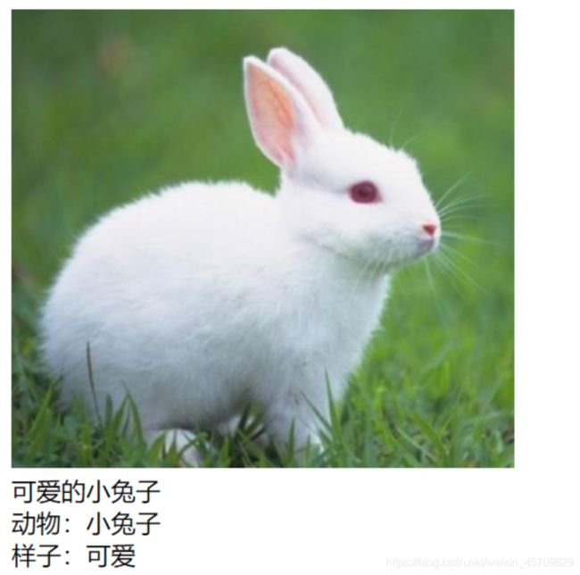
那么现在,我想把文字"可爱的小兔子"放在空盒子tipBg图片上面怎么办?用z-index定位。(感受一下层级)
代码展示
<html>
  <head>
      <meta charset="UTF-8">
      <title>z-index定位title>
      <style>
        #content{
          padding: 0px;
          margin: 0px;
          overflow: hidden;
          width: 380px;
          font-size: 12px;
          line-height: 25px;
          border: 2px solid lightpink;
        }/*给div盒子加边框,这样显示更明显*/
        ul,li{
          margin: 0px;
          padding: 0px;
          list-style: none;
        }
        /*父级元素相对定位*/
        #content ul{
          position: relative;
        }
        .tipText,.tipBg{
          position: absolute;/*子元素绝对定位*/
          width: 380px;
          height: 25px;
          top: 216px;
        }
          /*tipText显示在tipBg上面*/
        .tipText{
          color: magenta;
          z-index: 999;/*数值设置999,层级显示在最上面*/
        }
        .tipBg{
          background: rgb(8, 8, 8);
        }/*tipBg空盒子设置背景,方便显示*/
      style>
  head>
  <body>
    <div id="content">
       <ul>
         <li><img src="C:\Users\Gabrielle\Desktop\bg.png" alt="背景图片">li>
         <li class="tipText">可爱的小兔子li>
         <li class="tipBg">li>
         <li>动物:小兔子li>
         <li>样子:可爱li>
       ul>
    div>
  body>

html>
效果展示

玩一下测试代码,如果上面的代码z-index设置小的数值,会发生什么?
<html>
  <head>
      <meta charset="UTF-8">
      <title>z-index定位title>
      <style>
        #content{
          padding: 0px;
          margin: 0px;
          overflow: hidden;
          width: 380px;
          font-size: 12px;
          line-height: 25px;
          border: 2px solid lightpink;
        }/*给div盒子加边框,这样显示更明显*/
        ul,li{
          margin: 0px;
          padding: 0px;
          list-style: none;
        }
        /*父级元素相对定位*/
        #content ul{
          position: relative;
        }
        .tipText,.tipBg{
          position: absolute;
          width: 380px;
          height: 25px;
          top: 216px;
        }
        .tipText{
          color: magenta;
          z-index: 0;/*数值设置为0,层级显示在最下面*/
        }
        .tipBg{
          background: rgb(8, 8, 8);
        }
      style>
  head>
  <body>
    <div id="content">
       <ul>
         <li><img src="C:\Users\Gabrielle\Desktop\bg.png" alt="背景图片">li>
         <li class="tipText">可爱的小兔子li>
         <li class="tipBg">li>
         <li>动物:小兔子li>
         <li>样子:可爱li>
       ul>
    div>
  body>

html>
效果展示(文字"可爱的小兔子"被覆盖,因为层级显示在最下面)

z-index取值
1 关键字:auto
2 数值:任意整数(正数,负数,0)
z-index取值作用
1 z-index默认值是auto,不建立新的层叠上下文
2 z-index取数值的时候,有两个作用
- 当前元素建立一个层叠上下文,即告诉浏览器这里出现了层叠,考虑分层
- 告诉浏览器当前的元素在层叠上下文的位置,方便元素的显示顺序。
z-index使用规则
1 只有position为relative,absolute,fixed的元素,z-index属性才起作用。
2 z-index遵循从父原则,当父元素和子元素同时设置z-index的时候,以父级元素的z-index为准。
3 一般设置-1,0,1
4 z-index数值为负的时候,不能脱离层叠上下文
三 后话
前端css需要掌握的重难点之一就是定位,其实也很简单,z-index是最简单的,也是最难去理解的。前端三件套中css需要熟练掌握的有css选择器,css定位,css盒子模型等。我们都知道,在写简历的时候,有了解,熟悉,熟练,掌握,精通五个等级。希望每个技术都能熟练掌握吧。css代码可以多写多玩,然后发现问题,接着解决问题,这样学习就很快。
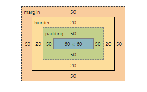
前端css盒子模型(box model)
一 盒子模型分类

标准模型
(1)标准模型基本概念

(2)模型标准默认box-sizing:content-box,由四部分组成
- 内容区域content:一般设置的width和height指的是这个内容的宽度和高度
- 内边距区域padding:内容和边框之间的距离
- 边框border:指的就是边框
- 外边距区域margin:区分开相邻的元素
盒子总宽度/高度=width/height+padding+border+margin
盒子实际内容content的width宽度/height高度 = 程序员设置的width宽度/height高度
元素内容占据的空间大小由width属性设置的,而border和padding是另外计算的
(3)举个例子代码展示
<html>
  <head>
      <meta charset="UTF-8">
      <title>标准盒模型title>
      <style>
         *{
          margin: 0px;
          padding: 0px;
        }
        .box{
        box-sizing: content-box;/*指定盒子类型*/
        width:200px;
        height:200px;
        border:20px solid rgb(243, 106, 170);
        padding:50px;
        margin:50px;
        }
      style>
  head>
  <body>
    <div class="box">div>
  body>

html>
效果展示

在浏览器,右键在开发者工具找到检查功能,可以看到标准盒子模型

可以计算总宽度width = width+padding+border+margin = 200px+50px+20px+50px = 320px
IE盒子模型(怪异盒模型)
(1) IE盒子模型基本概念

(2)IE盒模型box-sizing:border-box,也是由四部分组成
- 内容区域content:一般设置的width和height指的是这个内容的宽度和高度
- 内边距区域padding:内容和边框之间的距离
- 边框border:指的就是边框
- 外边距区域margin:区分开相邻的元素
IE盒子模型浏览器的width属性不是内容border的宽度,而是内容content+内边距padding+边框border
IE盒子模型的内容content包括边框border和内边距padding
盒子总宽度/高度=width/height +margin = 内容区宽度/高度+padding+border+margin.
(3)在上面的代码例子中,稍作改动就可以了
<html>
  <head>
      <meta charset="UTF-8">
      <title>IE盒模型title>
      <style>
         *{
          margin: 0px;
          padding: 0px;
        }
        .box{
        box-sizing: border-box;/*指定盒子类型*/s
        width:200px;
        height:200px;
        border:20px solid rgb(243, 106, 170);
        padding:50px;
        margin:50px;
        }
      style>
  head>
  <body>
    <div class="box">div>
  body>
html>
效果展示(可以在自己的电脑上跑代码,盒子明显比上一个小)

可以计算总宽度width = 180px
IE盒模型和标准盒模型的区别
- 总宽度计算不一样。标准盒子模型总宽度/高度width/height = width/height+padding+border+margin ,IE盒模型盒子总宽度/高度=width/height +margin = 内容区宽度/高度+padding+border+margin.
- content包含的内容不一样。标准盒模型content不包含其他部分,IE盒模型content包含padding和border。
- 程序员设置的宽度/高度含义不一样。标准盒模型content的width/height等于我们设置的width/height,对IE盒模型来说,我们设置的width/heght包括content+padding+border的width/height。
二 标准盒模型和IE盒模型的兼容性问题
在前端开发中的建议不要给元素添加具有指定宽度的内边距padding,而是尝试将内边距或外边距添加到元素的父元素和子元素。
/*box-sizing属性匹配某个特定区域的特定元素*/
/*
box-sizing:content-box
box-sizing:border-box
box-sizing:inherit 继承父元素box-sizing的属性值
*/
三 css盒模型其他需要了解的知识
Q1:什么元素可以设置width宽度和height高度?
A1:只设置一个width/heigth的话,相当于另一个属性值auto。只有块级元素和内联块元素可以设置宽度和高度。
Q2:内联元素和块级元素有哪一些?
A2:块级元素:div、p、h1~h6、ol、ul、dl、li、dd、table、form
内联元素:a、br、i、img、input、label、select、span、textarea
内联块元素(内联元素,但是可以设置width、height):img input
Q3:元素变成块级元素,可以设置宽度和高度吗?
A3:可以!
- border边框
/*
border 属性 属性值
border-width
border-style: none|solid|dashed
border-color:颜色|transparent(透明)
*/
/*
border一般都合并
border:宽度 样式 颜色
*/
/*
不同的方向,top开始顺时针到left
border-top
border-right
border-bottom
border-left
*/
- padding 内边距
attention:padding不能为负值,padding会改变盒子的高度和宽度
/*
padding: 值10                 // 4个方向都是值10
padding: 值10 值20             // top+bottom=10 right+left=20
padding: 值1 值2 值3         // top=10 right+left=20 bottom=30
padding: 值1 值2 值3 值4     // top=10 right=20 bottom=30 left=40
*/
- margin 外边距
attention:默认html块级元素都存在margin,比如body(body默认有8px的margin),h1~h6,可以声明这些元素的margin去覆盖默认样式。
margin:auto
- 水平居中显示
- 交给浏览器来计算外边距
- 相对于父元素居中
/*
margin: 值10                 // 4个方向都是值10
margin: 值10 值20             // top+bottom=10 right+left=20
margin: 值1 值2 值3         // top=10 right+left=20 bottom=30
margin: 值1 值2 值3 值4     // top=10 right=20 bottom=30 left=40
*/
四 后记
css盒子模型是前端开发中最重要的一部分,很多时候开发遇到的难题,都是因为对盒子模型理解不够透彻。
BFC原理详细剖析整理
一 需要的知识储备
我们在web网页中看到的是二维平面的结构,但实际上在css抽象中,所有的元素都存在于一个三维空间中,拥有x轴,y轴,z轴(垂直于终端显示设备),用processon画了一个图,方便理解。

Q:web网页我们看到的是二维的(x轴,y轴),那么css元素三维多了z有什么作用?代表什么含义呢?
A:这里我们可以引出一个概念"层叠上下文"。
1.1 层叠上下文(Stacking Context)
层叠上下文在上一篇博客介绍css定位的时候有详细介绍,不懂的可以去翻上一篇博客哦!
官方解释概念就是将HTML元素沿着其相对于用户的一条虚构的z轴排列开。说人话就是html的元素中地位较高的元素称为层叠上下文元素。大部分元素在底层,垂直距离用户很远,但有部分元素在元素中地位比较高,垂直距离用户更近一点。
1.2 层叠水平(Stacking Level)
层叠水平决定了一个层叠上下文的z轴顺序。层叠水平越高,在z轴位置相对靠前,元素距离用户就越近。是不是感觉和z-index很像,这两者并不是一个东西。
Q:层叠水平和z-index有什么区别?
A:作用范围不一样。层叠水平作用范围是所有html元素。z-index作用脱离正常文档流的定位元素和flexbox元素。
1.3 层叠顺序(Stacking Order)
元素在z轴上面的排列顺序,元素盒子在层叠上下文的顺序依次是
这张图在上一篇博客介绍层叠上下文的时候也出现过。

- 背景和边框(background/border)
- 负z-index值
- 块级盒子
- 浮动盒子
- 行内盒子(inline-box)
- z-index值为0的元素
- 正z-index值
二 BFC原理详细清晰剖析
在了解BFC是什么玩意儿之前,我们先来了解FC。
Q:什么是FC?
A:FC = Formatting Context = 格式化上下文。
2.1 Formatting Context 简单介绍
Formatting context是W3C CSS2.1规范中的一个概念。它是页面中的一块渲染区域,并且有一套渲染规则,它决定了其子元素将如何定位,以及和其他元素的关系、相互作用。最常见的 Formatting context 有 Block fomatting context (简称BFC)和 Inline formatting context(简称IFC)。除此之外,css3中增加了G(Gird)FC和F(Flex)FC。
2.2 BFC和IFC
Q1:BFC和IFC是什么?
A1:BFC是Block Formatting Context 块格式化上下文,IFC是Inline Formatting Context 行内格式化上下文。分别对应CSS盒模型的块盒子和内联盒子。
- BFC简单介绍
在BFC中,盒子在垂直方向一个接着一个放置,从包含块的顶部开始。兄弟盒子之间的距离由margin属性决定。同一个快格式化上下文中的相邻块盒子之间的垂直外边距会合并。
- IFC简单介绍
在IFC中,盒子在水平方向一个接着一个放置,从包含块的顶部开始这些盒之间的水平外边距,边框和内边距都有效。盒可能会以不同的方式垂直对齐:以它们的底部或者顶部对齐,或者以它们里面的文本的基线对齐。包含来自同一行的盒的矩形区域叫做行框。
2.3 BFC定义
BFC是一块独立的渲染区域,只有Block-Level box参与,它规定了内部的Block-Level Box是如何布局的,与这个区域外的毫不相干。
2.4 BFC触发
CSS2.1中规定满足下列CSS声明之一的元素便会触发BFC
- 根元素或包含根元素的元素
- 浮动元素(元素的 float 不是 none)
- 绝对定位元素(元素的 position 为 absolute 或 fixed)
- 行内块元素(元素的 display 为 inline-block)
- 表格单元格(元素的 display为 table-cell,HTML表格单元格默认为该值)
- 表格标题(元素的 display 为 table-caption,HTML表格标题默认为该值)
- 匿名表格单元格元素(元素的 display为 table、table-row、 table-row-group、table-header-group、table-footer-group(分别是HTML table、row、tbody、thead、tfoot的默认属性)或 inline-table)
- overflow 值不为 visible 的块元素
- display 值为 flow-root 的元素
- contain 值为 layout、content或 strict 的元素
- 弹性元素(display为 flex 或 inline-flex元素的直接子元素)
- 网格元素(display为 grid 或 inline-grid 元素的直接子元素)
- 多列容器(元素的 column-count 或 column-width 不为 auto,包括 column-count 为 1)
- column-span 为 all 的元素始终会创建一个新的BFC,即使该元素没有包裹在一个多列容器中(标准变更,Chrome bug)。
2.5 BFC约束规则
- 内部的box在垂直方向一个接着一个放置
- BFC是web页面上一个独立隔离开的容器container
- 属于同一个BFC的两个相邻Box的margin会发生塌陷(即重叠),与方向无关
- 垂直方向上的距离由margin决定
- BFC的区域不会与float的元素区域重叠
- 计算BFC的高度要加上浮动子元素的高度
- 每个元素的左margin与包含块的左边界相接触,包括浮动元素。
- BFC中的子元素不会超过他的包含块。(与position:absolute不同,这个属性可以超过它的包含块。)
2.6 BFC在布局中的应用
-
防止margin塌陷(重叠)
(1)两个相邻box垂直方向margin重叠
参考规则:属于同一个BFC的两个相邻Box的margin会发生塌陷(即重叠),与方向无关。
代码展示
<html>
  <head>
      <meta charset="UTF-8">
      <title>相邻box垂直方向margin塌陷title>
      <style>
       .p{
         width: 200px;
         height: 50px;
         margin: 50px 0px;
         background-color: pink;
       }
      style>
  head>
  <body>
    <div class="p">div>
    <div class="p">div>

  body>

html>
效果展示(两个盒子垂直方向重叠,垂直方向的距离由margin决定)
Q:为什么会发生塌陷(重叠)?怎么避免?
A:根据BFC规则,它们同属于一个BFC+相邻两个box+上下margin会发生重叠。在上面的代码中,两个div都同属于根元素body。让这两个元素属于不同的BFC,就能避免外边距重叠。
避免相邻盒子box塌陷
代码展示
<html>
  <head>
      <meta charset="UTF-8">
      <title>避免相邻box垂直方向margin塌陷title>
      <style>
        .wrap{
          overflow: hidden;
        }
       .p{
         width: 200px;
         height: 50px;
         margin: 50px 0px;
         background-color: pink;
       }
      style>
  head>
  <body>

    <div class="p">div>
        <div class="wrap">
          <div class="p">div>
        div>

  body>

html>
效果展示(塌陷消失)

(2)相邻Box水平方向margin重叠
代码展示
<html>
<head>
<meta charset="UTF-8">
<title>相邻box水平方向margin塌陷title>
<style >
    body {
        writing-mode:tb-rl;
    }

      #green{
        background: rgb(178, 235, 178);
        margin: 10px;
        width: 100px;
        height: 100px;
      }
      #blue{
        background: rgb(141, 182, 243);
        margin: 10px;
        width: 100px;
        height: 100px;
      }
      #pink{
        background: lightpink;
        margin: 10px;
        width: 100px;
        height: 100px;
      }
style>
head>
<body>

<div id="green" >div>
<div id="blue" >div>
<div id="pink" >div>

body>
html>
效果展示(水平方向margin塌陷)
解决方案:同理,与垂直方向margin塌陷处理方式一样。div加个display:inline-block,触每个div容器生成一个BFC。那么三个DIV便不属于同一个BFC。就不会发生margin重叠了。
代码展示
<html>
<head>
<meta charset="UTF-8">
<title>解决相邻box水平margin塌陷title>
<style >
    body {
        writing-mode:tb-rl;
    }

      #green{
        background: rgb(178, 235, 178);
        margin: 10px;
        width: 100px;
        height: 100px;
        display: inline-block;/*此行代码可以防止水平方向margin塌陷*/
      }
      #blue{
        background: rgb(141, 182, 243);
        margin: 10px;
        width: 100px;
        height: 100px;

      }
      #pink{
        background: lightpink;
        margin: 10px;
        width: 100px;
        height: 100px;

      }
style>
head>
<body>

<div id="green" >div>
<div id="blue" >div>
<div id="pink" >div>

body>
html>
效果展示

- 清除内部浮动
参考规则:计算BFC的高度要加上浮动子元素的高度。
正常情况下,浮动的元素脱离标准文档流,外层的div无法包含内部浮动的div
举个例子,代码展示
<html>
<head>
<meta charset="UTF-8">
<title>外部容器不触发BFCtitle>
<style>
.container{
  border: 2px solid black;
}
.box{
  width: 300px;
  height: 300px;
  background: blueviolet;
  float: left;/*设置浮动*/
}
style>

head>
<body>
<div class="container">
  <div class="box">div>
div>
body>
html>
效果展示(外层div无法包含内部浮动的div)

根据参考规则,触发外部div容器conainer的BFC,外部容器就可以包裹内部浮动元素
代码展示
<html>
<head>
<meta charset="UTF-8">
<title>外部容器触发BFCtitle>
<style>
.container{
  border: 2px solid black;
  overflow: hidden;/*触发BFC*/
}
.box{
  width: 300px;
  height: 300px;
  background: blueviolet;
  float: left;/*设置浮动*/
}
style>

head>
<body>
<div class="container">
  <div class="box">div>
div>
body>
html>
效果展示(外部容器包含内部浮动元素)
- BFC阻止浮动元素被覆盖,自适应两栏布局。
参考规则:每个元素的左margin与包含块的左边界相接触。
参考规则:BFC的区域不会与float的元素区域重叠,包括浮动元素。
代码展示
<html>
<head>
<meta charset="UTF-8">
<title>触发BFCtitle>
<style>
body{
  width: 400px;
  position: relative;
}
.aside{
  width: 100px;
  height: 150px;
  float: left;/*浮动元素*/
  background: lightpink;
}
.main{
  overflow:hidden;/*触发BFC生成*/
  height: 200px;
  background: lightskyblue;
}
style>

head>
<body>
<div class="aside">div>
<div class="main">div>
body>
html>
效果展示(形成自适应两栏布局)

attention:以上所有的例子都在说明BFC一个规则,BFC是一个独立隔离的容器,里面的子元素不会影响到外面的元素。
三 后话
深入理解BFC是熟练掌握css布局方式的知识储备。前面的一篇博客详细整理了一些css的重要内容。css的知识内容看起来很简单,但是要理解透彻,深入原理去理解的零碎知识很多,希望每一个以后想要往前端方向走的程序员都能意识到css的重要性。学习是一个贵在坚持的过程,特别是对于技术的理解,必须要深入底层去理解它。就好像让每一个程序员头大的汇编语言一样,它是底层与硬件打交道的语言,能深入理解计算机底层硬件的原理,在debug过程中就会容易很多。瞎扯了这么多,我的汇编语言也学的马马虎虎,“这是人学的东西吗?”,在我这学期学习计算机组成原理和汇编语言的时候总有这个疑惑。anyway希望自己能坚持学习技术吧。毕竟现在越来越多的人涌入互联网计算机,真的很卷,那么希望自己不要还没毕业就已经被卷走吧。希望大家都能打通底层逻辑,搞好顶层设计,抓手有力,闭环不漏气,找到自己的方法论。
css常见布局方式
一 前言
在上一篇博客中详细总结整理了css的重难点和必须掌握的知识储备,就是为了能深刻理解css的常见布局方式,这是web页面布局中很重要的一环,页面布局由很多种方式,这篇来详细介绍整理css的多种布局方式。
二 常见布局方式
1 弹性盒子模型flex布局(一维布局)
1.1 弹性布局
Flexible Box“弹性布局”,弹性盒子模型提供布局最大的灵活性。
在上篇笔记整理了标准盒模型的布局模式,标准盒模型是通过盒模型的大小和位置来决定浏览器如何把HTML元素渲染到web页面的。默认的渲染规则确定了各自的位置,所以不管是位置还是大小都是确定的,不可以改变,因此标准盒模型布局灵活性很差,只要改变viewport,这个布局就会乱套。相比标准盒模型布局,弹性盒子模型布局方式灵活。
Q:为什么弹性盒子布局灵活性很高?
A:因为flexbox描述的不是盒模型的大小,而是一种弹性布局的特征。flexbox描述的是父元素和子元素的相对位置关系,并不是规定他们的具体大小。描述的规则决定了它本身的灵活性很高。
1.2 弹性盒子布局模型的两部分组成
- 父元素:Flex容器(Flex Container)
- 子元素:Flex项目(Flex Item)
1.3 Flexbox模型(图来源于网络)

- flex container/flex item:flex container是flex布局的起点。
- 主轴/侧轴:重要,标明了flex-item在flex container中如何排列。flex-item按照主轴的方向进行排列。当我们规定哪一条是主轴的时候,另一条侧轴就自然而然规定了。
- 主方向/侧方向:重要,正方向规定主轴和侧轴延伸的方向。
- 主轴起点/主轴终点/侧轴起点/侧轴终点:有长度自然有坐标轴,也就自然有起点和终点。
- 主轴长度/侧轴长度:主轴/侧轴container的长度
1.4 flexbox经典三栏布局
代码展示
<html>
<head>
<meta charset="UTF-8">
<title>flexbox经典三栏布局title>
<style>
  body{
  margin: 40px;
  padding: 40px;
  }/*body给个外边距和内边距,便于撑开,更能看清楚布局*/
.container{
  display: flex;
  width: 300px;
  height: 300px;
}
.left{
  background-color: lightpink;
  text-align: center;
  line-height: 300px;
  flex: 1;
}
.middle{
  background-color: lightskyblue;
  text-align: center;
  line-height: 300px;
  flex: 1;
}
.right{
  background-color: lightseagreen;
  text-align: center;
  line-height: 300px;
  flex: 1;
}
style>

head>

<body>
<div class="container">
  <div class="left">我是左边栏div>
  <div class="middle">我是中间栏div>
  <div class="right">我是右边栏div>
div>

body>
html>
效果展示

但是有时候,我们看到的大多数页面布局左中右不是平均的,而是左右小,中间宽的布局方式,那么应该怎么调整呢?这时候需要我们写代码的时候,让中间栏的布局自适应去调整宽度。
代码展示
<html>
<head>
<meta charset="UTF-8">
<title>title>
<style>
  body{
    margin: 40px;
    padding: 40px;
  }
.container{
  display: flex;
  width: 300px;
  height: 300px;
}
.left{
  background-color: lightpink;
  text-align: center;
  line-height: 300px;
  width: 30px;
}
.middle{
  background-color: lightskyblue;
  text-align: center;
  line-height: 300px;
  flex: 1;
}
.right{
  background-color: lightseagreen;
  text-align: center;
  line-height: 300px;
  width: 30px;
}
style>

head>

<body>
<div class="container">
  <div class="left">左div>
  <div class="middle">中div>
  <div class="right">右div>
div>

body>
html>
效果展示

1.5 父元素flex属性(display:flex)
- flex-direction:表示布局的方向,子项目item的排列方向
row 				 // 行,从左向右
row-reverse 		 // 行,从右向左
colunm			 	//列,从上到下
colum-reverse 		// 列,从下到上
(1)设计测试代码flex-direction:row
<html>
<head>
<meta charset="UTF-8">
<title>flex-direction:rowtitle>
<style>
body{
  margin: 20px;
  padding: 20px;
}
ul{
  display: flex;
  flex-direction: row;/*item排列方向*/
  border: 2px solid lightskyblue;
}
li{
  width: 100px;
  height: 100px;
  background-color: lightpink;
  margin: 10px;
  list-style: none;
}
.item1,.item2,.item3{
  font-size: 40px;
  text-align: center;
  line-height: normal;
}

style>

head>

<body>
<ul class="container">
  <li class="item1">1li>
  <li class="item2">2li>
  <li class="item3">3li>
ul>
body>
html>
效果展示
(2)设计测试代码flex-direction:row-reverse
<html>
<head>
<meta charset="UTF-8">
<title>flex-direction:row-reversetitle>
<style>
body{
  margin: 20px;
  padding: 20px;
}
ul{
  display: flex;
  flex-direction: row-reverse;/*item排列方向*/
  border: 2px solid lightskyblue;
}
li{
  width: 100px;
  height: 100px;
  background-color: lightpink;
  margin: 10px;
  list-style: none;
}
.item1,.item2,.item3{
  font-size: 40px;
  text-align: center;
  line-height: normal;
}

style>

head>

<body>
<ul class="container">
  <li class="item1">1li>
  <li class="item2">2li>
  <li class="item3">3li>
ul>
body>
html>
效果展示

(3)设计测试代码flex-direction:colunm
<html>
<head>
<meta charset="UTF-8">
<title>flex-direction:colunmtitle>
<style>
body{
  margin: 20px;
  padding: 20px;
}
ul{
  display: flex;
  flex-direction: column;/*item排列方式*/
  border: 2px solid lightskyblue;
}
li{
  width: 100px;
  height: 100px;
  background-color: lightpink;
  margin: 10px;
  list-style: none;
}
.item1,.item2,.item3{
  font-size: 40px;
  text-align: center;
  line-height: normal;
}

style>

head>

<body>
<ul class="container">
  <li class="item1">1li>
  <li class="item2">2li>
  <li class="item3">3li>
ul>
body>
html>
效果展示

(4)设计测试代码flex-direction:colunm-reverse
<html>
<head>
<meta charset="UTF-8">
<title>flex-direction:colunm-reversetitle>
<style>
body{
  margin: 20px;
  padding: 20px;
}
ul{
  display: flex;
  flex-direction: column-reverse;/*item排列方式*/
  border: 2px solid lightskyblue;
}
li{
  width: 100px;
  height: 100px;
  background-color: lightpink;
  margin: 10px;
  list-style: none;
}
.item1,.item2,.item3{
  font-size: 40px;
  text-align: center;
  line-height: normal;
}

style>

head>

<body>
<ul class="container">
  <li class="item1">1li>
  <li class="item2">2li>
  <li class="item3">3li>
ul>
body>
html>
效果展示:发现没1,2,3顺序逆序了

- flex-wrap:表示子项目是否会换行,默认换行
nowrap	 		//不换行
wrap 			//换行
wrap-reverse 	//反向换行
(1)设计测试代码flex-wrap:nowrap
<html>
<head>
<meta charset="UTF-8">
<title>flex-wrap:nowraptitle>
<style>
body{
  margin: 20px;
  padding: 20px;
}
ul{
  display: flex;
  flex-wrap: nowrap;/*不换行*/
  border: 2px solid lightskyblue;
}
li{
  width: 200px;
  height: 200px;
  background-color: lightpink;
  margin: 10px;
  list-style: none;
}
.item1,.item2,.item3,.item4,.item5,.item6,.item7,.item8,.item9,.item10{
  font-size: 40px;
  text-align: center;
  line-height: normal;
}

style>

head>

<body>
<ul class="container">
  <li class="item1">1li>
  <li class="item2">2li>
  <li class="item3">3li>
  <li class="item4">4li>
  <li class="item5">5li>
  <li class="item6">6li>
  <li class="item7">7li>
  <li class="item8">8li>
  <li class="item9">9li>
  <li class="item10">10li>
ul>
body>
html>
效果展示
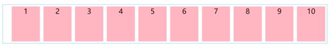
(2)设计测试代码flex-wrap:wrap
<html>
<head>
<meta charset="UTF-8">
<title>flex-wrap:wraptitle>
<style>
body{
  margin: 20px;
  padding: 20px;
}
ul{
  display: flex;
  flex-wrap: wrap;/*换行*/
  border: 2px solid lightskyblue;
}
li{
  width: 200px;
  height: 200px;
  background-color: lightpink;
  margin: 10px;
  list-style: none;
}
.item1,.item2,.item3,.item4,.item5,.item6,.item7,.item8,.item9,.item10{
  font-size: 40px;
  text-align: center;
  line-height: normal;
}

style>

head>

<body>
<ul class="container">
  <li class="item1">1li>
  <li class="item2">2li>
  <li class="item3">3li>
  <li class="item4">4li>
  <li class="item5">5li>
  <li class="item6">6li>
  <li class="item7">7li>
  <li class="item8">8li>
  <li class="item9">9li>
  <li class="item10">10li>
ul>
body>
html>
效果展示

(3)设计测试代码flex-wrap:wrap-reverse
<html>
<head>
<meta charset="UTF-8">
<title>flex-wrap:wrap-reversetitle>
<style>
body{
  margin: 20px;
  padding: 20px;
}
ul{
  display: flex;
  flex-wrap: wrap-reverse;/*逆序换行*/
  border: 2px solid lightskyblue;
}
li{
  width: 200px;
  height: 200px;
  background-color: lightpink;
  margin: 10px;
  list-style: none;
}
.item1,.item2,.item3,.item4,.item5,.item6,.item7,.item8,.item9,.item10{
  font-size: 40px;
  text-align: center;
  line-height: normal;
}

style>

head>

<body>
<ul class="container">
  <li class="item1">1li>
  <li class="item2">2li>
  <li class="item3">3li>
  <li class="item4">4li>
  <li class="item5">5li>
  <li class="item6">6li>
  <li class="item7">7li>
  <li class="item8">8li>
  <li class="item9">9li>
  <li class="item10">10li>
ul>
body>
html>
效果展示

- justify-content(控制主轴水平对齐方式)
flex-start 		//默认值,位于开头
flex-end		//位于结尾
center 			//位于中心
space-between 	//item间相同空白space,边框无间距
space-around 	//子item两边间距相同,子item间间距相同,子item到边框间距是item的1/2
- align-item(控制侧轴垂直对齐方式)
stretch //默认值,元素被拉伸去适应父容器。如果指定侧轴大小的属性值为'auto',则其值会使项目的边距盒的尺寸尽可能接近所在行的尺寸,但同时会遵照'min/max-width/height'属性的限制
center //位于中心
flex-start //默认值,位于开头
flex-end //位于结尾
baseline //以基线对齐,行内轴,侧轴重合时和flex-start一致
- align-content(控制侧轴对齐方式)
stretch	          // 默认值, 拉伸以适应容器。各行将会伸展以占用剩余的空间,剩余空间是负数,等效于'flex-start'
center	          // 位于中心,以横轴为对齐单元,如果剩下的空间是负数,则各行会向两个方向溢出的相等距离 !
flex-start	      // 位于开头
flex-end	      // 位于结尾
space-between	  // 行之间相同空白,紧贴边框
space-around      // 行之间相同空白,到边框保留距离,是其他空间的一半
1.6 子元素属性(方向,尺寸,对齐)
flex-item宽度计算方式
与计算相关的属性flex-grow、flex-shrink、flex-basis,先要明白两个概念
一个是flex容器剩余空间,还有一个是flex容器不足空间
- flex容器剩余空间:是指放置了flex子元素之后,还剩下的空间。
- flex容器不足空间:是指flex容器的宽度不够,子元素超出容器的部分。
再来了解属性flex-grow针对剩余空间而言,flex-shrink针对不足空间而言。
-
order:定义排列顺序,数值越小排越前面。默认值0,必须为整数不能为小数,可以为负数。
-
flex-basis:给元素设置一个基准的宽度,与width,max-width,min-width有关
-
flex-grow:盒子模型的扩展比率会按照flex-grow计算,默认值0,不进行扩展宽度会自适应。其他的盒子模型宽度会在父级宽度减去flex-basis后,再进行flex-grow宽度计算。
[外链图片转存失败,源站可能有防盗链机制,建议将图片保存下来直接上传(img-JibMkzJg-1618148134779)(C:\Users\Gabrielle\Desktop\字.jpg)]
-
flex-shrink:依次按照默认值1计算,所在因子相加后,计算压缩比来进行空间的压缩。
[外链图片转存失败,源站可能有防盗链机制,建议将图片保存下来直接上传(img-VGRrMpvY-1618148134780)(C:\Users\Gabrielle\Desktop\字2.jpg)]
-
flex: flex-grow flex-shrink flex-basis 简写
flex: auto | initial | none | 2 ;    // 为auto的盒子,会均分没有flex属性盒子模型之外的盒子
flex: 2 | 2px ;                      // 无单位表示 flex-grow, 有单位表示 flex-basis .
flex: 1 30px | 2 2 ;                 // flex-grow flex-basis || flex-grow flex-shrink .
flex: 2 2 20% ;                      // flex-grow flex-shrink flex-basis .
- align-self:定义flex的单项,在侧轴(纵轴)方向上的对齐方式,独立于侧轴对齐方式
取值情况 :
normal stretch ; 撑开
center         ; 居中
flex-end flex-start left right start end ; 各种正常取值
baseline       ; 基线
2 网格grid布局(二维布局)
2.1 grid网格布局
对于二维布局来说,则没有主轴和侧轴之分,子元素的排列方式不是沿着某一条坐标轴排列的。grid布局是一种典型的二维布局方式。可以将父元素比作一个个的格子,子元素是一个个格子里面填充的内容。优势是可以布置各种奇奇怪怪大大小小的元素。
2.2 grid组成和基本的概念
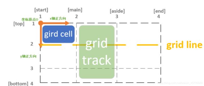
- 网格容器(grid container)/网格项目(grid item)
- 网格线(grid line)/网格轨道(grid tracks)
- 网格单元格(grid cell)
- 网格区域(grid area)/合并单元格
grid模型(做一个搬运工,从网络上找的图)
和坐标轴平行的虚拟的直线叫做网格线(grid line)。网格线的起点都是从坐标原点开始的(不管是水平还是垂直。任意两条网格线之间的区域称为网格轨道(grid tracks)。网格单元格是grid布局的基本单位,每个网格项目(grid item)都要填充到单元格里面。

2.3 Grid相关属性(display:grid)
Grid属性分类:容器container属性+项目item属性
container容器属性
(1)display属性—创建网格容器grid container
- display:grid—该容器元素为块级元素
- display:inline-grid—该容器元素为行内元素
(2)grid-template-rows|grid-template-columns属性—控制grid container容器划分单元格,grid-template-rows设置行高,grid-template-columns设置列宽。
//grid-template-rows 定义每一行的行高
//grid-template-columns 定义每一列的列宽
举个栗子测试代码更好的理解属性
<html>
<head>
<meta charset="UTF-8">
<title>title>
<style>
body{
  margin: 20px;
  padding: 20px;
}
.wrapper{
  margin: 0px;
  display: grid;
  grid-template-columns: 200px 100px 200px;/*声明三列,宽度分别为200px 100px 200px*/
  grid-gap: 5px;
  grid-template-rows: 50px 40px;/*声明两行,行高分别是50px 40px*/
}
.item1{
  background:lightpink;
}
.item2{
  background: lightskyblue;
}
.item3{
  background: lightslategray;
}
.item4{
  background: lightgreen;
}
.item5{
  background:lightsalmon;
}
.item6{
  background: magenta;
}
.item1,.item2,.item3,.item4,.item5,.item6{
  font-size: 30px;
  text-align: center;
  line-height: normal;
}
style>

head>

<body>
<div class="wrapper">
  <div class="item1">1div>
  <div class="item2">2div>
  <div class="item3">3div>
  <div class="item4">4div>
  <div class="item5">5div>
  <div class="item6">6div>
div>
body>
html>
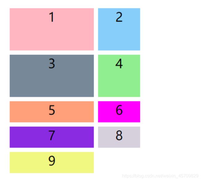
效果展示

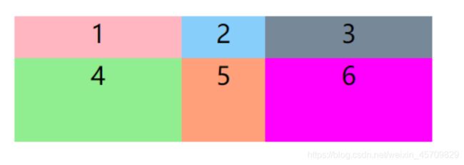
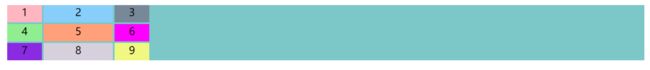
再举个栗子(三行三列的表格)
<html>
<head>
<meta charset="UTF-8">
<title>title>
<style>
body{
  margin: 20px;
  padding: 20px;
}
ul{
  display: grid;
  grid-template-columns: 100px 100px 100px;
  grid-template-rows: 100px 100px 100px;
  width: 350px;
  border: 2px solid lightskyblue;
}
li{
  background-color: lightpink;
  margin: 10px;
  list-style: none;
}
.item1,.item2,.item3,.item4,.item5,.item6,.item7,.item8,.item9{
  font-size: 40px;
  text-align: center;
  line-height: normal;
}

style>

head>

<body>
<ul class="container">
  <li class="item1">1li>
  <li class="item2">2li>
  <li class="item3">3li>
  <li class="item4">4li>
  <li class="item5">5li>
  <li class="item6">6li>
  <li class="item7">7li>
  <li class="item8">8li>
  <li class="item9">9li>
ul>
body>
html>
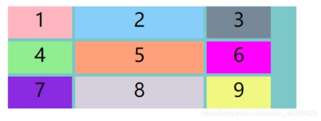
效果展示

(3)repeat()函数—接受两个参数,第一个是重复的次数,第二个是参数重复的值
写个测试代码更好的理解
<html>
<head>
<meta charset="UTF-8">
<title>title>
<style>
body{
  margin: 20px;
  padding: 20px;
}
.wrapper{
  margin: 0px;
  display: grid;
  grid-template-columns: 200px 100px 200px;/*声明三列,宽度分别为200px 100px 200px*/
  grid-gap: 5px;
  grid-template-rows: repeat(2,50px);/*2行,行高都是50px*/
}
.item1{
  background:lightpink;
}
.item2{
  background: lightskyblue;
}
.item3{
  background: lightslategray;
}
.item4{
  background: lightgreen;
}
.item5{
  background:lightsalmon;
}
.item6{
  background: magenta;
}
.item1,.item2,.item3,.item4,.item5,.item6{
  font-size: 30px;
  text-align: center;
  line-height: normal;
}
style>

head>

<body>
<div class="wrapper">
  <div class="item1">1div>
  <div class="item2">2div>
  <div class="item3">3div>
  <div class="item4">4div>
  <div class="item5">5div>
  <div class="item6">6div>
div>
body>
html>
效果展示

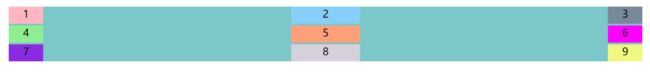
(3)grid-template-columns: repeat(auto-fill, xxxpx)|grid-template-rows: repeat(auto-fill, xxxpx)—表示自动填充,让一列|一行种尽可能的容纳更多的单元格。
.wrapper{
  margin: 0px;
  display: grid;
  grid-template-columns: 200px 100px 200px;/*声明三列,宽度分别为200px 100px 200px*/
  grid-gap: 5px;
  grid-auto-rows:50px;/*行高50px,但是行数不固定,在浏览器能容纳的范围内,尽可能的多填充*/
}
(4)fr关键字—创建灵活的网格轨道。fr表示网格容器中可用空间的一等份。
.wrapper{
  margin: 0px;
  display: grid;
  grid-template-columns: 200px 1fr 2fr;/*表示列宽设置200px,后面剩余的宽度为两部分,分别是剩余宽度的1/3,2/3*/
  grid-gap: 5px;
  grid-auto-rows:50px;/*行高50px,但是行数不固定,在浏览器能容纳的范围内,尽可能的多填充*/
}
(5)minmax()函数—设置网格元素最大最小尺寸。接受两个参数,第一个是最小值,第二个是最大值
.wrapper{
  margin: 0px;
  display: grid;
  grid-template-columns:1fr 1fr minmax(300px 2fr);/*第三个列宽最少200px,最大不能大于第一第二列宽的两倍*/
  grid-gap: 5px;
  grid-auto-rows:50px;/*行高50px,但是行数不固定,在浏览器能容纳的范围内,尽可能的多填充*/
}
(6)auto关键字—由浏览器决定长度。自动伸缩。
.wrapper{
  margin: 0px;
  display: grid;
  grid-template-columns:100px auto 100px;/*第二列根据浏览器自动决定长度*/
  grid-gap: 5px;
  grid-auto-rows:50px;/*行高50px,但是行数不固定,在浏览器能容纳的范围内,尽可能的多填充*/
}
(7)grid-row-gap|grid-column-gap—设置行间距|列间距。grid-gap—两者缩写。
对比两个例子,不写grid-gap和写grid-gap
- 不写grid-gap
<html>
<head>
<meta charset="UTF-8">
<title>title>
<style>
body{
  margin: 20px;
  padding: 20px;
}
.wrapper{
  margin: 0px;
  display: grid;
  grid-template-columns: 200px 100px 200px;
  grid-template-rows: 50px 100px;
}
.item1{
  background:lightpink;
}
.item2{
  background: lightskyblue;
}
.item3{
  background: lightslategray;
}
.item4{
  background: lightgreen;
}
.item5{
  background:lightsalmon;
}
.item6{
  background: magenta;
}
.item1,.item2,.item3,.item4,.item5,.item6{
  font-size: 30px;
  text-align: center;
  line-height: normal;
}
style>

head>

<body>
<div class="wrapper">
  <div class="item1">1div>
  <div class="item2">2div>
  <div class="item3">3div>
  <div class="item4">4div>
  <div class="item5">5div>
  <div class="item6">6div>
div>
body>
html>
效果展示
- 写grid-gap
<html>
<head>
<meta charset="UTF-8">
<title>title>
<style>
body{
  margin: 20px;
  padding: 20px;
}
.wrapper{
  margin: 0px;
  display: grid;
  grid-gap: 10px;/*here*/
  grid-template-columns: 200px 100px 200px;
  grid-template-rows: 50px 100px;
}
.item1{
  background:lightpink;
}
.item2{
  background: lightskyblue;
}
.item3{
  background: lightslategray;
}
.item4{
  background: lightgreen;
}
.item5{
  background:lightsalmon;
}
.item6{
  background: magenta;
}
.item1,.item2,.item3,.item4,.item5,.item6{
  font-size: 30px;
  text-align: center;
  line-height: normal;
}
style>

head>

<body>
<div class="wrapper">
  <div class="item1">1div>
  <div class="item2">2div>
  <div class="item3">3div>
  <div class="item4">4div>
  <div class="item5">5div>
  <div class="item6">6div>
div>
body>
html>
效果展示

(8)grid-template-areas— 控制grid container 划分区域.(每一个区域由一个或者多个单元格组成)
grid-template-areas: 'a b c'
                     'd e f'
                     'g h i';
//如果区域不需要使用,则用.来占位
代码展示(用.表示的区域也会占据空间)
<html>
<head>
<meta charset="UTF-8">
<title>title>
<style>
.sidebar {
  grid-area: sidebar;
}

.content {
  grid-area: content;
}

.header {
  grid-area: header;
}


.wrapper {
  margin: 50px;
  display: grid;
  grid-gap: 10px;
  grid-template-columns: 200px  200px 200px;
  grid-template-areas:
    ". header  header"
    "sidebar content content";
  background-color: rgb(255, 142, 142);
  color: rgb(54, 54, 54);
}
.box {
  background-color: rgb(152, 255, 215);
  color: rgb(90, 90, 90);
  border-radius: 5px;
  padding: 20px;
  font-size: 150%;
}

.header {
  background-color: rgb(180, 165, 247);
}
style>

head>

<body>
  <div class="wrapper">
    <div class="box header">Headerdiv>
    <div class="box sidebar">Sidebardiv>
    <div class="box content">Contentdiv>
  div>
body>
html>
效果展示(用.表示的区域也会占据空间)

(9)grid-auto-flow—控制新增单元的列宽和行宽。自动布局,先行后列原则。先填满第一行再填满第二行。
attention:元素放置顺序grid-auto-flow 控制container里面的item放置顺序
//属性grid-auto-flow
//属性值:colunm|row|dense
//colunm元素按列排列,排列不下就换下一列
//row元素按行排行,排行不下就换下一行
//dense关键字表示将空间尽可能占满
Q:为什么需要它?
A:在布局的时候会面临一个问题,空间不够元素放不下的问题,这时候就需要扩展容器的大小。
知识储备:隐式网格+显式网格
Q1:什么是显式网格?
A1:包含在grid-template-columns 和 grid-template-rows 属性中定义的行和列。
Q2:什么是隐式网格?
A2:在网格定义之外放入别的东西,或者因为内容的数量过多而需要更多的网格轨道的时候,网格将会在隐式网格中创建行和列
- grid-auto-rows
<html>
<head>
<meta charset="UTF-8">
<title>title>
<style>
body{
  margin: 20px;
  padding: 20px;
}
.wrapper{
  display: grid;
  grid-gap: 10px;
  grid-template-rows: 100px 100px;
   /*一共有九个item,但这里只设置了两行,超出的行高会以 grid-auto-rows 算 */
  grid-template-columns: 200px 100px;
  grid-auto-rows: 50px;
}
.item1{
  background:lightpink;
}
.item2{
  background: lightskyblue;
}
.item3{
  background: lightslategray;
}
.item4{
  background: lightgreen;
}
.item5{
  background:lightsalmon;
}
.item6{
  background: magenta;
}
.item7{
  background: blueviolet;
}
.item8{
  background: rgb(214, 208, 221);
}
.item9{
  background: rgb(240, 248, 129);
}
.item1,.item2,.item3,.item4,.item5,.item6,.item7,.item8,.item9{
  font-size: 30px;
  text-align: center;
  line-height: normal;
}
style>

head>

<body>
<div class="wrapper">
  <div class="item1">1div>
  <div class="item2">2div>
  <div class="item3">3div>
  <div class="item4">4div>
  <div class="item5">5div>
  <div class="item6">6div>
  <div class="item7">7div>
  <div class="item8">8div>
  <div class="item9">9div>
div>
body>
html>
效果展示
- grid-auto-colunms同理
小总结
还有需要记住一个容易被忽视的点:内部margin只有左left和上top
//grid-template-rows|grid-template-columns 控制grid container划分单元格
//grid-template-areas 控制grid container 划分区域.(每一个区域由一个或者多个单元格组成)
//grid-auto-flow 控制container里面的item放置顺序
//grid-auto-columns|grid-auto-rows 控制新增单元的列宽和行宽
(9)justify-items—设置水平布局方式(左中右)
.container {
  justify-items: start | end | center | stretch;
}
- justify-items:start
<html>
<head>
<meta charset="UTF-8">
<title>title>
<style>
body{
  margin: 20px;
  padding: 20px;
}
.wrapper{
  display: grid;
  grid-gap: 5px;
  grid-template-columns: 100px 200px 100px;
  grid-auto-rows: 50px;
  justify-items: start;/*对齐单元格的起始边框*/
  background: rgb(124, 199, 199);
  width: 400px;
}
.item1{
  background:lightpink;
}
.item2{
  background: lightskyblue;
}
.item3{
  background: lightslategray;
}
.item4{
  background: lightgreen;
}
.item5{
  background:lightsalmon;
}
.item6{
  background: magenta;
}
.item7{
  background: blueviolet;
}
.item8{
  background: rgb(214, 208, 221);
}
.item9{
  background: rgb(240, 248, 129);
}
.item1,.item2,.item3,.item4,.item5,.item6,.item7,.item8,.item9{
  font-size: 30px;
  text-align: center;
  line-height: normal;
}
style>

head>

<body>
<div class="wrapper">
  <div class="item1">1div>
  <div class="item2">2div>
  <div class="item3">3div>
  <div class="item4">4div>
  <div class="item5">5div>
  <div class="item6">6div>
  <div class="item7">7div>
  <div class="item8">8div>
  <div class="item9">9div>
div>
body>
html>
效果展示
- justify-items:center
<html>
<head>
<meta charset="UTF-8">
<title>title>
<style>
body{
  margin: 20px;
  padding: 20px;
}
.wrapper{
  display: grid;
  grid-gap: 5px;
  grid-template-columns: 100px 200px 100px;
  grid-auto-rows: 50px;
  justify-items: center;/*单元格内部居中*/
  background: rgb(124, 199, 199);
  width: 400px;
}
.item1{
  background:lightpink;
}
.item2{
  background: lightskyblue;
}
.item3{
  background: lightslategray;
}
.item4{
  background: lightgreen;
}
.item5{
  background:lightsalmon;
}
.item6{
  background: magenta;
}
.item7{
  background: blueviolet;
}
.item8{
  background: rgb(214, 208, 221);
}
.item9{
  background: rgb(240, 248, 129);
}
.item1,.item2,.item3,.item4,.item5,.item6,.item7,.item8,.item9{
  font-size: 30px;
  text-align: center;
  line-height: normal;
}
style>

head>

<body>
<div class="wrapper">
  <div class="item1">1div>
  <div class="item2">2div>
  <div class="item3">3div>
  <div class="item4">4div>
  <div class="item5">5div>
  <div class="item6">6div>
  <div class="item7">7div>
  <div class="item8">8div>
  <div class="item9">9div>
div>
body>
html>
效果展示

- justify-items: end
<html>
<head>
<meta charset="UTF-8">
<title>title>
<style>
body{
  margin: 20px;
  padding: 20px;
}
.wrapper{
  display: grid;
  grid-gap: 5px;
  grid-template-columns: 100px 200px 100px;
  grid-auto-rows: 50px;
  justify-items: end;/*对齐单元格的结束边框*/
  background: rgb(124, 199, 199);
  width: 450px;
}
.item1{
  background:lightpink;
}
.item2{
  background: lightskyblue;
}
.item3{
  background: lightslategray;
}
.item4{
  background: lightgreen;
}
.item5{
  background:lightsalmon;
}
.item6{
  background: magenta;
}
.item7{
  background: blueviolet;
}
.item8{
  background: rgb(214, 208, 221);
}
.item9{
  background: rgb(240, 248, 129);
}
.item1,.item2,.item3,.item4,.item5,.item6,.item7,.item8,.item9{
  font-size: 30px;
  text-align: center;
  line-height: normal;
}
style>

head>

<body>
<div class="wrapper">
  <div class="item1">1div>
  <div class="item2">2div>
  <div class="item3">3div>
  <div class="item4">4div>
  <div class="item5">5div>
  <div class="item6">6div>
  <div class="item7">7div>
  <div class="item8">8div>
  <div class="item9">9div>
div>
body>
html>
效果展示

- justify-items: stretch
<html>
<head>
<meta charset="UTF-8">
<title>title>
<style>
body{
  margin: 20px;
  padding: 20px;
}
.wrapper{
  display: grid;
  grid-gap: 5px;
  grid-template-columns: 100px 200px 100px;
  grid-auto-rows: 50px;
  justify-items: stretch;/*容器内部水平拉伸,占满单元格的整个宽度*/
  background: rgb(124, 199, 199);
  width: 450px;
}
.item1{
  background:lightpink;
}
.item2{
  background: lightskyblue;
}
.item3{
  background: lightslategray;
}
.item4{
  background: lightgreen;
}
.item5{
  background:lightsalmon;
}
.item6{
  background: magenta;
}
.item7{
  background: blueviolet;
}
.item8{
  background: rgb(214, 208, 221);
}
.item9{
  background: rgb(240, 248, 129);
}
.item1,.item2,.item3,.item4,.item5,.item6,.item7,.item8,.item9{
  font-size: 30px;
  text-align: center;
  line-height: normal;
}
style>

head>

<body>
<div class="wrapper">
  <div class="item1">1div>
  <div class="item2">2div>
  <div class="item3">3div>
  <div class="item4">4div>
  <div class="item5">5div>
  <div class="item6">6div>
  <div class="item7">7div>
  <div class="item8">8div>
  <div class="item9">9div>
div>
body>
html>
效果展示
(10)align-item—设置垂直布局方式(上中下)
.container {
  align-items: start | end | center | stretch;
}
//place-item是align-item和justify-item合并的写法
与水平布局方式同理。
(11)justify-content—设置内容区域再容器里面的水平位置(左中右)
- justify-content:start
<html>
<head>
<meta charset="UTF-8">
<title>title>
<style>
body{
  margin: 20px;
  padding: 20px;
}
.wrapper{
  display: grid;
  grid-gap: 5px;
  grid-template-columns: 100px 200px 100px;
  grid-auto-rows: 50px;
  justify-content:start;/*对齐容器的起始边框*/
  background: rgb(124, 199, 199);
}
.item1{
  background:lightpink;
}
.item2{
  background: lightskyblue;
}
.item3{
  background: lightslategray;
}
.item4{
  background: lightgreen;
}
.item5{
  background:lightsalmon;
}
.item6{
  background: magenta;
}
.item7{
  background: blueviolet;
}
.item8{
  background: rgb(214, 208, 221);
}
.item9{
  background: rgb(240, 248, 129);
}
.item1,.item2,.item3,.item4,.item5,.item6,.item7,.item8,.item9{
  font-size: 30px;
  text-align: center;
  line-height: normal;
}
style>

head>

<body>
<div class="wrapper">
  <div class="item1">1div>
  <div class="item2">2div>
  <div class="item3">3div>
  <div class="item4">4div>
  <div class="item5">5div>
  <div class="item6">6div>
  <div class="item7">7div>
  <div class="item8">8div>
  <div class="item9">9div>
div>
body>
html>
效果展示

- justify-content:end
<html>
<head>
<meta charset="UTF-8">
<title>title>
<style>
body{
  margin: 20px;
  padding: 20px;
}
.wrapper{
  display: grid;
  grid-gap: 5px;
  grid-template-columns: 100px 200px 100px;
  grid-auto-rows: 50px;
  justify-content:end;/*对齐容器的结束边框*/
  background: rgb(124, 199, 199);
}
.item1{
  background:lightpink;
}
.item2{
  background: lightskyblue;
}
.item3{
  background: lightslategray;
}
.item4{
  background: lightgreen;
}
.item5{
  background:lightsalmon;
}
.item6{
  background: magenta;
}
.item7{
  background: blueviolet;
}
.item8{
  background: rgb(214, 208, 221);
}
.item9{
  background: rgb(240, 248, 129);
}
.item1,.item2,.item3,.item4,.item5,.item6,.item7,.item8,.item9{
  font-size: 30px;
  text-align: center;
  line-height: normal;
}
style>

head>

<body>
<div class="wrapper">
  <div class="item1">1div>
  <div class="item2">2div>
  <div class="item3">3div>
  <div class="item4">4div>
  <div class="item5">5div>
  <div class="item6">6div>
  <div class="item7">7div>
  <div class="item8">8div>
  <div class="item9">9div>
div>
body>
html>
效果展示

- justify-content:center
<html>
<head>
<meta charset="UTF-8">
<title>title>
<style>
body{
  margin: 20px;
  padding: 20px;
}
.wrapper{
  display: grid;
  grid-gap: 5px;
  grid-template-columns: 100px 200px 100px;
  grid-auto-rows: 50px;
  justify-content:center;/*容器内部居中*/
  background: rgb(124, 199, 199);
}
.item1{
  background:lightpink;
}
.item2{
  background: lightskyblue;
}
.item3{
  background: lightslategray;
}
.item4{
  background: lightgreen;
}
.item5{
  background:lightsalmon;
}
.item6{
  background: magenta;
}
.item7{
  background: blueviolet;
}
.item8{
  background: rgb(214, 208, 221);
}
.item9{
  background: rgb(240, 248, 129);
}
.item1,.item2,.item3,.item4,.item5,.item6,.item7,.item8,.item9{
  font-size: 30px;
  text-align: center;
  line-height: normal;
}
style>

head>

<body>
<div class="wrapper">
  <div class="item1">1div>
  <div class="item2">2div>
  <div class="item3">3div>
  <div class="item4">4div>
  <div class="item5">5div>
  <div class="item6">6div>
  <div class="item7">7div>
  <div class="item8">8div>
  <div class="item9">9div>
div>
body>
html>
效果展示

- justify-content:space-around
<html>
<head>
<meta charset="UTF-8">
<title>title>
<style>
body{
  margin: 20px;
  padding: 20px;
}
.wrapper{
  display: grid;
  grid-gap: 5px;
  grid-template-columns: 100px 200px 100px;
  grid-auto-rows: 50px;
  justify-content:space-around;/*每个项目两侧的间隔相等,项目之间的间隔比项目与容器边框的间隔大一倍*/
  background: rgb(124, 199, 199);
}
.item1{
  background:lightpink;
}
.item2{
  background: lightskyblue;
}
.item3{
  background: lightslategray;
}
.item4{
  background: lightgreen;
}
.item5{
  background:lightsalmon;
}
.item6{
  background: magenta;
}
.item7{
  background: blueviolet;
}
.item8{
  background: rgb(214, 208, 221);
}
.item9{
  background: rgb(240, 248, 129);
}
.item1,.item2,.item3,.item4,.item5,.item6,.item7,.item8,.item9{
  font-size: 30px;
  text-align: center;
  line-height: normal;
}
style>

head>

<body>
<div class="wrapper">
  <div class="item1">1div>
  <div class="item2">2div>
  <div class="item3">3div>
  <div class="item4">4div>
  <div class="item5">5div>
  <div class="item6">6div>
  <div class="item7">7div>
  <div class="item8">8div>
  <div class="item9">9div>
div>
body>
html>
效果展示

- justify-content:space-between
<html>
<head>
<meta charset="UTF-8">
<title>title>
<style>
body{
  margin: 20px;
  padding: 20px;
}
.wrapper{
  display: grid;
  grid-gap: 5px;
  grid-template-columns: 100px 200px 100px;
  grid-auto-rows: 50px;
  justify-content:space-between;/*项目与项目的间隔相等,项目与容器边框之间没有间隔*/
  background: rgb(124, 199, 199);
}
.item1{
  background:lightpink;
}
.item2{
  background: lightskyblue;
}
.item3{
  background: lightslategray;
}
.item4{
  background: lightgreen;
}
.item5{
  background:lightsalmon;
}
.item6{
  background: magenta;
}
.item7{
  background: blueviolet;
}
.item8{
  background: rgb(214, 208, 221);
}
.item9{
  background: rgb(240, 248, 129);
}
.item1,.item2,.item3,.item4,.item5,.item6,.item7,.item8,.item9{
  font-size: 30px;
  text-align: center;
  line-height: normal;
}
style>

head>

<body>
<div class="wrapper">
  <div class="item1">1div>
  <div class="item2">2div>
  <div class="item3">3div>
  <div class="item4">4div>
  <div class="item5">5div>
  <div class="item6">6div>
  <div class="item7">7div>
  <div class="item8">8div>
  <div class="item9">9div>
div>
body>
html>
效果展示
- justify-content:space-evenly
<html>
<head>
<meta charset="UTF-8">
<title>title>
<style>
body{
  margin: 20px;
  padding: 20px;
}
.wrapper{
  display: grid;
  grid-gap: 5px;
  grid-template-columns: 100px 200px 100px;
  grid-auto-rows: 50px;
  justify-content:space-evenly;/*项目与项目的间隔相等,项目与容器边框之间也是同样长度的间隔*/
  background: rgb(124, 199, 199);
}
.item1{
  background:lightpink;
}
.item2{
  background: lightskyblue;
}
.item3{
  background: lightslategray;
}
.item4{
  background: lightgreen;
}
.item5{
  background:lightsalmon;
}
.item6{
  background: magenta;
}
.item7{
  background: blueviolet;
}
.item8{
  background: rgb(214, 208, 221);
}
.item9{
  background: rgb(240, 248, 129);
}
.item1,.item2,.item3,.item4,.item5,.item6,.item7,.item8,.item9{
  font-size: 30px;
  text-align: center;
  line-height: normal;
}
style>

head>

<body>
<div class="wrapper">
  <div class="item1">1div>
  <div class="item2">2div>
  <div class="item3">3div>
  <div class="item4">4div>
  <div class="item5">5div>
  <div class="item6">6div>
  <div class="item7">7div>
  <div class="item8">8div>
  <div class="item9">9div>
div>
body>
html>
效果展示

- justify-content:stretch
<html>
<head>
<meta charset="UTF-8">
<title>title>
<style>
body{
  margin: 20px;
  padding: 20px;
}
.wrapper{
  display: grid;
  grid-gap: 5px;
  grid-template-columns: 100px 200px 100px;
  grid-auto-rows: 50px;
  justify-content:stretch;/*项目大小没有指定时,拉伸占据整个网格容器*/
  background: rgb(124, 199, 199);
}
.item1{
  background:lightpink;
}
.item2{
  background: lightskyblue;
}
.item3{
  background: lightslategray;
}
.item4{
  background: lightgreen;
}
.item5{
  background:lightsalmon;
}
.item6{
  background: magenta;
}
.item7{
  background: blueviolet;
}
.item8{
  background: rgb(214, 208, 221);
}
.item9{
  background: rgb(240, 248, 129);
}
.item1,.item2,.item3,.item4,.item5,.item6,.item7,.item8,.item9{
  font-size: 30px;
  text-align: center;
  line-height: normal;
}
style>

head>

<body>
<div class="wrapper">
  <div class="item1">1div>
  <div class="item2">2div>
  <div class="item3">3div>
  <div class="item4">4div>
  <div class="item5">5div>
  <div class="item6">6div>
  <div class="item7">7div>
  <div class="item8">8div>
  <div class="item9">9div>
div>
body>
html>
效果展示
小总结
//支持行和列两个方向的同等属性flex
//justify-item水平布局方式
//align-item垂直布局方式
//place-item是align-item和justify-item合并的写法
//item的属性值:start|end|streth|space-around|space-between|space-evenly
//evenly均匀平均
项目item属性
(1)
//grid-column-start 属性:左边框所在的垂直网格线
//grid-column-end 属性:右边框所在的垂直网格线
//grid-row-start 属性:上边框所在的水平网格线
//grid-row-end 属性:下边框所在的水平网格线
// 块的行列坐标,以边线所在下标作为位置计算
.item {
    grid-column-start: 1;
    grid-column-end: 3;
    grid-row-start: 2;
    grid-row-end: 4;
}
// 占据划分后的两个块大小
.item-span {
    grid-column-start: span 2;
}
水平垂直的坐标轴,像这样的(大概画个图吧,可意会)

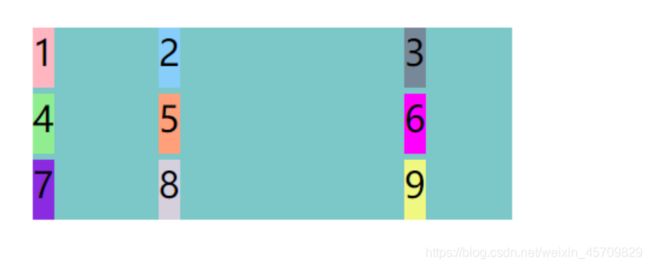
代码展示
<html>
<head>
<meta charset="UTF-8">
<title>title>
<style>
body{
  margin: 20px;
  padding: 20px;
}
.wrapper{
  display: grid;
  grid-gap: 10px;
  grid-template-columns: repeat(3,1fr);
  grid-auto-rows: minmax(100px auto);
}
.item1{
  background:lightpink;
  grid-column-start: 1;
  grid-column-end: 2;
}
.item2{
  background: lightskyblue;
  grid-column-start: 2;
  grid-column-end: 4;
  grid-row-start: 1;
  grid-row-end: 2;
  z-index: 1;/*2显示在3上面*/
  /*.item2 所在的网格项目,垂直网格线是从 2 到 4,水平网格线是从 1 到 2。其中它跟 .item3 (垂直网格线是从3 到 4,水平网格线是从 1 到 4) 是有冲突的。可以设置 z-index 去决定它们的层级关系*/
}
.item3{
  background: lightslategray;
  grid-column-start: 3;
  grid-column-end: 4;
  grid-row-start: 1;
  grid-row-end: 4;
}
.item4{
  background: lightgreen;
  grid-column-start: 1;
  grid-column-end: 2;
  grid-row-start: 2;
  grid-row-end: 5;
}
.item5{
  background:lightsalmon;
  grid-column-start: 2;
  grid-column-end: 2;
  grid-row-start: 2;
  grid-row-end: 5;
}
.item6{
  background: magenta;
  grid-column: 3;
  grid-row: 4;
}
.item1,.item2,.item3,.item4,.item5,.item6{
  font-size: 30px;
  text-align: center;
  line-height: normal;
}
style>

head>

<body>
<div class="wrapper">
  <div class="item1">1div>
  <div class="item2">2div>
  <div class="item3">3div>
  <div class="item4">4div>
  <div class="item5">5div>
  <div class="item6">6div>
div>
body>
html>
效果展示

(2)grid-area—指定item放在哪一个区域。与grid-template-areas同理。
(3)justify-self—设置单元格内容的水平位置(左中右)|align-self—设置单元格内容的垂直位置(上中下)|place-self 水平垂直合并。
.item {
  justify-self: start | end | center | stretch;
  align-self: start | end | center | stretch;
}
3 table布局
最简单的布局方式,因为table自身的特性决定它可以用来布局,并且表格中的内容可以自动居中。但是它有自身的局限性。下载时间延迟,占用服务器更多流量资源,阻挡浏览器渲染引擎的渲染顺序,影响用户体验等等。
- 两栏布局
<html>
<head>
<meta charset="UTF-8">
<title>title>
<style>
body{
  margin: 20px;
  padding: 20px;
}
.container{
  width: 200px;
  height: 200px;
}
.left{
  background-color: lightblue;
  font-size: 20px;
  text-align: center;
  line-height: normal;
}
.right{
  background-color: pink;
  font-size: 20px;
  text-align: center;
  line-height: normal;
}
style>

head>

<body>
<table class="container">
  <tbody>
    <tr>
      <td class="left">lefttd>
      <td class="right">righttd>
    tr>
  tbody>
table>
body>
html>
效果展示

- 三栏布局
<html>
<head>
<meta charset="UTF-8">
<title>title>
<style>
body{
  margin: 20px;
  padding: 20px;
}
.container{
  width: 200px;
  height: 200px;
}
.left{
  background-color: lightblue;
  font-size: 20px;
  text-align: center;
  line-height: normal;
}
.center{
  background-color: rebeccapurple;
  font-size: 20px;
  text-align: center;
  line-height: normal;
}
.right{
  background-color: pink;
  font-size: 20px;
  text-align: center;
  line-height: normal;
}
style>

head>

<body>
<table class="container">
  <tbody>
    <tr>
      <td class="left">lefttd>
      <td class="center">centertd>
      <td class="right">righttd>
    tr>
  tbody>
table>
body>
html>
效果展示

三 后记
css布局的知识点零散难以整合,有多种整理方式。css布局是网页最重要的知识点。关于写代码测试,我学习一个知识点的时候,习惯性去设计代去跑一次,然后能更好的理解每一个属性和属性值。