html+css仿制小米商城首页
一、首先是学习心得
简介:
这是一个仅用css+html实现的页面,不过y页面也用css实现了一些精致的动态效果,比如
- 老版本小米官网的logo滑动效果
- 小米的二维码和购物车,导航栏延时下拉效果
关于一些css常用的进阶知识
-
box-shodow

-
display的几种用法 除了常见的块元素和行内元素的切换,还有行内块的概念,更有使用display:none隐藏块元素,通过伪类:hover去修改可视性,提到的display:none,就不得不说它与visibility: hidden的区别,设置了display: none,那么该元素以及它的所有后代元素都会隐藏,隐藏后的元素无法点击,占据的空间消失;设置visibility: hidden也可以隐藏这个元素,但是隐藏元素仍需占用与未隐藏时一样的空间,也就是说虽然元素不可见了,但是仍然会影响页面布局。就比如这里的下拉框都是用disply:none,导航栏有个全部商品分类是visibility:hidden;关于可视化还有个overflow:hidden使用到了。
- 关于浮动和解除浮动效果,多次使用到clear:both,float,在使用claer属性时一般是用伪元素比如::before来实现。
- 更好的理解了position这个属性,尤其是position:abosult是以最近的开启position:relavetive的父元素原点为原点。
- 也使用了transitions这个带有延迟效果的属性
- 关于居中使用到了text-align:center,margin:0 auto;和height,line-height设置大小一样的效果,
- 关于背景尺寸,使用了box-sizing:border-box
- 关于优先级,因为下拉框,可能因为优先级问题导致出不来,所有设置下拉框效果时可能需要设置z-index:;
- 了解到了transparents这种透明颜色,和rgba这种不仅包含颜色还包含透明度的属性;
- 最后是关于图标字体和网站标题的引用,首先我是在阿里矢量库里下载的文件,导入项目文件,然后引用里面的css,通常在标签里应用相应的类来实现,然后网站标题icon需要下载相应的.ico的文件,然后通过.
二、代码分享
index.html
小米商城
-
手机App
-
个人中心
-
人工客服
-
购物车


one.css
.topbar-wrapper{
	width: 100%;
	background-color: #333;
	height: 40px;
	line-height: 40px;
}
/* 左侧导航栏 */
.service{
	float: left;
}
.show-car,.user-info{
	float: right;
}
.service li{
	float: left;
}
.show-car li,.user-info li{
	float: right;
}
.topbar a{
	font-size: 12px;
	color: #b0b0b0;
	display: block;
}
.topbar a:hover{
	color: #fff;
}
.topbar .line{
	color: #424242;
	margin: 0 8px;
}
.show-car a{
	width: 120px;
	background-color: #424242;
	text-align: center;
	height: 40px ;
}
.show-car{
	position: relative;
}
.show-car i{
	margin-right: 2px;
}
.show-car{
	margin-left: 25px;
}
.show-car:hover a{
	background-color: white;
	color: #ff6700;
}
.ts{
	position: absolute;
	padding: 30px;
	top:41px;
	left: -172px;
	width: 232px;
	hight:35px
	background-color: #fff;
	font-size: 10px;
	z-index: 99999;
	text-align: center;
	box-shadow: 0 0 1px 2px rgba(0,0,0,0.2);
	display: none;
}
.show-car:hover .ts,.ts:hover{
	display: inline-block;
}
.app{
	position: relative;
}
.app .qrcode{
	width: 124px;
	height: 0;
	background-color: white;
	line-height: 1px;
	text-align: center;
	box-shadow: 0 0 10px rgb(0,0,0,0.3);
	color: #333;
	position: absolute;
	left: -38px;

	transition: all 0.3s;
	overflow: hidden;
}
.app:hover::after,.app:hover .qrcode{
	display: block;
	height: 140px ;
	z-index: 9990;
	float: left;
}
.app:hover::after{

	border: 6px solid transparent;
	content: '';
	border-top: none;
	border-bottom-color: white;
	width: 0px;
	height: 0px;
	position: absolute;
	bottom: 0px;
	left: 0;
	right: 0;
	margin: auto;
	/* 设置过渡的样式 */

}
.qrcode img{
	width: 90px;
	height: 90px;
	margin: 17px;
	margin-bottom: 15px;
}
/* 设置中间的header */
.header-warpper{
	height: 100px;
	width: 100%;
    position: relative;
}
.header .logo{
	margin-top: 22.5px;
	float: left;
	position: relative;
	width: 55px;
	height: 55px;
	overflow: hidden;
	text-indent: -9999px;
}
.header .logo a{

	position: absolute;
	left: 0;
	width: 55px;
	height: 55px;
	background-image: url(logo-mi2.png);
	background-size: 55px 55px;
	background-position: center;
	transition: left 0.3s;
}
.header .logo .home{
	left: -55px;
	background-image: url(./mi.jpg);
	background-size: 55PX 55PX;
}
.header .logo:hover .mi{
	left: 55px;
}
.header .logo:hover .home{
	left: 0;
}
.header .nav{
	float: left;
	padding-left: 57px;
}
.header .nav-warpper{
	float: left;
	margin-left: 10px;
}
 .nav > li{
	float: left;
}
.all-goods-wrapper{
	position: relative;
}
/* 左侧导航条 */
.left-menu{
	width: 234px;
	height: 436px;
	background-color: rgba(0,0,0,.6);
	position: absolute;
	z-index: 990;
	left: -120px;
	line-height: 1;
	padding-top: 20px;
}
.left-menu a{
	display: block;
	height: 40px;
	line-height:40px;
	color: white;
	font-size: 14px;
	padding: 1px 0;
}
.nav li a:hover{
	color: #ff6700;
}
.left-menu li a:hover{
	background-color: #ff6700;
	color: white;
}
.left-menu li:hover{
	background-color: #ff6700;
	color: white;
}
.left-menu a i{
	float: right;
}
.header .nav{
	z-index: 10000;
	height: 100px;
	line-height: 100px;

}
.nav li a{
	display: block;

	font-size: 15px;
	margin-right: 20px;
		z-index: 999999;
}

.all-goods{
	visibility: hidden;
}
.nav .goods-infos{
	height: 226px;

	position: absolute;
	top:100px;
	left: 0;
	height: 0;
	width: 100%;
	transition: height 0.3s;
	background-size: 100% 200px;
    background-image: url(./下滑框.jpg);
	z-index: 99999;
}

.nav li:not(:nth-of-type(10),:nth-of-type(1)):hover ~.goods-infos,.goods-infos:hover{
	height: 226px;
	border-top: 1px solid silver;
	box-shadow: 0 5px 3px rgba(0,0,0,0.2);
}
.search-warpper{
	width: 296px;
	height: 51px;
	float: left;
	margin-top: 25px;
	margin-left: 10px;
	border: 1px solid rgb(224,224,224);
}
.search-warpper .search-bnt{
	float: left;
 height: 51px;
 width: 53px;
 border: #b0b0b0;

}
.search-warpper .search-inp{
	padding-left: 10px;
	float: left;
	display: block;
	border: none;
	width: 243px;
	height: 50px;
	border-color: #b0b0b0;
	font-size: 15px;
	box-sizing: border-box;
	border: 1px solid rgb(224,224,224);
	border-right: none;
	outline: none;
}
.search-warpper .search-inp:focus{
	outline: 1px solid #ff6700;
}
.search-warpper .search-bnt:hover{
	border-color:silver;
	background-color: #ff6700;
	color: white;
}

.banner{
	position: relative;
	height: 537px;
	margin: 0 auto;
	z-index: 1;
}
.banner img{
	width: 100%;
	vertical-align: top;
}

.banner .img-list{
	position: absolute;
}

.pointer{
	position: absolute;
	bottom: 100px;
	right: 135px;
}
.pointer a{
	float: left;
	margin-left: 6px;
	width: 6px;
	height: 6px;
	background-color: rgba(0,0,0,0.4);
	border: 3px rgba(255,255,255,0.4) solid;
	border-radius: 50%;
}
.pointer a:hover,.pointer a:active{
	border-color: rgba(0,0,0,0.4);
	background-color: rgba(255,255,255,0.4);
}
.prev-next a{
	width: 41px;
	height: 69px;
	background-image: url(箭头图.png);
	background-color: #333;
	position: absolute;
	top: 0;
	bottom: 0;
	margin: auto 0;
}
.prev-next .next{
	left: 257px;
	background-position: -84px 0;
}
.prev-next .prev{
	right: 0;

	background-position: -125px 0;
}
.back-top{
	width: 66px;
	height: 232px;
	position: fixed;
	bottom: 60px;
	right: 50px;
}
.back-top li{
	padding-top: 11px;
	border: 1px solid #f5f5f5;
	text-align: center;
}
.ad{
	height: 170px;
	margin-top: 14px;
    position: relative;
}
.ad-img{
	float: left;
}
.ad .ad-img li{
	display: inline-block;

}
.ad .short-cut li{
	display: inline-block;
	width: 75px;

}
.ad .short-cut li:last-child{
	margin-right: 0;

}
.ad .short-cut i{
	display: block;
  font-size: 20px;
  color: white;
  text-align: center;
}
.ad .short-cut a{
	color: white;
	font-size: 15px;
	display: inline-block;
	height: 80px;
	margin: 0 7px;
	margin-top: 10px;
}
.ad .short-cut{
	width: 234px;
	height: 170px;
	background-color: #5f5750;
	margin-left: 14px;
	position: relative;
	left: -12px;
}
.ad .ad-img li{
	width: 316px;
	margin-left: 10px;

}
.ad .ad-img{
	position: absolute;
	left: 235px;
	top:-1px;
}
.ad .ad-img img{
	width: 100%;
	vertical-align: top;
}
.black{
	background-color: #f5f5f5;
	margin-top: 50px;
	width: 100%;
}
.end{
	width: 1226px;
}
all.css
.w{
	width: 1226px;
	margin: 0 auto;
}
clear.css
*{
	padding: 0;
	margin: 0;
}
li{
	list-style: none;
}
a{
	text-decoration: none;
	color: #000;
}
.clearfix::after,.clearfix::before{
	content: "";
	display: table;
	clear: both;
}

body{
	    font: 14px/1.5 Helvetica Neue,Helvetica,Arial,Microsoft Yahei,Hiragino Sans GB,Heiti SC,WenQuanYi Micro Hei,sans-serif;
	    color: #333;
		min-width: 1226px;
}
三、运行效果
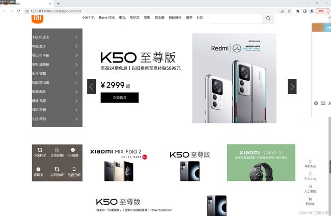
一些效果具体:
网站标题
下拉二维码(有延时效果)

类似的


还有一些fixed定位和:hoverd的字体和背景背景颜色变化效果。
最后本人的一个心结:给css中的类起名时语义化非常重要。