FigDraw 20. SCI文章中绘图之马赛克图 (mosaic)
点击关注,桓峰基因
桓峰基因公众号推出基于R语言绘图教程并配有视频在线教程,目前整理出来的教程目录如下:
FigDraw 1. SCI 文章的灵魂 之 简约优雅的图表配色
FigDraw 2. SCI 文章绘图必备 R 语言基础
FigDraw 3. SCI 文章绘图必备 R 数据转换
FigDraw 4. SCI 文章绘图之散点图 (Scatter)
FigDraw 5. SCI 文章绘图之柱状图 (Barplot)
FigDraw 6. SCI 文章绘图之箱线图 (Boxplot)
FigDraw 7. SCI 文章绘图之折线图 (Lineplot)
FigDraw 8. SCI 文章绘图之饼图 (Pieplot)
FigDraw 9. SCI 文章绘图之韦恩图 (Vennplot)
FigDraw 10. SCI 文章绘图之直方图 (HistogramPlot)
FigDraw 11. SCI 文章绘图之小提琴图 (ViolinPlot)
FigDraw 12. SCI 文章绘图之相关性矩阵图(Correlation Matrix)
FigDraw 13. SCI 文章绘图之桑葚图及文章复现(Sankey)
FigDraw 14. SCI 文章绘图之和弦图及文章复现(Chord Diagram)
FigDraw 15. SCI 文章绘图之多组学圈图(OmicCircos)
FigDraw 16. SCI 文章绘图之树形图(Dendrogram)
FigDraw 17. SCI 文章绘图之主成分绘图(pca3d)
FigDraw 18. SCI 文章绘图之矩形树状图 (treemap)
FigDraw 19. SCI 文章中绘图之坡度图(Slope Chart)
FigDraw 20. SCI文章中绘图之马赛克图 (mosaic)
这期介绍一下马赛克图,这个马赛克估计大家都听过,但是用来分析数据,展示数据结果就不知道怎么应用了,而且我们在文章中对数据整体分布情况概述一般都是使用柱状图,饼图,今天不妨改用高级别点的马赛克图形展示,放在文章中肯定增添色彩,下面我们就来学一下吧!!!
前 言
马赛克图(mosaic plot),显示分类数据中一对变量之间的关系,原理类似双向的100%堆叠式条形图,但其中所有条形在数值/标尺轴上具有相等长度,并会被划分成段。可以通过这两个变量来检测类别与其子类别之间的关系。
主要优点
马赛克图能按行或按列展示多个类别的比较关系。
主要缺点
难以阅读,特别是当含有大量分段的时候。此外,我们也很难准确地对每个分段进行比较,因为它们并非沿着共同基线排列在一起。
适用
马赛克图比较适合提供数据概览。
注意
非坐标轴非均匀的马赛克图也是统计学领域标准的马赛克图,一个非均匀的马赛克图包含以下构成元素:①非均匀的分类坐标轴;②面积、颜色均有含义的矩形块;③图例。对于非均匀的马赛克图,关注的数据维度非常多,一般的用户很难直观理解,在多数情况下可以被拆解成多个不同的图表,以下我们会对其进行绘制。
软件安装
这里我们只需要安装软件包 vcd 或者 graphics,软件包安装如下:
if(!require(vcd))
  install.packages("vcd")
if(!require(graphics))
  install.packages("graphics")
参数说明
因为两个软件包里面的函数使用方法基本相似,我们主要展示一下 mosaic {vcd} 的实例。
1. mosaic {vcd}
## Default S3 method:
mosaic(x, condvars = NULL,
  split_vertical = NULL, direction = NULL, spacing = NULL,
  spacing_args = list(), gp = NULL, expected = NULL, shade = NULL,
  highlighting = NULL, highlighting_fill = rev(gray.colors(tail(dim(x), 1))),
  highlighting_direction = NULL,
  zero_size = 0.5, zero_split = FALSE, zero_shade = NULL,
  zero_gp = gpar(col = 0), panel = NULL, main = NULL, sub = NULL, ...)
## S3 method for class 'formula'
mosaic(formula, data, highlighting = NULL,
  ..., main = NULL, sub = NULL, subset = NULL, na.action = NULL)
2. mosaicplot {graphics}
## Default S3 method:
mosaicplot(x, main = deparse1(substitute(x)),
           sub = NULL, xlab = NULL, ylab = NULL,
           sort = NULL, off = NULL, dir = NULL,
           color = NULL, shade = FALSE, margin = NULL,
           cex.axis = 0.66, las = par("las"), border = NULL,
           type = c("pearson", "deviance", "FT"), ...)

## S3 method for class 'formula'
mosaicplot(formula, data = NULL, ...,
           main = deparse1(substitute(data)), subset,
           na.action = stats::na.omit)
数据读取及实例
我们这里采用软件包自带的数据集,因为mosaic能够介绍两种数据结构,所以在数据选择上就有两种方式,一种是 “Default S3 method”,一种就是"S3 method for class ‘formula’", 其中默认就是第一种方式,这种我们可以通过 table() 函数来获取。下面我们了解一下5个数据集的特点:
1. Survival of passengers on the Titanic
Description
This data set provides information on the fate of passengers on the fatal maiden voyage of the ocean liner ‘Titanic’, summarized according to economic status (class), sex, age and survival.
Usage
Titanic
Format
A 4-dimensional array resulting from cross-tabulating 2201 observations on 4 variables. The variables and their levels are as follows:
No	Name	Levels
1	Class	1st, 2nd, 3rd, Crew
2	Sex	Male, Female
3	Age	Child, Adult
4	Survived	No, Yes
Details
The sinking of the Titanic is a famous event, and new books are still being published about it. Many well-known facts—from the proportions of first-class passengers to the ‘women and children first’ policy, and the fact that that policy was not entirely successful in saving the women and children in the third class—are reflected in the survival rates for various classes of passenger.
These data were originally collected by the British Board of Trade in their investigation of the sinking. Note that there is not complete agreement among primary sources as to the exact numbers on board, rescued, or lost.
Due in particular to the very successful film ‘Titanic’, the last years saw a rise in public interest in the Titanic. Very detailed data about the passengers is now available on the Internet, at sites such as Encyclopedia Titanica (https://www.encyclopedia-titanica.org/).
data("Titanic")
str(Titanic)
##  'table' num [1:4, 1:2, 1:2, 1:2] 0 0 35 0 0 0 17 0 118 154 ...
##  - attr(*, "dimnames")=List of 4
##   ..$ Class   : chr [1:4] "1st" "2nd" "3rd" "Crew"
##   ..$ Sex     : chr [1:2] "Male" "Female"
##   ..$ Age     : chr [1:2] "Child" "Adult"
##   ..$ Survived: chr [1:2] "No" "Yes"
library(vcd)
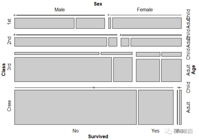
mosaic(Titanic)
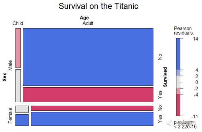
表格数据加上阴影和图例的公式界面:
## Formula interface for tabulated data plus shading and legend:
mosaic(~Sex + Age + Survived, data = Titanic, main = "Survival on the Titanic", shade = TRUE,
    legend = TRUE)
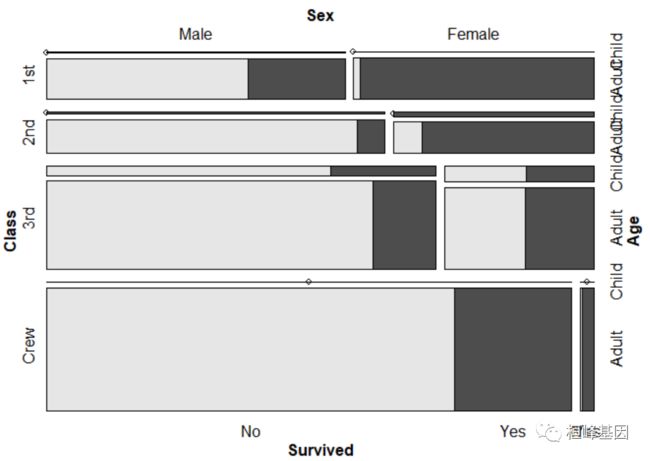
重点强调:
mosaic(Survived ~ ., data = Titanic)
2. Hair and Eye Color of Statistics Students
>Description
Distribution of hair and eye color and sex in592 statistics students.
Usage
HairEyeColor
Format
A 3-dimensional array resulting from cross-tabulating 592 observations on 3 variables. The variables and their levels are as follows:
No	Name	Levels
1	Hair	Black, Brown, Red, Blond
2	Eye	Brown, Blue, Hazel, Green
3	Sex	Male, Female
Details
The Hair \times× Eye table comes from a survey of students at the University of Delaware reported by Snee (1974). The split by Sex was added by Friendly (1992a) for didactic purposes.
This data set is useful for illustrating various techniques for the analysis of contingency tables, such as the standard chi-squared test or, more generally, log-linear modelling, and graphical methods such as mosaic plots, sieve diagrams or association plots.
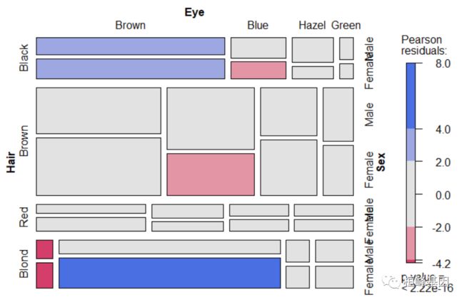
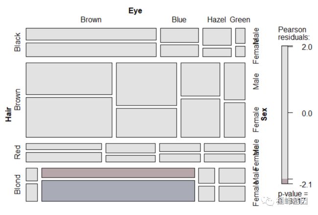
独立模型的头发和眼睛的颜色和性别。表明在独立的情况下,蓝眼睛的金发女性比预期的要多得多(棕色眼睛的金发女性太少)。
data("HairEyeColor")
str(HairEyeColor)
##  'table' num [1:4, 1:4, 1:2] 32 53 10 3 11 50 10 30 10 25 ...
##  - attr(*, "dimnames")=List of 3
##   ..$ Hair: chr [1:4] "Black" "Brown" "Red" "Blond"
##   ..$ Eye : chr [1:4] "Brown" "Blue" "Hazel" "Green"
##   ..$ Sex : chr [1:2] "Male" "Female"
mosaic(HairEyeColor, shade = TRUE)
性别共同独立于头发和眼睛颜色的模型。在棕色头发和眼睛的人群中,男性的比例偏低,而在棕色头发和蓝色眼睛的人群中,男性的比例过高,但“不显著”。
mosaic(HairEyeColor, shade = TRUE, expected = list(c(1, 2), 3))
3. Motor Trend Car Road Tests
Description
The data was extracted from the 1974 Motor Trend US magazine, and comprises fuel consumption and 10 aspects of automobile design and performance for32 automobiles (1973–74 models).
Usage
mtcars
Format
A data frame with 32 observations on 11 (numeric) variables.
[, 1]	mpg	Miles/(US) gallon
[, 2]	cyl	Number of cylinders
[, 3]	disp	Displacement (cu.in.)
[, 4]	hp	Gross horsepower
[, 5]	drat	Rear axle ratio
[, 6]	wt	Weight (1000 lbs)
[, 7]	qsec	1/4 mile time
[, 8]	vs	Engine (0 = V-shaped, 1 = straight)
[, 9]	am	Transmission (0 = automatic, 1 = manual)
[,10]	gear	Number of forward gears
[,11]	carb	Number of carburetors
data("mtcars")
head(mtcars)
##                    mpg cyl disp  hp drat    wt  qsec vs am gear carb
## Mazda RX4         21.0   6  160 110 3.90 2.620 16.46  0  1    4    4
## Mazda RX4 Wag     21.0   6  160 110 3.90 2.875 17.02  0  1    4    4
## Datsun 710        22.8   4  108  93 3.85 2.320 18.61  1  1    4    1
## Hornet 4 Drive    21.4   6  258 110 3.08 3.215 19.44  1  0    3    1
## Hornet Sportabout 18.7   8  360 175 3.15 3.440 17.02  0  0    3    2
## Valiant           18.1   6  225 105 2.76 3.460 20.22  1  0    3    1
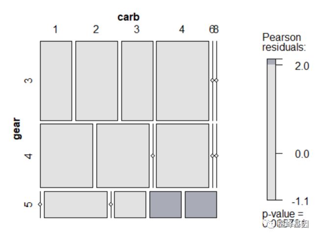
mosaic(~gear + carb, data = mtcars, shade = TRUE)
4. Pre-marital Sex and Divorce
Description
Data from Thornes & Collard (1979), reported in Gilbert (1981), on pre- and extra-marital sex and divorce.
Usage
data("PreSex")
Format
A 4-dimensional array resulting from cross-tabulating 1036 observations on 4 variables. The variables and their levels are as follows:
No	Name	Levels
1	MaritalStatus	Divorced, Married
2	ExtramaritalSex	Yes, No
3	PremaritalSex	Yes, No
4	Gender	Women, Men
data("PreSex")
str(PreSex)
##  'table' num [1:2, 1:2, 1:2, 1:2] 17 4 54 25 36 4 214 322 28 11 ...
##  - attr(*, "dimnames")=List of 4
##   ..$ MaritalStatus  : chr [1:2] "Divorced" "Married"
##   ..$ ExtramaritalSex: chr [1:2] "Yes" "No"
##   ..$ PremaritalSex  : chr [1:2] "Yes" "No"
##   ..$ Gender         : chr [1:2] "Women" "Men"
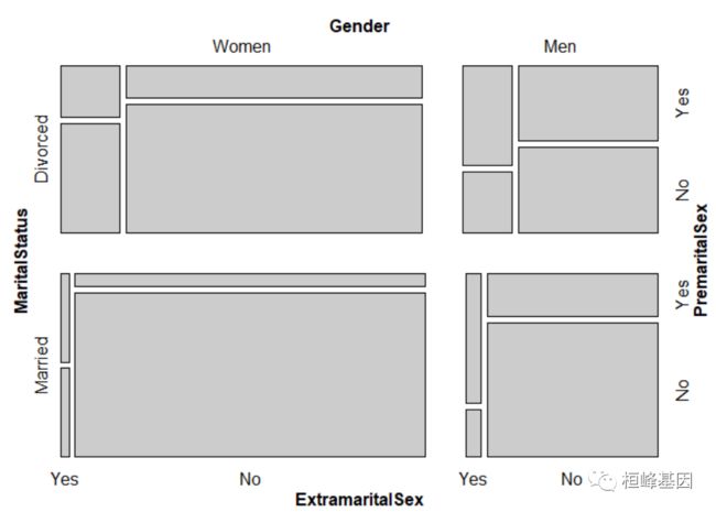
mosaic(PreSex, condvars = c(1, 4))
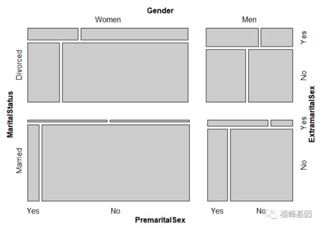
另一种方式:
mosaic(~ExtramaritalSex + PremaritalSex | MaritalStatus + Gender, data = PreSex)
5. Arthritis Treatment Data
数据集说明:
Description
Data from Koch & Edwards (1988) from a double-blind clinical trial investigating a new treatment for rheumatoid arthritis.
Usage
data("Arthritis")
Format
A data frame with 84 observations and 5 variables.
ID
patient ID.
Treatment
factor indicating treatment (Placebo, Treated).
Sex
factor indicating sex (Female, Male).
Age
age of patient.
Improved
ordered factor indicating treatment outcome (None, Some, Marked).
绘制马赛克图
data("Arthritis")
head(Arthritis)
##   ID Treatment  Sex Age Improved
## 1 57   Treated Male  27     Some
## 2 46   Treated Male  29     None
## 3 77   Treated Male  30     None
## 4 17   Treated Male  32   Marked
## 5 36   Treated Male  46   Marked
## 6 23   Treated Male  58   Marked
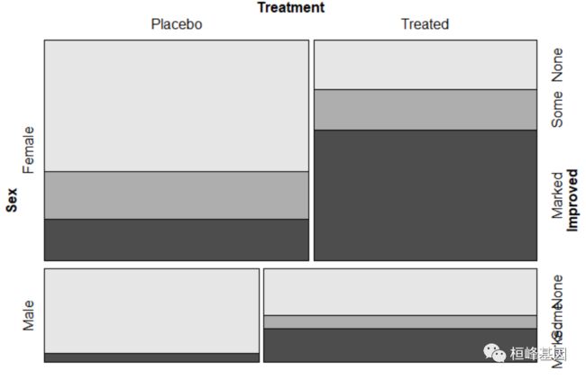
mosaic(Improved ~ Treatment | Sex, data = Arthritis, zero_size = 0)
两组分别作图:
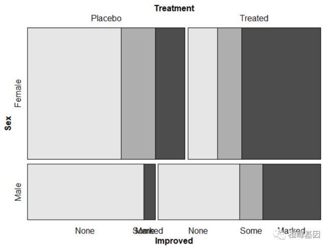
mosaic(Improved ~ Treatment | Sex, data = Arthritis, zero_size = 0, highlighting_direction = "right")
mosaicplot 绘制马赛克图
因为 mosaicplot {graphics} 的用法类似,这里只举一个例子说明一下,其他参数的使用可以参考说明。
library(graphics)
require(stats)
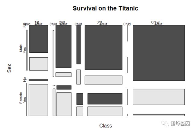
mosaicplot(Titanic, main = "Survival on the Titanic", color = TRUE)
软件包里面自带的例子,我这里都展示了一遍为了方便大家选择适合自己的图形,另外需要代码的将这期教程转发朋友圈,并配文“学生信,找桓峰基因,铸造成功的你!”即可获得!
桓峰基因,铸造成功的您!
有想进生信交流群的老师可以扫最后一个二维码加微信,备注“单位+姓名+目的”,有些想发广告的就免打扰吧,还得费力气把你踢出去!
References:
-
Hartigan, J.A., and Kleiner, B. (1984), A mosaic of television ratings. The American Statistician, 38, 32–35.
-
Emerson, J. W. (1998), Mosaic displays in S-PLUS: A general implementation and a case study. Statistical Computing and Graphics Newsletter (ASA), 9, 1, 17–23.
-
Friendly, M. (1994), Mosaic displays for multi-way contingency tables. Journal of the American Statistical Association, 89, 190–200.
-
Meyer, D., Zeileis, A., and Hornik, K. (2006), The strucplot framework: Visualizing multi-way contingency tables with vcd. Journal of Statistical Software, 17(3), 1-48.
-
Friendly, M. (1994). Mosaic displays for multi-way contingency tables. Journal of the American Statistical Association, 89, 190–200

