uniApp开发小程序(5)首页的大致搭建
页面效果如下,从零开始搭建主页面
 图1主页面上效果 图1主页面上效果
|
 图1 主页面下效果 图1 主页面下效果
|
1、配置下面五个tabBar页面
1、主类的配置信息
pages:配置每个页面基础信息以及路由信息
tabBar:配置导航栏的具体信息
globalStyle:全局的页面信息
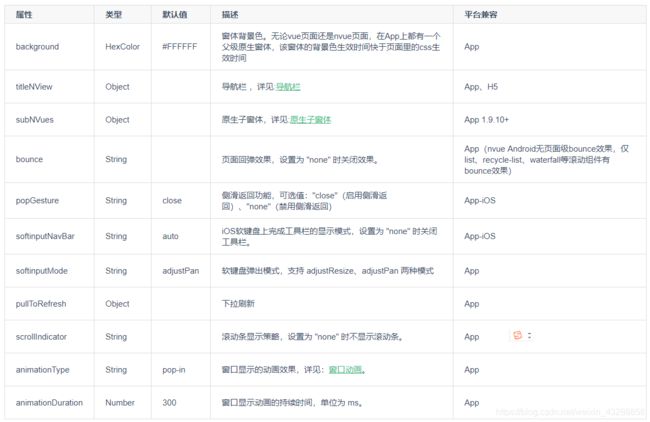
2、app-plus配置(配置编译到 App 平台时的特定样式,部分常用配置 H5 平台也支持)
3、titleNView导航栏的配置
官网的titileNView的配置信息
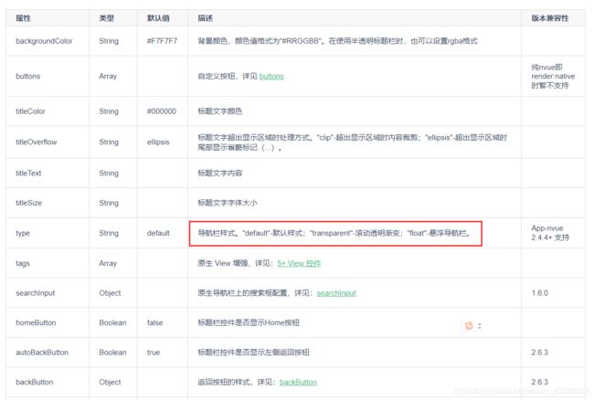
4、titleNView中searchInput(搜索框)的配置

5、buttons(按钮)的配置
按钮的样式有几种默认,我是用的是自定义样式来配置扫一扫的按钮
并且使用 #ifdef APP-PLUS来限制只能编译到App中,h5不编译这个扫一扫按钮

// 下面的扫一扫只能在app端调用,因为调用系统的相机扫一扫,H5不支持
						// #ifdef APP-PLUS
						,
						"buttons": [{
							"fontSrc": "/static/icon/iconfont.ttf",
							"text": "\ue689", //unicode编码以\u开头,并且截取e后面部分
							"fontSize": "23px",
							"background": "rgba(0,0,0,0)"

						}]
						// #endif
{
	"pages": [ //pages数组中第一项表示应用启动页,参考:https://uniapp.dcloud.io/collocation/pages
		{
			"path": "pages/index/index",
			"style": {
				// "navigationBarTitleText": "首页"
				"navigationBarTextStyle": "white", //导航栏文字颜色
				"navigationBarBackgroundColor": "#345DC2", //导航栏背景色
				"app-plus": {
					"titleNView": { //自定义导航配置
						"type": "transparent", //导航栏滚动透明渐变
						//searchInput搜索框
						"searchInput": {
							"align": "center", //居中
							"backgroundColor": "#f0f1f2",
							"borderRadius": "30rpx", //圆角
							"placeholder": "搜索你想输入内容",
							"placeholderColor": "#979C9D",
							"disabled": true //disable是否可以输入,禁止输入

						}
						// 下面的扫一扫只能在app端调用,因为调用系统的相机扫一扫,H5不支持
						// #ifdef APP-PLUS
						,
						"buttons": [{
							"fontSrc": "/static/icon/iconfont.ttf",
							"text": "\ue689", //unicode编码以\u开头,并且截取e后面部分
							"fontSize": "23px",
							"background": "rgba(0,0,0,0)"

						}]
						// #endif
					}
				}
			}

		},
		{
			"path": "pages/category/category",
			"style": {
				"navigationBarTitleText": "分类"

			}
		},
		{
			"path": "pages/article/article",
			"style": {
				"navigationBarTitleText": "阅读"
			}
		},

		{
			"path": "pages/question/question",
			"style": {
				"navigationBarTitleText": "问答"
			}
		},
		{
			"path": "pages/my/my",
			"style": {
				"navigationBarTitleText": "我的"
			}
		},

		{
			"path": "pages/public/web-view",
			"style": {
				"navigationBarTitleText": "",
				"app-plus":{
					"bounce":"none" //app无回弹效果
				}
			}
		}
	],

	"tabBar": {
		"color": "#b0abb3", //未选中颜色
		"selectedColor": "#345DC2", //选中的颜色
		"backgroundColor": "#F8F8F8", //背景色
		"borderStyle": "white", //上边框的颜色,可以选择white和back
		"fontSize": "11px",
		"height": "52px",
		"list": [{
				"pagePath": "pages/index/index",
				"text": "首页",
				"iconPath": "static/tab/index.png",
				"selectedIconPath": "static/tab/index-active.png"
			},
			{
				"pagePath": "pages/article/article",
				"text": "文章",
				"iconPath": "./static/tab/article.png",
				"selectedIconPath": "static/tab/article-active.png"
			},
			{
				"pagePath": "pages/category/category",
				"text": "分类",
				"iconPath": "static/tab/category.png",
				"selectedIconPath": "static/tab/category-active.png"
			},
			{
				"pagePath": "pages/question/question",
				"text": "问答",
				"iconPath": "static/tab/question.png",
				"selectedIconPath": "static/tab/question-active.png"
			},
			{
				"pagePath": "pages/my/my",
				"text": "我的",
				"iconPath": "static/tab/my.png",
				"selectedIconPath": "static/tab/my-active.png"
			}
		]
	},
	"globalStyle": {
		//全局导航栏颜色
		"navigationBarBackgroundColor": "#FFFFFF",
		//导航栏字体颜色
		"navigationBarTextStyle": "black",
		//回弹黑色
		"backgroundColor": "#333333"
	}
}
2、配置搜索栏、
1、小程序输入框添加
在pages.json中的AppPlus已经配置了,搜索栏,搜索栏只针对App和H5有效,小程序是无效的,所以针对小程序,要单独写一个搜索栏
"app-plus": {
					"titleNView": { //自定义导航配置
						"type": "transparent", //导航栏滚动透明渐变
						//searchInput搜索框
						"searchInput": {
							"align": "center", //居中
							"backgroundColor": "#f0f1f2",
							"borderRadius": "30rpx", //圆角
							"placeholder": "搜索你想输入内容",
							"placeholderColor": "#979C9D",
							"disabled": true //disable是否可以输入,禁止输入

						}
						// 下面的扫一扫只能在app端调用,因为调用系统的相机扫一扫,H5不支持
						// #ifdef APP-PLUS
						,
						"buttons": [{
							"fontSrc": "/static/icon/iconfont.ttf",
							"text": "\ue689", //unicode编码以\u开头,并且截取e后面部分
							"fontSize": "23px",
							"background": "rgba(0,0,0,0)"

						}]
						// #endif
					}
				}
配置的搜索栏组件如下,样式如下,
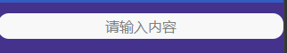
<template>
	<view class="search-box">

<!-- disabled 默认false能输入,disabled等于true表示不能输入 -->
		<input class="search-input" placeholder="请输入内容" disabled/>
	</view>
</template>

<script>
</script>

<style lang="scss">
	// 使用scss语法
	.search-box{
		position: absolute;
		left: 0px;
		top: 30rpx;
		z-index: 9999;//设置层级,不会被其他模块遮挡
		width: 100%;
		.search-input{
			background-color: #F8F8F8;
			height: 70rpx;
			line-height: 40rpx;
			text-align: center;
			border-radius: 30rpx;
			margin: 0 20;
		}
		}
</style>
在主页面引入,输入框组件,并做小程序条件编译
	<!-- #ifdef MP -->
		<!-- 小程序条件编译,只在小程序显示 -->
		<search-import></search-import>
		<!-- #endif -->
2、App中的输入框内容动态修改
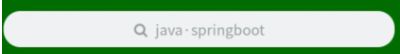
placeHolderdata这个方法,通过定时器,动态的修改AppPlus中定义的输入框的样式
	placeHolderdata() {
				// 获取当前页面实例
				const currentWebview = this.$scope.$getAppWebview();
				//此对象相当于html5plus里的plus.webview.currentWebview()。在uni-app里vue页面直接使用plus.webview.currentWebview()无效,非v3编译模式使用this.$mp.page.$getAppWebview()
				//搜索框提示的内容,定时从这个数组中获取
				let arr = ['App·微信小程序', 'java·springboot', 'Springcloud·SpringScurity']
				let i = 0
				currentWebview.setStyle({
					"titleNView": {
						"searchInput": {
							"placeholder": arr[i]
						}
					}
				})
				const arrlen = arr.length - 1
				// 定时器/
				setInterval(() => {
					// ++i不管怎样值都会加一,i++表示
					i = i < arrlen ? ++i : 0
					// console.log(i)
					currentWebview.setStyle({
						"titleNView": {
							"searchInput": {
								"placeholder": arr[i]
							}
						}
					})
				}, 2000)
			},
并将这个方法放在onload里面,页面打开时候调用,并且进行条件编译
      async onLoad() {
			console.log("页面调用")
			// #ifdef APP-PLUS
			this.placeHolderdata()
			// #endif
		},
3、配置swiper轮播图
swiper轮播图
效果如下

1、@change=“swiperChange”
当轮播页面改变时候调用 swiperChange方法,并将当前头部的颜色,随着图片变化而变化
swiperChange(e) {
				// console.log(e.detail.current)
				this.current = e.detail.current;
				this.bannerBackGround = this.bannerList[this.current].background
				// console.log(this.bannerBackGround)
}
2、运用v-for 对数组遍历,这个数据现在是props 下面的数组,后面是承接父组件里面的数组
<swiper-item class="swiper-item" v-for="(item, index) in bannerList " :key="index">
				<image :src="item.imageUrl"></image>
			</swiper-item>
3、第一次加载监听 bannerList,将bannerList第一个颜色赋值给头部背景色,
watch: {
			bannerList: {
				// handler header
				handler(newVal) {
					if (newVal && newVal.length > 0) {
						// 然后获取第一个背景色并设置
						// this.current = 0
						this.current = 0
						// this.bannerBackGround = this.bannerList[0] && this.bannerList[0].background
						this.bannerBackgroud =
							this.bannerList[0] && this.bannerList[0].background

					}
				},
				immediate: true //表示第一次加载的时候执行这个函数
			}
		}
4、针对app端,样式问题
calc(var(–status-bar-height)这个是拿到App顶部导航高度
/*#ifdef APP-PLUS */
		// padding-top: calc(var(--status-bar-height) + 120rpx);
		padding-top: calc(var(--status-bar-height) + 120rpx);
		/*#endif */
<template>
	<!-- 轮播图 -->
	<view class="banner-box">
		<!-- 背景色 -->: ;
		<!-- background-image使用单引号 -->
		<view class="banner-bj" :style="{'background-image':`linear-gradient(${bannerBackGround||'#345DC2'} 50%, #fff)`}">

		</view>
		<!-- 轮播图展示 -->
		<!-- indicator-dots开启圆点 -->
		<!-- indicator-color 没有选中的颜色  不能加: 加:等于绑定-->
		<!-- indicator-active-color选中的颜色 -->
		<!-- autoplay是否自动切换 -->
		<swiper class="banner-swiper" :indicator-dots="true" indicator-color="rgba(255,255,255,0.5)" indicator-active-color="#fff"
		 :autoplay="true" :interval="3000" :duration="1000" :current="current" @change="swiperChange">
			<swiper-item class="swiper-item" v-for="(item, index) in bannerList " :key="index">
				<image :src="item.imageUrl"></image>
			</swiper-item>

		</swiper>
	</view>
</template>

<script>
	export default {
		props: {
			bannerList: {
				type: Array,
				default: () => [{
						id: 1,
						imageUrl: "/static/images/banner1.jpg",
						background: "#45328c",
						adverUrl: "pages/course/course-details"

					}, {
						id: 2,
						imageUrl: "/static/images/banner2.jpg",
						background: "#006C00",
						adverUrl: "pages/course/course-details"

					}, {
						id: 3,
						imageUrl: "/static/images/banner3.jpg",
						background: "#0072b7 ",
						adverUrl: "pages/course/course-details"

					}

				]

			}
		},
		data() {
			return {
				current: 0,
				bannerBackGround: ""
			}
		},
		methods: {
			swiperChange(e) {
				// console.log(e.detail.current)
				this.current = e.detail.current;
				this.bannerBackGround = this.bannerList[this.current].background
				// console.log(this.bannerBackGround)
			}
		},
		// 监听器
		watch: {
			bannerList: {
				// handler header
				handler(newVal) {
					if (newVal && newVal.length > 0) {
						// 然后获取第一个背景色并设置
						// this.current = 0
						this.current = 0
						// this.bannerBackGround = this.bannerList[0] && this.bannerList[0].background
						this.bannerBackgroud =
							this.bannerList[0] && this.bannerList[0].background

					}
				},
				immediate: true //表示第一次加载的时候执行这个函数
			}

		}
	}
</script>

<style lang="scss">
	// 使用scss语法
	.banner-box {

		// 方法后面的+要空一格
		// 方法后面的+要空一格
		// 方法后面的+要空一格
		padding-top: 120rpx;
		// 改变App中的样式
		/*#ifdef APP-PLUS */
		// padding-top: calc(var(--status-bar-height) + 120rpx);
		padding-top: calc(var(--status-bar-height) + 120rpx);
		/*#endif */


		.banner-bj {
			position: absolute;
			top: 0;
			width: 100%;

			height: 470rpx;
			/* #ifdef APP-PLUS*/
			height: calc(var(--status-bar-height) + 470rpx);
			/* #endif*/
			// background-color: red;


			// 过渡效果
			transform: .5s;

		}

		.banner-swiper {
			width: 100%;
			height: 350rpx;

			.swiper-item {
				width: 100%;
				height: 100%;
				padding: 0 30rpx;

				image {
					width: 100%;
					height: 100%;
					border-radius: 10rpx;
				}
			}
		}
	}
</style>
4、配置分类框
<template>
	<!--:class="{column:isColums}"  绑定common.css中的样式column,true显示,false不显示样式-->
	<view class="couse-item" :class="{column:isColums}">
		<view class="item-left">
			<!-- lazy-load懒加载 异步加载 -->
			<image :src="item.mainImage" class="couse-img" lazy-load></image>
			<view class="course-time">
				{{item.totalTime}}

			</view>
		</view>
		<view class="item-right column">
			<view class="title">{{item.title}}</view>
			<view class="info">
				<view class="nickName iconfont icon-laoshi2">{{item.nickName}} </view>
				<view class="count">
					<!-- item.isFree当isFree为0则这个为true,免费显示出来 -->
					<view class="money" v-if="item.isFree">免费</view>
					<view   v-else class="money iconfont icon-moneybag">
						{{item.priceDiscount||item.priceOriginal}}
						</view>
						<!-- item.priceDiscount如果有值就显示,没有就显示折扣价 -->
					<view class="iconfont icon-video"> {{item.studyTotal}} 人在学</view>
				</view>

			</view>
		</view>
	</view>
</template>

<script>
	export default {
		props: {
			// 是否纵向排列文字,(true纵向,false 横向)
			isColums: {
				type: Boolean,
				default: false
			},
			item: {
				type: Object,
				// 如果返回是对象,则用箭头函数 es6中的语法
				default: () => ({
					id: 1,
					mainImage: "../../static/images/banner2.jpg",

					totalTime: '00:59:38',
					title: 'uniApp学习教程',
					nickName: 'Tony老师',
					isFree: 0 ,// 是否收费 0是免费。1是收费
					priceOriginal:999,
					priceDiscount:199,//优惠价
					studyTotal:999

				})
			}
		}

	}
</script>

<style lang="scss">
	// flex-direction: column纵向排列
	.couse-item {
		display: flex;
		// flex-direction: column;//纵向排列
		// 相对于父类元素定位,父类要加上 position relative
		width: 100%;
		padding: 20rpx 0;
		border-bottom: 1rpx solid #F1f1f1; //添加一个下划线

		// item-left左边图片的样式
		.item-left {
			position: relative;
			width: 290rpx;
			height: 160rpx;
			margin-right: 20rpx;

			.couse-img {
				width: 290rpx;
				height: 160rpx;
				border-radius: 10rpx;
			}

			// 有了父元素的position: relative;,子元素的 position: absolute;相对于父元素的宽高
			.course-time {
				position: absolute;
				bottom: 5rpx;
				right: 5rpx;
				font-size: 22rpx;
				color: #FFFFFF;
				background: rgba(51, 51, 51, 0.4);
				border-radius: 20rpx;
				padding: 0 8rpx;
			}

		}

		// font weight bold表示加粗
		.item-right {

			// display: flex;//指定flex布局
			// flex-direction: column; //垂直排布
			justify-content: space-between; //两端对齐
			height: 160rpx;
			padding-top: 5rpx;
			padding-left: 5rpx;

			.title {
				max-width: 365rpx;
				height: 70rpx;
				line-height: 35rpx;
				font-size: 28rpx;
				font-weight: bold;
				// 显示两行,超出的部分省略号显示
				overflow: hidden;
				text-overflow: ellipsis; //省略号
				-webkit-line-clamp: 1; //最多显示两行
				display: -webkit-box; //弹性的计算有多少行
				-webkit-box-orient: vertical; //排列方式纵向排列
				white-space: normal; //文本自动处理换行
			}

			.info {
				.nickName {
					font-size: 23rpx;
					color: #999;

				}

				// align-items: center;垂直居中
				.count {
					display: flex;
					align-items: center; //上下居中

					.iconfont {
						font-size: 23rpx;
						color: #222222;
					}

					.money {
						color: $mxg-color-orange;
						width: 120rpx;
						font-size: 28rpx;
						padding-right: 30rpx;

					}
				}
			}
		}
	}
</style>
5、配置热门推荐框
样式如下
v-for 中间数值记得加逗号
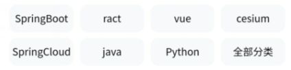
为了防止后台拿取的数组超过八个,样式被改变,所以采用categoryList.slice对数组分割
categoryList.slice(0,8)截取数组中 下标 0到7的,(0,8)包头不包尾
Flex布局样式
<template>
	<view class="category-box">
		<!-- v-for 中间数值记得加逗号 -->
		<!-- 为了防止后台拿取的数组超过八个,样式被改变,所以采用categoryList.slice对数组分割 -->
		<!-- categoryList.slice(0,8)截取数组中 下标 0到7的,(0,8)包头不包尾 -->
		<view v-for="(item, index) in categoryList.slice(0,8)" :key="index">
			{{item.name}}
		</view>
	</view>
</template>

<script>
	export default {
		props: {
			categoryList: {
				type: Array,
				default: () => [{
					id: 1,
					name: 'SpringBoot'
				}, {
					id: 2,
					name: 'ract'
				}, {
					id: 3,
					name: 'vue'
				}, {
					id: 4,
					name: 'cesium'
				}, {
					id: 5,
					name: 'SpringCloud'
				}, {
					id: 6,
					name: 'java'
				}, {
					id: 7,
					name: 'Python'
				}, {
					id: 8,
					name: '全部分类'
				}]

			}
		}

	}
</script>

<style lang="scss">
	// 	overflow: hidden; 超出的部分隐藏
	// flex-wrap: wrap;flex布局自动换行
	// justify-content: center; flex布局内容水平居中
	// justify-content: space-around; 项目位于各行之前、之间、之后都留有空白的容器内
	// https://www.runoob.com/cssref/css3-pr-justify-content.html
	.category-box {
		display: flex;
		justify-content: space-around;
		flex-wrap: wrap;
		padding: 20rpx 30rpx 0 30rpx;

		>view {
			width: 160rpx;
			height: 70rpx;
			background-color: $mxg-color-grey;
			text-align: center;
			line-height: 70rpx;
			font-size: 26rpx;
			border-radius: 20rpx;
			overflow: hidden;
			margin-top: 15rpx;
		}

	}
</style>
6、推荐课件样式

<template>
	<!--:class="{column:isColums}"  绑定common.css中的样式column,true显示,false不显示样式-->
	<view class="couse-item" :class="{column:isColums}">
		<view class="item-left">
			<!-- lazy-load懒加载 异步加载 -->
			<image :src="item.mainImage" class="couse-img" lazy-load></image>
			<view class="course-time">
				{{item.totalTime}}

			</view>
		</view>
		<view class="item-right column">
			<view class="title">{{item.title}}</view>
			<view class="info">
				<view class="nickName iconfont icon-laoshi2">{{item.nickName}} </view>
				<view class="count">
					<!-- item.isFree当isFree为0则这个为true,免费显示出来 -->
					<view class="money" v-if="item.isFree">免费</view>
					<view   v-else class="money iconfont icon-moneybag">
						{{item.priceDiscount||item.priceOriginal}}
						</view>
						<!-- item.priceDiscount如果有值就显示,没有就显示折扣价 -->
					<view class="iconfont icon-video"> {{item.studyTotal}} 人在学</view>
				</view>

			</view>
		</view>
	</view>
</template>

<script>
	export default {
		props: {
			// 是否纵向排列文字,(true纵向,false 横向)
			isColums: {
				type: Boolean,
				default: false
			},
			item: {
				type: Object,
				// 如果返回是对象,则用箭头函数 es6中的语法
				default: () => ({
					id: 1,
					mainImage: "../../static/images/banner2.jpg",

					totalTime: '00:59:38',
					title: 'uniApp学习教程',
					nickName: 'Tony老师',
					isFree: 0 ,// 是否收费 0是免费。1是收费
					priceOriginal:999,
					priceDiscount:199,//优惠价
					studyTotal:999

				})
			}
		}

	}
</script>

<style lang="scss">
	// flex-direction: column纵向排列
	.couse-item {
		display: flex;
		// flex-direction: column;//纵向排列
		// 相对于父类元素定位,父类要加上 position relative
		width: 100%;
		padding: 20rpx 0;
		border-bottom: 1rpx solid #F1f1f1; //添加一个下划线

		// item-left左边图片的样式
		.item-left {
			position: relative;
			width: 290rpx;
			height: 160rpx;
			margin-right: 20rpx;

			.couse-img {
				width: 290rpx;
				height: 160rpx;
				border-radius: 10rpx;
			}

			// 有了父元素的position: relative;,子元素的 position: absolute;相对于父元素的宽高
			.course-time {
				position: absolute;
				bottom: 5rpx;
				right: 5rpx;
				font-size: 22rpx;
				color: #FFFFFF;
				background: rgba(51, 51, 51, 0.4);
				border-radius: 20rpx;
				padding: 0 8rpx;
			}

		}

		// font weight bold表示加粗
		.item-right {

			// display: flex;//指定flex布局
			// flex-direction: column; //垂直排布
			justify-content: space-between; //两端对齐
			height: 160rpx;
			padding-top: 5rpx;
			padding-left: 5rpx;

			.title {
				max-width: 365rpx;
				height: 70rpx;
				line-height: 35rpx;
				font-size: 28rpx;
				font-weight: bold;
				// 显示两行,超出的部分省略号显示
				overflow: hidden;
				text-overflow: ellipsis; //省略号
				-webkit-line-clamp: 1; //最多显示两行
				display: -webkit-box; //弹性的计算有多少行
				-webkit-box-orient: vertical; //排列方式纵向排列
				white-space: normal; //文本自动处理换行
			}

			.info {
				.nickName {
					font-size: 23rpx;
					color: #999;

				}

				// align-items: center;垂直居中
				.count {
					display: flex;
					align-items: center; //上下居中
					.iconfont {
						font-size: 23rpx;
						color: #222222;
					}
					.money {
						color: $mxg-color-orange;
						width: 120rpx;
						font-size: 28rpx;
						padding-right: 30rpx;

					}
				}
			}
		}
	}
</style>
7、配置插槽
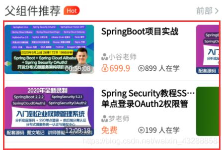
配置好上面的文字推荐,和留出红色位置做插槽使用,slot,相当于组件的占位
<template>
	<view class="list-box">
		<!-- .center{
			display:flex;
			align-items: center;
			justify-content: center;
		}
		center的公共样式 flex布局,水平垂直居中-->
		<view class="title space-between center">

			<view class="center">
				<text class="name">{{name}}</text>
				<text class="word" v-if="word">{{word}}</text>
			</view>
			<view class="all">

				<text>前部</text>
				<text class="iconfont icon-right"></text>

			</view>
		</view>

		<!-- //使用插槽 相当于站位的使用-->
		<slot></slot>

	</view>
</template>

<script>
	import mockCourseData from "@/mock/courseData.js"
	export default {

		components: {
		},
		props: {
			name: {
				type: String,
				default: "热门推荐"
			},
			word: {
				type: String,
				default: ""
			}

		}

	}
</script>

<style lang="scss">
	.list-box {
		margin-top: 60rpx;

		.name {
			font-size: 38rpx;
			font-weight: 500;
			color: #303133;
			margin-right: 10rpx;
		}

		.word {
			font-size: 20rpx;
			// linear-gradient颜色渐变
			background-image: linear-gradient(to right, $mxg-color-orange, $mxg-text-color-red);
			color: white;
			padding: 0 10rpx;
			border-radius: 30rpx 30rpx 30rpx 0;
		}

		.all {
			font-weight: normal;
			font-size: 28rpx;
			color: $mxg-text-color-grey;

			.iconfont {
				font-size: 25rpx;
			}
		}


	}
</style>
8、免费精选框配置
免费精选部分

前面注释的这些,被抽选出来做为公共的样式组件
<!-- <view class="list-box"> -->
		<!-- .center{
			display:flex;
			align-items: center;
			justify-content: center;
		}
		center的公共样式 flex布局,水平垂直居中-->
		<!-- <view class="title space-between center">

			<view class="center">
				<text class="name">{{name}}</text>
				<text class="word" v-if="word">{{word}}</text>
			</view>
			<view class="all">

				<text>前部</text>
				<text class="iconfont icon-right"></text>

			</view>
		</view> -->
引入插槽的组件
list-box,并绑定父组件传参的name,和Word,
swiper 轮播通过 v-for 方法循环数据给 couse-item ,绑定传递给子组件:item=“每次循环的一组数据”
<template>
	<!-- <view class="list-box"> -->
		<!-- .center{
			display:flex;
			align-items: center;
			justify-content: center;
		}
		center的公共样式 flex布局,水平垂直居中-->
		<!-- <view class="title space-between center">

			<view class="center">
				<text class="name">{{name}}</text>
				<text class="word" v-if="word">{{word}}</text>
			</view>
			<view class="all">

				<text>前部</text>
				<text class="iconfont icon-right"></text>

			</view>
		</view> -->


		<list-box :name="name" :word="word">
			<!-- (item,index) in 2 循环两个 -->
			<!--  :item="it"子组件的 item接收父组件  couseData拿到的数据并遍历的数组传给 子组件 -->
			<!-- 根据每页显示多少行来动态显示高度  :style="{height:`${200*row}rpx`}" -->
			<swiper class="list-swiper" next-margin="80rpx" :style="{height:`${200*row}rpx`}">
				<swiper-item v-for="(ite,index) in column" :key="index" class="swiper-item">
					<couse-item v-for="(it, i) in couseData.slice(index*row,(index+1)*row)" :key="i" :item="it"></couse-item>
				</swiper-item>

			</swiper>


		</list-box>
	<!-- </view> -->
</template>

<script>
	import  listBox from './list-box.vue'
	import couseItem from "@/components/common/course-item.vue"

	import mockCourseData from "@/mock/courseData.js"
	export default {

		components: {
			couseItem,
			listBox

		},
		props: {
			name: {
				type: String,
				default: "热门推荐"
			},
			word: {
				type: String,
				default: ""
			},
			column: {
				type:Number,
				default:2
			},
			row:{
				type:Number,
				default:4
			},
			couseData:{
				type:Array,
				default:()=>mockCourseData
			}

		}

	}
</script>

<style lang="scss">
	// .list-box {
		// margin-top: 60rpx;
		// .name {
		// 	font-size: 38rpx;
		// 	font-weight: 500;
		// 	color: #303133;
		// 	margin-right: 10rpx;
		// }

		// .word {
		// 	font-size: 20rpx;
		// 	// linear-gradient颜色渐变
		// 	background-image: linear-gradient(to right, $mxg-color-orange, $mxg-text-color-red);
		// 	color: white;
		// 	padding: 0 10rpx;
		// 	border-radius: 30rpx 30rpx 30rpx 0;
		// }

		// .all {
		// 	font-weight: normal;
		// 	font-size: 28rpx;
		// 	color: $mxg-text-color-grey;

		// 	.iconfont {
		// 		font-size: 25rpx;
		// 	}
		// }

		// .list-swiper {
		// 	height: 800rpx;

		// 	.swiper-item {
		// 		// height: 400rpx;
		// 		padding: 20rpx;
		// 		// background-color: red;
		// 	}
		// }
	// }
</style>
9、近期上新框配置
1、绑定传递到子组件的isColums为true,也就控制组件文字和图片,纵向排列

2、使用scroll-view组件,scroll-x=“true” 可以横向滑动
3、white-space: nowrap;不换行一行显示
<template>
	<list-box :name="name" :word="word">

		<scroll-view class="list-scroll" scroll-x="true">

			<view class="list-scroll-view noScorll" v-for="(item,index) in courseData" :key="index">
				<courseItem :isColums="true" :item="item"></courseItem>
			</view>
		</scroll-view>
	</list-box>
</template>

<script>
	import listBox from './list-box.vue'
	// 课程
	import courseItem from '@/components/common/course-item.vue'
	// 导入模拟数据
	import mockCourseData from '@/mock/courseData.js'

	export default {
		components: {
			listBox,
			courseItem
		},
		props: {
			name: {
				type: String,
				default: "近期上新"
			},
			word: {
				type: String,
				default: "hot"
			},
			courseData: {
				type: Array,
				default: () => mockCourseData
			}
		}
	}
</script>

<style lang="scss">
	.list-scroll {
		// white-space: nowrap;不换行一行显示
		white-space: nowrap;
		height: 380rpx;

		.list-scroll-view {
			display: inline-block; //行块布局
			width: 310rpx;
			padding: 0 10rpx;
			border-radius: 20rpx;
			box-shadow: 1px 1px 1px rgba(0, 0, 0, 0.1);
			background-color: #fff;


		}
	}
</style>
10、付费精品配置
付费精品不用翻页,所以拿到数据后直接在组件上面循环,并绑定数据,:item=“item”
<template>
	<list-box :name="name" :word="word">

		<course-item v-for="(item, i) in courseData" :key="i" :item="item"></course-item>
	</list-box>
</template>

<script>
	import listBox from './list-box.vue'
	import courseItem from '@/components/common/course-item.vue'
	import mockCourseData from "@/mock/courseData.js"
	export default {
		components: {
			listBox,
			courseItem
		},
		props: {
			name: {
				type: String,
				default: "付费精品"
			},
			word: {
				type: String,
				default: ""
			},
			courseData:{
				type:Array,
				default:()=>mockCourseData
			}
		}

	}
</script>

<style>
</style>
11、扫一扫按钮配置和使用
onNavigationBarButtonTap是和method同级的,监听APP端按钮的点击,如果点击了扫一扫按钮,就会触发onNavigationBarButtonTap方法,每一个按钮都有个index值,扫一扫因为是第一个所以为index=0

扫码调用函数
scanCode
官方scanCode讲解


扫码成功后跳转路径到/pages/public/web-view页面
uni.navigateTo({
							// url: `pages/public/web-view`,
							url: `/pages/public/web-view?url=${res.result}`,
						})
onNavigationBarButtonTap(e) {

			if (e.index === 0) {
				// 打开扫一扫功能
				console.log("第一个按钮")
				// 允许从相机和相册扫码
				uni.scanCode({
					success: (res) => { //如果要在方法中this,则需要改变成箭头函数
						console.log('条码类型:' + res.scanType);
						console.log('条码内容:' + res.result);
						// ?url=${res.result}
						// 注意,添加的url不能前面没有斜杠,不然不能跳转
						uni.navigateTo({
							// url: `pages/public/web-view`,
							url: `/pages/public/web-view?url=${res.result}`,
						})
					},
					fail: (res) => {
						uni.showModal({
							title: "扫描失败",

						})
					}
				});
			}

		},
扫码接收页面
1、onLoad接收扫码传过来的参数,
2、web-view内置的浏览器打开
3、isOpen来判断,传过来的地址是不是包含某些参数
<template>
	<!-- <view>扫描的结果oooo{{url}}</view> -->
	<view>
		<web-view v-if="isOpen(url)" :src="url"></web-view>
		<view v-else class="tip   column">
			<text>
				如需浏览,请长按浏览器打开


			</text>
			<text selectable="true"> {{url}}</text>
		</view>
	</view>
</template>

<script>
	export default {
		data() {
			return {
				url: ""
			}
		},
		onLoad(pub) {
			console.log(pub)
			this.url = pub.url
		},
		methods: {
			isOpen() {
				if (this.url) {
					// indexOf方法,如果没有含有含有返回-1
					return this.url.indexOf("www.mengxuegu.com") !== -1
				}
			}
		}
	}
</script>

<style lang="scss">
	.tip {
		position: relative;
		top:200rpx;
		width:300rpx;
		margin: 0 auto;
		word-wrap: break-word;  //word-wrap: break-word;自动换行
		font-size: 30rpx;
		text-align: center;
		text:first-child{
			font-size: 40rpx;
			font-weight: bold;
			margin-bottom: 30rpx;
		}

	}
</style>
大致首页就是这样了