matplotlib:1、设置图表名称 2、x轴y轴名称 3、设置x轴的刻度xticks 4、图例legend 5、显示线条数据text
1、设置图表名称
from matplotlib import pyplot as plt

import numpy as np
#获得-50到50之间的ndarray对象
x=np.arange(-50,51)
x

y=x**2

#设置图名
plt.title("y=x^2")
#不支持中文y=x的平方

#plot()绘制图形
plt.plot(x,y)
#临时设置
plt.rcParams['font.sans-serif']=["SimHei"]

#设置图名
plt.title("y=x的平方")
#不支持中文y=x的平方

#plot()绘制图形
plt.plot(x,y)

#此方法无法显示负号
#解决方法:修改轴5中的负号编码
plt.rcParams['axes.unicode_minus']=False

#临时设置
plt.rcParams['font.sans-serif']=["SimHei"]

#设置图名
plt.title("y=x的平方")
#不支持中文y=x的平方

#plot()绘制图形
plt.plot(x,y)
2、x轴y轴名称
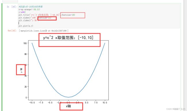
#创建x未-10到10的整数
x=np.arange(-10,11)
y=x**2
plt.title('y=c^2 x取值范围:[-10,10]')
plt.xlabel("x轴")
plt.ylabel("y轴")

plt.plot(x,y)
#创建x未-10到10的整数
x=np.arange(-10,11)
y=x**2
plt.title('y=c^2 x取值范围:[-10,10]',fontsize=18)
plt.xlabel("x轴",fontsize=15)
plt.ylabel("y 轴")

plt.plot(x,y)
字体大小
线条宽度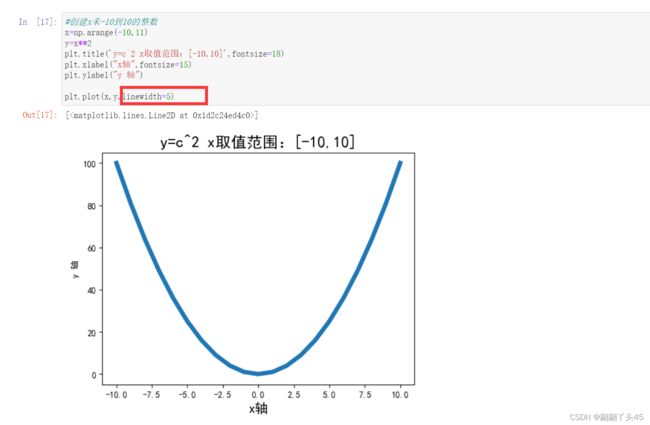

3、设置x轴的刻度xticks
#每个时间点的销量绘图
times=['2015/6/26','2015/8/1','2015/9/6','2015/10/12','2015/11/17','2015/12/23','2016/1/28','2016/3/4','2016/5/15','2016/6/20','2016/7/26']

#随机出销量
sales=np.random.randint(500,2000,size=len(times))

#绘制图形
plt.plot(times,sales)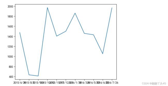
#如果只是显示部分时间,或者按照某个规则展示(如:间隔两个数展示)
plt.xticks(range(1,len(times),2))

#绘制图形
plt.plot(times,sales)
#让横坐标字体倾斜
plt.xticks(range(1,len(times),2),rotation=45)
plt.plot(times,sales)

#每个时间点的销量绘图
times=['2015/6/26','2015/8/1','2015/9/6','2015/10/12','2015/11/17','2015/12/23','2016/1/28','2016/3/4','2016/5/15','2016/6/20','2016/7/26']

#随机出销量
sales=np.random.randint(500,2000,size=len(times))

plt.xticks(rotation=45)

#绘制图形
plt.plot(times,sales)
#每个时间点的销量绘图
times=['2015/6/26','2015/8/1','2015/9/6','2015/10/12','2015/11/17','2015/12/23','2016/1/28','2016/3/4','2016/5/15','2016/6/20','2016/7/26']

#随机出销量
sales=np.random.randint(500,2000,size=len(times))

x_titcks=[1,2,3,4,5,6,7,8,9]
x_lables=['%s度'%i for i in x_titcks]
plt.xticks(x_titcks,x_lables)

#绘制图形
plt.plot(times,sales)
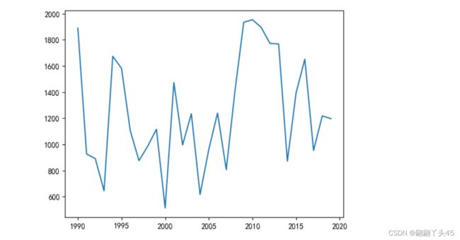
#日期
times=np.arange(1990,2020).astype(np.str_)#类型如果为字符串类型,则会把所有数字都展示出来
#销量
sales=np.random.randint(500,2000,size=len(times))
#绘图

#所以用这个选择性显示
plt.xticks(range(0,len(times),2),color='red',rotation=45)

plt.plot(times,sales)
#日期
times=np.arange(1990,2020)#这个数据类型为数字,会以size大小展示
#销量
sales=np.random.randint(500,2000,size=len(times))
#绘图
plt.plot(times,sales)
4、图例legend
#每个时间点的销量绘图
times=['2015/6/26','2015/8/1','2015/9/6','2015/10/12','2015/11/17','2015/12/23','2016/1/28','2016/3/4','2016/5/15','2016/6/20','2016/7/26']

#随机收入
income=np.random.randint(500,2000,size=len(times))

#支出
outcome=np.random.randint(300,1500,size=len(times))

#绘制图形
plt.xticks(range(0,len(times),2),color='red',rotation=45)
#注意:在使用图例前为每个图形设置label参数
plt.plot(times,income,label="收入")
plt.plot(times,outcome,label="支出")
#默认会使用每个图形的label值作为图例中的说明
plt.legend()

5、显示线条数据text
#每个时间点的销量绘图
times=['2015/6/26','2015/8/1','2015/9/6','2015/10/12','2015/11/17','2015/12/23','2016/1/28','2016/3/4','2016/5/15','2016/6/20','2016/7/26']

#随机收入
income=np.random.randint(500,2000,size=len(times))

#支出
outcome=np.random.randint(300,1500,size=len(times))

#绘制图形
plt.xticks(range(0,len(times),2),color='red',rotation=45)
#注意:在使用图例前为每个图形设置label参数
plt.plot(times,income,label="收入")
plt.plot(times,outcome,label="支出")
#默认会使用每个图形的label值作为图例中的说明
plt.legend()

#zip()可以把两个列表压成一个
for x,y in zip(times,income):
    #plt.text(x,y,y)
    plt.text(x,y,'%s万'%y)