正态分布(用python画出相应的图)
正态分布
正态分布代表了宇宙中大多数情况的运转状态。大量的随机变量被证明是正态分布的。
若随机变量X服从一个数学期望为 、方差为^2的正态分布,记为N( ,^2)。其概率密度函数为正态分布的期望值 决定了其位置,其标准差决定了分布的幅度。当 = 0, = 1时的正态分布是标准正态分布。
公式为:
- 是均值
- 是标准差
# IMPORTS
import numpy as np
import scipy.stats as stats
import matplotlib.pyplot as plt
import matplotlib.style as style
from IPython.core.display import HTML
# PLOTTING CONFIG
%matplotlib inline
style.use('fivethirtyeight')
plt.rcParams["figure.figsize"] = (14, 7)
plt.figure(dpi=100)
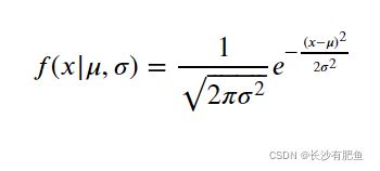
# PDF 概率密度函数(Probability Density Function)
plt.plot(np.linspace(-6, 6, 100),
stats.norm.pdf(np.linspace(-6, 6, 100)) / np.max(stats.norm.pdf(np.linspace(-3, 3, 100))),
)
plt.fill_between(np.linspace(-6, 6, 100),
stats.norm.pdf(np.linspace(-6, 6, 100)) / np.max(stats.norm.pdf(np.linspace(-3, 3, 100))),
alpha=.15,
)
# CDF 累积概率密度函数(Cumulative Probability Density Function)
plt.plot(np.linspace(-6, 6, 100),
stats.norm.cdf(np.linspace(-6, 6, 100)),
)
# LEGEND
plt.text(x=-1.5, y=.7, s="pdf (normed)", rotation=65, alpha=.75, weight="bold", color="#008fd5")
plt.text(x=-.4, y=.5, s="cdf", rotation=55, alpha=.75, weight="bold", color="#fc4f30")
# TICKS
plt.tick_params(axis = 'both', which = 'major', labelsize = 18)
plt.axhline(y = 0, color = 'black', linewidth = 1.3, alpha = .7)
# TITLE
plt.text(x = -5, y = 1.25, s = "Normal Distribution - Overview",
fontsize = 26, weight = 'bold', alpha = .75)
plt.text(x = -5, y = 1.1,
s = 'Depicted below are the normed probability density function (pdf) and the cumulative density\nfunction (cdf) of a normally distributed random variable $ y \sim \mathcal{N}(\mu,\sigma) $, given $ \mu = 0 $ and $ \sigma = 1$.',
fontsize = 19, alpha = .85)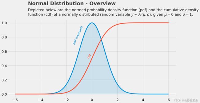
改变均值后,用python画出不同均值的图如下所示:
plt.figure(dpi=100)

# PDF MU = 0
plt.plot(np.linspace(-4, 4, 100),
         stats.norm.pdf(np.linspace(-4, 4, 100)),
        )
plt.fill_between(np.linspace(-4, 4, 100),
                 stats.norm.pdf(np.linspace(-4, 4, 100)),
                 alpha=.15,
                )

# PDF MU = 2
plt.plot(np.linspace(-4, 4, 100),
         stats.norm.pdf(np.linspace(-4, 4, 100), loc=2),
        )
plt.fill_between(np.linspace(-4, 4, 100),
                 stats.norm.pdf(np.linspace(-4, 4, 100),loc=2),
                 alpha=.15,
                )

# PDF MU = -2
plt.plot(np.linspace(-4, 4, 100),
         stats.norm.pdf(np.linspace(-4, 4, 100), loc=-2),
        )
plt.fill_between(np.linspace(-4, 4, 100),
                 stats.norm.pdf(np.linspace(-4, 4, 100),loc=-2),
                 alpha=.15,
                )

# LEGEND
plt.text(x=-1, y=.35, s="$ \mu = 0$", rotation=65, alpha=.75, weight="bold", color="#008fd5")
plt.text(x=1, y=.35, s="$ \mu = 2$", rotation=65, alpha=.75, weight="bold", color="#fc4f30")
plt.text(x=-3, y=.35, s="$ \mu = -2$", rotation=65, alpha=.75, weight="bold", color="#e5ae38")


# TICKS
plt.tick_params(axis = 'both', which = 'major', labelsize = 18)
plt.axhline(y = 0, color = 'black', linewidth = 1.3, alpha = .7)

# TITLE,
plt.text(x = -5, y = 0.51, s = "Normal Distribution - $ \mu $",
               fontsize = 26, weight = 'bold', alpha = .75)
plt.text(x = -5, y = 0.45,
         s = 'Depicted below are three normally distributed random variables with varying $ \mu $. As one can easily\nsee the parameter $\mu$ shifts the distribution along the x-axis.',
         fontsize = 19, alpha = .85)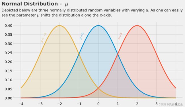
改变标准差的值后:
plt.figure(dpi=100)

# PDF SIGMA = 1
plt.plot(np.linspace(-4, 4, 100),
         stats.norm.pdf(np.linspace(-4, 4, 100), scale=1),
        )
plt.fill_between(np.linspace(-4, 4, 100),
                 stats.norm.pdf(np.linspace(-4, 4, 100), scale=1),
                 alpha=.15,
                )

# PDF SIGMA = 2
plt.plot(np.linspace(-4, 4, 100),
         stats.norm.pdf(np.linspace(-4, 4, 100), scale=2),
        )
plt.fill_between(np.linspace(-4, 4, 100),
                 stats.norm.pdf(np.linspace(-4, 4, 100), scale=2),
                 alpha=.15,
                )

# PDF SIGMA = 0.5
plt.plot(np.linspace(-4, 4, 100),
         stats.norm.pdf(np.linspace(-4, 4, 100), scale=0.5),
        )
plt.fill_between(np.linspace(-4, 4, 100),
                 stats.norm.pdf(np.linspace(-4, 4, 100), scale=0.5),
                 alpha=.15,
                )

# LEGEND
plt.text(x=-1.25, y=.3, s="$ \sigma = 1$", rotation=51, alpha=.75, weight="bold", color="#008fd5")
plt.text(x=-2.5, y=.13, s="$ \sigma = 2$", rotation=11, alpha=.75, weight="bold", color="#fc4f30")
plt.text(x=-0.75, y=.55, s="$ \sigma = 0.5$", rotation=75, alpha=.75, weight="bold", color="#e5ae38")


# TICKS
plt.tick_params(axis = 'both', which = 'major', labelsize = 18)
plt.axhline(y = 0, color = 'black', linewidth = 1.3, alpha = .7)

# TITLE, SUBTITLE & FOOTER
plt.text(x = -5, y = 0.98, s = "Normal Distribution - $ \sigma $",
               fontsize = 26, weight = 'bold', alpha = .75)
plt.text(x = -5, y = 0.87,
         s = 'Depicted below are three normally distributed random variables with varying $\sigma $. As one can easily\nsee the parameter $\sigma$ "sharpens" the distribution (the smaller $ \sigma $ the sharper the function).',
         fontsize = 19, alpha = .85)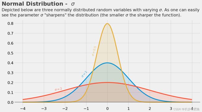
可以使用norm.rvs()其中默认值 =0 =1,也可以自己指定。
from scipy.stats import norm

# draw a single sample
print(norm.rvs(), end="\n\n")

# draw 10 samples
print(norm.rvs(size=10), end="\n\n")

# adjust mean ('loc') and standard deviation ('scale')
print(norm.rvs(loc=10, scale=0.1), end="\n\n")
得到的结果:
-1.0327268294570437

[ 0.23949108 -1.90965281  1.27537009 -1.29891168  1.05951491 -0.3961516
  0.3143319  -0.4762236   3.07865552 -2.15669779]

10.050218738855552
通过概率密度分布函数来进行计算:
from scipy.stats import norm

# additional imports for plotting purpose
import numpy as np
import matplotlib.pyplot as plt
%matplotlib inline
plt.rcParams["figure.figsize"] = (14, 7)

# relative likelihood of x and y
x = -1
y = 2
print("pdf(x) = {}\npdf(y) = {}".format(norm.pdf(x), norm.pdf(y)))

# continuous pdf for the plot
x_s = np.linspace(-3, 3, 50)
y_s = norm.pdf(x_s)
plt.scatter(x_s, y_s,color='red');
pdf(x) = 0.24197072451914337 pdf(y) = 0.05399096651318806

累积概率密度函数(Cumulative Probability Density Function)
from scipy.stats import norm

# probability of x less or equal 0.3
print("P(X <0.3) = {}".format(norm.cdf(0.3)))

# probability of x in [-0.2, +0.2]
print("P(-0.2 < X < 0.2) = {}".format(norm.cdf(0.2) - norm.cdf(-0.2)))
P(X <0.3) = 0.6179114221889526 P(-0.2 < X < 0.2) = 0.15851941887820603
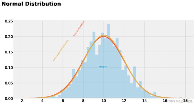
当遇到下面的报错时:
AttributeError: 'Rectangle' object has no property 'normed'
将normed=True改为density=True:
plt.hist(sample, bins=50,normed=True, alpha=.25)plt.hist(sample, bins=50,density=True, alpha=.25)plt.figure(dpi=100)
##### COMPUTATION #####
# DECLARING THE "TRUE" PARAMETERS UNDERLYING THE SAMPLE
mu_real = 10
sigma_real = 2
# DRAW A SAMPLE OF N=1000
np.random.seed(42)
sample = stats.norm.rvs(loc=mu_real, scale=sigma_real, size=1000)
# ESTIMATE MU AND SIGMA
mu_est = np.mean(sample)
sigma_est = np.std(sample)
print("Estimated MU: {}\nEstimated SIGMA: {}".format(mu_est, sigma_est))
##### PLOTTING #####
# SAMPLE DISTRIBUTION
plt.hist(sample, bins=50,density=True, alpha=.25)
# TRUE CURVE
plt.plot(np.linspace(2, 18, 1000), norm.pdf(np.linspace(2, 18, 1000),loc=mu_real, scale=sigma_real))
# ESTIMATED CURVE
plt.plot(np.linspace(2, 18, 1000), norm.pdf(np.linspace(2, 18, 1000),loc=np.mean(sample), scale=np.std(sample)))
# LEGEND
plt.text(x=9.5, y=.1, s="sample", alpha=.75, weight="bold", color="#008fd5")
plt.text(x=7, y=.2, s="true distrubtion", rotation=55, alpha=.75, weight="bold", color="#fc4f30")
plt.text(x=5, y=.12, s="estimated distribution", rotation=55, alpha=.75, weight="bold", color="#e5ae38")
# TICKS
plt.tick_params(axis = 'both', which = 'major', labelsize = 18)
plt.axhline(y = 0, color = 'black', linewidth = 1.3, alpha = .7)
# TITLE
plt.text(x = 0, y = 0.3, s = "Normal Distribution",
fontsize = 26, weight = 'bold', alpha = .75)