matplotlib条形图
Matplotlib
- 条形图
- 一、简单的条形图
-
- 1.用jupyter实现
- 2.pycharm
- 二、对条形图进行颜色区分
-
- 1.jupyter
- 2.pycharm
- 三、对折线图进行填充
-
- 1.jupyter
- 2.pycharm
- 四、条形图细节
-
- 1.jupyter
- 2.pycharm
- 五、条形图外观
-
- 1.pycharm
- 2.jupyter
条形图
一、简单的条形图
1.用jupyter实现
import numpy as np
import matplotlib
matplotlib.use('nbagg')
import matplotlib.pyplot as plt
#使得随机数据可预测,即设置相同的seed,每次生成的随机数相同
np.random.seed(0)
#一个参数时,参数值为终点
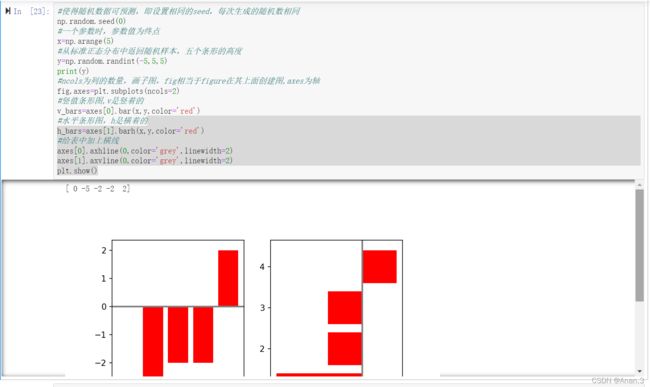
x=np.arange(5)
#从标准正态分布中返回随机样本,五个条形的高度
y=np.random.randint(-5,5,5)
print(y)
#ncols为列的数量,画子图,fig相当于figure在其上面创建图,axes为轴
fig,axes=plt.subplots(ncols=2)
#竖值条形图,v是竖着的
v_bars=axes[0].bar(x,y,color='red')
#水平条形图,h是横着的
h_bars=axes[1].barh(x,y,color='red')
#给表中加上横线
axes[0].axhline(0,color='grey',linewidth=2)
axes[1].axvline(0,color='grey',linewidth=2)
plt.show()
2.pycharm
import numpy as np
import matplotlib.pyplot as plt
#使得随机数据可预测,即设置相同的seed,每次生成的随机数相同
np.random.seed(0)
#一个参数时,参数值为终点
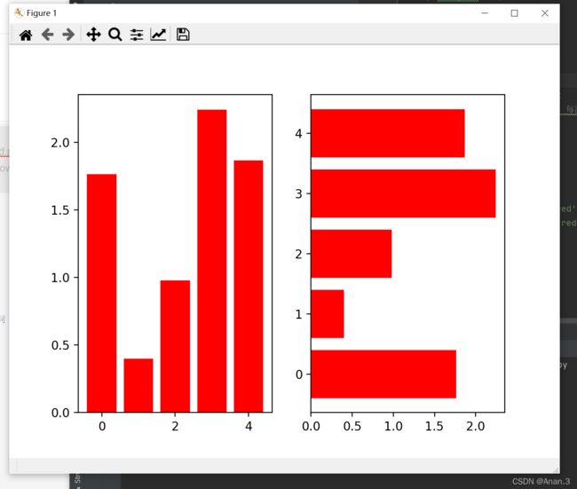
x=np.arange(5)
#从标准正态分布中返回随机样本
y=np.random.randn(5)
fig,axes=plt.subplots(ncols=2)
v_bars=axes[0].bar(x,y,color='red')
h_bars=axes[1].barh(x,y,color='red')
plt.show()
二、对条形图进行颜色区分
1.jupyter
import numpy as np
import matplotlib
matplotlib.use('nbagg')
import matplotlib.pyplot as plt
fig,ax=plt.subplots()
#设置一个竖值条形图,颜色为浅蓝
v_bars=ax.bar(x,y,color='lightblue')
#对条形图和y值进行遍历,如果在y=0下面则设置成绿色
for bar,height in zip(v_bars,y):
    if height<0:
        bar.set(color='green',linewidth=3)
plt.show()

2.pycharm
import numpy as np
import matplotlib.pyplot as plt
np.random.seed(0)
#一个参数时,参数值为终点
x=np.arange(5)
#从标准正态分布中返回随机样本
y=np.random.randint(-5,5,5)
fig,ax=plt.subplots()
#设置一个竖值条形图,颜色为浅蓝
v_bars=ax.bar(x,y,color='lightblue')
#对条形图和y值进行遍历,如果在y=0下面则设置成绿色
for bar,height in zip(v_bars,y):
    if height<0:
        bar.set(color='green',linewidth=3)
plt.show()

三、对折线图进行填充
1.jupyter
样例一
import numpy as np
import matplotlib
matplotlib.use('nbagg')
import matplotlib.pyplot as plt
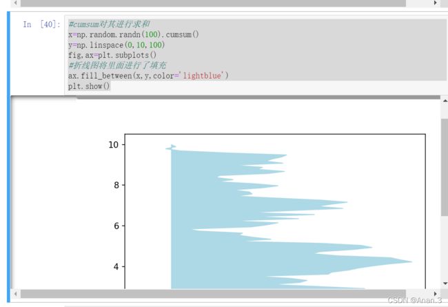
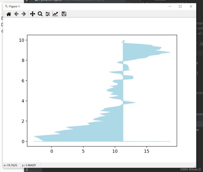
#cumsum对其进行求和
x=np.random.randn(100).cumsum()
y=np.linspace(0,10,100)
fig,ax=plt.subplots()
#折线图将里面进行了填充
ax.fill_between(x,y,color='lightblue')
plt.show()
样例二
import numpy as np
import matplotlib
matplotlib.use('nbagg')
import matplotlib.pyplot as plt
x=np.linspace(0,10,200)
y1=2*x+1
y2=3*x+1.2
y_mean=0.5*x*np.cos(2*x)+2.5*x+1.1
fig,ax=plt.subplots()
ax.fill_between(x,y1,y2,color='red')
ax.plot(x,y_mean,color='black')
plt.show()

2.pycharm
样例一
import numpy as np
import matplotlib.pyplot as plt
#cumsum对其进行求和
x=np.random.randn(100).cumsum()
y=np.linspace(0,10,100)
fig,ax=plt.subplots()
#折线图将里面进行了填充
ax.fill_between(x,y,color='lightblue')
plt.show()
样例二
import numpy as np
import matplotlib.pyplot as plt
x=np.linspace(0,10,200)
y1=2*x+1
y2=3*x+1.2
y_mean=0.5*x*np.cos(2*x)+2.5*x+1.1
fig,ax=plt.subplots()
ax.fill_between(x,y1,y2,color='red')
ax.plot(x,y_mean,color='black')
plt.show()

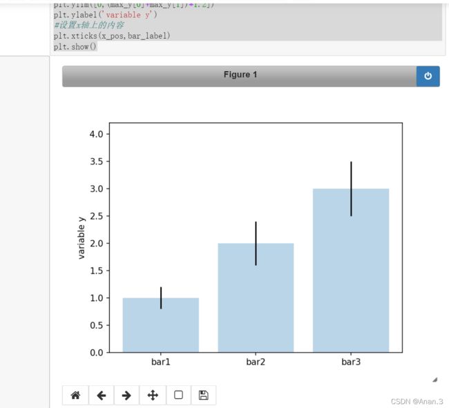
四、条形图细节
1.jupyter
样例一
import numpy as np
import matplotlib
matplotlib.use('nbagg')
import matplotlib.pyplot as plt
#要画的三个指标
mean_values=[1,2,3]
#误差范围
variance=[0.2,0.4,0.5]
#三个柱名字
bar_label=['bar1','bar2','bar3']
fig,ax=plt.subplots()
#在x上的位置
x_pos=list(range(len(bar_label)))
#yerr为误差范围
plt.bar(x_pos,mean_values,yerr=variance,alpha=0.3)
#设置高度
max_y=max(zip(mean_values,variance))
#y轴高度
plt.ylim([0,(max_y[0]+max_y[1])*1.2])
plt.ylabel('variable y')
#设置x轴上的内容
plt.xticks(x_pos,bar_label)
plt.show()
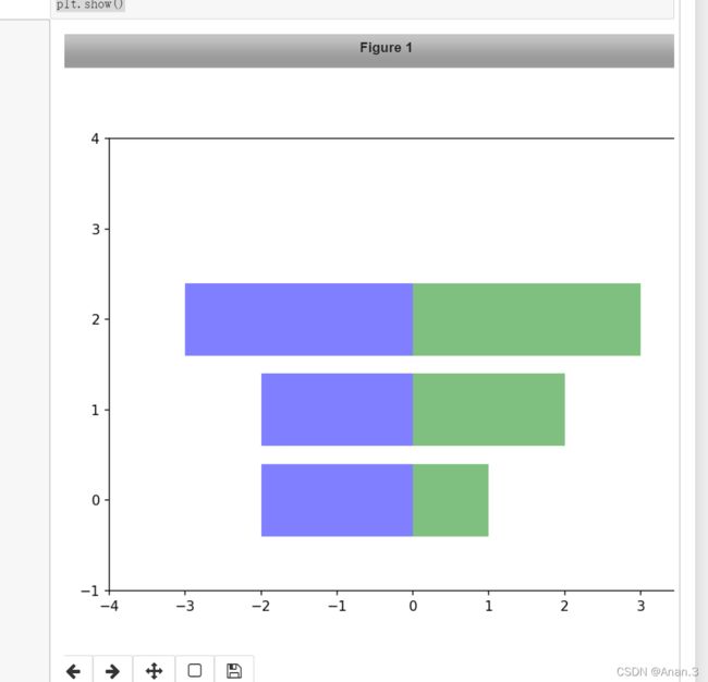
样例二
import numpy as np
import matplotlib
matplotlib.use('nbagg')
import matplotlib.pyplot as plt
#柱子的长度
x1=np.array([1,2,3])
x2=np.array([2,2,3])
bar_labels=['bar1','bar2','bar3']
#图的宽,高
fig=plt.figure(figsize=(8,6))
#三个值对应的位置
y_pos=np.arange(len(x1))
y_pos=[x for x in y_pos]
plt.barh(y_pos,x1,color='g',alpha=0.5)
plt.barh(y_pos,-x2,color='b',alpha=0.5)
plt.xlim(-max(x2)-1,max(x1)+1)
plt.ylim(-1,len(x1)+1)
plt.show()
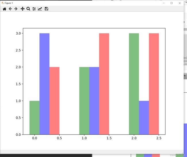
样例三
import numpy as np
import matplotlib
matplotlib.use('nbagg')
import matplotlib.pyplot as plt
green_data=[1,2,3]
blue_data=[3,2,1]
red_data=[2,3,3]
labels=['group 1','group 2','group 3']
pos=list(range(len(green_data)))
width=0.2
fig,ax=plt.subplots(figsize=(8,6))
plt.bar(pos,green_data,width,alpha=0.5,color='g',label=labels[0])
plt.bar([p+width for p in pos],blue_data,width,alpha=0.5,color='b',label=labels[1])
plt.bar([p+width*2 for p in pos],red_data,width,alpha=0.5,color='r',label=labels[2])
plt.show()

2.pycharm
样例一
import matplotlib.pyplot as plt
#要画的三个指标
mean_values=[1,2,3]
#误差范围
variance=[0.2,0.4,0.5]
#三个柱名字
bar_label=['bar1','bar2','bar3']
#间隔位置
x_pos=list(range(len(bar_label)))
plt.bar(x_pos,mean_values,yerr=variance)
#设置高度
max_y=max(zip(mean_values,variance))
plt.ylim([0,(max_y[0]+max_y[1])*1.2])
plt.ylabel('variable y')
plt.xticks(x_pos,bar_label)
plt.show()

样例二
import numpy as np
import matplotlib.pyplot as plt
#柱子的长度
x1=np.array([1,2,3])
x2=np.array([2,2,3])
bar_labels=['bar1','bar2','bar3']
#图的宽,高
fig=plt.figure(figsize=(8,6))
#三个值对应的位置
y_pos=np.arange(len(x1))
y_pos=[x for x in y_pos]
plt.barh(y_pos,x1,color='g',alpha=0.5)
plt.barh(y_pos,-x2,color='b',alpha=0.5)
plt.xlim(-max(x2)-1,max(x1)+1)
plt.ylim(-1,len(x1)+1)
plt.show()

样例三
import matplotlib.pyplot as plt
green_data=[1,2,3]
blue_data=[3,2,1]
red_data=[2,3,3]
labels=['group 1','group 2','groups 3']
pos=list(range(len(green_data)))
width=0.2
fig,ax=plt.subplots(figsize=(8,6))
plt.bar(pos,green_data,width,alpha=0.5,color='g',label=labels[0])
plt.bar([p+width for p in pos],blue_data,width,alpha=0.5,color='b',label=labels[1])
plt.bar([p+width*2 for p in pos],red_data,width,alpha=0.5,color='r',label=labels[2])
plt.show()
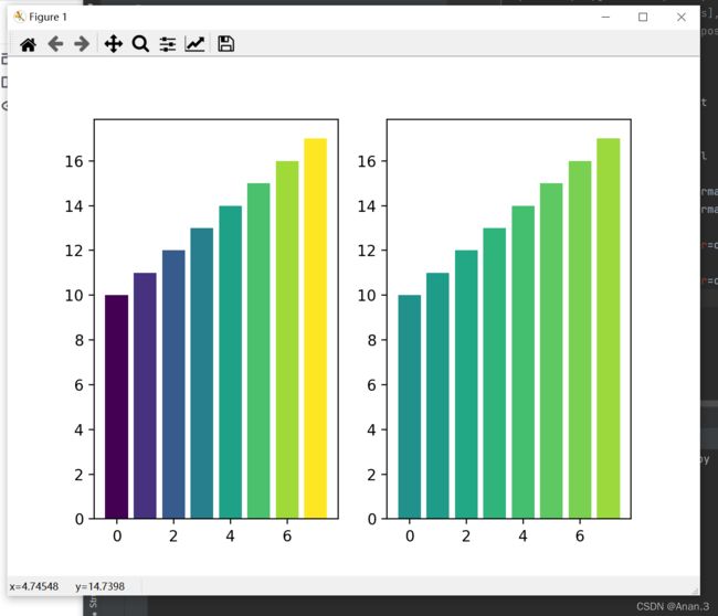
五、条形图外观
1.pycharm
import matplotlib.pyplot as plt
mean_values=range(10,18)
x_pos=range(len(mean_values))
import matplotlib.colors as col
import matplotlib.cm as cm
cmap1=cm.ScalarMappable(col.Normalize(min(mean_values),max(mean_values),cm.hot))
cmap2=cm.ScalarMappable(col.Normalize(0,20,cm.hot))
plt.subplot(121)
plt.bar(x_pos,mean_values,color=cmap1.to_rgba(mean_values))
plt.subplot(122)
plt.bar(x_pos,mean_values,color=cmap2.to_rgba(mean_values))
plt.show()
2.jupyter
import numpy as np
import matplotlib
matplotlib.use('nbagg')
import matplotlib.pyplot as plt
patterns=('-','+','x','\\','*','o','O','.')
fig=plt.gca()
mean_value=range(1,len(patterns)+1)
fig,ax=plt.subplots()
x_pos=list(range(len(mean_value)))
bars=plt.bar(x_pos,mean_value,color='white')
for bar,pattern in zip(bars,patterns):
    bar.set_hatch(pattern)
plt.show()
