最近项目里边要用进度条,进度条中间展示进度,底部展示label,因为这个组件用的地方多,所以我就直接封装了一个通用组件。
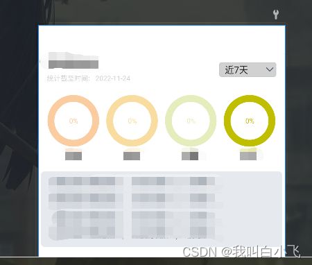
先看一下效果图:
功能有:
- 圆环的颜色和进度可以自定义;
- 中间文字可以自定义;
- 可以自定义圆环的宽度;
- 可以设置底部文字(文字内容、大小和textStyle);
- 提供设置进度的接口;
- 可以设置进度的最大值;
下边开始编码:
- 首先继承定义一个类继承自View,因为我们需要提供一些可配置的自定义属性:
public class CircleProgress extends View {
private final Paint mPaint;
private final RectF mRectF;
private final Rect mRect;
private final Paint mBottomPaint;
private int mCurrent;
private int mMax;
private int mWidth;
public CircleProgress(Context context) {
this(context,null);
}
public CircleProgress(Context context, @Nullable AttributeSet attrs) {
this(context, attrs,0);
}
public CircleProgress(Context context, @Nullable AttributeSet attrs, int defStyleAttr) {
super(context, attrs, defStyleAttr);
initAttr(context,attrs);
mPaint = new Paint();
mBottomPaint = new Paint();
mBottomPaint.setAntiAlias(true);
mPaint.setAntiAlias(true);
mRectF = new RectF();
mRect = new Rect();
}
}
- 自定义属性,在attr.xml中新建一个declare-styleable,并命名为:CircleProgress
    <declare-styleable name="CircleProgress">
        <attr name="max_progress" format="integer"/>
        <attr name="arc_bg_color" format="color"/>
        <attr name="arc_color" format="color"/>
        <attr name="arc_width" format="dimension"/>
        <attr name="mid_text_size" format="dimension"/>
        <attr name="bottom_text_size" format="dimension"/>
        <attr name="bottom_text" format="string" localization="suggested"/>
        <attr name="textStyle">
            <flag name="normal" value="0" />
            <flag name="bold" value="1" />
        attr>
    declare-styleable>
- 然后我们在initAttr()方法中解析这些属性,解析出来的属性,后边在绘制的时候需要用到:
  private void initAttr(Context context, AttributeSet attrs) {
        TypedArray attributes = context.obtainStyledAttributes(attrs,R.styleable.CircleProgress);
        mMax = attributes.getInteger(R.styleable.CircleProgress_max_progress, 100);
        mCircleBGColor = attributes.getColor(R.styleable.CircleProgress_arc_bg_color,context.getResources().getColor(R.color.color_d1, null));
        mCircleColor = attributes.getColor(R.styleable.CircleProgress_arc_color,context.getResources().getColor(R.color.colorRed, null));
        mArcWidth = attributes.getDimensionPixelOffset(R.styleable.CircleProgress_arc_width,SizeUtils.dp2px(20));
        mPercentTextSize = attributes.getDimensionPixelOffset(R.styleable.CircleProgress_mid_text_size,SizeUtils.sp2px(12));
        mBottomTextSize = attributes.getDimensionPixelOffset(R.styleable.CircleProgress_bottom_text_size,SizeUtils.sp2px(14));
        mBottomTextId = attributes.getResourceId(R.styleable.CircleProgress_bottom_text,0);
        mBottomText = attributes.getText(R.styleable.CircleProgress_bottom_text).toString();
        mBottomTextType = attributes.getInt(R.styleable.CircleProgress_textStyle,0);
        attributes.recycle();
    }
- 解析完属性之后,就可以开始绘制了,绘制主要按照顺序绘制,我们先绘制圆环,在绘制百分比,然后绘制底部文字:
@Override
protected void onDraw(Canvas canvas) {
super.onDraw(canvas);
mPaint.setStyle(Paint.Style.STROKE);
mPaint.setAntiAlias(true);
mPaint.setStrokeWidth(mArcWidth);
mPaint.setColor(mCircleBGColor);
float bigCircleRadius = mWidth / 2;
float smallCircleRadius = bigCircleRadius - mArcWidth;
canvas.drawCircle(bigCircleRadius,bigCircleRadius,smallCircleRadius,mPaint);
mPaint.setColor(mCircleColor);
mRectF.set(mArcWidth,mArcWidth,mWidth - mArcWidth,mWidth - mArcWidth);
canvas.drawArc(mRectF,90f,mCurrent * 360f / mMax, false, mPaint);
String percent = mCurrent * 100 / mMax + "%";
mPaint.setStrokeWidth(0);
mPaint.setStyle(Paint.Style.FILL);
mPaint.setTextSize(mPercentTextSize);
mPaint.getTextBounds(percent, 0, percent.length(), mRect);
mPaint.setColor(mCircleColor);
canvas.drawText(percent,bigCircleRadius- mRect.width() / 2, bigCircleRadius + mRect.height() / 2, mPaint);
if (!TextUtils.isEmpty(mBottomText)) {
mBottomPaint.setStrokeWidth(0);
mBottomPaint.setTextSize(mBottomTextSize);
mBottomPaint.getTextBounds(mBottomText.toString(),0, mBottomText.toString().length(),mRect);
mBottomPaint.setColor(Color.BLACK);
if (mBottomTextType == 1) {
Typeface tf = Typeface.DEFAULT_BOLD;
mBottomPaint.setTypeface(tf);
}
canvas.drawText(mBottomText.toString(),bigCircleRadius - mRect.width() / 2f, mWidth + mRect.height(), mBottomPaint);
} else if(mBottomTextId > 0){
String bottomText = getResources().getString(mBottomTextId);
mBottomPaint.setStrokeWidth(0);
mBottomPaint.setTextSize(mBottomTextSize);
mBottomPaint.getTextBounds(bottomText,0, bottomText.length(),mRect);
mBottomPaint.setColor(Color.BLACK);
if (mBottomTextType == 1) {
Typeface tf = Typeface.DEFAULT_BOLD;
mBottomPaint.setTypeface(tf);
}
canvas.drawText(bottomText,bigCircleRadius - mRect.width() / 2f, mWidth + mRect.height(), mBottomPaint);
}
}
- 编译之后就可以在布局文件中使用了:
 <com.towngas.top.commonlibrary.widget.CircleProgress
                    android:id="@+id/cp_timeliness_patrol"
                    android:layout_width="0dp"
                    android:layout_weight="1"
                    android:layout_height="match_parent"
                    app:max_progress="100"
                    app:arc_width="@dimen/dp_12"
                    app:arc_bg_color="#FBCCA0"
                    app:arc_color="#FBCCA0"
                    app:bottom_text_size="@dimen/sp_14"
                    app:textStyle="bold"
                    app:bottom_text="下载"/>
完整代码:
public class CircleProgress extends View {
private final Paint mPaint;
private final RectF mRectF;
private final Rect mRect;
private final Paint mBottomPaint;
private int mCurrent;
private int mMax;
private int mWidth;
private float mArcWidth;
private int mCircleBGColor;
private int mCircleColor;
private int mBottomTextId = Resources.ID_NULL;
private CharSequence mBottomText;
private float mPercentTextSize;
private float mBottomTextSize;
private int mBottomTextType;
public CircleProgress(Context context) {
this(context,null);
}
public CircleProgress(Context context, @Nullable AttributeSet attrs) {
this(context, attrs,0);
}
public CircleProgress(Context context, @Nullable AttributeSet attrs, int defStyleAttr) {
super(context, attrs, defStyleAttr);
initAttr(context,attrs);
mPaint = new Paint();
mBottomPaint = new Paint();
mBottomPaint.setAntiAlias(true);
mPaint.setAntiAlias(true);
mRectF = new RectF();
mRect = new Rect();
}
private void initAttr(Context context, AttributeSet attrs) {
TypedArray attributes = context.obtainStyledAttributes(attrs,R.styleable.CircleProgress);
mMax = attributes.getInteger(R.styleable.CircleProgress_max_progress, 100);
mCircleBGColor = attributes.getColor(R.styleable.CircleProgress_arc_bg_color,context.getResources().getColor(R.color.color_d1, null));
mCircleColor = attributes.getColor(R.styleable.CircleProgress_arc_color,context.getResources().getColor(R.color.colorRed, null));
mArcWidth = attributes.getDimensionPixelOffset(R.styleable.CircleProgress_arc_width,SizeUtils.dp2px(20));
mPercentTextSize = attributes.getDimensionPixelOffset(R.styleable.CircleProgress_mid_text_size,SizeUtils.sp2px(12));
mBottomTextSize = attributes.getDimensionPixelOffset(R.styleable.CircleProgress_bottom_text_size,SizeUtils.sp2px(14));
mBottomTextId = attributes.getResourceId(R.styleable.CircleProgress_bottom_text,0);
mBottomText = attributes.getText(R.styleable.CircleProgress_bottom_text).toString();
mBottomTextType = attributes.getInt(R.styleable.CircleProgress_textStyle,0);
attributes.recycle();
}
public void SetCurrent(int current) {
this.mCurrent = current;
invalidate();
}
@Override
protected void onMeasure(int widthMeasureSpec, int heightMeasureSpec) {
super.onMeasure(widthMeasureSpec, heightMeasureSpec);
mWidth = getMeasuredWidth();
}
@Override
protected void onDraw(Canvas canvas) {
super.onDraw(canvas);
mPaint.setStyle(Paint.Style.STROKE);
mPaint.setAntiAlias(true);
mPaint.setStrokeWidth(mArcWidth);
mPaint.setColor(mCircleBGColor);
float bigCircleRadius = mWidth / 2;
float smallCircleRadius = bigCircleRadius - mArcWidth;
canvas.drawCircle(bigCircleRadius,bigCircleRadius,smallCircleRadius,mPaint);
mPaint.setColor(mCircleColor);
mRectF.set(mArcWidth,mArcWidth,mWidth - mArcWidth,mWidth - mArcWidth);
canvas.drawArc(mRectF,90f,mCurrent * 360f / mMax, false, mPaint);
String percent = mCurrent * 100 / mMax + "%";
mPaint.setStrokeWidth(0);
mPaint.setStyle(Paint.Style.FILL);
mPaint.setTextSize(mPercentTextSize);
mPaint.getTextBounds(percent, 0, percent.length(), mRect);
mPaint.setColor(mCircleColor);
canvas.drawText(percent,bigCircleRadius- mRect.width() / 2, bigCircleRadius + mRect.height() / 2, mPaint);
if (!TextUtils.isEmpty(mBottomText)) {
mBottomPaint.setStrokeWidth(0);
mBottomPaint.setTextSize(mBottomTextSize);
mBottomPaint.getTextBounds(mBottomText.toString(),0, mBottomText.toString().length(),mRect);
mBottomPaint.setColor(Color.BLACK);
if (mBottomTextType == 1) {
Typeface tf = Typeface.DEFAULT_BOLD;
mBottomPaint.setTypeface(tf);
}
canvas.drawText(mBottomText.toString(),bigCircleRadius - mRect.width() / 2f, mWidth + mRect.height(), mBottomPaint);
} else if(mBottomTextId > 0){
String bottomText = getResources().getString(mBottomTextId);
mBottomPaint.setStrokeWidth(0);
mBottomPaint.setTextSize(mBottomTextSize);
mBottomPaint.getTextBounds(bottomText,0, bottomText.length(),mRect);
mBottomPaint.setColor(Color.BLACK);
if (mBottomTextType == 1) {
Typeface tf = Typeface.DEFAULT_BOLD;
mBottomPaint.setTypeface(tf);
}
canvas.drawText(bottomText,bigCircleRadius - mRect.width() / 2f, mWidth + mRect.height(), mBottomPaint);
}
}
水平有限,忘各位批评指正。如果有问题欢饮交流讨论。项目中涉及的工具SizeUtils 就是简单的dp、px的转换。