pyplot的基础使用
学习目标:
学习python数据分析与展示
所采用到的课程链接是北理-Python数据分析与展示-Numpy、Matplotlib、Pandas
学习内容:
| 函数 | 使用说明 |
|---|---|
| plt.plot(x,y,fmt,…) | 坐标图 |
| plt.boxplot(data,notch,postion) | 箱型图 |
| plt.bar(left,height,width,bottom) | 条形图 |
| plt.barth(width,bottom,left,height) | 横向条形图 |
| plt.ploar(theta,r) | 极坐标图 |
| plt.pie(data,explode) | 饼图 |
| plt.psd(x,NFFT=256,pad_to,Fs) | 功率谱密度图 |
| plt.specgram(x,NFFT=256,pad_to,F) | 谱图 |
| plt.cohere(x,y,NFFT=256,pad_to,Fs) | X-Y的相关性函数 |
| plt.scatter(x,y) | 散点图,x,y长度相同 |
| plt.step(x,y,where) | 步阶图 |
| plt.hist(x,bins,normed) | 直方图 |
| plt.contour(X,Y,Z,N) | 等值图 |
| plt.vlines() | 垂直图 |
| plt.stem(x,y,linefmt,markerfmt) | 柴火图 |
| plt.plot_date() | 数据日期 |
更多的内容可以查找pyplot的官网进行学习
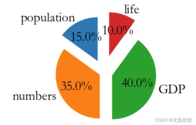
饼图的绘制
import matplotlib.pyplot as plt
labels='population','numbers','GDP','life'
sizes=[15,35,40,10]
explode=(0.3,0.1,0.2,0.4)
#表示哪一部分是需要突出的
plt.pie(sizes,explode=explode,labels=labels,autopct='%1.1f%%',shadow=False,startangle=90)
plt.axis('equal')
plt.show()
绘制直方图
bin:表示的是直方图的个数
可以进行归一化,对取值上的一个分布
import numpy as np
import matplotlib.pyplot as plt
import warnings


warnings.filterwarnings("ignore")
np.random.seed(0)#随机数种子
mu,sigma=100,20#均值以及标准差
a=np.random.normal(mu,sigma,size=100)

plt.hist(a,40,density=True,facecolor='red',alpha=0.75)
#原版视频使用到的是normed,是因为 matplotlib版本所导致的问题
#将normed改为density
#要删除掉type
plt.title('Histogram')
plt.show()
画出得到的图像如下:

绘制极坐标图像
import numpy as np
import matplotlib. pyplot as plt
N=25#设计随机数种子
thera=np.linspace(0.0,3*np.pi,N,endpoint=False)
radii=10*np.random.rand(N)
width=np.pi/4 *np.random.rand(N)

ax=plt.subplot(111,projection='polar')
bars=ax.bar(thera,radii,width=width,bottom=0.5)
#left,heigh ,width
for r,bar in zip(radii,bars):
    bar.set_facecolor(plt.cm.viridis(r/10.))
    bar.set_alpha(0.5)

plt.show()

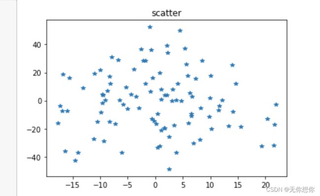
画制散点图
fig,ax=plt.subplots()
ax.plot(10*np.random.randn(100),20*np.random.randn(100),'*')
ax.set_title('scatter')
plt.show()
学习总结
基于matplotlib画图不是最重要的,最重要的是根据得到的数据去选择合适的图像