python 分组箱线图_箱线图的N种画法

图中标示了箱线图中每条线和点表示的含义,其中应用到了分位数的概念 线的主要包含五个数据节点,将一组数据从大到小排列,分别计算出他的上边缘(Maximum),上四分位数(Q3),中位数(Median),下四分位数(Q1),下边缘(Minimum) 不在上边缘与下边缘的范围内的为异常值,用点表示。
数据准备
data <- data.frame(Value = rnorm(300),
                   Repeat = rep(paste("Repeat", 1:3, sep = "_"), 100),
                   Condition = rep(c("Control", "Test"), 150))

> head(data)
       Value   Repeat Condition
1 -1.1395507 Repeat_1   Control
2  0.7319707 Repeat_2      Test
3 -0.2219461 Repeat_3   Control
4 -1.1454664 Repeat_1      Test
5  1.0740937 Repeat_2   Control
6  0.3741845 Repeat_3      Test
boxplot函数(R自带)
最方便的方法就是用boxplot函数,不需要依赖任何包
boxplot(data$Value, ylab="Value")
根据不同的条件,加上颜色
boxplot(Value ~ Condition, data=data, ylab="Value", col=c("darkred", "darkgreen"))
boxplot(Value ~ Condition * Repeat, data=data, ylab="Value", col="darkgreen")
多个分组(condition和repeat)的箱线图
boxplot(Value ~ Condition + Repeat, data=data, ylab="Value", col="darkgreen")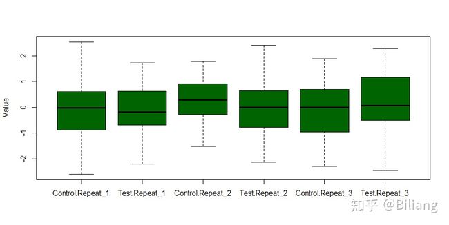
ggplot2
使用ggplot2来画箱线图是现在常用的方法
library(tidyverse)

# 定义一种主题,方便后面重复使用
theme_boxplot <- theme(panel.background=element_rect(fill="white",colour="black",size=0.25),
      axis.line=element_line(colour="black",size=0.25),
      axis.title=element_text(size=13,face="plain",color="black"),
      axis.text = element_text(size=12,face="plain",color="black"),
      legend.position="none"

# ggplot2画图
ggplot(data, aes(Condition, Value)) +
    geom_boxplot(aes(fill = Condition), notch = FALSE) +
    scale_fill_brewer(palette = "Set2") +
    theme_classic() + theme_boxplot
添加抖动散点
ggplot(data, aes(Condition, Value)) +
    geom_boxplot(aes(fill = Condition), notch = FALSE) +
    geom_jitter(binaxis = "y", position = position_jitter(0.2), stackdir = "center", dotsize = 0.4) +
    scale_fill_brewer(palette = "Set2") +
    theme_classic() + theme_boxplot
带凹槽(notched)的箱线图,中位数的置信区用凹槽表示
ggplot(data, aes(Condition, Value)) +
    geom_boxplot(aes(fill = Condition), notch = TRUE, varwidth = TRUE) +
    geom_jitter(binaxis = "y", position = position_jitter(0.2), stackdir = "center", dotsize = 0.4) +
    scale_fill_brewer(palette = "Set2") +
    theme_classic() + theme_boxplot
比较流行的小提琴图,内嵌箱线图和扰动散点
ggplot(data, aes(Condition, Value)) +
    geom_violin(aes(fill = Condition), trim = FALSE) +
    geom_boxplot(width = 0.2) +
    geom_jitter(binaxis = "y", position = position_jitter(0.2), stackdir = "center", dotsize = 0.4) +
    scale_fill_brewer(palette = "Set2") +
    theme_classic() + theme_boxplot
云雨图,它是密度分布图、箱线图、散点图的集合,完美的展示了所有数据信息
library(grid)

# GeomFlatViolin函数的定义见https://github.com/EasyChart/Beautiful-Visualization-with-R
ggplot(data, aes(Condition, Value, fill=Condition)) +
    geom_flat_violin(aes(fill = Condition), position = position_nudge(x=.25), color="black") +
    geom_jitter(aes(color = Condition), width=0.1) +
    geom_boxplot(width=.1, position=position_nudge(x=0.25), fill="white",size=0.5) +
    scale_fill_brewer(palette = "Set2") +
    coord_flip() + theme_bw() + theme_boxplot
分组画箱线图
根据不同的Condition和Repeat对数据分组画图
ggplot(data, aes(Repeat, Value)) +
    geom_boxplot(aes(fill = Condition), notch = FALSE, size = 0.4) +
    scale_fill_brewer(palette = "Set2") +
    guides(fill=guide_legend(title="Repeat")) +
    theme_bw()
同样的,我们可以对箱线图添加抖动点,但是分组之后,并不能直接添加抖动点,需要增加两列信息来辅助画抖动点
# 增加dist_cat和scat_adj ,用于画抖动点
data <- data %>% mutate(dist_cat = as.numeric(Repeat),
                        scat_adj = ifelse(Condition == "Control", -0.2, 0.2))

# 增加之后的数据如下
> head(data)
       Value   Repeat Condition dist_cat scat_adj
1 -1.1395507 Repeat_1   Control        1     -0.2
2  0.7319707 Repeat_2      Test        2      0.2
3 -0.2219461 Repeat_3   Control        3     -0.2
4 -1.1454664 Repeat_1      Test        1      0.2
5  1.0740937 Repeat_2   Control        2     -0.2
6  0.3741845 Repeat_3      Test        3      0.2

ggplot(data, aes(Repeat, Value)) +
    geom_boxplot(aes(fill = Condition), notch = FALSE, size = 0.4) +
    geom_jitter(aes(scat_adj+dist_cat, Value, fill = factor(Condition)),
                position=position_jitter(width=0.1,height=0),
                alpha=1,
                shape=21, size = 1.2) +
    scale_fill_brewer(palette = "Set2") +
    guides(fill=guide_legend(title="Condition ")) +
    theme_bw()
小提琴图本来是由两个左右对称的密度估计曲线构成,那么对数据分组之后,我们可以只保留两个小提琴图的各一半,这样更能直接的观察出两组之间的差异!
# ggplot2并未提供这样的功能,这里定义了geom_split_violin函数来实现
# geom_split_violin 的定义见 https://github.com/EasyChart/Beautiful-Visualization-with-R
ggplot(data, aes(x = Repeat, y = Value, fill=Condition)) +
  geom_split_violin(draw_quantiles = 0.5, trim = FALSE) +
    geom_jitter(aes(scat_adj+dist_cat, Value, fill = factor(Condition)),
                position=position_jitter(width=0.1,height=0),
                alpha=1,
                shape=21, size = 1.2) +
  scale_fill_brewer(palette = "Set2") +
  guides(fill=guide_legend(title="Condition ")) +
  theme_bw()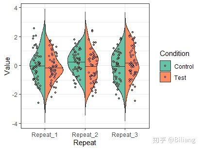
ggpubr (带显著性的箱线图)
生成数据
# 均值为3,标准差为1的正态分布
c1 <- rnorm(100, 3, 1)
# Johnson分布的偏斜度2.2和峰度13
c2 <- rJohnson(100, findParams(3, 1, 2., 13.1))
# Johnson分布的偏斜度0和峰度20
c3 <- rJohnson(100, findParams(3, 1, 2.2, 20))

data <- data.frame(
  Conditon = rep(c("C_1", "C_2", "C_3"), each = 100),
  Value = c(c1, c2, c3)
)

#数据如下
> head(data)
  Conditon    Value
1      C_1 2.679169
2      C_1 1.699026
3      C_1 5.459568
4      C_1 3.778365
5      C_1 3.689881
6      C_1 1.295534
ggpubr的功能多样,这里只举箱线图的例子
library(ggpubr)
library(RColorBrewer)

# 定义需要两两比较的组
compaired <- list(c("C_1", "C_2"),
                  c("C_2", "C_3"),
                  c("C_1", "C_3"))
palette <- c(brewer.pal(7, "Set2")[c(1, 2, 4)])

# wilcox.test
ggboxplot(data, x = "Conditon", y = "Value",
          fill = "Conditon", palette = palette,
          add = "jitter", size=0.5) +
    stat_compare_means(comparisons = compaired, method = "wilcox.test") + # 添加每两组变量的显著性
    theme_classic() + theme_boxplot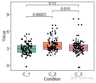
使用ggplot2的语法添加显著性检验,将wilcox.test 换成t.test
# t.test
ggplot(data, aes(Conditon, Value))+
  geom_boxplot(aes(fill = Conditon), notch = FALSE, outlier.alpha  = 1) +
  scale_fill_brewer(palette = "Set2") +
  geom_signif(comparisons = compaired,
              step_increase = 0.1,
              map_signif_level = F,
              test = t.test) +
  theme_classic() + theme_boxplot
欢迎关注公众号:"生物信息学"