红酒数据集分析【详细版】
红酒数据集分析【详细版】
原文链接:阿里云天池
数据连接:链接:https://pan.baidu.com/s/1UpVkbgOEIjpc_GQTGHyqTQ
提取码:ztjs
介绍
这个notebook分析了红酒的通用数据集。这个数据集有1599个样本,11个红酒的理化性质,以及红酒的品质(评分从0到10)。这里主要目的在于展示进行数据分析的常见python包的调用,以及数据可视化。主要内容分为:单变量,双变量,和多变量分析。
数据集基本情况探索:
fixed acidity 非挥发性酸
volatile acidity 挥发性酸
citric acid 柠檬酸
residual sugar 剩余糖分
chlorides 氯化物
free sulfur dioxide 游离二氧化硫
total sulfur dioxide 总二氧化硫
density 密度
pH 酸碱性
sulphates 硫酸盐
alcohol 酒精
quality 质量
#功能是可以内嵌绘图,并且可以省略掉plt.show()这一步,具体作用是当你调用matplotlib.pyplot的绘图函数plot()进行绘图的时候,或者生成一个figure画布的时候,可以直接在你的python console里面生成图像。
%matplotlib inline
import matplotlib.pyplot as plt
import numpy as np
import pandas as pd
#Seaborn是基于matplotlib的Python可视化库
import seaborn as sns
# 创建调色板
color = sns.color_palette()
# 数据print精度,显示小数点后三位
pd.set_option('precision',3)
# data 路径
dataPath = 'D:\APAGANI\ww\winequality-red.csv'
# 读取数据
df = pd.read_csv("D:/APAGANI/ww/winequality-red.csv",sep=';')
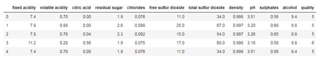
df.head(5)
# 查看数据信息
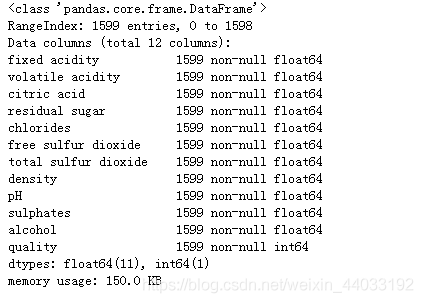
df.info()
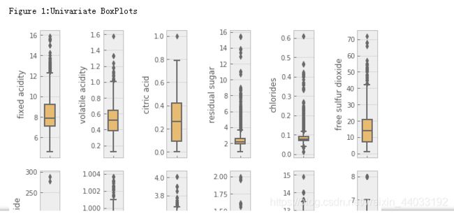
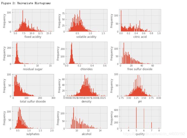
单变量分析
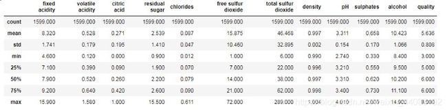
df.describe()# 简单的数据统计
count 数量mean 平均值std 标准差min 最小值25% 第一四分位数 (Q1),又称“较小四分位数”,等于该样本中所有数值由小到大排列后第25%的数字。50% 中位数75% 同上类似max 最大值
plt.style.use('ggplot')# 设置样式
colnm = df.columns.tolist()#可以使用tolist()函数转化为list
fig = plt.figure(figsize=(8,6))#plt.figure()返回一个Figure()对象,figsize设置图像大小。图大小(宽,高)(单位英寸)
for i in range(12):
plt.subplot(2,6,i+1)#设置了12个位置,2代表行,6代表列,其参数为:
plt.subplot(numrows, numcols, fignum)
sns.boxplot(df[colnm[i]], orient='v',width=1, color=color[4]) #palette参数用于控制图像的色调
# orient参数用于控制图像水平显示还是竖直显示,只取 v和h
# width控制箱线图的宽度
plt.ylabel(colnm[i], fontsize=12)# 设置y轴的取值范围, 添加 y 轴标题
plt.tight_layout() #tight_layout会自动调整子图参数,使之填充整个图像区域。
print('\nFigure 1:Univariate BoxPlots')
# df.hist
colnm = df.columns.tolist()
plt.figure(figsize=(10,8))
for i in range(12):
    plt.subplot(4,3,i+1)
    df[colnm[i]].hist(bins = 100, color = color[0])#bins指bin(箱子)的个数,即每张图柱子的个数
    plt.xlabel(colnm[i], fontsize=12)#xlabel:x轴标注
    plt.ylabel('Frequency')#频率ylabel:y轴标注
plt.tight_layout()
print('\nFigure 2: Univariate Histograms')
品质
这个数据集的目的是研究红酒品质和理化性质之间的关系。品质的评价范围是0-10,这个数据集中范围是3到8,有82%的红酒品质是5或6。
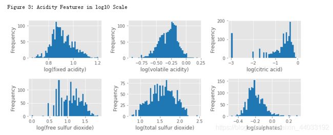
酸度相关的特征
这个数据集有7个酸度相关的特征:fixed acidity, volatile acidity, citric acid, free sulfur dioxide, total sulfur dioxide, sulphates, pH。
前6个特征都与红酒的pH的相关。
pH是在对数的尺度,下面对前6个特征取对数然后作histogram。
acidityFeat = ['fixed acidity','volatile acidity', 'citric acid','free sulfur dioxide','total sulfur dioxide', 'sulphates']

plt.figure(figsize=(10,4))

for i in range(6):
    ax = plt.subplot(2,3,i+1)
    v = np.log10(np.clip(df[acidityFeat[i]].values, a_min = 0.001, a_max= None))#np.clip()将一个数组元素的值限制在一个范围内
    plt.hist(v, bins=50, color=color[0])#用来画直方图
    plt.xlabel('log(' + acidityFeat[i] + ')', fontsize = 12)#x 轴标注

    plt.ylabel('Frequency')y 轴标注

plt.tight_layout()
print("\nFigure 3: Acidity Features in log10 Scale")
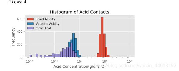
plt.figure(figsize=(6,3))
bins = 10**(np.linspace(-2,2)) # linspace 默认50等分
plt.hist(df['fixed acidity'], bins=bins, edgecolor = 'k', label='Fixed Acidity') #bins: 直方图的柱数,可选项,默认为10
plt.hist(df['volatile acidity'], bins=bins, edgecolor = 'k', label='Volatitle Acidity')#label:字符串或任何可以用'%s'转换打印的内容。
plt.hist(df['citric acid'], bins=bins, edgecolor = 'k', label='Citric Acid')
plt.xscale('log')
plt.xlabel('Acid Concentration(g/dm^3)')
plt.ylabel('Frequency')
plt.title('Histogram of Acid Contacts')#title :图形标题
plt.legend()#plt.legend()函数主要的作用就是给图加上图例
plt.tight_layout()
print('Figure 4')
"""
pH值主要是与fixed acidity有关,
fixed acidity比volatile acidity和citric acid高1到2个数量级(Figure 4),比free sulfur dioxide, total sulfur dioxide, sulphates高3个数量级。
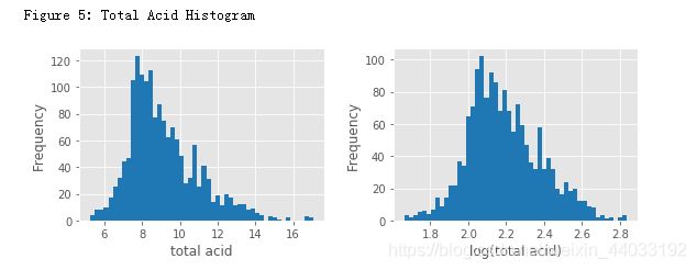
一个新特征total acid来自于前三个特征的和。
"""
# 总酸度
df['total acid'] = df['fixed acidity'] + df['volatile acidity'] + df['citric acid']

plt.figure(figsize = (8,3))

plt.subplot(121)
plt.hist(df['total acid'], bins = 50, color = color[0])
plt.xlabel('total acid')
plt.ylabel('Frequency')
plt.subplot(122)#plt.subplot(numrows, numcols, fignum)当 numrows * numcols < 10 时,中间的逗号可以省略,因此 plt.subplot(211) 就相当于 plt.subplot(2,1,1)。
plt.hist(np.log(df['total acid']), bins = 50 , color = color[0])
plt.xlabel('log(total acid)')
plt.ylabel('Frequency')
plt.tight_layout()

print("Figure 5: Total Acid Histogram")
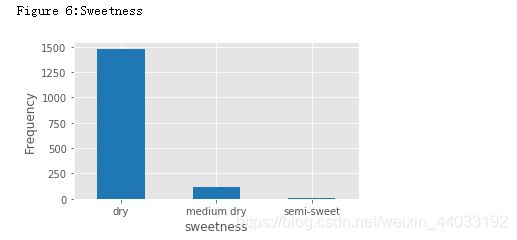
甜度
Residual sugar 与酒的甜度相关,通常用来区别各种红酒,干红(<=4 g/L), 半干(4-12 g/L),半甜(12-45 g/L),和甜(>45 g/L)。
# Residual sugar
df['sweetness']=pd.cut(df['residual sugar'], bins = [0,4,12,45],labels=["dry","medium dry","semi-sweet"])

plt.figure(figsize =(5,3))
df['sweetness'].value_counts().plot(kind = 'bar',color=color[0])
plt.xticks(rotation=0)#rotation代表lable显示的旋转角度。
plt.xlabel('sweetness',fontsize=12)#fontsize文字大小
plt.ylabel('Frequency',fontsize=12)
plt.tight_layout()
print("Figure 6:Sweetness")
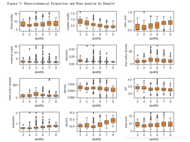
双变量分析
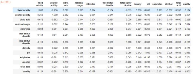
红酒品质和理化特征的关系¶ 下面Figure 7和8分别显示了红酒理化特征和品质的关系。其中可以看出的趋势有:
品质好的酒有更高的柠檬酸,硫酸盐,和酒精度数。硫酸盐(硫酸钙)的加入通常是调整酒的酸度的。其中酒精度数和品质的相关性最高。
品质好的酒有较低的挥发性酸类,密度,和pH。
残留糖分,氯离子,二氧化硫似乎对酒的品质影响不大。
sns.set_style('ticks')#设置图表主题背景为十字叉
sns.set_context("notebook",font_scale=1.1) #设置图表样式

colnm = df.columns.tolist()[:11]+['total acid']
plt.figure(figsize=(10,8))

for i in range(12):
    plt.subplot(4,3,i+1)
    sns.boxplot(x='quality',y=colnm[i],data=df,color=color[1],width=0.6)
    plt.ylabel(colnm[i],fontsize=12)
plt.tight_layout()
print("\nFigure 7: Physicochemical Properties and Wine Quality by Boxplot")
sns.set_style("dark")

plt.figure(figsize=(10,8))
colnm = df.columns.tolist()[:11]+['total acid','quality']
mcorr = df[colnm].corr()#相关系数矩阵,即给出了任意两个变量之间的相关系数
mask = np.zeros_like(mcorr,dtype=np.bool) # 创建一个mcorr一样的全False矩阵
mask[np.triu_indices_from(mask)]=True  # 上三角置位True
cmap = sns.diverging_palette(220,10,as_cmap=True)# 建立一个发散调色板
g=sns.heatmap(mcorr,mask=mask, cmap=cmap, square=True,annot=True, fmt='0.2f')
print("\nFigure 8:Pairwise Correlation Plot")
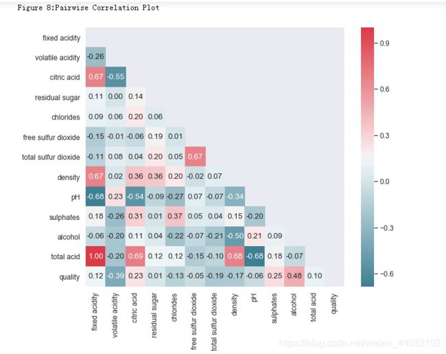
mcorr#相关系数矩阵,即给出了任意两个变量之间的相关系数
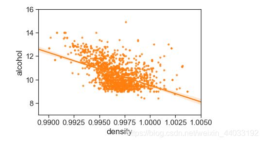
密度和酒精浓度
密度和酒精浓度是相关的,物理上,两者并不是线性关系。Figure 9 展示了两者的关系。另外密度还与酒中其他物质的含量有关,但是关系很小。
# style
sns.set_style('ticks')
sns.set_context("notebook", font_scale=1.4)
# plot figure
plt.figure(figsize=(6,4))#画出双变量的散点图,然后以y~x拟合回归方程和预测值95%置信区间并将其画出。
sns.regplot(x='density',y='alcohol',data=df, scatter_kws={'s':10},color=color[1])
plt.xlim(0.989,1.005)
plt.ylim(7,16)
print("Figure 9: Density vs Alcohol")
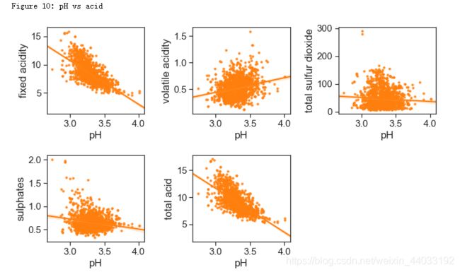
酸性物质含量和pH
pH和非挥发性酸性物质有-0.683的相关性。因为非挥发性酸性物质的含量远远高于其他酸性物质,总酸性物质(total acidity)这个特征并没有太多意义。
acidity_related = ['fixed acidity', 'volatile acidity', 'total sulfur dioxide',
                   'sulphates', 'total acid']

plt.figure(figsize = (10,6))

for i in range(5):
    plt.subplot(2,3,i+1)
    sns.regplot(x='pH', y = acidity_related[i], data = df, scatter_kws = {'s':10}, color = color[1])
plt.tight_layout()
print("Figure 10: pH vs acid")
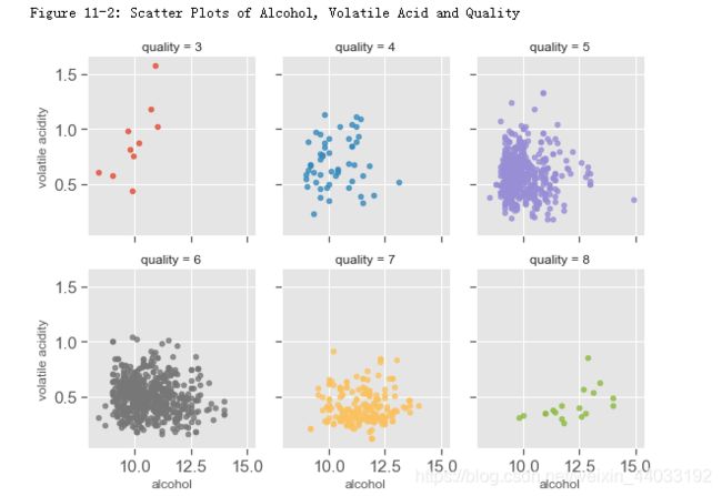
多变量分析
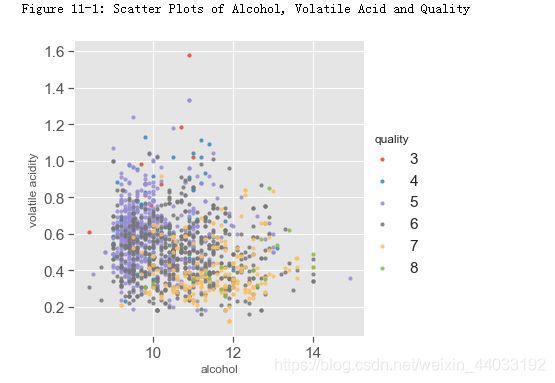
与品质相关性最高的三个特征是酒精浓度,挥发性酸度,和柠檬酸。下面图中显示的酒精浓度,挥发性酸和品质的关系。
酒精浓度,挥发性酸和品质 对于好酒(7,8)以及差酒(3,4),关系很明显。但是对于中等酒(5,6),酒精浓度的挥发性酸度有很大程度的交叉。
plt.style.use('ggplot')
sns.lmplot(x='alcohol',y='volatile acidity', hue='quality',data= df, fit_reg= False, scatter_kws={'s':10}, size=5)
print("Figure 11-1: Scatter Plots of Alcohol, Volatile Acid and Quality")
sns.lmplot(x = 'alcohol', y = 'volatile acidity', col='quality', hue = 'quality', data = df,fit_reg = False, size = 3,  aspect= 0.9, col_wrap=3,scatter_kws={'s':20})

print("Figure 11-2: Scatter Plots of Alcohol, Volatile Acid and Quality")
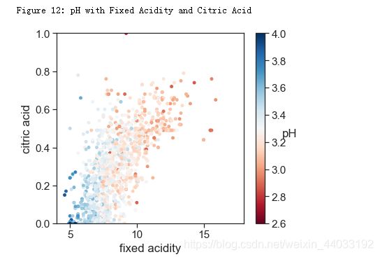
pH,非挥发性酸和柠檬酸
pH和非挥发性的酸以及柠檬酸有相关性。整体趋势也很合理,即浓度越高,pH越低。
# style
sns.set_style('ticks')
sns.set_context("notebook", font_scale= 1.4)

plt.figure(figsize=(6,5))
cm = plt.cm.get_cmap('RdBu')
sc = plt.scatter(df['fixed acidity'], df['citric acid'], c=df['pH'], vmin=2.6, vmax=4, s=15, cmap=cm)
bar = plt.colorbar(sc)
bar.set_label('pH', rotation = 0)
plt.xlabel('fixed acidity')
plt.ylabel('citric acid')
plt.xlim(4,18)
plt.ylim(0,1)
print('Figure 12: pH with Fixed Acidity and Citric Acid')
总结:
整体而言,红酒的品质主要与酒精浓度,挥发性酸,和柠檬酸有关。对于品质优于7,或者劣于4的酒,直观上是线性可分的。但是品质为5,6的酒很难线性区分。