python数据可视化项目设计-中国人口
大三数据可视化,基于python,使用包matplotlib绘制图形。数据来源是国家数据。数据下载链接国家数据
import matplotlib.pyplot as plt
import matplotlib as mpl
import numpy as np
import pandas as pd
#解决中文编码
mpl.rcParams['font.sans-serif']=['SimHei']
mpl.rcParams['axes.unicode_minus'] = False
#读取文件
df_pop = pd.read_excel('D:/databaes/pop/China_Population.xlsx') #读取人口文件
df_age = pd.read_excel('D:/databaes/pop/China_raise.xlsx')#读取年龄分级文件
#处理数据
df_pop.sort_index(ascending=False,inplace=True)
df_pop.reset_index(inplace=True)
#print(df_pop.head(10))
#设置x轴坐标
x_labels=df_pop.Year
x_labels1=df_age.Year
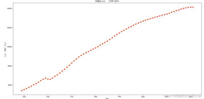
#创建一个画布,绘制1949-2021年中国总人口变化曲线
plt.figure(figsize=(20,10))
plt.plot(df_pop['Year'],df_pop['Population'],color='#EDB120')
plt.plot(df_pop['Year'], df_pop['Population'], '*', color='r', markersize=8)
plt.xlabel('Year')
plt.ylabel('人口 (单位:万人)')
plt.title('中国总人口 (1949-2021)')
plt.show()
#对比1949-1979与1980-2010年增加的总人口数对比(计划生育)
plt.figure(figsize=(13,9))
pop_total1=df_pop.Population[29]-df_pop.Population[0]
pop_total2=df_pop.Population[60]-df_pop.Population[30]
x_label=np.array(['1949-1979年增加人口','1980-2010年增加人口'])
data=(pop_total1,pop_total2)
x=np.arange(2)
bar_width=0.6
plt.bar(x,data,width=bar_width,color=["#00FFFF",'#EDB120'],tick_label=x_label)
plt.text(0,43000,pop_total1,color='r',fontsize=20)
plt.text(1,36000,pop_total2,color='r',fontsize=20)
plt.ylim(5500)
plt.xlabel("增加人数 (单位:万人)",fontsize=20)
plt.xlabel("时间(计划生育实行前后)")
plt.title("执行计划生育前30年和后三十年增加人口总数对比 (单位:万人)")
plt.show() 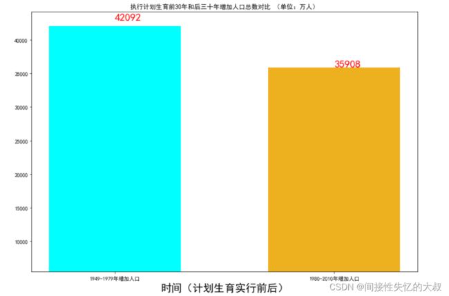
#一个画布分四部分
#第一部分2021年中国男女所占比例
fig = plt.figure(figsize=(20,15))
as1 = fig.add_subplot(221)
boy_2020 = df_pop.Boytotal[71]
girl_2020 = df_pop.Girltotal[71]
total=(boy_2020,girl_2020)
as1.pie(total,radius=0.8,autopct='%3.1f%%')
plt.legend(['男','女'])
as1.set_title('2020年中国男女比')

#第二部分 历年男生在总人数的值
as2 = fig.add_subplot(222)
as2.plot(df_pop.Year,df_pop.boy_rate,color='r')
as2.text(1949,0.5196,"51.96%",color='blue',fontsize=15)
as2.text(1996,0.508,"50.82%",color='blue',fontsize=15)
as2.set_ylim(0.50,0.522)
as2.set_title('历年男性占总人数比')
as2.set_ylabel('比值')
#第三部分
as3 = fig.add_subplot(223)
as3.plot(df_pop.Year,df_pop.Boytotal,color='#45B39D',linestyle=':')
as3.plot(df_pop.Year,df_pop.Girltotal,color='#E74C3C',linestyle='--')
as3.legend(['男','女'])
as3.set_title('中国70年男女总人数 (单位:万人)')
as3.set_ylabel('人数 (单位:万人)')
#第四部分 男女差值
as4 = fig.add_subplot(224)
dv = df_pop.Boytotal - df_pop.Girltotal
as4.plot(df_pop.Year,dv,color='r',linestyle='--')
as4.set_title("70年中国男女差值 (单位:万人)")
as4.text(2000,4131,4131,color='blue',fontsize=15)
as4.text(1965,1718,1718,color='blue',fontsize=15)
as4.set_ylabel('人数 (单位:万人)')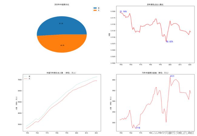
#城镇化
fig=plt.figure(figsize=(13,5))
as5 = fig.add_subplot(221)
U_pop = df_pop.Urban_population
as5.plot(df_pop.Year,U_pop,color='blue')
as5.vlines(1959,100,85000,color='r')
as5.vlines(1965,100,85000,color='r')
as5.vlines(1978,100,85000,color='r')
as5.vlines(1991,100,85000,color='r')
as5.text(1949,20000,'城镇化起步发展阶段',color='#3498DB')
as5.text(1960,20000,'波动阶段',color='#3498DB')
as5.text(1970,20000,'停滞阶段',color='#3498DB')
as5.text(1982,30000,'高速发展阶段',color='#3498DB')
as5.text(2000,60000,'平稳发展阶段',color='#3498DB')
as5.set_title("中国城镇化发展进程")

#饼图  2020年中国城市人口和乡村人口比例
as6 = fig.add_subplot(222)
data1 = (df_pop.Rural_population[71],df_pop.Urban_population[71])
as6.pie(data1,radius=0.8,autopct='%3.1f%%')
as6.legend(['2020乡村人口','2020城市人口'])
as6.set_title("2020年中国城镇化比例")

#散点图 中国70年城乡人口散点图
as7 = fig.add_subplot(223)
as7.scatter(df_pop.Year,df_pop.Rural_population,s=10,alpha=0.9)
as7.scatter(df_pop.Year,df_pop.Urban_population,s=10,alpha=0.9)
as7.legend(['乡村人口','城市人口'])

#中国人口城镇化比例曲线
as8 = fig.add_subplot(224)
as8.plot(df_pop.Year,df_pop.Urban_rate,color='#CD6155',linestyle='-.')
as8.hlines(y=0.3,xmin=1949,xmax=2020,colors='#2ECC71')
as8.hlines(y=0.606,xmin=1949,xmax=2020,colors='#2ECC71')
as8.set_title("中国人口城镇化比例曲线")
plt.show()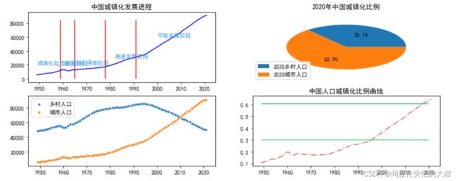
 #出生率、死亡率、增长率
plt.figure(figsize=(13,5))
plt.plot(df_pop.Year,df_pop.Natality,color='#239B56',marker='o',linestyle='-.')
plt.plot(df_pop.Year,df_pop.Death_rate,color='#943126',marker='+',linestyle='--')
plt.plot(df_pop.Year,df_pop.Natural_population_growth_rate,color='#D2B4DE',marker='s',linestyle=':' )
plt.legend(['出生率','死亡率','人口自然增长率'])
plt.title('中国71年的出生率、死亡率和自然增长率变化')
plt.xlabel('年份')
plt.ylabel('增长率 (%)')
plt.show()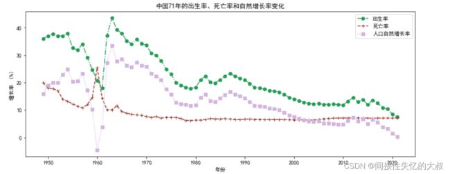
#高级绘图
import pyecharts.options as opts
from pyecharts.charts import Pie
pie_demo = (
    Pie().add("",[('0-9岁',16812),('10-19岁',15794),('20-29岁',16679),('30-39岁',22316)
                  ,('40-44岁',9296),('45-59岁',33678),('60岁以上',26406)],
             center=["50%","50%"],radius=[100,160]
             ).set_global_opts(title_opts=opts.TitleOpts(title="2020年年龄结构"))
)
pie_demo.render_notebook() 
#中国抚养比变化图
fig = plt.figure(figsize=(20,5))
as9 = fig.add_subplot(121)
as9.plot(df_age.Year,df_age.population0_14,marker='s',linestyle='--',color='#82E0AA')
as9.plot(df_age.Year,df_age.population15_64,marker='D',linestyle='-.',color='#839192')
as9.plot(df_age.Year,df_age.powerPopulation65,marker='h',linestyle=':',color='#2C3E50')
as9.legend(['0-14岁','15-64岁','65岁以上'])
as9.set_title("中国人口年龄变化图(万人)")
as10 =fig.add_subplot(122)
as10.plot(df_age.Year,df_age.Elderly_care,marker='p',linestyle='-.',color='#1D8348')
as10.plot(df_age.Year,df_age.Children_to_raise,marker='h',linestyle='--',color='#1D8348')
as10.plot(df_age.Year,df_age.total,marker='v',linestyle=':',color='#5B2C6F')
as10.set_title("中国抚养比变化图")
