机器学习 可视化
机器学习导论 (Introduction to machine learning)
In the traditional hard-coded approach, we program a computer to perform a certain task. We tell it exactly what to do when it receives a certain input. In mathematical terms, this is like saying that we write the f(x) such that when users feed the input x into f(x), it gives the correct output y.
在传统的硬编码方法中,我们对计算机进行编程以执行特定任务。 我们确切地告诉它在收到某个输入时该怎么做。 用数学术语来说,这就像说我们写f(x) 这样,当用户将输入x馈入f(x)时 ,它会给出正确的输出y 。

In machine learning, however, we have a large set of inputs x and corresponding outputs y but not the function f(x). The goal here is to find the f(x) that transforms the input x into the output y. Well, that’s not an easy job. In this article, we will learn how this happens.
但是,在机器学习中,我们有大量的输入x和对应的输出y,但没有函数f(x) 。 这里的目标是找到将输入x转换为输出y的f(x) 。 好吧,这不是一件容易的事。 在本文中,我们将学习如何发生这种情况。
数据集 (Dataset)
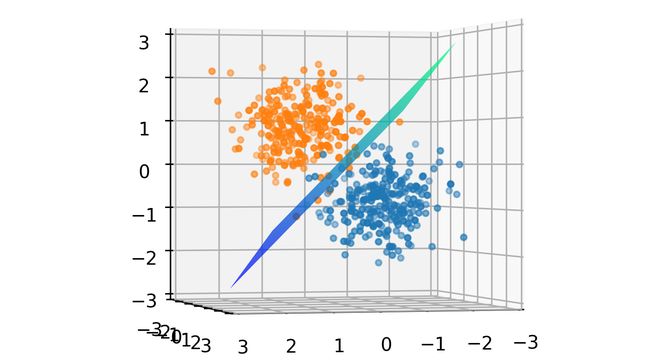
To visualize the dataset, let’s make our synthetic dataset where each data point (input x) is 3 dimensional, making it suitable to be plotted on a 3D chart. We will generate 250 points (cluster 0) in a cluster centered at the origin (0, 0, 0). A similar cluster of 250 points (cluster 1) is generated but not centered at the origin. Both clusters are relatively close but there is a clear separation as seen in the image below. These two clusters are the two classes of data points. The big green dot represents the centroid of the whole dataset.
为了可视化数据集,让我们制作合成数据集,其中每个数据点(输入x )都是3维的,使其适合绘制在3D图表上。 我们将在以原点(0,0,0 )为中心的群集中生成250个点(群集 0)。 生成了一个类似的250点群集(群集1) ,但未将其原点居中。 两个群集都相对较近,但存在明显的分离,如下图所示。 这两个群集是两类数据点。 大绿点代表整个数据集的质心。

After generating the dataset, we will normalize it by subtracting the mean and dividing by the standard deviation. This is done to zero-center the data and map values in each dimension in the dataset to a common scale. This speeds up the learning.
生成数据集后,我们将通过减去平均值并除以标准差来对其进行归一化。 这样做是为了使数据零中心并将数据集中每个维度的值映射到一个公共比例。 这样可以加快学习速度。

The data will be saved in an array X containing the 3D coordinates of normalized points. We will also generate an array Y with the value either 0 or 1 at each index depending on which cluster the 3D point belongs.
数据将保存在包含归一化点的3D坐标的数组X中。 我们还将根据3D点所属的簇,在每个索引处生成一个值为0或1的数组Y。
易学的功能 (Learnable Function)
Now that we have our data ready, we can say that we have the x and y. We know that the dataset is linearly separable implying that there is a plane that can divide the dataset into the two clusters, but we don’t know what the equation of such an optimal plane is. For now, let’s just take a random plane.
现在我们已经准备好数据,可以说我们有x和y。 我们知道数据集是线性可分离的,这意味着存在一个可以将数据集分为两个簇的平面,但是我们不知道这种最佳平面的方程是什么。 现在,让我们随机乘坐飞机。
The function f(x) should take a 3D coordinate as input and output a number between 0 and 1. If this number is less than 0.5, this point belongs to cluster 0 otherwise, it belongs to cluster 1. Let’s define a simple function for this task.
函数f(x)应该以3D坐标作为输入,并输出一个介于0和1之间的数字。如果该数字小于0.5,则此点属于聚类0,否则,它属于聚类1。让我们为这个任务。

x: input tensor of shape (num_points, 3)W: Weight (parameter) of shape (3, 1) chosen randomlyB: Bias (parameter) of shape (1, 1) chosen randomlySigmoid: A function that maps values between 0 and 1
x :形状(num_points,3)的输入张量W:形状(3,1)的权重(参数)随机选择B:形状(1,1)的偏差(参数)随机选择Sigmoid:映射0到1之间的值的函数
Let’s take a moment to understand what this function means. Before applying the sigmoid function, we are simply creating a linear mapping from the 3D coordinate (input) to 1D output. Therefore, this function will squish the whole 3D space onto a line meaning that each point in the original 3D space will now be lying somewhere on this line. Since this line will extend to infinity, we map it to [0, 1] using the Sigmoid function. As a result, for each given input, f(x) will output a value between 0 and 1.
让我们花一点时间来了解此功能的含义。 在应用sigmoid函数之前,我们仅创建从3D坐标(输入)到1D输出的线性映射。 因此, 此功能会将整个3D空间压缩到一条线上,这意味着原始3D空间中的每个点现在都将位于此线上的某个位置。 由于这条线将延伸到无穷大,因此我们使用Sigmoid函数将其映射到[0,1] 。 结果,对于每个给定的输入, f(x)将输出一个介于0和1之间的值。
Remember that W and B are chosen randomly and so the 3D space will be squished onto a random line. The decision boundary for this transformation is the set of points that make f(x) = 0.5. Think why! As the 3D space is being squished onto a 1D line, a whole plane is mapped to the value 0.5 on the line. This plane is the decision boundary for f(x). Ideally, it should divide the dataset into two clusters but since W and B are randomly chosen, this plane is randomly oriented as shown below.
请记住,W和B是随机选择的,因此3D空间将被压缩到随机线上。 此变换的决策边界是使f(x)= 0.5的点集。 想想为什么! 当3D空间被压缩到1D线上时,整个平面将映射到该线上的值0.5。 该平面是f(x)的决策边界。 理想情况下,它应该将数据集分为两个簇,但是由于W和B是随机选择的,因此该平面的方向如下图所示。

Our goal is to find the right values for W and B that orients this plane (decision boundary) in such a way that it divides the dataset into the two clusters. This when done, yields a plane as shown below.
我们的目标是为W和B找到正确的值,以该方向将平面(决策边界)划分为将数据集分为两个簇。 完成后,将产生一个如下所示的平面。
失利 (Loss)
So, we are now at the starting point (random decision boundary) and we have defined the goal. We need a metric to decide how far we are from the goal. The output of the classifier is a tensor of shape (num_points, 1) where each value is between [0, 1]. If you think carefully, these values are just the probabilities of the points belonging to cluster 1. So, we can say that:
因此,我们现在处于起点(随机决策边界),并且已经定义了目标。 我们需要一个度量标准来决定我们离目标有多远。 分类器的输出是形状的张量(num_points,1),其中每个值都在[0,1]之间 。 如果仔细考虑,这些值只是属于聚类1的点的概率。因此,我们可以这样说:
- f(x) = P(x belongs to cluster 1) f(x)= P(x属于簇1)
- 1-f(x) = P(x belongs to cluster 0) 1-f(x)= P(x属于簇0)
It wouldn’t be wrong to say that [1-f(x), f(x)] forms a probability distribution over the clusters 0 and cluster 1 respectively. This is the predicted probability distribution. We know for sure which cluster every point in the dataset belongs to (from y). So, we also have the true probability distribution as:
说[ 1-f(x),f(x) ]分别在聚类0和聚类1上形成概率分布是没有错的。 这是预测的概率分布 。 我们可以确定(从y )数据集中的每个点都属于哪个群集。 因此,我们也有真实的概率分布为:
- [0, 1] when x belongs to the cluster 1 [0,1]当x属于集群1
- [1, 0] when x belongs to the cluster 0 [1,0]当x属于簇0时
A good metric to calculate the incongruity between two probability distributions is the Cross-Entropy function. As we are dealing with just 2 classes, we can use Binary Cross-Entropy (BCE). This function is available in PyTorch’s torch.nn module. If the predicted probability distribution is very similar to the true probability distribution, this function returns a small value and vice versa. We can average this value for all the data points and use it as a parameter to test how the classifier is performing.
交叉熵函数是计算两个概率分布之间的不一致性的一个很好的指标。 由于我们仅处理2个类,因此可以使用二进制交叉熵(BCE)。 该功能在PyTorch的torch.nn模块中可用。 如果预测的概率分布与真实的概率分布非常相似,则此函数返回一个较小的值,反之亦然。 我们可以对所有数据点取平均值,然后将其用作测试分类器性能的参数。
This value is called the loss and mathematically, our goal now is to minimize this loss.
该值称为损失,从数学上讲,我们现在的目标是使这种损失最小化。
训练 (Training)
Now that we have defined our goal mathematically, how do we reach our goal practically? In other words, how do we find optimal values for W and B? To understand this, we will take a look at some basic calculus. Recall that we currently have random values for W and B. The process of learning or training or reaching the goal or minimizing the loss can be divided into two steps:
既然我们已经在数学上定义了目标,那么实际上如何实现目标呢? 换句话说,我们如何找到W和B的最佳值? 为了理解这一点,我们将看一些基本的演算。 回想一下,我们目前有W和B的随机值。 学习或培训,达到目标或使损失最小化的过程可以分为两个步骤:
Forward-propagation: We feed the dataset through the classifier f(x) and use BCE to find the loss.
正向传播:我们通过分类器f(x)馈送数据集,并使用BCE查找损失 。
Backpropagation: Using the loss, adjust the values of W and B to minimize the loss.
反向传播:使用损耗,调整W和B的值以使损耗最小。
The above two steps will be repeated over and over again until the loss stops decreasing. In this condition, we say that we have reached the goal!
将重复上述两个步骤,直到损失停止减少。 在这种情况下,我们说我们已经达到了目标!
反向传播 (Backpropagation)
Forward propagation is simple and already discussed above. However, it is essential to take a moment to understand backpropagation as it is the key to machine learning. Recall that we have 3 parameters (variables) in W and 1 in B. So, in total, we have 4 values to optimize.
前向传播很简单,上面已经讨论过了。 但是,必须花一点时间来了解反向传播,因为它是机器学习的关键。 回想一下,我们在W中有3个参数(变量),在B中有1个参数。 因此,总共有4个值需要优化。

Once we have the loss from forward-propagation, we will calculate the gradients of the loss function with respect to each variable in the classifier. If we plot the loss for different values of each parameter, we can see that the loss is minimum at a particular value for each parameter. I have plotted the loss vs parameter for each parameter.
一旦有了正向传播的损失,我们将针对分类器中的每个变量计算损失函数的梯度。 如果我们针对每个参数的不同值绘制损耗,则可以看到每个参数在特定值下损耗最小。 我已经为每个参数绘制了损耗与参数的关系图。

An important observation to make here is that the loss is minimized at a particular value for each of these parameters as shown by the red dot.
此处要进行的重要观察是,对于这些参数中的每个参数,损耗都在特定值处最小化,如红点所示。
Let’s consider the first plot and discuss how w1 will be optimized. The process remains the same for the other parameters. Initially, the values for W and B are chosen randomly and so (w1, loss) will be randomly placed on this curve as shown by the green dot.
让我们考虑第一个图并讨论如何优化w1。 其他参数的处理过程相同。 最初,W和B的值是随机选择的,因此(w1,损耗)将随机放置在该曲线上,如绿点所示。

Now, the goal is to reach the red dot, starting from the green dot. In other words, we need to move downhill. Looking at the slope of the curve at the green dot, we can tell that increasing w1 (moving right) will lower the loss and therefore move the green dot closer to the red one. In mathematical terms, if the gradient of the loss with respect to w1 is negative, increase w1 to move downhill and vice versa. Therefore, w1 should be updated as:
现在,目标是从绿点开始到达红点。 换句话说,我们需要走下坡路。 观察绿点处的曲线斜率,我们可以知道增加w1(向右移动)将降低损耗,因此将绿点移向红色。 用数学术语来说,如果损耗相对于w1的斜率为负,则增加w1即可下坡,反之亦然。 因此,w1应该更新为:

The equation above is known as gradient descent equation. Here, the learning_rate controls how much we want to increase or decrease w1. If the learning_rate is large, the update will be large. This could lead to w1 going past the red dot and therefore missing the optimal value. If this value is too small, it will take forever for w1 to reach the red dot. You can try experimenting with different values of learning rate to see which works the best. In general, small values like 0.01 works well for most cases.
上面的方程式称为梯度下降方程式 。 在这里, learning_rate控制我们要增加或减少w1的数量。 如果learning_rate大,则更新将大。 这可能导致w1越过红点并因此缺少最佳值。 如果此值太小,则w1永远需要到达红点。 您可以尝试使用不同的学习率值进行实验,以了解哪种方法效果最好。 通常,在大多数情况下,较小的值(如0.01)效果很好。
In most cases, a single update is not enough to optimize these parameters; so, the process of forward-propagation and backpropagation is repeated in a loop until the loss stops reducing further. Let’s see this in action:
在大多数情况下,单次更新不足以优化这些参数。 因此,向前传播和向后传播的过程会循环重复,直到损耗不再进一步降低为止。 让我们来看看实际情况:

An important observation to make is that initially the green dot moves quickly and slows down as it gradually approaches the minima. The large slope (gradient) during the first few epochs (when the green dot is far from the minima) is responsible for this large update to the parameters. The gradient decreases as the green dot approaches the minima and thus the update becomes slow. The other three parameters are trained in parallel in the exact same way. Another important observation is that the shape of the curve changes with epoch. This is due to the fact that the other three parameters (w2, w3, b) are also being updated in parallel and each parameter contributes to the shape of the loss curve.
需要注意的重要一点是,绿点最初随着其逐渐接近最小值而快速移动并减慢速度。 前几个时期(当绿点远离最小值时)的大斜率(梯度)是对参数的大更新的原因。 随着绿点接近最小值,梯度减小,因此更新变慢。 其他三个参数以完全相同的方式并行训练。 另一个重要的观察结果是曲线的形状会随着时代的变化而变化。 这是由于以下事实:其他三个参数(w2,w3,b)也正在并行更新,并且每个参数都对损耗曲线的形状有所贡献。
可视化 (Visualize)
Let’s see how the decision boundary updates in real-time as the parameters are being updated.
让我们看一下如何随着参数的更新实时更新决策边界。

那是所有人! (That’s all folks!)
If you made it till here, hats off to you! In this article, we took a visual approach to understand how machine learning works. So far, we have seen how a simple 3D to 1D mapping, f(x), can be used to fit a decision boundary (2D plane) to a linearly separable dataset (3D). We discussed how forward propagation is used to calculate the loss followed by backpropagation where gradients of the loss with respect to parameters are calculated and the parameters are updated repeatedly in a training loop.
如果您做到了这里,就向您致敬! 在本文中,我们采用了一种直观的方法来了解机器学习的工作原理。 到目前为止,我们已经看到如何使用简单的3D到1D映射f(x)将决策边界(2D平面)拟合到线性可分离数据集(3D)。 我们讨论了如何使用前向传播来计算损耗,然后进行反向传播,在反向传播中,将计算相对于参数的损耗梯度,并在训练循环中重复更新参数。
If you have any suggestions, please leave a comment. I write articles regularly so you should consider following me to get more such articles in your feed.
如果您有任何建议,请发表评论。 我会定期撰写文章,因此您应该考虑关注我,以便在您的供稿中获取更多此类文章。
If you liked this article, you might as well love these:
如果您喜欢这篇文章,则不妨喜欢这些:
Visit my website to learn more about me and my work.
访问我的网站以了解有关我和我的工作的更多信息。
翻译自: https://towardsdatascience.com/machine-learning-visualized-11965ecc645c
机器学习 可视化