【Python】项目实战二:数据可视化 - 《Python编程:从入门到实践》
1、生成数据
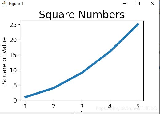
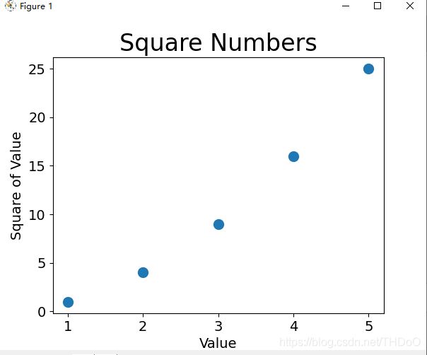
(1)绘制简单的图像:折线图、散点图、自动计算数据

import matplotlib.pyplot as plt
"""注释内替换:折线图变为散点图"""
input_values = [1, 2, 3, 4, 5]
squares = [1, 4, 9, 16, 25]
plt.plot(input_values, squares, linewidth=5)    # plt.scatter(input_values, squares, s=100)

# 设置图表标题,并给坐标轴加上标签
plt.title("Square Numbers", fontsize=24)
plt.xlabel("Value", fontsize=14)
plt.ylabel("Square of Value", fontsize=14)

# 设置刻度标记的大小
plt.tick_params(axis='both', labelsize=14)     # plt.tick_params(axis='both', which='major', labelsize=14)

plt.show()
import matplotlib.pyplot as plt
"""自动计算数据"""
x_values = list(range(1,1001))
y_values = [x**2 for x in x_values]
# c='red' c=(0, 0.9, 0.9) 0-1之间取值,值越接近0,指定的颜色越深,值越接近1,指定的颜色越浅
# colormap 颜色映射;用较浅的颜色来显示较小的值,并使用较深的颜色来显示较大的值
plt.scatter(x_values, y_values, c=y_values, cmap=plt.cm.Blues, edgecolor='none', s=40)
# 默认蓝色点和黑色轮廓,删除数据点的轮廓
# 设置图表标题并给坐标轴加上标签
plt.title("Square Numbers", fontsize=24)
plt.xlabel("Value", fontsize=14)
plt.ylabel("Square of Value", fontsize=14)
# 设置每个坐标轴的取值范围
plt.axis([0, 1100, 0, 1100000])
plt.show() # 自动保存图表:plt.savefig('squares_plot.png', bbox_inches='tight')
# 保存在项目文件中; 第二个参数:将图表多余的空白区域裁剪掉(2)随机漫步
rw_visual.py 绘制随机漫步的点
import matplotlib.pyplot as plt
from random_walk import RandomWalk


# 只要程序处于活动状态,就不断的模拟随机漫步
while True:
    # 创建一个RandomWalk实例
    rw = RandomWalk(50000)      # 默认是5000
    rw.fill_walk()

    # 设置绘图窗口的尺寸
    plt.figure(figsize=(10,6))

    point_numbers = list(range(rw.num_points))
    plt.scatter(rw.x_values, rw.y_values, c=point_numbers, cmap=plt.cm.Blues, edgecolors='none', s=1)

    # 突出起点和终点
    plt.scatter(0, 0, c='green', edgecolors='none', s=100)
    plt.scatter(rw.x_values[-1], rw.y_values[-1], c='red', edgecolors='none', s=100)

    # 隐藏坐标轴
    plt.axes().get_xaxis().set_visible(False)
    plt.axes().get_yaxis().set_visible(False)
    plt.show()

    keep_running = input("Make another walk?(y/n)")
    if keep_running == 'n':
        break
random_walk.py 配置类
from random import choice


class RandomWalk():
    """一个生成随机漫步数据的类"""

    def __init__(self, num_points=5000):
        """初始化随机漫步的属性"""
        self.num_points = num_points

        # 所以随机漫步都始于(0,0)
        self.x_values = [0]
        self.y_values = [0]

    def fill_walk(self):
        """计算随机漫步包含的所有点"""

        # 不断漫步,直到列表达到指定的长度
        while len(self.x_values) < self.num_points:
            # 决定前进方向以及沿这个方向前进的距离
            x_direction = choice([1, -1])
            x_distance = choice([0, 1, 2, 3, 4])    # 取0为某个轴方向上移动
            x_step = x_direction * x_distance

            y_direction = choice([1, -1])
            y_distance = choice([0, 1, 2, 3, 4])
            y_step = y_direction * y_distance

            # 拒绝原地踏步
            if x_step == 0 and y_step == 0:
                continue

            # 计算下一个点的x和y值
            next_x = self.x_values[-1] + x_step     # x_values中的最后一个值
            next_y = self.y_values[-1] + y_step

            self.x_values.append(next_x)
            self.y_values.append(next_y)
(3)模拟掷骰子(一个骰子、两个骰子)

die.py 配置
from random import randint
class Die():
"""表示一个骰子的类"""
def __init__(self, num_sides=6):
"""骰子默认为6面"""
self.num_sides = num_sides
def roll(self):
"""返回一个位于1和骰子面数之间的随机值"""
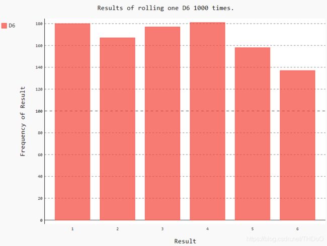
return randint(1, self.num_sides)die_visual.py 生成die_visual.svg文件用浏览器打开
from die import Die
import pygal


# 创建两个D6骰子
die_1 = Die()
die_2 = Die()


# 掷几次骰子,并将结果存储在一个列表中
results = []
for roll_num in range(1000):     # 掷骰子100次
    result = die_1.roll() + die_2.roll()
    results.append(result)

# 分析结果
frequencies = []
max_result = die_1.num_sides + die_2.num_sides
for value in range(2, max_result):
    frequency = results.count(value)
    frequencies.append(frequency)

# 对结果进行可视化
hist = pygal.Bar()

hist.title = "Results of rolling two D6 1000 times."
hist.x_labels = ['2', '3', '4', '5', '6', '7', '8', '9', '10', '11', '12']
hist.x_title = "Result"
hist.y_title = "Frequency of Result"

hist.add('D6 + D6', frequencies)
hist.render_to_file('die_visual.svg')

print(results)
print(frequencies)
2、下载数据
(1)CSV文件格式:地区一年的天气变化

import csv
from matplotlib import pyplot as plt
from datetime import datetime

# 从文件中获取日期和最高气温
filename = 'death_valley_2014.csv'
with open(filename) as f:
    reader = csv.reader(f)
    header_row = next(reader)   # 文件第一行

    dates, highs , lows = [], [], []
    for row in reader:  # 读取过第一行之后,循环将从第二行开始
        try:
            current_date = datetime.strptime(row[0], "%Y-%m-%d")
            high = int(row[1])
            low = int(row[3])
        except ValueError:
            print(current_date, 'missing data')
        else:
            dates.append(current_date)
            highs.append(high)
            lows.append(low)


    # 根据数据绘制图形
    fig = plt.figure(dpi=128, figsize=(10, 6))  # 设置绘图窗口的尺寸
    plt.plot(dates, highs, c='red', alpha=0.5)  # alpha指定颜色的透明度。0:完全透明,1(默认设置):完全不透明
    plt.plot(dates, lows, c='blue', alpha=0.5)
    # 传递了一个x值系列:dates;两个y值系列:highs和lows。facecolor指定了填充区域的颜色
    plt.fill_between(dates, highs, lows, facecolor='blue',  alpha=0.1)

    # 设置图形的格式
    plt.title("Daily high and low temperatures - 2014\nDeath Valley, CA", fontsize=20)
    plt.xlabel('', fontsize=16)
    fig.autofmt_xdate()     # 绘制斜的日期标签
    plt.ylabel('Temperature(F)', fontsize=16)
    plt.tick_params(axis='both', which='major', labelsize=16)   # 设置刻度标记的大小

    plt.show()
    # for index, column_header in enumerate(header_row):  # enumerate():获取每个元素的索引及其值
    #     print(index, column_header)
(2)JSON文件格式

world_population.py
import json
import pygal_maps_world.maps
from country_codes import get_country_code
from pygal.style import RotateStyle as RS
from pygal.style import LightColorizedStyle as LCS


# JSON中每个元素包含四个键的字典:国家名、国别码、年份以及表示人口数量的值
# 将数据加载到一个列表中
filename = 'population_data.json'
with open(filename) as f:
    pop_data = json.load(f)

# 创建一个包含人口数量的字典
cc_populations = {}
# 打印每个国家2010年的人口数量
for pop_dict in pop_data:
    if pop_dict['Year'] == '2010':
        country_name = pop_dict['Country Name']
        # Python不能直接将包含小数点的字符串'1127437398.85751'转换为整数
        # 先将字符串转换为浮点数,再将浮点数转换为整数
        population = int(float(pop_dict['Value']))
        # population_data.json中包含的是三个字母的国别码,但Pygal使用两个字母的国别码
        # 所以要进行转换
        code = get_country_code(country_name)
        if code:
            cc_populations[code] = population

# 根据人口数量将所有的国家分成三组
cc_pops_1, cc_pops_2, cc_pops_3 = {}, {}, {}
for cc, pop in cc_populations.items():
    if pop <  10000000:
        cc_pops_1[cc] = pop
    elif pop < 1000000000:
        cc_pops_2[cc] = pop
    else:
        cc_pops_3[cc] = pop

# 看看每组分别包含多少个国家
print(len(cc_pops_1), len(cc_pops_2), len(cc_pops_3))
# wm_style = RotateStyle('#336699'):为RotateStyle提供了一种淡蓝色基色
wm_style = RS('#77DDFF', base_style=LCS)
wm = pygal_maps_world.maps.World(style=wm_style)

wm.title = 'World Population in 2010, by Country'
wm.add('0-10m', cc_pops_1)
wm.add('10m-1bn', cc_pops_2)
wm.add('>1bn', cc_pops_3)


wm.render_to_file('world_population.svg')
country_codes.py
from pygal_maps_world.i18n import COUNTRIES


def get_country_code(country_name):
    """根据指定的国家,返回Pygal使用的两个字母的国别码"""
    for code, name in COUNTRIES.items():
        if name == country_name:
            return code
    # 如果没有找到指定的国家,就返回None
    return None
3、API响应
(1)Github API:探索GitHub上星级最高的Python项目

python_repos.py
import requests
import pygal
from pygal.style import LightColorizedStyle as LCS, LightenStyle as LS


# 执行API调用并存储响应
url = 'https://api.github.com/search/repositories?q=language:python&sort=stars'
r = requests.get(url)   # 将响应对象存储在变量r中
print("Status code:", r.status_code)    # 状态码200表示请求成功

# 将API响应存储在一个变量中
response_dict = r.json()
print("Total repositories:", response_dict['total_count'])

# 探索有关仓库的信息
repo_dicts = response_dict['items']     # 打印response_dict中的键,与'items'相关联的值是一个列表
# print("Repositories returned:", len(repo_dicts))    # 显示有多少个仓库的信息

names, plot_dicts = [], []

for repo_dict in repo_dicts:
    names.append(repo_dict['name'])
    plot_dict = {
        'value': repo_dict['stargazers_count'],
        'label': str(repo_dict['description']), # 添加项目的描述信息
        'xlink': repo_dict['html_url'],         # 添加可单击的链接
        }
    plot_dicts.append(plot_dict)

    # stars.append(repo_dict['stargazers_count'])     # 项目获得了多少个星,用于确定条形的高度
    # 项目所有者是用一个字典表示的,使用键owner来访问表示所有者的字典,再使用键key来获取所有者的登录名
    # print('Owner', repo_dict['owner']['login'])

# 可视化
my_style = LS('#333366', base_style=LCS)    # 基色设置为深蓝色

my_config = pygal.Config()
my_config.x_label_rotation = 45     # 让标签绕x轴旋转45度
my_config.show_legend = False
my_config.title_font_size = 24
my_config.label_font_size = 14
my_config.major_label_font_size = 24
my_config.truncate_label = 15       # 将较长的项目名缩短为15个字符
my_config.show_y_guides = False
my_config.width = 1000

chart = pygal.Bar(my_config, style=my_style)
chart.title = 'Most-Starred Python Projects on GitHub'
chart.x_labels = names

chart.add('', plot_dicts)
chart.render_to_file('python_repos.svg')
(2)Hacker News API

hn_submissions.py
import requests
from operator import itemgetter

# 执行API调用并存储响应
url = 'https://hacker-news.firebaseio.com/v0/topstories.json'
r = requests.get(url)
print("Status code:", r.status_code)    # 打印响应的状态

# 处理有关每篇文章的信息
submission_ids = r.json()       # 将响应文本转换为一个Python列表
submission_dicts = []
for submission_id in submission_ids[:30]:   # 遍历前30篇文章的ID
    # 对每篇文章都执行一个API调用
    url = ('https://hacker-news.firebaseio.com/v0/item/' + str(submission_id) + '.json')
    submission_r = requests.get(url)
    print(submission_r.status_code)
    response_dict = submission_r.json()

    submission_dict = {
        'title': response_dict['title'],
        'link': 'http://news.ycombinator.com/item?id=' + str(submission_id),
        'comments': response_dict.get('descendants', 0)     # 不确定某个键是否包含在字典中时,可使用方法dict.get()
    }
    submission_dicts.append(submission_dict)
# 根据评论数对字典列表submission_dicts排序,评论最多的文章位于最前面
submission_dicts = sorted(submission_dicts, key=itemgetter('comments'), reverse=True)

for submission_dict in submission_dicts:
    print("\nTitle:", submission_dict['title'])
    print("Discussion link:", submission_dict['link'])
    print("Comments:", submission_dict['comments'])