01.个人项目难点汇总1 定制动态卡片切换轮播图
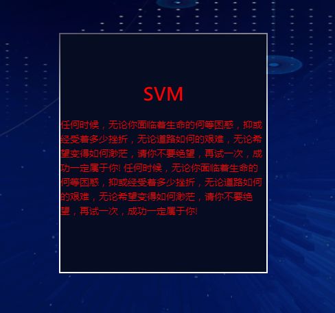
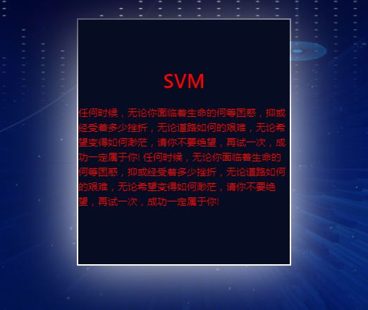
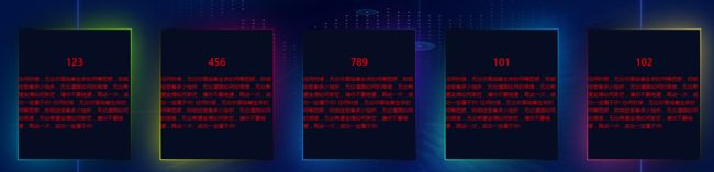
最终效果
01.画黑色盒子
 <div class="box">
     <div class="glass">div>
     <div class="content">
         <h1 style="color:red;text-align:center">SVMh1>
         <p style="color:red">
         任何时候,无论你面临着生命的何等困惑,抑或经受着多少挫折,无论道路如何的艰难,无论希望变得如何渺茫,请你不要绝望,再试一次,成功一定属于你!
         任何时候,无论你面临着生命的何等困惑,抑或经受着多少挫折,无论道路如何的艰难,无论希望变得如何渺茫,请你不要绝望,再试一次,成功一定属于你!
         p>
     div>
 div>
.box{
  position: relative;
  /* left: 50%;
  top: 50%;
  transform: translateX(-50%) translateY(-50%); */ /*transform会改变层级*/
  /* margin: 60px 40px; */
  width: calc(300vw * 100 / 1920);
  height: calc(400vh * 100 / 1080);
  display: flex;
  justify-content: center;
  align-items: center;
  background-color: #060c21;
}

02.添加before边框
.box::before {
  content: "";
  position: absolute;
  top: -2px;
  left: -2px;
  right: -2px;
  bottom: -2px;
  background: #fff;
  z-index: -1;
}
遇到层级问题 需要给父元素添加 z-index: 0;
.alg-container {
  position: relative;
  width: 100%;
  height: 100%;
  background-image: url("../../../assets/imgs/alg/algBc.png");
  background-size: 100% 100%;
  /* 排查问题 */
  display: flex;
  align-items: center;
  justify-content: center;
  min-height: 100vh;
  flex-wrap: wrap;
  z-index: 0;
}
03.添加外光圈
 .box::after{
  content: '';
  position: absolute;
  top:-2px;
  left: -2px;
  right: -2px;
  bottom: -2px;
  background: #fff;
  filter: blur(40px);
  z-index: -2;
}
04.添加外光圈与before渐变
.box:nth-child(2)::before,
.box:nth-child(2)::after{
  /* background-color: red; */
  background-image: linear-gradient(235deg,#89ff00, #010615, #00bcd4);
}
.box:nth-child(3)::before,
.box:nth-child(3)::after{
  background-image: linear-gradient(235deg,#ff005e, #010615, #fbff00);
}
.box:nth-child(4)::before,
.box:nth-child(4)::after{
  background-image: linear-gradient(235deg, #772aff, #010615, #2196f3);
}
.box:nth-child(5)::before,
.box:nth-child(5)::after{
  background-image: linear-gradient(235deg, #02AAFA, #010615, #29FFBF);
}
.box:nth-child(6)::before,
.box:nth-child(6)::after{
  background-image: linear-gradient(235deg, #FFE45A, #010615, #F43C86);
}
02.黑光卡片动画
01.代码
06-迷幻般的渐变投影
"shadow">
02.关键
添加动画+背景色渐变+background-position
03.动画卡片 选中放大
核心总结
元素悬浮变大
.box:hover{
  width: calc(450vw * 100 / 1920);
  height: calc(600vh * 100 / 1080);
}
元素opacity变化
.box-title{
  position: absolute;
  color: #fff;
  text-align: center;
  font-size: 38px;
  line-height: 38px;
  letter-spacing: 1px;
  opacity: 0.5;
  transition: 0.5s;
}
.box:hover .box-title{
  top: 6px;
  opacity: 1;
}
.box .content{
  position: absolute;
  bottom: 0;
  left: 10px;
  right: 10px;
  bottom: 10px;
  background: rgba(0,0,0,0.4);
  /* background: red; */
  color: #fff;
  display: flex;
  align-items: center;
  flex-direction: column;
  opacity: 0;
  transition: 0.2s;
}
.box:hover .content{
  opacity: 1;
}
04.轮播图效果+transform:scale 01
思路

html
<div class="alg-container">
        <div class="alg-center-box">div>

        <div class="center-card">
          <div class="card left1" ref="svmRef">
            <div class="box1" @click="middleChange('SVM')">
              <div class="box-title">SVMdiv>
              <div class="content">
                <h1 style="color: white">数据1h1>
                <h1 style="color: white">数据2h1>
                <h1 style="color: white">数据3h1>
                <h1 style="color: white">数据4h1>
              div>
            div>
          div>

          <div class="card left2" ref="rfRef">
            <div class="box2" @click="middleChange('RF')">
              <div class="box-title">RFdiv>
              <div class="content">
                <h1 style="color: white">数据1h1>
                <h1 style="color: white">数据2h1>
                <h1 style="color: white">数据3h1>
                <h1 style="color: white">数据4h1>
              div>
            div>
          div>
          <div class="card middle" ref="rnnRef">
            <div class="box3" @click="middleChange('RNN')">
              <div class="box-title">RNNdiv>
              <div class="content">
                <h1 style="color: white">数据1h1>
                <h1 style="color: white">数据2h1>
                <h1 style="color: white">数据3h1>
                <h1 style="color: white">数据4h1>
              div>
            div>
          div>

          <div class="card right2" ref="lstmRef">
            <div class="box4" @click="middleChange('LSTM')">
              <div class="box-title">LSTMdiv>
              <div class="content">
                <h1 style="color: white">数据1h1>
                <h1 style="color: white">数据2h1>
                <h1 style="color: white">数据3h1>
                <h1 style="color: white">数据4h1>
              div>
            div>
          div>

          <div class="card right1" ref="tcnRef">
            <div class="box5" @click="middleChange('TCN')">
              <div class="box-title">TCNdiv>
              <div class="content">
                <h1 style="color: white">数据1h1>
                <h1 style="color: white">数据2h1>
                <h1 style="color: white">数据3h1>
                <h1 style="color: white">数据4h1>
              div>
            div>
          div>
        div>
      div>
css
.alg-container {
  position: relative;
  width: 100%;
  height: 100%;
  background-image: url("../../../assets/imgs/alg/algBc.png");
  background-size: 100% 100%;
  /* 排查问题 */
  display: flex;
  align-items: center;
  justify-content: space-around;
  min-height: 100vh;
  flex-wrap: wrap;
  z-index: 0;
}
.alg-center-box {
  position: absolute;
  width: calc(1529vw * 100 / 1920);
  height: calc(995vh * 100 / 1080);
  left: 0;
  right: 0;
  top: 40px;
  margin: auto;
  background-image: url("../../../assets/imgs/alg/algBc2.png");
  background-size: 100% 100%;
}
.center-card {
  position: relative;
  width: calc(300vw * 100 / 1920);
  height: calc(400vh * 100 / 1080);
}
.card {
  position: absolute;
  width: 100%;
  height: 100%;
  left: 0;
  top: 0;
  background-color: #fff;
  transition: all 0.8s;
}
[class^="box"] {
  position: relative;
  width: 100%;
  height: 100%;
  /* top: 50%;
  left: 50%;
  transform: translateX(-50%) translateY(-50%); */
  margin: auto;
  display: inline-flex;
  justify-content: center;
  align-items: center;
  background-color: #060c21;
  transition: all 0.5s linear;
}
/* 位移卡片 */
.right2 {
  left: calc(360vw * 100 / 1920);
}
.right1 {
  left: calc(720vw * 100 / 1920);
}
.left2 {
  left: calc(-360vw * 100 / 1920);
}
.left1 {
  left: calc(-720vw * 100 / 1920);
}
.middle {
  transform: scale(1.25);
}
/* 添加边框与光晕 */
.box1::before,
.box1::after,
.box2::before,
.box2::after,
.box3::before,
.box3::after,
.box4::before,
.box4::after,
.box5::before,
.box5::after {
  content: "";
  position: absolute;
  top: -2px;
  left: -2px;
  width: calc(100% + 4px);
  height: calc(100% + 4px);
  background: linear-gradient(
    45deg,
    #fb0094,
    #00f,
    #0f0,
    #ff0,
    #f00,
    #fb0094,
    #00f,
    #0f0,
    #ff0,
    #f00
  );
  z-index: -1;
  background-position: 0% 0;
}
/* 这种写法会层级上下文改变 还不知道为什么 */
/* [class^='box']::after,
[class^='box']::before{
  content: "";
  position: absolute;
  top: -2px;
  left: -2px;
  width: calc(100% + 4px);
  height: calc(100% + 4px);
  background: linear-gradient(
    45deg,
    #fb0094,
    #00f,
    #0f0,
    #ff0,
    #f00,
    #fb0094,
    #00f,
    #0f0,
    #ff0,
    #f00
  );
  z-index: -1;
  background-position: 0% 0;
} */
/* 添加光晕 */
[class^="box"]::after {
  filter: blur(20px);
}
/* 单独设置边框色彩 */
.box1::before,
.box1::after {
  background-image: linear-gradient(235deg, #89ff00, #010615, #00bcd4);
}
.box2::before,
.box2::after {
  background-image: linear-gradient(235deg, #ff005e, #010615, #fbff00);
}
/* 居中的边框设置为着重关注 */
.middle [class^="box"]::before,
.middle [class^="box"]::after {
  background: linear-gradient(
    45deg,
    #fb0094,
    #00f,
    #0f0,
    #ff0,
    #f00,
    #fb0094,
    #00f,
    #0f0,
    #ff0,
    #f00
  );
  background-size: 400%;
  background-position: 0% 0;
  animation: animate 20s linear infinite;
}
.box3::before,
.box3::after {
  background-image: linear-gradient(235deg, #772aff, #010615, #2196f3);
}
.box4::before,
.box4::after {
  background-image: linear-gradient(235deg, #02aafa, #010615, #29ffbf);
}
.box5::before,
.box5::after {
  background-image: linear-gradient(235deg, #ffe45a, #010615, #f43c86);
}
/* 居中的边框动画 */
@keyframes animate {
  0% {
    background-position: 0 0;
  }
  50% {
    background-position: 300% 0;
  }
  100% {
    background-position: 0 0;
  }
}
.box-title {
  position: absolute;
  color: #fff;
  text-align: center;
  font-size: 38px;
  line-height: 38px;
  letter-spacing: 1px;
  opacity: 0.5;
  transition: 0.5s;
}
[class^="box"] .content {
  position: absolute;
  bottom: 0;
  left: 10px;
  right: 10px;
  bottom: 10px;
  background: rgba(0, 0, 0, 0.4);
  color: #fff;
  display: flex;
  align-items: center;
  flex-direction: column;
  opacity: 0;
  transition: 0.2s;
}
js
handleChange(refId) {
      //为了封装函数
      eval(`
        //添加middle
        this.$refs.${refId}.classList.remove(
          "left1",
          "left2",
          "middle",
          "right1",
          "right2"
        );
        this.$refs.${refId}.classList.add("middle");
        //左侧元素变化
        let left2 = this.$refs.${refId}.previousElementSibling ?? this.$refs.tcnRef;
        left2.classList.remove("left1", "left2", "middle", "right1", "right2");
        left2.classList.add("left2");
        let left1 = left2.previousElementSibling ?? this.$refs.tcnRef;
        left1.classList.remove("left1", "left2", "middle", "right1", "right2");
        left1.classList.add("left1");
        //右侧元素变化
        let right2 = this.$refs.${refId}.nextElementSibling ?? this.$refs.svmRef;
        right2.classList.remove("left1", "left2", "middle", "right1", "right2");
        right2.classList.add("right2");
        let right1 = right2.nextElementSibling ?? this.$refs.svmRef;
        right1.classList.remove("left1", "left2", "middle", "right1", "right2");
        right1.classList.add("right1");
      `);
    },
    //切换顺序
    middleChange(name) {
      switch (name) {
        case "RNN":
          this.handleChange("rnnRef");
          break;
        case "LSTM":
          this.handleChange("lstmRef");
          break;
        case "TCN":
          this.handleChange("tcnRef");
          break;
        case "SVM":
          this.handleChange("svmRef");
          break;
        case "RF":
          this.handleChange("rfRef");
          break;
      }
    },