python 之 matplotlib
文章目录
- 1.NumPy Matplotlib
-
- 1.1 下载所需要的包
- 1.2 pyplot介绍
- 2.画图
-
- 2.1 一般包含什么内容
- 2.2 语法(没啥用)
- 2.3 画图流程解释
- 2.4 以折线图为例讲解 流程、基本语法(看这个就够了)
- 3. 各图示例
-
- 3.1折线图 .plot()
-
- 3.1.1 设置x、y轴坐标为字符串+坐标轴添加名字+图的名字
- 3.1.2 绘制网格+绘制同一个图上绘制第二条线
- 3.2 散点图 .scatter()
- 3.3条形图 .bar() .barh()
-
- 3.3.1正常的条形图 .bar()
- 3.3.2 横着的条形图 .barh()
- 3.3.3 画多个条形图
- 3.4直方图 .hist()
- 3.5饼状图 .pie()
- 4. 遇到的问题
-
- 4.1 坐标轴字挤在一起
-
- 4.1.1 解决一 关闭 x 轴标签
- 4.1.2 解决二 刻度旋转
- 4.1.2 解决三 拉长图片
- 4.1.2 解决四 缩小文字大小
1.NumPy Matplotlib
Matplotlib 是 Python 的绘图库。 它可与 NumPy 一起使用,提供了一种有效的 MatLab 开源替代方案。 它也可以和图形工具包一起使用,如 PyQt 和 wxPython。
1.1 下载所需要的包
pip3 install matplotlib
1.2 pyplot介绍
Matplotlib 软件包中子包,提供了一个类似MATLAB的绘图框架。支持 Python 语言。
2.画图
2.1 一般包含什么内容

2.2 语法(没啥用)
2.3 画图流程解释
整个流程相当于一步一步的添加东西,比如先添加画布、然后是坐标轴、然后是表示数据的图、然后是题目、然后是其他等等,因此保存图像的语句要在所有东西都添加好后,然后最后都添加完毕也保存了,再show
2.4 以折线图为例讲解 流程、基本语法(看这个就够了)
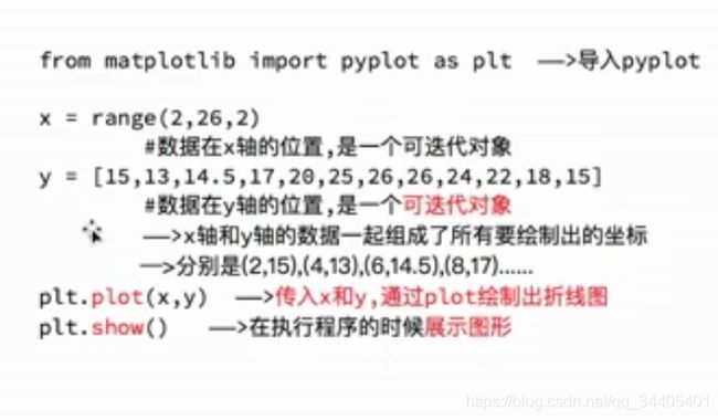
# 1.首先导包
from matplotlib import pyplot
# 2. 准备数据:坐标轴的刻度数据以及构成图的数据
# 2.1 首先准备坐标轴的刻度数据
labelX=[1,2,3,4,5]
labelY=[1,2,3,4,5]
# 2.2 再准备构成图的数据
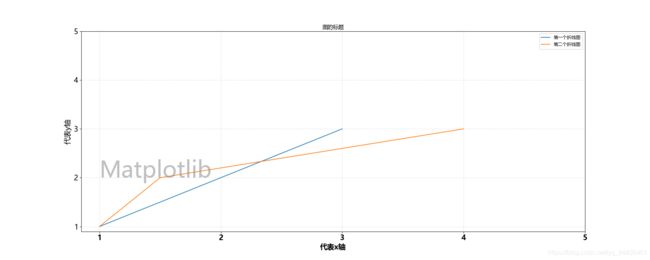
# 第一个折线图的数据
x1=[1,2,3]
y1=[1,2,3]
# 第二个折线图的数据
x2=[1,1.5,4]
y2=[1,2,3]
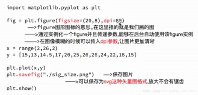
# 3.然后准备画布,决定图的宽、高、清晰度(20是宽,8是高,dpi是清晰度)
pyplot.figure(figsize=(20,8),dpi=80)
# 4.将构成图的数据绑定到图上,先是横坐标,然后是纵坐标,label是标记,标价显示还需要legend()
# 画第一个折线图
pyplot.plot(x1, y1,label="第一个折线图")
# 画第二个折线图,自动改变颜色!当然也可以指定两个折线图分别为什么颜色
pyplot.plot(x2, y2,label="第二个折线图")
# 显示线的标记
# Python matplotlib画图时图例说明(legend)放到图像外侧详解:https://www.jb51.net/article/186659.htm
pyplot.legend()
# 5.将坐标轴刻度绑定上去,然后再标记x、y分别代表了什么;刻度和标记都为Times New Roman,且字体大小为16
# 5.1 绑定刻度,刻度数据可以通过一一对应显示字符串
pyplot.xticks(labelX, size = 16, weight=1000)
pyplot.yticks(labelY, size = 16)
# 5.2 标记x、y代表什么
pyplot.xlabel("代表x轴",fontdict={'weight' : 1000,'size' : 16})
pyplot.ylabel("代表y轴",fontdict={'weight' : 'normal','size' : 16})
# 6.整个图的标题
pyplot.title("图的标题")
# 7.背景换成网格,以及添加水印
# 7.1 网格:ls=":"-->网格样式(虚线),color="gray"-->网格颜色,alpha=0.5-->网格透明度
pyplot.grid(ls=":",color="gray",alpha=0.5)
# 7.2 添加水印
pyplot.text(x=1, # 水印开头左下角对应的X点
y=2, # 水印开头左下角对应的Y点
s="Matplotlib", # 水印文本
fontsize=50, # 水印大小
color="gray", # 水印颜色
alpha=0.5) # 水印是通过透明度控制的
# 8.保存图
pyplot.savefig("./save.png")
# 9.显示图
pyplot.show()
结果:
3. 各图示例
3.1折线图 .plot()
3.1.1 设置x、y轴坐标为字符串+坐标轴添加名字+图的名字
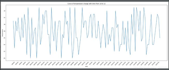
from matplotlib import pyplot
import random

# 刻画一个10点到12点每一分钟温度20到35变化的折线图
x = range(0, 120)
y = [random.randint(20, 35) for i in range(120)]
pyplot.figure(figsize=(20,8),dpi=80)
pyplot.plot(x, y)
str_x = ["10h{}m".format(i) for i in range(60)]
str_x += ["11h{}m".format(i) for i in range(60)]
# 取步长,数字和字符串一一对应,数据的长度一样
pyplot.xticks(list(x)[::3], str_x[::3], rotation=45)  # rotation是旋转角度
pyplot.xlabel("time")#x轴名字
pyplot.ylabel("temperature")#y轴名字
pyplot.title("Curve of temperature change with time from 10 to 12")
pyplot.show()
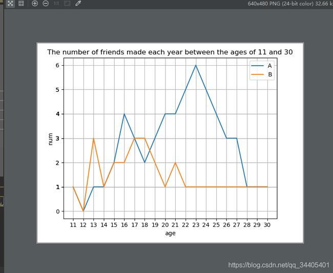
3.1.2 绘制网格+绘制同一个图上绘制第二条线
from matplotlib import pyplot
'''
题目:
统计 A 11到30岁每年交的朋友个数
x:岁数
y:个数[1,0,1,1,2,4,3,2,3,4,4,5,6,5,4,3,3,1,1,1]
再统计 B 11到30每年的个数
y:个数[1,0,3,1,2,2,3,3,2,1,2,1,1,1,1,1,1,1,1,1]
'''
x=range(11,31)
yA=[1,0,1,1,2,4,3,2,3,4,4,5,6,5,4,3,3,1,1,1]
yB=[1,0,3,1,2,2,3,3,2,1,2,1,1,1,1,1,1,1,1,1]
pyplot.plot(x,yA,label="A")
pyplot.plot(x,yB,label="B")#画第二个图的时候会自动变色的
pyplot.xticks(x)
pyplot.yticks(yA)
pyplot.xlabel("age")
pyplot.ylabel("num")
pyplot.title("The number of friends made each year between the ages of 11 and 30")
pyplot.grid()#绘制网格
pyplot.legend()#结合plot方法中label参数的值给线标注
pyplot.show()
3.2 散点图 .scatter()
'''
已知3月份和10月份的每天最高气温
three=[11,17,16,11,12,6,6,7,8,9,12,15,14,17,18,21,16,17,20,14,15,15,15,19,21,22,22,22,23,24]
ten=[26,26,28,19,21,17,16,19,18,20,20,19,22,23,17,20,21,20,22,1,5,11,15,5,13,17,10,11,13,12,13]
'''
from matplotlib import pyplot
#因为两个月份的散点图放到一起会重叠,所以设置两个x
day_3=range(1,32)
day_10=range(41,72)
three=[11,17,16,11,12,6,6,7,8,9,12,15,14,17,18,21,16,17,20,14,15,15,15,19,21,22,22,22,23,24,26]
ten=[26,26,28,19,21,17,16,19,18,20,20,19,22,23,17,20,21,20,22,1,5,11,15,5,13,17,10,11,13,12,13]
pyplot.figure(figsize=(20,8),dpi=80)
#scatter()是绘制散点图的函数
pyplot.scatter(day_3,three,label="March")
pyplot.scatter(day_10,ten,label="October")
x=list(day_3)+list(day_10)
str_x=["{} March".format(i) for i in range(1,32)]
str_x=str_x+["{} October".format(j-40) for j in range(41,72)]
pyplot.xticks(x[::2],str_x[::2],rotation=45)
pyplot.xlabel("day")
pyplot.ylabel("temperature")
pyplot.title("the air temperautre of BeiJing in March and October")
pyplot.legend()
pyplot.show()

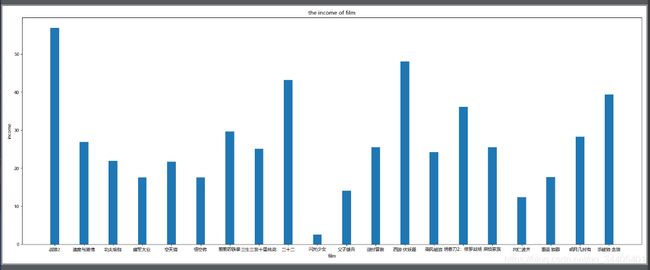
3.3条形图 .bar() .barh()
3.3.1正常的条形图 .bar()
'''
绘制20部电影以及他的票房收入
films=["战狼2","速度与激情","功夫瑜伽","建军大业","空天猎","悟空传","羞羞的铁拳","三生三世十里桃花","二十二","闪光少女","父子雄兵","逆时营救","西游·伏妖篇","乘风破浪","绣春刀2:修罗战场","麻烦家族","冈仁波齐","重返·狼群","明月几时有","杀破狼·贪狼"]
income=[56.83,26.94,21.9,17.53,21.68,17.53,29.63,25.11,43.24,02.54,14.11,25.55,48.12,24.22,36.11,25.48,12.35,17.72,28.23,39.44]
'''
from matplotlib import pyplot
import matplotlib
print(matplotlib.matplotlib_fname())
film=["战狼2","速度与激情","功夫瑜伽","建军大业","空天猎","悟空传","羞羞的铁拳","三生三世十里桃花","二十二","闪光少女","父子雄兵","逆时营救","西游·伏妖篇","乘风破浪","绣春刀2:修罗战场","麻烦家族","冈仁波齐","重返·狼群","明月几时有","杀破狼·贪狼"]
income=[56.83,26.94,21.9,17.53,21.68,17.53,29.63,25.11,43.24,02.54,14.11,25.55,48.12,24.22,36.11,25.48,12.35,17.72,28.23,39.44]
pyplot.figure(figsize=(20,8),dpi=80)
#.bar()是绘制条形图,注意这里传的第一个参是range(len(film)),因为绘图参数得传数字,想要显示名字得最后通过设置x、y轴一一对应;但经测验直接传film也可以
pyplot.bar(range(len(film)),income,width=0.3)
pyplot.xlabel("film")
pyplot.ylabel("income")
pyplot.title("the income of film")
pyplot.xticks(range(len(film)),film)
pyplot.show()
3.3.2 横着的条形图 .barh()
#横着的条形图,数据和tiaoxingtu.py一样
from matplotlib import pyplot
import matplotlib
print(matplotlib.matplotlib_fname())
film=["战狼2","速度与激情","功夫瑜伽","建军大业","空天猎","悟空传","羞羞的铁拳","三生三世十里桃花","二十二","闪光少女","父子雄兵","逆时营救","西游·伏妖篇","乘风破浪","绣春刀2:修罗战场","麻烦家族","冈仁波齐","重返·狼群","明月几时有","杀破狼·贪狼"]
income=[56.83,26.94,21.9,17.53,21.68,17.53,29.63,25.11,43.24,02.54,14.11,25.55,48.12,24.22,36.11,25.48,12.35,17.72,28.23,39.44]
pyplot.figure(figsize=(20,8),dpi=80)
#.barh()是绘制横着的条形图,注意这里传的第一个参默认对应了y轴
pyplot.barh(range(len(film)),income,height=0.3,color="orange")#注意这里变成了height
#下面的x、y和正常的都颠倒了
pyplot.xlabel("income")
pyplot.ylabel("film")
pyplot.title("the income of film")
pyplot.yticks(range(len(film)),film)
pyplot.show()

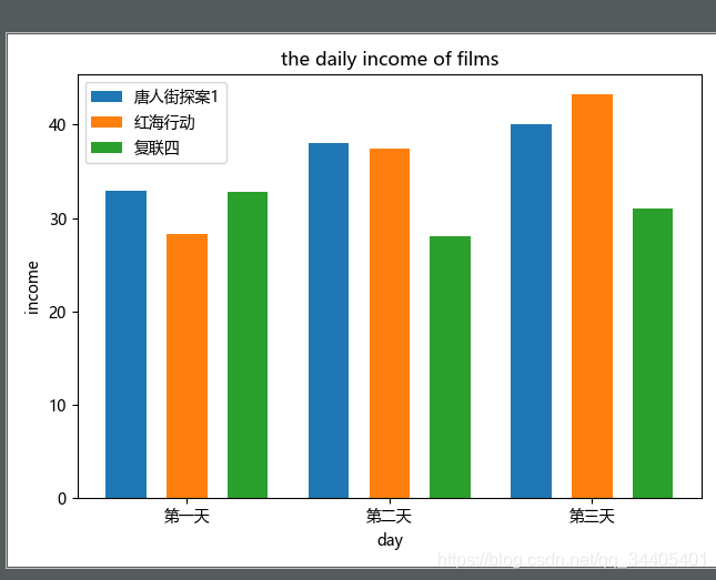
3.3.3 画多个条形图
#画多个条形图进行对比
'''
已知三个电影分别的三天票房
画条形图进行对比
'''
from matplotlib import pyplot
film=["唐人街探案1","红海行动","复联四"]
day=["第一天","第二天","第三天"]
income1=[32.86,38,40.02]
income2=[28.33,37.44,43.21]
income3=[32.78,28.02,31.03]
filmx1=[i for i in range(len(film))]
filmx2=[i+0.3 for i in range(len(film))]
filmx3=[i+0.6 for i in range(len(film))]
pyplot.bar(filmx1,income1,width=0.2,label="唐人街探案1")
pyplot.bar(filmx2,income2,width=0.2,label="红海行动")
pyplot.bar(filmx3,income3,width=0.2,label="复联四")
pyplot.title("the daily income of films")
pyplot.xlabel("day")
pyplot.ylabel("income")
pyplot.xticks(filmx2,day)
pyplot.legend()
pyplot.show()
3.4直方图 .hist()
'''
获取了100部电影的时长(通过下面随机数生成时长)
统计这些电影的时长的分布状态(比如时长100到120的有几部)
'''
from matplotlib import pyplot
import random
time=[100,180]
for i in range(98):
    time.append(random.randint(100,180))#电影时长为100到180
print(time)
pyplot.hist(time,20)#这个20的意思是分成20组
x=[i for i in range(80)]
x1=[i for i in range((180-100)//20)]
pyplot.xticks(range(100,181,4))#xticks()的第一个参数是对应原先坐标的
pyplot.show()

3.5饼状图 .pie()
https://zhuanlan.zhihu.com/p/26812779
4. 遇到的问题
4.1 坐标轴字挤在一起
4.1.1 解决一 关闭 x 轴标签
plt.xticks(())# 关闭x轴标签
4.1.2 解决二 刻度旋转
rotation是标签旋转角度
plt.xticks(labelX, rotation=90)
4.1.2 解决三 拉长图片
通过plt.figure(figsize = (x,y))实现
4.1.2 解决四 缩小文字大小
plt.xticks(fontsize = 2)