pff1_whylog return Nominal Inflation_CPI_Realized Volati_outlier_distplot_Jarque–Bera_pAcf_sARIMAx
Simple returns VS Log returns
There are two types of returns:
- Simple returns(or raw returns): They aggregate over assets; the simple return of a portfolio is the weighted sum of the returns of the individual assets in the portfolio. Simple returns are defined as:

pct_change() command that gives us the percentage change over the prior period values - Log returns: They aggregate over time; it is easier to understand with the help of an example—the log return for a given month is the sum of the log returns of the days within that month. Log returns are defined as:
 Note: the logarithmic base to use. Default is 'e'
Why use log returns over simple returns? There are several reasons, but the most important of them is normalization, and this avoids the problem of negative prices.
Benefit of using returns, versus prices, is normalization: measuring all variables in a comparable metric, thus enabling evaluation of analytic relationships amongst two or more variables despite originating from price series of unequal values. This is a requirement for many multidimensional statistical analysis and machine learning techniques. For example, interpreting an equity covariance matrix解释股权协方差矩阵 is made sane when the variables are both measured in percentage.
Several benefits of using log returns, both theoretic and algorithmic.- First, log-normality对数正态性: if we assume that prices are distributed log normally (which, in practice, may or may not be true for any given price series), then
 is conveniently normally distributed, because:

This is handy given much of classic statistics presumes normality. - Second, approximate raw-log equality近似原始对数相等: when returns are very small (common for trades with short holding durations), the following approximation ensures they are close in value to raw returns(simple return):
 ,
, 
- Third, time-additivity: consider an ordered sequence of n trades. A statistic frequently calculated from this sequence is the compounding return, which is the running return of this sequence of trades over time:

This formula is fairly unpleasant, as probability theory reminds us the product of normally-distributed variables is not normal. Instead, the sum of normally-distributed variables is normal (important technicality: only when all variables are uncorrelated), which is useful when we recall the following logarithmic identity:
Thus, compounding returns are normally distributed. Finally, this identity leads us to a pleasant algorithmic benefit; a simple formula for calculating compound returns:
Thus, the compound return over n periods is merely the difference in log between initial and final periods. In terms of algorithmic complexity, this simplification reduces O(n) multiplications to O(1) additions. This is a huge win for moderate to large n. Further, this sum is useful for cases in which returns diverge from normal, as the central limit theorem reminds us that the sample average of this sum will converge to normality (presuming finite first and second moments). - Fourth, mathematical ease: from calculus, we are reminded (ignoring the constant of integration):
This identity is tremendously useful, as much of financial mathematics is built upon continuous time stochastic processes which rely heavily upon integration and differentiation. - Fifth, numerical stability: addition of small numbers is numerically safe, while multiplying small numbers is not as it is subject to arithmetic underflow. For many interesting problems, this is a serious potential problem. To solve this, either the algorithm must be modified to be numerically robust or it can be transformed into a numerically safe summation via logs.
- As suggested by John Hall, there are downsides to using log returns. Here are two recent papers to consider (along with their references):
- Comparing Security Returns is Harder than You Think: Problems with Logarithmic Returns, by Hudson (2010)
- Quant Nugget 2: Linear vs. Compounded Returns – Common Pitfalls in Portfolio Management, by Meucci (2010)
- First, log-normality对数正态性: if we assume that prices are distributed log normally (which, in practice, may or may not be true for any given price series), then
- The difference between simple and log returns for daily/intraday data will be very small, however, the general rule is that log returns are smaller in value than simple returns.
 is the price of an asset in time t. In the preceding case, we do not consider dividends, which obviously impact the returns and require a small modification of the formulas.
The best practice while working with stock prices is to use adjusted values, as they account for possible corporate actions, such as stock splits.
def download(tickers, start=None, end=None, actions=False, threads=True, ignore_tz=True,
             group_by='column', auto_adjust=False, back_adjust=False, repair=False, keepna=False,
             progress=True, period="max", show_errors=True, interval="1d", prepost=False,
             proxy=None, rounding=False, timeout=10, **kwargs):
    """Download yahoo tickers
    :Parameters:
        tickers : str, list
            List of tickers to download
        period : str
            Valid periods: 1d,5d,1mo,3mo,6mo,1y,2y,5y,10y,ytd,max
            Either Use period parameter or use start and end
        interval : str
            Valid intervals: 1m,2m,5m,15m,30m,60m,90m,1h,1d,5d,1wk,1mo,3mo
            Intraday data cannot extend last 60 days
        start: str
            Download start date string (YYYY-MM-DD) or _datetime.
            Default is 1900-01-01
        end: str
            Download end date string (YYYY-MM-DD) or _datetime.
            Default is now
        group_by : str
            Group by 'ticker' or 'column' (default)
        prepost : bool
            Include Pre and Post market data in results?
            Default is False
        auto_adjust: bool
            Adjust all OHLC automatically? Default is False
        repair: bool
            Detect currency unit 100x mixups and attempt repair
            Default is False
        keepna: bool
            Keep NaN rows returned by Yahoo?
            Default is False
        actions: bool
            Download dividend + stock splits data. Default is False
        threads: bool / int
            How many threads to use for mass downloading. Default is True
        ignore_tz: bool
            When combining from different timezones, ignore that part of datetime.
            Default is True
        proxy: str
            Optional. Proxy server URL scheme. Default is None
        rounding: bool
            Optional. Round values to 2 decimal places?
        show_errors: bool
            Optional. Doesn't print errors if False
        timeout: None or float
            If not None stops waiting for a response after given number of
            seconds. (Can also be a fraction of a second e.g. 0.01)
In this recipe, we show how to calculate both types of returns using Apple's stock prices.
import pandas as pd
import numpy as np
import yfinance as yf
# progress=True : Progress will show a progress bar.
# auto_adjust will overwrite the Close
# Adjust all OHLC automatically? Default is False
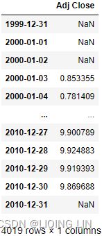
df = yf.download( 'AAPL',
start='2000-01-01',
end='2010-12-31',
progress=False
)
df 
aapl = yf.download( 'AAPL',
                    start='2010-01-01',
                    #end='2010-12-31',
                    progress=False
                  )
aapl
aapl.append(df).sort_index() 
aapl.to_csv('aapl')![]()
3. Calculate the simple![]() and
and
log returns![]() using the adjusted close prices:
using the adjusted close prices:
df['simple_rtn'] = df['Adj Close'].pct_change() # (p_t - p_t_previous)/p_t_previous
df['log_rtn'] = np.log( df['Adj Close']/df['Adj Close'].shift(1) )
df- To calculate the simple returns, we used the pct_change method of pandas Series/DataFrame, which calculates the percentage change between the current and prior element (we can specify the number of lags, but for this specific case, the default value of 1 suffices).
- To calculate the log returns, we followed the formula given in the introduction to this recipe. When dividing each element of the series by its lagged value, we used the shift method with a value of 1 to access the prior element. In the end, we took the natural logarithm of the divided values by using np.log .

The first row will always contain a not a number (NaN) value, as there is no previous price to use for calculating the returns.
We will also discuss how to account for inflation in the returns series如何在收益系列中解释通货膨胀. To do so, we continue with the example used in this recipe.
What is an inflation rate?
Inflation rate is the measure of the increase or rate of increase in the general price of selected goods and services over a determined period. Inflation can indicate a decline in the purchasing power or value of a nation's currency and is typically recorded and reported as a percentage.
Inflation rate is important because as the average cost of items increases, currency loses value as it takes more and more funds to acquire the same goods and services as before. This fluctuation in the value of the dollar impacts the cost of living and adversely affects the economy leading to slower economic growth.
The consumer price index
The consumer price index (CPI) is a measure of the overall cost of the goods and services bought by a typical consumer.
The consumer price index is used to monitor changes in the cost of living over time. When the consumer price index rises, the typical family has to spend more money to maintain the same standard of living. Economists use the term inflation to describe a situation in which the economy’s overall price level is rising. The inflation rate is the percentage change in the price level from the previous period. The preceding chapter showed how economists can measure inflation using the GDP deflator. The inflation rate you are likely to hear on the nightly news, however, is calculated from the consumer price index, which better reflects the goods and services bought by consumers.
When the Bureau of Labor Statistics (BLS) calculates the consumer price index and the inflation rate, it uses data on the prices of thousands of goods and services. To see exactly how these statistics are constructed, let’s consider a simple economy in which consumers buy only two goods: hot dogs and hamburgers. Table 1 shows the five steps that the BLS follows.
- 1. Fix the basket. Determine which prices are most important to the typical consumer. If the typical consumer buys more hot dogs than hamburgers, then the price of hot dogs is more important than the price of hamburgers and, therefore, should be given greater weight in measuring the cost of living. The BLS sets these weights by surveying consumers to find the basket of goods and services bought by the typical consumer. In the example in the table, the typical consumer buys a basket of 4 hot dogs and 2 hamburgers.

- 2. Find the prices. Find the prices of each of the goods and services in the basket at each point in time. The table shows the prices of hot dogs and hamburgers for three different years.
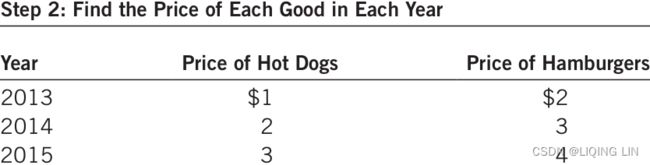
- 3. Compute the basket’s cost. Use the data on prices to calculate the cost of the basket of goods and services at different times. The table shows this calculation for each of the three years. Notice that only the prices in this calculation change. By keeping the basket of goods the same (4 hot dogs and 2 hamburgers), we are isolating the effects of price changes from the effects of any quantity changes that might be occurring at the same time.

- 4. Choose a base year and compute the consumer price index (CPI). Designate one year as the base year, the benchmark against which other years are compared. (The choice of base year is arbitrary, as the index is used to measure changes in the cost of living.) Once the base year is chosen, the index is calculated as follows:


The consumer price index is 175 in 2014. This means that the price of the basket in 2014 is 175 percent of its price in the base year
the consumer price index is 250 in 2015, indicating that the price level in 2015 is 250 percent of the price level in the base year. - 5. Compute the inflation rate. Use the consumer price index to calculate the inflation rate, which is the percentage change in consumer price index (CPI) from the preceding period. That is, the inflation rate between two consecutive years is computed as follows:


the inflation rate in our example is 75 percent in 2014 and 43 percent in 2015.
In addition to the consumer price index (CPI) for the overall economy, the BLS calculates several other price indexes. It reports the index for specific metropolitan areas特定大都市地区 within the country (such as Boston, New York, and Los Angeles) and for some narrow categories of goods and services (such as food, clothing, and energy). It also calculates the producer price index (PPI), which measures the cost of a basket of goods and services bought by firms rather than consumers. Because firms eventually pass on their costs to consumers in the form of higher consumer prices, changes in the producer price index are often thought to be useful in predicting changes in the consumer price index.
#############
https://data.stats.gov.cn/easyquery.htm?cn=A01

https://data.stats.gov.cn/english/ks.htm?cn=A01
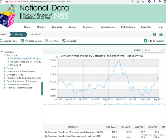
#############USA Consumer Price Index (CPI) | Inflation Rate and Consumer Price Index
What Is the Inflation-Adjusted Return?
The inflation-adjusted return is the measure of return that takes into account the time period's inflation rate. The purpose of the inflation-adjusted return metric is to reveal the return on an investment after removing the effects of inflation.![]()
Removing the effects of inflation from the return of an investment allows the investor to see the true earning potential of the security看到证券的真正盈利潜力 without external economic forces. The inflation-adjusted return is also known as the real rate of return or required rate of return adjusted for inflation(The real rate of return on an investment measures the increase in purchasing power that the investment provides.).
- The inflation-adjusted return accounts for the effect of inflation on an investment's performance over time.
- Also known as the real return, the inflation-adjusted return provides a more realistic comparison of an investment's performance.
- Inflation will lower the size of a positive return and increase the magnitude of a loss.
The inflation-adjusted return is useful for comparing investments, especially between different countries because each country's inflation rate is accounted for in the return. In this scenario, without adjusting for inflation across international borders, an investor may get vastly different results when analyzing an investment's performance. The Inflation-adjusted return serves as a more realistic measure of an investment's return when compared to other investments.
example
assume a bond investment is reported to have earned 2% in the previous year. This appears like a gain. However, suppose that inflation last year was 2.5%. Essentially, this means the investment did not keep up with inflation, and it effectively lost 0.5%.![]()
Assume also a stock that returned 12% last year and inflation was 3%. An approximate estimate of the real rate of return is 9%![]() , or the 12% reported return less the inflation amount (3%).
, or the 12% reported return less the inflation amount (3%).
We first download the monthly Consumer Price Index (CPI) values from Quandl and calculate the percentage change (simple return) in the index. We can then merge the inflation data with Apple's stock returns通胀数据与苹果的股票收益合并, and account for inflation计算通胀 by using the following formula:![]() OR
OR![]()
Here, ![]() is a time t simple return and
is a time t simple return and ![]() is the inflation rate.
is the inflation rate.
Calculating the inflation-adjusted return requires three basic steps.
- First, the return on the investment must be calculated.
- Second, the inflation for the period must be calculated.
- And third, the inflation amount must be geometrically backed out of the investment's return.通货膨胀金额必须以几何方式从投资回报中扣除。
Example of Inflation-Adjusted Return
Assume an investor purchases a stock on January 1 of a given year for $75,000. At the end of the year, on December 31, the investor sells the stock for $90,000. During the course of the year, the investor received $2,500 in dividends. At the beginning of the year, the Consumer Price Index (CPI) was at 700. On December 31, the CPI was at a level of 721.
- The first step is to calculate the investment's return using the following formula:
Return = (Ending price - Beginning price + Dividends) / (Beginning price)
= ( $90,000 - $75,000 + $2,500 ) / $75,000
= 23.3% percent. - The second step is to calculate the level of inflation over the period using the following formula:
Inflation = (Ending CPI level - Beginning CPI level) / Beginning CPI level
= ( 721 - 700 ) / 700
= 3 percent - The third step is to geometrically back out the inflation amount using the following formula:

Inflation-adjusted return = (1 + Stock Return) / (1 + Inflation) - 1
= ( 1.233 / 1.03 ) - 1
= 19.7 percent
Nominal Return vs. Inflation-Adjusted Return
Using inflation-adjusted returns is often a good idea because they put things into a very real-world perspective. Focusing on how investments are doing over the long-term can often present a better picture when it comes to its past performance (rather than a day-to-day, weekly, or even monthly glance).
But there may be a good reason why nominal returns work over those adjusted for inflation. Nominal returns are generated before any taxes, investment fees, or inflation. Since we live in a “here and now” world, these nominal prices and returns are what we deal with immediately to move forward. So, most people will want to get an idea of how the high and low price of an investment is—relative to its future prospects—rather than its past performance. In short, how the price fared when adjusted for inflation five years ago won’t necessarily matter when an investor buys it tomorrow.
Example
The nominal rate of return on an investment is the return that the investment earns expressed in current dollars. For example, if you put $50 into an investment that promises to pay 3% interest, at the end of the year you will have $51.50 (the initial $50 plus a $1.50 return). Your nominal return is 3%, but this does not necessarily mean that you are better off financially at the end of the year because the nominal return does not take into account the effects of inflation.
To continue the example, assume that at the beginning of the year, one bag of groceries costs $50. During the year, suppose grocery prices rise by 3%. This means that by the end of the year one bag of groceries costs $51.50. In other words, at the beginning of the year you could have used your $50 either to buy one bag of groceries or to make the investment that promised a 3% return. If you invested your money rather than spending it on groceries, by the end of 1 year you would have had $51.50, still just enough to buy one bag of groceries. In other words, your purchasing power did not increase at all during the year. The real rate of return on an investment measures the increase in purchasing power that the investment provides. In our continuing example, the real rate of return is 0%(or![]()
![]() ) even though the nominal rate of return is 3%. In dollar terms, by investing $50 you increased your wealth by 3% to $51.50, but in terms of purchasing power you are no better off because your money is only enough to buy the same amount of goods that it could have bought before you made the investment. In mathematical terms, the real rate of return is approximately equal to the nominal rate of return minus the inflation rate.
) even though the nominal rate of return is 3%. In dollar terms, by investing $50 you increased your wealth by 3% to $51.50, but in terms of purchasing power you are no better off because your money is only enough to buy the same amount of goods that it could have bought before you made the investment. In mathematical terms, the real rate of return is approximately equal to the nominal rate of return minus the inflation rate.
Example
Suppose you have $50 today and are trying to decide whether to invest that money or spend it.
- If you invest it, you believe that you can earn a nominal return of 10%, so after 1 year your money will grow to $55.
- If you spend the money today, you plan to feed your caffeine habit by purchasing 20 lattes at your favorite coffee shop at $2.50 each.
You decide to save and invest your money, so a year later you have $55. Unfortunately, during that time inflation caused the price of a latte to increase by 4.8% from $2.50 to $2.62(=2.5*1.048). At the new price, you can just about afford to buy 21 lattes (21 × $2.62 = $55.02). That extra latte represents an increase in your purchasing power of 5% (i.e., 21 is 5% more than 20), so your real return(or![]()
![]() ) on the investment is 5% because it enabled you to buy 5% more than you could before you invested. Notice that the real return is approximately equal to the difference between the investment’s nominal return (10%) and the inflation rate (4.8%).
) on the investment is 5% because it enabled you to buy 5% more than you could before you invested. Notice that the real return is approximately equal to the difference between the investment’s nominal return (10%) and the inflation rate (4.8%).
Execute the following steps to account for inflation in the returns series.
import pandas as pd
import quandl

QUANDL_API_KEY = 'sKqHwnHr8rNWK-3s5imS'
quandl.ApiConfig.api_key = QUANDL_API_KEY

df_all_dates = pd.DataFrame( index=pd.date_range( start='1999-12-31',
                                                  end='2010-12-31'
                                                )
                           )
df = df_all_dates.join( df[ ['Adj Close'] ],
                        how ='left'
                      ).fillna( method='ffill').asfreq('M')
                      #Convert time series to specified frequency
df
df_all_dates.join( df[ ['Adj Close'] ],.join(how='left') foward-fill resample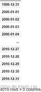 ==>
==> ==>
==> ==>
==>
- We used a left join, which is a type of join (used for merging DataFrames) that returns all rows from the left table and the matched rows from the right table while leaving the unmatched rows empty.
- In case the last day of the month was not a trading day, we used the last known price of that month( fillna(method=' ffill' ) ).
- Lastly, we selected the end-of-month rows only by applying asfreq(' M' ) .
Download the inflation data from Quandl:
# Download the inflation data from Quandl:
# Consumer Price Index (CPI)
df_cpi = quandl.get( dataset='RATEINF/CPI_USA',
start_date = '1999-12-01',
end_date = '2010-12-31'
)
df_cpi.rename( columns={'Value':'cpi'},
inplace=True
)
# Merge the inflation data to the prices:
df_merged = df.join(df_cpi, how='left')
df_merged 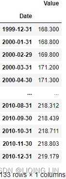 =>
=> =>
=> <=
<=
5. Calculate the simple returns![]() and inflation rate(the inflation rate between two consecutive years):
and inflation rate(the inflation rate between two consecutive years):
df_merged['simple_rtn'] = df_merged['Adj Close'].pct_change()
df_merged['inflation_rate'] = df_merged.cpi.pct_change()
df_merged
6. Adjust the returns for inflation:![]() OR
OR![]()
df_merged['real_rtn'] = ( df_merged.simple_rtn + 1)\
                            /(df_merged.inflation_rate -1 )-1
df_merged
The DataFrame contains all the intermediate results, and the real_rtn column contains the inflation-adjusted returns.
######################
import pandas as pd
import numpy as np
import yfinance as yf

# progress=True : Progress will show a progress bar.
# auto_adjust will overwrite the Close
# Adjust all OHLC automatically? Default is False
df = yf.download( 'AAPL',
                  start='2000-01-01',
                  #end='2010-12-31',
                  progress=False
                )
df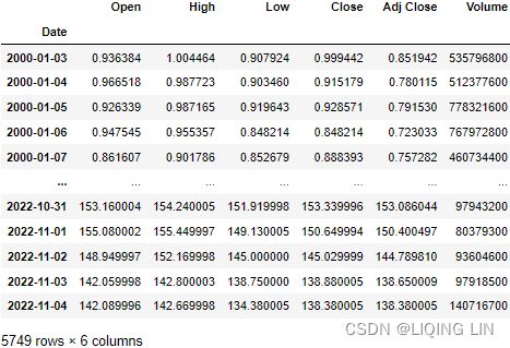
df['simple_rtn'] = df['Adj Close'].pct_change() # (p_t - p_t_previous)/p_t_previous
df['log_rtn'] = np.log( df['Adj Close']/df['Adj Close'].shift(1) )
df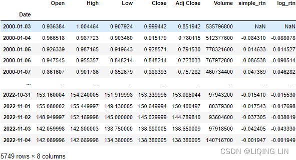
import pandas as pd
import quandl

QUANDL_API_KEY = 'sKqHwnHr8rNWK-3s5imS'
quandl.ApiConfig.api_key = QUANDL_API_KEY

df_all_dates = pd.DataFrame( index=pd.date_range( start=df.index[:1][0],
                                                  end=df.index[-1:][0]
                                                )
                           )
df = df_all_dates.join( df[ ['Adj Close'] ],
                        how ='left'
                      ).fillna( method='ffill').asfreq('M')
                      #Convert time series to specified frequency

# Download the inflation data from Quandl:
# Consumer Price Index (CPI)
df_cpi = quandl.get( dataset='RATEINF/CPI_USA',
                     start_date = df.index[:1][0],
                     end_date = df.index[-1:][0]
                   )
df_cpi.rename( columns={'Value':'cpi'},
               inplace=True
             )
# Merge the inflation data to the prices:
df_merged = df.join(df_cpi, how='left')
df_merged
inflation_rate = quandl.get( dataset='RATEINF/inflation_USA',
                             start_date = '1999-12-01',
                           )
inflation_rate.rename( columns={'Value':'inflation_rate'},
                       inplace=True
                     )
# Merge the inflation data to the prices:
df_merged = df_merged.join(inflation_rate, how='left')

df_merged['simple_rtn'] = df_merged['Adj Close'].pct_change()
df_merged['inflation_rate_from_cpi'] = df_merged.cpi.pct_change()

df_merged['real_rtn'] = ( df_merged.simple_rtn + 1)\
                            /(df_merged.inflation_rate -1 )-1
df_merged
import matplotlib.pyplot as plt
plt.style.use('seaborn')

fig, ax = plt.subplots( 1,1, figsize=(10,8) )

date='2021-01-01'
#df_merged.loc[df.index>'2019-01-01']['real_rtn'].plot()
ax.plot( df.index[df.index>date],
         df_merged.loc[df.index>date]['inflation_rate'],
         label='inflation_rate',
         color='blue'
       )
ax.plot( df.index[df.index>date],
         df_merged.loc[df.index>date]['inflation_rate_from_cpi'],
         label='inflation_rate_from_cpi',
         color='green'
       )
ax.plot( df.index[df.index>date],
         df_merged.loc[df.index>date]['real_rtn'],
         label='aapl real_rtn',
         color='r'
       )


plt.setp( ax.get_xticklabels(), rotation=45, horizontalalignment='right', fontsize=14 )
plt.xticks(fontsize=14)
plt.yticks(fontsize=14)
plt.legend(loc='best', fontsize=14)
plt.show()
######################
Changing frequency
The general rule of thumb for changing frequency can be broken down into the following:
- Multiply/divide the log returns by the number of time periods.
- Multiply/divide the volatility by the square root of the number of time periods.
In this recipe, we present an example of how to calculate the monthly realized volatilities for Apple using daily returns and then annualize the values.
What is Realized Volatility?
Realized volatility is the assessment of variation in returns for an investment product by analyzing its historical returns within a defined time period.(that is, the observed volatility of the underlying returns from historical market prices.)
- Assessment of degree of uncertainty and/or potential financial loss/gain from investing in a firm may be measured using variability/ volatility in stock prices of the entity.
- In statistics, the most common measure to determine variability is by measuring the standard deviation, i.e., the variability of returns from the mean.测量标准差,即平均收益的变异性 It is an indicator of the actual price risk.
The realized volatility or actual volatility in the market is caused by two components- a continuous volatility component and a jump component, which influence the stock prices. Continuous volatility in a stock market is affected by the intra-day trading volumes. 股票市场的持续波动受日内(当天的)交易量的影响For example, a single high volume trade transaction can introduce a significant variation in the price of an instrument.
Analysts make use of high-frequency intraday data to determine measures of volatility at hourly/daily/weekly or monthly frequency. The data may then be utilized to forecast the volatility in returns.
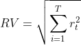
Realized Volatility Formula
It is measured by calculating the standard deviation from the average price of an asset in a given time period. Since volatility is non-linear, realized variance is
- first calculated by converting returns from a stock/asset to logarithmic values and
-
Variance in daily returns of the underlying标的资产 is calculated as follows:
This approach assumes the mean to be set to zero, considering the upside and downside trend in the movement of stock prices. - P= stock price
- t= time period
-
- measuring the standard deviation of log normal returns.
-
Realized variance is calculated by computing the aggregate of returns over the time period defined

where
 = number of observations (monthly/ weekly/ daily returns). Typically, 20, 50, and 100-day returns are calculated.
 -
The formula of Realized volatility is the square root of realized variance.
 Realized volatility is frequently used for daily volatility using the intraday returns.
 -
The results are then annualized. Realized variance is annualized by multiplying daily realized variance with a number of trading days/weeks/ months in a year.The square root of the annualized realized variance is the realized volatility
 .
.
-
Examples of Realized Volatility
Example #1
For example, supposed realized volatility for two stocks with similar closing prices is calculated for 20, 50, and 100 days for stock and is annualized with values as follows:
Looking at the pattern of increasing volatility in the given time frame, it can be inferred that stock-1 has been trading with high variation in prices in recent times (i.e., 20 days), whereas stock-2 has been trading without any wild swings.
Advantages
- It measures the actual performance of an asset in the past and helps to understand the stability of the asset based on its past performance.
- It is an indicator of how an asset’s price has changed in the past and the time period in which it has undergone the change.
- Higher the volatility, the higher the price risk associated with the stock, and therefore higher the premium attached to the stock因此与股票相关的溢价就越高。.
- The realized volatility of the asset may be used to forecast future volatility, i.e., implied volatility of the asset. While entering into transactions with complex financial products such as derivatives, options, etc., the premiums are determined based on the volatility of the underlying and influences the prices of these products.
- It is the starting point for option pricing.
- Realized volatility is measured based on statistical methods and is, therefore, a reliable indicator of the volatility in asset value.
Disadvantages
It is a measure of historical volatility and is therefore not forward-looking. It does not factor in any major “shocks” in the market that may arise in the future, which may affect the value of the underlying.
Limitation
- The volume of data used influences the end results during the calculation of realized volatility. At least 20 observations are statistically required to calculate a valid value of realized volatility. Therefore, realized volatility is better used to measure longer-term price risk in the market (~ 1 month or more).
- Realized volatility calculations are directionless. i.e., it factors in upward and downward trends in price movements它会影响价格走势的上升和下降趋势。.
- It is assumed that asset prices reflect all available information while measuring volatility.
Important Points
- In order to calculate the downside risk associated with a stock, the measurement of realized volatility may be restricted to downside price movements.
- An increase in realized volatility of a stock over a time period would imply a significant change in the inherent value of the stock owning to external/internal factors.
- An increase in volatility implies a higher premium on option prices. The value of a stock can be inferred by comparing the realized volatility and estimated future volatility (implied volatility) of the options.可以通过比较期权的已实现波动率和估计的未来波动率(隐含波动率)来推断股票的价值。
- Comparing the volatility of a stock with the benchmark index helps determine the stability of stock将股票的波动性与基准指数进行比较有助于确定股票的稳定性: the lower the volatility, the more predictable the price of the asset.
- A decrease in the realized volatility of a stock over a time period would indicate the stabilization of the stock.
Realized volatility measures help to quantify the inherent price risk arising out of volume fluctuations and external factors of a stock based on its historical performance. Combined with implied volatility, it also helps determine option prices based on the volatility in the underlying stock.
Realized volatility is frequently used for daily volatility using the intraday returns.
The steps we need to take are as follows:
- Download the data and calculate the log returns.
- Calculate the realized volatility over the months.
- Annualize the values by multiplying by
 , as we are converting from monthly values.
We assume you have followed the instructions from earlier recipes and have a DataFrame called df with a single log_rtn column and timestamps as the index.
converting returns from a stock/asset to logarithmic values![]()
import pandas as pd
import numpy as np
import yfinance as yf
# progress=True : Progress will show a progress bar.
# auto_adjust will overwrite the Close
# Adjust all OHLC automatically? Default is False
df = yf.download( 'AAPL',
start='2000-01-01',
end='2010-12-31',
auto_adjust=False,
progress=False
)
# keep only the adjusted close price
df = df.loc[:, ['Adj Close']]
df.rename( columns={'Adj Close':'adj_close'},
inplace=True
)
# converting returns from a stock/asset to logarithmic values
df['log_rtn'] = np.log( df['adj_close']/df['adj_close'].shift(1) )
df.drop('adj_close', axis=1, inplace=True)
df.dropna( axis=0, inplace=True )
df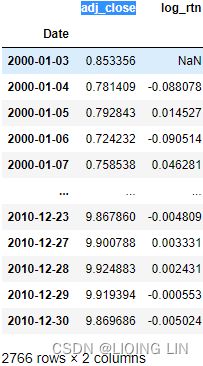 ==>
==>
2. Define the function for calculating the realized volatility and
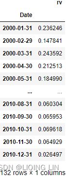
3. Calculate the monthly realized volatility:
import pandas as pd

def realized_volatility(x):
    return np.sqrt( np.sum(x**2) # Realized variance for each month
                  ) # Realized volatility

df_rv = df.groupby( pd.Grouper( freq='M') ).apply(realized_volatility)
df_rv.rename( columns={'log_rtn':'rv'},
              inplace=True
            )
df_rv
==> ==>
==>
4.Annualize the values![]() :
:
df_rv.rv = df_rv.rv * np.sqrt(12)
df_rv 
5. Plot the results:
import matplotlib.pyplot as plt
plt.style.use('seaborn')

fig, ax = plt.subplots(2, 1, sharex=True, figsize=(10,10))

ax[0].plot(df)
ax[0].set_title('daily log return(adjust_close)')
ax[1].plot( df_rv )
ax[1].set_title('realized volatility')

plt.show() 
We can see that the spikes(it can be inferred that stock has been trading with high variation in prices in that time point) in the realized volatility coincide with some extreme log-returns (which might be outliers).
Normally, we could use the resample method of a pandas DataFrame. Supposing we wanted to calculate the average monthly return, we could run df.log_rtn.resample(' M' ).mean().
For the resample method, we can use any built-in aggregate functions of pandas, such as mean, sum, min, and max. However, our case is a bit more complex, so we defined a helper function called realized_volatility, and replicated the behavior of resample by using a combination of groupby, Grouper, and apply.
###################
###################
Identifying outliers
While working with any kind of data, we often encounter observations that are significantly different from the majority, that is, outliers. They can be a result of a wrong tick (price), something major happening on the financial markets金融市场上发生的重大事件, an error in the data processing pipeline, and so on. Many machine learning algorithms and statistical approaches can be influenced by outliers, leading to incorrect/biased results. That is why we should handle the outliers before creating any models.
Execute the following steps to detect outliers using the 3σ(![]() ) approach, and mark them on a plot.
) approach, and mark them on a plot.
import pandas as pd
import yfinance as yf

df = yf.download( 'AAPL',
                  start='2000-01-01',
                  end='2010-12-31',
                  progress=False
                )
df = df.loc[:, ['Adj Close']] # keep only the adjusted close price
df.rename( columns={'Adj Close':'adj_close'},
           inplace=True
         )
df['simple_rtn'] = df.adj_close.pct_change()
df
<==
<==![]()
Calculate the rolling mean and standard deviation:
Simple moving average
Simple moving average, which we will refer to as SMA, is a basic technical analysis indicator. The simple moving average, as you may have guessed from its name, is computed by adding up the price of an instrument over a certain period of time divided by the number of time periods. It is basically the price average over a certain time period, with equal weight being used for each price. The time period over which it is averaged is often referred to as the lookback period or history. Let's have a look at the following formula of the simple moving average:
Here, the following applies:
![]() : Price at time period i
: Price at time period i : Number of prices added together or the number of time periods(lookback periods)
#########rolling window https://blog.csdn.net/Linli522362242/article/details/122955700
There are exactly 252 trading days in 2021. January and February have the fewest (19), and March the most (23), with an average of 21 per month, or 63 per quarter.
Out of a possible 365 days, 104 days(365/7=52*2=104) are weekend days (Saturday and Sunday) when the stock exchanges are closed. Seven of the nine holidays which close the exchanges fall on weekdays, with Independence Day being observed on Monday, July 5, and Christmas on Friday, December 24. There is one shortened trading session on Friday, November 26 (the day after Thanksgiving Day). ==> 365-104-7-2=252
########
Standard deviation
Standard deviation, which will be referred to as STDEV, is a basic measure of price volatility that is used in combination with a lot of other technical analysis indicators to improve them. We'll explore that in greater detail in this section.
Standard deviation is a standard measure that is computed by measuring the squared deviation of individual prices from the mean price, and then finding the average of all those squared deviation values. This value is known as variance, and the standard deviation is obtained by taking the square root of the variance.
Larger STDEVs are
- a mark of more volatile markets市场波动较大的标志 or
- larger expected price moves,
- so trading strategies need to factor that increased volatility into risk estimates and other trading behavior.
To compute standard deviation, first we compute the variance:
Then, standard deviation is simply the square root of the variance:![]()
SMA : Simple moving average over n time periods.
# Calculate the rolling mean and standard deviation:
# 21 : the average number of trading days in a month
df_rolling = df[['simple_rtn']].rolling( window=21 )\
                                .agg(['mean',# SMA
                                      'std'
                                     ])
# df_rolling.columns
#      MultiIndex([('simple_rtn', 'mean'),
#                  ('simple_rtn',  'std')
#                 ],)
df_rolling.columns = df_rolling.columns.droplevel()
# droplevel()
#    Return Series/DataFrame with requested index / column level(s) removed
df_rolling
df df_rolling df_rolling
==> ==>
==>
2. Join the rolling metrics to the original data:
df_outliers = df.join(df_rolling, how='left')
df_outliers[:25]
<==rolling( window=21 )
3. Define a function for detecting outliers(using the 3σ approach ![]() ):
):
we defined a function that
- returns 1 if the observation is considered an outlier, according to the 3σ rule (we parametrized the number of standard deviations),
- and 0 otherwise.
The condition for a given observation x to be qualified as an outlier is x > μ + 3σ or x < μ - 3σ.
def identify_outliers( row, n_sigmas = 3 ):
    '''
    Function for identifying the outliers using the 3 sigma rule.
    The row must contain the following columns/indices: simple_rtn, mean, std.

    Parameters
    ----------
    row : pd.Series
        A row of a pd.DataFrame, over which the function can be applied.
    n_sigmas : int
        The number of standard deviations above/below the mean - used for detecting outliers

    Returns
    -------
    0/1 : int
        An integer with 1 indicating an outlier and 0 otherwise.
    '''
    x = row['simple_rtn']
    mu = row['mean']
    sigma = row['std']

    if( (x < mu - n_sigmas*sigma) | (x > mu + n_sigmas*sigma) ):
        return 1
    else:
        return 0
4. Identify the outliers and extract their values for later use:
df_outliers['outlier'] = df_outliers.apply( identify_outliers,
                                            axis=1 # for each row
                                          )
outliers = df_outliers.loc[ df_outliers['outlier']==1,
                            ['simple_rtn']
                          ]
outliers 
5. Plot the results:
fig = plt.figure( figsize=(10,8) )
plt.plot( df_outliers.index, df_outliers.simple_rtn,
color='blue', label='Normal'
)
plt.scatter( outliers.index, outliers.simple_rtn,
color='red', label='Anomaly'
)
plt.title("Apple's stock returns")
plt.legend( loc='lower right')
plt.show()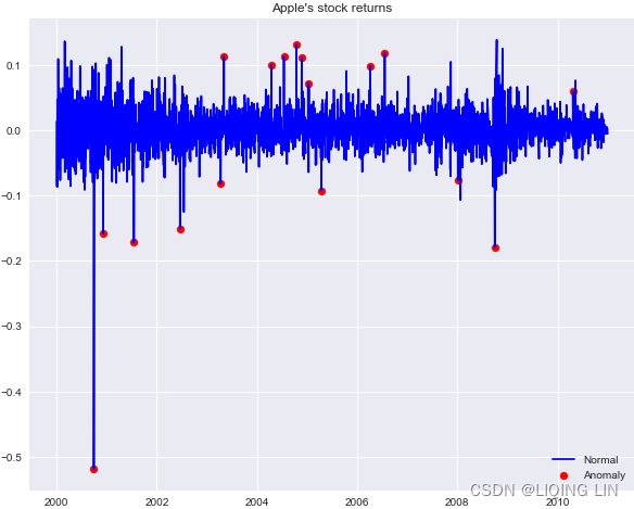 In the plot, we can observe outliers marked with a red dot. One thing to notice is that when there are two large returns in the vicinity, the algorithm identifies the first one as an outlier and the second one as a regular observation. This might be due to the fact that the first outlier enters the rolling window and affects the moving average/standard deviation.
In real-life cases, we should not only identify the outliers, but also treat them, for example, by capping them at限制在 the maximum/minimum acceptable value, replacing them by interpolated values, or by following any of the other possible approaches.
There are many different methods of identifying outliers in a time series, for example, using Isolation Forest, Hampel Filter, Support Vector Machines, and z-score ( which is similar to the presented approach).
In the 3σ approach, for each time point, we calculated the moving average (μ) and standard deviation (σ) using the last 21 days (not including that day since we missing the first day trading data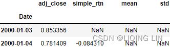 ). We used 21 as this is the average number of trading days in a month, and we work with daily data. However, we can choose different value, and then the moving average will react faster/slower to changes. We can also use (exponentially) weighted moving average if we find it more meaningful in our particular case. https://blog.csdn.net/Linli522362242/article/details/121406833
Investigating stylized facts of asset returns
Stylized程式化的,按固定格式的 facts are statistical properties that appear to be present in many empirical/ɪmˈpɪrɪk(ə)l/经验主义的,以经验为依据的 asset returns (across time and markets). It is important to be aware of them because when we are building models that are supposed to represent asset price dynamics, the models must be able to capture/replicate these properties.
In the following recipes, we investigate the five stylized facts using an example of daily S&P 500 returns from the years 1985 to 2018.
We download the S&P 500 prices from Yahoo Finance (following the approach in the Getting data from Yahoo Finance recipe) and calculate returns as in the Converting prices to returns recipe.
Fact1:Non-Gaussian distribution of returns回报的非高斯(正态)分布
The name of the fact (Non-Gaussian distribution of returns) is pretty much selfexplanatory. It was observed in the literature that (daily) asset returns exhibit the following:
- Negative skewness (third moment): Large negative returns occur more frequently than large positive ones.
- Excess kurtosis (fourth moment) : Large (and small) returns occur more often than expected.
Note:
The pandas implementation of kurtosis is the one that literature refers to as excess kurtosis or Fisher's kurtosis费舍尔峰度. Using this metric, the excess kurtosis of a Gaussian distribution(or called normal distribution) is 0, while the standard kurtosis is 3. This is not to be confused with the name of the stylized fact's excess kurtosis, which simply means kurtosis higher than that of normal distribution(or called Gaussian distribution)它仅表示峰度高于正态分布的峰度( excess kurtosis=Kurtosis-3=0 ).
- Samples from a normal distribution have
- an expected skewness of 0 and
- an expected excess kurtosis of 0 (which is the same as a kurtosis of 3).
The normal distribution has standard Kurtosis=3. The measure ( excess kurtosis=Kurtosis-3=0 ) is known ast the "Excess Kurtosis", i.e:
- Jarque-Bera 检验使用正态的这两个(统计)属性分布
In social sciences, especially economics, a stylized fact is a simplified presentation of an empirical finding.[1] Stylized facts are broad tendencies that aim to summarize the data, offering essential truths while ignoring individual details.
A prominent example of a stylized fact is: "Education significantly raises lifetime income." Another stylized fact in economics is: "In advanced economies, real GDP growth fluctuates in a recurrent but irregular fashion".
However, scrutiny to detail will often produce counterexamples对细节的审查往往会产生反例。. In the case given above, holding a PhD may lower lifetime income, because of the years of lost earnings it implies and because many PhD holders enter academia instead of higher-paid fields. Nonetheless, broadly speaking, people with more education tend to earn more, so the above example is true in the sense of a stylized fact.
Stylized facts are widely used in economics, in particular to motivate the construction of a model and/or to validate it. Examples are:
- Stock returns are uncorrelated and not easily forecastable.[6]
- Yield curves tend to move in parallel.
- Education is positively correlated to lifetime earnings
- Inventory behavior of firms: “the variance of production exceeds the variance of sales”
Run the following steps to investigate the existence of this first fact by plotting the histogram of returns and a Q-Q plot.
import pandas as pd
import yfinance as yf

df = yf.download( '^GSPC',
                  start='1985-01-01',
                  end='2018-12-31',
                  progress=False
                )
df = df[['Adj Close']].rename( columns={'Adj Close':'adj_close'} )
df['log_rtn'] = np.log( df.adj_close/df.adj_close.shift(1) )

df = df[['adj_close', 'log_rtn']].dropna( how='any' )
df
##################################################################
the binomial distribution
- 概率密度函数(Probability Density Function (PDF) 连续性数据)

 where n is the number of trials, p is the probability of success, and N is the number of successes.
 - 概率质量函数(Probability Mass Function, PMF,离散型数据)


 是离散随机变量在各特定取值上的概率
 - 概率质量函数PMF是对离散 随机变量定义的,本⾝代表该值的概率;
- 概率密度函数PDF是对连续 随机变量定义的,本⾝不是概率,只有对连续 随机变量的概率密度函数PDF在某区间内进⾏积分后才是概率
- The cumulative distribution function (cdf) or distribution function of a random variable X of the continuous type, defined in terms of the pdf of X, is given by

Here, again, F(x) accumulates (or, more simply, cumulates) all of the probability less than or equal to x. From the fundamental theorem of calculus, we have, for x values
for which the derivative exists,
  and we call
  the Probability Density Function (PDF) of X
seaborn.distplot can help us to process the data into bins and show us a histogram as a result.
The seaborn.distplot function expects either pandas Series, single-dimensional numpy.array, or a Python list as input. Then, it determines the size(width) of the bins according to the Freedman-Diaconis rule(the size of the bins =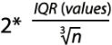 , the number of bins =
 , Interquartile range( IQR = Q3-Q1 ), Freedman-Diaconisf方法偏向适用于长尾分布的数据,因为其对数据中的离群值不敏感。x表示事例的数值分布情况), and finally it fits(curve) a kernel density estimate (KDE) over the histogram.
KDE is a non-parametric method used to estimate the distribution of a variable. We can also supply a parametric distribution, such as beta, gamma, or normal distribution, to the fit argument.https://blog.csdn.net/Linli522362242/article/details/93617948
##############
1. Calculate the normal Probability Density Function (PDF) using the mean and standard deviation of the observed returns:
import scipy.stats as scs

r_range = np.linspace( min(df.log_rtn), max(df.log_rtn),
                       num=1000
                     )
mu = df.log_rtn.mean()
sigma = df.log_rtn.std()

# scipy.stats.norm : A normal continuous random variable.
# The location (loc) keyword specifies the mean.
# The scale (scale) keyword specifies the standard deviation
norm_pdf = scs.norm.pdf( r_range, loc=mu, scale=sigma )
2. Plot the histogram and the Q-Q plot:
import seaborn as sns
import statsmodels.api as sm
import matplotlib.pyplot as plt

# https://blog.csdn.net/Linli522362242/article/details/93617948
sns.set(font_scale=1.)
# sns.set_style('ticks') # white, dark, whitegrid, darkgrid, ticks

fig, ax = plt.subplots( 1,2, figsize=(12,8) )

# histogram
# sns. displot()
# norm_hist:若为True, 则直方图高度显示密度而非计数(含有kde图像中默认为True)
sns.distplot( df.log_rtn, kde=False, norm_hist=True, ax=ax[0], )
ax[0].plot( r_range, norm_pdf,
            'g', lw=2, label=f'N({mu:.2f}, {sigma**2 : .4f})',
          )
ax[0].legend(loc='upper left')
ax[0].set_title( 'Distribution of S&P 500 returns', fontsize=16 )

# Q-Q plot
qq = sm.qqplot( df.log_rtn.values, line='s', ax=ax[1],
                markerfacecolor='b',
                # markeredgecolor='k'
                # alpha=0.3
              )
# sm.qqline( qq.axes[1], line='45', #If line is not 45, x and y cannot be None.
#            fmt='y--') #fmt = '[marker][line][color]'
ax[1].get_lines()[1].set_color('red')
ax[1].get_lines()[1].set_linewidth(3.0)
ax[1].set_title('Q-Q plot', fontsize=16)

plt.show()
Histogram of returns
The first step of investigating this fact was to plot a histogram visualizing the distribution of returns. To do so, we used sns.distplot while setting kde=False (which does not use the Gaussian kernel density estimate) and norm_hist=True (this plot shows density instead of the count).
To see the difference between our histogram and Gaussian distribution(or called Normal distribution), we superimposed a line representing the PDF of the Gaussian distribution with the mean(mu = df.log_rtn.mean()) and standard deviation(sigma = df.log_rtn.std()) coming from the considered return series.
First, we specified the range over which we calculated the PDF by using np.linspace (we set the number of points to 1,000, generally the more points the smoother the line) and then calculated the PDF using scs.norm.pdf . The default arguments correspond to the standard normal distribution, that is, with zero mean and unit variance即0均值(loc default=1)和单位方差(scale default=1). That is why we specified the loc and scale arguments as the sample mean and standard deviation, respectively.
To verify the existence of the previously mentioned patterns, we should look at the following:
- Negative skewness: The left tail of the distribution is longer, while the mass of the distribution is concentrated on the right side of the distribution.而分布的质量集中在分布的右侧。(Large negative returns occur more frequently than large positive ones.)
- Excess kurtosis: Fat-tailed and peaked distribution(leptokurtic distributions are sometimes characterized as "concentrated toward the mean,"(“向均值集中”)). Large(Massive) and (small) returns occur more often than expected大量的小额回报的发生频率比预期的要高.
The second point is easier to observe on our plot, as there is a clear peak over the PDF and we see more mass in the tails.

Q-Q plot
After inspecting the histogram, we looked at the Q-Q (quantile-quantile) plot, on which we compared two distributions (theoretical and observed) by plotting their quantiles against each other. In our case,
- the theoretical distribution is Gaussian (Normal) and
- the observed one comes from the S&P 500 returns.
To obtain the plot, we used the sm.qqplot function. If the empirical distribution is Normal, then the vast majority of the points will lie on the red line 如果经验分布是正态分布,那么绝大多数点将位于红线上. However, we see that this is not the case,  as points on the left side of the plot are more negative (that is, lower empirical quantiles are smaller) than expected in the case of the Gaussian distribution, as indicated by the line. This means that the left tail of the returns distribution is heavier than that of the Gaussian distribution. Analogical conclusions can be drawn about the right tail
 , which is heavier than under normality.
if `distplot` is deprecated(solution):
import seaborn as sns
import statsmodels.api as sm
import matplotlib.pyplot as plt

sns.set(font_scale=1.1)
#sns.set() # Reset all previous theme settings to default
# sns.set( context="notebook",
#          style="darkgrid",
#          font_scale=1.2,      # increase the font scale#
#          rc={ #'grid.color': '0.6',
#               'axes.labelcolor':'darkblue',
#               #"lines.linewidth": 2.5, # increase the line width of the KDE plot
#             }
#        )

fig, ax = plt.subplots( 1,2, figsize=(12,8) )

# histogram
# sns. displot()
# norm_hist:若为True, 则直方图高度显示密度而非计数(含有kde图像中默认为True)
sns.histplot( df.log_rtn,
              kde=False,
              stat='density', #norm_hist=True,
              ax=ax[0],
              bins=50,
              color='b'
            )
ax[0].plot( r_range, norm_pdf,
            'g', lw=2, label=f'N({mu:.2f}, {sigma**2 : .4f})',
          )
# ax[0].fig.legend(loc='upper left')
ax[0].set_title( 'Distribution of S&P 500 returns', fontsize=16 )

# Q-Q plot
qq = sm.qqplot( df.log_rtn.values, line='s', ax=ax[1],
                markerfacecolor='b',
                # markeredgecolor='k'
                # alpha=0.3
              )
# sm.qqline( qq.axes[1], line='45', # If line is not 45, x and y cannot be None.
#            fmt='y--') #fmt = '[marker][line][color]'
ax[1].get_lines()[1].set_color('red')
ax[1].get_lines()[1].set_linewidth(3.0)
ax[1].set_title('Q-Q plot', fontsize=16)

plt.subplots_adjust(wspace=0.3)
plt.show()
We can use the histogram (showing the shape of the distribution) and the Q-Q plot to assess the normality of the log returns评估对数回报的正态性. Additionally, we can print the summary statistics:
Perform the Jarque-Bera goodness of fit test on sample data.
The Jarque-Bera test tests whether the sample data has the skewness and kurtosis matching a normal distribution.
Note that this test only works for a large enough number of data samples (>2000) as the test statistic asymptotically has a Chi-squared distribution with 2 degrees of freedom.
# import scipy.stats as scs
# df['log_rtn'] = np.log( df.adj_close/df.adj_close.shift(1) )
jb_test = scs.jarque_bera( df.log_rtn.values )
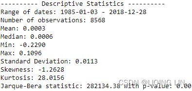
print( '---------- Descriptive Statistics ----------' )
print( 'Range of dates:', min(df.index.date), '-', max(df.index.date) )
print( 'Number of observations:', df.shape[0] )
print( f'Mean: {df.log_rtn.mean():.4f}' )
print( f'Median: {df.log_rtn.median():.4f}' )
print( f'Min: {df.log_rtn.min():.4f}' )
print( f'Max: {df.log_rtn.max():.4f}' )
print( f'Standard Deviation: {df.log_rtn.std():.4f}' )
print( f'Skewness: {df.log_rtn.skew():.4f}' )
print( f'Kurtosis: {df.log_rtn.kurtosis():.4f}' )
print( f'Jarque-Bera statistic: {jb_test[0]:.2f} with p-value: {jb_test[1]:.2f}') If the data comes from a normal distribution, the JB statistic asymptotically has a chi-squared distribution with two degrees of freedomJB 统计量渐近具有自由度为2的卡方分布, so the statistic can be used to test the hypothesis that the data are from a normal distribution.
https://www.itl.nist.gov/div898/handbook/eda/section3/eda3674.htm
We immediately see that the returns exhibit negative skewness and excess kurtosis. We also ran the Jarque-Bera test ( scs.jarque_bera ) to verify that returns do not follow a Gaussian distribution. With a p-value of zero, we reject the null hypothesis that sample data has skewness and kurtosis matching those of a Gaussian distribution(called Normal distribution).
 first fact
![]()
At 5% significant level(α = 0.05), we reject the null hypothesis that the log-return is normally distributed(OR![]() ).
).
By looking at the metrics such as the mean, standard deviation, skewness, and kurtosis we can infer that they deviate from what we would expect under normality. Additionally, the Jarque-Bera normality test gives us reason to reject the null hypothesis stating that the distribution is normal at the 99% confidence level(α = 0.01).
Jarque–Bera test : can give us reason to reject the null hypothesis
In statistics, the Jarque–Bera test is a goodness-of-fit test拟合优度检验 of whether sample data have the skewness and kurtosis matching a normal distribution. The test statistic is always nonnegative. If it is far from zero, it signals the data do not have a normal distribution.
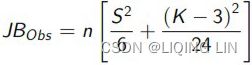
The test statistic JB is defined as ![]()
Skewness is a function of data, i.e. a random variable, Kurtosis is a function of data, i.e. a random variable, so JB![]() is is a random variable, and follows what distribution?
is is a random variable, and follows what distribution?
where
- n is the number of observations (or degrees of freedom in general);
- S is the sample skewness:

Zero skewness implies asymmetric distribution非对称分布 (the Normal, t-distribution)
Skewness is a function of data, i.e. a random variable - K is the sample kurtosis :

Kurtosis is a function of data, i.e. a random variable- where
 and
and  are the estimates of third and fourth central moments,三阶中心矩和四阶中心矩的估计值 respectively,
  is the sample mean, and
  is the estimate of the second central moment二阶中心矩(即方差)的估计值, the variance.
- where
If the data comes from a normal distribution, the JB statistic asymptotically has a chi-squared distribution with two degrees of freedomJB 统计量渐近具有自由度为2的卡方分布, so the statistic can be used to test the hypothesis that the data are from a normal distribution.
- The null hypothesis is a joint hypothesis of the skewness being zero and the excess kurtosis being zero.

- Samples from a normal distribution have
- an expected skewness of 0 and
- an expected excess kurtosis of 0 (which is the same as a kurtosis of 3).
The normal distribution has Kurtosis=3. The measure ( excess kurtosis= Kurtosis-3 =0) is known ast the "Excess Kurtosis", i.e: - Jarque-Bera 检验使用正态的这两个(统计)属性分布
- As the definition of JB shows, any deviation from this increases the JB statistic.
- The Jarque-Bera test tests the hypothesis
H0: Data is normal
H1: Data is NOT norma
The Jarque-Bera test — Example


- Hypotheses:
H0: The error term is normally distributed,
H1: The error term is not normally distributed - Significance level: α = 0.05 and How to do a Jarque-Bera test in practice:
- 1 Calculate the skewness in the sample.
- 2 Calculate the kurtosis in the sample.
- Assumptions n large, Calculate the Jarque-Bera test statistic :

which under the null( asymptoically ) follows a a chisquare distribution with 2 df
JB统计量近似服从自由度为2的卡方分布 - 4 Compare the Jarque-Bera test statistic with the critical values in the chi-square table, 2 df.
Distribution under the null rejection rule: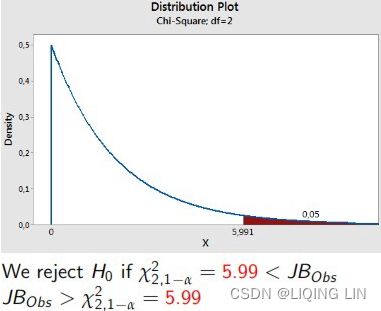

- At 5% significant level(α = 0.05), we reject the null of that the disturbance term is normally distributed.(The error term is not normally distributed)
- 1 Calculate the skewness in the sample.
For small samples the chi-squared approximation is overly sensitive, often rejecting the null hypothesis when it is true. Furthermore, the distribution of p-values departs from a uniform distribution and becomes a right-skewed unimodal distribution, especially for small p-values. This leads to a large Type I error rate(
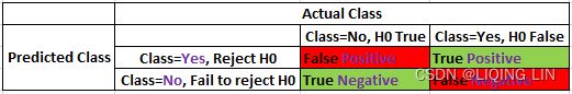 Type I error(FP): Rejecting a null hypothesis when it is true
![]() , (OR
, (OR  is true, but we reject it by mistake. Because we mistakenly think is False, ###wrongly reject
P=target class(the null hypothesis =False, Reject) https://blog.csdn.net/Linli522362242/article/details/125662545)
). The table below shows some p-values approximated by a chi-squared distribution that differ from their true alpha levels for small samples.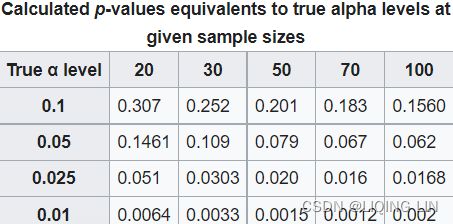
Skewness(偏度)
用来描述数据分布的对称性Skewness measures the degree of symmetry in the distribution.
- 正态分布的偏度为0。
Zero skewness implies asymmetric distribution非对称分布 (the Normal, t-distribution) - 计算数据样本的偏度,
- 当偏度<0时,称为负偏,数据出现左侧长尾;
Negative skewness means that the distribution has a long left tail, its skewed to the left. - 当偏度>0时,称为正偏,数据出现右侧长尾;
Positive skewness means that the distribution has a long right tail, it's skewed to the right. - 当偏度为0时,表示数据相对均匀的分布在平均值两侧,不一定是绝对的对称分布,此时要与正态分布偏度为0的情况进行区分。
- 当偏度绝对值过大时,长尾的一侧出现极端值的可能性较高。
Kurtosis measures how much of a probability distribution is centered around the middle (mean) vs. the tails峰度测量有多少概率分布集中在中间(平均值)与尾部.Positive or negative excess kurtosis will then change the shape of the distribution, accordingly. 正或负的超峰度将相应地改变分布的形状。
Skewness instead measures the relative symmetry of a distribution around the mean偏度测量平均值周围分布的相对对称性。.
Kurtosis(峰度)
用来描述数据分布陡峭或是平滑的情况。
Kurtosis explains how often observations in some data set fall in the tails vs. the center of a probability distribution.峰度解释了某些数据集中的观测值落在概率分布的尾部与中心的频率 In finance and investing, excess kurtosis is interpreted as a type of risk, known as "tail risk,"尾部风险 or the chance of a loss occurring due to a rare event或由概率分布预测的由于罕见事件而发生损失的可能性, as predicted by a probability distribution. If such events turn out to be more common than predicted by a distribution, the tails are said to be "fat." Tail events have had experts questions the true probability distribution of returns for investable assets - and now many believe that the normal distribution is not a correct template.尾部事件让专家质疑可投资资产回报的真实概率分布——现在许多人认为正态分布不是一个正确的模板。
- 正态分布的峰度为3,
The normal distribution has Kurtosis=3. The measure ( Kurtosis-3 ) is known ast the "Excess Kurtosis", i.e:
Excess kurtosis compares the kurtosis coefficient with that of a normal distribution.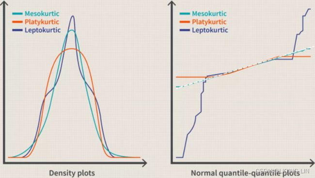
- A distribution with kurtosis=3 is said to be mesokurtic中峰分布(常峰态分布).
This distribution has a kurtosis statistic similar to that of the normal distribution, meaning the extreme value characteristic of the distribution is similar to that of a normal distribution. - A distribution with kurtosis>3 is said to be leptokurtic/ ˌleptəˈkərtɪk /尖峰态分布 or fat-tailed胖尾.
Any distribution that is leptokurtic displays greater kurtosis than a mesokurtic distribution. Characteristics of this distribution is one with long tails (outliers.) The prefix of "lepto-" means "skinny," making the shape of a leptokurtic distribution easier to remember. The "skinniness" of a leptokurtic distribution is a consequence of the outliers, which stretch the horizontal axis of the histogram graph, making the bulk of the data appear in a narrow ("skinny") vertical range.细峰分布的“瘦”是异常值的结果,异常值拉伸直方图的水平轴,使大部分数据出现在狭窄(“瘦”)的垂直范围内。
Thus leptokurtic distributions are sometimes characterized as "concentrated toward the mean,"(“向均值集中”) but the more relevant issue (especially for investors) is there are occasional extreme outliers that cause this "concentration" appearance. Examples of leptokurtic distributions are the T-distributions with small degrees of freedom. -
Platykurtic (kurtosis < 3.0)
The final type of distribution is a platykurtic distribution. These types of distributions have short tails (paucity/ˈpɔːsəti/ of outliers缺乏异常值.) The prefix of "platy-" means "broad," and it is meant to describe a short and broad-looking peak短而宽的峰值, but this is an historical error. Uniform distributions (1.3.6.6.2. Uniform Distribution orhttps://en.wikipedia.org/wiki/Continuous_uniform_distribution
 )are platykurtic and have broad peaks, but the beta (.5,1) distribution is also platykurtic and has an infinitely pointy peak.
 - 峰度越大,代表分布越陡峭,尾部越厚;
- 如果峰度大于三,峰的形状比较尖,比正态分布峰要陡峭。反之亦然
- 峰度越小,分布越平滑。
- 很多情况下,为方便计算,将峰度值-3 ( Kurtosis-3 ),因此正态分布的峰度变为0,方便比较。
- 在方差相同(或者相同的标准差)的情况下,峰度(系数)越大,分布就可能有更多的极端值,那么其余值必然要更加集中在众数周围,其分布必然就更加陡峭#https://blog.csdn.net/Linli522362242/article/details/99728616
Fact2: Volatility clustering
Run the following code to investigate this second fact by plotting the log returns series.
1. Visualize the log returns series:
df.log_rtn.plot( title='Daily S&P 500 returns', figsize=(10,6) )
plt.show()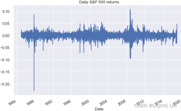 We can observe clear clusters of volatility—periods of higher positive and negative returns.
The first thing we should be aware of when investigating stylized facts is the volatility clustering—periods of high returns alternating with交替出现 periods of low returns, suggesting that volatility is not constant. To quickly investigate this fact, we plot the returns using the plot method of a pandas DataFrame.
# Displaying rolling statistics
def plot_rolling_statistics_ts( ts, titletext, ytext, window_size=12 ):
    ts.plot( color='red', label='Original', lw=0.5 )
    ts.rolling( window_size ).mean().plot( color='blue', label='Rolling Mean' )
    ts.rolling( window_size ).std().plot( color='black', label='Rolling Std' )

    plt.legend( loc='best' )
    plt.ylabel( ytext )
    plt.xlabel( 'Date')
    plt.setp( plt.gca().get_xticklabels(), rotation=30, horizontalalignment='right' )
    plt.title( titletext )
    plt.show( block=False )

# df['log_rtn'] = np.log( df.adj_close/df.adj_close.shift(1) )
#                          the daily historical log returns
plot_rolling_statistics_ts( df.log_rtn,
                           ' Daily S&P 500 returns rolling mean and standard deviation',
                           'Daily prices',
                          )
The intuition behind the test is as follows. If the series y is stationary (or trend-stationary, e.g. Daily S&P 500 log-return ), then it has a tendency to return to a constant (or deterministically trending确定性趋势) mean. Therefore, large values will tend to be followed by smaller values (negative changes), and small values by larger values (positive changes).
 红线 一直围绕均值波动。而均值不随时间变化(其实方差(标准差)也不随时间变化
A stationary time series is one whose statistical properties, such as mean, variance, and autocorrelation, are constant over time.https://blog.csdn.net/Linli522362242/article/details/126113926
It looks the daily S&P 500 log returns has no trend, seasonality or cyclic behaviour(In general, the average length of cycles is longer than the length of a seasonal pattern, and the magnitudes of cycles tend to be more variable than the magnitudes of seasonal patterns.). There are random fluctuations which do not appear to be very predictable, and no strong patterns that would help with developing a forecasting model.
- Stationary process: A process that generates a stationary series of observations.
- Trend stationary: A process that does not exhibit a trend.
- Seasonal stationary: A process that does not exhibit seasonality.
- Strictly stationary: Also known as strongly stationary. A process whose unconditional joint probability distribution of random variables does not change when shifted in time (or along the x axis)随机变量的无条件联合概率分布在随时间(或沿 x 轴)移动时不会改变.
- Weakly stationary: Also known as covariance-stationary, or second-order stationary. A process whose mean, variance, and correlation of random variables doesn't change when shifted in time.
Making a time series stationary
A non-stationary time series data is likely to be affected by a trend or seasonality. Trending time series data has a mean that is not constant over time. Data that is affected by seasonality have variations at specific intervals in time. In making a time series data stationary, the trend and seasonality effects have to be removed. Detrending, differencing, and decomposition are such methods. The resulting stationary data is then suitable for statistical forecasting. https://blog.csdn.net/Linli522362242/article/details/126113926
There is also an extension of the Dickey–Fuller (DF) test called the Augmented Dickey-Fuller Test (ADF), which removes all the structural effects (autocorrelation) in the time series and then tests using the same procedure.
An Augmented Dickey-Fuller Test (ADF) is a type of statistical test that determines whether a unit root is present in time series data. Unit roots can cause unpredictable results in time series analysis. A null hypothesis is formed on the unit root test to determine how strongly time series data is affected by a trend.
- By accepting the null hypothesis(the series has a unit root), we accept the evidence that the time series data is non-stationary.
- By rejecting the null hypothesis(we don't find a unit root), or accepting the alternative hypothesis, we accept the evidence that the time series data is generated by a stationary process. This process is also known as trend-stationary.
- Values of the ADF test statistic are negative. Lower values of ADF indicates stronger rejection of the null hypothesis. the stronger the rejection of the hypothesis that there is a unit root at some level of confidence.
- The testing procedure for the ADF test is the same as for the Dickey–Fuller test but it is applied to the model https://blog.csdn.net/Linli522362242/article/details/121721868
from statsmodels.tsa.stattools import adfuller

def test_stationarity( timeseries ):
    print( "Results of Dickey-Fuller Test:" )
    df_test = adfuller( timeseries, autolag='AIC' )
    print(df_test)

    df_output = pd.Series( df_test[0:4], index=['Test Statistic',
                                                'p-value',
                                                "#Lags Used",
                                                "Number of Observations Used"
                                               ]
                         )
    print( df_output )
test_stationarity(df.log_rtn)
https://blog.csdn.net/Linli522362242/article/details/126113926

The ADF test statistic value(-15.81989, Lower values of ADF indicates stronger rejection of the null hypothesis) is less than the critical values (especially at 5%, -2.8618787387723104 ), and the p-value of less than 0.05. With these, we reject the null hypothesis that there is a unit root(we reject the null hypothesis, this means that we don't find a unit root) and consider that our data is stationary. We recommend using daily returns when studying financial products.
Autocorrelation
Autocorrelation is a mathematical representation of the degree of similarity between a given time series and a lagged version of itself over successive time intervals. It's conceptually similar to the correlation between two different time series, but autocorrelation uses the same time series twice: once in its original form and once lagged one or more time periods.
For example, if it's rainy today, the data suggests that it's more likely to rain tomorrow than if it's clear today. When it comes to investing, a stock might have a strong positive autocorrelation of returns, suggesting that if it's "up" today, it's more likely to be up tomorrow, too.
Naturally, autocorrelation can be a useful tool for traders to utilize; particularly for technical analysts.
- Autocorrelation represents the degree of similarity between a given time series and a lagged version of itself over successive time intervals.
- Autocorrelation measures the relationship between a variable's current value and its past values.
- An autocorrelation of +1 represents a perfect positive correlation, while an autocorrelation of negative 1 represents a perfect negative correlation.
- Technical analysts can use autocorrelation to measure how much influence past prices for a security have on its future price.
Autocorrelation can also be referred to as lagged correlation or serial correlation, as it measures the relationship between a variable's current value and its past values.
As a very simple example, take a look at the five percentage values in the chart below. We are comparing them to the column on the right, which contains the same set of values, just moved up one row.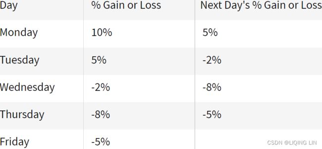
When calculating autocorrelation, the result can range from -1 to +1.
An autocorrelation of +1 represents a perfect positive correlation (an increase seen in one time series leads to a proportionate increase成比例地增加 in the other time series). 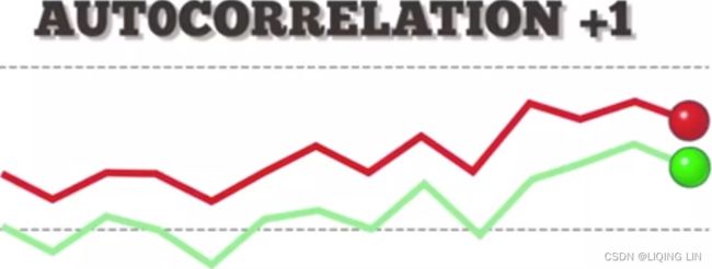 vs
vs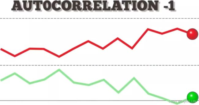
On the other hand, an autocorrelation of -1 represents a perfect negative correlation (an increase seen in one time series results in a proportionate decrease in the other time series).
Autocorrelation measures linear relationships. Even if the autocorrelation is minuscule /ˈmɪnəskjuːl/极小的, there can still be a nonlinear relationship between a time series and a lagged version of itself.
So why is autocorrelation important in financial markets? Simple. Autocorrelation can be applied to thoroughly analyze historical price movements, which investors can then use to predict future price movements. Specifically, autocorrelation can be used to determine if a momentum trading strategy makes sense.
Autocorrelation in Technical Analysis
Autocorrelation can be useful for technical analysis, That's because technical analysis is most concerned with the trends of, and relationships between, security prices using charting techniques. This is in contrast with fundamental analysis, which focuses instead on a company's financial health or management.
Technical analysts can use autocorrelation to figure out how much of an impact past prices for a security have on its future price.
Autocorrelation can help determine if there is a momentum factor是否存在动量因素 at play with a given stock. If a stock with a high positive autocorrelation posts two straight days of big gains, for example, it might be reasonable to expect the stock to rise over the next two days, as well.
If the price of a stock with strong positive autocorrelation has been increasing for several days, the analyst can reasonably estimate the future price will continue to move upward in the recent future days. The analyst may buy and hold the stock for a short period of time to profit from the upward price movement.
Example of Autocorrelation
Let’s assume Rain is looking to determine if a stock's returns in their portfolio exhibit autocorrelation; that is, the stock's returns relate to its returns in previous trading sessions是否股票的回报与之前交易时段的回报有关.
If the returns exhibit autocorrelation, Rain could characterize it as a momentum stock because past returns seem to influence future returns. Rain runs a regression with
- the prior trading session's return as the independent variable and
- the current return as the dependent variable.
- They find that returns one day prior have a positive autocorrelation of 0.8.
Since 0.8 is close to +1, past returns seem to be a very good positive predictor of future returns for this particular stock.
Therefore, Rain can adjust their portfolio to take advantage of the autocorrelation, or momentum, by continuing to hold their position or accumulating more shares.
################
10.2 - Autocorrelation and Time Series Methods
One common way for the "independence" condition in a multiple linear regression model to fail is when the sample data have been collected over time and the regression model fails to effectively capture any time trends. In such a circumstance, the random errors in the model are often positively correlated over time, so that each random error is more likely to be similar to the previous random error that it would be if the random errors were independent of one another. This phenomenon is known as autocorrelation (or serial correlation) and can sometimes be detected by plotting the model residuals versus time通过绘制模型残差与时间的关系图来检测. We'll explore this further in this section and the next.
A time series is a sequence of measurements of the same variable(s) made over time. Usually the measurements are made at evenly spaced times测量是在均匀间隔的时间进行的 - for example, monthly or yearly. Let us first consider the problem in which we have a y-variable measured as a time series. As an example, we might have y a measure of global temperature, with measurements observed each year. To emphasize that we have measured values over time, we use "t" as a subscript rather than the usual "i," i.e.,  means y measured in time period t. An autoregressive model is when a value from a time series is regressed on previous values from that same time series自回归模型是指时间序列中的值根据同一时间序列中的先前值进行回归。(The Auto-Regressive (AR) model assumes that the current value is dependent on previous values
 ![]() ,
,![]() ,...,
,...,![]() ,
,![]() ). for example, on
). for example, on  :
:
![]()
In this regression model, the response variable in the previous time period has become the predictor and the errors have our usual assumptions about errors  (white noise) in a simple linear regression model(note
 ![]() is a constant). The order of an autoregression is the number of immediately preceding values in the series that are used to predict the value at the present time. So, the preceding model is a first-order autoregression, written as AR(1).
is a constant). The order of an autoregression is the number of immediately preceding values in the series that are used to predict the value at the present time. So, the preceding model is a first-order autoregression, written as AR(1).
If we want to predict y this year () using measurements of global temperature in the previous two years (,![]() ), then the autoregressive model for doing so would be:
), then the autoregressive model for doing so would be:![]()
This model is a second-order autoregression, written as AR(2), since the value at time t is predicted from the values at times t−1 and t−2. More generally, a ![]() -order autoregression, written as AR(k) or AR(p), is a multiple linear regression in which the value of the series at any time t is a (linear) function of the values at times t−1,t−2,…,t−k.
-order autoregression, written as AR(k) or AR(p), is a multiple linear regression in which the value of the series at any time t is a (linear) function of the values at times t−1,t−2,…,t−k. OR
OR
https://blog.csdn.net/Linli522362242/article/details/121721868
To figure out the order of an AR model, you need to look at the PACF.
(MA) Moving Average Model
The Moving Average (MA) model assumes that the current value (y_t) is dependent on the error terms including the current error (_t, _(t-1),…). Because error terms are random, there’s no linear relationship between the current value and the error terms.![]() OR
OR
![]() is white noise or current error
is white noise or current error
To figure out the order of an MA model, you need to look at the ACF.
Autocorrelation( ,
, ,
, ,...,
,..., ,
, ) and Partial Autocorrelation(and )
The coefficient of correlation between two values in a time series is called the autocorrelation function (ACF) For example the ACF for a time series ![]() is given by:
is given by: ![]()
This value of k is the time gap being considered and is called the lag. A lag 1 autocorrelation (i.e., k = 1 in the above) is the correlation between values that are one time period apart. More generally, a lag k autocorrelation is the correlation between values that are k time periods apart.滞后 k 自相关是相隔 k 个时间段的值之间的相关性。
The ACF is a way to measure the linear relationship between an observation at time t and the observations at previous times. If we assume an AR(k) model, then we may wish to only measure the association between ![]() and
and ![]() and filter out the linear influence of the random variables that lie in between (i.e.,
and filter out the linear influence of the random variables that lie in between (i.e., ![]() ,
,![]() ,…,
,…,![]() , which requires a transformation on the time series. Then by calculating the correlation of the transformed time series we obtain the partial autocorrelation function (PACF).
, which requires a transformation on the time series. Then by calculating the correlation of the transformed time series we obtain the partial autocorrelation function (PACF).
The PACF is most useful for identifying the order of an autoregressive model. Specifically, sample partial autocorrelations that are significantly different from 0 indicate lagged terms of ![]() that are useful predictors of
that are useful predictors of ![]() . It is important that the choice of the order makes sense. For example, suppose you have blood pressure readings for every day over the past two years. You may find that an AR(1) or AR(2) model is appropriate for modeling blood pressure. However, the PACF may indicate a large partial autocorrelation value at a lag of 17, but such a large order for an autoregressive model likely does not make much sense.
. It is important that the choice of the order makes sense. For example, suppose you have blood pressure readings for every day over the past two years. You may find that an AR(1) or AR(2) model is appropriate for modeling blood pressure. However, the PACF may indicate a large partial autocorrelation value at a lag of 17, but such a large order for an autoregressive model likely does not make much sense.
Example 1: Google Data


20 : 1 Stock Split :https://seekingalpha.com/symbol/GOOG/historical-price-quotes![]()
Amazon Announces 20-1 Stock Split

Amazon approved a 20-1 stock split and a $10 billion stock buyback on March 9. The board said the split would “give our employees more flexibility in how they manage their equity in Amazon and make the share price more accessible for people looking to invest.”
When a company splits its stock, that means it divides each existing share into multiple new shares. In a 20-1 stock split, every share of the company’s stock will be split into 20 new shares, each of which would be worth one twentieth of the original share value.
A stock split does not impact a company’s market capitalization—the combined value of all its shares—and it doesn’t change the value of each investor’s stake in the company. It merely increases the number of shares outstanding and decreases the cost of each share.(In fact, it has an impact, the price after splitting will be lower than price/20事实上是有影响的,拆分后的价格会低于![]() )
)

The data set (google_stock.txt) consists of n = 105 values which are the closing stock price of a share of Google stock during 2-7-2005 to 7-7-2005. We will analyze the dataset to identify the order of an autoregressive model. A plot of the stock prices versus time is presented in the figure below:
import yfinance as yf
import pandas as pd

start_date = '2014-01-01'
end_date = '2018-01-01'
SRC_DATA_FILENAME = 'goog_data.pkl'

try:
    goog_data2 = pd.read_pickle( SRC_DATA_FILENAME )
    print( 'File found...reading GOOG data')
except:
    print( 'File not found...downloading GOOG data')
    goog_data2 = yf.download( 'goog', start=start_date, end=end_date)
    goog_data2.to_pickle( SRC_DATA_FILENAME )
goog_data2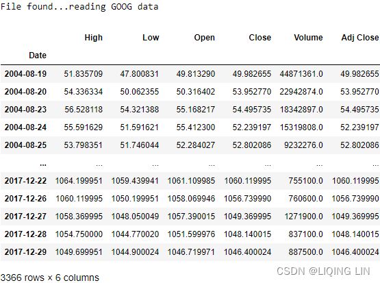
goog=goog_data2.loc['2005-02-07':'2005-07-07']
goog
If you are careful enough, then you will also notice that the current price of "Adj Close" is the same as the price of "Close", also because of the previous split  https://online.stat.psu.edu/stat462/sites/onlinecourses.science.psu.edu.stat462/files/data/google_stock/index.txt

Why is the stock price downloaded from yfinance now different from the previous download, because there is a 1:20 split
为什么现在从yfinance下载的股价不同于之前下载的呢,因为存在1:20的拆分
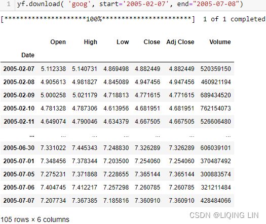
goog=goog_data2.loc['2005-02-07':'2005-07-07']

import matplotlib.ticker as ticker

goog['Adj Close'].plot(ls='-', lw=0.8, marker='o', label='Daily price')
# 24%12=0: we need 10 xticklabels and 12 is close to 10
plt.gca().xaxis.set_major_locator(ticker.MaxNLocator(12))
plt.gca().grid(True)
plt.legend( loc='best' )
plt.xlabel('Date')
plt.ylabel('price' )
plt.setp( plt.gca().get_xticklabels(), rotation=30, horizontalalignment='right' )
plt.show() 
Consecutive values appear to follow one another fairly closely, suggesting an autoregression model could be appropriate. We next look at a plot of partial autocorrelations for the data:
import statsmodels.tsa.api as smt
from matplotlib import pyplot

smt.graphics.plot_pacf( goog['Adj Close'],
                        lags=26,
                        alpha=0.05, # α
                        method='ywm', # Yule-Walker without adjustment. Default.
                        ax=pyplot.gca(),
                        auto_ylims=True,
                        zero=False # Flag indicating whether to include the 0-lag autocorrelation.
                      )
#plt.autoscale(enable=True, axis='x', tight=True)
plt.show()
Here we notice that there is a significant spike at a lag of 1 and much lower spikes for the subsequent lags. Thus, an AR(1) model would likely be feasible for this data set.
Approximate bounds can also be constructed (as given by the red lines in the plot above) for this plot to aid in determining large values. Approximate (1−α)×100% significance bounds are given by ![]() Values lying outside of either of these bounds are indicative of an autoregressive process位于这些界限之外的值表示自回归过程.
Values lying outside of either of these bounds are indicative of an autoregressive process位于这些界限之外的值表示自回归过程.
We next create a lag-1 price variable and consider a scatterplot of price versus this lag-1 variable:
plt.scatter( goog['Adj Close'].shift(1), goog['Adj Close'])
plt.xlabel('lag-1-price', fontsize=14)
plt.ylabel('price', fontsize=14 )

plt.show()
There appears to be a strong linear pattern, affirming that the first-order autoregression model (AR(1)).
The PACF is most useful for identifying the order of an autoregressive model. Specifically, sample partial autocorrelations that are significantly different from 0 indicate lagged terms of ![]() that are useful predictors of
that are useful predictors of ![]() . It is important that the choice of the order makes sense. For example, suppose you have blood pressure readings for every day over the past two years. You may find that an AR(1) or AR(2) model is appropriate for modeling blood pressure. However, the PACF may indicate a large partial autocorrelation value at a lag of 17, but such a large order for an autoregressive model likely does not make much sense.
. It is important that the choice of the order makes sense. For example, suppose you have blood pressure readings for every day over the past two years. You may find that an AR(1) or AR(2) model is appropriate for modeling blood pressure. However, the PACF may indicate a large partial autocorrelation value at a lag of 17, but such a large order for an autoregressive model likely does not make much sense.
Example 2(PACF:sm.OLS vs AutoReg): Quake Data
Let ![]() = the annual number of worldwide earthquakes with magnitude greater than 7 on the Richter scale for n = 100 years (earthquakes.txt data obtained from https://earthquake.usgs.gov). The plot below gives a time series plot for this dataset.
= the annual number of worldwide earthquakes with magnitude greater than 7 on the Richter scale for n = 100 years (earthquakes.txt data obtained from https://earthquake.usgs.gov). The plot below gives a time series plot for this dataset.
earthquakes = pd.read_table('earthquakes.txt')

earthquakes.set_index('Year',inplace=True)
earthquakes
import matplotlib.ticker as ticker

earthquakes['Quakes'].plot(ls='-', lw=0.8, marker='o')
# 24%12=0: we need 10 xticklabels and 12 is close to 10
plt.gca().xaxis.set_major_locator(ticker.MaxNLocator(12))
plt.gca().grid(True)
plt.legend( loc='best' )
plt.xlabel('Year')
plt.ylabel('Quakes' )
plt.setp( plt.gca().get_xticklabels(), rotation=30, horizontalalignment='right' )
plt.legend([])
plt.show()
https://online.stat.psu.edu/stat462/node/188/
The plot below gives a plot of the PACF (partial autocorrelation function), which can be interpreted to mean that a third-order autoregression may be warranted since there are notable partial autocorrelations for lags 1 and 3.
import statsmodels.tsa.api as smt
from matplotlib import pyplot

smt.graphics.plot_pacf( earthquakes['Quakes'],
                        lags=26,
                        alpha=0.05,
                        method='ywm', # Yule-Walker without adjustment. Default.
                        ax=pyplot.gca(),
                        auto_ylims=True,
                        zero=True # Flag indicating whether to include the 0-lag autocorrelation.
                      )
#plt.autoscale(enable=True, axis='x', tight=True)
plt.show()
called “lollipop plots”
The next step is to do a multiple linear regression with number of quakes as the response variable and lag-1, lag-2, and lag-3 quakes as the predictor variables. In the results below we see that the lag-3 predictor is significant at the 0.05 level (p-value < 0.05 and the lag-1 predictor p-value is also relatively small).
smt.graphics.plot_acf( earthquakes['Quakes'],
                        lags=26,
                        alpha=0.05,
                        #method='ywm', # Yule-Walker without adjustment. Default.
                        ax=pyplot.gca(),
                        auto_ylims=True,
                        zero=True # Flag indicating whether to include the 0-lag autocorrelation.
                      )
#plt.autoscale(enable=True, axis='x', tight=True)
plt.show()
called “lollipop plots”
Autocorrelation is the correlation between a time series with a lagged version of itself. The ACF starts at a lag of 0, which is the correlation of the time series with itself and therefore results in a correlation of 1.![]()
Both the ACF and PACF start with a lag of 0, which is the correlation of the time series with itself and therefore results in a correlation of 1.
The difference between ACF and PACF is the inclusion or exclusion of indirect correlations in the calculation.
Autocorrelation(![]() ,
,![]() ,
,![]() ,...,
,...,![]() ,
,![]() ) and Partial Autocorrelation(
) and Partial Autocorrelation(![]() and
and ![]() )
)
Additionally, you can see a blue area in the ACF and PACF plots. This blue area depicts the 95% confidence interval and is an indicator of the significance threshold. That means, anything within the blue area is statistically close to zero and anything outside the blue area is statistically non-zero(statistically significant).
We can make the following observations:
- There are several autocorrelations that are significantly non-zero. Therefore, the time series is non-random.
- High degree of autocorrelation between adjacent (lag = 3) in PACF plot
- Geometric decay in ACF plot
sm.OLS
eq = pd.DataFrame(earthquakes['Quakes'].shift(1))
eq.rename(columns={'Quakes':'lag1Quakes'},
          inplace=True
         )
eq=eq.join(earthquakes['Quakes'].shift(2), how='left')
eq.rename(columns={'Quakes':'lag2Quakes'},
          inplace=True
         )
eq=eq.join(earthquakes['Quakes'].shift(3), how='left')
eq.rename(columns={'Quakes':'lag3Quakes'},
          inplace=True
         )
eq.dropna(inplace=True)
eq ==>dropna==>
import pandas as pd
import statsmodels.api as sm

#https://www.statology.org/sklearn-linear-regression-summary/

x= sm.add_constant(eq[list(eq.columns)]) # insert 1s to first column
# with sklearn
model = sm.OLS( earthquakes['Quakes'][3:], x ).fit()
model.summary()
Quakes AR(3) = 6.4492 + 0.1642 lag1Quakes + 0.0713 lag2Quakes + 0.2693 lag3Quakes
OR AutoReg
from statsmodels.tsa.ar_model import AutoReg
# https://vitalflux.com/autoregressive-ar-models-with-python-examples/
train_data = earthquakes['Quakes'].values
#
# Instantiate and fit the AR model with training data
# Autoregressive AR-X(p) model
# Estimate an AR-X model using Conditional Maximum Likelihood (OLS).
ar_model = AutoReg(train_data, lags=3,
                   trend='c',# ‘c’ - Constant only.
                   missing='drop',# dropna
                  )
ar_model=ar_model.fit('nonrobust',#The class OLS covariance estimator that assumes homoskedasticity
                       use_t=True #use the Student’s t distribution that accounts for model degree of freedom
                     )
#
# Print Summary
#
print(ar_model.summary())
use_t = True, so the values of z column in the summary result are T-Values
Quakes AR(3) = 6.4492 + 0.1642 y.L1 + 0.0713 y.L2 + 0.2693 y.L3
use_t bool, optional
A flag indicating that inference should use the Student’s t distribution that accounts for model degree of freedom. If False, uses the normal distribution. If None, defers the choice to the cov_type. It also removes degree of freedom corrections from the covariance estimator when cov_type is ‘nonrobust’.
from statsmodels.tsa.ar_model import AutoReg
# https://vitalflux.com/autoregressive-ar-models-with-python-examples/
train_data = earthquakes['Quakes'].values
#
# Instantiate and fit the AR model with training data
# Autoregressive AR-X(p) model
# Estimate an AR-X model using Conditional Maximum Likelihood (OLS).
ar_model = AutoReg(train_data, lags=3,
                   trend='c',# ‘c’ - Constant only.
                   missing='drop',# dropna
                  )
ar_model=ar_model.fit('nonrobust',#The class OLS covariance estimator that assumes homoskedasticity
                       use_t=False #use the Student’s t distribution that accounts for model degree of freedom
                     )
#
# Print Summary
#
ar_model.summary() 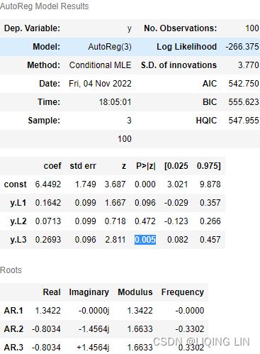
From AutoReg to SARIMAX
from statsmodels.tsa.statespace.sarimax import SARIMAX

ar_model = SARIMAX( earthquakes['Quakes'].values,
                  #order: The (p,d,q) order of the model for
                  #the autoregressive, differences, and moving average components.
                  #d is always an integer, while p and q may either be integers or lists of integers.
                  order = (3,0,0), # AR(3)
                  trend='c',
                  missing='drop',
                  enforce_stationarity=False,
                  concentrate_scale=True, # not sigma^2=variance of the error term,

               ).fit(cov_type='oim')

ar_model.summary() 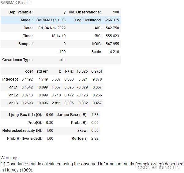
From SARIMAX to ARIMA
from statsmodels.tsa.arima.model import ARIMA

ar_model = ARIMA( earthquakes['Quakes'].values,
                  #order: The (p,d,q) order of the model for
                  #the autoregressive, differences, and moving average components.
                  #d is always an integer, while p and q may either be integers or lists of integers.
                  order = (3,0,0), # AR(3)
                  trend='c',
                  missing='drop',
                  enforce_stationarity=False,
                  concentrate_scale=True, # not sigma^2=variance of the error term,

               ).fit(cov_type='oim')

ar_model.summary() 
MA(3)
https://towardsdatascience.com/interpreting-acf-and-pacf-plots-for-time-series-forecasting-af0d6db4061c ==>ma(q=3)
mpf6_Time Series Data_quandl_更正kernel PCA_AIC_BIC_trend_log_return_seasonal_decompose_sARIMAx_ADFull_LIQING LIN的博客-CSDN博客
Rules for identifying ARIMA models
from statsmodels.tsa.arima.model import ARIMA
ma_model = ARIMA( earthquakes['Quakes'].values,
                  #order: The (p,d,q) order of the model for
                  #the autoregressive, differences, and moving average components.
                  #d is always an integer, while p and q may either be integers or lists of integers.
                  order = (0,0,3), # MA(3)
                  trend='c',
                  missing='drop',
                  enforce_stationarity=False,
                  concentrate_scale=True, # not sigma^2=variance of the error term,
               ).fit(cov_type='oim')

ma_model.summary()
OR we use SARIMAX will have same output result:
from statsmodels.tsa.statespace.sarimax import SARIMAX

ma_model = SARIMAX( earthquakes['Quakes'].values,
                  #order: The (p,d,q) order of the model for
                  #the autoregressive, differences, and moving average components.
                  #d is always an integer, while p and q may either be integers or lists of integers.
                  order = (0,0,3), # MA(3)
                  trend='c',
                  missing='drop',
                  enforce_stationarity=False,
                  concentrate_scale=True, # not sigma^2=variance of the error term,
               ).fit(cov_type='oim')

ma_model.summary()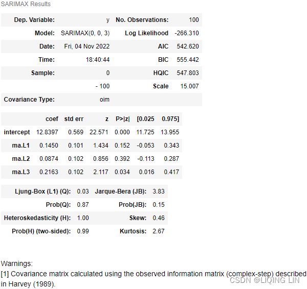
Quakes MA(3) = 12.8397 + 0.1450 ma.L1 + 0.0874 ma.L2 + 0.2163 ma.L3
from statsmodels.tsa.arima.model import ARIMA
ma_model = ARIMA( earthquakes['Quakes'].values,
                  #order: The (p,d,q) order of the model for
                  #the autoregressive, differences, and moving average components.
                  #d is always an integer, while p and q may either be integers or lists of integers.
                  order = (0,0,3), # MA(3)
                  trend='c',
                  missing='drop',
                  enforce_stationarity=False,
                  #concentrate_scale=True, # not sigma^2=variance of the error term,
               ).fit(cov_type='oim')

ma_model.summary()
sigma squared represents the variance of the residual values. This value is used to test the normality of residuals against the alternative of non-normality
where ![]() ∼WN(0,
∼WN(0,![]() ) is a white noise process
) is a white noise process![]() is coef term at time t-q:
is coef term at time t-q: ![]()
################
Fact3: Absence of autocorrelation in returns
Investigate this third fact about the absence of autocorrelation in returns回报中不存在自相关.
Autocorrelation (also known as serial correlation) measures how similar is a given time series to the lagged version of itself, over successive time intervals.
1. Define the parameters for creating the autocorrelation plots:
import statsmodels.tsa.api as smt
from matplotlib.collections import PolyCollection

#1. Define the parameters for creating the autocorrelation plots:
N_lags = 50
Sigificance_Level = 0.05

# plt.rc("figure", figsize=(10,8))
curr_fig, curr_ax = plt.subplots(figsize=(10, 8))
#2. Run the following code to create ACF plot of log returns:
# plot_acf : Plots lags on the horizontal and the correlations on vertical axis.
smt.graphics.plot_acf( df.log_rtn,
                             lags=N_lags,
                             alpha = Sigificance_Level,
                             title='Autocorrelation', zero=True,
                             auto_ylims=True,#adjusts automatically the y-axis limits to ACF values
                             ax=curr_ax,
                             color='blue',
                             vlines_kwargs={"colors": 'black'}
                           )
for item in curr_ax.collections:
    if type(item)==PolyCollection:
        item.set_facecolor('green')
plt.show()
https://blog.csdn.net/Linli522362242/article/details/121406833
To investigate whether there is significant autocorrelation in returns, we created the autocorrelation plot using plot_acf from the statsmodels library. We inspected 50 lags and used the default alpha=0.05 , which means that we also plotted the 95% confidence interval. Values outside of this interval can be considered statistically significant.
 third fact
Only a few values lie outside the confidence interval (we do not look at lag 0) and can be considered statistically significant. We can assume that we have verified that there is no autocorrelation in the log returns series.
Fact 4:Small and decreasing autocorrelation in squared/absolute returns
平方和绝对收益的自相关值 较小且递减(autocorrelation range from -1 to +1)
Investigate this fourth fact by creating the ACF plots of squared and absolute returns.
import statsmodels.tsa.api as smt
from matplotlib.collections import PolyCollection
plt.rcParams.update({'font.size': 12})

fig, ax = plt.subplots( 2,1, figsize=(12,12) )

smt.graphics.plot_acf( df.log_rtn**2,
                       lags=N_lags,
                       alpha = Sigificance_Level,
                       #title='Autocorrelation-df.log_rtn**2',
                       zero=True,
                       auto_ylims=True,#adjusts automatically the y-axis limits to ACF values
                       ax=ax[0],
                       color='blue',
                       vlines_kwargs={"colors": 'black'},

                     )
ax[0].set(ylabel='Squared Returns')
ax[0].set_title('Autocorrelation-df.log_rtn**2', fontsize=14)

smt.graphics.plot_acf( np.abs(df.log_rtn),
                       lags=N_lags,
                       alpha = Sigificance_Level,
                       zero=True,
                       auto_ylims=True,#adjusts automatically the y-axis limits to ACF values
                       ax=ax[1],
                       color='blue',
                       vlines_kwargs={"colors": 'black'},
                     )
ax[1].set_title('Autocorrelation-np.abs(df.log_rtn)', fontsize=14)
ax[1].set( xlabel='Lag',
           ylabel='Absolute Returns',
         )

for curr_ax in ax:
    for item in curr_ax.collections:
        if type(item)==PolyCollection:
            item.set_facecolor('green')
plt.show()
We can observe the small and decreasing values(<0.5) of autocorrelation for the squared and absolute returns, which are in line with the fourth stylized fact.
Fact5: Leverage effect
For the fifth fact, run the following steps to investigate the existence of the leverage effect.
To investigate it, we used the moving standard deviation (calculated using the rolling method of a pandas DataFrame) as a measure of historical volatility. We used windows of 21 and 252 days, which correspond to one month and one year of trading data.
1. Calculate volatility measures as rolling standard deviations:
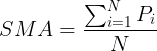
To compute standard deviation, first we compute the variance:
Then, standard deviation is simply the square root of the variance:![]()
# Calculate volatility measures as rolling standard deviations:
# 252 trading days per year
# 21 trading days per month
df['Moving_std_252'] = df[['log_rtn']].rolling(window=252).std()
df['Moving_std_21'] = df[['log_rtn']].rolling(window=21).std()

df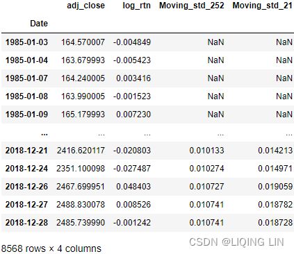
plt.style.use('seaborn')
plt.rcParams.update({'font.size': 12})

fig, ax = plt.subplots( 3,1,
                        figsize=(10,10),
                        sharex=True
                      )

df.adj_close.plot( ax=ax[0] )
ax[0].set( title='S&P 500 time series(adj_close)',
           ylabel='Price ($)',
         )

df.log_rtn.plot( ax=ax[1] )
ax[1].set( ylabel='Log returns (%)' )

df.moving_std_252.plot( ax=ax[2], color='darkred',
                        label='Moving Volatility 252d'
                      )
df.moving_std_21.plot( ax=ax[2], color='g',
                        label='Moving Volatility 21d'
                      )
ax[2].set( ylabel='Moiving Volatility',
           xlabel='Date'
         )
ax[2].legend()

plt.show()
We can now investigate the leverage effect by visually comparing the price series to the (rolling) volatility metric: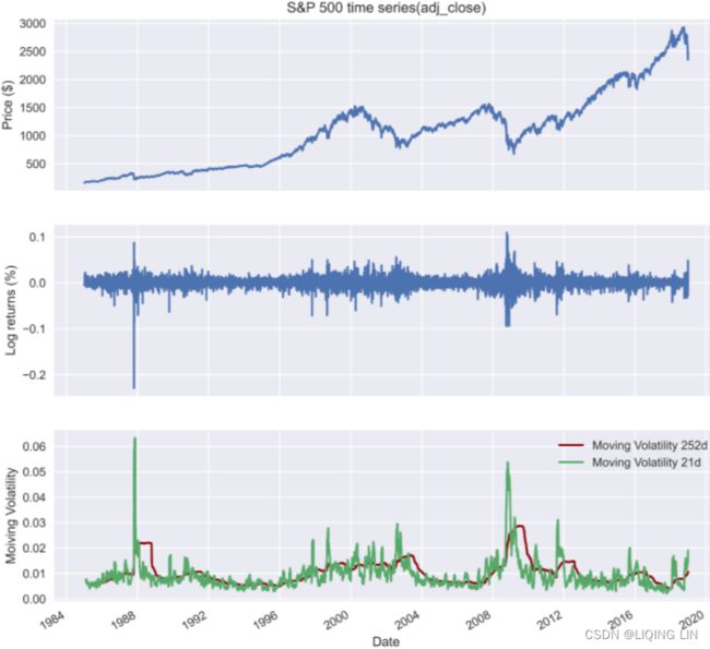
This fact states that most measures of an asset's volatility are negatively correlated with its returns, and we can indeed observe a pattern of increased volatility when the prices go down and decreased volatility when they are rising.
We present another method of investigating the leverage effect (fact 5). To do so, we use the VIX (CBOE VIX : Chicago Board Options Exchange (CBOE) Volatility Index(VIX)), which is a popular metric of the stock market's expectation regarding volatility. The measure is implied by option prices on the S&P 500 index该指标隐含在标准普尔 500 指数的期权价格中. We take the following steps:
df = yf.download( ['^GSPC', '^VIX'],
start='1985-01-01',
end='2018-12-31',
progress=False
)
df = df[['Adj Close']]
df.columns = df.columns.droplevel(0)
df = df.rename(columns={'^GSPC': 'sp500', '^VIX': 'vix'})
df 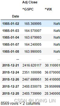 ==>droplevel(0) and rename
2. Calculate the log returns (we can just as well use percentage change-simple returns):
df['log_rtn'] = np.log( df.sp500 / df.sp500.shift(1) )
df['vol_rtn'] = np.log( df.vix / df.vix.shift(1) )
df.dropna( how='any', axis=0, inplace=True )

df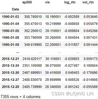
3. Plot a scatterplot with the returns on the axes and fit a regression line to identify the trend:
( Pearson product-moment correlation coefficient ) Pearson's r :

We additionally calculated the correlation coefficient between the two series and included it in the title:
# corr() : Compute pairwise correlation of columns, excluding NA/null values.
corr_coeff = df.log_rtn.corr( df.vol_rtn )

ax = sns.regplot( x='log_rtn', y='vol_rtn', data=df,
                  line_kws={'color': 'red'}
                )
ax.set( title=f'S&P 500 vs. VIX ($\\rho$ = {corr_coeff:.2f})',
        ylabel='VIX log returns',
        xlabel='S&P 500 log returns'
      )

# plt.tight_layout()
plt.show()
( Pearson product-moment correlation coefficient ) Pearson's r :
import statsmodels.api as sm

x_u = df.log_rtn - df.log_rtn.mean()
y_u = df.vol_rtn - df.vol_rtn.mean()
corr_coeff = x_u.dot(y_u) / ( np.sqrt( np.sum(x_u**2) ) * np.sqrt( np.sum(y_u**2) ) )

df.plot( figsize=(10,6),
         kind='scatter',
         x='log_rtn', y='vol_rtn'
       )

ols_fit = sm.OLS( df['vol_rtn'].values,
                  df['log_rtn'].values,
                ).fit()

plt.plot( df['log_rtn'],
          ols_fit.fittedvalues,
          color='r',
        )

plt.title( f'S&P 500 vs. VIX ($\\rho$ = {corr_coeff:.2f})', fontsize=14 )
plt.xlabel('S&P 500 log returns', fontsize=14)
plt.ylabel('VIX log returns', fontsize=14)

plt.show()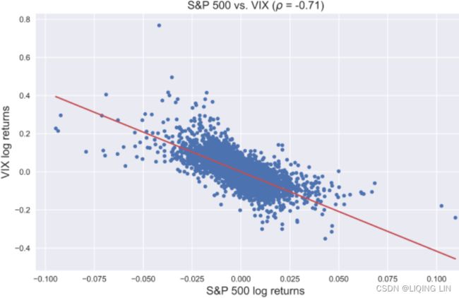
We can see that both the negative slope of the regression line and a strong negative correlation between the two series confirm the existence of the leverage effect in the return series.