ts10_2Univariate TS模型_pAcf_bokeh_AIC_BIC_combine seasonal_decompose twinx ylabel_bold partial title
ts10_Univariate TS模型_circle mark pAcf_ETS_unpack product_darts_bokeh band interval_ljungbox_AIC_BIC : ts10_Univariate TS模型_circle mark pAcf_ETS_unpack product_darts_bokeh band interval_ljungbox_AIC_BIC_LIQING LIN的博客-CSDN博客
Forecasting univariate time series data with seasonal ARIMA
In this recipe, you will be introduced to an enhancement to the ARIMA model for handling seasonality, known as the Seasonal Autoregressive Integrated Moving Average or SARIMA. Like an ARIMA(p, d, q), a SARIMA model also requires (p, d, q) to represent non-seasonal orders. Additionally, a SARIMA model requires the orders for the seasonal component, which is denoted as (P, D, Q, s). Combining both components, the model can be written as a SARIMA(p, d, q)(P, D, Q, s). The letters still mean the same, and the letter case indicates which component. For example, the lowercase letters represent the non-seasonal orders, while the uppercase letters represent the seasonal orders. The new parameter, s , is the number of steps per cycle – for example, s=12 for monthly data or s=4 for quarterly data.
In statsmodels, you will use the SARIMAX class to build a SARIMA model.
In this recipe, you will be working with the milk data, which contains both trend and seasonality. This was prepared in the Technical requirements section.
from statsmodels.tsa.statespace.sarimax import SARIMAX

plt.rcParams["figure.figsize"] = [10, 5]

milk_file='https://raw.githubusercontent.com/PacktPublishing/Time-Series-Analysis-with-Python-Cookbook/main/datasets/Ch10/milk_production.csv'
milk = pd.read_csv( milk_file,
                    index_col='month',
                    parse_dates=True,
                  )

milk.index
milk=milk.asfreq('MS')
milk.index1. plot to determine seasonality and trend
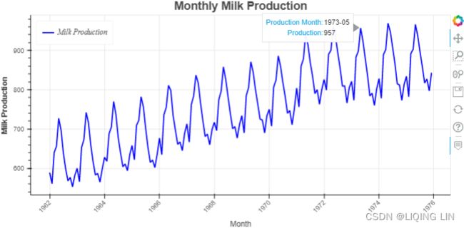
From Figure 10.1, we determined that both seasonality and trend exist(a positive (upward) trend and a repeating seasonality (every summer)). We could also see that the seasonal effect is additive(The seasonal magnitudes and variations over time seem to be steady).
from bokeh.plotting import figure, show
from bokeh.models import ColumnDataSource, HoverTool
#from bokeh.layouts import column
import numpy as np

import hvplot.pandas
hvplot.extension("bokeh")

source = ColumnDataSource( data={'productionMonth':milk.index,
                                 'production':milk['production'].values,
                                })

# def datetime(x):
#     return np.array(x, dtype=datetime64)

p2 = figure( width=800, height=400,
             title='Monthly Milk Production',
             x_axis_type='datetime',
             x_axis_label='Month', y_axis_label='Milk Production'
           )
p2.xaxis.axis_label_text_font_style='normal'
p2.yaxis.axis_label_text_font_style='bold'
p2.xaxis.major_label_orientation=np.pi/4 # rotation
p2.title.align='center'
p2.title.text_font_size = '1.5em'

p2.line( x='productionMonth', y='production', source=source,
         line_width=2, color='blue',
         legend_label='Milk Production'
       )
# https://docs.bokeh.org/en/latest/docs/first_steps/first_steps_3.html
p2.legend.location = "top_left"
p2.legend.label_text_font = "times"
p2.legend.label_text_font_style = "italic"

p2.add_tools( HoverTool( tooltips=[('Production Month', '@productionMonth{%Y-%m}'),
                                   ('Production', '@production{0}')
                                  ],
                         formatters={'@productionMonth':'datetime',
                                     '@production':'numeral'
                                    },
                         mode='vline'
                       )
            )
show(p2)
Figure 10.1
2. ACF & pACF to determine the ARMA model & seasonal periods, then seasonal_decompose(Additive/Multiplicative) ==> extract the seasonal component, then seasonal ACF
The periodicity or number of periods in a season is 12 since the data is monthly. This can be confirmed with an ACF plot:
statsmodels.tsa.stattools.acf(x, adjusted=False, nlags=None, qstat=False, fft=True, alpha=None, bartlett_confint=True, missing='none')[source]
Calculate the autocorrelation function.
Returns:
acf ndarray
The autocorrelation function for lags 0, 1, …, nlags. Shape (nlags+1,).
confint ndarray, optional
Confidence intervals for the ACF at lags 0, 1, …, nlags. Shape (nlags + 1, 2). Returned if alpha is not None.
qstat ndarray, optional
The Ljung-Box Q-Statistic for lags 1, 2, …, nlags (excludes lag zero). Returned if q_stat is True.
pvalues ndarray, optional
The p-values associated with the Q-statistics for lags 1, 2, …, nlags (excludes lag zero). Returned if q_stat is True.
import statsmodels.tsa.api as smt
from statsmodels.tsa.stattools import acf, pacf
from matplotlib.collections import PolyCollection

fig, ax = plt.subplots( 1,1, figsize=(10,6) )
# using first order differencing (detrending)
# life_diff = life.diff().dropna()
lags=np.array(range(41)) # including lag at 0: autocorrelation of the first observation on itself
acf_x=acf( milk, nlags=40,alpha=0.05,
           fft=False, qstat=False,
           bartlett_confint=True,
           adjusted=False,
           missing='none',
         )
acf_x, confint =acf_x[:2]

smt.graphics.plot_acf( milk, zero=False, ax=ax,
                       auto_ylims=True, lags=40 )
for lag in [1,12, 24]:
    ax.scatter( lag,  acf_x[lag] , s=500 ,  facecolors='none', edgecolors='red' )
    ax.text( lag-1.3, acf_x[lag]+0.1, 'Lag '+str(lag), color='red', fontsize='x-large')

plt.show()
This should produce an ACF plot for the milk data with a noticeable cyclical pattern of spikes at specific lags:
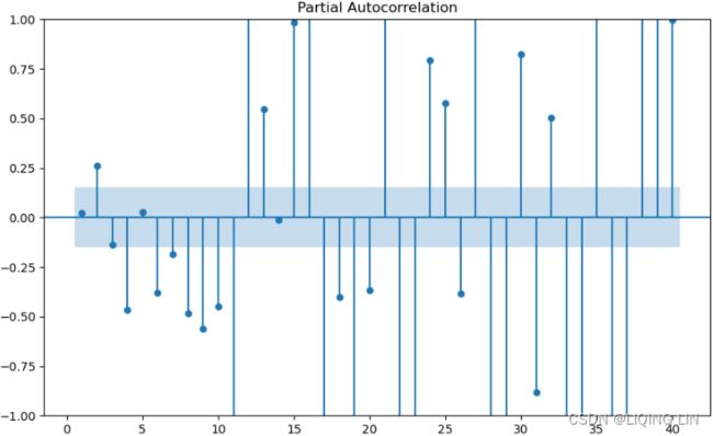
 Figure 10.18 – ACF plot showing significant spikes at lags 1, 12, and 24, followed by a cut-off (no other significant lags afterward) + exponential decay in the following PACF plot==> MA
- [12,24] ==> s=12
- there is a significant spike at lag 1, followed by a cut-off, which represents the non-seasonal order for the MA process as q=1.
- The spike at lags 12 and 24 represents the seasonal order for the MA process as Q=1=12/s or Q=1=24/s.
import statsmodels.tsa.api as smt
from statsmodels.tsa.stattools import acf, pacf
from matplotlib.collections import PolyCollection

fig, ax = plt.subplots( 1,1, figsize=(10,6) )
# using first order differencing (detrending)
# life_diff = life.diff().dropna()
lags=np.array(range(41))# including lag at 0: autocorrelation of the first observation on itself
pacf_x=pacf( milk, nlags=40,alpha=0.05,
           )
pacf_x, pconfint =pacf_x[:2]

smt.graphics.plot_pacf( milk, zero=False, ax=ax, auto_ylims=False, lags=40)
for lag in [1,13,25,37]:
    ax.scatter( lag,  pacf_x[lag] , s=500 ,  facecolors='none', edgecolors='red' )
    ax.text( lag-1.3, pacf_x[lag]-0.15, 'Lag '+str(lag), color='red', fontsize='large')

plt.show()- The PACF plot : an exponential decay at lags 13, 25, and 36 indicates an MA model. So, the SARIMA model would be ARIMA (0, 0, 1) (0, 0, 1, 12) .
- SARIMA(p, d, q) (P, D, Q, S)
Notice that there is a repeating pattern every 12 months (lags). If the pattern is not easy to spot, you can try the ACF plot after you difference the data – for example, detrend (first-order differencing ![]() ) the data first, then plot the ACF plot:
) the data first, then plot the ACF plot:
Note that the differenced data will contain one less data point (row) than the original data, hence the use of the .dropna() method:
import statsmodels.tsa.api as smt
from statsmodels.tsa.stattools import acf, pacf
from matplotlib.collections import PolyCollection

fig, ax = plt.subplots( 1,1, figsize=(10,6) )
# using first order differencing (detrending)
# life_diff = life.diff().dropna()
lags=np.array(range(41)) # including lag at 0: autocorrelation of the first observation on itself
acf_x=acf( milk.diff(1).dropna(), nlags=40,alpha=0.05,
           fft=False, qstat=False,
           bartlett_confint=True,
           adjusted=False,
           missing='none',
         )
acf_x, confint =acf_x[:2]

smt.graphics.plot_acf( milk.diff(1).dropna(), zero=False, ax=ax,
                       auto_ylims=True, lags=40 )
for lag in [12, 24, 36]:
    ax.scatter( lag,  acf_x[lag] , s=500 ,  facecolors='none', edgecolors='red' )
    ax.text( lag-1.3, acf_x[lag]+0.1, 'Lag '+str(lag), color='red', fontsize='x-large')

plt.show()
This should produce an ACF plot on the differenced data that makes the seasonal spikes more apparent:
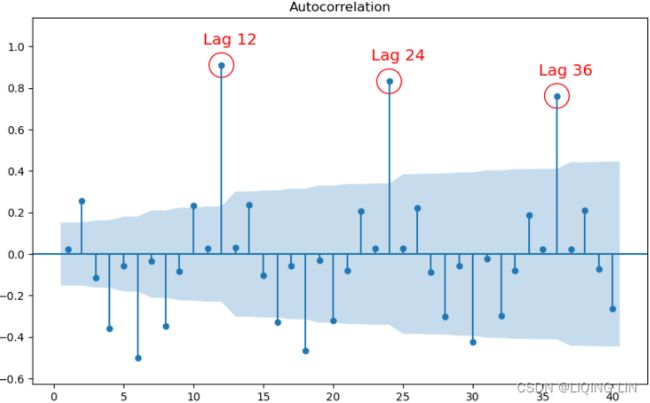 Figure 10.19 – ACF plot after differencing shows significant spikes at lags 1, 12, 24, and 36
fig, ax = plt.subplots( 1,1, figsize=(10,6) )

pacf=smt.graphics.plot_pacf( milk.diff(1).dropna(), zero=False,
                             ax=ax, auto_ylims=False, lags=40
                           )
extract the seasonal component and its ACF plot
You can also extract the seasonal component and use that for the ACF plot, as shown in the following code:
plt.rcParams['figure.figsize'] = (8,8)

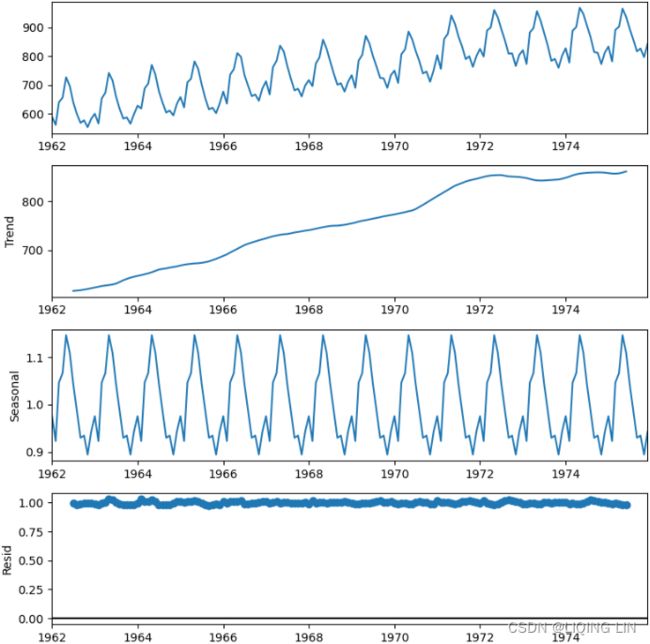
decomposed_add = seasonal_decompose( milk, period=12, model='additive')
decomposed_add.plot()

plt.show()
plt.rcParams['figure.figsize'] = (8,8)
decomposed_mul = seasonal_decompose( milk, period=12, model='multiplicative')
decomposed_mul.plot()
plt.show()# decomposed_add = seasonal_decompose( milk, period=12, model='additive')
# decomposed_mul = seasonal_decompose( milk, period=12, model='multiplicative')
###########
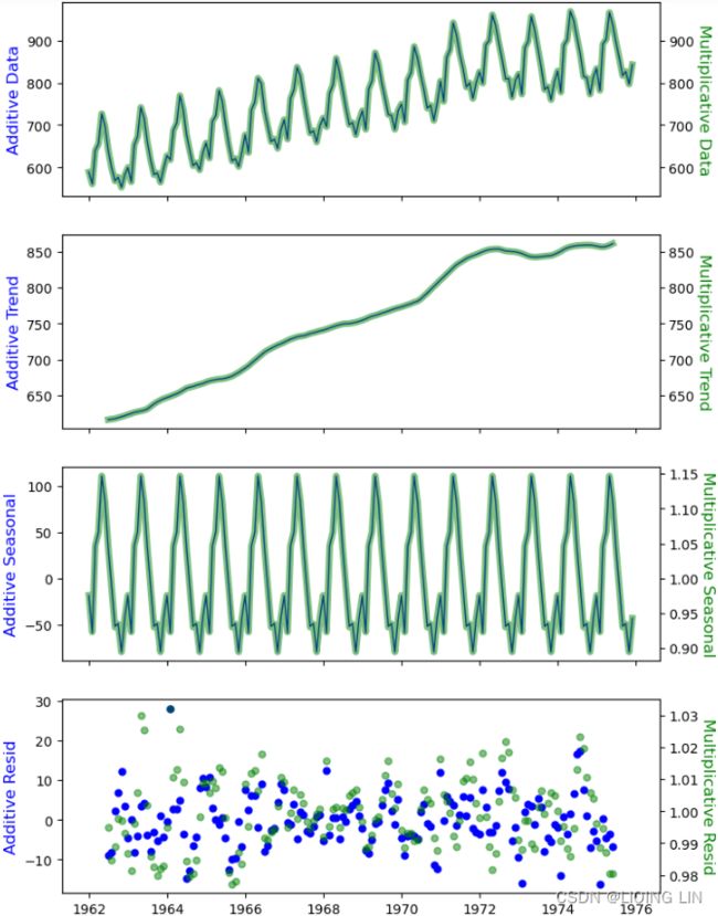
fig, axes = plt.subplots(4,1, sharex=True, figsize=(8,12))
comps = ["observed","trend", "seasonal", "resid"]
ylabels = ["Data", "Trend", "Seasonal", "Resid"]
colors = ["blue","green"]
alphas=[1, 0.5]
linewidths=[1,5]
for i, decomposed in enumerate( [decomposed_add, decomposed_mul] ):
for idx, ax in enumerate(axes):
series = getattr(decomposed, comps[idx])
if i == 0:
ax.set_ylabel('Additive '+ ylabels[idx], fontsize = 12, color=colors[i])
else:
ax=ax.twinx()
ax.set_ylabel('Multiplicative '+ ylabels[idx], fontsize = 12,
rotation=270, labelpad=12, color=colors[i])
if comps[idx] == "resid":
ax.plot(series, color=colors[i], marker='o', markersize=5,
linestyle="none", alpha=alphas[i])
# nobs = decomposed.observed.shape[0]
# xlim = decomposed.observed.index[0], decomposed.observed.index[nobs - 1]
# ax.plot(xlim, (0, 0), color=colors[i], zorder=-3)
else:
ax.plot(series, color=colors[i], alpha=alphas[i],
linewidth=linewidths[i])
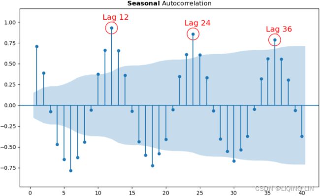
plt.show()The ACF plot will show the autocorrelation using the seasonal component after decomposition and will tell a similar story to what's shown in Figure 10.18 and Figure 10.19.
# same with milk_s_add = decomposed_add.seasonal
milk_s_mul = decomposed_mul.seasonal

# plt.rcParams['figure.figsize'] = (10,5)
# plot_acf( milk_s_mul, zero=False, lags=40)

import statsmodels.tsa.api as smt
from statsmodels.tsa.stattools import acf, pacf

fig, ax = plt.subplots( 1,1, figsize=(10,6) )
# using first order differencing (detrending)
# life_diff = life.diff().dropna()
lags=np.array(range(41)) # including lag at 0: autocorrelation of the first observation on itself
acf_x=acf( milk_s_mul.dropna(), nlags=40, alpha=0.05, # 95 % confidence intervals
           fft=False, qstat=False,
           bartlett_confint=True,
           adjusted=False,
           missing='none',
         )
acf_x, confint =acf_x[:2]

# https://matplotlib.org/2.0.2/users/usetex.html
smt.graphics.plot_acf( milk_s_mul, zero=False, ax=ax, # OR r'$\bf{}$ Autocorrelation'.format('Seasonal')
                       auto_ylims=True, lags=40, title= r'$\bfSeasonal$ Autocorrelation' )
for lag in [12, 24, 36]:
    ax.scatter( lag,  acf_x[lag] , s=500 ,  facecolors='none', edgecolors='red' )
    ax.text( lag-1.3, acf_x[lag]+0.1, 'Lag '+str(lag), color='red', fontsize='x-large')

plt.show()
Generally, you can assume a 12-month cycle when working with monthly data. For example, for the non-seasonal ARIMA portion, start with d=1 for detrending, and for the seasonal ARIMA portion, start with D=1 as well, given s=12 .
3. find the the differencing order (d & D) and check_stationarity
3. Suppose you are not sure about the values for d (non-seasonal differencing) and D (seasonal differencing). In that case, you can use the check_stationarity function after differencing to determine if seasonal differencing was enough or not(over-differenced data are less accuratehttps://blog.csdn.net/Linli522362242/article/details/127737895.). In most cases, if the time series has both trend and seasonality, you may need to difference twice. First, you perform seasonal differencing, followed by a first-order differencing for detrending.
detrend (first-order differencing : ![]()
second-order differencing: ![]()
For example, a seasonal difference followed by a first difference can be written as
![]()
Start with seasonal differencing by using diff(12) (deseasonalize) and test if that is enough to make the time series stationarity. If not, then you will need to follow it with a first-order differencing, diff() :
import matplotlib as mpl

mpl.rcParams.update(mpl.rcParamsDefault)

from statsmodels.tsa.api import adfuller
#plt.rc('font', size=12)

def check_stationary( df ):
    results = adfuller(df)[1:3] #
    s = 'Non-Stationary'
    if results[0] < 0.05: # p-value < 0.05
        s = 'Stationary'

    print( f"{s}\t p-value:{results[0]} \t lags:{results[1]}" )
    return (s, results[0])

milk_diff_12 = milk.diff(12).dropna()
milk_diff_12_1 = milk.diff(12).diff(1).dropna()

sets = [milk, milk_diff_12, milk_diff_12_1]
desc = ['Original', 'Deseasonalize', 'Deseasonalize and Detrend']

fig, ax = plt.subplots( 2,2, figsize=(10,10) )
index, length = milk.index, milk.shape[0]


for i, (d_set, d_desc) in enumerate( zip(sets, desc) ):
    outcome, pval = check_stationary( d_set )

    v, r = i//2, i%2      #r'$\bfSeasonal$ Autocorrelation'
    d_set.plot( ax=ax[v,r], title=r'{}:$\bf{}$'.format(d_desc,outcome ),
                legend=False, color='black' , fontsize=10
              )
    pd.Series( d_set.mean().values.tolist()*length, index = index).plot( ax=ax[v,r], color='blue' )
    ax[v,r].title.set_size(16)
    ax[v,r].grid(False)

    for pos in ['top','right','bottom','left']:
        ax[v,r].spines[pos].set_visible(False)

ax[1,1].set_visible(False)
plt.show()
Figure 10.20 – Stationarity comparison for original, seasonally differenced, and differenced twice time series
4. estimate the AR and MA orders on stationary data
4. Now, you will need to estimate the AR and MA orders for the non-seasonal (p, q) and seasonal components (P, Q). To do this, you must use the ACF and PACF plots on the stationary data, which can be found in the milk_diff_12_1 DataFrame:
fig, ax = plt.subplots(1,2, figsize=(12,5) )
lags=37# including lag at 0: autocorrelation of the first observation on itself
acf_x=acf( milk_diff_12_1, nlags=lags-1, alpha=0.05,
fft=False, qstat=False,
bartlett_confint=True,
adjusted=False,
missing='none',
)
acf_x, confint =acf_x[:2]
plot_acf( milk_diff_12_1, zero=False, lags=lags-1, ax=ax[0],
title=r'$\bf{}$-{}'.format('ACF', desc[-1] )
)
for lag in [1, 12]:
ax[0].scatter( lag, acf_x[lag] , s=400 , facecolors='none', edgecolors='red' )
ax[0].text( lag-1.3, acf_x[lag]-0.2, 'Lag '+str(lag), color='red', fontsize=9)
pacf_x=pacf( milk_diff_12_1, nlags=lags-1,alpha=0.05,
)
pacf_x, pconfint =pacf_x[:2]
plot_pacf( milk_diff_12_1, zero=False, lags=lags-1, ax=ax[1],
title=r'$\bf{}$-{}'.format('PACF', desc[-1] )
)
for lag in [1,12,24,36]:
ax[1].scatter( lag, pacf_x[lag] , s=400 , facecolors='none', edgecolors='red' )
ax[1].text( lag-2, pacf_x[lag]-0.2, 'Lag '+str(lag), color='red', fontsize=9)
plt.show()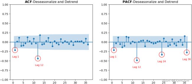 Figure 10.21 – ACF and PACF plots for the milk data after becoming stationary
the plot is based on milk_diff_12_1 = milk.diff(12).diff(1).dropna() ==> S=12, d=1
Starting with the ACF plot,
- there is a signifcant spike at lag 1, which represents the non-seasonal order for the MA process as q=1
- The spike at lag 12 represents the seasonal order for the MA process as Q=1=12/S.
- Notice that there is a cut-off right after lag 1, then a spike at lag 12, followed by a cut-off (no other signifcant lags afterward) + exponential decay in the PACF plot==> MA
- These indicate a moving average model: an MA(1) for the non-seasonal component and an MA(1) for the seasonal component.
- The PACF plot : an exponential decay at lags 12, 24, and 36 indicates an MA model. So, the SARIMA model would be ARIMA (0, 1, 1) (0, 1, 1, 12) .
SARIMA(p, d, q) (P, D, Q, S)
Build the SARIMA model based on the initial information that was extracted for the AR and MA orders. The following code will fit a SARIMA(0, 1, 1)(0, 1, 1, 12) model on the training dataset. Note that the results may differ from those shown in the Plotting ACF and PACF recipe since the data was not split in that recipe, but it has been split here:
SARIMA
The SARIMA model is very similar to the ARIMA model, except that it can handle seasonality and requires a seasonal order. For example, SARIMA(1,1,1)(0,0,0,0) is an ARIMA model of order (1, 1, 1).
You can think of the SARIMAX implementation as a generalized implementation for running AR, MA, ARMA, ARIMA, and SARIMA models. As shown in the Forecasting univariate time series data with Exponential Smoothing recipe, the ExponentialSmoothing class is a generalized implementation for running SimpleExpSmoothing and Holt .
Similar to what you did in the Forecasting univariate time series data with non-seasonal ARIMA recipe, you can perform a naive grid search by evaluating different combinations of the (p, d, q) and (P, D, Q, s) parameters to pick the best model.
Leverage the combinator() function, loop through the list, and fit a different SARIMA model at every iteration. Finally, use the get_best_model() function to get the best model.
###########
Note: Sometimes, it is not clear what the optimal lag values are (the order values for p and q ), so you may need to run different ARIMA models with different values for the (p, d, q) (P, D, Q, S) parameters, similar to what you did for the grid search method (Cartesian product of the p , d , and q) in the Forecasting univariate time series data with Exponential Smoothing recipe. ts10_Univariate TS模型_circle mark pAcf_ETS_unpack product_darts_bokeh band interval_ljungbox_AIC_BIC_LIQING LIN的博客-CSDN博客
replace the following ARIMA with SARIMA
from itertools import product

def combinator(items, r=1):
    combo = [ i               # [trend, damped] ==> ['add', 'mul'] [True, False]
              for i in product( *items, repeat=r )
            ]          # Cartesian product of input iterables.
    return combo# return a list of tuples

pv, dv, qv = [ list( range(3) ) ]*3 # [[0, 1, 2], [0, 1, 2], [0, 1, 2]]
vals = combinator([ pv, dv, qv ])
score = {}


import warnings
warnings.filterwarnings('ignore')

for i, (p,d,q) in enumerate( vals ):
    m = ARIMA( life_train, order=(p,d,q) )
    model = m.fit()

    y = life_test.values.ravel()
    y_hat = model.forecast( steps=len(y) )

    score[i] = {'order': (p,d,q),
                'AIC': model.aic,
                'BIC': model.bic,
                'AICc': model.aicc,

                'RMSPE': rmspe(y, y_hat),
                'RMSE' : rmse(y, y_hat),
                'MAPE' : mape(y, y_hat),
                'model': model
               }
best_model = get_best_model( score, 'AIC' )
###########
def split_data(data, test_split):
    length = len(data)
    t_idx = round( length*(1-test_split) )
    train, test = data[:t_idx], data[t_idx:]
    print( f'train: {len(train)}, test: {len(test)}' )

    return train,test

test_split = 0.15
milk_train, milk_test = split_data( milk, test_split )

sarima_model = SARIMAX( milk_train, order = (0,1,1),
                                    seasonal_order=(0,1,1,12)
                      )
# https://www.statsmodels.org/dev/generated/statsmodels.tsa.statespace.sarimax.SARIMAX.fit.html
model = sarima_model.fit( disp=True )# Set to True to print convergence messages.
Now, use the plot_diagnostics method, which becomes available after ftting the model:
model.plot_diagnostics( figsize=(12,10) )

plt.show()
This will provide four plots – a standardized residual plot, a QQPlot, an ACF residual plot, and a histogram with kernel density plot:

Figure 10.22 – SARIMA(0,1,1)(0,1,1,12) diagnostic plots
The residual's ACF plot (correlogram) does not show autocorrelation (ignoring the spike at lag 0 since it is always 1). However, the histogram and QQPlot show that the residuals do not fit a perfectly normal distribution. These are not critical assumptions compared to random residuals (no autocorrelation). Overall, the results look very promising.
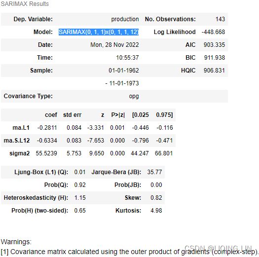
You can obtain the summary using the summary method:
model.summary()5. forecast (prediction) VS test dataset
5. Use the plot_forecast function to plot the forecast from the SARIMA model and compare it with the test set:
plot_forecast( model, '1971', milk_train, milk_test )
plt.show()
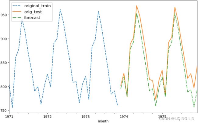
Figure 10.23 – Milk production forecast versus actual production using SARIMA(0,1,1)(0,1,1,12)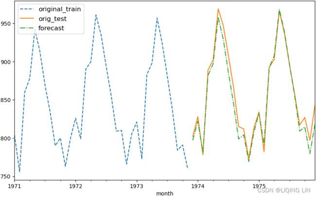
Overall, the SARIMA model did a great job of capturing the seasonal and trend effects. You can always iterate and test different values for (p, q) and (P, Q) by evaluating the results using other metrics such as RMSE, MAPE, or AIC, to name a few.
model.residfig, ax = plt.subplots(2,1, figsize=(12,8) )
plot_acf(model.resid[1:], ax=ax[0])
plot_pacf(model.resid[1:], ax=ax[1])
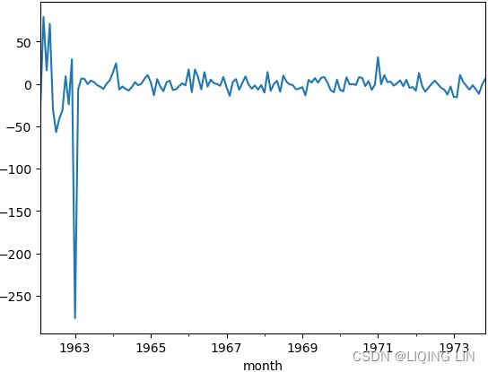
plt.show()model.resid[1:].plot()n = milk.shape[0] # number of observations
milk_train.plot(style='.-', figsize=(12,6))
model.predict(end=n).plot(style='--')
plt.legend(['train', 'forecast'], loc='lower right')
plt.show()get_best_model() and combinator()
Leverage the combinator() function, loop through the list, and fit a different SARIMA model at every iteration. Finally, use the get_best_model() function to get the best model.
Let's try the combination of (0,1,2) for each of the non-seasonal order parameters, (p, d, q) and (0,1), for the seasonal order parameters, (P, D, Q). For s , you can keep it at 12 for now. Tis means you will be testing (3x3x3x2x2x2) or 216 models. Again, this is a naive approach and not resource-efcient, but it's still a valid option. Automated time series libraries such as Auto_ARIMA support this naive brute force grid search over combinations:
from itertools import product

def combinator(items, r=1):
    combo = [ i               # [trend, damped] ==> ['add', 'mul'] [True, False]
              for i in product( *items, repeat=r )
            ]          # Cartesian product of input iterables.
    return combo# return a list of tuples

p_ns, d_ns, q_ns = [ list( range(3) ) ]*3 # [[0, 1, 2], [0, 1, 2], [0, 1, 2]]
P_s, D_s, Q_s = [list(range(2) ) ] *3

vals = combinator([p_ns, d_ns, q_ns, P_s, D_s, Q_s] )
print(vals)
score = {}
# len( vals ) : 216
for i, (p,d,q, P,D,Q) in enumerate(vals):
if i%15==0 :
print( f'Running model #{i} using SARIMA({p},{d},{q})x({P},{D},{Q},12)' )
m = SARIMAX( milk_train,
order = (p,d,q),
seasonal_order = (P,D,Q,12),
enforce_stationarity=False
)
model = m.fit(disp=True)# Set to True to print convergence messages.
y = milk_test.values.ravel()
y_hat = model.forecast( steps=len(y) )
score[i] = {'non-seasonal order': (p,d,q),
'seasonal order': (P, D, Q),
'AIC': model.aic,
'AICc': model.aicc,
'BIC': model.bic,
'RMSPE': rmspe(y, y_hat),
'RMSE' : rmse(y, y_hat),
'MAPE' : mape(y, y_hat),
'model': model}Notice the enforce_stationarity=False(Whether or not to transform the AR parameters to enforce stationarity in the autoregressive component of the model. Default is True.) parameter to avoid a LinAlgError that may occur when running a naive grid search.
It will take a little more time (compared to running one SARIMA model) to run all 216 models. This took approximately 55 seconds (about 1 minute) on my machine. Once completed, you can evaluate the winning model using get_best_model :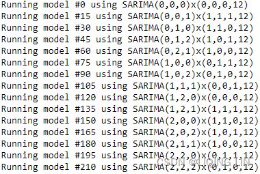
def get_best_model( score, metric='AIC' ):
    initial_score = score[0][metric]
    best_model = 0
    for idx_model, metric_score in score.items():
        if metric_score[metric] < initial_score:
            initial_score = metric_score[metric]
            best_model = idx_model
    print( f'Best model: {best_model} with lowest {metric} score: {initial_score}' )
    return score[best_model]['model']

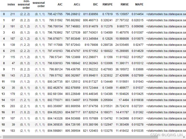
best_model = get_best_model( score, 'AIC') ![]()
results = pd.DataFrame(score).T.sort_values(by='AIC').reset_index()
results.head(20)
The best model was a SARIMA(2, 2, 2)(0, 1, 1, 12). This is different from the earlier model we estimated as SARIMA(0, 1, 1)(0, 1, 1, 12). Finally, you can forecast and plot the model using the plot_forecast function:
This should produce an output similar to what's shown in Figure 10.17. You can change the sort_values criteria and use any other columns, such as BIC or AIC.
results = pd.DataFrame(score).T.sort_values(by='BIC').reset_index()
results.head(20)
plot_forecast( best_model, '1971', milk_train, milk_test )
plt.show()Figure 10.24 – Milk production forecast versus actual production using SARIMA(2,2,2)(0,1,1,12)
Here's an exercise for you: compare the plots from Figure 10.23(better for test set) and Figure 10.24. What do you notice? 
Figure 10.23 – Milk production forecast versus actual production using SARIMA(0,1,1)(0,1,1,12)
sarima_model = SARIMAX( milk_train, order = (0,2,2),
                                    seasonal_order=(0,1,1,12)
                      )
# https://www.statsmodels.org/dev/generated/statsmodels.tsa.statespace.sarimax.SARIMAX.fit.html
model = sarima_model.fit( disp=True )# Set to True to print convergence messages.

plot_forecast( model, '1971', milk_train, milk_test )
plt.show()
best_model.plot_diagnostics( figsize=(12,10) )
plt.show()To learn more about the SARIMAX class, you can visit statsmodels's official documentation at statsmodels.tsa.statespace.sarimax.SARIMAX — statsmodels


