ts8_Outlier Detection_plotly_sns_text annot_modified z-score_hist_Tukey box_cdf_resample freq_Quanti
In addition to missing data, as discussed in Chapter 7, Handling Missing Data, a common data issue you may face is the presence of outliers. Outliers can be point outliers, collective outliers, or contextual outliers. For example,
- a point outlier occurs when a data point deviates from the rest of the population—sometimes referred to as a global outlier.
- Collective outliers集体异常值, which are groups of observations, differ from the population and don't follow the expected pattern.
- Lastly, contextual outliers occur when an observation is considered an outlier based on a particular condition or context, such as deviation from neighboring data points. Note that with contextual outliers, the same observation may not be considered an outlier if the context changes.
In this chapter, you will be introduced to a handful of practical statistical techniques that cover parametric and non-parametric methods. In Chapter 14, Outlier Detection Using Unsupervised Machine Learning, you will dive into more advanced machine learning and deep learning-based techniques.
In the literature, you will find another popular term, anomaly detection, which can be synonymous with outlier detection异常检测,它可以与离群点检测同义. The methods and techniques to identify outlier or anomaly observations are similar; the difference lies in区别在于 the context and the actions that follow once these points have been identified. For example, an outlier transaction in financial transactions may be referred to as an anomaly and trigger a fraud investigation to stop them from re-occurring. Under a different context, survey data with outlier data points may simply be removed by the researchers once they examine the overall impact of keeping versus removing such points. Sometimes you may decide to keep these outlier points if they are part of the natural process. In other words, they are legitimate and opt to use robust statistical methods that are not influenced by outliers.
7. What is the difference between anomaly detection and novelty detection?
Many people use the terms anomaly detection and novelty detection interchangeably, but they are not exactly the same.
- In anomaly detection, the algorithm is trained on a dataset that may contain outliers, and the goal is typically to identify these outliers (within the training set), as well as outliers among new instances.
- In novelty detection, the algorithm is trained on a dataset that is presumed假定 to be “clean,” and the objective is to detect novelties新颖性 strictly among new instances.
- Some algorithms work best for anomaly detection (e.g., Isolation Forest), while others are better suited for novelty detection (e.g., one-class SVM).
Another concept, known as change point detection (CPD)变化点检测, relates to outlier detection与异常值检测有关. In CPD, the goal is to anticipate预测 abrupt/əˈbrʌpt/突然的 and impactful fluctuations (increasing or decreasing) in the time series data. CPD covers specifc techniques, for example, Cumulative sum (CUSUM) and Bayesian Online Change Point Detection (BOCPD). Detecting change is vital in many situations. For example, a machine may break if the internal temperature reaches a certain point or if you are trying to understand whether the discounted price did increase sales or not. This distinction between outlier detection and CPD is vital since you sometimes want the latter. Where the two disciplines converge, depending on the context, sudden changes may indicate the potential presence of outliers (anomalies).
Te recipes that you will encounter in this chapter are as follows:
- • Resampling time series data
- • Detecting outliers using visualizations
- • Detecting outliers using the Tukey method
- • Detecting outliers using a z-score
- • Detecting outliers using a modified z-score
Throughout the chapter, you will be using a dataset from the Numenta Anomaly Benchmark (NAB), which provides outlier detection benchmark datasets. For more information about NAB, please visit their GitHub repository here: https://github.com/numenta/NAB.
The New York Taxi dataset captures the number of NYC taxi passengers at a specific timestamp. The data contains known anomalies that are provided to evaluate the performance of our outlier detectors. The dataset contains 10,320 records between July 1, 2014, to May 31, 2015. The observations are captured in a 30-minute interval, which translates to freq = ' 30T'.
- nyc_taxi.csv: Number of NYC taxi passengers, where the five anomalies occur during the NYC marathon, Thanksgiving, Christmas, New Years day, and a snow storm. The raw data is from the NYC Taxi and Limousine/ˈlɪməziːn/豪华轿车,大型豪华轿车 Commission. The data file included here consists of aggregating the total number of taxi passengers into 30 minute buckets.
Load the nyc_taxi.csv data into a pandas DataFrame as it will be used throughout the chapter:
import pandas as pd

file='https://raw.githubusercontent.com/PacktPublishing/Time-Series-Analysis-with-Python-Cookbook/main/datasets/Ch8/nyc_taxi.csv'

nyc_taxi = pd.read_csv( file,
                        index_col='timestamp',
                        parse_dates=True
                      )
nyc_taxi 
nyc_taxi.index 
nyc_taxi.index.freq = '30T' # 30-minute interval
nyc_taxi.index 
You can store the known dates containing outliers, also known as ground truth labels基本事实标签:
nyc_dates =  [ "2014-11-01", # before the New York Marathon(2014-11-02)
               "2014-11-27", # Thanksgiving Day
               "2014-12-25", # Christmas Day
               "2015-01-01", # New Year's Day
               "2015-01-27", # North American Blizzard
             ]
If you investigate these dates to gain more insight into their signifcance, you will find similar information to the following summary:
- • Saturday, November 1, 2014, was before the New York Marathon, and the official marathon event was on Sunday, November 2, 2014.
- • Tursday, November 27, 2014, was Thanksgiving Day.
- • Tursday, December 25, 2014, was Christmas Day.
- • Tursday, January 1, 2015, was New Year's Day.
- • Tuesday, January 27, 2015, was the North American Blizzard where all vehicles were ordered of the street from January 26 to January 27, 2015.
You can plot the time series data to gain an intuition on the data you will be working with for outlier detection:
import matplotlib.pyplot as plt

nyc_taxi.plot( title='NYC Taxi', alpha=0.6, figsize=(12,5) )
plt.show()
This should produce a time series with a 30-minute frequency:
 Figure 8.1 – Plot of the New York City taxi time series data
Understanding outliers
Finally, create the plot_outliers function that you will use throughout the recipes:
def plot_outliers( outliers, data, method='KNN',
                   halignment='right', valignment='bottom',
                   labels=False
                 ):
    # ax = data.plot( alpha=0.6, figsize=(12,5) )
    # or
    fig = plt.figure( figsize=(12,5) )
    ax = fig.add_subplot( 111 )
    ax.plot(data.index, data.values)
    if labels:
        for i in outliers['value'].items():
            plt.plot( i[0], i[1], 'rx' )
            plt.text( i[0], i[1], f'{i[0].date()}',
                      horizontalalignment = halignment,
                      verticalalignment = valignment
                    )
    else:
        data.loc[outliers.index].plot( ax=ax,
                                       style='rx'
                                     )
    ax.set_title( f'NYC Taxi - {method}' )
    ax.set_xlabel( 'date' )
    ax.set_ylabel( '# of passengers' )
    plt.setp( ax.get_xticklabels(), rotation=45,
              horizontalalignment='right', fontsize=12
            )
    plt.legend( ['nyc taxi','outliers'] )
    plt.show()
tx = nyc_taxi.resample('D').mean()
known_outliers = tx.loc[nyc_dates]
plot_outliers(known_outliers, tx, 'Known Outliers') Figure 8.3 – Plotting the NYC Taxi data after downsampling with ground truth labels (outliers)基本事实标签
known_outliers 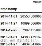
import plotly.graph_objects as go
def plotly_outliers( outliers, data, method='KNN',
halignment='right', valignment='bottom',
labels=False
):
# https://stackoverflow.com/questions/59953431/how-to-change-plotly-figure-size
layout=go.Layout(width=1000, height=500,
title=f'NYC Taxi - {method}',
title_x=0.5, title_y=0.9,
xaxis=dict(title='Date', color='black', tickangle=-30),
yaxis=dict(title='# of passengers', color='black')
)
fig = go.Figure(layout=layout)
# https://plotly.com/python/marker-style/#custom-marker-symbols
# circle-open-dot
# https://support.sisense.com/kb/en/article/changing-line-styling-plotly-python-and-r
fig.add_trace( go.Scatter( name='nyc taxi',
mode ='lines', #marker_symbol='circle',
line=dict(shape = 'linear', color = 'blue',#'rgb(100, 10, 100)',
width = 2, #dash = 'dashdot'
),
x=data.index,
y=data['value'].values,
hovertemplate = 'Date: %{x|%Y-%m-%d}
# of passengers: %{y:.1f}
# of passengers: %{y:.1f}outliers ',
#showlegend=False,
)
)
#fig.update_xaxes(showgrid=True, ticklabelmode="period", gridcolor='grey', griddash='dash')
#fig.update_yaxes(showgrid=True, ticklabelmode="period", gridcolor='grey', griddash='dash')
fig.update_layout( hoverlabel=dict( font_color='white',
font_size=16,
font_family="Rockwell",
#bgcolor="black"
),
legend=dict( x=0,y=1,
bgcolor='rgba(0,0,0,0)',#None
),
#plot_bgcolor='rgba(0,0,0,0)',
#paper_bgcolor='rgba(0,0,0,0)',
xaxis_tickformat='%Y-%m'
)
fig.show()
plotly_outliers(known_outliers, tx, 'Known Outliers')
The presence of outliers requires special handling and further investigation before hastily
/ˈheɪstɪli/匆忙地,急速地,慌忙地 jumping to decisions on how to handle them. First, you will need to detect and spot their existence, which this chapter is all about. Domain knowledge can be instrumental in determining whether these identified points are outliers, their impact on your analysis, and how you should deal with them.
Outliers can indicate bad data due to a random variation in the process, known as noise, or due to data entry error, faulty sensors传感器故障, bad experiment, or natural variation. Outliers are usually undesirable if they seem synthetic/sɪnˈθetɪk/合成的, for example, bad data. On the other hand, if outliers are a natural part of the process, you may need to rethink removing them and opt to keep these data points. In such circumstances, you can rely on non-parametric statistical methods that do not make assumptions on the underlying distribution.
Generally, outliers can cause side effects when building a model based on strong assumptions on the data distribution; for example, the data is from a Gaussian (normal) distribution. Statistical methods and tests based on assumptions of the underlying distribution are referred to as parametric methods.
There is no fixed protocol for dealing with outliers, and the magnitude of their impact will vary. For example, sometimes you may need to test your model with outliers and again without outliers to understand the overall impact on your analysis. In other words, not all outliers are created, nor should they be treated equally. However, as stated earlier, having domain knowledge is essential when dealing with these outliers.
Now, before using a dataset to build a model, you will need to test for the presence of such outliers so you can further investigate their significance. Spotting outliers is usually part of the data cleansing and preparation process before going deep into your analysis.
A common approach to handling outliers is to delete these data points and not have them be part of the analysis or model development. Alternatively, you may wish to replace the outliers using similar techniques highlighted in Chapter 7, Handling Missing Data, such as imputation and interpolation. Other methods, such as smoothing the data, could minimize the impact of outliers. Smoothing, such as exponential smoothing(Forecasts are calculated using weighted averages, where the weights decrease exponentially as observations come from further in the past — the smallest weights are associated with the oldest observations:![]() Note that the sum of the weights even for a small value of α will be approximately one for any reasonable sample size.
Note that the sum of the weights even for a small value of α will be approximately one for any reasonable sample size.
), is discussed in https://blog.csdn.net/Linli522362242/article/details/127932130, Building Univariate Time Series Models Using Statistical. You may also opt to keep the outliers and use more resilient/ rɪˈzɪliənt /有弹性的 algorithms to their effect.
There are many well-known methods for outlier detection. The area of research is evolving, ranging from basic statistical techniques to more advanced approaches leveraging neural networks and deep learning. In statistical methods, you have different tools that you can leverage, such as the use of visualizations (boxplots, QQ-plots, histograms, and scatter plots), z-score, interquartile range (IQR) and Tukey fences, and statistical tests such as Grubb's test, the Tietjen-Moore test, or the generalized Extreme Studentized Deviate (ESD) test广义极端学生偏差检验. These are basic, easy to interpret, and effective methods.
In your first recipe, you will be introduced to a crucial time series transformation technique known as resampling before diving into outlier detection.
Resampling time series data
A typical transformation that is done on time series data is resampling. The process implies changing the frequency or level of granularity of the data.
Usually, you will have limited control over how the time series is generated in terms of frequency. For example, the data can be generated and stored in small intervals, such as milliseconds, minutes, or hours. In some cases, the data can be in larger intervals, such as daily, weekly, or monthly.
The need for resampling time series can be driven by the nature of your analysis and at what granular level you need your data to be. For instance, you can have daily data, but your analysis requires the data to be weekly, and thus you will need to resample. This process is known as downsampling. When you are downsampling, you will need to provide some level of aggregation, such as mean, sum, min, or max, to name a few. On the other hand, some situations require you to resample your data from daily to hourly. This process is known as upsampling. When upsampling, you will have null rows, which you must fill either using imputation or interpolation techniques. See Chapter 7, Handling Missing Data, where both imputation and interpolation methods were discussed in more detail.
In this recipe, you will explore how resampling is done using the pandas library.
In this recipe, you will work with the nyc_taxis DataFrame created earlier in the Technical requirements section. The data captures the number of passengers in 30-minute intervals.
Downsample the data to a daily frequency. Currently, you have 10,320 records, and when you resample the data to daily, you will need to aggregate the data. In this example, you will use the .mean() function. This will reduce the number of samples to 215 records, hence the name downsampling (the number of samples went down).
The DataFrame.resample() method allows you to group rows in a specifed time frame, for example, by day, week, month, year, or any DateTime attribute. https://pandas.pydata.org/pandas-docs/stable/user_guide/timeseries.html#offset-aliasesThe way .resample() works is by grouping the data using the DatetimeIndex and the frequency provided, hence, this method is specifc to time series DataFrames.
The .resample() function works in a very similar manner to the .groupby() function; the difference is that .resample() is specific to time series data and groups at the DatetimeIndex.
Resampling is done using the DataFrame.resample() function. For daily, you will use 'D' as the date offset rule, followed by .mean():
nyc_taxi_downsampled = nyc_taxi.resample('D').mean()
nyc_taxi_downsampled
print( nyc_taxi.loc['2014-07-01'].mean() )
print( nyc_taxi.loc['2014-07-02'].mean() )
print( nyc_taxi.loc['2014-07-03'].mean() ) 
Notice how DatetimeIndex is now at a daily frequency, and the number of passengers now refects the daily average. Inspect the DatetimeIndex to check its frequency:
nyc_taxi_downsampled_D.index
You can also check frequency directly using the .freq property:
nyc_taxi_downsampled_D.index.freq![]()
Check the number of records now after downsampling:
nyc_taxi_downsampled_D.shape ![]() Indeed, now you have 215 records.
Indeed, now you have 215 records.
2. Resample the data one more time, but this time as a 3-day frequency. You can do this by using ' 3D' . This time, use the .sum() method instead:
nyc_taxi_downsampled_3D = nyc_taxi.resample('3D').sum() # 3D: 3days
nyc_taxi_downsampled_3D
notice the number of records got reduced to 72 records
nyc_taxi.loc['2014-07-01'].sum()+nyc_taxi.loc['2014-07-02'].sum()+nyc_taxi.loc['2014-07-03'].sum()![]()
Check the frequency of DatetimeIndex
nyc_taxi_downsampled_3D.index 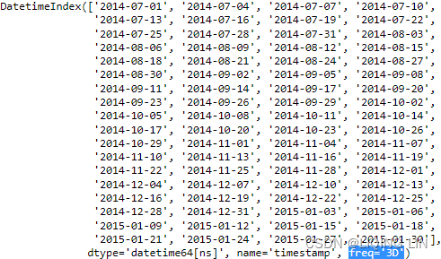
3. Now, change the frequency to 3 business days instead. The default in pandas is Monday to Friday. In the Working with custom business days recipe in Chapter 6, Working with Date and Time in Python, You learned how to create custom business days. For now, you will use the default definition of business days.
originTimestamp or str, default ‘start_day’
The timestamp on which to adjust the grouping. The timezone of origin must match the timezone of the index. If string, must be one of the following:
-
‘epoch’: origin is 1970-01-01
-
‘start’: origin is the first value of the timeseries
-
‘start_day’: origin is the first day at midnight of the timeseries
-
‘end’: origin is the last value of the timeseries
-
‘end_day’: origin is the ceiling midnight of the last day
nyc_taxi.resample( '3B', origin='start_day' ).sum()
nyc_taxi_downsampled_3B = nyc_taxi.resample('3B',
                                            origin='start_day'# default: origin is the first day at midnight of the timeseries
                                           ).sum() # 3B: 3 business days
nyc_taxi_downsampled_3B.head() 
#              monday
nyc_taxi.loc['2014-07-01'].sum()+nyc_taxi.loc['2014-07-02'].sum()+nyc_taxi.loc['2014-07-03'].sum() ![]()
#              friday
nyc_taxi.loc['2014-07-04'].sum()+nyc_taxi.loc['2014-07-05'].sum()+nyc_taxi.loc['2014-07-06'].sum()+\
nyc_taxi.loc['2014-07-07'].sum()+nyc_taxi.loc['2014-07-08'].sum() ![]()
nyc_taxi.resample( '3B', origin='end_day' ).sum()
nyc_taxi.resample('3B',
                  origin='end_day'# origin is the ceiling midnight of the last day
                 ).sum().head() # 3B: 3 business days
The reason is the Business Day rule which specifies we have 2 days of the week as weekends. Since the function is calendar-aware, it knows a weekend is coming after the first 4-business days,
#              monday
nyc_taxi.loc['2014-07-01'].sum() ![]()
#              Tuesday
nyc_taxi.loc['2014-07-02'].sum()+nyc_taxi.loc['2014-07-03'].sum()+nyc_taxi.loc['2014-07-04'].sum() ![]()
#              friday
nyc_taxi.loc['2014-07-05'].sum()+nyc_taxi.loc['2014-07-06'].sum()+nyc_taxi.loc['2014-07-07'].sum()+\
nyc_taxi.loc['2014-07-08'].sum()+nyc_taxi.loc['2014-07-09'].sum() ![]()
4. Lastly, let's upsample the data from a 30-minute interval (frequency) to a 15-minutes frequency. This will create an empty entry ( NaN ) between every other entry. You will use ' T' for minutes, since 'M' is used for monthly aggregation:
nyc_taxi.resample('15T').mean()
Notice that upsampling creates NaN rows. Unlike downsampling, when upsampling, you need to give instructions on how to fill the NaN rows. You might be wondering why we used .mean() here? The simple answer is because it would not matter whether you used .sum() , .max() , or .min() , for example. You will need to augment the missing rows using imputation or interpolation techniques when you upsample. For example, you can specify an imputation method in .fillna() or by using the shortcut methods such as .ffill() or .bfill() .
Notice the two statements are equivalent:
# nyc_taxi.resample('15T').fillna('ffill')
# OR
nyc_taxi.resample('15T').ffill() 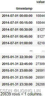 The first five records show the use of forward filling. For more information on using .fillna() or imputation in general, refer to Chapter 7, Handling Missing Data.
Overall, resampling in pandas is very convenient and straightforward. This can be a handy tool when you want to change the frequency of your time series.
You can supply more than one aggregation at once when downsampling using the .agg() function.
For example, using 'M' for monthly, you can supply the .agg() function with a list of aggregations you want to perform:
nyc_taxi.resample('M').agg(['mean', 'min', 'max', 'median', 'sum']) This should produce a DataFrame with five columns, one for each aggregation method specified. The index column, a timestamp column, will be grouped at monthly intervals:
Figure 8.2 – Multiple aggregations using the .agg() method
Notice that the default behavior for 'M' or monthly frequency is at the month's end (example 2014-07-31). You can change to month's start instead by using 'MS' . For example, this will produce 2014-07-01 instead (the beginning of each month).
nyc_taxi.resample('MS').agg(['mean', 'min', 'max', 'median', 'sum'])
Detecting outliers using visualizations
There are two general approaches for using statistical techniques to detect outliers: parametric and non-parametric methods.
- Parametric methods assume you know the underlying distribution of the data. For example, if your data follows a normal distribution.
- On the other hand, in non-parametric methods, you make no such assumptions.
Using histograms and box plots are basic non-parametric techniques that can provide insight into the distribution of the data and the presence of outliers. More specifically, box plots, also known as box and whisker plots, provide a five-number summary: the minimum, first quartile (25th percentile), median (50th percentile), third quartile (75th percentile), and the maximum. There are different implementations for how far the whiskers extend, for example, the whiskers can extend to the minimum and maximum values. In most statistical software, including Python's matplotlib and seaborn libraries, the whiskers extend to what is called Tukey's lower and upper fences. Any data point outside these boundaries is considered an outlier. You will dive into the actual calculation and implementation in the Detecting outliers using the Tukey method recipe. For now, let's focus on the visualization aspect of the analysis.
In this recipe, you will use seaborn as another Python visualization library that is based on matplotlib.
In this recipe, you will explore different plots available from seaborn including histplot() , displot() , boxplot() , boxenplot() , and violinplot() . You will notice that these plots tell a similar story but visually, each plot represents the information differently. Eventually, you will develop a preference toward some of these plots for your own use when investigating your data;
Recall from Figure 8.1, the nyc_taxi DataFrame contains passenger counts recorded every 30 minutes. Keep in mind that every analysis or investigation is unique and so should be your approach to align with the problem you are solving for. This also means that you will need to consider your data preparation approach, for example, determine what transformations you need to apply to your data.
For this recipe, your goal is to find which days have outlier observations, not at which interval within the day, so you will resample the data to a daily frequency. You will start by downsampling the data using the mean aggregation. Even though such a transformation will smooth out the data, you will not lose too much of the detail as it pertains to finding outliers since the mean is very sensitive to outliers. In other words, if there was an extreme outlier on a specific interval (there are 48 intervals in a day, 24*2 per hour), the mean will still carry that information.
Downsample the data to a daily frequency. This will reduce the number of observations from 10,320 to 215, or (10320/48 = 215) :
nyc_taxi_downsampled_D = nyc_taxi.resample('D').mean()In the recipe, we were introduced to several plots that help visualize the distribution of the data and show outliers. Generally, histograms are great for showing distribution, but a box plot (and its variants) are much better for outlier detection. We also explored the boxen (letter-value) plot, which is more suited for larger datasets and is more appropriate than regular box plots.
Now, let's start with your first plot for inspecting your time series data using the histplot() function:
import seaborn as sns

sns.set( rc={'figure.figsize':(10,3),
            }
       )
sns.set_style("white")
# nyc_taxi_downsampled_D = nyc_taxi.resample('D').mean()
sns.histplot( nyc_taxi_downsampled_D, edgecolor="black",linewidth=0.8 )
plt.show()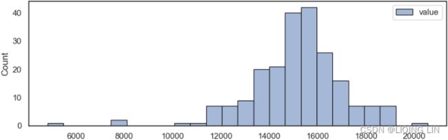
import seaborn as sns
import numpy as np
sns.set_style("white")
fig, ax = plt.subplots( 1,1, figsize=(12,4) )
bins = np.histogram_bin_edges(nyc_taxi_downsampled_D.values, bins='auto')
# nyc_taxi_downsampled_D = nyc_taxi.resample('D').mean()
sns.histplot( nyc_taxi_downsampled_D, bins=bins, stat='count',# show the number of observations in each bin
edgecolor="black",linewidth=0.8 , ax=ax)
label_n=1
for p in ax.patches:
x, w, h = p.get_x(), p.get_width(), p.get_height()
if h > 0:
pct=h / len(nyc_taxi_downsampled_D)
# https://matplotlib.org/stable/gallery/text_labels_and_annotations/text_alignment.html
ax.text(x + w / 2, h, # the location(x + w/2, h) of the anchor point
f'{pct*100:.2f}%\n',
ha='center', # center of text_box(square box) as the anchor point
va='center', # center of text_box(square box) as the anchor point
size=7.5
)
if pct < 0.01:
ax.scatter( x + w / 2, 10 , s=w/2, facecolors='green', edgecolors='black' )
ax.text( x + w / 2 , y=10-0.5,
s=label_n,
ha='center', va='center',
color='white', fontsize=18)
label_n+=1
# for pos in ['top','right','bottom','left']:
# ax.spines[pos].set_visible(False)
ax.xaxis.tick_bottom()
plt.show()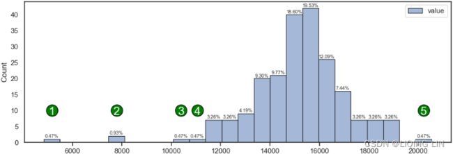 Figure 8.4 – Histogram showing extreme daily mean passenger rides极端的每日平均乘客乘车次数
In Figure 8.4, the observations labeled as 1, 2, 3, 4, and 5 seem to represent extreme passenger values. Recall, these numbers represent the average daily passengers after resampling. The question you should ask is whether these observations are outliers. The center of the histogram is close to 15,000 daily average passengers. This should make you question whether the extreme value close to 20,000 (label 5) is that extreme. Similarly, the observations labeled 3 and 4 (since they are close to the tail of the distribution), are they actually extreme values? How about labels 1 and 2 with average passenger rides at 3,000 and 8,000 daily average passengers respectively? These do seem more extreme compared to the rest and may potentially be actual outliers. Again, determining what is an outlier and what is not requires domain knowledge and further analysis. There is no specifc rule, and you will see throughout this chapter that some of the generally accepted rules are arbitrary
/ˈɑːrbɪtreri/任意的,武断的 and subjective. You should not jump to conclusions immediately您不应该立即下结论.
import numpy as np

from bokeh.plotting import figure, show
from bokeh.models import ColumnDataSource, HoverTool
import hvplot.pandas
hvplot.extension("bokeh")

p = figure(width=670, height=400, toolbar_location=None,
           title="Histogram showing extreme daily mean passenger rides")

# Histogram
bins = np.linspace(-3, 3, 40)
hist, edges = np.histogram(nyc_taxi_downsampled_D.values, bins='auto')
source = ColumnDataSource( data={'pct':hist/len(nyc_taxi_downsampled_D),
                                 'height':hist,
                                 'left':edges[:-1],
                                 'right':edges[1:],
                                })
# p.quad( top=hist, bottom=0,
#         left=edges[:-1], right=edges[1:],
#         fill_color="skyblue", line_color="white",
#         legend_label="value"
#       )
p.quad( top='height', bottom=0,
        left='left', right='right',
        fill_color="skyblue", line_color="white", source=source,
        legend_label="value"
      )
p.add_tools( HoverTool( tooltips=[ ('Count', '@height{0.}'),
                                   ('Percentage', '@pct{%0.2f}'),
                                   ('Range', '(@left{0.},@right{0.})'),
                                 ],
                        formatters={'@height':'numeral',
                                    '@pct':'numeral',
                                    '@left':'numeral',
                                    '@right':'numeral'
                                   },
                       )
            )

show(p) 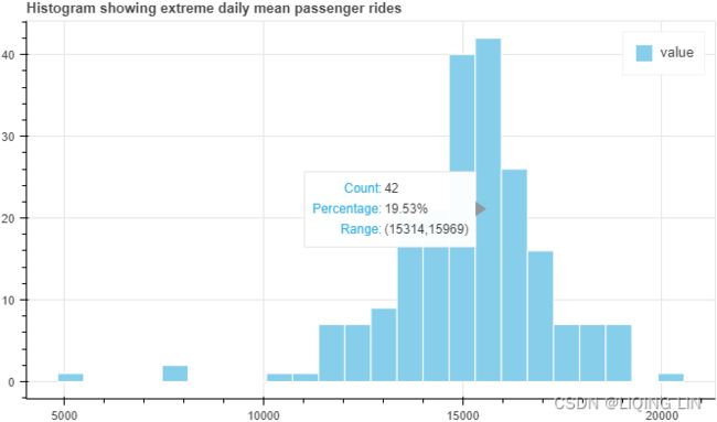
You can achieve a similar plot using displot() , which has a kind parameter. The kind parameter can take one of three values:
- hist for the histogram plot,
- kde for the kernel density estimate plot, and
- ecdf for the empirical cumulative distribution function plot.
You will use displot(kind=' hist' ) to plot a similar histogram as the one in Figure 8.4:
sns.set_style("white")

sns.displot( nyc_taxi_downsampled_D, kind='hist',
             edgecolor="black",linewidth=0.8,
             height=4, aspect=2 # aspect * height gives the width
            )
plt.show()
A box plot provides more information than a histogram and can be a better choice for spotting outliers. In a box plot, observations that are outside the whiskers or boundaries are considered outliers. The whiskers represent the visual boundary for the upper and lower fences as proposed by mathematician John Tukey in 1977.
Tukey's fences
Other methods flag observations based on measures such as the interquartile range(![]() ). For example, if
). For example, if ![]() and
and ![]() are the lower and upper quartiles respectively, then one could define an outlier to be any observation outside the range:
are the lower and upper quartiles respectively, then one could define an outlier to be any observation outside the range:![]()
for some nonnegative constant  . John Tukey proposed this test, where
 ![]() indicates an "outlier", and
indicates an "outlier", and ![]() indicates data that is "far out"
indicates data that is "far out"
fig, ax = plt.subplots( 1,1, figsize=(12,4) )

sns.boxplot( nyc_taxi_downsampled_D['value'], orient='h', ax=ax)
ax.set_yticks([]) # remove the yticks
ax.set_xlabel('value')

plt.show()
def annotate_boxplot(bpdict, annotate_params=None,
                     x_offset=0.05, x_loc=0,
                     text_offset_x=35,
                     text_offset_y=20
                    ):
    """Annotates a matplotlib boxplot with labels marking various centile levels.

    Parameters:
    - bpdict: The dict returned from the matplotlib `boxplot` function. If you're using pandas you can
    get this dict by setting `return_type='dict'` when calling `df.boxplot()`.
    - annotate_params: Extra parameters for the plt.annotate function. The default setting uses standard arrows
    and offsets the text based on other parameters passed to the function
    - x_offset: The offset from the centre of the boxplot to place the heads of the arrows, in x axis
    units (normally just 0-n for n boxplots). Values between around -0.15 and 0.15 seem to work well
    - x_loc: The x axis location of the boxplot to annotate. Usually just the number of the boxplot, counting
    from the left and starting at zero.
    text_offset_x: The x offset from the arrow head location to place the associated text, in 'figure points' units
    text_offset_y: The y offset from the arrow head location to place the associated text, in 'figure points' units
    """
    if annotate_params is None:
        annotate_params = dict( xytext=(text_offset_x, text_offset_y-25),
                                textcoords='offset points',
                                arrowprops=dict(arrowstyle='->', color='b',)
                              )

    plt.annotate('Median (50th Percentile)',
                 (1.025 + x_offset, bpdict['medians'][0].get_ydata()[0]),
                 **annotate_params
                )
    plt.annotate('Q1 (25th Percentile)', # boxes: the quartiles and the median's confidence intervals if enabled.
                 (1.025 + x_offset, bpdict['boxes'][0].get_ydata()[1]),
                 **annotate_params
                )
    plt.annotate('Q3 (75th Percentile)',
                 (1.025 + x_offset, bpdict['boxes'][0].get_ydata()[2]),
                 **annotate_params
                )
    plt.annotate('5%',             # caps: the horizontal lines at the ends of the whiskers.
                 (0.99 + x_offset, bpdict['caps'][0].get_ydata()[0] ),
                 **annotate_params
                )
    plt.annotate('95%',
                 (0.99 + x_offset, bpdict['caps'][1].get_ydata()[0] ),
                 **annotate_params
                )
    plt.annotate('Potential Outliers',
                 (0.99 + x_offset, bpdict['fliers'][0].get_ydata()[2]),
                 **annotate_params
                )
    plt.annotate('Potential Outliers',
                 (0.99 + x_offset, bpdict['fliers'][0].get_ydata()[3]),
                 **annotate_params
                )
    plt.annotate('Potential Outliers',
                 (0.99 + x_offset, bpdict['fliers'][0].get_ydata()[4]),
                 **annotate_params
                )
    plt.annotate('Potential Outliers',
                 (0.99 + x_offset, bpdict['fliers'][0].get_ydata()[-1]),
                 **annotate_params
                )

fig, ax = plt.subplots( 1,1, figsize=(12,4) )

result=nyc_taxi_downsampled_D.boxplot(return_type='dict', vert=True)#orient='h'
ax.set_yticks([]) # remove the yticks

annotate_boxplot(result, x_loc=1)
plt.show()
Automatically annotating a boxplot in matplotlib « Robin's Blog
bpdict 
def annotate_boxplot(bpdict, annotate_params=None,
                     x_offset=0.05, x_loc=0,
                     text_offset_x=0,
                     text_offset_y=50
                    ):
    """Annotates a matplotlib boxplot with labels marking various centile levels.

    Parameters:
    - bpdict: The dict returned from the matplotlib `boxplot` function. If you're using pandas you can
    get this dict by setting `return_type='dict'` when calling `df.boxplot()`.
    - annotate_params: Extra parameters for the plt.annotate function. The default setting uses standard arrows
    and offsets the text based on other parameters passed to the function
    - x_offset: The offset from the centre of the boxplot to place the heads of the arrows, in x axis
    units (normally just 0-n for n boxplots). Values between around -0.15 and 0.15 seem to work well
    - x_loc: The x axis location of the boxplot to annotate. Usually just the number of the boxplot, counting
    from the left and starting at zero.
    text_offset_x: The x offset from the arrow head location to place the associated text, in 'figure points' units
    text_offset_y: The y offset from the arrow head location to place the associated text, in 'figure points' units
    """
    if annotate_params is None:
        annotate_params = dict( xytext=(text_offset_x, text_offset_y),
                                textcoords='offset points',
                                arrowprops=dict(arrowstyle='-|>', color='green',ls="--")
                              )
    potential_annotate = dict( xytext=(bpdict['fliers'][0].get_xdata()[3],
                                       bpdict['medians'][0].get_ydata()[1]+0.15
                                      ),
                               #textcoords='offset points',
                               arrowprops=dict(arrowstyle='-|>', color='green',ls="--")
                             )

    plt.annotate('Median (50th Percentile)',
                 ha='center', va='bottom',
                 xy=(bpdict['medians'][0].get_xdata()[0],
                     bpdict['medians'][0].get_ydata()[1]
                    ), # destination
                 **annotate_params
                )

    plt.annotate('Q1 (25th Percentile)',
                 ha='right', va='top',
                 xy=(bpdict['boxes'][0].get_xdata()[0]-3,
                     bpdict['boxes'][0].get_ydata()[1]-0.05
                    ), # destination
                 **annotate_params
                )
    plt.annotate('Q3 (75th Percentile)',
                 ha='left', va='top',
                 xy=(bpdict['boxes'][0].get_xdata()[2]-3,
                     bpdict['boxes'][0].get_ydata()[2]-0.05
                    ), # destination
                 **annotate_params
                )
    plt.annotate('',
                 ha='center', va='bottom',
                 xy= (bpdict['fliers'][0].get_xdata()[0],
                      bpdict['fliers'][0].get_ydata()[0]+0.05
                     ),
                 **potential_annotate
                )
    plt.annotate('',
                 ha='center', va='bottom',
                 xy= (bpdict['fliers'][0].get_xdata()[1],
                      bpdict['fliers'][0].get_ydata()[1]+0.05
                     ),
                 **potential_annotate
                )
    plt.annotate('Potential Outliers',
                 ha='center', va='bottom',
                 xy= (bpdict['fliers'][0].get_xdata()[2],
                      bpdict['fliers'][0].get_ydata()[2]+0.05
                     ),
                 **potential_annotate
                )
    plt.annotate('',
                 ha='center', va='bottom',
                 xy= (bpdict['fliers'][0].get_xdata()[3],
                      bpdict['fliers'][0].get_ydata()[3]+0.05
                     ),
                 **potential_annotate
                )
    plt.annotate('',
                 ha='center', va='bottom',
                 xy= (bpdict['fliers'][0].get_xdata()[4],
                      bpdict['fliers'][0].get_ydata()[4]+0.05
                     ),
                 **potential_annotate
                )
    plt.annotate('Potential Outliers',
                 ha='center', va='bottom',
                 xy= (bpdict['fliers'][0].get_xdata()[-1],
                      bpdict['fliers'][0].get_ydata()[-1]+0.05
                     ),
                 **annotate_params
                )


fig, ax = plt.subplots( 1,1, figsize=(12,4) )

# https://matplotlib.org/stable/api/markers_api.html
boxprops = dict( color='k')
medianprops = dict(color='k')
whiskerprops=dict(color='k')
capprops=dict(color='k')
flierprops = dict(marker='d', markerfacecolor='b', markersize=4,
                  markeredgecolor='k'
                 )

# https://github.com/matplotlib/matplotlib/blob/v3.6.2/lib/matplotlib/pyplot.py#L2401-L2422
                                          # 'both' : 'dict' and 'axes'
ax, bpdict=nyc_taxi_downsampled_D.boxplot(return_type='both', vert=False, #orient='h'
                                          grid=False,
                                          widths = 0.8, # 0.8*(distance between extreme positions)
                                          #patch_artist=True,# fill with color
                                          boxprops=boxprops,
                                          medianprops=medianprops,
                                          whiskerprops=whiskerprops,
                                          capprops=capprops,
                                          flierprops=flierprops, # or sym='bd',
                                          whis=1.5,#default
                                         )#orient='h'


annotate_boxplot(bpdict, x_loc=1)

nyc_taxi_downsampled_D.boxplot( ax=ax, vert=False, #orient='h'
                                grid=False,
                                widths = 0.8, # 0.8*(distance between extreme positions)
                                patch_artist=True,# fill with color
                                boxprops=boxprops,
                                medianprops=medianprops,
                                whiskerprops=whiskerprops,
                                capprops=capprops,
                                flierprops=flierprops, # or sym='bd',
                                whis=1.5,#default
                              )

#annotate_boxplot(result, x_loc=1)
ax.set_yticks([])
plt.show()
Figure 8.5 – A box plot showing potential outliers that are outside the boundaries (whiskers)
bpdict['boxes'][0].get_xdata()[0] ![]() Q1 (25th Percentile)
Q1 (25th Percentile)
bpdict['boxes'][0].get_xdata()[2] ![]() Q3 (75th Percentile)
Q3 (75th Percentile)
bpdict['boxes'][0].get_xdata()array([14205.19791667(left), 14205.19791667(left), #Q1 (25th Percentile)
16209.42708333(right), 16209.42708333(right), #Q3 (75th Percentile)
14205.19791667(left)])
bpdict['boxes'][0].get_ydata() array([0.6(bottom), 1.4(top),
1.4(top), 0.6(bottom),
0.6(bottom)])
The width of the box (Q1 to Q3) is called InterQuartile Range (IQR) calculated as the diference between the 75th and 25th percentiles (Q3 – Q1).
- The lower fence is calculated as Q1 - (1.5 x IQR), and
- the upper fence as Q3 + (1.5 x IQR).
bpdict['caps'][1].get_xdata() ![]() upper fence
upper fence
bpdict['caps'][0].get_xdata() ![]() lower fence
lower fence
Any observation less than the lower boundary or greater than the upper boundary is considered a potential outlier. More on that in the Detecting outliers using the Tukey method recipe. The whis parameter in the boxplot function is set to 1.5 by default (1.5 times IQR), which controls the width or distance between the upper and lower fences.
- Larger values mean fewer observations will be deemed as outliers, and
- smaller values will make non-outlier points seem outside of boundaries (more outliers).
import plotly.graph_objects as go

# https://stackoverflow.com/questions/59953431/how-to-change-plotly-figure-size
layout=go.Layout(width=800, height=500,
                 title=f'A box plot showing potential outliers that are outside the boundaries (whiskers)',
                 title_x=0.5, title_y=0.9,
                 xaxis=dict(title='value', color='black', tickangle=-30),
                 #yaxis=dict(title='value', color='black')
                )
fig = go.Figure(layout=layout)

fig.add_trace( go.Box( x=nyc_taxi_downsampled_D['value'],
                       name='',
                       marker_color='#3D9970'
                     )
             )
fig.update_traces(orientation='h') # horizontal box plots
fig.show()
Percentile Values
Are you wondering how I was able to determine the exact value for the 25th, 50th, and 75th percentiles?
You can obtain these values for a DataFrame or series with the describe method. For example, if you run nyc_taxi_downsampled_D.describe(), you should see a table of descriptive statistics that includes count, mean, standard deviation, minimum, maximum, 25th, 50th, and 75th percentile values for the dataset.
nyc_taxi_downsampled_D.describe() 
7. There are two more variations for box plots in seaborn ( boxenplot and violinplot ). They provide similar insight as to the boxplot but are presented differently. The boxen plot, which in literature is referred to as a letter-value plot, can be considered as an enhancement to regular box plots to address some of their shortcomings, as described in the paper Heike Hofmann, Hadley Wickham & Karen Kafadar (2017) Letter-Value Plots: Boxplots for Large Data, Journal of Computational and Graphical Statistics, 26:3, 469-477. More specifcally, boxen (letter-value) plots are better suited when working with larger datasets (higher number of observations for displaying data distribution and more suitable for differentiating outlier points for larger datasets). The seaborn implementation in boxenplot is based on that paper. 
seaborn.boxenplot(data=None, *, x=None, y=None, hue=None, order=None, hue_order=None, orient=None, color=None, palette=None, saturation=0.75, width=0.8, dodge=True, k_depth='tukey', linewidth=None, scale='exponential', outlier_prop=0.007, trust_alpha=0.05, showfliers=True, ax=None, box_kws=None, flier_kws=None, line_kws=None)
k_depth {“tukey”, “proportion”, “trustworthy”, “full”} or scalar
The number of boxes, and by extension number of percentiles, to draw. All methods are detailed in Wickham’s paper. Each makes different assumptions about the number of outliers and leverages different statistical properties. If “proportion”, draw no more than outlier_prop extreme observations. If “full”, draw log(n)+1 boxes.
The following code shows how to create a boxen (letter-value) plot using seaborn :
fig, ax = plt.subplots( 1,1, figsize=(12,4) )

# nyc_taxi_downsampled_D = nyc_taxi.resample('D').mean()
sns.boxenplot( nyc_taxi_downsampled_D['value'], orient='h', ax=ax )
ax.set_yticks([]) # remove the yticks
ax.set_xlabel('value')

plt.show()
This should produce a plot that looks like the box plot in Figure 8.5, but with boxes extending beyond the quartiles (Q1, Q2, and Q3). The 25th percentile is at the 14,205 daily average passengers mark, and the 75th percentile is at the 16,209 daily average passengers mark.
 Figure 8.6 – A boxen (letter-value k_depth="tukey" or k_depth=4 ) plot for the average daily taxi passengers in NYCFigure 8.5 – A box plot showing potential outliers that are outside the boundaries (whiskers)
In Figure 8.6, you are getting additional insight into the distribution of passengers beyond the quantiles. In other words, it extends the box plot to show additional distributions to give more insight into the tail of the data. The boxes in theory could keep going to accommodate all the data points, but in order to show outliers, there needs to be a stopping point, referred to as depth. In seaborn, this parameter is called k_depth, which can take a numeric value, or you can specify different methods such as tukey, proportion, trustworthy, or full. For example, a k_depth=1 numeric value will show a similar box to the boxplot in Figure 8.5 (one box). As a reference, Figure 8.6 shows four boxes determined using the Tukey method, which is the default value ( k_depth="tukey" ). Using k_depth=4 would produce the same plot.
These methods are explained in the referenced paper by Heike Hofmann, Hadley Wickham & Karen Kafadar (2017). To explore the different methods, you can try the following code:
methods=['tukey', 'proportion', 'trustworthy', 'full']

fig, ax = plt.subplots( len(methods),1, figsize=(12,10) )

for i,k in enumerate(methods):
    sns.boxenplot( nyc_taxi_downsampled_D['value'], orient='h', k_depth=k, ax=ax[i] )
    ax[i].set_title( r'$\bf{}$'.format(k) )
    ax[i].set_yticks([])
plt.subplots_adjust(hspace=0.5)
plt.show()
This should produce four plots; notice the different numbers of boxes that were determined by each method. Recall, you can also specify k_depth numerically as well. Figure 8.7 – The different k_depth methods available in seaborn for the boxenplot function
Now, the final variation is the violin plot, which you can display using the violinplot function:
fig, ax = plt.subplots( 1,1, figsize=(12,3) )
sns.violinplot( nyc_taxi_downsampled_D['value'], inner='quartile',orient='h',ax=ax)
ax.set_yticks([])
plt.show()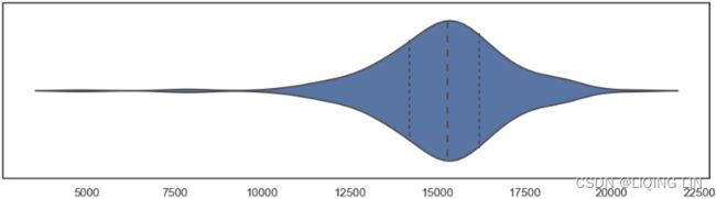
###########
fig, ax = plt.subplots( 1,1, figsize=(12,3) )
ax.set_title('Figure 8.8 – A violin plot for the average daily taxi passengers in NYC')

parts = ax.violinplot( nyc_taxi_downsampled_D['value'],
                       vert=False,
                       showmeans=False, showmedians=False, showextrema=False,
                       quantiles=[0.25,0.5,0.75],
                     )
for pc in parts['bodies']:
    # https://matplotlib.org/stable/gallery/color/named_colors.html
    pc.set_facecolor('purple')
    pc.set_edgecolor('black')
    pc.set_alpha(0.6)
# quartile1, medians, quartile3 = np.percentile(nyc_taxi_downsampled_D['value'],
#                                               [25, 50, 75], axis=0
#                                              )
#14205.197916666668 , 15299.9375 , 16209.427083333332
q1, medians, q3 = parts['cquantiles'].get_paths()[0].vertices[:,0][0],\
                  parts['cquantiles'].get_paths()[1].vertices[:,0][0],\
                  parts['cquantiles'].get_paths()[2].vertices[:,0][0]
# median
q2_min, q2_max= min( parts['bodies'][0].get_paths()[0].vertices[:,1] ),\
                max( parts['bodies'][0].get_paths()[0].vertices[:,1] )

# shaded area: array[ [x_axis(q1,q2,q3), y_axis], ...,[x_axis, y_axis] ]
vertices=parts['bodies'][0].get_paths()[0].vertices
q1_min, q1_max=vertices[ vertices[:,0]== vertices[vertices[:,0] >= int(q1)][:,0][0]
                       ][:,1]
q3_min, q3_max=vertices[ vertices[:,0]== vertices[vertices[:,0] >= int(q3)][:,0][0]
                       ][:,1]

ax.vlines( medians, q2_min, q2_max, ls='--', color='black', lw=1)
ax.vlines( q1, q1_min+0.01, q1_max-0.01, color='k', ls='--', lw=1)
ax.vlines( q3, q3_min, q3_max, color='k', ls='--', lw=1)

ax.set_yticks([])
plt.show()
parts['cquantiles'].get_paths()  q1, q2, q3
parts['bodies'][0].get_paths()
...

vertices=parts['bodies'][0].get_paths()[0].vertices
vertices
note : vertices[:,0] : is ordered
fig, ax = plt.subplots( 1,1, figsize=(12,3) )
ax.set_title('Figure 8.8 – A violin plot for the average daily taxi passengers in NYC',
             #loc='left'
             y=-0.2,
             pad=-14,
             fontsize=14
            )

parts = ax.violinplot( nyc_taxi_downsampled_D['value'],
                       vert=False,
                       showmeans=False, showmedians=False, showextrema=False,
                       quantiles=[0.25,0.5,0.75],
                     )
for pc in parts['bodies']:
    # https://matplotlib.org/stable/gallery/color/named_colors.html
    pc.set_facecolor('purple')
    pc.set_edgecolor('black')
    pc.set_alpha(0.6)
# quartile1, medians, quartile3 = np.percentile(nyc_taxi_downsampled_D['value'],
#                                               [25, 50, 75], axis=0
#                                              )
#14205.197916666668 , 15299.9375 , 16209.427083333332
q1, medians, q3 = parts['cquantiles'].get_paths()[0].vertices[:,0][0],\
                  parts['cquantiles'].get_paths()[1].vertices[:,0][0],\
                  parts['cquantiles'].get_paths()[2].vertices[:,0][0]
# median
q2_min, q2_max= min( parts['bodies'][0].get_paths()[0].vertices[:,1] ),\
                max( parts['bodies'][0].get_paths()[0].vertices[:,1] )

# shaded area: array[ [x_axis(q1,q2,q3), y_axis], ...,[x_axis, y_axis] ]
vertices=parts['bodies'][0].get_paths()[0].vertices
q1_min, q1_max=vertices[ vertices[:,0]== vertices[vertices[:,0] >= int(q1)][:,0][0]
                       ][:,1]
q3_min, q3_max=vertices[ vertices[:,0]== vertices[vertices[:,0] >= int(q3)][:,0][0]
                       ][:,1]

ax.vlines( medians, q2_min, q2_max, ls='--', color='black', lw=1)
ax.vlines( q1, q1_min+0.01, q1_max-0.01, color='k', ls='--', lw=1)
ax.vlines( q3, q3_min, q3_max, color='k', ls='--', lw=1)

text_offset_x=0
text_offset_y=60
annotate_params = dict( xytext=(text_offset_x, text_offset_y),
                        textcoords='offset points',
                        arrowprops=dict(arrowstyle='-|>', color='green',ls="--")
                      )

plt.annotate(r'$\bf{}$'.format('Median') +'\n(50th Percentile)',
             ha='center', va='bottom',
             xy=(medians,
                 q2_max
                ), # destination
             **annotate_params
            )
plt.annotate(r'$\bf{}$ (25th Percentile)'.format('Q1'),
             ha='right', va='top',
             xy=(q1,
                 q1_max
                ), # destination
             **annotate_params
                )
plt.annotate(r'$\bf{}$ (75th Percentile)'.format('Q3'),
             ha='left', va='top',
             xy=(q3,
                 q3_max
                ), # destination
             **annotate_params
            )

ax.set_yticks([])
ax.set_xlabel('value')
plt.show()
This should produce a plot that is a hybrid between a box plot and a kernel density estimation (KDE). A kernel is a function that estimates the probability density function, the larger peaks (wider area), for example, show where the majority of the points are concentrated. This means that there is a higher probability that a data point will be in that region as opposed to the much thinner regions showing much lower probability.

Notice that Figure 8.8 shows the distribution for the entire dataset. Another observation is the number of peaks; in this case, we have one peak, which makes it a unimodal distribution单峰分布. If there is more than one peak, we call it a multimodal distribution多峰分布, which should trigger a further investigation into the data ( bimodal distribution
 ). A KDE plot will provide similar insight as a histogram but with a more smoothed curve.
###########
layout=go.Layout(width=800, height=500,
                 title=f' A violin plot for the average daily taxi passengers in NYC',
                 title_x=0.5, title_y=0.9,
                 xaxis=dict(title='value', color='black', tickangle=-30),
                 #yaxis=dict(title='value', color='black')
                )
fig = go.Figure(layout=layout)

fig.add_trace(go.Violin(x=nyc_taxi_downsampled_D['value'],
                        box_visible=True,
                        name='',
                        line_color='blue', meanline_visible=False,
                       )
             )
fig.update_traces(orientation='h') # horizontal box plots
fig.show()
The lag plot is another useful visualization for spotting outliers. A lag plot is essentially a scatter plot, but instead of plotting two variables to observe correlation, as an example, we plot the same variable against its lagged version. This means, it is a scatter plot using the same variable, but the y axis represents passenger count at the current time (t) and the x axis will show passenger count at a prior period (t-1), which we call lag. The lag parameter determines how many periods to go back; for example, a lag of 1 means one period back, while a lag of 2 means two periods back.
In our resampled data (downsampled to daily), a lag of 1 represents the prior day.
The pandas library provides the lag_plot function, which you can use as shown in the following example:
from pandas.plotting import lag_plot

fig, ax = plt.subplots( 1,1, figsize=(12,3) )
lag_plot( nyc_taxi_downsampled_D, lag=1, ax=ax )
plt.show()
##################
y_df = nyc_taxi_downsampled_D.copy(deep=False)
y_df.rename( columns={'value': 'yt'}, inplace=True)
y_df['yt_lag1'] = y_df['yt'].shift(1)
y_df.dropna(inplace=True)
y_df
outlier_df=y_df[ (y_df['yt_lag1']<10000)  | (y_df['yt_lag1']>20000) ]
outlier_df=pd.merge(outlier_df,y_df[y_df['yt']<10000],
                    how='outer',
                    on=['timestamp','yt','yt_lag1']
                   ).copy(deep=True)
outlier_df
 from boxplot
from pandas.plotting import lag_plot

fig, ax = plt.subplots( 1,1, figsize=(12,4) )
ax.set_title('Figure 8.9 – A lag plot of average daily taxi passengers in NYC',
             #loc='left'
             y=-0.2,
             pad=-14,
             fontsize=14
            )

lag_plot( nyc_taxi_downsampled_D['value'], lag=1, ax=ax )

ax.scatter(outlier_df['yt_lag1'], outlier_df['yt'],
           marker='o',linewidth=2,
           s=350 ,  facecolors='none', edgecolors='green',
          )
plt.show()
##################
The circled data points highlight interesting points that can be可能是(not exactly equivalent to bpdict['fliers'][0].get_xdata() ) potential outliers(). Some seem more extreme than others. Further, you can see some linear relationship between the passenger counts and its lagged version (prior day) indicating the existence of an autocorrelation. Recall from basic statistics that correlation shows the relationship between two independent variables, so you can think of autocorrelation as a correlation of a variable at a time (t) and its prior version at a time (t-1). More on this in ts9_annot_arrow_hvplot PyViz interacti_bokeh_STL_seasonal_decomp_HodrickP_KPSS_F-stati_Box-Cox_Ljung_LIQING LIN的博客-CSDN博客, Exploratory Data Analysis and Diagnosis, and ts10_Univariate TS模型_circle mark pAcf_ETS_unpack product_darts_bokeh band interval_ljungbox_AIC_BIC_LIQING LIN的博客-CSDN博客ts10_2Univariate TS模型_pAcf_bokeh_AIC_BIC_combine seasonal_decompose twinx ylabel_bold partial title_LIQING LIN的博客-CSDN博客_first-order diff, Building Univariate Time Series Models Using Statistical Methods.
The labels for the x axis and the y axis in Figure 8.9 can be a bit confusing, with the y axis being labeled as y(t+1). Essentially it is saying the same thing we described earlier: the x axis represents prior values (the predictor) to its future self at t+1, which is what the y axis represents. To make it clearer, you can recreate the exact visualization produced by lag_plot using seaborn manually, as shown in the following code:
from pandas.plotting import lag_plot

fig, ax = plt.subplots( 1,1, figsize=(12,4) )
ax.set_title('Figure 8.9 – A lag plot of average daily taxi passengers in NYC',
             #loc='left'
             y=-0.2,
             pad=-14,
             fontsize=14
            )

# ax.scatter( nyc_taxi_downsampled_D['value'].shift(1).values,
#             nyc_taxi_downsampled_D['value'],
#           )
# or
ax.scatter( nyc_taxi_downsampled_D['value'].values[:-1], #x
            nyc_taxi_downsampled_D['value'].values[1:], #y
          )
ax.scatter(outlier_df['yt_lag1'], outlier_df['yt'],
           marker='o',linewidth=2,
           s=350 ,  facecolors='none', edgecolors='green',
          )

plt.show()
Notice in the code that the y values start from t+1 (we skipped the value at index 0 ) up to the last observation, and the x values start from index 0 up to index -1 (we skip the last observation). This makes the values in the y axis ahead by one period.
In the next recipe, we will dive further into IQR and Tukey fences that we briefy discussed when talking about box plots.
Detecting outliers using the Tukey method
This recipe will extend on the previous recipe, Detecting outliers using visualizations. In Figure 8.5, the box plot showed the quartiles with whiskers extending to the upper and lower fences. These boundaries or fences were calculated using the Tukey method.
Let's expand on Figure 8.5 with additional information on the other components:
Axes.boxplot(self, x, notch=None, sym=None, vert=None, whis=None, positions=None, widths=None, patch_artist=None, bootstrap=None, usermedians=None, conf_intervals=None, meanline=None, showmeans=None, showcaps=None, showbox=None, showfliers=None, boxprops=None, labels=None, flierprops=None, medianprops=None, meanprops=None, capprops=None, whiskerprops=None, manage_ticks=True, autorange=False, zorder=None, *, data=None)[source]whis float or (float, float), default: 1.5
The position of the whiskers.
If a float, the lower whisker is at the lowest datum above Q1 - whis*(Q3-Q1), and the upper whisker at the highest datum below Q3 + whis*(Q3-Q1), where Q1 and Q3 are the first and third quartiles. The default value of whis = 1.5 corresponds to Tukey's original definition of boxplots.
If a pair of floats, they indicate the percentiles at which to draw the whiskers (e.g., (5, 95)). In particular, setting this to (0, 100) results in whiskers covering the whole range of the data.
In the edge case where Q1 == Q3, whis is automatically set to (0, 100) (cover the whole range of the data) if autorange is True.
Beyond the whiskers, data are considered outliers and are plotted as individual points.
bootstrap int, optional
Specifies whether to bootstrap the confidence intervals around the median for notched boxplots. If bootstrap is None, no bootstrapping is performed, and notches are calculated using a Gaussian-based asymptotic approximation (see McGill, R., Tukey, J.W., and Larsen, W.A., 1978, and Kendall and Stuart, 1967). Otherwise, bootstrap specifies the number of times to bootstrap the median to determine its 95% confidence intervals. Values between 1000 and 10000 are recommended.
def annotate_boxplot(bpdict, annotate_params=None,
x_offset=0.05, x_loc=0,
text_offset_x=0,
text_offset_y=50
):
"""Annotates a matplotlib boxplot with labels marking various centile levels.
Parameters:
- bpdict: The dict returned from the matplotlib `boxplot` function. If you're using pandas you can
get this dict by setting `return_type='dict'` when calling `df.boxplot()`.
- annotate_params: Extra parameters for the plt.annotate function. The default setting uses standard arrows
and offsets the text based on other parameters passed to the function
- x_offset: The offset from the centre of the boxplot to place the heads of the arrows, in x axis
units (normally just 0-n for n boxplots). Values between around -0.15 and 0.15 seem to work well
- x_loc: The x axis location of the boxplot to annotate. Usually just the number of the boxplot, counting
from the left and starting at zero.
text_offset_x: The x offset from the arrow head location to place the associated text, in 'figure points' units
text_offset_y: The y offset from the arrow head location to place the associated text, in 'figure points' units
"""
if annotate_params is None:
annotate_params = dict( xytext=(text_offset_x, text_offset_y),
textcoords='offset points',
arrowprops=dict(arrowstyle='-|>', color='green',ls="--")
)
potential_annotate = dict( xytext=(bpdict['fliers'][0].get_xdata()[3],
bpdict['medians'][0].get_ydata()[1]+0.15
),
#textcoords='offset points',
arrowprops=dict(arrowstyle='-|>', color='green',ls="--")
)
plt.annotate(r'$\bf{}$'.format('Median') +'\n(50th Percentile)',
ha='center', va='bottom',
xy=(bpdict['medians'][0].get_xdata()[0],
bpdict['medians'][0].get_ydata()[1]
), # destination
**annotate_params
)
plt.annotate('Q1 (25th Percentile)',
ha='right', va='top',
xy=(bpdict['boxes'][0].get_xdata()[0]-3,
bpdict['boxes'][0].get_ydata()[1]-0.05
), # destination
**annotate_params
)
plt.annotate('Q3 (75th Percentile)',
ha='left', va='top',
xy=(bpdict['boxes'][0].get_xdata()[2]-3,
bpdict['boxes'][0].get_ydata()[2]-0.05
), # destination
**annotate_params
)
plt.annotate('',
ha='center', va='bottom',
xy= (bpdict['fliers'][0].get_xdata()[0],
bpdict['fliers'][0].get_ydata()[0]+0.05
),
**potential_annotate
)
plt.annotate('',
ha='center', va='bottom',
xy= (bpdict['fliers'][0].get_xdata()[1],
bpdict['fliers'][0].get_ydata()[1]+0.05
),
**potential_annotate
)
plt.annotate('Potential Outliers',
ha='center', va='bottom',
xy= (bpdict['fliers'][0].get_xdata()[2],
bpdict['fliers'][0].get_ydata()[2]+0.05
),
**potential_annotate
)
plt.annotate('',
ha='center', va='bottom',
xy= (bpdict['fliers'][0].get_xdata()[3],
bpdict['fliers'][0].get_ydata()[3]+0.05
),
**potential_annotate
)
plt.annotate('',
ha='center', va='bottom',
xy= (bpdict['fliers'][0].get_xdata()[4],
bpdict['fliers'][0].get_ydata()[4]+0.05
),
**potential_annotate
)
plt.annotate('Potential Outliers',
ha='center', va='bottom',
xy= (bpdict['fliers'][0].get_xdata()[-1],
bpdict['fliers'][0].get_ydata()[-1]+0.05
),
**annotate_params
)
fence_lower = dict( xytext=(text_offset_x, -text_offset_y+10),
textcoords='offset points',
arrowprops=dict(arrowstyle='->', color='green',ls="--")
)
plt.annotate(r'$\bf{}$'.format('Lower Fence') +'\nQ1-(1.5xIQR)',
ha='right', va='top',
xy= (bpdict['caps'][0].get_xdata()[0],
bpdict['caps'][0].get_ydata()[0]
),# destination
**fence_lower
)
plt.annotate(r'$\bf{}$'.format('Upper Fence') +'\nQ1-(1.5xIQR)',
ha='left', va='top',
xy= (bpdict['caps'][1].get_xdata()[0],
bpdict['caps'][1].get_ydata()[0]
),# destination
**fence_lower
)
plt.annotate('',
ha='left', va='top',
xy= (bpdict['boxes'][0].get_xdata()[-1]-50,
bpdict['boxes'][0].get_ydata()[-1]-0.05
),# destination
xytext=(bpdict['boxes'][0].get_xdata()[-2]+50,
bpdict['boxes'][0].get_ydata()[-2]-0.05
),
arrowprops=dict(arrowstyle='|-|', color='green',ls="--")
)
plt.annotate('',
ha='left', va='top',
xy= (bpdict['boxes'][0].get_xdata()[-1]-50,
bpdict['boxes'][0].get_ydata()[-1]-0.05
),# destination
xytext=(bpdict['boxes'][0].get_xdata()[-2]+50,
bpdict['boxes'][0].get_ydata()[-2]-0.05
),
arrowprops=dict(arrowstyle='|-|', color='green',ls="--")
)
plt.annotate('*\n'+r'$\bf{}$'.format('IQR=Q3-Q1'),
ha='center', va='bottom',
xy=(bpdict['medians'][0].get_xdata()[0],
bpdict['boxes'][0].get_ydata()[-2]-0.05
), # destination
xytext=(text_offset_x, -text_offset_y),
textcoords='offset points',
arrowprops=dict(arrowstyle='->', color='green',ls="--")
)
fig, ax = plt.subplots( 1,1, figsize=(12,4) )
# https://matplotlib.org/stable/api/markers_api.html
boxprops = dict( color='k')
medianprops = dict(color='k')
whiskerprops=dict(color='k')
capprops=dict(color='k')
flierprops = dict(marker='d', markerfacecolor='b', markersize=4,
markeredgecolor='k'
)
# https://github.com/matplotlib/matplotlib/blob/v3.6.2/lib/matplotlib/pyplot.py#L2401-L2422
# 'both' : 'dict' and 'axes'
ax, bpdict=nyc_taxi_downsampled_D.boxplot(return_type='both', vert=False, #orient='h'
grid=False,
widths = 0.8, # 0.8*(distance between extreme positions)
#patch_artist=True,# fill with color
boxprops=boxprops,
medianprops=medianprops,
whiskerprops=whiskerprops,
capprops=capprops,
flierprops=flierprops, # or sym='bd',
whis=1.5,#default
)#orient='h'
annotate_boxplot(bpdict, x_loc=1)
nyc_taxi_downsampled_D.boxplot( ax=ax, vert=False, #orient='h'
grid=False,
widths = 0.8, # 0.8*(distance between extreme positions)
patch_artist=True,# fill with color
boxprops=boxprops,
medianprops=medianprops,
whiskerprops=whiskerprops,
capprops=capprops,
flierprops=flierprops, # or sym='bd',
whis=1.5,#default
)
#annotate_boxplot(result, x_loc=1)
ax.set_yticks([])
plt.show()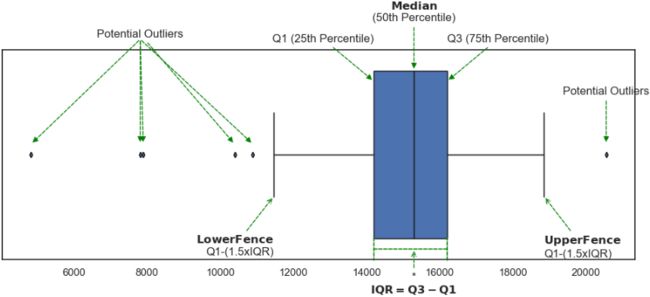 Figure 8.10 – Box plot for the daily average taxi passengers data
Visualizations are great to give you a high-level perspective on the data you are working with, such as the overall distribution and potential outliers. Ultimately you want to identify these outliers programmatically so you can isolate these data points for further investigation and analysis. This recipe will teach how to calculate IQR and define points that fall outside the lower and upper Tukey fences.
Most statistical methods allow you to spot extreme values beyond a certain threshold. For example, this could be the mean, standard deviation, the 10th or 90th percentile, or some other value that you want to compare against. You will start the recipe by learning how to obtain basic descriptive statistics and more specifically, the quantiles.
1. Both DataFrame and Series have the describe method that outputs summary descriptive statistics. By default, it shows the quartiles:
- the first quartile, which is the 25th percentile,
- the second quartile (median), which is the 50th percentile, and
- the third quartile, which is the 75th percentile.
You can customize the percentiles by providing a list of values to the percentiles parameter. The following code shows how you can get values for additional percentiles:
percentiles = [0, 0.05, .10, .25, .5, .75, .90, .95, 1]
nyc_taxi_downsampled_D.describe( percentiles=percentiles )
Figure 8.11 – Descriptive statistics with custom percentiles for the daily tax passenger data
Quantiles等分 versus Quartiles versus Percentiles
The terms can be confusing, but essentially both percentiles and quartiles are quantiles等分. Sometimes you will see people use percentiles more loosely and interchangeably with quantiles.
Quartiles divide your distribution into 4 segments (hence the name) marked as Q1 (25th percentile), Q2 (50th percentile or Median), and Q3 (75th percentile). Percentiles, on the other hand, can take any range from 0 to 100 (in pandas from 0 to 1, while in NumPy from 0 to 100), but most commonly refer to when the distribution is partitioned into 100 segments. These segments are called quantiles.
The names pretty much indicate the type of partitioning (number of quantiles) applied on the distribution; for example, with 4 quantiles(4等分) we call it quartiles, with two quantiles(2等分) we call it median, with 10 quantiles(10等分) we call it deciles, and with 100 quantiles(100等分) we call it percentiles.
2. The NumPy library also offers the percentile function, which would return the value(s) for the specified percentiles. The following code explains how this can be used:
percentiles = [0, 5, 10, 25, 50, 75, 90, 95, 100]
np.percentile( nyc_taxi_downsampled_D, percentiles )![]()
3. In Figure 8.10, notice that most extreme values, potential outliers, fall below the lower fence calculated as Q1 – (1.5 x IQR) or above the upper fence calculated as Q3 + (1.5 x IQR). IQR is calculated as the difference between Q3 and Q1 (IQR =Q3 – Q1), which determines the width of the box in the box plot. These upper and lower fences are known as Tukey's fences, and more specifically, they are referred to as inner boundaries. The outer boundaries also have lower Q1 - (3.0 x IQR) and upper Q3 + (3.0 x IQR) fences. We will focus on the inner boundaries and describe anything outside of those as potential outliers.
You will create a function, iqr_outliers, which calculates the IQR, upper (inner) fence, lower (inner) fence, and then filters the data to return the outliers. These outliers are any data points that are below the lower fence or above the upper fence:
def iqr_outliers( data ):
    q1, q3 = np.percentile( data, [25,75] )
    IQR = q3 - q1
    lower_fence = q1 - (1.5*IQR)
    upper_fence = q3 + (1.5*IQR)
    return data[ (data.value>upper_fence) | (data.value
4. Test the function by passing the nyc_taxi_downsampled_D DataFrame:
outliers = iqr_outliers( nyc_taxi_downsampled_D )
print( outliers )
These dates (points) are the same ones identified in Figure 8.5 and Figure 8.10 as outliers based on Tukey's fences.
5. Use the plot_outliers function defined earlier in the Technical requirements section:
plot_outliers( outliers, nyc_taxi_downsampled_D,
               "Outliers using IQR with Tukey's Fences"
             )
This should produce a plot similar to that in Figure 8.3, except the x markers are based on the outliers identified using the Tukey method: Figure 8.12 – Daily average taxi passengers and outliers identified using the Tukey method
plotly_outliers( outliers, nyc_taxi_downsampled_D,
                 "Outliers using IQR with Tukey's Fences"
               )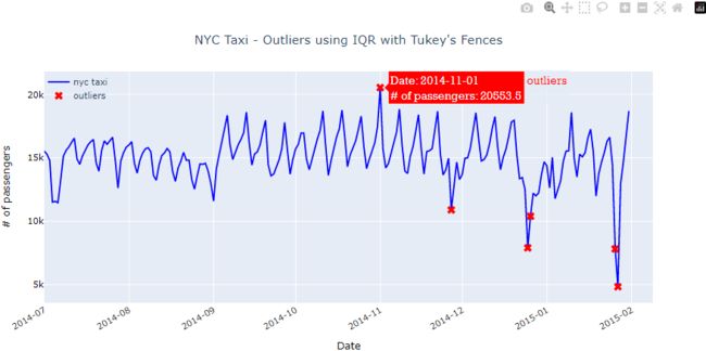
Compare Figures 8.12 and 8.3 and you will see that this simple method did a great job at identifying four of the five known outliers. In addition, Tukey's method identified two additional outliers on 2014-12-26 and 2015-01-26.
Using IQR![]() and Tukey's fences
and Tukey's fences![]() is a simple non-parametric statistical method. Most box plot implementations use 1.5x(IQR) to define the upper and lower fences.
is a simple non-parametric statistical method. Most box plot implementations use 1.5x(IQR) to define the upper and lower fences.
The use of 1.5x(IQR) is common when it comes to defining outliers; the choice is still arbitrary, even though there is a lot of discussion about its reasoning. You can change the value for more experimentation. For example, in seaborn, you can change the default 1.5 value by updating the whis parameter in the boxplot function. The choice of ![]() makes the most sense when the data follows a Gaussian distribution (normal), but this is not always the case.
makes the most sense when the data follows a Gaussian distribution (normal), but this is not always the case.
- Generally, the larger the value, the fewer outliers you will capture as you expand your boundaries (fences).
- Similarly, the smaller the value, the more non-outliers will be defined as outliers, as you are shrinking the boundaries (fences).
Let's update the iqr_outliers function to accept a p parameter so you can experiment with different values:
def iqr_outliers(data, p=1.5):
    q1, q3 = np.percentile( data, [25,75] )
    IQR = q3-q1
    lower_fence = q1 - (p*IQR)
    upper_fence = q3 + (p*IQR)
    return data[ (data.value > upper_fence) | (data.value < lower_fence) ]
Run the function on different values:
for p in [1.3, 1.5, 2.0, 2.5, 3.0]:
    print( f'with p={p}' )
    print( iqr_outliers(nyc_taxi_downsampled_D, p) )
    print( '-'*15 )
The best value will depend on your data and how sensitive you need the outlier detection to be.
To learn more about Tukey's fences for outlier detection, you can refer to this Wikipedia page: https://en.wikipedia.org/wiki/Outlier#Tukey's_fences.
We will explore another statistical method based on a z-score in the following recipe.
Detecting outliers using a z-score
The z-score is a common transformation for standardizing the data. This is common when you want to compare different datasets. For example, it is easier to compare two data points from two different datasets relative to their distributions. This can be done because the z-score standardizes the data to be centered around a zero mean and the units represent standard deviations away from the mean. For example, in our dataset, the unit is measured in daily taxi passengers (in thousands). Once you apply the z-score transformation, you are no longer dealing with the number of passengers, but rather, the units represent standard deviation, which tells us how far an observation is from the mean. Here is the formula for the z-score:![]()
Where  is a data point (an observation), mu (
 ) is the mean of the dataset, and sigma (
 ) is the standard deviation for the dataset.
Keep in mind that the z-score is a lossless transformation, which means you will not lose information such as its distribution (shape of the data) or the relationship between the observations. All that is changing is the units of measurement as they are being scaled (standardized).
Once the data is transformed using the z-score, you can pick a threshold. So, any data point above or below that threshold (in standard deviation) is considered an outlier. For example, your threshold can be +3 and -3 standard deviations away from the mean![]() OR
OR ![]() . Any point lower than -3 or higher than +3 standard deviation can be considered an outlier. In other words, the further a point is from the mean, the higher the probability of it being an outlier.
. Any point lower than -3 or higher than +3 standard deviation can be considered an outlier. In other words, the further a point is from the mean, the higher the probability of it being an outlier.
The z-score has one major shortcoming due to it being a parametric statistical method based on assumptions. It assumes a Gaussian (normal) distribution. So, suppose the data is not normal. In that case, you will need to use a modifed version of the z-score, which is discussed in the following recipe, Detecting outliers using a modified z-score.
You will start by creating the zscore function that takes in a dataset and a threshold value that we will call degree. The function will return the standardized data and the identified outliers. These outliers are any points above the positive threshold or below the negative threshold.
1. Create the zscore() function to standardize the data and filter out the extreme values based on a threshold. Recall, the threshold is based on the standard deviation:
def zscore(df, degree=3):
    data = df.copy()
    data['zscore'] = ( data-data.mean() )/data.std()
    outliers = data[ (data['zscore'] <= -degree) | (data['zscore']>= degree) ]
    return outliers['value'], data
2. Now, use the zscore function and store the returned objects:
threshold = 2.5
outliers, transformed = zscore( nyc_taxi_downsampled_D, threshold )
transformed 
3. To see the effect of the z-score transformation, you can plot a histogram. The transformed DataFrame contains two columns, the original data labeled value and the standardized data labeled zscore :
transformed.hist()
plt.show()
Figure 8.13–Histogram to compare the distribution of the original and standardized data(mean=5.804142696179888e-15 = 0)
Notice how the shape of the data did not change, hence why the z-score is called a lossless transformation. The only difference between the two is the scale (units). 
4. You ran the zscore function using a threshold of 2.5 , meaning any data point that is 2.5 standard deviations away from the mean in either direction. For example, any data point that is above the +2.5 standard deviations or below the -2.5 standard deviations will be considered an outlier. Print out the results captured in the outliers object:
outliers This simple method managed to capture three out of the five known outliers
 .
.
5. Use the plot_outliers function defined earlier in the Technical requirements section:
plot_outliers( outliers, nyc_taxi_downsampled_D, "Outliers using Z-score" ) This should produce a plot similar to that in Figure 8.3, except the x markers are based on the outliers identified using the z-score method: Figure 8.14 – Daily average taxi passengers and outliers identified using the z-score method
plotly_outliers( pd.DataFrame(outliers), nyc_taxi_downsampled_D,
                 "Outliers using Z-score"
               )
You will need to play around反复试验 to determine the best threshold value.
- The larger the threshold, the fewer outliers you will capture, and
- the smaller the threshold, the more non-outliers will be labeled as outliers.
6. Finally, let's create a plot_zscore function that takes the standardized data to plot the data with the threshold lines. This way you can visually see how the threshold is isolating extreme values:
def plot_zscore( data, d=3 ):
    n = len(data)
    plt.figure( figsize=(10,8) )
    plt.plot( data, 'k^' )
    plt.plot( [0,n], [d,d], 'b--', lw=2 )
    plt.plot( [0,n], [-d,-d], 'b--',lw=2 )
Run the function using a threshold of 2.5 :
d=2.5
outliers=transformed['zscore'][(transformed['zscore']>=d ) | (transformed['zscore']<=-d )]
outliers_idx = np.array([ np.where(transformed['zscore'].values==v)
                          for v in outliers.values
                        ]).reshape(-1)
data = transformed['zscore'].values
plot_zscore( data, d=d )

plt.scatter(outliers_idx, outliers.values,
            marker='o',linewidth=2,
            s=350 ,  facecolors='none', edgecolors='green',
           )
plt.show()
This should produce a scatter plot with two horizontal lines:
Figure 8.15 – Plot of the standardized data and outliers based on the threshold lines
The four circled data points represent the outliers that were returned by the zscore function. Run the function using different threshold values to gain a deeper understanding of this simple technique.
import plotly.graph_objects as go
d=2.5
layout=go.Layout(width=1000, height=800,
title=f'Figure 8.15–Plot of the standardized data and outliers based on the threshold lines',
title_x=0.5, xaxis=dict(title='Date', color='black', tickangle=-30),
title_y=0.9, yaxis=dict(title='z-score', color='black')
)
fig = go.Figure(layout=layout)
# https://plotly.com/python/marker-style/
fig.add_trace( go.Scatter(x=transformed.index,# x=np.arange(transformed.shape[0]), # index
y=transformed['zscore'].values,
mode='markers', marker_symbol='arrow', marker_color='black', marker_size=13,
hovertemplate = 'Date: %{x|%Y-%m-%d}
z-score: %{y:.6f}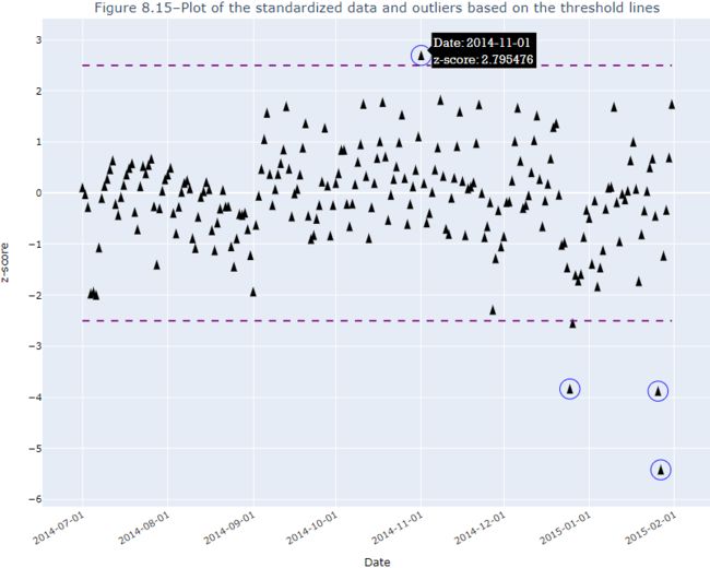 The z-score method is a very simple and interpretable method. The z-scores are interpreted as standard deviation units away from the mean, which is the center of the distribution. Since we are subtracting the mean from all observations, we are essentially mean-centering the data. We also divide by the standard deviation to standardize the data(mean=0).
Figure 8.15 pretty much explains the understanding of this method. Once the data is standardized, it became easy to just use the standard deviation threshold. If the data was not standardized, it may have been challenging to determine the threshold based on daily passengers.
The z-score is a parametric method and assumes the data comes from a Gaussian (normal) distribution. There are several tests available in the statsmodels library to test if the data is normally distributed. One of these tests is the Kolmogorov-Smirnov test. The null hypothesis is that the data comes from a normal distribution. The test returns the test statistics and a p -value; if the p -value is less than 0.05 , you can reject the null hypothesis (data is not normally distributed). Otherwise, you would fail to reject the null hypothesis (data is normally distributed).
You will use the kstest_normal function from the statsmodels library. To make the results easier to interpret, create the test_normal function as follows:
def is_normal( test, p_level=0.05, name='' ):
    stat, pvalue = test
    print( name + ' test')
    print( 'statistic: ', stat )
    print( 'p-value:', pvalue)
    return 'Normal, fail to reject null hypothesis' if pvalue>0.05 else 'Not Normal, reject null hypothesis'


from statsmodels.stats.diagnostic import kstest_normal

is_normal( kstest_normal(nyc_taxi_downsampled_D),
           name='Kolmogorov-Smirnov'
         )
As expected, the dataset is not normally distributed. In ts9_annot_arrow_hvplot PyViz interacti_bokeh_STL_seasonal_decomp_HodrickP_KPSS_F-stati_Box-Cox_Ljung_LIQING LIN的博客-CSDN博客, Exploratory Data Analysis and Diagnosis, you will learn about additional normality tests under the Applying power transformations recipe. But do be cautious; these tests will usually fail in the presence of outliers测试通常会在异常值存在的情况下失败. If your data fails a normality test, then use some of the plotting methods discussed in the Detecting outliers using visualizations recipe to examine any outliers that may be causing the test to fail.
To read more about z-scores and standardization, you can refer to this Wikipedia page:
https://en.wikipedia.org/wiki/Standard_score
In the following recipe, you will explore a very similar method to the z-score that is more robust to outliers and is more suitable with non-normal data.
Detecting outliers using a modified z-score
In the Detecting outliers using a z-score recipe, you experienced how simple and intuitive the method is. But it has one major drawback: it assumes your data is normally distributed.
But, what if your data is not normally distributed? Luckily, there is a modifed version of the z-score to work with non-normal data. The main difference between the regular z-score and the modified z-score is that we replace the mean with the median:
![]()
Where ![]() (tilde x) is the median of the dataset, and MAD is the median absolute deviation of the dataset:
(tilde x) is the median of the dataset, and MAD is the median absolute deviation of the dataset:![]()
The 0.6745 value is the standard deviation unit that corresponds to the 75th percentile (Q3) in a Gaussian distribution and is used as a normalization factor. In other words, it is used to approximate the standard deviation. This way, the units you obtain from this method are measured in standard deviation, similar to how you would interpret the regular z-score.
You can obtain this value using SciPy's percent point function (PPF), also known as the inverse of the cumulative distribution function (CDF
The cumulative distribution function (cdf) or distribution function of a random variable X of the continuous type, defined in terms of the pdf of X, is given by
Here, again, F(x) accumulates (or, more simply, cumulates) all of the probability less
than or equal to x. From the fundamental theorem of calculus, we have, for x values
for which the derivative exists, = f(x)=f(k) and we call f(x) the probability
density function (pdf: 
 概率密度函数PDF是对连续 随机变量定义的,本⾝不是概率,只有对连续 随机变量的概率密度函数PDF在某区间内进⾏ 积分后才是概率) of X.
mpf10_yfinan_Explained variance_R2_ols_cointegration_Gradient Boost_lbfgs_热力图sns ticklabel_SVM_confu_LIQING LIN的博客-CSDN博客_mpf10.mpshape
). Simply give the PPF function a percentile, for example, 75%, and it will return the quantile等分 corresponding to the lower tail probability.
ppf(q, *args, **kwds) method of scipy.stats._continuous_distns.norm_gen instance
    Percent point function (inverse of `cdf`) at q of the given RV.

    Parameters
    ----------
    q : array_like
        lower tail probability
    arg1, arg2, arg3,... : array_like
        The shape parameter(s) for the distribution (see docstring of the
        instance object for more information)
    loc : array_like, optional
        location parameter (default=0)
    scale : array_like, optional
        scale parameter (default=1)

    Returns
    -------
    x : array_like
        quantile corresponding to the lower tail probability q.
import scipy.stats as stats

# https://blog.csdn.net/Linli522362242/article/details/103646927
# https://blog.csdn.net/Linli522362242/article/details/125863306
# Compute the inverse of cdf values evaluated
# at the probability values in 'prob'
# for the normal distribution with 'mean/mu/theta ==> loc
# and standard deviation 'sigma'

# confidence = 0.50, prob=(1+confidence)/2 = 0.75, and 2 since two tail

# ppf(q, loc=0, scale=1) = ppf(prob, theta, sigma)
stats.norm.ppf( 0.75 ) # zscore in the right tail![]()
This is the normalization factor used in the formula.mpf5_定价Bond_yield curve_Spot coupon_duration_有效利率_连续复利_远期_Vasicek短期_CIR模型Derivatives_Tridiagonal_ppf_LIQING LIN的博客-CSDN博客
# the 'inverse' normal cumulative distribution function
# https://blog.csdn.net/Linli522362242/article/details/103646927
# confidence (interval)= 0.95 ==>(1-confidence)/2 = 0.025 ==>1-0.025=0.975
# P(z
# ppf(q, loc=0, scale=1) or ppf(prob, mean, stddev)
self.norminv = st.distributions.norm.ppf
# the normal Cumulative Distribution Function
# https://blog.csdn.net/Linli522362242/article/details/125662545
# P(z<1.96) ==> 0.975 # probability(area) under the curve
self.norm = st.distributions.norm.cdf

阴影部分的面积就是cdf
Lastly, the modified z-score is sometimes referred to as the robust z-score.
Overall, the approach will work exactly as the steps used when using the standard z-score method. You will start by creating the modified_zscore function that takes in a dataset, and a threshold value we will call degree, and the function will return the standardized data as well as the identified outliers. These outliers are any points above the positive threshold or below the negative threshold.
1. Create the modified_zscore() function to standardize the data and filter out the extreme values based on a threshold. Recall, the threshold is based on the standard deviation:
def modified_zscore(df, degree=3):
    data = df.copy()
    s = stats.norm.ppf(0.75) # confidence = 0.50, prob=(1+confidence)/2 = 0.75, and 2 since two tail
    numerator = s*( data - data.median() )
    MAD = np.abs( data-data.median() ).median()
    data['m_zscore'] = numerator/MAD
    outliers = data[ (data['m_zscore'] > degree) | (data['m_zscore'] < -degree) ]

    return outliers['value'], data
2. Now, use the modified_zscore function and store the returned objects:
threshold = 3
outliers, transformed = modified_zscore( nyc_taxi_downsampled_D, threshold )
transformed
3. To see the effect of the modifed z-score transformation, let's plot a histogram. The transformed DataFrame contains two columns, the original data labeled value and the standardized data labeled zscore.
transformed.hist()
plt.show()
Figure 8.16 – Histogram to compare the distribution of the original and modified z-score standardized data(mean=transformed['m_zscore'].mean() =-0.11544924284700371 )
Compare the results from Figure 8.16 with Figure 8.13. Both approaches, the z-score and modified z-score approaches, do not change the shape of the data. The difference is in the scaling factor.
4. Run the modified_zscore function using a threshold of 3 , meaning any data point three standard deviations away from the mean in either direction![]() OR
OR![]() . For example, any data point above +3 standard deviations or below -3 standard deviations will be considered an outlier. Print out the results captured in the outliers object:
. For example, any data point above +3 standard deviations or below -3 standard deviations will be considered an outlier. Print out the results captured in the outliers object:
print( outliers ) Interestingly, the modified z-score did a much better job capturing four out of the five known outliers
 .
.
5. Use the plot_outliers function defned earlier in the Technical requirements section:
plot_outliers( outliers, nyc_taxi_downsampled_D,
              r"Outliers using $\bf{}$ Z-score".format('Modified')
             )
This should produce a plot similar to that in Figure 8.3, except the x markers are based on the outliers identifed using the modifed z-score method: Figure 8.17 – Daily average taxi passengers and outliers identified using the z-score method
You will need to play around to determine the best threshold value. The larger the threshold, the fewer outliers you will capture, and the smaller the threshold, the more non-outliers will be labeled as outliers.
6. Finally, let's create a plot_zscore function that takes the standardized data to plot the data with the threshold lines. This way you can visually see how the threshold is isolating extreme values:
def plot_zscore( data, d=3 ):
    n = len(data)
    plt.figure( figsize=(10,8) )
    plt.plot( data, 'k^' )
    plt.plot( [0,n], [d,d], 'b--', lw=2 )
    plt.plot( [0,n], [-d,-d], 'b--',lw=2 )

d=3
outliers=transformed['m_zscore'][(transformed['m_zscore']>=d ) | (transformed['m_zscore']<=-d )]
outliers_idx = np.array([ np.where(transformed['m_zscore'].values==v)
                          for v in outliers.values
                        ]).reshape(-1)
data = transformed['m_zscore'].values
plot_zscore( data, d=d )

plt.scatter(outliers_idx, outliers.values,
            marker='o',linewidth=2,
            s=350 ,  facecolors='none', edgecolors='green',
           )
plt.show()
This should produce a scatter plot with two horizontal lines: Figure 8.18 – Plot of the standardized data and outliers based on the threshold lines
import plotly.graph_objects as go
d=3
layout=go.Layout(width=1000, height=800,
title=f'Figure 8.18–Plot of the standardized data and outliers based on the threshold lines',
title_x=0.5, xaxis=dict(title='Date', color='black', tickangle=-30),
title_y=0.9, yaxis=dict(title='m_zscore', color='black')
)
fig = go.Figure(layout=layout)
# https://plotly.com/python/marker-style/
fig.add_trace( go.Scatter(x=transformed.index,# x=np.arange(transformed.shape[0]), # index
y=transformed['m_zscore'].values,
mode='markers', marker_symbol='arrow', marker_color='black', marker_size=13,
hovertemplate = 'Date: %{x|%Y-%m-%d}
z-score: %{y:.6f}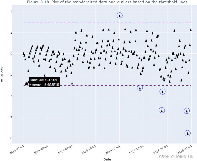 The six circled data points represent the outliers that were returned by the modified_score function. Run the function using different threshold values to gain more profound intuition into this simple technique.
Notice in Figure 8.18 if we have a data point that is right at the threshold line. Would you consider this an outlier? Generally, when it comes to outlier detection you will still need to apply due diligence/ˈdɪlɪdʒəns/尽职调查 to inspect the results.
The modified z-score (robust z-score) method is very similar to the z-score approach, as it depends on defining a standard deviation threshold. What makes this method more robust to outliers is the use of the median instead of the mean. We also use the median absolute deviation (MAD![]() ) instead of the standard deviation.
) instead of the standard deviation.
In the previous recipe, Detecting outliers using a z-score, we used kstest_normal from statsmodels to test normality.
Another helpful plot that is specifically designed to test for normality and sometimes can help detect outliers is the Quantile-Quantile plot (QQ-plot).
You can plot a QQ-plot using SciPy or statsmodels. Both will produce the same plot. The following code will show you can plot using either.
This shows how you can plot using SciPy:
import scipy
import matplotlib.pyplot as plt

res = scipy.stats.probplot( nyc_taxi_downsampled_D.values.reshape(-1),
                            plot = plt
                          )
This shows how you can plot using statsmodels:
from statsmodels.graphics.gofplots import qqplot

fig, ax = plt.subplots( 1,1, figsize=(12,4) )

# https://www.statsmodels.org/0.9.0/generated/statsmodels.graphics.gofplots.qqplot.html
qqplot( nyc_taxi_downsampled_D.values.reshape(-1),
        line='s', # standardized line
        ax=ax
      )
plt.show()
Figure 8.19 – QQ-plot comparing the taxi passenger data against a hypothetical normal distribution
The solid line represents a reference line for what normally distributed data would look like. If the data you are comparing is normally distributed, all the points will lie on that straight line. In Figure 8.19, we can see that the distribution is almost normal (not perfect), and we see issues toward the distribution's tails. This also aligns with what we have seen in Figure 8.16 and Figure 8.13, showing the majority of the outliers are at the bottom tail end (less than -2 standard deviation).
To learn more about MAD, you can refer to the Wikipedia page here: https://en.wikipedia.org/wiki/Median_absolute_deviation .
Identifying outliers
While working with any kind of data, we often encounter observations that are significantly different from the majority, that is, outliers. They can be a result of a wrong tick (price), something major happening on the financial markets金融市场上发生的重大事件, an error in the data processing pipeline, and so on. Many machine learning algorithms and statistical approaches can be influenced by outliers, leading to incorrect/biased results. That is why we should handle the outliers before creating any models.
Execute the following steps to detect outliers using the 3σ(![\small R_t \notin [sma - 3\sqrt{\sigma}, sma + 3\sqrt{\sigma}]](http://img.e-com-net.com/image/info8/86576d01cb344989a7b3ea3e4f9245b0.gif) ) approach, and mark them on a plot.
) approach, and mark them on a plot.
pff1_whylog return Nominal Inflation_CPI_Realized Volati_outlier_distplot_Jarque–Bera_pAcf_sARIMAx_LIQING LIN的博客-CSDN博客