【北京理工大学-Python 数据分析-2.2Matplotlib绘制饼图、直方图、极坐标、散点图】
pyplot的基础图标函数
| 函数 | 说明 |
|---|---|
| plt.plot(x,y,fmt,…) | 绘制一个坐标图 |
| plt.boxplot(data,notch,position) | 绘制一个箱型图 |
| plt.bar(left,height,width,bottom) | 绘制一个条形图 |
| plt.barh(width,bottom,left,height) | 绘制一个横向条形图 |
| plt.polar(theta,r) | 绘制极坐标图 |
| plt.psd(x,NFFT=256,psd_to,Fs) | 绘制功率密度图 |
| plt.specgram(x,NFFT=256,pad_to,F) | 绘制谱图 |
| plt.cohere(x,y,NFFT=256,Fs) | 绘制x-y相关性图函数 |
| plt.scatter(x,y) | 绘制散点图,其中,x和y长度相同 |
| plt.step(x,y,where) | 绘制步阶图 |
| plt.hist(x,bins,normed) | 绘制直方图 |
| plt.contour(x,y,z,n) | 绘制等值图 |
| plt.vlines() | 绘制垂直图 |
| plt.stem(x,y,linefmt,markerfmt) | 绘制柴火图 |
| plt.plot_data() | 绘制数据日期 |
饼图小试
import matplotlib.pyplot as plt
labels='Frogs','Hogs','Dogs','Logs' ##pie图的每个小块的标签
sizes=[15,30,45,10]##每个小块所占的比例数值
explode=(0,0.05,0,0)##每部分是否分割出来
plt.pie(sizes,explode=explode,labels=labels,autopct='%1.1f%%',shadow=False,startangle=90)##shadow,是否显示阴影;startangle起始的角度
plt.axis('equal')
plt.show()

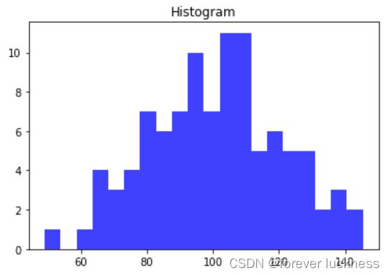
直方图的绘制
import numpy as np
import matplotlib.pyplot as plt
np.random.seed(0)
mu,sigma=100,20 ##均值和标准差
a=np.random.normal(mu,sigma,size=100)
plt.hist(a,20,histtype='stepfilled',facecolor='b',alpha=0.75)##第二个参数bin是直方的个数
plt.title('Histogram')
plt.show()
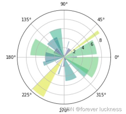
面向对象绘制极坐标图
这个绘图是先通过构建面向对象,然后再进行作图的
import numpy as np
import matplotlib.pyplot as plt
N=20
theta=np.linspace(0.0,2*np.pi,N,endpoint=False)
radii=10*np.random.rand(N)
width=np.pi/4*np.random.rand(N)
ax=plt.subplot(111,projection='polar')##形成一个面向对象
bars=ax.bar(theta,radii,width=width,bottom=0.0)##采用条形图的作图参数,plt.bar(left,height,width,bottom),但在作图之前约定了ax面向对象的类型为polar
for r, bar in zip(radii,bars):
    bar.set_facecolor(plt.cm.viridis(r/10.0))
    bar.set_alpha(0.5)
plt.show()
面向对象法pyplot绘制散点图
import numpy as np
import matplotlib.pyplot as plt
fig,ax=plt.subplots()
ax.plot(10*np.random.randn(100),10*np.random.randn(100),'o')
ax.set_title('Simple Scatter')
plt.show()
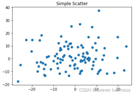
面向对象法是matplotlib库比较推荐的作图方法。
单元小结
matplotlib库基本作图,需要经常练习,然后熟练将数据用合适的图展现出来。
实例引力波绘制
数据下载

import numpy as np
import matplotlib.pyplot as plt
from scipy.io import wavfile ##用于读取波形文件

rate_h, hstrain= wavfile.read(r"H1_Strain.wav","rb")
rate_l, lstrain= wavfile.read(r"L1_Strain.wav","rb")
#reftime, ref_H1 = np.genfromtxt('GW150914_4_NR_waveform_template.txt').transpose()
reftime, ref_H1 = np.genfromtxt('wf_template.txt').transpose() #使用python123.io下载文件

htime_interval = 1/rate_h
ltime_interval = 1/rate_l
fig = plt.figure(figsize=(12, 6))

# 丢失信号起始点
htime_len = hstrain.shape[0]/rate_h
htime = np.arange(-htime_len/2, htime_len/2 , htime_interval)
plth = fig.add_subplot(221)
plth.plot(htime, hstrain, 'y')
plth.set_xlabel('Time (seconds)')
plth.set_ylabel('H1 Strain')
plth.set_title('H1 Strain')

ltime_len = lstrain.shape[0]/rate_l
ltime = np.arange(-ltime_len/2, ltime_len/2 , ltime_interval)
pltl = fig.add_subplot(222)
pltl.plot(ltime, lstrain, 'g')
pltl.set_xlabel('Time (seconds)')
pltl.set_ylabel('L1 Strain')
pltl.set_title('L1 Strain')

pltref = fig.add_subplot(212)
pltref.plot(reftime, ref_H1)
pltref.set_xlabel('Time (seconds)')
pltref.set_ylabel('Template Strain')
pltref.set_title('Template')
fig.tight_layout()

plt.savefig("Gravitational_Waves_Original.png")
plt.show()
plt.close(fig)