numpy+pandas+matplotlib数据可视化方法
本文总结了pandas+matplotlib数据可视化的几种方式,适合初学者入门学习。
import numpy as np
import matplotlib.pyplot as plt
import pandas as pd
%matplotlib inline
plt.rcParams["font.family"] = ['SimHei']
plt.rcParams["axes.unicode_minus"] = False
df = pd.DataFrame({"学号":["001","002","003"],
"身高":[140,150,160],
"体重":[50,52,55],
"语文":[89,60,78]
})
print(df)
df1 = df[["学号","语文"]]
print(df1)
df2 = df[["身高","体重"]]
print(df2)
   学号   身高  体重  语文
0  001  140  50  89
1  002  150  52  60
2  003  160  55  78
    学号  语文
0  001  89
1  002  60
2  003  78
    身高  体重
0  140  50
1  150  52
2  160  55
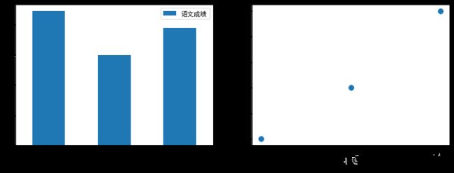
# 绘图方法1 plt.bar()  #切出数据后再绘图
# 绘图方法1 plt.scatter()  #切出数据后再绘图
fig = plt.figure(figsize =(12,4))
ax1 = fig.add_subplot(121)
plt.bar(x= df1["学号"],height = df1["语文"],label = "语文成绩")
plt.legend()

ax2 = fig.add_subplot(122)
plt.scatter(x = df2["身高"],y = df2["体重"],s = 60)

plt.show()
输出结果:

# 绘图方法2 plt.bar(data = df1)   #传入data绘图
# 绘图方法2 plt.scatter(data = df2)   #传入data绘图
fig = plt.figure(figsize =(12,4))
ax1 = fig.add_subplot(121)
plt.bar(x= "学号",height = "语文",data = df1,label = "语文成绩")  #传入data数据后,可以不用索引数据,直接引用列标签即可
plt.legend()

ax2 = fig.add_subplot(122)
plt.scatter(x = "身高",y = "体重",data = df2,s= 60)

plt.show()
输出结果:

# 绘图方法3 df1.plot(kind = "bar")
# 绘图方法3 df2.plot(kind = "scatter")
fig = plt.figure(figsize =(12,4))
ax1 = fig.add_subplot(121)
df1.plot(x = "学号",y = "语文",kind = "bar", ax = ax1,label = "语文成绩") #x是位置参数,可以省略。注意在存在子图的情况下,需要传入ax参数。
plt.legend()

ax2 = fig.add_subplot(122)
df2.plot(kind = "scatter",x = "身高",y = "体重",ax = ax2,s= 60)

plt.show()
输出结果:

# 绘图方法4 df1.plot.bar()
# 绘图方法4 df1.plot.scatter()
fig = plt.figure(figsize =(12,4))
ax1 = fig.add_subplot(121)
df1.plot.bar(x = "学号",y = "语文",ax = ax1,label = "语文成绩") #注意要传入ax参数
plt.legend()

ax2 = fig.add_subplot(122)
df2.plot.scatter(x = "身高",y = "体重",ax = ax2,s= 60)

plt.show()
输出结果:
总结:
以上仅示例了bar和scatter的绘图方法。其他图例类似。
用matplotplib+pandas绘图的方式,有多种,以bar为例:
(1)绘图方法1:plt.bar() #传入切出(指数据查询:索引或者切片等操作)的数据后再绘图
(2)绘图方法2:plt.bar(data = df1) #传入data绘图 ,传入data数据后,可以不用索引数据,直接引用列标签即可实现数据索引。
(3)绘图方法3 df1.plot(kind = "bar") 该方法不需要已经有df1,函数内部不需要重复传入data,若有子图,需要传入ax参数。
(4)绘图方法4 df1.plot.bar() 该方法不要指定kind类型。函数内部不需要重复传入data,若有子图,需要传入ax参数。