【Python百日进阶-数据分析】Day224 - plotly漏斗图px.funnel()
文章目录
- 一、语法
- 二、参数
- 三、返回值
- 四、实例
-
- 4.1 使用 plotly.express 的漏斗图
-
- 4.1.1 基本漏斗图
- 4.1.2 堆积漏斗图
- 4.1.3 基本区域漏斗图
- 4.2 使用 plotly.graph_objects 的漏斗图
-
- 4.2.1 基本漏斗图
- 4.2.2 设置标记大小和颜色
- 4.2.3 堆积漏斗图
- 4.2.4 基本区域漏斗图
- 4.2.5 在区域漏斗图中设置标记大小和颜色
- 4.2.6 多区域漏斗
一、语法
在漏斗图中,每一行都data_frame表示为漏斗的一个矩形扇区。
二、参数
-
data_frame ( DataFrame或类似数组的或dict ) – 需要传递此参数才能使用列名(而不是关键字名)。Array-like 和 dict 在内部转换为 pandas DataFrame。可选:如果缺少,则使用其他参数在后台构建 DataFrame。
-
x ( str或int或Series或array-like ) – 中的列名data_frame,或者 pandas Series 或 array_like 对象。此列或 array_like 中的值用于在笛卡尔坐标中沿 x 轴定位标记。或者可以是列引用列表或 array_likes 列表,在这种情况下,数据将被视为“宽”而不是“长” x。 y
-
y(str或int或Series或array-like)– 中的列名data_frame,或者 pandas Series 或 array_like 对象。此列或 array_like 中的值用于在笛卡尔坐标中沿 y 轴定位标记。或者可以是列引用列表或 array_likes 列表,在这种情况下,数据将被视为“宽”而不是“长” x。 y
-
color (str或int或Series或array-like)– 中的列名data_frame,或者 pandas Series 或 array_like 对象。此列或 array_like 中的值用于为标记分配颜色。
-
facet_row ( str或int或Series或array-like ) – 中的列名data_frame,或者 pandas Series 或 array_like 对象。此列或 array_like 中的值用于在垂直方向上为多面子图分配标记。
-
facet_col ( str或int或Series或array-like ) – 中的列名data_frame,或者 pandas Series 或 array_like 对象。此列或 array_like 中的值用于在水平方向上为多面子图分配标记。
-
facet_col_wrap ( int ) – 最大分面列数。以该宽度包装列变量,以便列分面跨越多行。如果为 0,则忽略,如果设置facet_row了或 a ,marginal则强制为 0。
-
facet_row_spacing ( float between 0 and 1 ) – 分面行之间的间距,以纸张为单位。使用 facet_col_wrap 时,默认值为 0.03 或 0.0.7。
-
facet_col_spacing ( float between 0 and 1 ) – 分面列之间的间距,以纸张为单位默认为 0.02。
-
hover_name(str或int或Series或array-like)- 中的列名data_frame,或者 pandas Series 或 array_like 对象。此列或 array_like 中的值在悬停工具提示中以粗体显示。
-
hover_data ( list of str or int , or Series or array-like , or dict ) – 或者 pandas Series 中的列名列表data_frame,或者是 array_like 对象或者以列名作为键的 dict,值为 True (默认为格式)False(为了从悬停信息中删除此列)或格式字符串,例如 ‘:.3f’ 或 ’ | %a’ 或类似列表的数据出现在悬停工具提示中,或带有布尔或格式化字符串的元组作为第一个元素,以及类似列表的数据作为第二个元素出现在悬停中 这些列中的值在悬停工具提示中显示为额外数据.
-
custom_data(str或int的列表,或Series或类似数组)——data_frame或 pandas Series 或 array_like 对象中的列名称这些列中的值是额外数据,例如用于小部件或 Dash 回调。此数据对用户不可见,但包含在图形发出的事件中(套索选择等)
-
text ( str或int或Series或array-like ) – 中的列名data_frame,或者 pandas Series 或 array_like 对象。此列或 array_like 中的值在图中显示为文本标签。
-
animation_frame ( str或int或Series或array-like ) – 中列的名称data_frame,或者 pandas Series 或 array_like 对象。此列或 array_like 中的值用于为动画帧分配标记。
-
animation_group ( str或int或Series或array-like ) – 中的列名data_frame,或者 pandas Series 或 array_like 对象。此列或 array_like 中的值用于提供跨动画帧的对象恒定性:具有匹配
animation_group的行将被视为描述每个帧中的相同对象。 -
category_orders(带有 str 键和 str 值列表的字典(默认{}))——默认情况下,在 Python 3.6+ 中,轴、图例和构面中的分类值的顺序取决于这些值第一次遇到的顺序data_frame(并且没有在低于 3.6 的 Python 中默认保证顺序)。此参数用于强制对每列的值进行特定排序。此 dict 的键应对应于列名,值应是与所需的特定显示顺序相对应的字符串列表。
-
labels (带有 str 键和 str 值的字典(默认{}))——默认情况下,列名在图中用于轴标题、图例条目和悬停。这个参数允许它被覆盖。此 dict 的键应对应于列名,值应对应于要显示的所需标签。
-
color_discrete_sequence ( list of str ) – 字符串应该定义有效的 CSS 颜色。当color设置为 且对应列中的值不是数字时,该列中的值通过color_discrete_sequence 按 中描述的顺序循环分配颜色category_orders,除非 的值 color是 中的键color_discrete_map。子模块中提供了各种有用的颜色序列plotly.express.colors,特别是plotly.express.colors.qualitative.
-
color_discrete_map (dict with str keys and str values (default {})) – 字符串值应该定义有效的 CSS-colors 用于覆盖 color_discrete_sequence以将特定颜色分配给与特定值对应的标记。中的键color_discrete_map应该是由 表示的列中的值color。或者,如果 的值color是有效颜色,则’identity’可以传递字符串以直接使用它们。
-
opacity ( float ) – 介于 0 和 1 之间的值。设置标记的不透明度。
-
orientation (str,‘h’水平或’v’垂直之一。) - (默认’v’如果提供 和x并且y都连续或都分类,否则’v’
('h' )是分类和 )是连续的,否则提供'h' )) ifx(yy(x’v’() if onlyx(y -
log_x (boolean (default False)) – 如果True是,x 轴在笛卡尔坐标中按对数缩放。
-
log_y (boolean (default False)) – 如果True是,y 轴在笛卡尔坐标中按对数缩放。
-
range_x (两个数字的列表) – 如果提供,则覆盖笛卡尔坐标中 x 轴上的自动缩放。
-
range_y (两个数字的列表) – 如果提供,则覆盖笛卡尔坐标中 y 轴上的自动缩放。
-
title ( str ) – 图形标题。
-
template(str或dict或plotly.graph_objects.layout.Template 实例)–图形模板名称(必须是 plotly.io.templates 中的键)或定义。
-
width (int (default None)) – 图形宽度(以像素为单位)。
-
height (int (default None)) – 以像素为单位的图形高度。
三、返回值
plotly.graph_objects.Figure
文章目录
- 一、语法
- 二、参数
- 三、返回值
- 四、实例
-
- 4.1 使用 plotly.express 的漏斗图
-
- 4.1.1 基本漏斗图
- 4.1.2 堆积漏斗图
- 4.1.3 基本区域漏斗图
- 4.2 使用 plotly.graph_objects 的漏斗图
-
- 4.2.1 基本漏斗图
- 4.2.2 设置标记大小和颜色
- 4.2.3 堆积漏斗图
- 4.2.4 基本区域漏斗图
- 4.2.5 在区域漏斗图中设置标记大小和颜色
- 4.2.6 多区域漏斗
四、实例
漏斗图通常用于表示业务流程不同阶段的数据。它是商业智能中识别流程潜在问题区域的重要机制。例如,它用于观察销售过程中每个阶段的收入或损失,并显示逐渐减少的值。每个阶段都显示为所有值总和的百分比。
4.1 使用 plotly.express 的漏斗图
4.1.1 基本漏斗图
import plotly.express as px
data = dict(
    number=[39, 27.4, 20.6, 11, 2],
    stage=["网站访问", "下载量", "潜在客户", "询价", "成交"])
fig = px.funnel(data, x='number', y='stage')
fig.show()

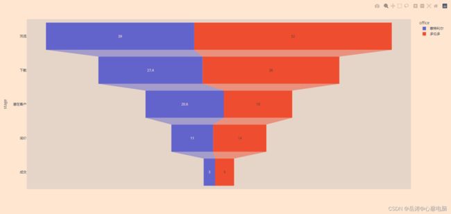
4.1.2 堆积漏斗图
import plotly.express as px
import pandas as pd
stages = ["浏览", "下载", "潜在客户", "询价", "成交"]
df_mtl = pd.DataFrame(dict(number=[39, 27.4, 20.6, 11, 3], stage=stages))
df_mtl['office'] = '蒙特利尔'
df_toronto = pd.DataFrame(dict(number=[52, 36, 18, 14, 5], stage=stages))
df_toronto['office'] = '多伦多'
df = pd.concat([df_mtl, df_toronto], axis=0)
fig = px.funnel(df, x='number', y='stage', color='office')
fig.show()
4.1.3 基本区域漏斗图
使用px.funnel_area,DataFrame 的每一行都表示为漏斗的一个阶段。
import plotly.express as px
fig = px.funnel_area(names=["The 1st","The 2nd", "The 3rd", "The 4th", "The 5th"],
                    values=[5, 4, 3, 2, 1])
fig.show()

4.2 使用 plotly.graph_objects 的漏斗图
4.2.1 基本漏斗图
from plotly import graph_objects as go

fig = go.Figure(go.Funnel(
    y = ["浏览", "下载", "潜在客户", "询价", "成交"],
    x = [39, 27.4, 20.6, 11, 2]))

fig.show()

4.2.2 设置标记大小和颜色
此示例使用textposition和textinfo来确定图表上显示的信息,并显示如何自定义条形。
from plotly import graph_objects as go

fig = go.Figure(go.Funnel(
    y = ["浏览", "下载", "潜在客户", "询价", "成交"],
    x = [39, 27.4, 20.6, 11, 2],
    textposition = "inside",
    textinfo = "value+percent initial",
    opacity = 0.65, marker = {"color": ["deepskyblue", "lightsalmon", "tan", "teal", "silver"],
    "line": {"width": [4, 2, 2, 3, 1, 1], "color": ["wheat", "wheat", "blue", "wheat", "wheat"]}},
    connector = {"line": {"color": "royalblue", "dash": "dot", "width": 3}})
    )

fig.show()

4.2.3 堆积漏斗图
from plotly import graph_objects as go

fig = go.Figure()

fig.add_trace(go.Funnel(
    name = 'Montreal',
    y = ["浏览", "下载", "潜在客户", "询价"],
    x = [120, 60, 30, 20],
    textinfo = "value+percent initial"))

fig.add_trace(go.Funnel(
    name = 'Toronto',
    orientation = "h",
    y = ["浏览", "下载", "潜在客户", "询价", "要约"],
    x = [100, 60, 40, 30, 20],
    textposition = "inside",
    textinfo = "value+percent previous"))

fig.add_trace(go.Funnel(
    name = 'Vancouver',
    orientation = "h",
    y = ["浏览", "下载", "潜在客户", "询价", "要约", "成交"],
    x = [90, 70, 50, 30, 10, 5],
    textposition = "outside",
    textinfo = "value+percent total"))

fig.show()

4.2.4 基本区域漏斗图
from plotly import graph_objects as go

fig = go.Figure(go.Funnelarea(
    text = ["The 1st","The 2nd", "The 3rd", "The 4th", "The 5th"],
    values = [5, 4, 3, 2, 1]
    ))
fig.show()

4.2.5 在区域漏斗图中设置标记大小和颜色
from plotly import graph_objects as go

fig = go.Figure(go.Funnelarea(
      values = [5, 4, 3, 2, 1], text = ["The 1st","The 2nd", "The 3rd", "The 4th", "The 5th"],
      marker = {"colors": ["deepskyblue", "lightsalmon", "tan", "teal", "silver"],
                "line": {"color": ["wheat", "wheat", "blue", "wheat", "wheat"], "width": [0, 1, 5, 0, 4]}},
      textfont = {"family": "Old Standard TT, serif", "size": 13, "color": "black"}, opacity = 0.65))
fig.show()

4.2.6 多区域漏斗
from plotly import graph_objects as go

fig = go.Figure()

fig.add_trace(go.Funnelarea(
    scalegroup = "first", values = [500, 450, 340, 230, 220, 110], textinfo = "value",
    title = {"position": "top center", "text": "Sales for Sale Person A in U.S."},
    domain = {"x": [0, 0.5], "y": [0, 0.5]}))

fig.add_trace(go.Funnelarea(
    scalegroup = "first", values = [600, 500, 400, 300, 200, 100], textinfo = "value",
    title = {"position": "top center", "text": "Sales of Sale Person B in Canada"},
    domain = {"x": [0, 0.5], "y": [0.55, 1]}))

fig.add_trace(go.Funnelarea(
    scalegroup = "second", values = [510, 480, 440, 330, 220, 100], textinfo = "value",
    title = {"position": "top left", "text": "Sales of Sale Person A in Canada"},
    domain = {"x": [0.55, 1], "y": [0, 0.5]}))

fig.add_trace(go.Funnelarea(
            scalegroup = "second", values = [360, 250, 240, 130, 120, 60],
            textinfo = "value", title = {"position": "top left", "text": "Sales of Sale Person B in U.S."},
            domain = {"x": [0.55, 1], "y": [0.55, 1]}))

fig.update_layout(
            margin = {"l": 200, "r": 200}, shapes = [
            {"x0": 0, "x1": 0.5, "y0": 0, "y1": 0.5},
            {"x0": 0, "x1": 0.5, "y0": 0.55, "y1": 1},
            {"x0": 0.55, "x1": 1, "y0": 0, "y1": 0.5},
            {"x0": 0.55, "x1": 1, "y0": 0.55, "y1": 1}])

fig.show()
