ggplot画 ump 和tsne 从seurat中使用addmodule得到的umap 使用ggplot画图
ggplot画 ump 和tsne 从seurat中使用addmodule得到的umap 使用ggplot画图
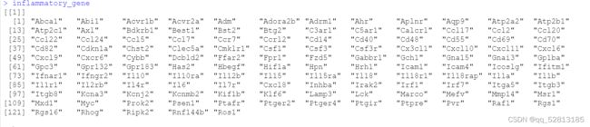
输入炎性基因
#对给定的基因集合进行打分
All.merge=AddModuleScore(All.merge,
features = inflammatory_gene,
name = “inflammatory_gene”)
#结果保存在这里
colnames([email protected])
library(ggplot2)
mydata<- FetchData(All.merge,vars = c(“UMAP_1”,“UMAP_2”,“inflammatory_gene1”,“stim”))
head(mydata)
a <- ggplot(mydata,aes(x = UMAP_1,y =UMAP_2,colour = inflammatory_gene1))
geom_point(size = 1)+
scale_color_gradientn(values = seq(0,1,0.2),colours = c(‘blue’,‘cyan’,‘green’,‘yellow’,‘orange’,‘red’))
a+ theme_bw() + theme(panel.border = element_blank(), panel.grid.major = element_blank(),
panel.grid.minor = element_blank(), axis.line = element_line(colour = “black”))
data<- FetchData(All.merge,vars = c(“cell.type”,“inflammatory_gene1”))
p <- ggplot(data,aes(cell.type,inflammatory_gene1))
p+geom_boxplot()+theme_bw()+RotatedAxis()
mydata<- FetchData(All.merge,vars = c(“UMAP_1”,“UMAP_2”,“inflammatory_gene1”,“stim”))
head(mydata)
dev.off()
a <- ggplot(mydata,aes(x = UMAP_1,y =UMAP_2,
colour = inflammatory_gene1))+
geom_point(size = 1)+
scale_color_gradientn(values = seq(0,1,0.2),colours = c(‘blue’,‘cyan’,‘green’,‘yellow’,‘orange’,‘red’))
a+ theme_bw() + theme(panel.border = element_blank(), panel.grid.major = element_blank(),
panel.grid.minor = element_blank(), axis.line = element_line(colour = “black”))
#####富集得分 富集分数
head(mydata)

ggplot(mydata,aes(x = UMAP_1,y =UMAP_2,
colour = inflammatory_gene1))+geom_point(size = 1)+
scale_color_gradientn(values = seq(0,1,0.2),colours = c(‘blue’,‘cyan’,‘green’,‘yellow’,‘orange’,‘red’))+
facet_wrap(~stim)
结果展示

###https://www.jianshu.com/p/67d2decf5517
head([email protected])
mydata<- FetchData(All.merge,vars = c(“UMAP_1”,“UMAP_2”,“inflammatory_gene1”,“stim”,“cell.type”))
head(mydata)
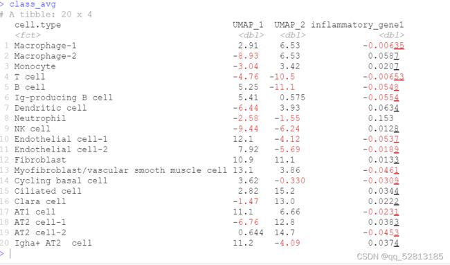
class_avg <- mydata %>%
group_by(cell.type) %>%
summarise(
UMAP_1 = median(UMAP_1),
UMAP_2 = median(UMAP_2),
inflammatory_gene1=mean(inflammatory_gene1)
)
head(class_avg)

#https://ggplot2.tidyverse.org/reference/geom_text.html
#https://ggplot2-book.org/annotations.html?q=text#annotations
pdf(“inflammatoryscore.pdf”,width = 15,height = 10)
p=ggplot(mydata,aes(x = UMAP_1,y =UMAP_2,
colour = inflammatory_gene1))+geom_point(size = 1)+
scale_color_gradientn(values = seq(0,1,0.2),colours = c(‘blue’,‘cyan’,‘green’,‘yellow’,‘orange’,‘red’))+ #face = c(“plain”, “bold”, “italic”)
geom_text(aes(label = cell.type,fontface=“plain”,family=“sans”), data = class_avg,colour = “red”)+ # ggrepel::geom_text_repel(aes(label = cell.type), data = class_avg) +#添加标签
theme(text=element_text(family=“sans”,size=18)) +
facet_wrap(~stim)+
theme(panel.background = element_rect(fill=‘white’, colour=‘black’),
panel.grid=element_blank(), axis.title = element_text(color=‘black’,
family=“Arial”,size=18),axis.ticks.length = unit(0.4,“lines”),
axis.ticks = element_line(color=‘black’),
axis.ticks.margin = unit(0.6,“lines”),
axis.line = element_line(colour = “black”),
axis.title.x=element_text(colour=‘black’, size=18),
axis.title.y=element_text(colour=‘black’, size=18),
axis.text=element_text(colour=‘black’,size=18),
legend.title=element_blank(),
legend.text=element_text(family=“Arial”, size=18),
legend.key=element_blank())+
theme(plot.title = element_text(size=22,colour = “black”,face = “bold”)) +
guides(colour = guide_legend(override.aes = list(size=5)))
print§
dev.off()
ggplot2::ggplot(data = mydata,mapping = aes(x = UMAP_1,y =UMAP_2,colour = inflammatory_gene1,
fill=stim))+
geom_bar(stat = “identity”,position = “stack”) #stat = "identity"条形的高度表示数据的值,由aes()函数的y参数决定的
ggplot(mydata, aes(x = UMAP_1,y =UMAP_2))+
geom_boxplot(aes(fill = stim),position=position_dodge(0.5),width=0.6)
#https://www.jianshu.com/p/8d65a13dbc88
使用plot函数可视化UMAP的结果
head(mydata)
mystim=factor(mydata$stim)
head(mystim)
plot(mydata[,c(1,2)],col=mystim,pch=16,asp = 1,
xlab = “UMAP_1”,ylab = “UMAP_2”,
main = “A UMAP visualization of the All.merge”)
添加分隔线
abline(h=0,v=0,lty=2,col=“gray”)
添加图例
legend(“topright”,title = “Species”,inset = 0.01,
legend = unique(mystim),pch=16,
col = unique(mystim))
#######################################
使用ggplot2包可视化UMAP降维的结果
library(ggplot2)
head(mydata)
ggplot(mydata,aes(UMAP_1,UMAP_2,color=stim)) +
geom_point() + theme_bw() +
geom_hline(yintercept = 0,lty=2,col=“red”) +
geom_vline(xintercept = 0,lty=2,col=“blue”,lwd=1) +
theme(plot.title = element_text(hjust = 0.5)) +
labs(x=“UMAP_1”,y=“UMAP_2”,
title = “A UMAP visualization of the iris dataset”)

结果展示