前端基础(一)
目录
1.对HTML语义化的理解
2.DOCTYPE(⽂档类型) 的作⽤
3.HTML5有哪些更新
4.行内元素有哪些?块级元素有哪些?
6.伪元素和伪类的区别和作用
7.标准盒子和怪异盒子(IE盒子)
8.对精灵图CSS Sprites 的理解
9.单行、多行文本溢出隐藏
10.如何用 Webpack 实现对 CSS 的处理
11.两栏布局的实现
12.三栏布局的实现
13.水平垂直居中的实现
14.实现一个三角形
(1)三角1
(2)三角2
(3)三角3
(4)三角4
(5)总结
15. 居中布局
16.去除浮动影响,防止父级高度塌陷
17.什么是BFC?BFC有什么特性?如何创建BFC?BFC有什么作用?
(1)什么是BFC?
(2)BFC有什么特性?
(3)如何创建BFC?
(4)BFC有什么作用
1.对HTML语义化的理解
HTML语义化就是说在css加载失败或者没有css的情况下,页面也能呈现出清晰的结构。
同时HTML5也出了很多新的语义化标签,例如header,nav,footer,main。
2.DOCTYPE(⽂档类型) 的作⽤
DOCTYPE是为了告诉浏览器应该以什么类型(html,xhtml)去解析文档,从而更好的展现页面
3.HTML5有哪些更新
(1)新增了一些语义化标签
header,nav,aside,footer
(2)新增了音频audio,视频video标签
(3)新增存储属性localStorge,sessionStorge
4.行内元素有哪些?块级元素有哪些?
(1)行内元素:不独占一行,不可以设置宽高 span img a
(2)块级元素:独占一行,可以设置宽高 div p h1-h5
5.display:none与visibility:hidden的区别
display隐藏,元素不占据位置
visibility隐藏,元素占据位置
6.伪元素和伪类的区别和作用
(1)伪元素:在内容元素的前后插入额外的元素或样式,但是这些元素实际上并不在文档中生成 ,他们只是在外部显示可见,并不能在文档的源码中找到他们::
p::before {content:"第一章:";}
p::after {content:"Hot!";}
p::first-line {background:red;}
p::first-letter {font-size:30px;}
(2)伪类是为了给元素添加一些特殊的效果, 用于已有元素处于某种状态时(滑动、点击等)为其添加对应的样式,不会产生新的元素
他是例如鼠标经过或者已有元素上添加类别的,不会产生新的元素
a:hover {color: #FF00FF}
p:first-child {color: red}
7.标准盒子和怪异盒子(IE盒子)
标准盒子的宽度和高度只包括content,标准盒子box-sizeing:content-box
怪异盒子的宽度和高度包括content,padding,border,怪异盒子box-sizeing:border-box
8.对精灵图CSS Sprites 的理解
CSSSprites(精灵图),将一个页面涉及到的所有图片都包含到一张大图中去,然后利用CSS的 background-image,background-repeat,background-position属性的组合进行背景定位。
9.单行、多行文本溢出隐藏
单行文本溢出
overflow:hidder;//溢出隐藏
text-overflow:ellipsis;//溢出用省略号显示
white-space:nowrap;//规定段落中的文本不进行换行
多行文本溢出
overflow: hidden;            // 溢出隐藏
text-overflow: ellipsis;     // 溢出用省略号显示
display:-webkit-box;         // 作为弹性伸缩盒子模型显示。
-webkit-box-orient:vertical; // 设置伸缩盒子的子元素排列方式:从上到下垂直排列
-webkit-line-clamp:3;        // 显示的行数
10.如何用 Webpack 实现对 CSS 的处理
Webpack 中操作 CSS 需要使用的两个关键的 loader:css-loader 和 style-loader
注意,答出“用什么”有时候可能还不够,面试官会怀疑你是不是在背答案,所以你还需要了解每个 loader 都做了什么事情:
-
css-loader:导入 CSS 模块,对 CSS 代码进行编译处理;
-
style-loader:创建style标签,把 CSS 内容写入标签。
11.两栏布局的实现
一般两栏布局指的是左边一栏宽度固定,右边一栏宽度自适应,两栏布局的具体实现:
-
利用浮动,将左边元素宽度设置为200px,并且设置向左浮动。将右边元素的margin-left设置为200px,宽度设置为100%(默认为auto,撑满整个父元素)。
.left {
      float: left;
      width: 200px;
      background-color: aqua;
    }
    .right {
      width: 100%;
      margin-left: 200px;
      background-color: bisque;
    }
定位方法:给父级盒子添加position:relative,固定一侧的盒子position:absolute,另一侧宽度100%,但是要给右侧盒子添加margin-left:左侧盒子宽度,不然就会右侧盒子的宽度为整个浏览器的宽度
leftleftleftlefleftlef
right
.fater {
position: relative;
}
.fater .left1 {
width: 200px;
height: 200px;
position: absolute;
background-color: blue;
}
.fater .right1 {
margin-left: 200px;
height: 200px;
width: 100%;
background-color: rgb(189, 189, 223);
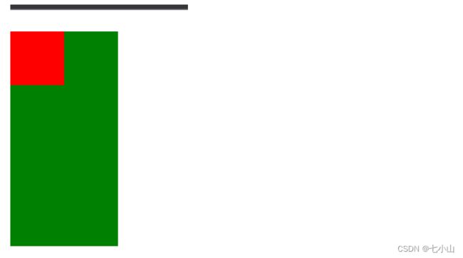
}12.三栏布局的实现
-
利用绝对定位,左右两栏设置为绝对定位,中间设置对应方向大小的margin的值。
left
center
right
.outer {
position: relative;
height: 100px;
}
.left {
position: absolute;
width: 200px;
height: 100px;
background: tomato;
}
.right {
position: absolute;
top: 0;
right: 0;
width: 200px;
height: 100px;
background: gold;
}
.center {
margin-left: 200px;
margin-right: 200px;
height: 100px;
background: lightgreen;
}-
利用flex布局,左右两栏设置固定大小,中间一栏设置为flex:1
.outer { display: flex; height: 100px; } .left { width: 100px; background: tomato; } .right { width: 100px; background: gold; } .center { flex: 1; background: lightgreen; }leftcenterright
13.水平垂直居中的实现
-
利用绝对定位,父元素设置relative,子元素设置top50%,left50%,同时设置绝对定位absolute,还要通过 transform(转换): (位移)translate(-50%,-50%);}
 .fater {
      position: relative;
      height: 200px;
      background-color: aqua;
    }
    .child {
      position: absolute;
      top: 50%;
      left: 50%;
      transform: translate(-50%, -50%);
    }

      child
使用flex布局,通过align-items:center和justify-content:center设置容器的垂直和水平方向上为居中对齐,然后它的子元素也可以实现垂直和水平的居中。该方法要考虑兼容的问题,该方法在移动端用的较多:
.fater {
      display: flex;
      justify-content: center;
      align-items: center;
      height: 200px;
      background-color: aqua;
    }

      child

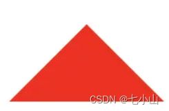
14.实现一个三角形
CSS绘制三角形主要用到的是border属性,也就是边框。
平时在给盒子设置边框时,往往都设置很窄,就可能误以为边框是由矩形组成的。实际上,border属性是右三角形组成的,下面看一个例子:
div {
    width: 0;
    height: 0;
    border: 100px solid;
    border-color: orange blue red green;
}
将元素的长宽都设置为0,显示出来的效果是这样的:

所以可以根据border这个特性来绘制三角形
(1)三角1
div {    width: 0;
         height: 0;
         border-top: 50px solid red;
         border-right: 50px solid transparent;
         border-left: 50px solid transparent;
}
(2)三角2
div {
    width: 0;
    height: 0;
    border-bottom: 50px solid red;
    border-right: 50px solid transparent;
    border-left: 50px solid transparent;
}
(3)三角3
div {
    width: 0;
    height: 0;
    border-left: 50px solid red;
    border-top: 50px solid transparent;
    border-bottom: 50px solid transparent;
}
(4)三角4
div {
    width: 0;
    height: 0;
    border-right: 50px solid red;
    border-top: 50px solid transparent;
    border-bottom: 50px solid transparent;
}
还有很多,就不一一实现了,总体的原则就是通过上下左右边框来控制三角形的方向,用边框的宽度比来控制三角形的角度。
(5)总结
三角形的底边朝哪边那边的border就有颜色
15. 居中布局
-
水平居中
-
行内元素:
text-align: center -
块级元素:
margin: 0 auto -
absolute + transform -
flex + justify-content: center
-
-
垂直居中
-
line-height: height -
absolute + transform -
flex + align-items: center -
table
-
-
水平垂直居中
-
absolute + transform -
flex + justify-content + align-items
-
16.去除浮动影响,防止父级高度塌陷
-
通过增加伪元素清除浮动
:after / : clear: both -
创建父级 BFC
-
父级设置高度
17.什么是BFC?BFC有什么特性?如何创建BFC?BFC有什么作用?
(1)什么是BFC?
BFC全称是Block Formatting Context,意思就是块级格式化上下文。你可以把BFC看做一个容器,容器里边的元素不会影响到容器外部的元素。
(2)BFC有什么特性?
BFC是一个块级元素,块级元素在垂直方向上依次排列。
BFC是一个独立的容器,内部元素不会影响容器外部的元素。
属于同一个BFC的两个盒子,外边距margin会发生重叠,并且取最大外边距。
代码:
Document
box1
box2

计算BFC高度时,浮动元素也要参与计算。
(3)如何创建BFC?
给父级元素添加以下任意样式
-
overflow: hidden;
-
display: flex;
-
display: inline-flex;
-
display: inline-block;
-
position: absolute;
-
position: fixed; Tip:记住这几个常用的就可以了。
(4)BFC有什么作用?
解决当父级元素没有高度时,子级元素浮动会使父级元素高度塌陷的问题
Document

解决后代码:
Document

解决子级元素外边距会使父级元素塌陷的问题
解决前源码:
Document
解决后源码:
Document
