Matplotlib从入门到精通02-层次元素和容器
Matplotlib从入门到精通02-层次元素和容器
-
- 总结
- Matplotlib三个层次
-
- Matplotlib由三个不同的层次结构组成:
- Artist的分类-primitives和containers
- 基本元素 - primitives-01-Line2D
-
- 1)以Line2D为例
-
- 设置Line2D的属性的3种方法
- 绘制直线line的2种方法:
- 2) errorbar绘制误差折线图
- 基本元素 - primitives-02-patches
-
- a. Rectangle-矩形
-
- 1) hist-直方图
-
- 基于hist
- 基于Rectangle绘制直方图
- 2) bar-柱状图
- b. Polygon-多边形
- c. Wedge-契形
- 基本元素 - primitives-03-collections
- 基本元素 - primitives-04-images
- 容器-container-01-Figure容器
- 容器-container-02-Axes容器
- 容器-container-03- Axis容器
- 容器-container-04-Tick容器
参考:
https://datawhalechina.github.io/fantastic-matplotlib/%E7%AC%AC%E4%B8%80%E5%9B%9E%EF%BC%9AMatplotlib%E5%88%9D%E7%9B%B8%E8%AF%86/index.html
http://c.biancheng.net/matplotlib/data-visual.html
https://www.bookstack.cn/read/huaxiaozhuan-ai/333f5abdbabf383d.md
总结
本文主要是Matplotlib从入门到精通系列第2篇,本文介绍了Matplotlib的历史,绘图元素的概念以及Matplotlib的多个层级,同时介绍了较好的参考文档置于博客前面,读者可以重点查看参考链接。本系列的目的是可以完整的完成Matplotlib从入门到精通。重点参考连接

Matplotlib三个层次
Matplotlib由三个不同的层次结构组成:
1)脚本层
Matplotlib结构中的最顶层。我们编写的绘图代码大部分代码都在该层运行,它的主要工作是负责生成图形与坐标系。
2)美工层
Matplotlib结构中的第二层,它提供了绘制图形的元素时的给各种功能,例如,绘制标题、轴标签、坐标刻度等。
3)后端层
Matplotlib结构最底层,它定义了三个基本类,首先是FigureCanvas(图层画布类),它提供了绘图所需的画布,其次是Renderer(绘图操作类),它提供了在画布上进行绘图的各种方法,最后是Event(事件处理类),它提供了用来处理鼠标和键盘事件的方法。

matplotlib.backend_bases.FigureCanvas 代表了绘图区,所有的图像都是在绘图区完成的
matplotlib.backend_bases.Renderer 代表了渲染器,可以近似理解为画笔,控制如何在 FigureCanvas 上画图。
matplotlib.artist.Artist 代表了具体的图表组件,即调用了Renderer的接口在Canvas上作图。
前两者处理程序和计算机的底层交互的事项,第三项Artist就是具体的调用接口来做出我们想要的图,比如图形、文本、线条的设定。所以通常来说,我们95%的时间,都是用来和matplotlib.artist.Artist类打交道
matplotlib的原理或者说基础逻辑是,用Artist对象在画布(canvas)上绘制(Render)图形。
就和人作画的步骤类似:
准备一块画布或画纸
准备好颜料、画笔等制图工具
作画
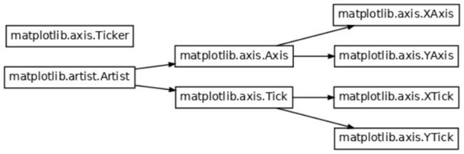
Artist的分类-primitives和containers
参考:https://datawhalechina.github.io/fantastic-matplotlib/%E7%AC%AC%E4%BA%8C%E5%9B%9E%EF%BC%9A%E8%89%BA%E6%9C%AF%E7%94%BB%E7%AC%94%E8%A7%81%E4%B9%BE%E5%9D%A4/index.html#id2
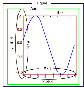
Artist有两种类型:primitives原生的 和containers容器。
primitive是基本要素,它包含一些我们要在绘图区作图用到的标准图形对象,如曲线Line2D,文字text,矩形Rectangle,图像image等。
container是容器,即用来装基本要素的地方,包括图形figure、坐标系Axes和坐标轴Axis。他们之间的关系如下图所示:
artist类可以参考下图。
第一列表示matplotlib中子图上的辅助方法,可以理解为可视化中不同种类的图表类型,如柱状图,折线图,直方图等,这些图表都可以用这些辅助方法直接画出来,属于更高层级的抽象。
第二列表示不同图表背后的artist类,比如折线图方法plot在底层用到的就是Line2D这一artist类。
第三列是第二列的列表容器,例如所有在子图中创建的Line2D对象都会被自动收集到ax.lines返回的列表中。

基本元素 - primitives-01-Line2D
基本元素 - primitives。primitives 的几种类型:曲线-Line2D,矩形-Rectangle,多边形-Polygon,图像-image。
1)以Line2D为例
参考:https://matplotlib.org/stable/api/_as_gen/matplotlib.lines.Line2D.html
https://datawhalechina.github.io/fantastic-matplotlib/%E7%AC%AC%E4%B8%80%E5%9B%9E%EF%BC%9AMatplotlib%E5%88%9D%E7%9B%B8%E8%AF%86/index.html
在matplotlib中曲线的绘制,主要是通过类 matplotlib.lines.Line2D 来完成的。
matplotlib中线-line的含义:它表示的可以是连接所有顶点的实线样式,也可以是每个顶点的标记。此外,这条线也会受到绘画风格的影响,比如,我们可以创建虚线种类的线。
class matplotlib.lines.Line2D(xdata, ydata, *, linewidth=None,
linestyle=None, color=None, gapcolor=None, marker=None,
markersize=None, markeredgewidth=None, markeredgecolor=None,
markerfacecolor=None, markerfacecoloralt='none', fillstyle=None,
antialiased=None, dash_capstyle=None, solid_capstyle=None,
dash_joinstyle=None, solid_joinstyle=None, pickradius=5,
drawstyle=None, markevery=None, **kwargs)[
xdata:需要绘制的line中点的在x轴上的取值,若忽略,则默认为range(1,len(ydata)+1)
ydata:需要绘制的line中点的在y轴上的取值
linewidth:线条的宽度
linestyle:线型
color:线条的颜色
marker:点的标记,详细可参考markers API
markersize:标记的size
设置Line2D的属性的3种方法
有三种方法可以用设置线的属性。
直接在plot()函数中设置
通过获得线对象,对线对象进行设置
获得线属性,使用setp()函数设置
from matplotlib import pyplot as plt

# 设置x和y的值
x = range(0,5)
y = [2,5,7,8,10]

# 1) 直接在plot()函数中设置
plt.plot(x,y, linewidth=10); # 设置线的粗细参数为10
plt.show()

# 2) 通过获得线对象,对线对象进行设置
line, = plt.plot(x, y, ':') # 这里等号左边的line,是一个列表解包的操作,目的是获取plt.plot返回列表中的Line2D对象
line.set_antialiased(False); # 关闭抗锯齿功能
plt.show()

# 3) 获得线属性,使用setp()函数设置
lines = plt.plot(x, y)
plt.setp(lines, color='r', linewidth=10);
plt.show()


绘制直线line的2种方法:
介绍两种绘制直线line常用的方法:
plot方法绘制
Line2D对象绘制
- plot方法绘制
from matplotlib import pyplot as plt
# 1. plot方法绘制
x = range(0,5)
y1 = [2,5,7,8,10]
y2= [3,6,8,9,11]
fig,ax= plt.subplots()
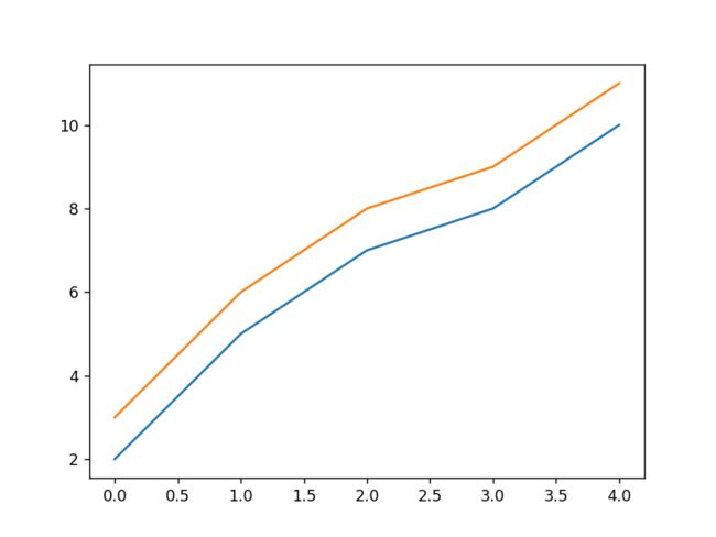
ax.plot(x,y1)
ax.plot(x,y2)
print(ax.lines); # 通过直接使用辅助方法画线,打印ax.lines后可以看到在matplotlib在底层创建了两个Line2D对象
# 输出为:
2. Line2D对象绘制
from matplotlib import pyplot as plt
from matplotlib.lines import Line2D
# 2. Line2D对象绘制
x = range(0,5)
y1 = [2,5,7,8,10]
y2= [3,6,8,9,11]
fig,ax= plt.subplots()
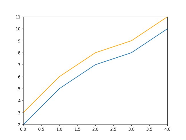
lines = [Line2D(x, y1), Line2D(x, y2,color='orange')] # 显式创建Line2D对象
for line in lines:
ax.add_line(line) # 使用add_line方法将创建的Line2D添加到子图中
ax.set_xlim(0,4)
ax.set_ylim(2, 11);
plt.show()
2) errorbar绘制误差折线图
参考:
matplotlib基础绘图命令之errorbar
官方文档errorbar
pyplot里有个专门绘制误差线的功能,通过errorbar类实现,它的构造函数:
matplotlib.pyplot.errorbar(x, y, yerr=None, xerr=None, fmt='',
ecolor=None, elinewidth=None, capsize=None, barsabove=False,
lolims=False, uplims=False, xlolims=False, xuplims=False,
errorevery=1, capthick=None, *, data=None, **kwargs)
其中最主要的参数是前几个:
x:需要绘制的line中点的在x轴上的取值
y:需要绘制的line中点的在y轴上的取值
yerr:指定y轴水平的误差
xerr:指定x轴水平的误差
fmt:指定折线图中某个点的颜色,形状,线条风格,例如‘co–’
ecolor:指定error bar的颜色
elinewidth:指定error bar的线条宽度
绘制errorbar
import numpy as np
import matplotlib.pyplot as plt


fig = plt.figure()
x = np.arange(10)
y = 2.5 * np.sin(x / 20 * np.pi)
yerr = np.linspace(0.05, 0.2, 10)

plt.errorbar(x, y + 3, yerr=yerr, label='both limits (default)')

plt.errorbar(x, y + 2, yerr=yerr, uplims=True, label='uplims=True')

plt.errorbar(x, y + 1, yerr=yerr, uplims=True, lolims=True,
             label='uplims=True, lolims=True')

upperlimits = [True, False] * 5
lowerlimits = [False, True] * 5
plt.errorbar(x, y, yerr=yerr, uplims=upperlimits, lolims=lowerlimits,
             label='subsets of uplims and lolims')

plt.legend(loc='lower right')

plt.show()

import numpy as np
import matplotlib.pyplot as plt

upperlimits = [True, False] * 5
lowerlimits = [False, True] * 5

fig = plt.figure()
x = np.arange(10) / 10
y = (x + 0.1)**2

plt.errorbar(x, y, xerr=0.1, xlolims=True, label='xlolims=True')
y = (x + 0.1)**3

plt.errorbar(x + 0.6, y, xerr=0.1, xuplims=upperlimits, xlolims=lowerlimits,
             label='subsets of xuplims and xlolims')

y = (x + 0.1)**4
plt.errorbar(x + 1.2, y, xerr=0.1, xuplims=True, label='xuplims=True')

plt.legend()

plt.show()

基本元素 - primitives-02-patches
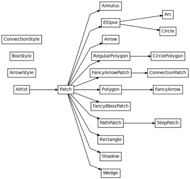
matplotlib.patches.Patch类是二维图形类,并且它是众多二维图形的父类,它的所有子类见matplotlib.patches API ,
Patches are Artists with a face color and an edge color.
Patch类的构造函数:
Patch(edgecolor=None, facecolor=None, color=None, linewidth=None,
linestyle=None, antialiased=None, hatch=None, fill=True,
capstyle=None, joinstyle=None, **kwargs)
本小节重点讲述三种最常见的子类,矩形,多边形和楔形。
a. Rectangle-矩形
A rectangle defined via an anchor point xy and its width and height.
Rectangle矩形类在官网中的定义是: 通过锚点xy及其宽度和高度生成。
Rectangle本身的主要比较简单,即xy控制锚点,width和height分别控制宽和高。它的构造函数:
class matplotlib.patches.Rectangle(xy, width, height, angle=0.0, **kwargs)
在实际中最常见的矩形图是hist直方图和bar条形图。
1) hist-直方图
基于hist
matplotlib.pyplot.hist(x,bins=None,range=None, density=None,
bottom=None, histtype='bar', align='mid', log=False, color=None,
label=None, stacked=False, normed=None)
下面是一些常用的参数:
x: 数据集,最终的直方图将对数据集进行统计
bins: 统计的区间分布
range: tuple, 显示的区间,range在没有给出bins时生效
density: bool,默认为false,显示的是频数统计结果,为True则显示频率统计结果,这里需要注意,频率统计结果=区间数目/(总数*区间宽度),和normed效果一致,官方推荐使用density
histtype: 可选{‘bar’, ‘barstacked’, ‘step’, ‘stepfilled’}之一,默认为bar,推荐使用默认配置,step使用的是梯状,stepfilled则会对梯状内部进行填充,效果与bar类似
align: 可选{‘left’, ‘mid’, ‘right’}之一,默认为’mid’,控制柱状图的水平分布,left或者right,会有部分空白区域,推荐使用默认
log: bool,默认False,即y坐标轴是否选择指数刻度
stacked: bool,默认为False,是否为堆积状图
import numpy as np
import matplotlib.pyplot as plt

# hist绘制直方图
x=np.random.randint(0,100,100) #生成[0-100)之间的100个数据,即 数据集
bins=np.arange(0,101,10) #设置连续的边界值,即直方图的分布区间[0,10),[10,20)...
plt.hist(x,bins,color='fuchsia',alpha=0.5)#alpha设置透明度,0为完全透明
plt.xlabel('scores')
plt.ylabel('count')
plt.xlim(0,100); #设置x轴分布范围 plt.show()

plt.show()
输出为:

基于Rectangle绘制直方图
- 导入依赖
import numpy as np
import pandas as pd
import matplotlib.pyplot as plt
import re
- 初始化数据
# hist绘制直方图
x=np.random.randint(0,100,100) #生成[0-100)之间的100个数据,即 数据集
bins=np.arange(0,101,10) #设置连续的边界值,即直方图的分布区间[0,10),[10,20)...

# Rectangle矩形类绘制直方图
df = pd.DataFrame(columns = ['data'])
df.loc[:,'data'] = x
print("df-->\n",df)
print("--------------------------")
"""
df-->
     data
0     93
1     22
2     75
3     44
4     59
..   ...
95     6
96    90
97    90
98    60
99    32

[100 rows x 1 columns]
--------------------------
"""
- 分组数据
df['fenzu'] = pd.cut(df['data'], bins=bins, right = False,include_lowest=True)

print("fenzu-->\n",df)
print("--------------------------")
"""
fenzu-->
     data      fenzu
0     93  [90, 100)
1     22   [20, 30)
2     75   [70, 80)
3     44   [40, 50)
4     59   [50, 60)
..   ...        ...
95     6    [0, 10)
96    90  [90, 100)
97    90  [90, 100)
98    60   [60, 70)
99    32   [30, 40)

[100 rows x 2 columns]
--------------------------
"""
- 统计分组数量
df_cnt = df['fenzu'].value_counts().reset_index()
print("df_cnt-->\n",df_cnt)
print("--------------------------")
"""
df_cnt-->
        index  fenzu
0   [40, 50)     13
1   [70, 80)     13
2   [60, 70)     11
3   [20, 30)     10
4   [30, 40)     10
5   [50, 60)     10
6  [90, 100)     10
7    [0, 10)      9
8   [80, 90)      8
9   [10, 20)      6
--------------------------
"""
- 统计最小最大宽度的值
df_cnt.loc[:,'mini'] = df_cnt['index'].astype(str).map(lambda x:re.findall('\[(.*)\,',x)[0]).astype(int)
df_cnt.loc[:,'maxi'] = df_cnt['index'].astype(str).map(lambda x:re.findall('\,(.*)\)',x)[0]).astype(int)
df_cnt.loc[:,'width'] = df_cnt['maxi']- df_cnt['mini']
print("df_cnt_minmaxwidth-->\n",df_cnt)
print("--------------------------")
"""
df_cnt_minmaxwidth-->
        index  fenzu  mini  maxi  width
0   [70, 80)     13    70    80     10
1   [10, 20)     12    10    20     10
2   [80, 90)     12    80    90     10
3   [30, 40)     11    30    40     10
4   [60, 70)     11    60    70     10
5   [20, 30)     10    20    30     10
6   [40, 50)     10    40    50     10
7    [0, 10)      9     0    10     10
8   [50, 60)      7    50    60     10
9  [90, 100)      5    90   100     10
--------------------------
"""
- 排序并重置索引
df_cnt.sort_values('mini',ascending = True,inplace = True)
print("df_cnt_sortvalues-->\n",df_cnt)
print("--------------------------")
"""
df_cnt_sortvalues-->
        index  fenzu  mini  maxi  width
1    [0, 10)     13     0    10     10
0   [10, 20)     14    10    20     10
2   [20, 30)     11    20    30     10
6   [30, 40)      9    30    40     10
8   [40, 50)      7    40    50     10
9   [50, 60)      6    50    60     10
3   [60, 70)     11    60    70     10
5   [70, 80)     10    70    80     10
7   [80, 90)      8    80    90     10
4  [90, 100)     11    90   100     10
--------------------------
"""
df_cnt.reset_index(inplace = True,drop = True)
print("df_cnt_resetindex-->\n",df_cnt)
print("--------------------------")
"""
df_cnt_resetindex-->
        index  fenzu  mini  maxi  width
0    [0, 10)     13     0    10     10
1   [10, 20)     14    10    20     10
2   [20, 30)     11    20    30     10
3   [30, 40)      9    30    40     10
4   [40, 50)      7    40    50     10
5   [50, 60)      6    50    60     10
6   [60, 70)     11    60    70     10
7   [70, 80)     10    70    80     10
8   [80, 90)      8    80    90     10
9  [90, 100)     11    90   100     10
--------------------------
"""
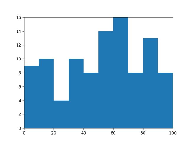
- 用Rectangle把hist绘制出来
#用Rectangle把hist绘制出来

fig = plt.figure()
ax1 = fig.add_subplot(111)

for i in df_cnt.index:
    rect =  plt.Rectangle((df_cnt.loc[i,'mini'],0),df_cnt.loc[i,'width'],df_cnt.loc[i,'fenzu'])
    print('rect-->',rect)
    ax1.add_patch(rect)
"""
rect--> Rectangle(xy=(0, 0), width=10, height=10, angle=0)
rect--> Rectangle(xy=(10, 0), width=10, height=14, angle=0)
rect--> Rectangle(xy=(20, 0), width=10, height=11, angle=0)
rect--> Rectangle(xy=(30, 0), width=10, height=6, angle=0)
rect--> Rectangle(xy=(40, 0), width=10, height=12, angle=0)
rect--> Rectangle(xy=(50, 0), width=10, height=10, angle=0)
rect--> Rectangle(xy=(60, 0), width=10, height=13, angle=0)
rect--> Rectangle(xy=(70, 0), width=10, height=8, angle=0)
rect--> Rectangle(xy=(80, 0), width=10, height=5, angle=0)
rect--> Rectangle(xy=(90, 0), width=10, height=11, angle=0)
"""
ax1.set_xlim(0, 100)
ax1.set_ylim(0, 16)

plt.show()
完整代码
import numpy as np
import pandas as pd
import matplotlib.pyplot as plt
import re

# hist绘制直方图
x=np.random.randint(0,100,100) #生成[0-100)之间的100个数据,即 数据集
bins=np.arange(0,101,10) #设置连续的边界值,即直方图的分布区间[0,10),[10,20)...

# Rectangle矩形类绘制直方图
df = pd.DataFrame(columns = ['data'])
df.loc[:,'data'] = x
df['fenzu'] = pd.cut(df['data'], bins=bins, right = False,include_lowest=True)

df_cnt = df['fenzu'].value_counts().reset_index()
df_cnt.loc[:,'mini'] = df_cnt['index'].astype(str).map(lambda x:re.findall('\[(.*)\,',x)[0]).astype(int)
df_cnt.loc[:,'maxi'] = df_cnt['index'].astype(str).map(lambda x:re.findall('\,(.*)\)',x)[0]).astype(int)
df_cnt.loc[:,'width'] = df_cnt['maxi']- df_cnt['mini']
df_cnt.sort_values('mini',ascending = True,inplace = True)
df_cnt.reset_index(inplace = True,drop = True)

#用Rectangle把hist绘制出来

fig = plt.figure()
ax1 = fig.add_subplot(111)

for i in df_cnt.index:
    rect =  plt.Rectangle((df_cnt.loc[i,'mini'],0),df_cnt.loc[i,'width'],df_cnt.loc[i,'fenzu'])
    ax1.add_patch(rect)

ax1.set_xlim(0, 100)
ax1.set_ylim(0, 16)

plt.show()
输出为:
2) bar-柱状图
matplotlib.pyplot.bar(left, height, alpha=1, width=0.8, color=,
edgecolor=, label=, lw=3)
下面是一些常用的参数:
left:x轴的位置序列,一般采用range函数产生一个序列,但是有时候可以是字符串
height:y轴的数值序列,也就是柱形图的高度,一般就是我们需要展示的数据;
alpha:透明度,值越小越透明
width:为柱形图的宽度,一般这是为0.8即可;
color或facecolor:柱形图填充的颜色;
edgecolor:图形边缘颜色
label:解释每个图像代表的含义,这个参数是为legend()函数做铺垫的,表示该次bar的标签
有两种方式绘制柱状图
bar绘制柱状图
Rectangle矩形类绘制柱状图
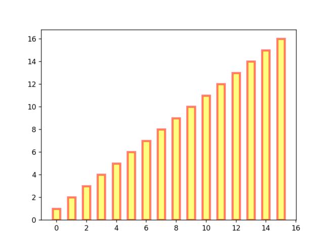
import numpy as np
import matplotlib.pyplot as plt

# bar绘制柱状图
y = range(1,17)
plt.bar(np.arange(16), y, alpha=0.5, width=0.5, color='yellow', edgecolor='red', label='The First Bar', lw=3);

plt.show()
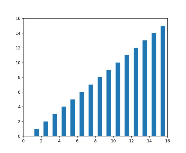
import matplotlib.pyplot as plt

# Rectangle矩形类绘制柱状图
fig = plt.figure()
ax1 = fig.add_subplot(111)

for i in range(1,17):
    rect =  plt.Rectangle((i+0.25,0),0.5,i)
    ax1.add_patch(rect)
ax1.set_xlim(0, 16)
ax1.set_ylim(0, 16)

plt.show()
b. Polygon-多边形
参考:https://matplotlib.org/stable/api/_as_gen/matplotlib.patches.Polygon.html
matplotlib.patches.Polygon类是多边形类。它的构造函数:
class matplotlib.patches.Polygon(xy, closed=True, **kwargs)
xy是一个N×2的numpy array,为多边形的顶点。
closed为True则指定多边形将起点和终点重合从而显式关闭多边形。
matplotlib.patches.Polygon类中常用的是fill类,它是基于xy绘制一个填充的多边形,它的定义:
matplotlib.pyplot.fill(*args, data=None, **kwargs)
参数说明 : 关于x、y和color的序列,其中color是可选的参数,每个多边形都是由其节点的x和y位置列表定义的,后面可以选择一个颜色说明符。您可以通过提供多个x、y、[颜色]组来绘制多个多边形。
import matplotlib.pyplot as plt
import numpy as np

# 用fill来绘制图形
x = np.linspace(0, 5 * np.pi, 1000)
y1 = np.sin(x)
y2 = np.sin(2 * x)
plt.fill(x, y1, color = "g", alpha = 0.3);

plt.show()

import matplotlib.pyplot as plt
import numpy as np

from matplotlib.patches import Polygon


def func(x):
    return (x - 3) * (x - 5) * (x - 7) + 85


a, b = 2, 9  # integral limits
x = np.linspace(0, 10)
y = func(x)

fig, ax = plt.subplots()
ax.plot(x, y, 'r', linewidth=2)
ax.set_ylim(bottom=0)

# Make the shaded region
ix = np.linspace(a, b)
iy = func(ix)
verts = [(a, 0), *zip(ix, iy), (b, 0)]
poly = Polygon(verts, facecolor='0.9', edgecolor='0.5')
ax.add_patch(poly)

ax.text(0.5 * (a + b), 30, r"$\int_a^b f(x)\mathrm{d}x$",
        horizontalalignment='center', fontsize=20)

fig.text(0.9, 0.05, '$x$')
fig.text(0.1, 0.9, '$y$')

ax.spines[['top', 'right']].set_visible(False)
ax.set_xticks([a, b], labels=['$a$', '$b$'])
ax.set_yticks([])

plt.show()
输出为:

c. Wedge-契形
matplotlib.patches.Wedge类是楔型类。其基类是matplotlib.patches.Patch,它的构造函数:
class matplotlib.patches.Wedge(center, r, theta1, theta2, width=None, **kwargs)
一个Wedge-楔型 是以坐标x,y为中心,半径为r,从θ1扫到θ2(单位是度)。
如果宽度给定,则从内半径r -宽度到外半径r画出部分楔形。wedge中比较常见的是绘制饼状图。
matplotlib.pyplot.pie语法:
matplotlib.pyplot.pie(x, explode=None, labels=None, colors=None,
autopct=None, pctdistance=0.6, shadow=False, labeldistance=1.1,
startangle=0, radius=1, counterclock=True, wedgeprops=None,
textprops=None, center=0, 0, frame=False, rotatelabels=False, *,
normalize=None, data=None)
制作数据x的饼图,每个楔子的面积用x/sum(x)表示。
其中最主要的参数是前4个:
x:楔型的形状,一维数组。
explode:如果不是等于None,则是一个len(x)数组,它指定用于偏移每个楔形块的半径的分数。
labels:用于指定每个楔型块的标记,取值是列表或为None。
colors:饼图循环使用的颜色序列。如果取值为None,将使用当前活动循环中的颜色。
startangle:饼状图开始的绘制的角度。
pie绘制饼状图
import matplotlib.pyplot as plt

# pie绘制饼状图
labels = 'Frogs', 'Hogs', 'Dogs', 'Logs'
sizes = [15, 30, 45, 10]
explode = (0, 0.1, 0, 0)
fig1, ax1 = plt.subplots()
ax1.pie(sizes, explode=explode, labels=labels, autopct='%1.1f%%', shadow=True, startangle=90)
ax1.axis('equal'); # Equal aspect ratio ensures that pie is drawn as a circle.

plt.show()

wedge绘制饼图
from matplotlib.collections import PatchCollection
from matplotlib.patches import Wedge
import matplotlib.pyplot as plt
import numpy as np

# wedge绘制饼图
fig = plt.figure(figsize=(5,5))
ax1 = fig.add_subplot(111)
theta1 = 0
sizes = [15, 30, 45, 10]
patches = []
patches += [
    Wedge((0.5, 0.5), .4, 0, 54),
    Wedge((0.5, 0.5), .4, 54, 162),
    Wedge((0.5, 0.5), .4, 162, 324),
    Wedge((0.5, 0.5), .4, 324, 360),
]
colors = 100 * np.random.rand(len(patches))
p = PatchCollection(patches, alpha=0.8)
p.set_array(colors)
ax1.add_collection(p);

plt.show()

基本元素 - primitives-03-collections
参考:https://matplotlib.org/devdocs/api/collections_api.html#

collections类是用来绘制一组对象的集合,collections有许多不同的子类,如RegularPolyCollection, CircleCollection, Pathcollection, 分别对应不同的集合子类型。其中比较常用的就是散点图,它是属于PathCollection子类,scatter方法提供了该类的封装,根据x与y绘制不同大小或颜色标记的散点图。 它的构造方法:
Axes.scatter(self, x, y, s=None, c=None, marker=None, cmap=None,
norm=None, vmin=None, vmax=None, alpha=None, linewidths=None,
verts=, edgecolors=None, *, plotnonfinite=False, data=None, **kwargs)
其中最主要的参数是前5个:
x:数据点x轴的位置
y:数据点y轴的位置
s:尺寸大小
c:可以是单个颜色格式的字符串,也可以是一系列颜色
marker: 标记的类型
import matplotlib.pyplot as plt

# 用scatter绘制散点图
x = [0,2,4,6,8,10]
y = [10]*len(x)
s = [20*2**n for n in range(len(x))]
plt.scatter(x,y,s=s)

plt.show()

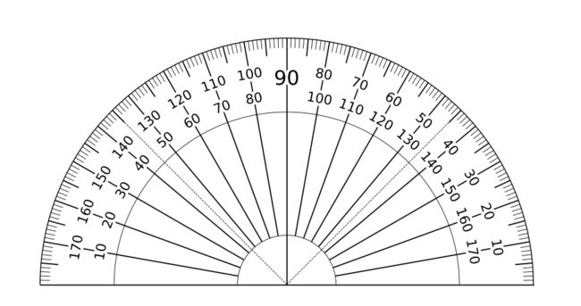
参考:制作量角器
import matplotlib.pyplot as plt
from matplotlib.patheffects import withStroke
from matplotlib.collections import LineCollection
import numpy as np


fig=plt.figure(figsize=(10,8),dpi=100)
ax = fig.add_subplot(111, projection='polar')
# 设置坐标系为0到180度,半径为10,去掉刻度标签和网格线,量角器的形状就出来了
ax.set_thetamin(0)
ax.set_thetamax(180)
ax.set_rlim(0, 10)
ax.set_xticklabels([])
ax.set_yticklabels([])
ax.grid(False)

# 因为要画的线比较多,用for循环plot来画会比较慢,这里使用LineCollection来画。先用数组创建出线的坐标。
# 再用ax.add_collection方法一次性画出来
scale = np.zeros((181, 2, 2))
scale[:, 0, 0] = np.linspace(0, np.pi, 181)  # 刻度线的角度值
scale[:, 0, 1] = 9.6  # 每度的刻度线起始点r值
scale[::5, 0, 1] = 9.3  # 每5度的刻度线起始点r值
scale[::10, 0, 1] = 2  # 每10度的刻度线起始点r值
scale[::90, 0, 1] = 0  # 90度的刻度线起始点r值
scale[:, 1, 0] = np.linspace(0, np.pi, 181)
scale[:, 1, 1] = 10

line_segments = LineCollection(scale, linewidths=[1, 0.5, 0.5, 0.5, 0.5],
                               color='k', linestyle='solid')
ax.add_collection(line_segments)

# 接下来再画两个半圆和45度刻度线。再加上数字。大功告成。
c = np.linspace(0, np.pi, 500)
ax.plot(c, [7]*c.size, color='k', linewidth=0.5)
ax.plot(c, [2]*c.size, color='k', linewidth=0.5)

ax.plot([0, np.deg2rad(45)], [0, 10],
        color='k', linestyle='--', linewidth=0.5)
ax.plot([0, np.deg2rad(135)], [0, 10],
        color='k', linestyle='--', linewidth=0.5)

text_kw = dict(rotation_mode='anchor',
               va='top', ha='center', color='black', clip_on=False,
               path_effects=[withStroke(linewidth=5, foreground='white')])

for i in range(10, 180, 10):
    theta = np.deg2rad(i)
    if theta == np.pi/2:
        ax.text(theta, 8.7, i, fontsize=18, **text_kw)
        continue
    ax.text(theta, 8.9, i, rotation=i-90, fontsize=12, **text_kw)
    ax.text(theta, 7.9, 180-i, rotation=i-90, fontsize=12, **text_kw)

plt.show()
基本元素 - primitives-04-images
images是matplotlib中绘制image图像的类,
AxesImage
BboxImage
FigureImage
NonUniformImage
PcolorImage
composite_images()
imread()
imsave()
pil_to_array()
thumbnail()
支持基本的图像加载、缩放和显示操作。其中最常用的imshow可以根据数组绘制成图像,它的构造函数:
class matplotlib.image.AxesImage(ax, cmap=None, norm=None,
interpolation=None, origin=None, extent=None, filternorm=True,
filterrad=4.0, resample=False, **kwargs)
imshow根据数组绘制图像
matplotlib.pyplot.imshow(X, cmap=None, norm=None, aspect=None,
interpolation=None, alpha=None, vmin=None, vmax=None, origin=None,
extent=None, shape=, filternorm=1, filterrad=4.0, imlim=,
resample=None, url=None, *, data=None, **kwargs)
使用imshow画图时首先需要传入一个数组,数组对应的是空间内的像素位置和像素点的值,interpolation参数可以设置不同的差值方法,具体效果如下。
import matplotlib.pyplot as plt
import numpy as np

methods = [None, 'none', 'nearest', 'bilinear', 'bicubic', 'spline16',
           'spline36', 'hanning', 'hamming', 'hermite', 'kaiser', 'quadric',
           'catrom', 'gaussian', 'bessel', 'mitchell', 'sinc', 'lanczos']

grid = np.random.rand(4, 4)

fig, axs = plt.subplots(nrows=3, ncols=6, figsize=(9, 6),
                        subplot_kw={'xticks': [], 'yticks': []})

for ax, interp_method in zip(axs.flat, methods):
    ax.imshow(grid, interpolation=interp_method, cmap='viridis')
    ax.set_title(str(interp_method))

plt.tight_layout()


plt.show()

容器-container-01-Figure容器
对象容器 - Object container,容器会包含一些primitives,并且容器还有它自身的属性。
比如Axes Artist,它是一种容器,它包含了很多primitives,比如Line2D,Text;同时,它也有自身的属性,比如xscal,用来控制X轴是linear还是log的。
- Figure容器
from matplotlib import pyplot as plt
from matplotlib.lines import Line2D

fig = plt.figure()
ax1 = fig.add_subplot(211) # 作一幅2*1的图,选择第1个子图
ax2 = fig.add_axes([0.1, 0.1, 0.7, 0.3]) # 位置参数,四个数分别代表了(left,bottom,width,height)
print(ax1)
print(fig.axes) # fig.axes 中包含了subplot和axes两个实例, 刚刚添加的
# Axes(0.125,0.53;0.775x0.35)
# [, ]
plt.show()

由于Figure维持了current axes,因此你不应该手动的从Figure.axes列表中添加删除元素,而是要通过Figure.add_subplot()、Figure.add_axes()来添加元素,通过Figure.delaxes()来删除元素。但是你可以迭代或者访问Figure.axes中的Axes,然后修改这个Axes的属性。
from matplotlib import pyplot as plt

fig = plt.figure()
ax1 = fig.add_subplot(211)

for ax in fig.axes:
    ax.grid(True)
plt.show()

Figure也有它自己的text、line、patch、image。你可以直接通过add primitive语句直接添加。但是注意Figure默认的坐标系是以像素为单位,你可能需要转换成figure坐标系:(0,0)表示左下点,(1,1)表示右上点。
Figure容器的常见属性:
Figure.patch属性:Figure的背景矩形
Figure.axes属性:一个Axes实例的列表(包括Subplot)
Figure.images属性:一个FigureImages patch列表
Figure.lines属性:一个Line2D实例的列表(很少使用)
Figure.legends属性:一个Figure Legend实例列表(不同于Axes.legends)
Figure.texts属性:一个Figure Text实例列表
容器-container-02-Axes容器
matplotlib.axes.Axes是matplotlib的核心。
The Axes class represents one (sub-)plot in a figure. It contains the plotted data, axis ticks, labels, title, legend, etc. Its methods are the main interface for manipulating the plot.
Axes类表示图形中的一个(子)图。它包含绘制的数据、轴刻度、标签、标题、图例等。它的方法是操纵情节的主要界面。
大量的用于绘图的Artist存放在它内部,并且它有许多辅助方法来创建和添加Artist给它自己,而且它也有许多赋值方法来访问和修改这些Artist。
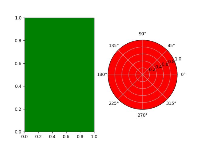
和Figure容器类似,Axes包含了一个patch属性,对于笛卡尔坐标系而言,它是一个Rectangle;对于极坐标而言,它是一个Circle。这个patch属性决定了绘图区域的形状、背景和边框。
from matplotlib import pyplot as plt

fig = plt.figure()
ax1 = fig.add_subplot(121)
rect = ax1.patch  # axes的patch是一个Rectangle实例
rect.set_facecolor('green')

ax2 = fig.add_subplot(122,polar=True)
rect = ax2.patch  # axes的patch是一个Circle实例
rect.set_facecolor('red')
plt.show()
Axes容器的常见属性有:
artists: Artist实例列表
patch: Axes所在的矩形实例
collections: Collection实例
images: Axes图像
legends: Legend 实例
lines: Line2D 实例
patches: Patch 实例
texts: Text 实例
xaxis: matplotlib.axis.XAxis 实例
yaxis: matplotlib.axis.YAxis 实例
容器-container-03- Axis容器
参考:https://matplotlib.org/devdocs/api/axis_api.html
matplotlib.axis.Axis实例处理tick line、grid line、tick label以及axis label的绘制,它包括坐标轴上的刻度线、刻度label、坐标网格、坐标轴标题。通常你可以独立的配置y轴的左边刻度以及右边的刻度,也可以独立地配置x轴的上边刻度以及下边的刻度。
刻度包括主刻度和次刻度,它们都是Tick刻度对象
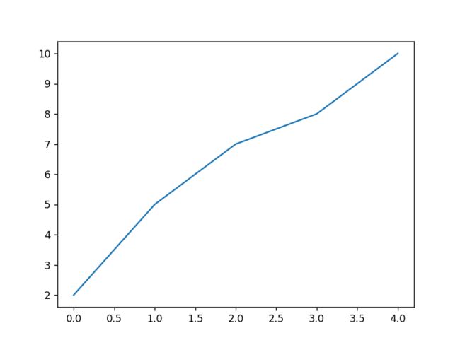
from matplotlib import pyplot as plt

fig, ax = plt.subplots()
x = range(0,5)
y = [2,5,7,8,10]
plt.plot(x, y, '-')

axis = ax.xaxis # axis为X轴对象
print(axis.get_ticklocs())     # 获取刻度线位置
print(axis.get_ticklabels())   # 获取刻度label列表(一个Text实例的列表)。 可以通过minor=True|False关键字参数控制输出minor还是major的tick label。
print(axis.get_ticklines())    # 获取刻度线列表(一个Line2D实例的列表)。 可以通过minor=True|False关键字参数控制输出minor还是major的tick line。
print(axis.get_data_interval())# 获取轴刻度间隔
print(axis.get_view_interval())# 获取轴视角(位置)的间隔

plt.show()
输出为:
[-0.5 0. 0.5 1. 1.5 2. 2.5 3. 3.5 4. 4.5]
[Text(-0.5, 0, ‘−0.5’), Text(0.0, 0, ‘0.0’), Text(0.5, 0, ‘0.5’), Text(1.0, 0, ‘1.0’),
Text(1.5, 0, ‘1.5’), Text(2.0, 0, ‘2.0’), Text(2.5, 0, ‘2.5’), Text(3.0, 0, ‘3.0’), Text(3.5, 0, ‘3.5’), Text(4.0, 0, ‘4.0’), Text(4.5, 0, ‘4.5’)]
[0. 4.]
[-0.2 4.2]
from matplotlib import pyplot as plt

fig = plt.figure() # 创建一个新图表
rect = fig.patch   # 矩形实例并将其设为黄色
rect.set_facecolor('lightgoldenrodyellow')

ax1 = fig.add_axes([0.1, 0.3, 0.4, 0.4]) # 创一个axes对象,从(0.1,0.3)的位置开始,宽和高都为0.4,
rect = ax1.patch   # ax1的矩形设为灰色
rect.set_facecolor('lightslategray')


for label in ax1.xaxis.get_ticklabels():
    # 调用x轴刻度标签实例,是一个text实例
    label.set_color('red') # 颜色
    label.set_rotation(45) # 旋转角度
    label.set_fontsize(16) # 字体大小

for line in ax1.yaxis.get_ticklines():
    # 调用y轴刻度线条实例, 是一个Line2D实例
    line.set_markeredgecolor('green')    # 颜色
    line.set_markersize(25)    # marker大小
    line.set_markeredgewidth(2)# marker粗细

plt.show()

容器-container-04-Tick容器
Abstract base class for the axis ticks, grid lines and labels.
Ticks mark a position on an Axis. They contain two lines as markers and two labels; one each for the bottom and top positions (in case of an.XAxis) or for the left and right positions (in case of a.YAxis).
轴刻度、网格线和标签的抽象基类。刻度标记轴上的位置。它们包含两行作为标记和两个标签;底部和顶部位置各一个’ . xaxis ‘)或用于左右位置(如果是’ . yaxis ')。
matplotlib.axis.Tick是从Figure到Axes到Axis到Tick中最末端的容器对象。
Tick包含了tick、grid line实例以及对应的label。
from matplotlib import pyplot as plt
import numpy as np
import matplotlib

fig, ax = plt.subplots()
ax.plot(100*np.random.rand(20))

# 设置ticker的显示格式
formatter = matplotlib.ticker.FormatStrFormatter('$%1.2f')
ax.yaxis.set_major_formatter(formatter)

# 设置ticker的参数,右侧为主轴,颜色为绿色
ax.yaxis.set_tick_params(which='major', labelcolor='green',
                         labelleft=False, labelright=True);

plt.show()
