使用ggstatsplot简化数据探索:一步完成数据可视化和统计建模 | 简说基因 Recommend...
【简说基因】ggstatsplot:画图并自动为图形加上丰富的统计信息。
在典型的探索性数据分析工作流中,数据可视化和统计建模是两个不同的阶段:可视化有助于建模,而建模反过来又可以建议不同的可视化方法,依此类推。ggstatsplot 的核心思想很简单:将这两个阶段合并为一个,以图形的形式呈现统计细节,使数据探索变得更简单、更快速。
ggstatsplot 是 ggplot2 的一个扩展包,它提供 9 个函数用于常见的统计作图,根据功能可以将它们分成 4 类:
分布
数据的分布(gghistostats(),直方图)
带标签的数据的分布(ggdotplotstats(), 点图)
比较
数值数据的组间比较(ggbetweenstats(), 小提琴图)
数值数据的组内比较(ggwithinstats(), 小提琴图)
分类数据的组间比较(ggbarstats(), 柱状图)
分类数据的组间比较(ggpiestats(), 饼图)
相关性
两个变量之间的相关性(ggscatterstats(), 散点图)
多个变量之间的相关性(ggcorrmat(), 相关性矩阵图)
回归
回归模型和 meta 分析(ggcoefstats(), 点须图)
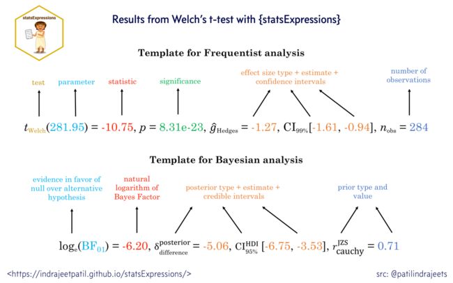
我们先来看一下统计报告的格式。ggstatsplot 默认的模板遵循统计报告的黄金标准,既报告了传统的频率学派分析结果,也包含贝叶斯分析结果,详情看下图:
分布
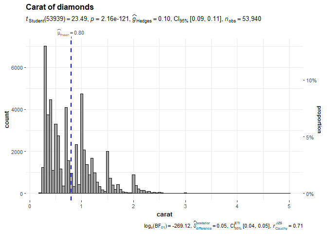
1. 数据的分布(gghistostats(),直方图)
可视化单个变量的分布,并进行单样本检验,看样本均值与指定值是否有显著不同。
# install.packages("ggstatsplot")
library(ggstatsplot)
library(ggplot2)

set.seed(123)

gghistostats(
  data       = diamonds,
  x          = carat,
  title      = "Carat of diamonds",
  test.value = 0.75,
  binwidth   = 0.05
)
2. 带标签的数据的分布(ggdotplotstats(), 点图)
当数字变量带有标签时,用点图进行可视化,同时进行单样本检验。
set.seed(123)

ggdotplotstats(
  data       = dplyr::filter(gapminder::gapminder, continent == "Asia"),
  x          = lifeExp,
  y          = country,
  test.value = 55,
  type       = "robust",
  title      = "Distribution of life expectancy in Asian continent",
  xlab       = "Life expectancy"
)
比较
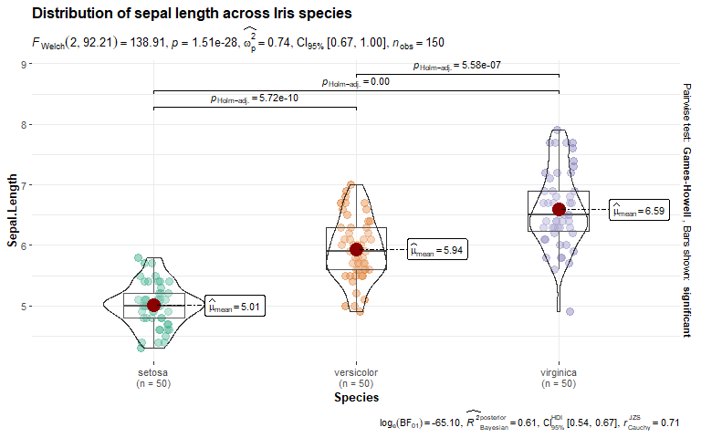
3. 数值数据的组间比较(ggbetweenstats(), 小提琴图)
组合箱线图、小提琴图和抖动散点图,并将统计信息展示在副标题和图注中。
set.seed(123)

ggbetweenstats(
  data  = iris,
  x     = Species,
  y     = Sepal.Length,
  title = "Distribution of sepal length across Iris species"
)
4. 数值数据的组内比较(ggwithinstats(), 小提琴图)
对于重复测量数据,可以使用 ggwithinstats()绘图并进行配对样本检验。
set.seed(123)
library(WRS2) ## for data
library(afex) ## to run ANOVA

ggwithinstats(
  data    = WineTasting,
  x       = Wine,
  y       = Taste,
  title   = "Wine tasting"
)
5. 分类数据的组间比较(ggbarstats(), 柱状图)
可以通过百分比柱状图展示分类变量,注意 x 参数将作为列联表的行,y 参数将作为列联表的列。
set.seed(123)
library(ggplot2)

ggbarstats(
  data             = mtcars,
  x                = am,
  y                = cyl,
  title            = "cyl by am",
  legend.title     = "Transmission",
  ggplot.component = list(ggplot2::scale_x_discrete(guide = ggplot2::guide_axis(n.dodge = 2))),
  palette          = "Set2"
)
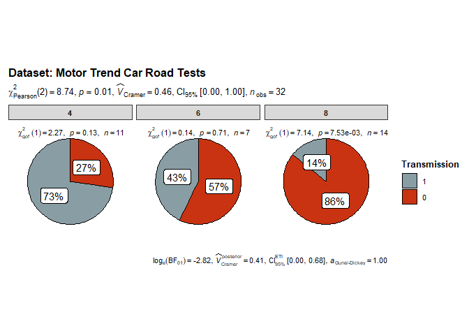
6. 分类数据的组间比较(ggpiestats(), 饼图)
也可以通过饼图研究分类变量之间的相互作用:
set.seed(123)

ggpiestats(
  data         = mtcars,
  x            = am,
  y            = cyl,
  package      = "wesanderson",
  palette      = "Royal1",
  title        = "Dataset: Motor Trend Car Road Tests",
  legend.title = "Transmission"
)
相关性
7. 两个变量之间的相关性(ggscatterstats(), 散点图)
散点图探索两个变量之间的相关性,其边缘添加直方图用于显示数据的分布。
ggscatterstats(
  data  = mtcars,
  x     = disp,
  y     = mpg,
  title = "The relationship between disp and mpg"
)
## `stat_bin()` using `bins = 30`. Pick better value with `binwidth`.
## `stat_bin()` using `bins = 30`. Pick better value with `binwidth`.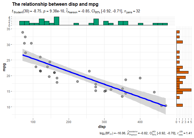
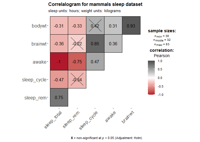
8. 多个变量之间的相关性(ggcorrmat(), 相关性矩阵图)
对于多个变量,可以用相关性矩阵图展示它们之间的关系。
set.seed(123)

## as a default this function outputs a correlation matrix plot
ggcorrmat(
  data     = ggplot2::msleep,
  colors   = c("#B2182B", "white", "#4D4D4D"),
  title    = "Correlalogram for mammals sleep dataset",
  subtitle = "sleep units: hours; weight units: kilograms"
)
回归
9. 回归模型和 meta 分析(ggcoefstats(), 点须图)
点须图:回归系数的点估计显示为点,置信区间显示为须,其他统计信息则显示为标签。
set.seed(123)

## model
mod <- stats::lm(formula = mpg ~ am * cyl, data = mtcars)

ggcoefstats(mod)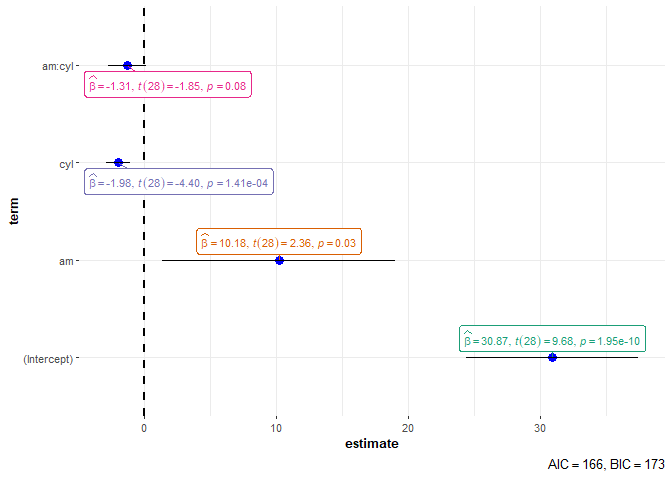
提取统计信息
ggstatsplot 图形中的统计信息可以通过一些方便的函数提取出来,比如:
set.seed(123)

p <- ggbetweenstats(mtcars, cyl, mpg)

extract_subtitle(p)
## list(italic("F")["Welch"](2, 18.03) == "31.62", italic(p) ==
##     "1.27e-06", widehat(omega["p"]^2) == "0.74", CI["95%"] ~
##     "[" * "0.53", "1.00" * "]", italic("n")["obs"] == "32")

extract_caption(p)
## list(log[e] * (BF["01"]) == "-14.92", widehat(italic(R^"2"))["Bayesian"]^"posterior" ==
##     "0.71", CI["95%"]^HDI ~ "[" * "0.57", "0.79" * "]", italic("r")["Cauchy"]^"JZS" ==
##     "0.71")

extract_stats(p)
## $subtitle_data
## # A tibble: 1 x 14
##   statistic    df df.error    p.value
##
## 1      31.6     2     18.0 0.00000127
##   method                                                   effectsize estimate
##
## 1 One-way analysis of means (not assuming equal variances) Omega2        0.744
##   conf.level conf.low conf.high conf.method conf.distribution n.obs expression
##
## 1       0.95    0.531         1 ncp         F                    32
##
## $caption_data
## # A tibble: 6 x 17
##   term     pd prior.distribution prior.location prior.scale     bf10
##
## 1 mu    1     cauchy                          0       0.707 3008850.
## 2 cyl-4 1     cauchy                          0       0.707 3008850.
## 3 cyl-6 0.780 cauchy                          0       0.707 3008850.
## 4 cyl-8 1     cauchy                          0       0.707 3008850.
## 5 sig2  1     cauchy                          0       0.707 3008850.
## 6 g_cyl 1     cauchy                          0       0.707 3008850.
##   method                          log_e_bf10 effectsize         estimate std.dev
##
## 1 Bayes factors for linear models       14.9 Bayesian R-squared    0.714  0.0503
## 2 Bayes factors for linear models       14.9 Bayesian R-squared    0.714  0.0503
## 3 Bayes factors for linear models       14.9 Bayesian R-squared    0.714  0.0503
## 4 Bayes factors for linear models       14.9 Bayesian R-squared    0.714  0.0503
## 5 Bayes factors for linear models       14.9 Bayesian R-squared    0.714  0.0503
## 6 Bayes factors for linear models       14.9 Bayesian R-squared    0.714  0.0503
##   conf.level conf.low conf.high conf.method n.obs expression
##
## 1       0.95    0.574     0.788 HDI            32
## 2       0.95    0.574     0.788 HDI            32
## 3       0.95    0.574     0.788 HDI            32
## 4       0.95    0.574     0.788 HDI            32
## 5       0.95    0.574     0.788 HDI            32
## 6       0.95    0.574     0.788 HDI            32
##
## $pairwise_comparisons_data
## # A tibble: 3 x 9
##   group1 group2 statistic   p.value alternative distribution p.adjust.method
##
## 1 4      6          -6.67 0.00110   two.sided   q            Holm
## 2 4      8         -10.7  0.0000140 two.sided   q            Holm
## 3 6      8          -7.48 0.000257  two.sided   q            Holm
##   test         expression
##
## 1 Games-Howell
## 2 Games-Howell
## 3 Games-Howell
##
## $descriptive_data
## NULL
##
## $one_sample_data
## NULL
##
## $tidy_data
## NULL
##
## $glance_data
## NULL
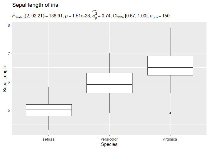
将统计信息应用于个性化图形
提取出来的统计信息,可以绘制到其他作图系统创建的图形上,例如:
## loading the needed libraries
set.seed(123)
library(ggplot2)

## using `{ggstatsplot}` to get expression with statistical results
stats_results <- ggbetweenstats(iris, Species, Sepal.Length) %>% extract_subtitle()

## creating a custom plot of our choosing
ggplot(iris, aes(x = Species, y = Sepal.Length)) +
  geom_boxplot() +
  labs(
    title = "Sepal length of iris",
    subtitle = stats_results,
  )
总结
ggstatsplot 确实为探索性数据分析带来了极大的便利,其优点有:
统计作图一个包搞定,无需使用其他大量的软件包。
易于使用,所有函数都只需要少量代码(通常只需要指定 data, x 和 y 即可),这可以极大地减少错误。
各种统计方法可以任选。
独立的图形就可以让人看懂,无需上下文信息。
本文首发于公众号:简说基因,欢迎关注。