【MSDN文摘】Windows Forms Layout
Chris Sells
Sells Brothers Consulting
December 5, 2002
Summary: Chris Sells discusses how controls are scaled and arranged on a form, and how the scaling and arrangement features are used to meet the needs of different users with respect to system font size and the size of the data being entered. (8 printed pages)
Download the winforms12102002.exe sample file.
After all those heavy threading and security pieces, I thought I'd go back into some of the basics of one of the most compelling new features in Windows Forms—how controls are scaled and arranged on a form. These scaling and arrangement features are used to meet the needs of different users with respect to system font size and the size of the data being entered.
Form Auto-Scaling
For example, if you lay out a form with system font size set to Normal (96 DPI) in the Display control panel, what happens when your users are using Large (120 DPI) or one of the custom settings? You'd certainly want a form like Figure 1 to show properly at all font sizes.

Figure 1. An example form at Normal size fonts
If you perform the actual test by changing from Normal to Large fonts in the Display control panel (requiring a restart under Microsoft Windows® XP), you'll be pleased to see that your form at this new font size looks like Figure 2 without recompiling your application.

Figure 2. The example form at Large size fonts
The secret to making this work is a form property called AutoScale. When a form is first loaded, and if AutoScale is set to true (the default), it uses another property called AutoScaleBaseSize. This property is set by the Designer and specifies the average width and height of characters in the form's font. The default font, 8.25pt MS Sans Serif under Windows XP Normal fonts, has an average width and height of 5x13. This information will be encoded into the InitializeComponent function like so:
this.AutoScaleBaseSize = new Size(5, 13);
Under Large fonts, the default font will be 7.8pt MS Sans Serif, but the average width and height of the font has now increased to 6x15 (which is why they call it "Large" fonts). At load time, the form will notice the difference between the scale it was designed with and the current scale by calling Form.GetAutoScaleSize and adjust the height and width of itself and its controls along with the positions of the controls. This keeps the feel of the form roughly the same, regardless of the system font settings.
Anchoring
Of course, scaling for system font settings is not all of the work that needs to be done to make your form adjusts itself to your users' whims. For example, if a user of our current example wants to enter a longer string into the text box, they may attempt to widen the form to do so, as shown in Figure 3.

Figure 3. All controls anchored Top, Left
Unfortunately, the user isn't likely to be happy when the form takes up more room, but the contained controls do not. Ideally, we'd like the text box to expand as the form expands, which can be achieved like so:
int delta = 0;

void Form1_Load(object sender, EventArgs e) {
  delta = ClientRectangle.Width - textBox1.Width;
}

void Form1_SizeChanged(object sender, EventArgs e) {
  textBox1.Width = ClientRectangle.Width - delta;
}
During the form's Load event, we capture the delta between the width of the text box and the width of the client rectangle so that when the form's size is changed, we can reset the width of the text box to maintain the difference in width as a constant. Keeping this difference constant means keeping the distance between the right edge of the text box a fixed number of pixels from the right edge of the form. This is called anchoring. By default, all controls are anchored to the top and left edges of their containers (which may be a form or a control that contains other controls). We're already accustomed to the operating system moving our child controls to keep this anchoring in tact as the container's left or top edge changes. However, the operating system can only do so much. It will not resize our controls to anchor them to other edges, which leads to resizing code or, more commonly, the fixed-sized form styles. Fortunately, Windows Forms has direct support for anchoring, saving us from writing this code at all.
You can change the edges that a control is anchored to by changing the Anchor property to be any bitwise combination of the values in the AnchorStyles enumeration:
enum AnchorStyles {
  None,
  Left, // default
  Top, // default
  Bottom,
  Right,
}
Resizing the text box in our current example so that it's resized as the form is resized is a matter of changing the Anchor property to include the right edge as well as the left and the top edges. Using the Property Browser, you even get a fancy drop-down editor, as shown in Figure 4.
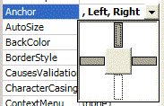
Figure 4. Setting the Anchor property in the Property Browser
Docking
As powerful as scaling and anchoring are, they still won't do everything. For example, if you wanted to build a text editor, you'd probably like to have a menu, a toolbar, and a status bar, along with a text box that takes up the rest of the client area not occupied by the menu, the toolbar, and the status bar. Anchoring would be tricky in this case, because some controls need more or less room depending on the runtime environment in which they find themselves. Instead of trying to anchor to zero pixels away from the edges, it would be easier to simply tell the form that the text box should take whatever space remains in the client area. For that, we have docking.
Docking is a way to specify a specific edge that we'd like to have a control hug. For example, Figure 5 shows a form with three controls, all docked. The menu is docked to the top edge, the status bar is docked to the bottom edge, and the text box is docked to fill the rest.
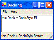
Figure 5. A Docking example
The docking behavior is achieved by setting each control's Dock property to one of the values in the DockStyle enumeration (exposed nicely in the Property Browser as shown in Figure 6):
enum DockStyle {
  None, // default
  Left,
  Top,
  Right,
  Bottom,
  Fill,
}
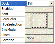
Figure 6. Setting the Dock property in the Property Browser
Splitting
Often, when docking is used, you'd like the user to have the ability to resize some of the controls independently of the size of the form itself. For example, the Windows file explorer splits the space between the toolbar and the status bar with a tree view on the left and a list view on the right. To resize these controls, the file explorer provides a splitter, which is a bar separating two controls that the user can drag to change the proportion of space shared between them. A simple example of a Splitter control between a TreeView control docking to the left edge and a ListView control docked to fill is shown in Figure 7.
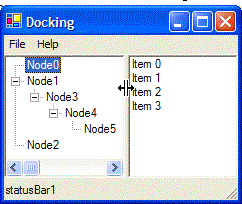
Figure 7. An example of splitting (notice the cursor indicating a potential drag)
Splitter controls are available in the Toolbox. Controls can be split vertically by setting the Dock property to DockStyle.Left (the default), or horizontally by setting the Dock property to DockStyle.Top. An example of horizontal splitting in shown in Figure 8.
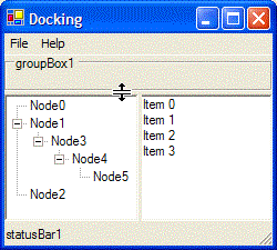
Figure 8. Horizontal splitting
Grouping
To achieve advanced layout effects, it's often necessary to break the problem down into groups. For example, imagine a list of people on the left and a list of details about the current selection on the right, as shown in Figure 9.
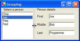
Figure 9. Grouping, docking and anchoring example
In this example, there are concepts that you've already seen. Notice the splitter in the middle, splitting the two group box controls. You can't tell by looking at a single picture, but as the group boxes change size, the controls inside the group boxes also change size. This is accomplished because of two attributes of group boxes. The first is that group boxes are container controls, that is they act as a parent for child controls, just like a form does. The list box on the left is a child of the group box on the left, not a child of the form directly. Likewise, the label and text box controls on the right are children of the group box on the right.
The second important attribute of container controls is that they share the same layout characteristics of forms in that child controls can be anchored or docked. Because of this, the anchoring and docking settings of a control aren't relative to the edges of the form, but rather to the edges of the container; for example, the group boxes in this case. So, the list box in Figure 9 is actually set to DockStyle.Fill to take up the entire client area of the group box. Likewise, the anchoring properties of the text boxes on the right are anchored top, left, and right, so as the group box changes position relative to the parent form or changes width, the text boxes act as you would expect relative to the group box.
The GroupBox control is one of three container controls Windows Forms provides; the other two being the Panel control and the TabControl. The Panel control is just like a group box except that there is no label and no frame. A panel is handy if you'd like something that looks and acts like a sub-form (a form within a form). The TabControl is a container or one or more TabPage controls, each of which is a container control with a tab at the top, as shown in Figure 10.
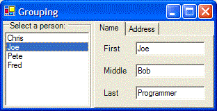
Figure 10. A TabControl with two TabPage controls
Custom Layout
The combination of anchoring, docking, splitting, and grouping solves a large majority of common layout problems. However, it won't solve them all. For example, automatically spreading controls proportionally across a client area in a table or grid-like manner, as shown in Figure 11, can't be accomplished using these techniques.
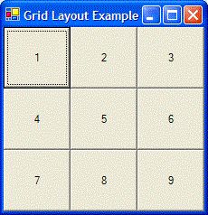
Figure 11. Custom layout example
For creating a layout as shown in Figure 11, it's best to use as much as you can from the provided bag of tricks and then to fall back on the Layout event on the form or the container controls to handle the rest. As an example, the following Layout event handler arranges nine button controls proportionally as the form is resized:
void GridForm_Layout(object sender, LayoutEventArgs e) {
  // Arrange the buttons in a grid on the form
  Button[] buttons = new Button[] { button1, button2, ..., };
  int cx = ClientRectangle.Width/3;
  int cy = ClientRectangle.Height/3;
  for( int row = 0; row != 3; ++row ) {
    for( int col = 0; col != 3; ++col ) {
      Button button = buttons[col * 3 + row];
      button.SetBounds(cx * row, cy * col, cx, cy);
    }
  }
}
Where Are We?
Scaling lets us arrange controls on a form at design time with one font setting, but still have the form look right under another font setting. For example, we could have our controls at design time set to a Normal font setting, but still have the form look correct when using a Large font setting. Anchoring lets us resize and move controls that need to maintain a fixed distance along some edges. Docking lets us hand an entire edge over to a control. Splitting lets us resize docked controls. Grouping lets us break down our control layout into manageable pieces. And when none of those things work, the Layout event is the backdoor that lets us do what the existing arsenal can't do.
Note This material is excerpted from the forthcoming Addison-Wesley title: Windows Forms Programming in C# by Chris Sells (0321116208). Please note the material presented here is an initial DRAFT of what will appear in the published book.
Chris Sells is an independent consultant, specializing in distributed applications in .NET and COM, as well as an instructor for DevelopMentor. He's written several books, including ATL Internals, which is in the process of being updated for ATL7. He's also working on Essential Windows Forms for Addison-Wesley and Mastering Visual Studio .NET for O'Reilly. In his free time, Chris hosts the Web Services DevCon and directs the Genghis source-available project. More information about Chris, and his various projects, is available at http://www.sellsbrothers.com.