QML控件类型:Button、RoundButton、ToolButton、CheckBox、RadioButton、DelayButton、Switch、MenuBarItem、MenuItem
这些按钮全部直接或间接继承自 AbstractButton。
Button
一、描述
Button 提供一个普通的按钮控件。
二、属性成员
1、flat : bool
存按钮是否扁平化。默认为false。
除非按下或选中扁平按钮,否则不会绘制背景。
2、highlighted : bool
按钮是否高亮显示。默认为false。
高亮显示按钮可吸引用户的注意力。它对键盘交互没有影响。
三、自定义 Button 示例
import QtQuick
import QtQuick.Controls

Window {
    width: 640
    height: 480
    visible: true
    title: qsTr("Hello World")

    Button {
        id: control
        text: qsTr("Button")
        hoverEnabled: true

        contentItem: Text {
            text: control.text
            font: control.font
            opacity: enabled ? 1.0 : 0.3
            color: control.down ? (control.hovered ? "#ff0000" : "#17a81a") : "#21be2b"
            horizontalAlignment: Text.AlignHCenter
            verticalAlignment: Text.AlignVCenter
            elide: Text.ElideRight
        }

        background: Rectangle {
            implicitWidth: 100
            implicitHeight: 40
            opacity: enabled ? 1 : 0.3
            border.color: control.down ? "#17a81a" : "#21be2b"
            border.width: 1
            radius: 2
        }
    }
}
RoundButton
一、描述
RoundButton 继承自 Button,特点是它具有一个 radius 属性,使得可以在无需自定义背景的情况下使角变圆。
二、属性成员
1、radius : real
按钮的圆角。
要创建一个完全圆形的按钮(默认),请使用等于按钮宽度或高度一半的值,并使按钮的宽度和高度相同。
要将此属性重置回默认值,请将其值设置为 undefined。
ToolButton
一、描述
ToolButton 继承自 Button,但提供了更适合于 ToolBar 的外观。
import QtQuick 2.14
import QtQuick.Window 2.14
import QtQuick.Controls 2.14
import QtQuick.Layouts 1.14
Window {
visible: true
width: 640
height: 480
title: qsTr("Hello World")
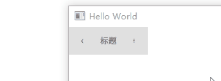
ToolBar {
RowLayout {
anchors.fill: parent
ToolButton {
text: qsTr("‹")
onClicked: stack.pop()
}
Label {
text: "标题"
elide: Label.ElideRight
horizontalAlignment: Qt.AlignHCenter
verticalAlignment: Qt.AlignVCenter
Layout.fillWidth: true
}
ToolButton {
text: qsTr("⋮")
onClicked: menu.open()
}
}
}
}
二、自定义 ToolButton 示例
import QtQuick
import QtQuick.Controls

Window {
    width: 640
    height: 480
    visible: true
    title: qsTr("Hello World")

    ToolButton
    {
        id: control
        text: qsTr("工具按钮")
        width: 120

        contentItem: Text
        {
            text: control.text
            font: control.font
            opacity: enabled ? 1.0 : 0.3
            color: control.down ? "#17a81a" : "#128bf1"
            horizontalAlignment: Text.AlignHCenter
            verticalAlignment: Text.AlignVCenter
            elide: Text.ElideRight
        }

        background: Rectangle
        {
            implicitWidth: 40
            implicitHeight: 40
            color: Qt.darker("#33333333", control.enabled && (control.checked || control.highlighted) ? 1.5 : 1.0)
            opacity: enabled ? 1 : 0.3
            visible: control.down || (control.enabled && (control.checked || control.highlighted))
        }
    }
}
CheckBox
一、描述
CheckBox 提供了复选框按钮,可以打开(选中)或关闭(未选中)。复选框通常用于从一组选项中选择一个或多个选项。对于更大的选项集,例如列表中的选项,请考虑改用 CheckDelegate。
除了选中和未选中状态之外,还有第三种状态:部分选中。可以使用 tristate 属性启用部分选中状态。
二、属性成员
1、checkState : enumeration
复选框的选中状态。
- Qt.Unchecked:未选中。
- Qt.PartiallyChecked:部分选中。仅在启用三态时使用。
- Qt.Checked:已选中。
2、nextCheckState : function
此属性包含一个回调函数,每当用户通过触摸、鼠标或键盘交互切换复选框时,都会调用该函数以确定下一个选中状态。
默认情况下,普通复选框在 Qt.Unchecked 和 Qt.Checked 状态之间循环,三态复选框在 Qt.Unchecked、Qt.PartiallyChecked 和 Qt.Checked 状态之间循环。
nextCheckState 回调函数可以覆盖默认行为。下面的示例实现了一个三态复选框,它可以根据外部条件呈现部分选中状态,但在用户交互切换时不会循环到部分选中状态。
CheckBox
{
    tristate: true
    checkState: allChildrenChecked ? Qt.Checked : anyChildChecked ? Qt.PartiallyChecked : Qt.Unchecked

    nextCheckState: function()
    {
        if (checkState === Qt.Checked)
            return Qt.Unchecked
        else
            return Qt.Checked
    }
}3、tristate : bool
复选框是否为三态复选框。默认为 false。
三、自定义 CheckBox 示例
import QtQuick
import QtQuick.Controls

Window {
    width: 640
    height: 480
    visible: true
    title: qsTr("Hello World")

    CheckBox {
        id: control
        text: qsTr("CheckBox")
        checked: true
        hoverEnabled: false

        indicator: Rectangle {
            implicitWidth: 26
            implicitHeight: 26
            x: control.leftPadding
            y: parent.height / 2 - height / 2
            radius: 3
            border.color: control.down ? "#17a81a" : "#21be2b"

            Rectangle {
                width: 14
                height: 14
                x: 6
                y: 6
                radius: 2
                color: control.down ? "#17a81a" : "#21be2b"
                visible: control.checked
            }
        }

        contentItem: Text {
            text: control.text
            font: control.font
            opacity: enabled ? 1.0 : 0.3
            color: control.down ? "#17a81a" : "#21be2b"
            verticalAlignment: Text.AlignVCenter
            leftPadding: control.indicator.width + control.spacing
        }
    }
}
RadioButton
一、描述
RadioButton 提供了单选按钮。单选按钮通常用于从一组选项中选择一个选项。
默认情况下,单选按钮是自动独占的。在属于同一父项的单选按钮中,默认只能选中一个按钮。对于不共享公共父级的单选按钮,可用 ButtonGroup 管理独占性。
RadioDelegate 类似于 RadioButton,不同之处在于它通常用于视图中。
二、自定义 RadioButton 示例
import QtQuick
import QtQuick.Controls
Window {
width: 640
height: 480
visible: true
title: qsTr("Hello World")
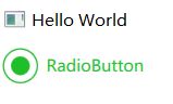
RadioButton {
id: control
text: qsTr("RadioButton")
checked: true
indicator: Rectangle {
implicitWidth: 26
implicitHeight: 26
x: control.leftPadding
y: parent.height / 2 - height / 2
radius: 13
border.color: control.down ? "#17a81a" : "#21be2b"
Rectangle {
width: 14
height: 14
x: 6
y: 6
radius: 7
color: control.down ? "#17a81a" : "#21be2b"
visible: control.checked
}
}
contentItem: Text {
text: control.text
font: control.font
opacity: enabled ? 1.0 : 0.3
color: control.down ? "#17a81a" : "#21be2b"
verticalAlignment: Text.AlignVCenter
leftPadding: control.indicator.width + control.spacing
}
}
} 
DelayButton
一、描述
DelayButton 是一个可选中按钮,它在按钮被选中和 activated() 信号发出之前包含一个延迟。此延迟可防止意外按下。

二、属性成员
1、delay : int
进度达到 1.0 并发出 activate() 所需的时间(以毫秒为单位)。
默认值为 3000 毫秒。
2、【只读】progress : real
进度指示器显示的当前进度,范围为 0.0 - 1.0。
3、transition : Transition
按下或释放按钮时应用于进度属性的过渡。
三、信号成员
1、activated()
当进度达到 1.0 时发出此信号。
四、自定义 DelayButton 示例
import QtQuick
import QtQuick.Controls
Window {
width: 640
height: 480
visible: true
title: qsTr("Hello World")
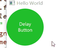
DelayButton {
id: control
checked: true
text: qsTr("Delay\nButton")
contentItem: Text {
text: control.text
font: control.font
opacity: enabled ? 1.0 : 0.3
color: "white"
horizontalAlignment: Text.AlignHCenter
verticalAlignment: Text.AlignVCenter
elide: Text.ElideRight
}
background: Rectangle {
implicitWidth: 100
implicitHeight: 100
opacity: enabled ? 1 : 0.3
color: control.down ? "#17a81a" : "#21be2b"
radius: size / 2
readonly property real size: Math.min(control.width, control.height)
width: size
height: size
anchors.centerIn: parent
Canvas {
id: canvas
anchors.fill: parent
Connections {
target: control
function onProgressChanged() { canvas.requestPaint(); }
}
onPaint: {
var ctx = getContext("2d")
ctx.clearRect(0, 0, width, height)
ctx.strokeStyle = "white"
ctx.lineWidth = parent.size / 20
ctx.beginPath()
var startAngle = Math.PI / 5 * 3
var endAngle = startAngle + control.progress * Math.PI / 5 * 9
ctx.arc(width / 2, height / 2, width / 2 - ctx.lineWidth / 2 - 2, startAngle, endAngle)
ctx.stroke()
}
}
}
}
}
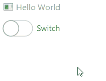
Switch
一、描述
Switch 是一个选项按钮,可以拖动或点击切换选中状态。通常用于在两种状态之间进行选择。
对于更大的选项集,例如列表中的选项,请考虑改用 SwitchDelegate。
可以使用 checked 属性设置 Switch 的状态。

二、属性成员
1、【只读】position : real
指示器的逻辑位置,范围为 0.0 - 1.0。
2、【只读】visualPosition : real
指示器的视觉位置。范围为 0.0 - 1.0。
当控件被镜像时,该值等于 1.0 - position。
三、自定义 Switch 示例
import QtQuick
import QtQuick.Controls

Window {
    width: 640
    height: 480
    visible: true
    title: qsTr("Hello World")

    Switch {
        id: control
        text: qsTr("Switch")

        indicator: Rectangle {
            implicitWidth: 48
            implicitHeight: 26
            x: control.leftPadding
            y: parent.height / 2 - height / 2
            radius: 13
            color: control.checked ? "#17a81a" : "#ffffff"
            border.color: control.checked ? "#17a81a" : "#cccccc"

            Rectangle {
                x: control.checked ? parent.width - width : 0
                width: 26
                height: 26
                radius: 13
                color: control.down ? "#cccccc" : "#ffffff"
                border.color: control.checked ? (control.down ? "#17a81a" : "#21be2b") : "#999999"
            }
        }

        contentItem: Text {
            text: control.text
            font: control.font
            opacity: enabled ? 1.0 : 0.3
            color: control.down ? "#17a81a" : "#21be2b"
            verticalAlignment: Text.AlignVCenter
            leftPadding: control.indicator.width + control.spacing
        }
    }
}
MenuBarItem
一、描述
MenuBarItem 在 MenuBar 中显示一个菜单。当 MenuBarItem 通过键盘、鼠标或触摸触发时,会显示相应的下拉菜单。
使用 MenuBar 时无需手动声明 MenuBarItem 实例。将 Menu 实例声明为 MenuBar 的子项就会自动创建相应的项目。
二、属性成员
1、highlighted : bool
保存菜单栏项是否由用户突出显示。默认为false。
可以通过鼠标悬停或键盘导航来突出显示菜单栏项。
2、menu : Menu
此项目在菜单栏中显示的菜单,如果此项目没有菜单,则为 null。
3、【只读】menuBar : Menu
包含此项目的菜单栏,如果该项目不在菜单栏中,则为 null。
三、信号成员
1、void triggered()
当用户触发菜单栏项时,会发出此信号。
四、自定义 MenuBarItem 示例
import QtQuick
import QtQuick.Controls

ApplicationWindow {
    id: window
    width: 320
    height: 260
    visible: true

    menuBar: MenuBar
    {
        Menu {
            title: qsTr("&File")
            Action { text: qsTr("&New...") }
            Action { text: qsTr("&Open...") }
            Action { text: qsTr("&Save") }
            Action { text: qsTr("Save &As...") }
            MenuSeparator { }
            Action { text: qsTr("&Quit") }
        }
        Menu {
            title: qsTr("&Edit")
            Action { text: qsTr("Cu&t") }
            Action { text: qsTr("&Copy") }
            Action { text: qsTr("&Paste") }
        }
        Menu {
            title: qsTr("&Help")
            Action { text: qsTr("&About") }
        }

        delegate: MenuBarItem
        {
            id: menuBarItem

            contentItem: Text
            {
                text: menuBarItem.text
                font: menuBarItem.font
                opacity: enabled ? 1.0 : 0.3
                color: menuBarItem.highlighted ? "#ffffff" : "#21be2b"
                horizontalAlignment: Text.AlignLeft
                verticalAlignment: Text.AlignVCenter
                elide: Text.ElideRight
            }

            background: Rectangle
            {
                implicitWidth: 40
                implicitHeight: 40
                opacity: enabled ? 1 : 0.3
                color: menuBarItem.highlighted ? "#21be2b" : "transparent"
            }
        }

        background: Rectangle
        {
            implicitWidth: 40
            implicitHeight: 40
            color: "#ffffff"

            Rectangle
            {
                color: "#21be2b"
                width: parent.width
                height: 1
                anchors.bottom: parent.bottom
            }
        }
    }
}
MenuItem
一、描述
MenuItem 提供了显示在菜单中的项目。
import QtQuick 2.14
import QtQuick.Window 2.14
import QtQuick.Controls 2.14
import QtQuick.Layouts 1.14

Window {
    visible: true
    width: 640
    height: 480
    title: qsTr("Hello World")

    Button {
        id: fileButton
        text: "File"
        onClicked: menu.open()

        Menu {
            id: menu

            MenuItem {
                text: "New..."
                onTriggered: document.reset()
            }
            MenuItem {
                text: "Open..."
                onTriggered: openDialog.open()
            }
            MenuItem {
                text: "Save"
                onTriggered: saveDialog.open()
            }
        }
    }
}
二、属性成员
1、arrow : Item
子菜单箭头项。
2、highlighted : bool
菜单项是否由用户突出显示。默认为false。
可以通过鼠标悬停或键盘导航来突出显示菜单项。
3、menu : Menu
包含此菜单项的菜单,如果该项不在菜单中,则为 null。
4、【只读】subMenu : Menu
此项在父菜单中显示的子菜单,如果该项不是子菜单项,则为 null。
三、信号成员
1、void triggered()
当用户触发菜单项时,会发出此信号。
四、自定义 MenuItem 示例
import QtQuick
import QtQuick.Controls
ApplicationWindow {
id: window
width: 320
height: 260
visible: true
menuBar: MenuBar
{
Menu {
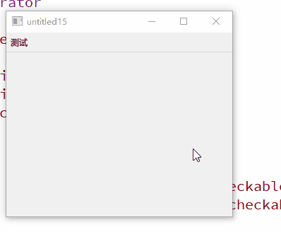
title:"测试"
id: menu
Action { text: qsTr("Tool Bar"); checkable: true }
MenuSeparator
{
contentItem: Rectangle
{
implicitWidth: 200
implicitHeight: 1
color: "#21be2b"
}
}
Action { text: qsTr("Side Bar"); checkable: true; checked: true }
Action { text: qsTr("Status Bar"); checkable: true; checked: true }
topPadding: 2
bottomPadding: 2
delegate: MenuItem {
id: menuItem
implicitWidth: 200
implicitHeight: 40
arrow: Canvas {
x: parent.width - width
implicitWidth: 40
implicitHeight: 40
visible: menuItem.subMenu
onPaint: {
var ctx = getContext("2d")
ctx.fillStyle = menuItem.highlighted ? "#ffffff" : "#21be2b"
ctx.moveTo(15, 15)
ctx.lineTo(width - 15, height / 2)
ctx.lineTo(15, height - 15)
ctx.closePath()
ctx.fill()
}
}
indicator: Item {
implicitWidth: 40
implicitHeight: 40
Rectangle {
width: 26
height: 26
anchors.centerIn: parent
visible: menuItem.checkable
border.color: "#21be2b"
radius: 3
Rectangle {
width: 14
height: 14
anchors.centerIn: parent
visible: menuItem.checked
color: "#21be2b"
radius: 2
}
}
}
contentItem: Text {
leftPadding: menuItem.indicator.width
rightPadding: menuItem.arrow.width
text: menuItem.text
font: menuItem.font
opacity: enabled ? 1.0 : 0.3
color: menuItem.highlighted ? "#ffffff" : "#21be2b"
horizontalAlignment: Text.AlignLeft
verticalAlignment: Text.AlignVCenter
elide: Text.ElideRight
}
background: Rectangle {
implicitWidth: 200
implicitHeight: 40
opacity: enabled ? 1 : 0.3
color: menuItem.highlighted ? "#21be2b" : "transparent"
}
}
background: Rectangle {
implicitWidth: 200
implicitHeight: 40
color: "#ffffff"
border.color: "#21be2b"
radius: 2
}
}
}
}