【Vue知识点- No6.】动态组件、插槽、自定义指令、tabbar案例
动态组件、插槽、自定义指令
学习目标
1.能够了解组件进阶知识。
2.能够掌握自定义指令的创建和使用。
3.能够完成tabbar案例的开发。
1.组件进阶
1.0 动态组件
问题:如何切换2个组件,互斥的显示或者隐藏呢?
动态组件定义: 多个组件使用同一个挂载点,并动态切换。
需求: 完成一个注册功能页面, 2个按钮切换, 一个填写注册信息, 另一个填写用户简介信息。
效果如下:

1.准备被切换的 - UserName.vue / UserInfo.vue 2个组件
2.引入到UseDynamic.vue注册
3.准备变量来承载要显示的"组件名"
4.设置挂载点, 使用 is属性 来设置要显示哪个组件
5.点击按钮 – 修改comName变量里的"组件名"
- UserName.vue / UserInfo.vue
<template>
	<div>
		<div>
			<span>用户名:</span>
			<input type="text">
		</div>
		<div>
			<span>密码:</span>
			<input type="password">
		</div>
	</div>
</template>
- 01_UseDynamic.vue
<template>
<div>
<button @click="comName = 'UserName'">账号密码填写</button>
<button @click="comName = 'UserInfo'">个人信息填写</button>
<p>下面显示注册组件-动态切换:</p>
<div style="border: 1px solid red;">
<!--vue内置的组件component,可以动态的显示组件-->
<component :is="comName"></component>
</div>
</div>
</template>
<script>
// 目标: 动态组件 - 切换组件显示
// 场景: 同一个挂载点要切换 不同组件 显示
// 1. 创建要被切换的组件 - 标签+样式
// 2. 引入到要展示的vue文件内, 注册
// 3. 变量-承载要显示的组件名
// 4. 设置挂载点- 在App.vue - 引入01_UseDynamic.vue并使用显示:
<template>
	... 省略注册
</template>
import UseDynamic from './views/01_UseDynamic'
export default {
	components: {
		UseDynamic
	}
}
总结: 1.如何使用动态组件?vue内置component组件, 配合is属性, 设置要显示的组件名字。
2.如何切换?改变is属性的值为要显示的组件名即可。
1.1 组件缓存
演示1: 可以先给UserName.vue和UserInfo.vue 注册created和destroyed生命周期事件, 观察创建和销毁过程。
注意: 组件切换会导致组件被频繁销毁和重新创建, 所以性能不高。
【解决】使用Vue内置的 keep-alive组件, 可以让包裹的组件保存在内存中不被销毁。
演示2: 使用keep-alive内置的vue组件, 让动态组件缓存而不是销毁。
- 02_UseDynamic.vue
<div style="border: 1px solid red;">
    <!-- Vue内置keep-alive组件, 把包起来的组件缓存起来 -->
    <keep-alive>
        <component :is="comName"></component>
    </keep-alive>
</div>
总结: keep-alive可以提高组件的性能, 内部包裹的标签不会被销毁和重新创建, 而是触发激活和非激活的生命周期方法。
1.2 激活和非激活
目标: 被缓存的组件不再创建和销毁, 而是激活和非激活。
补充2个新的生命周期方法:
- activated – 激活时触发
- deactivated – 失去激活状态触发

1.3 组件插槽
问题1:组件里的数据不确定时可以怎么做? 让组件在props里面定义一个变量,使用这个组件的时候分别传入不同的数据。
问题2:组件里的标签不确定时怎么办呢? vue提供组件插槽能力, 允许开发者在封装组件时,把不确定的部分定义为插槽。
组件插槽: 用于实现组件的内容分发, 通过 slot 标签, 可以接收到写在组件标签内的内容。
插槽例子:
案例: 以前的折叠面板案例, 想要实现不同内容显示, 我们把折叠面板里的Pannel组件, 添加组件插槽的方式:
语法口诀:
1.组件内不确定的标签处用
2.使用此组件,<组件名>传入具体标签
- src/components/03/Pannel.vue - 插槽
<template>
  <div>
    <!-- 按钮标题 -->
    <div class="title">
      <h4>芙蓉楼送辛渐</h4>
      <span class="btn" @click="isShow = !isShow">
        {{ isShow ? "收起" : "展开" }}
      </span>
    </div>
    <!-- 下拉内容 -->
    <div class="container" v-show="isShow">
    	<slot>默认显示内容</slot>
    </div>
  </div>
</template>

<script>
export default {
  data() {
    return {
      isShow: false,
    };
  },
};
</script>

<style scoped>
h3 {
  text-align: center;
}

.title {
  display: flex;
  justify-content: space-between;
  align-items: center;
  border: 1px solid #ccc;
  padding: 0 1em;
}

.title h4 {
  line-height: 2;
  margin: 0;
}

.container {
  border: 1px solid #ccc;
  padding: 0 1em;
}

.btn {
  /* 鼠标改成手的形状 */
  cursor: pointer;
}

img {
  width: 50%;
}
</style>
- src/views/03_UserSlot.vue - 使用组件(原始代码)
<template>
  <div id="container">
    <div id="app">
      <h3>案例:折叠面板</h3>
    </div>
  </div>
</template>

<script>
export default {
};
</script>

<style>
#app {
  width: 400px;
  margin: 20px auto;
  background-color: #fff;
  border: 4px solid blueviolet;
  border-radius: 1em;
  box-shadow: 3px 3px 3px rgba(0, 0, 0, 0.5);
  padding: 1em 2em 2em;
}
</style>
- src/views/03_UseSlot.vue - 组件插槽使用
<template>
  <div id="container">
    <div id="app">
      <h3>案例:折叠面板</h3>
      <Pannel>
          <img src="../assets/mm.gif" alt="">
          <span>我是内容</span>
      </Pannel>
      <Pannel>
          <p>寒雨连江夜入吴,</p>
          <p>平明送客楚山孤。</p>
          <p>洛阳亲友如相问,</p>
          <p>一片冰心在玉壶。</p>
      </Pannel>
      <Pannel></Pannel>
    </div>
  </div>
</template>

<script>
import Pannel from "../components/03/Pannel";
export default {
  components: {
    Pannel,
  },
}
</script>
- src/App.vue
<template>
	<div>
		<UseSlot></UseSlot>
	</div>
</template>
<script>
import UseSlot from './views/03_UseSlot'
export default {
	components: {
		UseSlot
	}
}
总结: 1.当组件内某一部分标签不确定时怎么办?用插槽技术。
2.插槽具体如何使用? ①先在组件内用slot占位。②使用组件时,用具体的标签插入。
3.插槽运行效果? 传入的标签会替换掉slot显示。
1.4 插槽默认内容
问题: 使用组件时,如果不给slot传标签怎么办?可否设置默认内容?
口诀:
效果:不给组件传标签,slot内容原地显示。如果给组件内传标签,则slot整体被替换掉。
<slot>默认内容</slot>
1.5 具名插槽
场景: 多个slot需要区分。传入的标签可以分别派发给不同的slot位置。
要求: v-slot一般和template标签使用 (template是html5新出标签内容模板元素, 不会渲染到页面上, 一般被vue解析的内部标签)
- components/04/Pannel.vue - 留下具名slot
<template>
  <div>
    <!-- 按钮标题 -->
    <div class="title">
      <slot name="title"></slot>
      <span class="btn" @click="isShow = !isShow">
        {{ isShow ? "收起" : "展开" }}
      </span>
    </div>
    <!-- 下拉内容 -->
    <div class="container" v-show="isShow">
     <slot name="content"></slot>
    </div>
  </div>
</template>
- views/04_UseSlot.vue使用
<template>
  <div id="container">
    <div id="app">
      <h3>案例:折叠面板h3>
      <Pannel>
        <template v-slot:title>
          <h4>芙蓉楼送辛渐h4>
        template>
        <template v-slot:content>
          <img src="../assets/mm.gif" alt="">
          <span>我是内容span>
        template>
      Pannel>
      <Pannel>
        <template #title>
          <span style="color: red;">我是标题span>
        template>
        <template #content>
          <p>寒雨连江夜入吴,p>
          <p>平明送客楚山孤。p>
          <p>洛阳亲友如相问,p>
          <p>一片冰心在玉壶。p>
        template>
      Pannel>
    div>
  div>
template>

<script>
import Pannel from "../components/04/Pannel";
export default {
  components: {
    Pannel,
  },
};
script>
v-slot可以简化成#使用
v-bind可以省略成:;v-on: 可以省略成@; 而v-slot: 可以简化成#
总结:
1.使用场景:多个slot需要区分。
2.slot的name属性起插槽名, 使用组件时, 分发的具体标签内容。
3.简化写法:template配合#插槽名传入具体标签,即v-slot:可以简写成#。
1.6 作用域插槽
目标: 子组件里的值, 在给插槽赋值时在父组件环境下使用。
复习: 插槽内slot中显示默认内容。
例子: 默认内容在子组件中, 但是父亲在给插槽传值, 想要改变插槽显示的默认内容。
口诀:
1.子组件中, 在slot上绑定属性(随便起的属性名)和子组件内的值。
2.使用组件, 传入自定义标签, 用 template和v-slot="自定义变量名scope"
【注意】冒号是具名插槽,而等号是使用作用域插槽。等号右边是随便起的一个变量名叫scope。变量名scope会收集slot身上的属性和值形成对象。
3.scope变量名自动绑定slot上的所有属性和值。scope = {row: defaultObj}
- components/05/Pannel.vue
<template>
  <div>
    <!-- 按钮标题 -->
    <div class="title">
      <h4>芙蓉楼送辛渐</h4>
      <span class="btn" @click="isShow = !isShow">
        {{ isShow ? "收起" : "展开" }}
      </span>
    </div>
    <!-- 下拉内容 -->
    <div class="container" v-show="isShow">
     <slot :row="defaultObj">{{ defaultObj.defaultOne }}</slot>
    </div>
  </div>
</template>

<script>
// 目标: 作用域插槽
// 场景: 使用插槽, 使用组件内的变量
// 1. slot标签, 自定义属性(随便起的属性名row)和内变量关联(defaultObj)
// 2. 使用组件, template配合v-slot="变量名"
// 变量名会收集slot身上属性和值形成对象
export default {
  data() {
    return {
      isShow: false,
      defaultObj: {
        defaultOne: "无名氏",
        defaultTwo: "小传同学"
      }
    };
  },
};
</script>
- src/views/05_UseSlot.vue
<template>
  <div id="container">
    <div id="app">
      <h3>案例:折叠面板</h3>
      <Pannel>
        <!-- 需求: 插槽时, 使用组件内变量 -->
        <!-- scope变量: {row: defaultObj} -->
        <template v-slot="scope">
          <p>{{ scope.row.defaultTwo }}</p>
        </template>
      </Pannel>
    </div>
  </div>
</template>

<script>
import Pannel from "../components/05/Pannel";
export default {
  components: {
    Pannel,
  },
};
</script>
总结: 作用域插槽什么时候用?使用组件插槽技术时,需要用到子组件内的变量。
1.7 作用域插槽使用场景
场景: 使用组件插槽时,调用子组件内的变量。
案例: 封装一个表格组件, 在表格组件内循环产生单元格:
1.准备MyTable.vue组件 – 内置表格, 传入数组循环铺设页面, 把对象每个内容显示在单元格里。
2.准备UseTable.vue – 准备数据传入给MyTable.vue使用
- components/06/MyTable.vue - 模板
<template>
  <div>
      <table border="1">
          <thead>
              <tr>
                  <th>序号th>
                  <th>姓名th>
                  <th>年龄th>
                  <th>头像th>
              tr>
          thead>
          <tbody>
              <tr>
                  <td>td>
                  <td>td>
                  <td>td>
                  <td>td>
              tr>
          tbody>
      table>
  div>
template>

<script>
export default {
}
script>
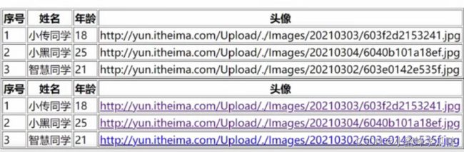
- views/06_UseTable.vue - 准备数据, 传入给MyTable.vue组件里循环使用。
list: [
    {
        name: "小传同学",
        age: 18,
        headImgUrl:
        "http://yun.itheima.com/Upload/./Images/20210303/603f2d2153241.jpg",
    },
    {
        name: "小黑同学",
        age: 25,
        headImgUrl:
        "http://yun.itheima.com/Upload/./Images/20210304/6040b101a18ef.jpg",
    },
    {
        name: "智慧同学",
        age: 21,
        headImgUrl:
        "http://yun.itheima.com/Upload/./Images/20210302/603e0142e535f.jpg",
    },
],
例子: 我想要给td内显示图片, 需要传入自定义的img标签

正确做法:
在MyTable.vue的td中准备
- components/06/MyTable.vue
<template>
  <div>
      <table border="1">
          <thead>
              <tr>
                  <th>序号th>
                  <th>姓名th>
                  <th>年龄th>
                  <th>头像th>
              tr>
          thead>
          <tbody>
              <tr v-for="(obj, index) in arr" :key="index">
                  <td>{{ index + 1 }}td>
                  <td>{{ obj.name }}td>
                  <td>{{ obj.age }}td>
                  <td>
                      <slot :row="obj">

                          {{ obj.headImgUrl}}
                      slot>
                  td>
              tr>
          tbody>
      table>
  div>
template>

<script>
export default {
    props: {
        arr: Array
    }
}
script>
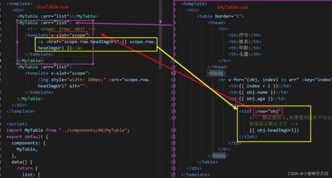
- 在UseTable使用MyTable的时候, template上v-slot绑定变量, 传入img组件设置图片地址。父组件UseTable.vue,子组件:MyTable.vue。
- 插槽技术:想要子组件里面的变量obj。用作用域插槽,随便定义一个属性
:row然后绑定内部的变量::row="obj"②在父组件中v-slot="随便起一个变量名,就叫scope"这个变量scope收集对应slot身上的所有属性和值。scope: {row: obj}
<template>
  <div>
    <MyTable :arr="list">MyTable>
    <MyTable :arr="list">

       <template v-slot="scope">
            <a :href="scope.row.headImgUrl">{{ scope.row.headImgUrl }}a>
       template>
    MyTable>
    <MyTable :arr="list">
       <template v-slot="scope">
            <img style="width: 100px;" :src="scope.row.headImgUrl" alt="">
       template>
    MyTable>
  div>
template>

<script>
import MyTable from "../components/06/MyTable";
export default {
  components: {
    MyTable,
  },
  data() {
    return {
      list: [
        {
          name: "小传同学",
          age: 18,
          headImgUrl:
            "http://yun.itheima.com/Upload/./Images/20210303/603f2d2153241.jpg",
        },
        {
          name: "小黑同学",
          age: 25,
          headImgUrl:
            "http://yun.itheima.com/Upload/./Images/20210304/6040b101a18ef.jpg",
        },
        {
          name: "智慧同学",
          age: 21,
          headImgUrl:
            "http://yun.itheima.com/Upload/./Images/20210302/603e0142e535f.jpg",
        },
      ],
    }
  },
}
script>
<style>style>
- App.vue
<template>
	// ……
	<UseTable></UseTable>
</template>

<script>
import UseTable from './views/06_UseTable'
export default {
	components: {
		UseTable
	}
}
总结: 插槽可以自定义标签, 作用域插槽可以把组件内的值取出来自定义内容。
1.
2. 变量名收集slot身上对应的所有属性和值。
2. 自定义指令
问题:如果想要一个输入框打开的时候自动处于聚焦的状态,用一个指令实现。但是Vue内置的指令无法实现这个功能,所以需要自定义指令。
自定义指令文档
除了核心功能默认内置的指令 (v-model 和 v-show),Vue 也允许注册自定义指令。 v-指令名
html+css复用的主要形式是组件。
对普通 DOM 元素进行底层操作时,会用到自定义指令。
2.0 全局注册
- 在main.js用 Vue.directive()方法来进行注册, 以后随便哪个.vue文件里都可以直接用v-fofo指令。
Vue.directive("指令名", {
  inserted(el) {
    // 可以对el标签扩展额外的功能
  }
})
// 全局指令 - 到处"直接"使用
Vue.directive("gfocus", {
  inserted(el) {
    el.focus() // 触发标签自动聚焦的事件方法。gfocus是指令名。
  }
})

// 在UseDirective.vue中使用:
<input type="text" v-gfocus>
总结: 全局注册自定义指令, 哪里都能用, 局部注册, 只能在当前vue文件里用
2.1 局部注册和使用
目标: 获取标签, 扩展额外的功能
directives: {
	"指令名字":{
		inserted(el){
			// 对el进行操作
		}
	}
}
- 07_UseDirective.vue - 只能在当前组件.vue文件中使用
<template>
  <div>
      <!-- <input type="text" v-gfocus> -->
      <input type="text" v-focus>
  </div>
</template>

<script>
// 目标: 创建 "自定义指令", 让输入框自动聚焦
// 1. 创建自定义指令
// 全局 / 局部
// 2. 在标签上使用自定义指令  v-指令名
export default {
    data(){
        return {
            colorStr: 'red'
        }
    },
    directives: {
        focus: {
            inserted(el){
                el.focus()
            }
        }
    }
}
</script>
【注意】
1.inserted方法 - 指令所在标签, 只有被插入到网页上才会触发(一次),比如: 当标签压根都没有在网页上显示的时候,这个指令就不会被触发。
2.update方法 - 指令对应数据/标签更新时, 此方法执行。
2.2 传值
目标: 使用自定义指令, 传入一个值
需求: 定义color指令-传入一个颜色, 给标签设置文字颜色。
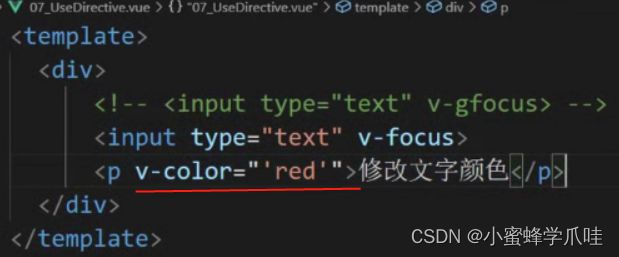
【注意】用v-color="'red'",原因是red没有定义,这里的意思是传入值。而不是将red当变量用。
- main.js定义处修改一下
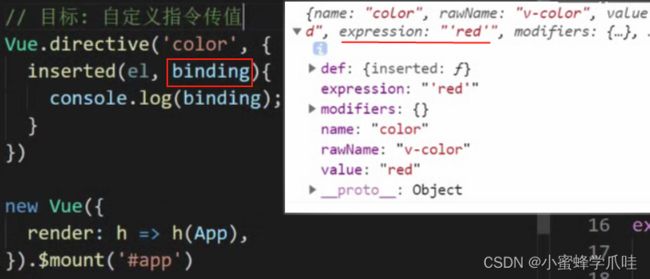
// 目标: 自定义指令传值
Vue.directive('color', {
  // 当被绑定的元素插入到父元素中时调用
  inserted(el, binding) { // el接收标签,binding绑定的值
    el.style.color = binding.value
  },
  update(el, binding) { // 值或者模板更新时,触发此函数
    el.style.color = binding.value
  }
})
- Direct.vue处更改一下
<p v-color="colorStr" @click="changeColor">修改文字颜色</p>

<script>
export default {
  data() {
    return {
      colorStr: "red",
    }
  },
  methods: {
    changeColor() {
      this.colorStr= 'blue';
    },
  },
</script>
总结: v-xxx, 自定义指令, 获取原生DOM, 自定义操作。
2.指令值变化触发什么方法?自定义指令的update方法而非inserted方法。
3. TabBar案例
完成如下案例:
知识点:组件封装、动态组件、keep-alive、作用域插槽、自定义指令。
3.0 初始化项目
准备: 创建项目文件夹, 引入字体图标, 下载 bootstrap, less, [email protected], axios, 在App.vue中注册组件。

组件拆分:
- MyHeader.vue – 复用之前的
- MyTabBar.vue – 底部导航
- MyTable.vue – 封装表格
三个页面:
- MyGoodsList.vue – 商品页
- MyGoodsSearch.vue – 搜索页
- MyUserInfo.vue – 用户信息页
思路分析:
①: vue create tabbar-demo
②: yarn add less [email protected] -D
③: yarn add bootstrap axios 并在main.js 引入全局属性。
④: 根据需求-创建需要的页面组件。
⑤: 把之前购物车案例-封装的MyHeader.vue文件复制过来复用。
⑥: 从App.vue – 引入组织相关标签。

新建工程:
在main.js中引入bootstrap.css和字体图标样式:
import "bootstrap/dist/css/bootstrap.css"
import "./assets/fonts/iconfont.css"
- vue.config.js
module.exports = {
    lintOnSave: false
}
创建/复制如下文件:
从购物车案例中-直接复制过来:components/MyHeader.vue
- components/MyTabBar.vue
- views/MyGoodsList.vue
- views/MyGoodsSearch.vue
- views/MyUserInfo.vue
- components/MyTable.vue
先将MyHeader.vue展示出来:
3.1 底部封装
目标: 实现MyTabBar.vue组件
需求: 把底部导航也灵活封装起来。
分析:
①: 基本标签+样式
②: 为tabbar组件指定数据源,数据源最少2个, 最多5个(validator)
不能写死,因为有可能别的项目导航数量是2个,或者4个。
③: 从App.vue给MyTabBar.vue传入底部导航的数据。
④: MyTabBar.vue中循环展示。
- App.vue-数组准备
tabList: [
    {
        iconText: "icon-shangpinliebiao",
        text: "商品列表",
        componentName: "MyGoodsList"
    },
    {
        iconText: "icon-sousuo",
        text: "商品搜索",
        componentName: "MyGoodsSearch"
    },
    {
        iconText: "icon-user",
        text: "我的信息",
        componentName: "MyUserInfo"
    }
]
- MyTabBar.vue - 标签模板
<template>
  <div class="my-tab-bar">
  	<div class="tab-item">
      <!-- 图标 -->
      <span class="iconfont"></span>
      <!-- 文字 -->
      <span></span>
    </div>
  </div>
</template>

<script>
export default {

}
</script>

<style lang="less" scoped>
.my-tab-bar {
  position: fixed;
  left: 0;
  bottom: 0;
  width: 100%;
  height: 50px;
  border-top: 1px solid #ccc;
  display: flex;
  justify-content: space-around;
  align-items: center;
  background-color: white;
  .tab-item {
    display: flex;
    flex-direction: column;
    align-items: center;
  }
}

.current {
  color: #1d7bff;
}
</style>
自定义校验规则validator
- MyTabBar.vue正确代码
<template>
  <div class="my-tab-bar">
    <div
      class="tab-item"
      v-for="(obj, index) in arr"
      :key="index"
    >
      <!-- 图标 -->
      <span class="iconfont" :class="obj.iconText"></span>
      <!-- 文字 -->
      <span>{{ obj.text }}</span>
    </div>
  </div>
</template>

<script>
export default {
  props: {
    arr: {
      type: Array,
      required: true,
      // 自定义校验规则
      validator(value) {
        // value就是接到的数组
        if (value.length >= 2 && value.length <= 5) {
          return true; // 符合条件就return true
        } else {
          console.error("数据源必须在2-5项");
          return false;
        }
      },
    },
  }
};
</script>
【注意】不要忘了把tabList数组从App.vue -> MyTabBar.vue
3.2 底部高亮
需求: 点击底部导航实现高亮效果。
分析:
①: 绑定点击事件, 获取点击的索引。
②: 循环的标签设置动态class, 遍历的索引和点击保存的索引比较, 相同则高亮。
效果演示:
- MyTabBar.vue
<template>
  <div class="my-tab-bar">
    <div class="tab-item"
    v-for="(obj, index) in arr"
    :key="index"
    :class="{current: index === activeIndex }"
    @click="btn(index)">
      <!-- 图标 -->
      <span class="iconfont" :class="obj.iconText"></span>
      <!-- 文字 -->
      <span>{{ obj.text }}</span>
    </div>
  </div>
</template>

<script>
export default {
  data(){
    return {
      activeIndex: 0 // 高亮元素下标
    }
  },
  methods: {
	btn(index){this.activeIndex = index}
  }
};
</script>
3.3 组件切换
需求: 点击底部导航, 切换页面组件显示。
分析:
①: 底部导航传出动态组件名字符串到App.vue
②: 切换动态组件is属性的值为要显示的组件名。
补充: 给内容div.main- 设置上下内边距。(因为头部MyHeader有一个固定定位。不设上下内边距的话,切换的MyGoodsList 就被挡住看不到了。)
- App.vue - 引入并注册
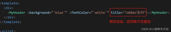
<template>
  <div>
    <MyHeader
      :background="'blue'"
      :fontColor="'white'"
      title="TabBar案例"
    ></MyHeader>
    <div class="main">
      <component :is="comName"></component>
    </div>
    <MyTabBar :arr="tabList"
    @changeCom="changeComFn"
    ></MyTabBar>
  </div>
</template>

<script>
import MyHeader from "./components/MyHeader";
// 目标: 完成底部封装
// 1. MyTabBar.vue 组件标签+样式 准备
// 2. 字体图标引入
// 3. 准备底部数据
// 4. 使用MyTabBar组件, 传入数据(父->子), 循环产生底部导航
// 5. 子组件内props自定义检验规则(2-5项)
// 6. 子组件内循环产生底部导航
import MyTabBar from './components/MyTabBar'

// 目标: 切换组件显示
// 1. 创建组件 - 编写内容
// 2. 引入App.vue注册
// 3. 挂载点设置is
// 4. 切换comName的值(重要)
// 5. 底部导航点击- MyTabBar.vue里
// 子 -> 父技术 (传要切换的组件名出来)

import MyGoodsList from './views/MyGoodsList'
import MyGoodsSearch from './views/MyGoodsSearch'
import MyUserInfo from './views/MyUserInfo'
export default {
  data() {
    return {
      comName: "MyGoodsList", // 默认显示的组件
      tabList: [ // 底部导航的数据
        {
          iconText: "icon-shangpinliebiao",
          text: "商品列表",
          componentName: "MyGoodsList",
        },
        {
          iconText: "icon-sousuo",
          text: "商品搜索",
          componentName: "MyGoodsSearch",
        },
        {
          iconText: "icon-user",
          text: "我的信息",
          componentName: "MyUserInfo",
        },
      ],
    };
  },
  components: {
    MyHeader,
    MyTabBar,
    MyGoodsList,
    MyGoodsSearch,
    MyUserInfo
  },
  methods: {
    changeComFn(cName){
      this.comName = cName;
      // MyTabBar里选出来的组件名赋予给is属性的comName
     // 导致组件的切换
    }
  }
}
</script>

<style scoped>
.main{
  padding-top: 45px;
  padding-bottom: 51px;
}
</style>
- MyTabBar.vue - 点击传递过来组件名
<div class="tab-item"
      v-for="(obj, index) in arr"
      :key="index"
      :class="{current: index === activeIndex }"
      @click="btn(index, obj)"
      >

methods: {
    btn(index, theObj) {
      this.selIndex = index; // 点谁, 就把谁的索引值保存起来
      this.$emit("changeCom", theObj.componentName); // 要切换的组件名传App.vue
    },
  },
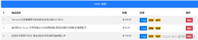
3.4 商品列表(用到axios请求数据)
需求: 为MyGoodsList页面, 准备表格组件MyTable.vue-铺设展示数据,完成商品列表铺设页面 。
分析:
①: 封装MyTable.vue – 准备标签和样式。
②: 用 axios 在MyGoodsList.vue请求数据回来。
③: 请求地址: https://www.escook.cn/api/goods
④: 传入MyTable.vue中循环数据显示。
⑤: 给删除按钮添加bootstrap的样式: btn btn-danger btn-sm
效果演示:

- MyTable.vue - 准备table整个表格标签和样式(模板)
<template>
  <table class="table table-bordered table-stripped">

    <thead>
      <tr>
        <th>#th>
        <th>商品名称th>
        <th>价格th>
        <th>标签th>
        <th>操作th>
      tr>
    thead>

    <tbody>
      <tr >
        <td>1td>
        <td>商品td>
        <td>998td>
        <td>xxxtd>
        <td>xxxtd>
      tr>
    tbody>
  table>
template>

<script>
export default {
  name: 'MyTable'
}
script>

<style scoped lang="less">
.my-goods-list {
  .badge {
    margin-right: 5px;
  }
}
style>
- main.js 中注册axios配置默认地址(全局配置)。
import axios from "axios";
axios.defaults.baseURL = "https://www.escook.cn";
- MyGoodsList.vue - 使用axios请求数据, 把数据传入给MyTable.vue里循环铺设。
<template>
  <div>
    <MyTable :arr="list">
    </MyTable>
  </div>
</template>

<script>
import MyTable from "../components/MyTable";
import axios from "axios";
axios.defaults.baseURL = "https://www.escook.cn";
// 目标: 循环商品列表表格
// 1. 封装MyTable.vue 整体表格组件-一套标签和样式
// 2. axios请求数据
// 3. 传入MyTable组件里循环tr显示数据

// 目标: 展示tags标签
// 1. tags数组 - 某个td循环span使用文字
// 2. span设置bs的样式

// 目标: 删除数据
// 1. 删除按钮 - 点击事件
// 2. 作用域插槽把索引值关联出来了
// scope身上就有row和index
// 3. 删除中使用scope.index的索引值
// 4. 删除事件里删除数组里对应索引值的数据
export default {
  components: {
    MyTable,
  },
  data() {
    return {
      list: [] // 所有数据
    }
  },
  created() {
    axios({
      // 默认为GET请求方式
      url: "/api/goods",
    }).then((res) => {
      console.log(res)
      this.list = res.data.data
    });
  }
};
</script>

- MyTable.vue里正确代码
<template>
  <table class="table table-bordered table-stripped">
    <!-- 表格标题区域 -->
    <thead>
      <tr>
        <th>#</th>
        <th>商品名称</th>
        <th>价格</th>
        <th>标签</th>
        <th>操作</th>
      </tr>
    </thead>
    <!-- 表格主体区域 -->
    <tbody>
      <tr v-for="(obj, index) in arr"
      :key="obj.id"
      >
        <td>{{ obj.id }}</td>
        <td>{{ obj.goods_name }}</td>
        <td>{{ obj.goods_price }}</td>
        <td>{{ obj.tags }}</td>
        <td>
            <button class="btn btn-danger btn-sm">删除</button>
        </td>
      </tr>
    </tbody>
  </table>
</template>

<script>
export default {
  name: 'MyTable',
  props: {
      arr: Array
  }
}
</script>

<style scoped lang="less">
.my-goods-list {
  .badge {
    margin-right: 5px;
  }
}
</style>
3.5 商品表格-具名插槽&作用域插槽
目标: 使用作用域插槽技术, 给MyTable.vue组件, 自定义列标题, 自定义表格内容。
需求: 允许用户自定义表格头和表格单元格内容。
分析:
①: 把MyTable.vue里准备slot标签占位。
②: 使用MyTable组件时传入具体标签。
步骤:
1.提高组件复用性和灵活性, 把表格列标题thead部分预留, 设置name属性(具名插槽)。
2.使用MyTable.vue时, 传入列标题标签。
3.表格内容td部分也可以让组件使用者自定义, 也给tbody下tr内留好。
4.使用插槽时需要用到插槽内的 obj 对象上的数据, 使用作用域插槽技术。
- MyTable.vue - 留好具名插槽
<template>
  <table class="table table-bordered table-stripped">
    <!-- 表格标题区域 -->
    <thead>
      <tr>
        // 删掉原来的表格标题
        <slot name="header"></slot>
      </tr>
    </thead>
    <!-- 表格主体区域 -->
    <tbody>
      <tr v-for="(obj, index) in arr"
      :key="obj.id"
      >
        <!-- <td>{{ obj.id }}</td>
        <td>{{ obj.goods_name }}</td>
        <td>{{ obj.goods_price }}</td>
        <td>{{ obj.tags }}</td>
        <td>
            <button class="btn btn-danger btn-sm">删除</button>
        </td> -->
        <slot name="body" :row="obj" :index="index"></slot>
      </tr>
    </tbody>
  </table>
</template>

<script>
export default {
  name: 'MyTable',
  props: {
      arr: Array
  }
}
</script>
- MyGoodsList.vue 使用,
相当于<template> <div> <MyTable :arr="list"> <template #header> <th>#</th> <th>商品名称</th> <th>价格</th> <th>标签</th> <th>操作</th> </template> <!-- scope的值: {row: obj, index: 索引值} --> <template #body="scope"> <td>{{ scope.row.id }}</td> <td>{{ scope.row.goods_name }}</td> <td>{{ scope.row.goods_price }}</td> <td>{{ scope.row.tags }}</td> <td> <button class="btn btn-danger btn-sm">删除</button> </td> </template> </MyTable> </div> </template> <script> import MyTable from "../components/MyTable"; import axios from "axios"; axios.defaults.baseURL = "https://www.escook.cn"; // 目标: 循环商品列表表格 // 1. 封装MyTable.vue 整体表格组件-一套标签和样式 // 2. axios请求数据 // 3. 传入MyTable组件里循环tr显示数据 // 目标: 展示tags标签 // 1. tags数组 - 某个td循环span使用文字 // 2. span设置bs的样式 // 目标: 删除数据 // 1. 删除按钮 - 点击事件 // 2. 作用域插槽把索引值关联出来了 // scope身上就有row和index // 3. 删除中使用scope.index的索引值 // 4. 删除事件里删除数组里对应索引值的数据 export default { components: { MyTable, }, data() { return { list: [] // 所有数据 }; }, created() { axios({ url: "/api/goods", }).then((res) => { console.log(res); this.list = res.data.data; }); } }; </script>3.6 商品表格-tags微标
需求: tags标签列自定义显示。
分析:
①: 插槽里传入的td单元格。
②: 自定义span标签的循环展示-给予样式。效果演示:

bootstrap徽章
bootstrap徽章:https://v4.bootcss.com/docs/components/badge/
- MyGoodsList.vue - 插槽

<td> <span v-for="(str, ind) in scope.row.tags" :key="ind" class="badge badge-warning" > {{ str }} </span> </td>- 下面额外添加样式
<style lang="less" scoped> .my-goods-list { .badge { margin-right: 5px; } } </style>3.7 商品表格-删除功能
需求: 点击删除按钮删除数据。
分析:
①: 删除按钮绑定点击事件。
②: 作用域插槽绑定id值出来。
③: 传给删除方法, 删除MyGoodsList.vue里数组里数据。
提示: id在MyTable.vue里, 但是MyGoodsList.vue里要使用, 而且在插槽位置, 使用作用域插槽已经把整个obj对象(包含id)带出来了。- MyTable.vue
<slot name="body" :row="obj"></slot>内置对象Array,splice(),findIndex()
- ES6 数组方法find()、findIndex()的总结
- JS 内置对象之-Array
- JS 中的splice方法的使用说明
- 当数组中的元素在测试条件时返回
true时, findIndex() 返回符合条件的元素的索引位置(注:find()返回的是元素),之后的值不会再调用执行函数。如果没有符合条件的元素返回-1(注:find()返回的是undefined)。 - array.splice(index,num),返回值为删除内容,array为结果值。第一个参数(起始位置),第二个参数(删除的项数)
- MyGoodsList.vue - 注册点击事件,根据 id 删除。
<button class="btn btn-danger btn-sm" @click="removeBtn(scope.row.id)" >删除</button> removeBtn(id){ let index = this.list.findIndex(obj => obj.id === id) this.list.splice(index, 1) },3.8 添加tab
需求: 实现点击tab按钮, 出现输入框自动获取焦点, 失去焦点关闭input, 回车新增tag, esc清空内容。
- 需求1: 点击Tab, 按钮消失, 输入框出现。
- 需求2: 输入框自动聚焦。
- 需求3: 失去焦点, 输入框消失, 按钮出现。
- 需求4: 监测input回车, 无数据拦截。
- 需求5: 监测input取消, 清空数据。
- 需求6: 监测input回车, 有数据添加。
效果展示:

3.8.0 点击按钮消失, 输入框出现
注意: 每个tab按钮和input都是独立变量控制, 那么直接在row身上的属性控制即可。
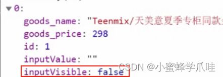
- MyGoodsList.vue - 标签位置添加
<input class="tag-input form-control" style="width: 100px;" type="text" v-if="scope.row.inputVisible" v-focus @blur="scope.row.inputVisible = false" /> <button v-else style="display: block;" class="btn btn-primary btn-sm add-tag" @click="scope.row.inputVisible = true" >+Tag</button>3.8.1 input自动获取焦点(自定义指令)
- main.js - 定义全局自定义指令
// 全局指令 Vue.directive("focus", { inserted(el){ el.focus() } })- MyGoodsList.vue - 使用 v-focus指令
3.8.2 input失去焦点关闭input
- 监听input失去焦点事件, 让input消失
@blur="scope.row.inputVisible = false"3.8.3 input回车新增tag
- 监听input的回车事件, 如果无数据则拦截代码
@keydown.enter="enterFn(scope.row)" v-model="scope.row.inputValue"- 在MyGoodsList.vue中添加事件处理函数
enterFn(obj){ // 回车 // console.log(obj.inputValue); if (obj.inputValue.trim().length === 0) { alert('请输入数据') return } obj.tags.push(obj.inputValue) // 表单里的字符串状态tags数组 obj.inputValue = "" }3.8.4 input框esc清空内容
@keydown.esc="scope.row.inputValue = ''"总结
1.动态组件的使用步骤
2.组件缓存使用步骤和作用
3.组件插槽默认使用
4.插槽默认显示的内容
5.多个插槽时, 具名插槽如何使用
6.作用域插槽如何使用以及目的
7.自定义命令如何使用
8.跟随视频完成tabbar案例面试题
1. vue中solt的使用方式,以及solt作用域插槽的用法
使用方式:当组件当做标签进行使用的时候,用slot可以用来接受组件标签包裹的内容,当给solt标签添加name属性的 时候,可以调换响应的位置
(高级用法) 插槽作用域: 当传递的不是单一的标签, 例如需要循环时, 把要循环的标签传入, 组件内使用v-for在slot标签上, 内部可以v-bind:把值传出来, 再外面把值赋予进去, 看示例<current-user> <template v-slot:default="slotProps"> {{ slotProps.user.firstName }} </template> </current-user> // current-user组件, user属性和值, 绑定给slotProps上 <span> <slot v-bind:user="user"> {{ user.lastName }} </slot> </span>扩展阅读: 插槽扩展阅读 (了解即可, 一般用不上)
2. 跟keep-alive有关的生命周期是哪些?(必会)
1**)前言:**在开发Vue项目的时候,大部分组件是没必要多次渲染的,所以Vue提供了一个内置组件keep-alive来缓存组件内部状态,避免重新渲染,在开发Vue项目的时候,大部分组件是没必要多次渲染的,所以Vue提供了一个内置组件keep-alive来缓存组件内部状态,避免重新渲染
2**)生命周期函数:**在被keep-alive包含的组件/路由中,会多出两个生命周期的钩子:activated 与 deactivated。
1**、activated钩子:**在在组件第一次渲染时会被调用,之后在每次缓存组件被激活时调用。
2**、Activated钩子调用时机:** 第一次进入缓存路由/组件,在mounted后面,beforeRouteEnter守卫传给 next 的回调函数之前调用,并且给因为组件被缓存了,再次进入缓存路由、组件时,不会触发这些钩子函数,beforeCreate created beforeMount mounted 都不会触发
1**、deactivated钩子:**组件被停用(离开路由)时调用。
2**、deactivated钩子调用时机**:使用keep-alive就不会调用beforeDestroy(组件销毁前钩子)和destroyed(组件销毁),因为组件没被销毁,被缓存起来了,这个钩子可以看作beforeDestroy的替代,如果你缓存了组件,要在组件销毁的的时候做一些事情,可以放在这个钩子里,组件内的离开当前路由钩子beforeRouteLeave => 路由前置守卫 beforeEach =>全局后置钩子afterEach => deactivated 离开缓存组件 => activated 进入缓存组件(如果你进入的也是缓存路由)
3. 自定义指令(v-check、v-focus)的方法有哪些?它有哪些钩子函数?还有哪些钩子函数参数?(必会)
全局定义指令:在vue对象的directive方法里面有两个参数,一个是指令名称,另外一个是函数。组件内定义指令:directives
钩子函数:bind(绑定事件触发)、inserted(节点插入的时候触发)、update(组件内相关更新)
钩子函数参数:el、binding
4. is这个特性你有用过吗?主要用在哪些方面?(高薪常问)
1**)动态组件**
, componentName可以是在本页面已经注册的局部组件名和全局组件名,也可以是一个组件的选项对象。 当控制componentName改变时就可以动态切换选择组件。
2**)is的用法**
有些HTML元素,诸如
- 、
- 、和 和