Homework 1 - Security Analytics - A simple task using Jupyter Notebook
1. Install Python and Numpy, Pandas, sklearn, matplotlib, seaborn.
2. Download credit card fraud data from https://www.kaggle.com/mlg-ulb/creditcardfraudLinks to an external site.
3. import data & check the shape of the dataset (how many rows, how many columns) & check information. (The last column is class. class = 1 means fraud.) Check how many frauds and how many normal transactions.
4. Explore some plot functions. visualize feature data in terms of fraud vs. normal data. Randomly pick 2 or 3 features. plot fraud data in red and normal data in green.
creditcard.csv
hw1_Kyle Wang.ipynb
import numpy as np
import pandas as pd
import matplotlib.pyplot as plt
import seaborn as sns
import matplotlib as mpl
import sklearn as skl


cards = pd.read_csv("creditcard.csv")
Class = cards["Class"]
Class_0 = Class.index[Class==0]
Class_1 = Class.index[Class==1]

row_num = cards.shape[0]
print("row number: ", row_num)

column_num = cards.shape[1]
print("column number: ", column_num)

normal_num = Class_0.size;
print("normal number: ", normal_num)

fraud_num = Class_1.size;
print("fraud number: ", fraud_num)
row number: 284807
column number: 31
normal number: 284315
fraud number: 492
colors = ['green', 'red']
sns.countplot(x=cards["Class"], palette=colors)
plt.title('Class Distribution \n (0: No Fraud || 1: Fraud)', fontsize=14);
plt.show()

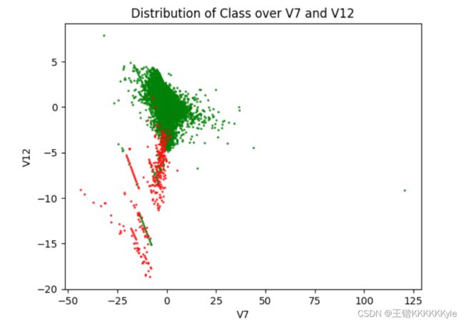
cm=mpl.colors.ListedColormap(['g','r'])
plt.title('Distribution of Class over V7 and V12') # title
plt.xlabel('V7')             # abscissa name
plt.ylabel('V12')            # ordinate name
plt.scatter(cards["V7"],cards["V12"], c = cards["Class"], cmap=cm, s=2, alpha=0.8, marker='x')
plt.show()
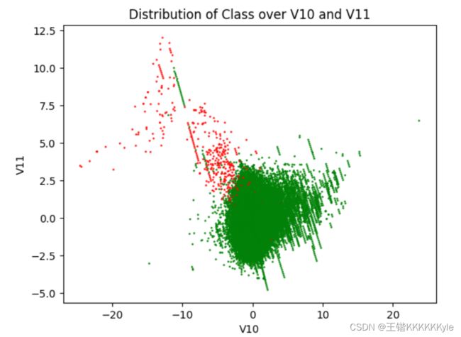
cm=mpl.colors.ListedColormap(['g','r'])
plt.title('Distribution of Class over V10 and V11') # title
plt.xlabel('V10')             # abscissa name
plt.ylabel('V11')           # ordinate name
plt.scatter(cards["V10"],cards["V11"], c = cards["Class"], cmap=cm, s=1, alpha=0.8)
plt.show()
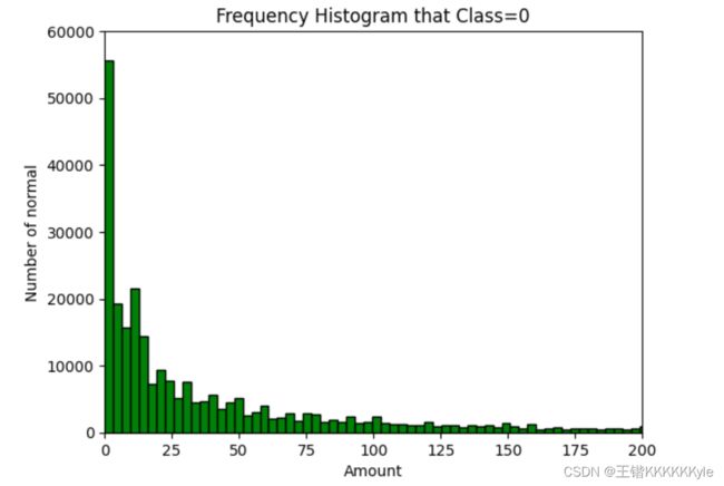
Amount_0 = cards.iloc[Class_0, 29] # get Amount list that Class=0

plt.ylim(0, 60000)
plt.xlim(0, 200)
plt.title('Frequency Histogram that Class=0') # title
plt.xlabel('Amount')             # abscissa name
plt.ylabel('Number of normal')   # ordinate name
plt.hist(Amount_0, bins=8000, density=False, color = 'green', edgecolor='black') # draw Frequency Histogram that Class=0
plt.show()
Amount_1 = cards.iloc[Class_1, 29] # get Amount list that Class=1

plt.ylim(0, 300)
plt.xlim(0, 1000)
plt.title('Frequency Histogram that Class=1') # title
plt.xlabel('Amount')             # abscissa name
plt.ylabel('Number of fraud')    # ordinate name
plt.hist(Amount_1, bins=100, density=False, color = 'red', edgecolor='black') # draw Frequency Histogram that Class=1
plt.show()
