【matplotlib】可视化解决方案——如何正确使用文本注释
概述
注释是图形元素,通常是文本片段,用于解释、添加上下文或以其他方式突出显示可视化数据的某些部分。文本注释的展示效果在很大程度上受文本注释位置的影响,而且,文本注释位置又由于采用的坐标系统的不同而呈现出不同的文本移动情况。接下来,本文将会详细介绍文本注释位置的坐标系统。
matplotlib 的注释一共有两种,第一种是无指向型注释 text();另一种是指向型注释 annotate()。本文将主要介绍 annotate(),该方法的定义如下:
Axes.annotate(text, xy, xytext=None, xycoords='data', textcoords=None, arrowprops=None, annotation_clip=None, **kwargs)
参数说明:
- text:要注释的文字;
- xy:指定要注释的点;
- xytext:放置文本的位置;
- xycoords:指定注释点的坐标系;
- textcoords:指定注释文字的坐标系;
- arrowprops:指定从文字注释位置出发到注释点之间的箭头属性;
- annotation_clip:指定当标注点在坐标轴区域外时的处理方法;
- kwargs:传递关键字参数给 Text类;
返回值:Annotation实例。
annotate() 方法主要需要定义三个东西,第一个是注释点;第二个是注释文字和其属性;最后一个是中间箭头的相关属性。使用该方法的难点在于 xycoords 和 textcoords 参数的设置,前者可能的取值如下:
| 值 | 描述 |
|---|---|
| figure points | 相对于图像左下角的点数(points) |
| figure pixels | 相对于图像左下角的像素数(pixels) |
| figure fraction | 相对于图像左下角的比例,(0, 0) 为图像左下角; (1, 1) 为右上角 |
| subfigure points | 相对于子图左下角的点数(points) |
| subfigure pixels | 相对于子图左下角的像素数(pixels) |
| subfigure fraction | 相对于子图左下角的比例 |
| axes points | 相对图坐标轴的点数(points) |
| axes pixels | 相对图坐标轴的像素数(pixels) |
| axes fraction | 相对图坐标轴的比例 |
| data | 默认值,使用被注解对象的坐标系 |
| polar | 极坐标系 |
一般情况下我们就使用默认值就好了,因为相对于注解对象的坐标系理解起来最为容易。textcoords 参数可能的取值就简单了,默认情况下和 xycoords 参数指定的模式一致,除此之外还可以设置是按点偏移还是按像素偏移。
示例
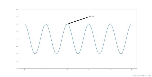
我们首先以一个简单的例子开始,给出数据标注位置和注释文本位置,这两个参数都传递一个元祖。完整代码如下:
import numpy as np
import matplotlib.pyplot as plt

fig, ax = plt.subplots(figsize=(3, 3))

t = np.arange(0.0, 5.0, 0.01)
s = np.cos(2*np.pi*t)
line, = ax.plot(t, s, lw=2)

ax.annotate('local max', xy=(2, 1), xytext=(3, 1.5),
            arrowprops=dict(facecolor='black', shrink=0.05))
ax.set_ylim(-2, 2)

plt.show()
画图结果:
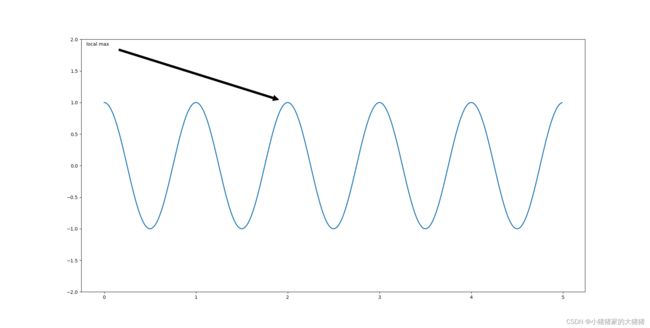
接着我们更改注释文字使用的坐标系为 axes fraction,传递元祖 (0.01, 0.99),那么文字注释就会在左上角。完整代码如下:
import numpy as np
import matplotlib.pyplot as plt

fig, ax = plt.subplots(figsize=(3, 3))

t = np.arange(0.0, 5.0, 0.01)
s = np.cos(2*np.pi*t)
line, = ax.plot(t, s, lw=2)

ax.annotate('local max', xy=(2, 1), xycoords='data',
            xytext=(0.01, .99), textcoords='axes fraction',
            va='top', ha='left',
            arrowprops=dict(facecolor='black', shrink=0.05))
ax.set_ylim(-2, 2)

plt.show()
画图结果如下:
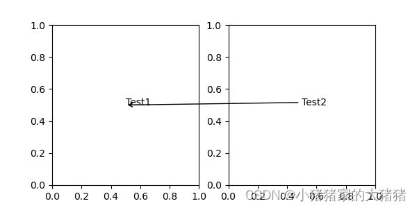
不光可以在一个 Axes 对象中注释,也可以在多个 Axes 对象中注释,完整的示例代码如下:
import numpy as np
import matplotlib.pyplot as plt

fig, (ax1, ax2) = plt.subplots(nrows=1, ncols=2, figsize=(6, 3))

ax1.annotate("Test1", xy=(0.5, 0.5), xycoords="axes fraction")
ax2.annotate("Test2",
               xy=(0.5, 0.5), xycoords=ax1.transData,
               xytext=(0.5, 0.5), textcoords=ax2.transData,
               arrowprops=dict(arrowstyle="->"))

plt.show()
画图结果:
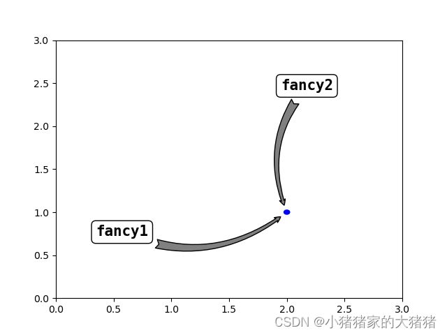
最后将 annotate() 方法做一个综合演示,包括箭头样式、文字样式、坐标轴等,其中箭头样式等内容将会在可视化之路专栏详细讲解完整代码如下:
import matplotlib.pyplot as plt

from basic_units import cm
from matplotlib.patches import Ellipse

fig, ax = plt.subplots(1, 1)
font_style = {"family": "monospace", "fontsize": 15, "weight": "bold"}
ellipse = Ellipse((2 * cm, 1 * cm), 0.05 * cm, 0.05 * cm, color='blue')
ax.add_patch(ellipse)

ax.annotate("fancy1", xy=(2 * cm, 1 * cm), xycoords='data', xytext=(0.8 * cm, 0.85 * cm), textcoords='data',
            bbox=dict(boxstyle='round', fc='w', ec='k'),
            arrowprops=dict(arrowstyle="fancy,head_length=0.4,head_width=0.4,tail_width=0.6", fc="gray",
                            connectionstyle='arc3,rad=0.3', shrinkA=5, patchB=ellipse, shrinkB=5), ha='right', va='top',
            **font_style)

ax.annotate("fancy2", xy=(2 * cm, 1 * cm), xycoords='data', xytext=(0.8 * cm, 0.85 * cm), textcoords='axes fraction',
            bbox=dict(boxstyle='round', fc='w', ec='k'),
            arrowprops=dict(arrowstyle="fancy,head_length=0.4,head_width=0.4,tail_width=0.6", fc="gray",
                            connectionstyle='arc3,rad=0.3', shrinkA=5, patchB=ellipse, shrinkB=5), ha='right', va='top',
            **font_style)

ax.set_xlim([0 * cm, 3 * cm])
ax.set_ylim([0 * cm, 3 * cm])
plt.show()
画图结果:
往期回顾
- 【matplotlib】可视化解决方案——如何调整计量单位和计量方法
- 【matplotlib】可视化解决方案——如何实现图形的动画效果
- 【matplotlib】可视化解决方案——如何正确使用plot方法
- 【matplotlib】可视化解决方案——如何正确使用bar方法
- 【matplotlib】可视化解决方案——如何向画布中添加坐标轴
- 【matplotlib】可视化解决方案——如何正确使用matplotlib颜色系统
- 【matplotlib】可视化解决方案——如何实现画布局部放大功能
- 【matplotlib】可视化解决方案——如何更改matplotlib配置信息
- 【matplotlib】可视化解决方案——如何定制化网格
- 【matplotlib】可视化解决方案——如何向画布添加交叉直线
文中难免会出现一些描述不当之处(尽管我已反复检查多次),欢迎在留言区指正,相关的知识点也可进行分享,希望大家都能有所收获!!如果觉得我的文章写得还行,不妨支持一下。你的每一个转发、关注、点赞、评论都是对我最大的支持!