【8】python_matplotlib改变横坐标和纵坐标上的刻度(ticks)、sagemath-list_plot()调整图例(legend)中点的数量、Matplotlib画各种论文图
1.python_matplotlib改变横坐标和纵坐标上的刻度(ticks)
用matplotlib画二维图像时,默认情况下的横坐标和纵坐标显示的值有时达不到自己的需求,需要借助xticks()和yticks()分别对横坐标x-axis和纵坐标y-axis进行设置。
import numpy as np
import matplotlib.pyplot as plt
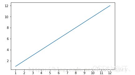
x = range(1,13,1)
y = range(1,13,1)
plt.plot(x,y)
plt.xticks(x)
plt.show()参考文档:xticks()函数介绍 yticks()函数介绍
xticks()中有3个参数:
xticks(locs, [labels], **kwargs) # Set locations and labels
locs参数为数组参数(array_like, optional),表示x-axis的刻度线显示标注的地方,即ticks放置的地方,
- 第一如果希望显示1到12所有的整数,就可以将locs参数设置为range(1,13,1),
- 第二个参数也为数组参数(array_like, optional),可以不添加该参数,表示在locs数组表示的位置添加的标签,labels不赋值,在这些位置添加的数值即为locs数组中的数。
xticks()函数中,locs参数为数组x,即1到12所有的整数, 即画出的图像会在这12个位置画出ticks,即上图中的刻度线。
当赋予labels的值为空时,则在locs决定的位置上虽然会画出ticks,但不会显示任何值。
import numpy as np
import matplotlib.pyplot as plt
x = range(1,13,1)
y = range(1,13,1)
plt.plot(x,y)
plt.xticks(x,())
plt.show()
对于labels参数,我们可以赋予其任意其它的值,如人名,月份等等。
import numpy as np
import matplotlib.pyplot as plt
x = range(1,13,1)
y = range(1,13,1)
plt.plot(x,y)
plt.xticks(x, ('Tom','Dick','Harry','Sally','Sue','Lily','Ava','Isla','Rose','Jack','Leo','Charlie'))
plt.show()
可以显示月份:
import numpy as np
import matplotlib.pyplot as plt
import calendar
x = range(1,13,1)
y = range(1,13,1)
plt.plot(x,y)
plt.xticks(x, calendar.month_name[1:13],color='blue',rotation=60)
plt.show()
这里添加了 calendar 模块,用于显示月份的名称。calendar.month_name[1:13]即1月份到12月份每个月份的名称的数组。后面的参数color='blue'表示将标签颜色置为蓝色,rotation表示标签逆时针旋转60度。
通过上个示例,可看出第3个参数关键字参数**kwargs用于控制labels,具体可通过Text属性中的定义,添加到该参数中,关于其定义可参考在 Text 查询。
另外,通过第1个参数locs可以看出,xticks()函数还可以用来设置使x轴上ticks隐藏,即将空数组赋予它,则没有tick会显示在x轴上,此处参考:x轴数值隐藏。
import numpy as np
import matplotlib.pyplot as plt
import calendar
x = range(1,13,1)
y = range(1,13,1)
plt.plot(x,y)
plt.xticks([])
plt.show()
可看出x轴上没有tick显示:

同理,对于yticks()函数定义和xticks()函数定义完全相同。对于第一个例子,如果希望在y轴上的刻度线也显示1到12所有的整数,则将lens(1,13,1)赋予yticks()的locs参数即可:
import numpy as np
import matplotlib.pyplot as plt
import calendar
x = range(1,13,1)
y = range(1,13,1)
plt.plot(x,y)
plt.xticks(x)
plt.yticks(y)
plt.show()
综上,可以设计一个x轴为月份,y为星期的图像:
import numpy as np
import matplotlib.pyplot as plt
import calendar
from datetime import *
x = range(1,13,1)
y = range(1,13,1)
plt.plot(x,y)
plt.xticks(x, calendar.month_name[1:13],color='blue',rotation=60)
today = datetime(2018, 9, 10)
a=[]
for i in range(12):
    a.append(calendar.day_name[today.weekday()+(i%7)])
plt.yticks(y,a,color='red')
plt.show()
参考链接:python_matplotlib改变横坐标和纵坐标上的刻度(ticks)_matplotlib yticks_Poul_henry的博客-CSDN博客
2.sagemath-list_plot()调整图例(legend)中点的数量
sagemath中的list_plot画二维散点图时,本来落在二维空间的就是一些离散的点,所以想加上图例(legend),在图例中显示和这些点相同的一个点,用以代表这些所有的点是表示了什么,但往往显示的是3个点,代码和效果如下:
a=range(10)
b=range(10)

plot1 = list_plot(zip(a,b),plotjoined=False,color=(0,.5,1),marker='o',ticks=[range(10),range(10)],legend_label='Original Data Points',legend_color='red',pointsize=50)

plot1.axes_labels(['x coordinate ','y coordinate'])
plot1.axes_labels_size(1.2)
plot1.legend(True)
plot1.show(frame=True,legend_loc='lower right',legend_markerscale=0.6,legend_font_size=10)
本来自己的原意是在legend中只出现1个圆点,1个点代表在这个二维空间中出现的10个点的意思是”Original Data Points“ ,但结果是出现了3个点,影响可读性。
为了增强可读性,使点的数量变为1个,自己去查了官方文档(PDF版本,可下载): 2D Graphics - SageMath Documentation
该文档显示它的默认值为2,但由于这两个函数save()和show()都是包含于plot()函数中的参数,明确指出是作用于线条(line)。
- 将list_plot()的参数plotjoined改为True
- 当加入参数legend_numpoints,使legend_numpoints=1:
a=range(10)
b=range(10)

plot1 = list_plot(zip(a,b),plotjoined=True,color=(0,.5,1),marker='o',ticks=[range(10),range(10)],legend_label='Original Data Points',legend_color='red')

plot1.axes_labels(['x coordinate ','y coordinate'])
plot1.axes_labels_size(1.2)
plot1.legend(True)
plot1.show(frame=True,legend_loc='lower right',legend_numpoints=1,legend_markerscale=0.6,legend_font_size=10)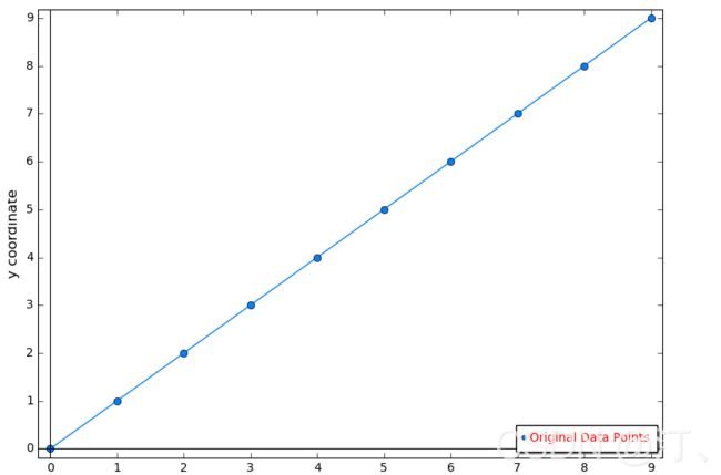
现在虽然知道legend_numpoints参数可以调节表示线条的图中legend里面点的数量,但对于离散的点,还是没有解决问题。
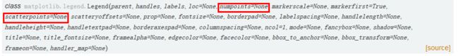
之后我又参考了python中matplotlib的关于legend官方文档:legend and legend_handler
里面有介绍legend类中的参数,里面有介绍两个参数:numpoints和scatterpoints:
numpoints作用于2D的线条,而scatterpoints作用于离散点。
这里也参考了stack overflow的一个问答:Setting a fixed size for points in legend 该问题是如何设置图例中点的大小,而不是点的数量。
所以考虑将legend_numpoints参数换作legend_scatterpoints,用于show()函数,并设置legend_scatterpoints=1。

代码改为:
a=range(10)
b=range(10)
plot1 = list_plot(zip(a,b),plotjoined=False,color=(0,.5,1),marker='o',ticks=[range(10),range(10)],legend_label='Original Data Points',legend_color='red',pointsize=50)

plot1.axes_labels(['x coordinate ','y coordinate'])
plot1.axes_labels_size(1.2)
plot1.legend(True)
plot1.show(frame=True,legend_loc='lower right',legend_scatterpoints=1,legend_markerscale=1.,legend_font_size=10)
效果完成,美观了。
参考链接:sagemath-list_plot()调整图例(legend)中点的数量(参考python_matplotlib)_Poul_henry的博客-CSDN博客
3.Matplotlib画各种论文图
可以,保存svg,再转成emf矢量图贴在文章里。在线转换工具。

# coding=utf-8

import numpy as np
import matplotlib.pyplot as plt

plt.rcParams['font.sans-serif'] = ['Arial']  # 如果要显示中文字体,则在此处设为:SimHei
plt.rcParams['axes.unicode_minus'] = False  # 显示负号

x = np.array([1, 2, 3, 4, 5, 6])
VGG_supervised = np.array([2.9749694, 3.9357018, 4.7440844, 6.482254, 8.720203, 13.687582])
VGG_unsupervised = np.array([2.1044724, 2.9757383, 3.7754183, 5.686206, 8.367847, 14.144531])
ourNetwork = np.array([2.0205495, 2.6509762, 3.1876223, 4.380781, 6.004548, 9.9298])

# label在图示(legend)中显示。若为数学公式,则最好在字符串前后添加"$"符号
# color:b:blue、g:green、r:red、c:cyan、m:magenta、y:yellow、k:black、w:white、、、
# 线型:-  --   -.  :    ,
# marker:.  ,   o   v    <    *    +    1
plt.figure(figsize=(10, 5))
plt.grid(linestyle="--")  # 设置背景网格线为虚线
ax = plt.gca()
ax.spines['top'].set_visible(False)  # 去掉上边框
ax.spines['right'].set_visible(False)  # 去掉右边框


plt.plot(x, VGG_supervised, marker='o', color="blue", label="VGG-style Supervised Network", linewidth=1.5)
plt.plot(x, VGG_unsupervised, marker='o', color="green", label="VGG-style Unsupervised Network", linewidth=1.5)
plt.plot(x, ourNetwork, marker='o', color="red", label="ShuffleNet-style Network", linewidth=1.5)

group_labels = ['Top 0-5%', 'Top 5-10%', 'Top 10-20%', 'Top 20-50%', 'Top 50-70%', ' Top 70-100%']  # x轴刻度的标识
plt.xticks(x, group_labels, fontsize=12, fontweight='bold')  # 默认字体大小为10
plt.yticks(fontsize=12, fontweight='bold')
# plt.title("example", fontsize=12, fontweight='bold')  # 默认字体大小为12
plt.xlabel("Performance Percentile", fontsize=13, fontweight='bold')
plt.ylabel("4pt-Homography RMSE", fontsize=13, fontweight='bold')
plt.xlim(0.9, 6.1)  # 设置x轴的范围
plt.ylim(1.5, 16)

# plt.legend()          #显示各曲线的图例
plt.legend(loc=0, numpoints=1)
leg = plt.gca().get_legend()
ltext = leg.get_texts()
plt.setp(ltext, fontsize=12, fontweight='bold')  # 设置图例字体的大小和粗细

plt.savefig('./filename.svg', format='svg')  # 建议保存为svg格式,再用inkscape转为矢量图emf后插入word中
plt.show()
效果:

其余详细补充:
import matplotlib.pyplot as plt
from matplotlib.pyplot import figure
import numpy as np

figure(num=None, figsize=(2.8, 1.7), dpi=300)
# figsize的2.8和1.7指的是英寸,dpi指定图片分辨率。那么图片就是(2.8*300)*(1.7*300)像素大小

plt.plot(test_mean_1000S_n, 'royalblue', label='without threshold')
plt.plot(test_mean_1000S, 'darkorange', label='with threshold')
# 画图,并指定颜色

plt.xticks(fontproperties = 'Times New Roman', fontsize=8)
plt.yticks(np.arange(0, 1.1, 0.2), fontproperties = 'Times New Roman', fontsize=8)
# 指定横纵坐标的字体以及字体大小,记住是fontsize不是size。yticks上我还用numpy指定了坐标轴的变化范围。

plt.legend(loc='lower right', prop={'family':'Times New Roman', 'size':8})
# 图上的legend,记住字体是要用prop以字典形式设置的,而且字的大小是size不是fontsize,这个容易和xticks的命令弄混

plt.title('1000 samples', fontdict={'family' : 'Times New Roman', 'size':8})
# 指定图上标题的字体及大小

plt.xlabel('iterations', fontdict={'family' : 'Times New Roman', 'size':8})
plt.ylabel('accuracy', fontdict={'family' : 'Times New Roman', 'size':8})
# 指定横纵坐标描述的字体及大小

plt.savefig('F:/where-you-want-to-save.png', dpi=300, bbox_inches="tight")
# 保存文件,dpi指定保存文件的分辨率
# bbox_inches="tight" 可以保存图上所有的信息,不会出现横纵坐标轴的描述存掉了的情况

plt.show()
# 记住,如果你要show()的话,一定要先savefig,再show。如果你先show了,存出来的就是一张白纸。
参考链接:https://www.cnblogs.com/luckyplj/p/12906509.html