Echarts 定制化日历图
目录
改造一(变化X轴、Y轴label):
改造二(单元格、图例改造):
改造三(tooltip、细节优化):
最近在做可视化,发现日历图挺有意思,分享一波吧!!!
首先放下官方示例网址:Examples - Apache ECharts
将它拉下备用后面在此基础解释并改造,如下代码
import React, { useEffect, useRef } from 'react'
import * as echarts from 'echarts'

type EChartsOption = echarts.EChartsOption

const App: React.FC = () => {
  const content = useRef(null)

  // 生成数据
  function getVirtualData(year: string) {
    const date = +echarts.time.parse(year + '-01-01')
    const end = +echarts.time.parse(year + '-12-31')
    const dayTime = 3600 * 24 * 1000
    const data: [string, number][] = []
    for (let time = date; time <= end; time += dayTime) {
      data.push([
        echarts.time.format(time, '{yyyy}-{MM}-{dd}', false),
        Math.floor(Math.random() * 1000),
      ])
    }
    return data
  }

  // 图表配置
  const option: EChartsOption = {
    visualMap: {
      show: false,
      min: 0,
      max: 10000,
    },
    calendar: {
      range: '2017',
    },
    series: {
      type: 'heatmap',
      coordinateSystem: 'calendar',
      data: getVirtualData('2017'),
    },
  }

  // 渲染函数
  const render = () => {
    const myChart = echarts.init(content.current!)
    option && myChart.setOption(option)
  }

  useEffect(() => {
    if (content.current) {
      render()
    }
  }, [])
  return (
    <>


  )
}

export default App
运行结果如图:

下面开始改造代码了!!!
改造一(变化X轴、Y轴label):
加上了dayLabel、monthLabel、yearLabel配置,并且去掉月份分割线
  // 图表配置
  const option: EChartsOption = {
    visualMap: {
      show: false,
      min: 0,
      max: 10000,
    },
    calendar: {
      range: '2017',
      splitLine: {
        // 去掉月份分割线
        show: false,
      },
      dayLabel: {
        firstDay: 0,
        fontSize: 14,
        margin: 16,
        color: 'rgb(140,140,140)',
        verticalAlign: 'middle',
        nameMap: ['周日', '周一', '周二', '周三', '周四', '周五', '周六'],
      },
      monthLabel: {
        nameMap: 'ZH',
        color: 'rgb(140,140,140)',
        align: 'center',
        margin: 4,
      },
      yearLabel: {
        show: false,
      },
    },
    series: {
      type: 'heatmap',
      coordinateSystem: 'calendar',
      data: getVirtualData('2017'),
    },
  }
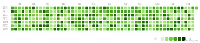
改造二(单元格、图例改造):
改动visualMap(视觉映射)配置,即图例与日历图表映射
 visualMap: {
      type: 'piecewise',
      orient: 'horizontal',
      top:230,
      right:380,
      min: 0,
      max: 1000,
      text: ['多', '少'],
      textStyle: {
        color: 'rgb(140,140,140)',
        fontSize: 14,
        // 处理两端文字与图例单元格距离
        padding:[0,16],
        borderWidth:0.000001,
        borderColor:'transparent'
      },
      showLabel: false,
      itemWidth: 20,
      itemHeight: 20,
      itemGap: 4,
      selectedMode: false, //禁止选择
      inRange: {
        color: [
          'rgba(233,233,233)',
          '#95de64',
          '#52c41a',
          '#237804',
          '#092b00',
        ],
      },
      //图例分段
      pieces: [
        { min: 1000 },
        { min: 800, max: 1000 },
        { min: 500, max: 800 },
        { min: 300, max: 500 },
        { min: 1, max: 300 },
        { value: 0, color: 'rgba(233,233,233)' },
      ],
    },
改造三(tooltip、细节优化):
样式可自行处理,tooltip可加气泡箭头,利用浮动做定位,可自行调节,有兴趣可试试

  // 图表配置
  const option: EChartsOption = {
    tooltip: {
      trigger: 'item',
      borderWidth: 0,
      formatter: (params: any) => {
        return `${params.value[0]} : ${params.value[1]}`
      },
    },
    visualMap: {
      type: 'piecewise',
      orient: 'horizontal',
      top: 230,
      right: 380,
      min: 0,
      max: 1000,
      text: ['多', '少'],
      textStyle: {
        color: 'rgb(140,140,140)',
        fontSize: 14,
        // 处理两端文字与图例单元格距离
        padding: [0, 16],
        borderWidth: 0.000001,
        borderColor: 'transparent',
      },
      showLabel: false,
      itemWidth: 20,
      itemHeight: 20,
      itemGap: 4,
      selectedMode: false, //禁止选择
      inRange: {
        color: [
          'rgba(233,233,233)',
          '#95de64',
          '#52c41a',
          '#237804',
          '#092b00',
        ],
      },
      //图例分段
      pieces: [
        { min: 1000 },
        { min: 800, max: 1000 },
        { min: 500, max: 800 },
        { min: 300, max: 500 },
        { min: 1, max: 300 },
        { value: 0, color: 'rgba(233,233,233)' },
      ],
    },
    calendar: {
      range: '2017',
      cellSize: [20, 20], //格子尺寸
      itemStyle: {
        //解决格子间距
        borderWidth: 5,
        borderColor: '#fff',
      },
      splitLine: {
        // 去掉月份分割线
        show: false,
      },
      dayLabel: {
        firstDay: 0,
        fontSize: 14,
        margin: 16,
        color: 'rgb(140,140,140)',
        verticalAlign: 'middle',
        nameMap: ['周日', '周一', '周二', '周三', '周四', '周五', '周六'],
      },
      monthLabel: {
        nameMap: 'ZH',
        color: 'rgb(140,140,140)',
        align: 'center',
        margin: 4,
      },
      yearLabel: {
        show: false,
      },
    },
    series: {
      type: 'heatmap',
      coordinateSystem: 'calendar',
      data: getVirtualData('2017'),
      // dimensions:, 数据名称处理,数据多时可以使用
      itemStyle: {
        borderRadius: 3,
      },
      emphasis: {
        disabled: true,
      },
    },
  }