React06-简单实战案例
一、计时器
1. 案例场景
计时器在很多网站中都有使用,以时分秒的格式展示当前时间,每秒刷新一次。
2. 案例展示

展示的时间将随着系统时间,每秒刷新一次。
3. 案例代码
import { useState, useEffect } from 'react';

export default function Clock() {
  const [time, setTime] = useState(new Date());
  useEffect(() => {
    // 在组件加载时调用
    const timer = setInterval(() => setTime(new Date()), 1000);
    return () => clearInterval(timer); // 在组件卸载时调用
  }, []);
  return (

        {time.toLocaleTimeString()}

  );
}
4. 案例总结
(1) 使用 useState 设置状态,状态更新会触发页面更新;
(2) 使用 useEffect 模拟组件生命周期,在组件加载时开启计时器,在组件卸载时清除计时器。
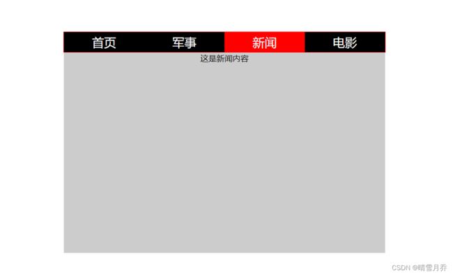
二、tab 切换
1. 案例场景
实现一个 tab 页组件,可以点击 tab 标签切换展示的内容。
2. 案例展示
3. 案例代码
/** @jsxRuntime classic */
/** @jsx jsx */
import {jsx, css} from '@emotion/react';
import {useState} from 'react';
// const data = [
// {id: '1', title: '首页', content: '这是首页内容'},
// {id: '2', title: '军事', content: '这是军事内容'},
// {id: '3', title: '新闻', content: '这是新闻内容'},
// {id: '4', title: '电影', content: '这是电影内容'}
// ];
export default function Tab(props) {
const styles = {
li: css`
list-style-type: none;
margin: 0;
padding: 0;
flex: 1;
text-align: center;
line-height: 40px;
background-color: black;
color: white;
font-size: 24px;
&.active {
background-color: red;
}
`,
ul: css`
width: 640px;
margin: 100px auto 0;
padding: 0;
border: 1px solid red;
display: flex;
`,
content: css`
width: 640px;
height: 400px;
background-color: #cccccc;
margin: 0 auto;
`
};
const [data] = useState(props.data);
const [selectedIndex, setSelectedIndex] = useState(0);
return (
{data.map((item, index) => - setSelectedIndex(index)} key={item.id} css={css`${styles.li}`}>{item.title}
)}
{props.data[selectedIndex].content}
);
}4. 案例总结
(1) 组件布局:tab 页组件由标签区域和内容区域组成,标签区域使用 ul 列表,内容区域使用一个 div 标签。
(2) 使用 emotion 为组件添加样式。
(3) 组件状态:tab 页需要切换标签而切换显示内容,而 tab 页的数据存储在一个对象数组中,切换标签的同时要切换展示元素的下标,这个下标要为一个 state。
(4) 激活标签的样式,使用 emotion 进行样式定义,动态切换类名。
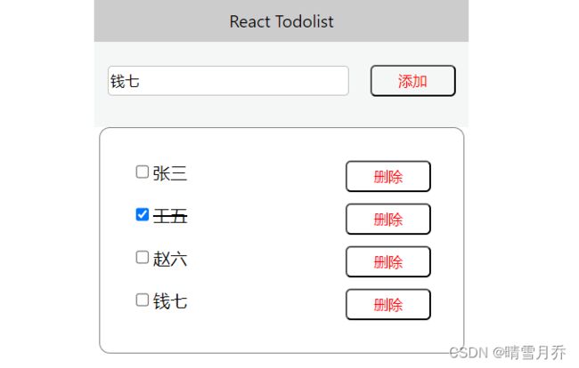
三、Todolist
1. 案例场景
以列表形式展示一个 Todolist,支持新增和删除功能,选中的记录添加删除线。
2. 案例展示
3. 案例代码
/** @jsxRuntime classic */
/** @jsx jsx */
import {jsx, css} from '@emotion/react';
import {useState} from 'react';
import {useImmer} from 'use-immer';
const componentStyles = {
button: css`
width: 80px;
height: 30px;
color: red;
background-color: transparent;
border-radius: 5px;
margin-left: 20px;
outline: none;
`
};
const ListItem = function ({list, setList}) {
const styles = {
ul: css`
margin: 0 auto;
border: 1px solid gray;
border-radius: 10px;
width: 300px;
padding: 20px;
li {
list-style-type: none;
margin: 10px;
display: flex;
justify-content: space-between;
span {
flex: 1;
&.delete {
text-decoration-line: line-through;
}
}
}
`
};
return (
{list.map((item, index) => -
setList(l => {
l[index].status = l[index].status === 1 ? 0 : 1;
return l;
})} />
{item.name}
)}
);
};
export default function Todolist() {
const styles = {
header: css`
width: 350px;
background-color: #cccccc;
margin: 0 auto;
text-align: center;
line-height: 40px;
`,
footer: css`
position: relative;
margin: 0 auto;
line-height: 30px;
height: 80px;
width: 350px;
box-sizing: border-box;
padding: 20px 10px 20px 10px;
background-color: rgba(223, 224 ,224, .3);
input {
height: 24px;
width: 220px;
border-radius: 4px;
outline: none;
border: 1px solid silver;
}
`,
button: css`
width: 80px;
height: 30px;
color: red;
background-color: transparent;
border-radius: 5px;
margin-left: 20px;
outline: none;
`
};
const [list, setList] = useImmer([
{ id: '0', name: '张三', status: 0 },
{ id: '1', name: '李四', status: 0 },
{ id: '2', name: '王五', status: 0 },
{ id: '3', name: '赵六', status: 0 }
]);
const [inputVal, setInputVal] = useState('');
return (
React Todolist
setInputVal(e.target.value)} />
4. 案例总结
(1) 组件布局:Todolist 组件分为 head 部分、输入框部分和 content 部分。
(2) 复选框选中和取消选中:使用 useImmer 设置 todolist 数据的状态,点击复选框时改变对应元素的 status 值。
(3) 选中元素添加删除线:使用动态 className 通过当前元素的状态来决定文字是否添加删除线。
(4) 删除元素:通过要删除元素的下标,改变 list 数组的状态。
(5) 新增元素,直接向 list 数组中添加元素。
注意:改变 list 数组时,要使用 setList 来设置 list 的状态。