SwiftUI——如何修改TabView的各种属性(包括tabItem的属性),例如颜色、位置、大小等
阅读建议和提示
- 可以利用侧边的目录来跳转哦!
- 本文所有代码适用于最新版本的 iOS 15 和 SwiftUI。
- 本文中没有列出所有的属性,是因为有些属性会和其他属性发生冲突而失效,所以忽略了可以被忽略的属性。
如何创建简单的 TabView
在SwiftUI中,我们可以很方便地实现标签页效果TabView,如下:
struct ContentView: View {
    var body: some View {
        TabView {
            Text("第一个 Tab")
                .badge(10)  /* 这是 iOS 15.0 新增的,之前的版本用不了 */
                .tabItem {
                    Image(systemName: "1.square.fill")
                    Text("第一页")
                }
            Text("另一个 Tab")
                .tabItem {
                    Image(systemName: "2.square.fill")
                    Text("第二页")
                }
            Text("最后一个 Tab")
                .tabItem {
                    Image(systemName: "3.square.fill")
                    Text("第三页")
                }
        }
    }
}
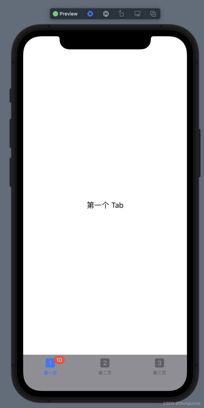
实现的界面是这样的:

.tabItem { }只能包含一个 Image 和 Text,或者反过来。
但是当我们需要修改他的一些属性的时候,却发现不能修改。例如我们想修改一个tabItem的颜色,使用.foregroundColor()发现没有变化。
这可能是由于SwiftUI还不够完善,所以这时候我们需要使用一下UIKit。这里有两种方式来修改:
UITabBar.appearance()(只能大致修改)UITabBarItemAppearance()UITabBarAppearance()(可以细致地修改。推荐使用这种)
用于大致修改的UITabBar.appearance()
第一种是直接修改UITabBar.appearance()的属性来修改,但是能修改的内容很少,基本上只用来修改TabBar的背景颜色。
为了代码简洁,本节最后附上完整使用代码。
修改标签栏背景色
//修改标签栏背景色
UITabBar.appearance().backgroundColor = UIColor(Color.gray)
修改后的样式如下:
修改未选择的项的颜色
//修改未选择的项的颜色
UITabBar.appearance().unselectedItemTintColor = UIColor(Color.pink)
修改后的样式如下:
我们能发现还有其他属性,但是修改发现并没有变化。
可以通过init()或者.onAppear(perform:)来使用。
所以,完整的使用代码如下:
struct ContentView: View {
    init() {
        //修改标签栏背景色
        UITabBar.appearance().backgroundColor = UIColor(Color.gray)
        //修改未选择的项的颜色
        UITabBar.appearance().unselectedItemTintColor = UIColor(Color.pink)
    }
    var body: some View {
        TabView {
            Text("第一个 Tab")
                .badge(10)  /* 这是 iOS 15.0 新增的,之前的版本用不了 */
                .tabItem {
                    Image(systemName: "1.square.fill")
                    Text("第一页")
                }
            Text("另一个 Tab")
                .tabItem {
                    Image(systemName: "2.square.fill")
                    Text("第二页")
                }
            Text("最后一个 Tab")
                .tabItem {
                    Image(systemName: "3.square.fill")
                    Text("第三页")
                }
        }
    }
}
或者使用.onAppear(perform:):
struct ContentView: View {
    var body: some View {
        TabView {
            Text("第一个 Tab")
                .badge(10)  /* 这是 iOS 15.0 新增的,之前的版本用不了 */
                .tabItem {
                    Image(systemName: "1.square.fill")
                    Text("第一页")
                }
            Text("另一个 Tab")
                .tabItem {
                    Image(systemName: "2.square.fill")
                    Text("第二页")
                }
            Text("最后一个 Tab")
                .tabItem {
                    Image(systemName: "3.square.fill")
                    Text("第三页")
                }
        }
        .onAppear(perform: {
        	//修改标签栏背景色
            UITabBar.appearance().backgroundColor = UIColor(Color.gray)

            //修改未选择的项的颜色
            UITabBar.appearance().unselectedItemTintColor = UIColor(Color.pink)
        })
    }
}
这种方法太简单了,所以推荐下面这种
用于细致修改的UITabBarItemAppearance()和UITabBarAppearance()
这种方法的使用方法比较复杂,所以篇幅比较长。为了代码整洁分散来写,最后列出完整的代码。
首先是TabBar 中的物件(tabItem)们,例如图标文本。我们需要先声明一个变量itemAppearance,如下:
let itemAppearance = UITabBarItemAppearance()
然后先介绍tabItem的属性:
设置tabItem的属性
图标的颜色,也就是Image的颜色
//未选中的标签的图标的颜色
itemAppearance.normal.iconColor = UIColor(Color.green)
//选中的标签的图标的颜色
itemAppearance.selected.iconColor = UIColor(Color.pink)
文本的属性,也就是Text部分的属性
为了代码简练,这里只演示了修改文本颜色。
除了能修改颜色之外,由于是NSAttributedString类型,所以还能修改字体类型、大小、阴影、背景,甚至是内容。NSAttributedString的更多使用方法可以查看: https://www.hackingwithswift.com/articles/113/nsattributedstring-by-example
//未选中的标签的标题的颜色
itemAppearance.normal.titleTextAttributes = [.foregroundColor: UIColor(Color.green)]
//选中的标签的标题的颜色
itemAppearance.selected.titleTextAttributes = [.foregroundColor: UIColor(Color.pink)]
气泡
需要注意的是,如果这部分的属性只设置了 normal 或者 selected 状态下的值,那么不论状态是什么,都用这个值!
背景颜色
//未选中的标签的气泡的背景颜色
itemAppearance.normal.badgeBackgroundColor = UIColor(Color.black)
//选中的标签的气泡的背景颜色
itemAppearance.selected.badgeBackgroundColor = UIColor(Color.yellow)
文本属性
为了代码简练,这里只演示了修改文本颜色。
除了能修改颜色之外,由于是NSAttributedString类型,所以还能修改字体类型、大小、阴影、背景,甚至是内容。NSAttributedString的更多使用方法可以查看: https://www.hackingwithswift.com/articles/113/nsattributedstring-by-example
//选中的标签的气泡的文本颜色
itemAppearance.normal.badgeTextAttributes = [.foregroundColor: UIColor(Color.gray)]
//选中的标签的气泡的文本颜色
itemAppearance.selected.badgeTextAttributes = [.foregroundColor: UIColor(Color.black)]
位置
//未选中的标签的气泡的位置
itemAppearance.normal.badgePositionAdjustment = UIOffset(horizontal: -10, vertical: -10)
//未选中的标签的气泡的位置
itemAppearance.selected.badgePositionAdjustment = UIOffset(horizontal: 10, vertical: 10)
标题的位置
需要注意的是,这个偏移是叠加在气泡的位置偏移上的,但是二者的参考系的横轴是反的。
//未选中的标签的气泡标题的位置
itemAppearance.normal.badgeTitlePositionAdjustment = UIOffset(horizontal: -10, vertical: -10)
//未选中的标签的气泡标题的位置
itemAppearance.selected.badgeTitlePositionAdjustment = UIOffset(horizontal: 10, vertical: 10)
barItem们设置完之后,就要开始设置TabBar的属性了,也就是UITabBarAppearance()部分了。
设置TabView整体的属性
同样,我们需要先声明一个变量appeareance,如下:
let appeareance = UITabBarAppearance()
应用之前的 barItem 们的设置
//这里就可以将我们上面设置的 itemAppearance 应用到 UITabBarAppearance() 的 stackedLayoutAppearance 属性中
appeareance.stackedLayoutAppearance = itemAppearance
TabBar 的背景图片
//TabBar的背景图片
appeareance.backgroundImage = UIImage(named: "test")
TabBar 的背景颜色
//TabBar 的背景颜色
appeareance.backgroundColor = UIColor(Color.white)
TabBar 的阴影,就是最上面的那条“线”
//TabBar的阴影,就是最上面的那条“线”
appeareance.shadowColor = UIColor(Color.black)
tabItem 们的摆放格式
//tabItem们的摆放格式。.automatic就是默认格式;.centered表示尽量往中间靠;.fill表示尽量填满TabBar。
appeareance.stackedItemPositioning = .centered
tabItem 们的摆放格式
//tabItem们的间距,不过最大的效果就是和.fill格式一样,不会超出视图
appeareance.stackedItemSpacing = 2000
最后,应用所有的设置到视图中
//来把之前的设置全部应用到视图中
UITabBar.appearance().scrollEdgeAppearance = appeareance
不过这里需要注意一点,有的人会想使用以下代码来应用设置:
//不要用。因为使用这个会无法应用我们对 UITabBarAppearance() 的设置
UITabBar.appearance().standardAppearance = appeareance
赋值给standardAppearance会让我们对 UITabBarAppearance() 的设置不能应用成功。
完整代码以及演示截图
完整代码如下:
struct ContentView: View {
    init() {
        //修改 TabBar 中的物件,例如图标文本等
        let itemAppearance = UITabBarItemAppearance()
        //标签
        //图标的颜色————也就是Image的颜色
            //未选中的标签的图标的颜色
            itemAppearance.normal.iconColor = UIColor(Color.green)
            //选中的标签的图标的颜色
            itemAppearance.selected.iconColor = UIColor(Color.pink)
        //文本的颜色————也就是Text的颜色
        //为了代码简练,这里只演示了修改文本颜色。除了能修改颜色之外,还能修改字体类型、大小、阴影、背景,甚至是内容。详情可以查看 https://www.hackingwithswift.com/articles/113/nsattributedstring-by-example
            //未选中的标签的标题的颜色
            itemAppearance.normal.titleTextAttributes = [.foregroundColor: UIColor(Color.green)]
            //选中的标签的标题的颜色
            itemAppearance.selected.titleTextAttributes = [.foregroundColor: UIColor(Color.pink)]

        //气泡
        //需要注意的是,如果只设置了 normal 或者 selected 状态下的值,那么不论状态是什么,都用这个值!
        //背景颜色
            //未选中的标签的气泡的背景颜色
            itemAppearance.normal.badgeBackgroundColor = UIColor(Color.black)
            //选中的标签的气泡的背景颜色
            itemAppearance.selected.badgeBackgroundColor = UIColor(Color.yellow)
        //文本属性————为了代码简练,这里只演示了修改文本颜色。除了能修改颜色之外,还能修改字体类型、大小、阴影、背景,甚至是内容。详情可以查看 https://www.hackingwithswift.com/articles/113/nsattributedstring-by-example
            //选中的标签的气泡的文本颜色
            itemAppearance.normal.badgeTextAttributes = [.foregroundColor: UIColor(Color.gray)]
            //选中的标签的气泡的文本颜色
            itemAppearance.selected.badgeTextAttributes = [.foregroundColor: UIColor(Color.black)]
        //位置
            //未选中的标签的气泡的位置
            itemAppearance.normal.badgePositionAdjustment = UIOffset(horizontal: -10, vertical: -10)
            //未选中的标签的气泡的位置
            itemAppearance.selected.badgePositionAdjustment = UIOffset(horizontal: 10, vertical: 10)
        //标题的位置————这个偏移是叠加在气泡的位置偏移上的,但是二者的参考系的横轴是反的
            //未选中的标签的气泡标题的位置
            itemAppearance.normal.badgeTitlePositionAdjustment = UIOffset(horizontal: -10, vertical: -10)
            //未选中的标签的气泡标题的位置
            itemAppearance.selected.badgeTitlePositionAdjustment = UIOffset(horizontal: 10, vertical: 10)

        let appeareance = UITabBarAppearance()
        //这里就可以将我们上面设置的 itemAppearance 应用到 UITabBarAppearance() 的 stackedLayoutAppearance 属性中
        appeareance.stackedLayoutAppearance = itemAppearance
        //TabBar的背景图片
        appeareance.backgroundImage = UIImage(named: "test")
        //TabBar的背景颜色
        appeareance.backgroundColor = UIColor(Color.white)
        //TabBar的阴影,就是最上面的那条“线”
        appeareance.shadowColor = UIColor(Color.black)
        //tabItem们的摆放格式。.automatic就是默认格式;.centered表示尽量往中间靠;.fill表示尽量填满TabBar。
        appeareance.stackedItemPositioning = .centered
        //tabItem们的间距,不过最大的效果就是和.fill格式一样,不会超出视图
        appeareance.stackedItemSpacing = 2000

        //来把之前的设置全部应用到视图中
        //使用这个会无法应用我们对 UITabBarAppearance() 的设置
//        UITabBar.appearance().standardAppearance = appeareance
        UITabBar.appearance().scrollEdgeAppearance = appeareance
    }
    var body: some View {
        TabView {
            Text("第一个 Tab")
                .badge(10)  /* 这是 iOS 15.0 新增的,之前的版本用不了 */
                .tabItem {
                    Image(systemName: "1.square.fill")
                    Text("第一页")
                }
            Text("另一个 Tab")
                .tabItem {
                    Image(systemName: "2.square.fill")
                    Text("第二页")
                }
            Text("最后一个 Tab")
                .badge(22)  /* 这是 iOS 15.0 新增的,之前的版本用不了 */
                .tabItem {
                    Image(systemName: "3.square.fill")
                    Text("第三页")
                }
        }
    }
}
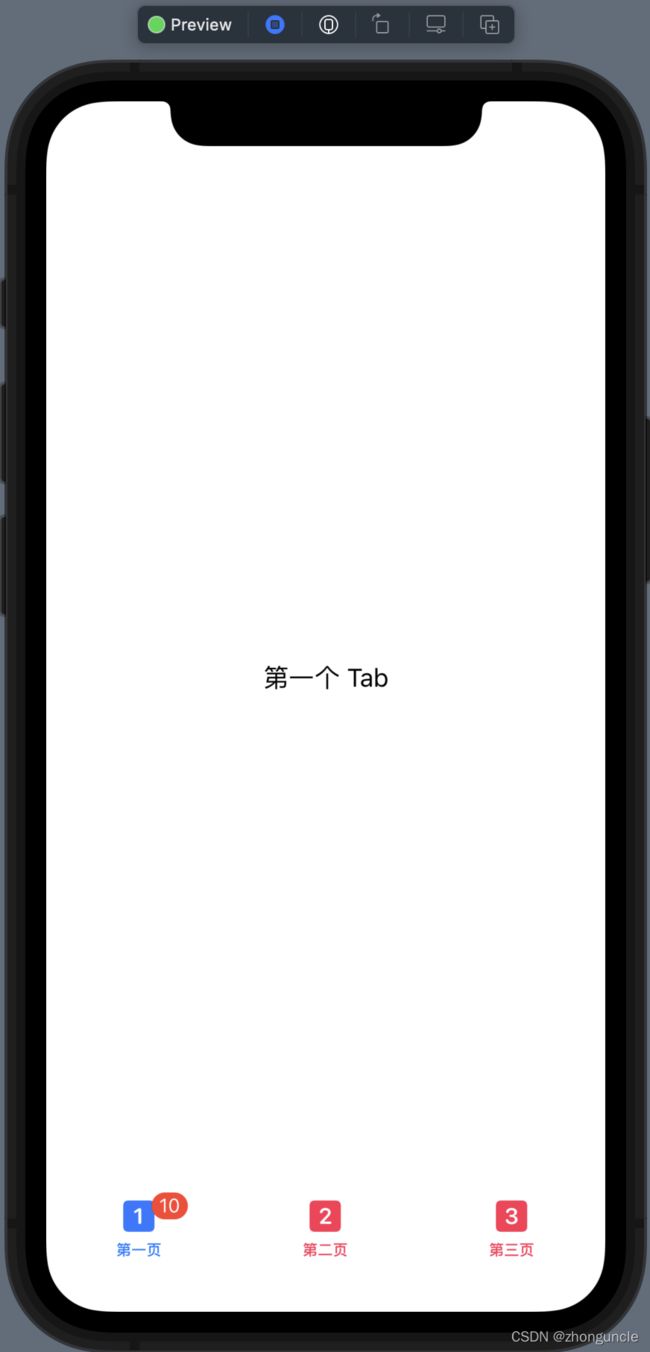
运行截图如下:

结尾
好啦看完本文,相信你一定可以做出自己想要的 TabView 了~
希望可以帮到有需要的人~