vite构建的项目如何修改element Plus的主题样式
安装element plus 安装icon
pnpm install element-plus
pnpm install @element-plus/icons-vue
main.ts配置
icon的使用https://element-plus.gitee.io/zh-CN/component/icon.html#%E7%BB%93%E5%90%88-el-icon-%E4%BD%BF%E7%94%A8
import { createApp } from 'vue'
import './style.css'
import ElementPlus from 'element-plus'
import 'element-plus/dist/index.css'
// 如果您正在使用CDN引入,请删除下面一行。
import * as ElementPlusIconsVue from '@element-plus/icons-vue'
import App from './App.vue'

const app = createApp(App)
for (const [key, component] of Object.entries(ElementPlusIconsVue)) {
  app.component(key, component)
}
app.use(ElementPlus).mount('#app')
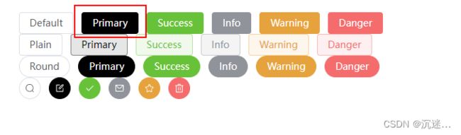
使用效果

<template>
  <el-row class="mb-4">
    <el-button>Defaultel-button>
    <el-button type="primary">Primaryel-button>
    <el-button type="success">Successel-button>
    <el-button type="info">Infoel-button>
    <el-button type="warning">Warningel-button>
    <el-button type="danger">Dangerel-button>
  el-row>

  <el-row class="mb-4">
    <el-button plain>Plainel-button>
    <el-button type="primary" plain>Primaryel-button>
    <el-button type="success" plain>Successel-button>
    <el-button type="info" plain>Infoel-button>
    <el-button type="warning" plain>Warningel-button>
    <el-button type="danger" plain>Dangerel-button>
  el-row>

  <el-row class="mb-4">
    <el-button round>Roundel-button>
    <el-button type="primary" round>Primaryel-button>
    <el-button type="success" round>Successel-button>
    <el-button type="info" round>Infoel-button>
    <el-button type="warning" round>Warningel-button>
    <el-button type="danger" round>Dangerel-button>
  el-row>

  <el-row>
    <el-button :icon="Search" circle />
    <el-button type="primary" :icon="Edit" circle />
    <el-button type="success" :icon="Check" circle />
    <el-button type="info" :icon="Message" circle />
    <el-button type="warning" :icon="Star" circle />
    <el-button type="danger" :icon="Delete" circle />
  el-row>
template>

<script lang="ts" setup>
import {
  Check,
  Delete,
  Edit,
  Message,
  Search,
  Star,
} from '@element-plus/icons-vue'
script>
1.修改element Plus主题
修改后的效果
HelloWorld.vue
<template>
  <h1 class="title">测试h1>
  <el-row class="mb-4">
    <el-button>Defaultel-button>
    <el-button type="primary">Primaryel-button>
    <el-button type="success">Successel-button>
    <el-button type="info">Infoel-button>
    <el-button type="warning">Warningel-button>
    <el-button type="danger">Dangerel-button>
  el-row>

  <el-row class="mb-4">
    <el-button plain>Plainel-button>
    <el-button type="primary" plain>Primaryel-button>
    <el-button type="success" plain>Successel-button>
    <el-button type="info" plain>Infoel-button>
    <el-button type="warning" plain>Warningel-button>
    <el-button type="danger" plain>Dangerel-button>
  el-row>

  <el-row class="mb-4">
    <el-button round>Roundel-button>
    <el-button type="primary" round>Primaryel-button>
    <el-button type="success" round>Successel-button>
    <el-button type="info" round>Infoel-button>
    <el-button type="warning" round>Warningel-button>
    <el-button type="danger" round>Dangerel-button>
  el-row>

  <el-row>
    <el-button :icon="Search" circle />
    <el-button type="primary" :icon="Edit" circle />
    <el-button type="success" :icon="Check" circle />
    <el-button type="info" :icon="Message" circle />
    <el-button type="warning" :icon="Star" circle />
    <el-button type="danger" :icon="Delete" circle />
  el-row>
template>

<script lang="ts" setup>
import {
  Check,
  Delete,
  Edit,
  Message,
  Search,
  Star,
} from '@element-plus/icons-vue'
script>
<style lang="scss" scoped>
  .title{
    color: red;
  }
style>

#### mian.ts文件内容
```ts
import { createApp } from 'vue

import './assets/style/element-theme.scss'
import './style.css'
import ElementPlus from 'element-plus'
// import 'element-plus/dist/index.css'
import * as ElementPlusIconsVue from '@element-plus/icons-vue'
import App from './App.vue'

const app = createApp(App)
for (const [key, component] of Object.entries(ElementPlusIconsVue)) {
  app.component(key, component)
}
app.use(ElementPlus).mount('#app')
vite.config.ts
import { fileURLToPath, URL } from 'node:url'
import { defineConfig } from 'vite'
import vue from '@vitejs/plugin-vue'

// https://vitejs.dev/config/
export default defineConfig({
  plugins: [vue(),
  ],
  resolve: {
    alias: {
      '@': fileURLToPath(new URL('./src', import.meta.url))
    }
  },
  // css: {
  //   preprocessorOptions: {
  //     //define global scss variable
  //     scss: {
  //       additionalData: `@import "@/theme/var.scss";`,
  //     }
  //   }
  // }
})
element-theme.scss

/* 只需要重写你需要的变量即可 */
@forward 'element-plus/theme-chalk/src/common/var.scss' with (
  $colors: (
    'primary': (
      'base': #000,
    ),
  ),
);

/* 如果只是按需导入,则可以忽略以下内容。
如果你想导入所有样式: */
/* 以上为官方说法  经验证 不应用以下代码 会使失去未重新定义的样式 */
@use "element-plus/theme-chalk/src/index.scss" as *;
package.json
{
  "name": "vite-demo-vue3",
  "private": true,
  "version": "0.0.0",
  "type": "module",
  "scripts": {
    "dev": "vite",
    "build": "vue-tsc && vite build",
    "preview": "vite preview"
  },
  "dependencies": {
    "@element-plus/icons-vue": "^2.1.0",
    "element-plus": "^2.3.5",
    "sass": "^1.62.1",
    "vue": "^3.2.47"
  },
  "devDependencies": {
    "@types/node": "^20.2.5",
    "@vitejs/plugin-vue": "^4.1.0",
    "typescript": "^5.0.2",
    "vite": "^4.3.2",
    "vue-tsc": "^1.4.2"
  }
}
第二种方式 直接修改:root
其他的和第一种方式相同, 主要变化为element-theme.scss中的写法,以及import ‘./assets/style/element-theme.scss’ 引入位置的变化 相当于层叠掉 element plus之前的主题变量的配置

element-theme.scss
:root{
  --el-color-primary: red;
}
main.ts
import { createApp } from 'vue'
import './style.css'
import ElementPlus from 'element-plus'
import 'element-plus/dist/index.css'
// 自定义的样式必须在 原来的样式之后 去层叠掉之前的样式
import './assets/style/element-theme.scss'
import * as ElementPlusIconsVue from '@element-plus/icons-vue'
import App from './App.vue'

const app = createApp(App)
for (const [key, component] of Object.entries(ElementPlusIconsVue)) {
  app.component(key, component)
}
app.use(ElementPlus).mount('#app')
配置中文
import ElementPlus from 'element-plus'
import zhCn from 'element-plus/es/locale/lang/zh-cn'

app.use(ElementPlus, {
  locale: zhCn,
})