【CSS3】rotate3d() 中的参数是什么意思?
其它 3D 正方体演示:【CSS3】2D/3D 转换函数
文章目录
- CSS3中的3D旋转函数rotate3d()
- 什么是矢量(向量)?
- 向量的坐标表示
- 二维坐标系(平面直角坐标系)
- 三维坐标系(空间直角坐标系)
- 注意!Web坐标系与数学/物理学中坐标系的不同
- 3D 正方体 Demo
CSS3中的3D旋转函数rotate3d()
很多人跟我刚开始一样,搞不懂 rotate3d(x, y, z, angle) 中的 xyz 参数究竟是什么鬼意思,只知道,xyz代表矢量(向量)。
在 MDN 中是这样介绍的:
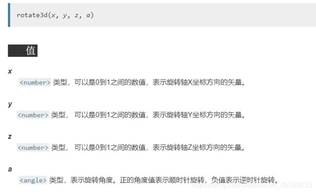
那么究竟个什么鬼是向量?
什么是矢量(向量)?
物理学中称为 矢量;
数学中称为 向量;
矢量(向量)通俗的说,就是点到点之间的距离,而正负则表示方向的正反,无关大小。
而坐标点 O(0,0,0) 为坐标轴原点,即三轴相交的地方,也是起始点。
向量的坐标表示
下图中,点 P 是正方体原点的对角点,而原点到该点,即 【点O】到【点P】之间的距离,就是向量。
可这么理解:
P(x,y,z)
rotate3d(P, angle)
即,原点 O(0,0,0) 到点 P(x,y,z) 旋转 angle 度。

【线OP】 亦称正方体对角线。
那么想要正方体沿对角线 OP 旋转 45°,那就是 rotate3d(1,1,1,45deg);
为何?且看下节【平面坐标系】。
二维坐标系(平面直角坐标系)
由下图可看出,由 x=y 坐标点连成的线,就是正方形的对角线。(1,1)、(2,2)、(3,3)…(999,999) 均在一条线上。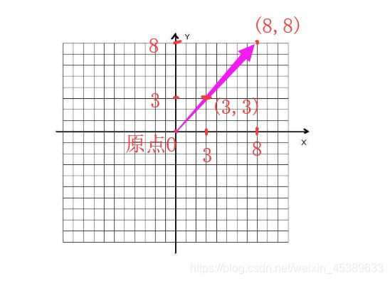
三维坐标系(空间直角坐标系)
当换成 3D 坐标系,(1,1,1)、(2,2,2)、(3,3,3)…(999,999,999) 同样在一条线上,这条线,即为正方体的对角线。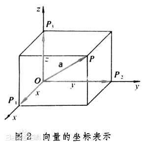
那么,在 rotate3d() 中,既然只要求根据正方体对角线顺旋转 45°,无论是 rotate3d(1,1,1,45deg),还是rotate3d(2,2,2,45deg)…rotate3d(999,999,999,45deg) 都可以实现相同效果,所以用 rotate3d(1,1,1,45deg) 即可。
同样的:
rotate3d(1,0,0,angle),表示原点到点(1,0,0)这个方向,旋转多少度,即该点仅在 x 轴上,所以绕 x 轴旋转;
rotate3d(0,1,0,angle),表示原点到点 (0,1,0) 这个方向,旋转多少度,即该点仅在 y 轴上,所以绕 y 轴旋转;
rotate3d(0,0,1,angle),表示原点到点 (0,0,1) 这个方向,旋转多少度,即该点仅在 z 轴上,所以绕 z 轴旋转;
注意!Web坐标系与数学/物理学中坐标系的不同
1. 数学/物理学等等(通常)的坐标系
(下面这个换了个方向而已)
2. Web 中的坐标系
PS:可以看出,Y轴反过来了
3D 正方体 Demo
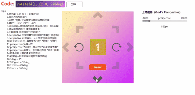

除 IE 之外的浏览器,可正常运行 code
<html>
<head>
	<meta charset="utf-8" />
	<title>title>
	<style type="text/css">
		/* 浮动修复 */
		.clearfix {
			zoom: 1;
		}
		.clearfix:after {
			display: block;
			content: '';
			clear: both;
			visibility: hidden;
			height: 0;
		}

		/* 元素浏览器水平居中 */
		.wrap {
			position: absolute;
			left: 50%;
			top: 50%;
		}
		/* 装骰子的容器 */
		.container {
			margin-top: -250px;
			margin-left: -250px;
			padding: 200px;
			background: linear-gradient(135deg, rgb(255, 243, 176) 10%, rgb(202, 38, 255) 100%);
			/* 注意此处, -webkit- 中,角度 = 90 - 原 = 90 - 135 = -45deg */
			background: -webkit-linear-gradient(-45deg, rgb(255, 243, 176) 10%, rgb(202, 38, 255) 100%);
		}

		/* - - - - - - - - - - 骰子样式 - - - - - - - - - - */
		/* 上帝窗口 */
		.Gods-Perspective {
			/* 创建3D场景 */
			perspective: 550px;
			perspective-origin: 50px 50px;
			-webkit-perspective: 550px;
			-webkit-perspective-origin: 50px 50px;
		}

		/* 创建色子 */
		#dice {
			width: 100px;
			height: 100px;
			transform-style: preserve-3d;
			-webkit-transform-style: preserve-3d;
		}

		/* 过渡动画 */
		.transition-all {
			transition: all 0.3s ease-out;
			-webkit-transition: all 0.3s ease-out;
		}

		/* 每个面通用样式 */
		.face {
			position: absolute;
			width: 100%;
			height: 100%;
			font-size: 60px;
			color: white;
			text-align: center;
			line-height: 100px;
		}

		/* 六个面样式 */
		.front {
			background: rgba(90, 90, 90, 0.7);
			transform: translateZ(50px);
			-webkit-transform: translateZ(50px);
		}
		.back {
			background: rgba(0, 210, 0, 0.7);
			transform: rotateY(180deg) translateZ(50px);
			-webkit-transform: rotateY(180deg) translateZ(50px);
		}
		.left {
			background: rgba(0, 0, 210, 0.7);
			transform: rotateY(-90deg) translateZ(50px);
			-webkit-transform: rotateY(-90deg) translateZ(50px);
		}
		.right {
			background: rgba(210, 0, 0, 0.7);
			transform: rotateY(90deg) translateZ(50px);
			-webkit-transform: rotateY(90deg) translateZ(50px);
		}
		.top {
			background: rgba(210, 210, 0, 0.7);
			transform: rotateX(90deg) translateZ(50px);
			-webkit-transform: rotateX(90deg) translateZ(50px);
		}
		.bottom {
			background: rgba(210, 0, 210, 0.7);
			transform: rotateX(-90deg) translateZ(50px);
			-webkit-transform: rotateX(-90deg) translateZ(50px);
		}

		/* - - - - - - - - - - 按钮 - - - - - - - - - -*/
		.control-a {
			margin-top: -25px;
			margin-left: -25px;
			width: 30px;
			height: 30px;
		}
		/* 各个方向 */
		.direction {
			display: block;
			width: 100%;
			height: 100%;
			border-top: 20px solid rgba(85, 85, 85, 0.3);
			border-right: 20px solid rgba(85, 85, 85, 0.3);
			cursor: pointer;
			transition: all 0.4s ease-in;
			-webkit-transition: all 0.4s ease-in;
		}
		.direction:hover {
			border-color: rgba(85, 85, 85, 1);
		}
		#toTop {
			margin-top: -490px;
			transform: rotate(-45deg);
			-webkit-transform: rotate(-45deg);
		}
		#toBottom {
			margin-top: 380px;
			margin-left: -1px;
			transform: rotate(135deg);
			-webkit-transform: rotate(135deg);
		}
		#toLeft {
			margin-top: -265px;
			margin-left: -215px;
			transform: rotate(-135deg);
			-webkit-transform: rotate(-135deg);
		}
		#toRight {
			margin-top: -50px;
			margin-left: 215px;
			transform: rotate(45deg);
			-webkit-transform: rotate(45deg);
		}
		#toTopRight {
			margin-top: -175px;
			margin-left: 125px;
		}
		#toTopLeft {
			margin-top: -50px;
			margin-left: -125px;
			transform: rotate(-90deg);
			-webkit-transform: rotate(-90deg);
		}
		#toBottomRight {
			margin-top: 200px;
			margin-left: 125px;
			transform: rotate(90deg);
			-webkit-transform: rotate(90deg);
		}
		#toBottomLeft {
			margin-top: -50px;
			margin-left: -125px;
			transform: rotate(180deg);
			-webkit-transform: rotate(180deg);
		}
		/*  重置按钮 */
		.button {
			display: block;
			width: 120px;
			padding: 10px 0;
			font-size: 20px;
			text-align: center;
			color: white;
			border: 0 none;
			border-radius: 12px;
			background: #f4511e;
			outline: 0 none;
			cursor: pointer;
			margin-top: -32px;
			margin-left: -35px;
		}
		.button span {
			transition: 0.5s;
			-webkit-transition: 0.5s;
		}
		.button span:after {
			position: absolute;
			content: '>>';
			margin-left: 9px;
			color: rgba(255, 255, 255, 0);
			transition: 0.5s;
			-webkit-transition: 0.5s;
		}
		.button:hover span {
			padding-right: 34px;
		}
		.button:hover span:after {
			color: rgba(255, 255, 255, 1);
		}
		.button:active {
			width: 120px;
			padding: 8px 0;
			border: 2px solid #f4511e;
			background: white;
			color: #f4511e;
			transition: 0.1s;
			-webkit-transition: 0.1s;
		}
		.button:active span:after {
			color: #f4511e;
			transition: 1s;
		}
		/* 顺时针或逆时针按钮*/
		.circle-wrap {
			width: 60px;
			height: 60px;
			cursor: pointer;
			transition: all 1s ease;
			-webkit-transition: all 1s ease;
		}
		.circle {
			display: block;
			width: 50px;
			height: 25px;
			border-left: 5px solid rgba(85, 85, 85, 1);
			border-top: 5px solid rgba(85, 85, 85, 1);
			border-right: 5px solid rgba(85, 85, 85, 1);
			border-top-left-radius: 60px 60px;
			border-top-right-radius: 60px 60px;
		}
		.circle:after {
			position: absolute;
			content: '';
			width: 25px;
			height: 50px;
			border-left: 5px solid rgba(85, 85, 85, 1);
			border-top: 5px solid rgba(85, 85, 85, 1);
			border-bottom: 5px solid rgba(85, 85, 85, 1);
			border-top-left-radius: 60px 60px;
			border-bottom-left-radius: 60px 60px;
			margin-top: 6px;
			margin-left: 0px;
			transform: rotate(-48deg);
			-webkit-transform: rotate(-48deg);
		}
		.arrow {
			position: absolute;
			width: 8px;
			height: 8px;
			border-top: 5px solid rgba(85, 85, 85, 1);
			border-right: 5px solid rgba(85, 85, 85, 1);
			margin-top: 13px;
			margin-left: 45px;
			transform: rotate(135deg);
			-webkit-transform: rotate(135deg);
		}
		#toCW {
			margin-top: 180px;
			margin-left: 100px;
		}
		#toCW:hover {
			transform: rotate(180deg);
			-webkit-transform: rotate(180deg);
		}
		#toCCW {
			margin-top: -60px;
			margin-left: -160px;
			transform: rotateY(180deg);
			-webkit-transform: rotateY(180deg);
		}
		#toCCW:hover {
			transform: rotateX(180deg);
			-webkit-transform: rotateX(180deg);
		}
		/* 上帝视角组件容器 */
		.control-c {
			float: right;
			padding-top: 50px;
			padding-right: 50px
		}
		/* - - - - - - - - - - 其它元素 - - - - - - - - - - */
		.txt {
			font-size: 2em;
			font-weight: bold;
			color: red;
		}
		#number {
			width: 100px;
			font-size: 0.6em;
			padding: 5px;
			text-align: center;
		}
		#code {
			padding: 10px;
			font-weight: normal;
			color: rgb(252, 255, 0);
			background: linear-gradient(135deg, rgb(59, 38, 103) 10%, rgb(188, 120, 236) 100%);
			/* 注意此处, -webkit- 中,角度 = 90 - 原 = 90 - 135 = -45deg */
			background: -webkit-linear-gradient(-45deg, rgb(59, 38, 103) 10%, rgb(188, 120, 236) 100%);
		}
		.tips {
			float: left;
		}
		input[type="range"] {
			width: 100%;
		}
	style>
	<script type="text/javascript">
		window.onload = function() {
			// 获取元素
			var God = document.getElementById('God');
			var dice = document.getElementById('dice');
			var reset = document.getElementById('reset');
			var code = document.getElementById('code');
			var number = document.getElementById('number');
			var GodR = document.getElementById('God-r');
			var GodRV = document.getElementById('God-rv');
				GodRV.value = GodR.value + 'px';

			// 按钮
			var toLeft = document.getElementById('toLeft');
			var toRight = document.getElementById('toRight');
			var toTop = document.getElementById('toTop');
			var toBottom = document.getElementById('toBottom');
			var toTopRight = document.getElementById('toTopRight');
			var toBottomLeft = document.getElementById('toBottomLeft');
			var toTopLeft = document.getElementById('toTopLeft');
			var toBottomRight = document.getElementById('toBottomRight');
			var toCW = document.getElementById('toCW');
			var toCCW = document.getElementById('toCCW');

			/*
			 *	运用 工厂 模式设计
			 *
			 *	@param {string} str - 传入字符串.
			 *
			 *	@property {string} str - 获取需要加工的字符串
			 *	@property {function} par_a - 检测字符串,前半部分符号位置.
			 *	@property {function} par_b - 检测字符串,后半部分符号位置.
			 *	@property {function} resetTurn - 重置/清空角度变量.
			 *	@property {function} str_a - 返回分割后,前半部分字符串.
			 *	@property {function} str_b - 返回分割后,后半部分字符串.
			 *	@property {function} num - 返回角度数值.
			 */
			function angleStr(str) {
				// 原材料
				var obj = new Object();
				// 加工
				obj.str = str;
				obj.par_a = function() {
					if (this.str.indexOf('rotate3d(') !== -1) {
						return this.str.lastIndexOf(',') + 1;
					} else if (this.str.indexOf('rotate(') !== -1 || 'rotateX(' !== -1 || 'rotateY(' !== -1 || 'rotateZ(' !== -1) {
						return this.str.indexOf('(') + 1;
					}
				};
				obj.par_b = function() {
					return this.str.indexOf('deg)');
				};
				obj.str_a = function() {
					return this.str.substring(0, this.par_a());
				};
				obj.str_b = function() {
					return this.str.substring(this.par_b());
				};
				obj.num = function() {
					return Number(this.str.substring(this.par_a(), this.par_b()));
				};
				return obj;
			}

			/*
			 *	运用 模块 模式设计
			 *
			 *	@param {number} x - 点在 x 轴上的位置.
			 *	@param {number} y - 点在 y 轴上的位置.
			 *	@param {number} z - 点在 z 轴上的位置.
			 *	@param {number} a - 以原点到指定点路径为轴,旋转的角度.
			 *	@param {number} n - 控制角旋转的方向,-1 逆时针,+1 顺时针.
			 *
			 *	@property {function} cw - 控制顺时针转动 (Clockwise).
			 *	@property {function} ccw - 控制逆时针转动 (Counterclockwise).
			 *	@property {function} resetTurn - 重置/清空角度变量.
			 *	@property {function} code - 返回元素样式代码.
			 */
			var turn = (function(x, y, z, a) {
				// 初始化
				var angle = 0;
				// 私有方法,执行完不会被清除
				function changeTo(n) {
					angle += n * a;
					dice.style.transform = 'rotate3d(' + x + ', ' + y + ', ' + z + ', ' + angle + 'deg)';
					dice.style.webkitTransform = 'rotate3d(' + x + ', ' + y + ', ' + z + ', ' + angle + 'deg)';
					// 数字框显示值
					var str = dice.style.transform;
					code.innerHTML = str;
					number.value = angleStr(str).num();
				}

				// 公有,闭包,执行完清除
				return  {
					cw : function(x, y, z, a) {
						changeTo(1);
					},
					ccw : function(x, y, z, a) {
						changeTo(-1);
					},
					resetTurn : function() {
						angle = null;
					},
					code : function() {
						return dice.style.transform;
					}
				}
			});

			/* - - - - - - - - - - 方向键 - - - - - - - - - - */
			// 水平转动
			var turn1 = turn(0, 1, 0, 45);

			// 垂直转动
			var turn2 = turn(1, 0, 0, 45);

			// 左下右上对角转动
			var turn3 = turn(1, 1, 0, 45);

			// 左上右下对角转动
			var turn4 = turn(-1, 1, 0, 45);

			// 正面旋转
			var turn5 = turn(0, 0, 1, 45);

			// 向右
			toRight.onclick = function() {
				turn1.cw();
			}

			// 向左
			toLeft.onclick = function() {
				turn1.ccw();
			}

			// 向上
			toTop.onclick = function() {
				turn2.cw();
			}

			// 向下
			toBottom.onclick = function() {
				turn2.ccw();
			}

			// 向右上
			toTopRight.onclick = function() {
				turn3.cw();
			}

			// 向左下
			toBottomLeft.onclick = function() {
				turn3.ccw();
			}

			// 向右下
			toBottomRight.onclick = function() {
				turn4.cw();
			}

			// 向左上
			toTopLeft.onclick = function() {
				turn4.ccw();
			}

			toCW.onclick = function() {
				turn5.cw();
			}

			toCCW.onclick = function() {
				turn5.ccw();
			}

			/* - - - - - - - - - - 其它DOM - - - - - - - - - - */
			// 手动输入旋转
			code.oninput = function() {
				var str = this.innerHTML;
				number.value = angleStr(str).num();
				dice.style.transform = this.innerHTML;
				dice.style.webkitTransform = this.innerHTML;
			}

			// 重置
			reset.onclick = function() {
				// 清空
				turn1.resetTurn();
				turn2.resetTurn();
				turn3.resetTurn();
				turn4.resetTurn();
				turn5.resetTurn();

				// 初始化
				dice.style.transform = 'rotate3d(0, 0, 0, 0deg)';
				dice.style.webkitTransform = 'rotate3d(0, 0, 0, 0deg)';
				code.innerHTML = dice.style.transform;
				number.value = 0;
				God.style.perspective = '550px';
				GodR.value = '550';
				GodRV.value = '550px';
			}

			// 编辑角度
			number.oninput = function() {
				var str = dice.style.transform;
				if (str !== null) {
					// 替换掉原数值
					dice.style.transform = angleStr(str).str_a() + this.value + angleStr(str).str_b();
					dice.style.webkitTransform = angleStr(str).str_a() + this.value + angleStr(str).str_b();
				}

				// 判断当前数值是否空
				if (!!this.value) {
					code.innerHTML = dice.style.transform;
				} else {
					if (str.indexOf('rotate3d(') !== -1) {
						code.innerHTML = angleStr(str).str_a() + ' 0' + angleStr(str).str_b();
					} else if (str.indexOf('rotate(') !== -1 || 'rotateX(' !== -1 || 'rotateY(' !== -1 || 'rotateZ(' !== -1) {
						code.innerHTML = angleStr(str).str_a() + '0' + angleStr(str).str_b();
					}
				}

			}

			// 上帝视角操作
			GodR.oninput = function() {
				GodRV.value = this.value + 'px';
				God.style.perspective = this.value + 'px';
				God.style.webkitPerspective = this.value + 'px';
			}
		}
	script>
head>
<body>
	<div class="wrap">
		<div class="container">
			<div class="Gods-Perspective" id="God">
				<div id="dice" class="transition-all">
					<div class="face top">1div>
					<div class="face left">2div>
					<div class="face back">3div>
					<div class="face front">4div>
					<div class="face right">5div>
					<div class="face bottom">6div>
				div>
			div>
		div>
		<div class="control-group">
			<div class="control-a">
				<span class="direction" id="toTop">span>
				<span class="direction" id="toBottom">span>
				<span class="direction" id="toLeft">span>
				<span class="direction" id="toRight">span>
				<span class="direction" id="toTopRight">span>
				<span class="direction" id="toTopLeft">span>
				<span class="direction" id="toBottomRight">span>
				<span class="direction" id="toBottomLeft">span>
				<button class="button" id="reset"><span>Resetspan>button>
			div>
			<div class="control-b">
				<div class="circle-wrap" id="toCW">
					<span class="circle">
						<i class="arrow">i>
					span>
				div>
				<div class="circle-wrap" id="toCCW">
					<span class="circle">
						<i class="arrow">i>
					span>
				div>
			div>
		div>
	div>
	<div class="control-c">
		<div>
			<h3>上帝视角(God's Perspective)h3>
			<p style="text-align: center;">
				<span>perspectivespan>
				<span style="float: left;">-1000span><span style="float: right;">10000span>
				<input type="range" id="God-r" min="-1000" max="10000" value="550" />
			p>
			<p style="text-align: center;"><output id="God-rv">output>p>
		div>
	div>
	<div class="txt">
		<span>Code: span><code id="code" contenteditable>code>
		<input type="number" id="number" value="0" placeholder="输入角度" />
	div>
	<div class="tips">
		<dl>
			<dt>Tips:dt>
			<dd>1.原点(0, 0, 0) 位于正方体中心;dd>
			<dd>2.每次点击旋转45°;dd>
			<dd>3.为更好观察, 仅同轴按钮共用角度计数器;dd>
			<dd>4.顺时针 +45°, 逆时针 -45°;dd>
			<dd>5.可手动输入旋转函数测试, 包括但不限于 3D 函数;dd>
			<dd>6.建议测同轴顺逆, 换轴前重置下;dd>
			<dd>7.比较粗糙, 还很多细节没处理好;dd>
			<dd>8.perspective 为浏览器到3D物体的距离(上帝视角);dd>
			<dd>9.perspective 可理解为,从天空俯视地面的视角;dd>
			<dd>10.在 CSS3 3D 中, 最里面为 "底", "地面", "地表";dd>
			<dd>11.perspective 负值无效;dd>
			<dd>12.perspective 为 0 时,表示我们"在该物体表面";dd>
			<dd>13.perspective 值越大,表示我们距离 "地表" 越高;dd>
			<dd>14.可手动输入其它角度单位测试;dd>
			<dd>15.数字输入框未实现检测其它单位功能;dd>
			<dd>16.1deg = 1°;dd>
			<dd>17.100grad = 90deg;dd>
			<dd>18.11rad = 630deg;dd>
			<dd>19.1turn = 360deg;dd>
		dl>
	div>
body>
html>