stencilJs学习之构建 Drawer 组件
前言
在之前的学习中,我们已经掌握了 stencilJs 中的一些核心概念和基础知识,如装饰器 Prop、State、Event、Listen、Method、Component 以及生命周期方法。这些知识是构建复杂组件和应用的基础,而抽屉组件是一个很好的示例,能够综合运用这些知识,让我们更深入地理解它们的作用和用法。
为什么选择抽屉组件
为什么选择抽屉组件作为综合练习呢?因为抽屉组件是现代 Web 应用中常见的 UI 元素,具有以下特点:
- 交互性强:抽屉组件允许用户在不离开当前页面的情况下进行额外操作,因此它需要响应用户的交互行为,如打开、关闭等。
- 多状态管理:抽屉可以有多种状态,比如打开、关闭、正在拖拽等,这就需要使用
State装饰器来管理和控制组件内部的状态。 - 属性传递:抽屉可能需要一些用户自定义的属性,如标题、内容、位置等。这就需要使用
Prop装饰器来接收外部传递的数据。 - 自定义事件:抽屉的打开和关闭需要触发自定义事件,以便其他组件或应用能够响应状态变化。
- 方法调用:用户可能需要通过调用方法来控制抽屉的行为,例如通过点击按钮来打开或关闭抽屉,这就需要使用
Method装饰器来定义公开方法。 - 生命周期方法:抽屉在不同的生命周期阶段可能需要执行特定的逻辑,例如组件初始化、渲染、卸载等。这就需要使用生命周期方法来实现这些逻辑。
- 可复用性:抽屉是一个通用的 UI 元素,在不同的场景中都可能被使用,因此需要设计良好的组件结构和接口,以实现高度的可复用性。
通过实际构建一个抽屉组件,我们能够在综合应用的背景下,更深入地理解这些概念的作用和相互关系。同时,这也为我们未来在实际项目中构建更复杂的组件和应用奠定了坚实的基础。抽屉组件的案例将帮助我们更好地运用 stencilJs 的知识,从而成为更有信心和能力的前端开发者。
实现抽屉组件
创建一个项目
使用以下的命令创建一个 Stencil 项目
#使用 npm
npm init stencil
#使用 yarn
yarn create stencil
#使用 pnpm
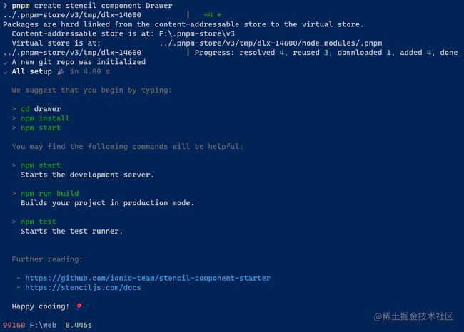
pnpm create stencil
创建成功,终端显示如下
创建一个组件
Stencil 项目内置一个生成组件命令 generate,使用下面的命令生成一个组件
#使用 npm
npm run generate
#使用 yarn
yarn generate
#使用 pnpm
pnpm run generate
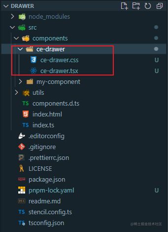
执行之后会让用户输入一个组件的名字(以-作为连字符),输入之后按回车键会让用户选择要生成的文件,选择之后按回车就能生成一个组件了。你可以在 src/components 目录下看到 ce-drawer, 如下图
实现组件
首先,创建组件的 HTML 结构:
import { Host, h } from '@stencil/core';

@Component({
  tag: 'ce-drawer',
  styleUrl: 'ce-drawer.css',
  shadow: true,
})
export class CeDrawer {

  renderHeader() {
    if (this.showHeader) {
      return (

          {this.header}

      );
    } else {
      return null;
    }
  }

  render() {
    return (


          {this.renderHeader()}


    );
  }
}
接下来,声明 prop:
import { Component, Event, EventEmitter, Host, Method, Prop, Watch, h } from '@stencil/core';

@Component({
  tag: 'ce-drawer',
  styleUrl: 'ce-drawer.css',
  shadow: true,
})
export class CeDrawer {
    @Prop({
      attribute: 'show',
      mutable: true,
      reflect: true,
    })
    visible: Boolean = false;
    @Prop() width: string = '36%';

    @Prop({
        attribute: 'show-header',
        mutable: true,
        reflect: true,
    })
    showHeader: boolean = false;

    @Prop({
        attribute: 'header',
    })
    header: string = '';

    @Prop({
        attribute: 'mask-closable',
        mutable: true,
        reflect: true,
    })
    maskClosable: boolean = true;

    @Prop({
        attribute: 'placement',
        mutable: true,
        reflect: true,
    })
    placement: string = 'right';

    /**监听传入的 placement 是否符合要求*/
    @Watch('placement')
    validateName(val: string) {
        const flag = ['left', 'right', 'top', 'bottom'].includes(val);
        if (!flag) {
          throw new Error('placement 必须是 left/right/top/bottom 其中之一');
        }
    }

    renderHeader() {
        if (this.showHeader) {
          return (

              {this.header}

          );
        } else {
          return null;
        }
    }

    render() {
        return (


                {this.renderHeader()}


        );
    }
}
接着,声明自定义事件和遮罩层点击事件:
// ...
maskClose() {
    if (this.maskClosable) {
      this.visible = false;
    }
}

@Event() closed: EventEmitter;
closeHandler() {
    this.closed.emit();
}
最后,声明外部可用的辅助方法,例如显示/关闭 Drawer 组件:
// ...

@Method()
async open() {
    this.visible = true;
}
@Method()
async close() {
    this.closeHandler();
    this.visible = false;
}
源码
完整代码